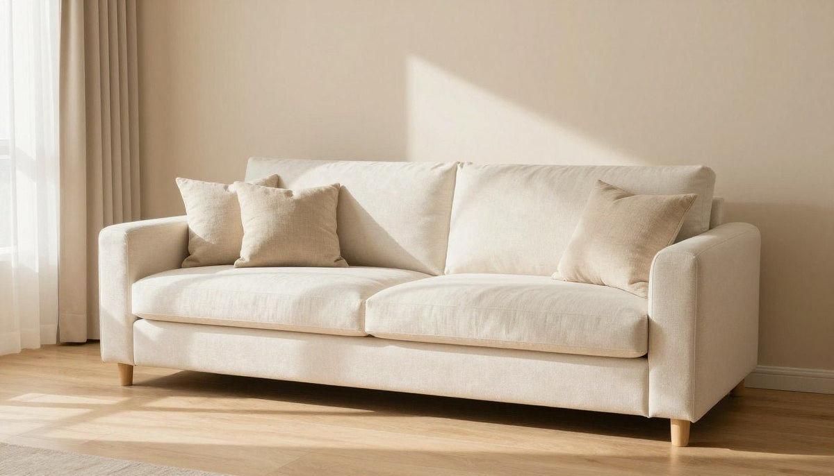
When asking what color goes with beige, the best pairings include crisp white, deep black, navy blue, sage green, terracotta, soft blue, warm gray, and warm metallic accents like gold and brass. Beige functions as a grounding, warm neutral that easily balances both saturated statement shades and gentle tonal layers. Choosing the right companion shade depends on the room's natural light and the mood you want to create.
Lighting temperature, architectural finishes, and fabric textures help decide which pairing performs best in your home. A space with cool northern light benefits from richer, warmer accents like rust or olive, while bright southern rooms handle crisp black or airy sky blue with ease.

What Beige Is and How It Differs From Tan and Gray
Beige is a pale, warm neutral created by mixing brown with white, often carrying subtle yellow, red, or golden undertones. These gentle undertones give beige an inviting, relaxed character that sets it apart from colder architectural colors.
Tan is distinctly darker and more saturated than beige, sitting closer to true medium brown on the color wheel. Gray, by contrast, relies on a cool black-and-white base that often carries blue, green, or violet undertones. While gray delivers a crisp, shadowy neutrality, beige adds visual softness and ambient warmth to interior walls and furnishings.
Check wall paint and fabrics against natural daylight before deciding on accent pieces, as beige shifts noticeably warmer under incandescent bulbs.
Beige Pairings at a Glance
Reviewing color combinations side by side clarifies how each accent alters the temperature and atmosphere of a beige interior. The table below outlines how each pairing functions, where it fits best, and a straightforward way to introduce it to your decor.
| Pairing | Mood | Best rooms | Easy way to try it |
|---|---|---|---|
| White and cream | Airy, serene | Bedrooms, baths | Layer textured throw blankets and cotton drapery. |
| Black | Bold, modern | Living rooms, entries | Introduce slim picture frames and dark metal lamp bases. |
| Navy blue | Classic, grounded | Offices, dining rooms | Place an accent chair or deep blue velvet cushions. |
| Sage and olive | Calm, organic | Kitchens, bedrooms | Add indoor foliage in unglazed ceramic planters. |
| Terracotta | Warm, earthy | Family rooms, dining | Style rustic clay pottery and kilim accent pillows. |
| Soft blue | Light, coastal | Guest rooms, lounges | Hang flowing sheer curtains or light blue ceramics. |
| Warm gray | Subtle, refined | Open-plan living | Roll out a flatweave wool area rug combining both tones. |
| Gold and brass | Polished, upscale | Powder rooms, living | Swap cabinet hardware or install brass sconces. |
Pairing Beige With White and Cream
Layering beige with white and cream creates a quiet, timeless foundation that feels soft rather than stark. Pure whites introduce crisp boundaries that keep beige surfaces looking intentional and fresh.
Cream and ivory soften transitions across the room, preventing the eye from registering abrupt visual stops. To explore tonal balance in wall decor, select framed prints featured in Beige Abstract Wall Art to anchor the seating zone.
How to use it: Paint moldings and door casings in a clean off-white to frame warm beige walls with defined, elegant structure.

Pairing Beige With Black
Black introduces sharp, architectural definition that immediately modernizes beige walls and upholstery. Because beige is naturally low in visual tension, dark outlines prevent the room from appearing flat or overly rustic.
Matte black finishes work especially well because they absorb light, creating grounding contrast without harsh glare. Balancing dark iron or ebony accents with pale sand tones produces a tailored, contemporary feel across dining and living areas.
- Use black in slim linear silhouettes such as metal table legs, curtain rods, and fine picture framing.
- Anchor the seating group with an ebony wood side table or a matte black floor reading lamp.
- Keep the proportion moderate so the black accents frame the beige surroundings rather than overpowering them.
Pairing Beige With Navy Blue
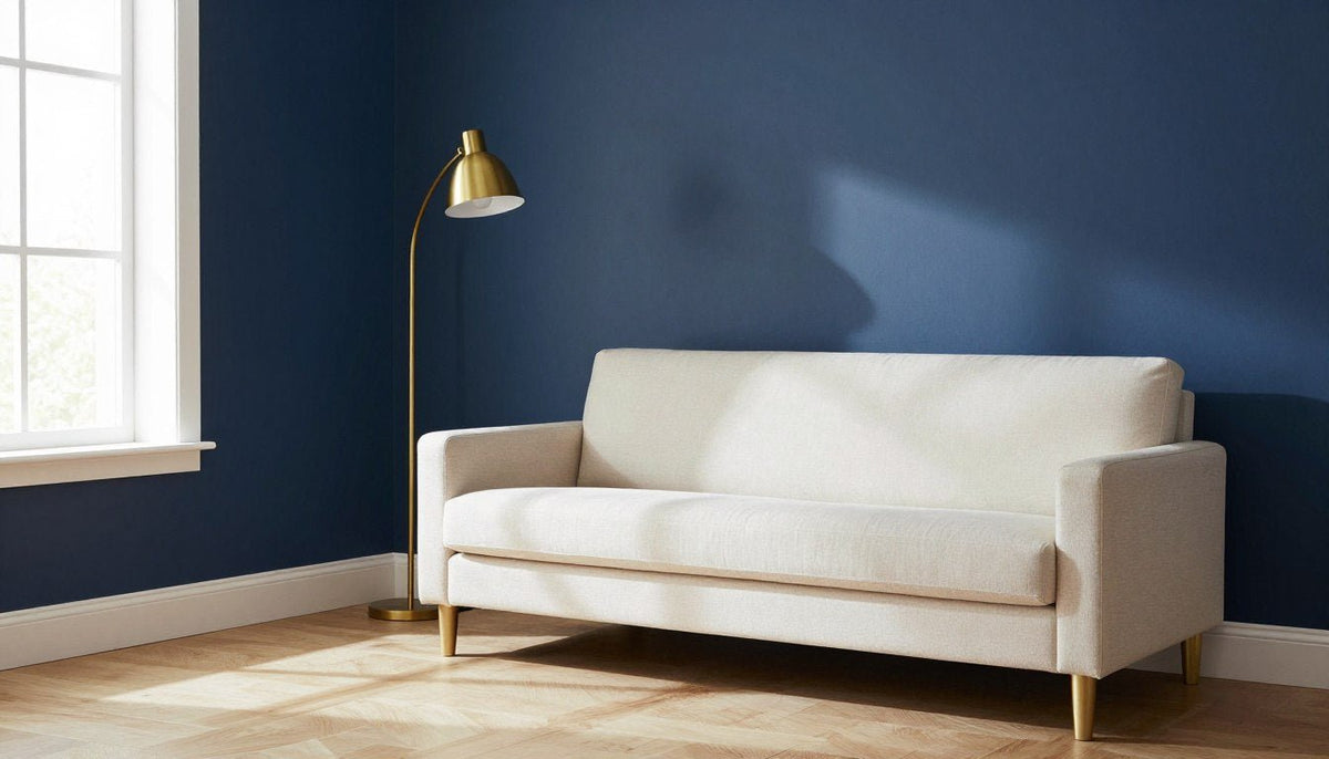
Navy blue offers rich, tailored contrast that feels both traditional and fresh when set against warm beige surfaces. The dark blue hue provides depth while beige softens the cool authority of the darker paint.
This pairing excels in shared spaces like living rooms and formal dining areas where balanced formality is desired. The warmth in beige prevents dark navy from feeling chilly or somber under dim evening light.
How to use it: Style a tailored navy upholstered accent chair or dark blue patterned pillows against a sand-toned sectional sofa.

Pairing Beige With Sage and Olive Green
Green tones create an effortless, nature-inspired palette when paired with beige backgrounds. Sage delivers a misty, restorative quality that keeps compact rooms feeling open and calm.
Olive green brings a richer, earthy weight that resonates with the yellow and brown undertones found in warm beige. Together, these shades evoke natural landscapes and bring an organic atmosphere into kitchens, bedrooms, and reading corners.
- Combine olive linen window panels with sand-colored textured wall paint.
- Place pale sage glazed pottery and live olive branches on a beige marble or stone countertop.
- Incorporate olive wool blankets over a natural linen duvet cover for subtle bedroom contrast.
Pairing Beige With Terracotta and Rust
Terracotta, rust, and burnt sienna inject comfortable warmth into neutral rooms by amplifying the inherent heat of beige. These reddish-clay accents feel grounded and welcoming without competing with the backdrop.
This palette creates an inviting, tactile environment in spaces designed for relaxing and entertaining. When working with deeper earth tones, styling guidance from Colors That Go With Brown helps maintain smooth transitions between rich clay shades and lighter sand bases.
How to use it: Group weathered terracotta urns and rust-toned woven cushions across a neutral seating layout to produce an earthy focal point.

Pairing Beige With Soft Blue
Soft blue and beige evoke the effortless balance of sand and coastal skies. The gentle temperature contrast creates a peaceful, open environment that feels easy on the eyes.
Pale sky blues and washed denim tones prevent light beige from feeling overly dry or dusty. For inspiration on positioning soothing focal points above furniture, look to Neutral Wall Art for Living Room when arranging key conversation areas.
- Hang semi-sheer soft blue linen drapery to filter daylight gently over beige living room walls.
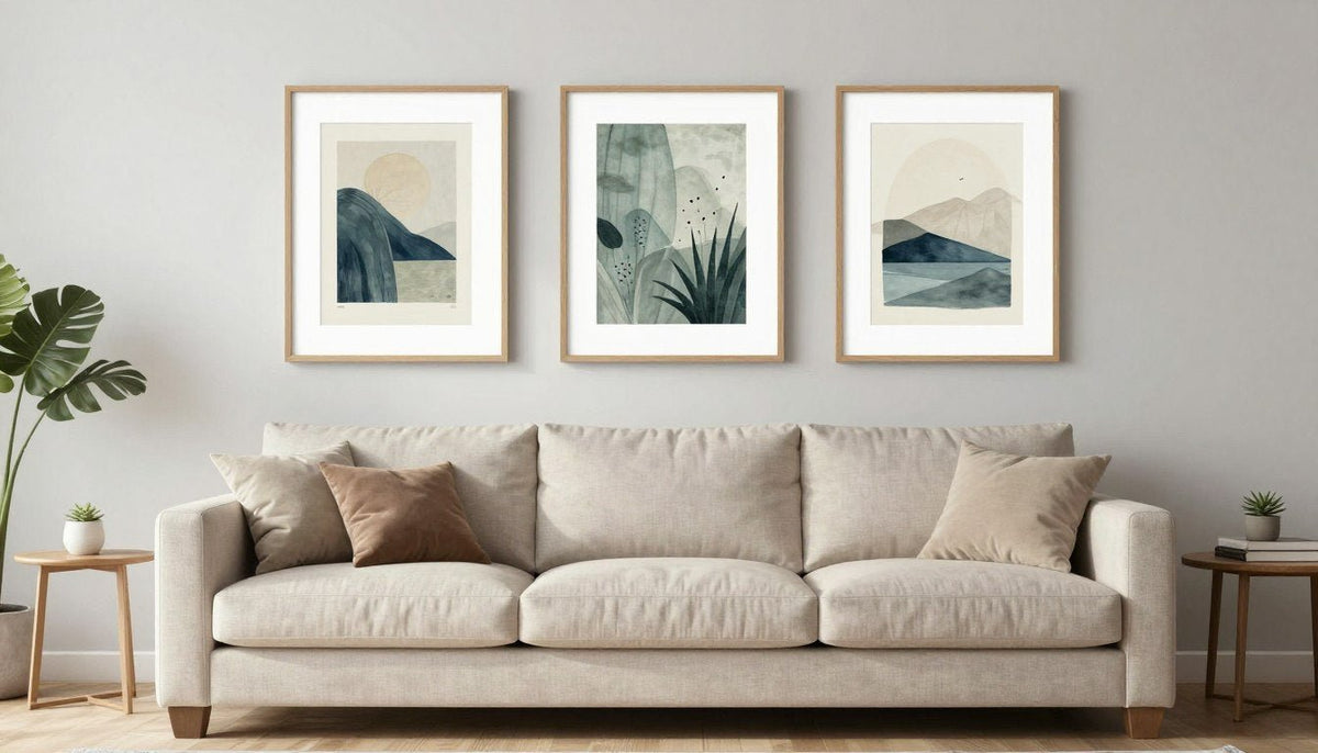
- Introduce powder blue decorative bowls or watercolor landscape prints in natural wood frames.
- Use washed blue throw cushions on a neutral upholstered bench in an entry or guest bedroom.
Pairing Beige With Warm Gray
Pairing beige with warm gray creates a refined, monochromatic aesthetic often referred to as greige. This subtle combination works because the gray component contains warm taupe or brown undertones rather than cold slate notes.
The gentle contrast between these two neutrals adds understated depth to large open floor plans where bold colors might feel distracting. It bridges traditional warm wood finishes with sleek modern interior architecture.
How to use it: Anchor the room with a plush charcoal-flecked warm gray area rug beneath a beige sectional sofa.
Pairing Beige With Gold and Brass
Gold and brass fixtures bring a luminous, reflective accent that elevates beige from casual to sophisticated. Because these metals carry yellow and amber undertones, they harmonize naturally with the warmth in beige surfaces.
Brushed, satin, or antique finishes are preferable to high-polish chrome, as they maintain a warm, soft glow rather than a cold specular shine. This metallic addition works especially well in dining rooms, living rooms, and entryways.
How to use it: Install brushed brass wall sconces or display a gold-leaf tray on an oatmeal-colored fabric ottoman.

How to Use Beige in Wall Art
Beige artwork serves as an ideal anchor across neutral and high-contrast interior schemes. It unifies disparate accent colors in the room, translating surrounding rug tones, wall paint, and upholstery into a cohesive vertical display.
When selecting canvas artwork, consider how the composition supports your chosen room palette. Each of these fine canvas sets is printed on poly-cotton canvas with UV- and fade-resistant HP latex inks (UL GREENGUARD Gold certified) and hand-stretched over a 1.25-inch hardwood stretcher frame with a satin-matte finish. Pieces are made to order, and the three panels of a set ship together, ready to hang with free shipping. An optional handcrafted poplar hardwood floater frame is also available.

Soft Shoreline
A beige set of 3 vertical panels offered in sizes 16 x 24 to 53 x 75 in, Soft Shoreline introduces a hazy horizon of cream, gold and dusty blue that coordinates with coastal and tone-on-tone rooms.

Dune Horizon
Featuring tan dunes, cream sand and a pale aqua sky across a set of 3 vertical panels, Dune Horizon provides subtle natural structure that anchors living spaces layered with terracotta or olive accents.


Ink Ledger & Orbit
For bold high-contrast palettes, Ink Ledger uses black, ivory, and cream, while Orbit features deep black, cream, and off-white in a set of 3 vertical panels.
To browse more versatile canvas prints that work across varied living room color palettes, explore the complete curation of neutral abstract wall art.
Three Decorating Mistakes to Avoid With Beige
Beige is a forgiving color, but common missteps can leave a room looking dull or visually disconnected. Avoiding three frequent pitfalls helps maintain a balanced, engaging interior.
- Relying entirely on smooth textures: When every item in a beige room has a flat finish, the environment feels monotonous. Fix this by layering tactile materials like chunky bouclé, nubby wool, slubby linen, and rough unglazed ceramics.
- Ignoring undertone clashes: Pairing beige that has yellow or pink undertones with icy, blue-tinted cool grays creates visual friction. Fix this by matching undertones, pairing warm beige with greige or earthy accent shades rather than cool steel hues.
- Underpowering the room lighting: Inadequate or overly cool lighting makes beige look muddy and drab. Fix this by incorporating warm-toned bulbs and layered light sources, including table lamps, sconces, and floor uplights.
Preview Artwork in Your Space
Finding the right balance between wall paint and canvas prints is simple when you can see the artwork in place before ordering. Every product page includes a Live Preview button that shows the artwork on your own wall through your phone or computer camera.
See Artwork on Your Wall
Upload a quick photo of your living room or bedroom to test how different canvas sizes and color palettes fit your beige walls.
Try Live Preview →🎨 FREE ROOM-BY-ROOM ART GUIDE
Get our free guide to choosing art for every room, with color and size tips.
Download Free →Frequently Asked Questions
Does beige go with gray?
Beige pairs well with gray when the gray carries warm taupe, brown, or green undertones. These gentle combinations create a seamless greige palette. Avoid pairing warm beige with icy, blue-based grays, as the temperature difference can make the room feel disjointed and unfinished.
What is the difference between beige and tan?
Beige is a pale, soft neutral made by blending brown with white, resulting in an airy background tone. Tan is noticeably darker, richer, and closer to medium brown on the spectrum. Beige feels lighter on expansive walls, whereas tan provides denser, more saturated warmth in decor.
What colors don't go with beige?
Beige clashes with harsh neon shades, electric purples, and ultra-cool stark grays with heavy blue undertones. These intense, synthetic, or cold hues fight the natural warmth of beige, causing the background to appear dingy or muddy rather than clean, warm, and intentional.
What's a color that compliments beige?
Navy blue serves as a classic complementary partner for beige. The rich, dark blue creates strong visual contrast that flatters the warm golden or red undertones in beige. It grounds the living space while allowing the neutral background to feel balanced, comfortable, and inviting.
Which color looks classy with beige?
Deep black creates an exceptionally classy look when paired with beige. Black adds modern structure, graphic framing, and refined architectural weight to soft sand surfaces. Combining matte black light fixtures or dark picture frames with beige creates a polished, upscale interior aesthetic.
Bringing Your Beige Color Scheme Together
Decorating with beige gives you an adaptable canvas that welcomes both understated neutral layering and confident statement accents. By coordinating undertones, mixing varied tactile materials, and adding structured wall art, you create a cohesive space that feels welcoming and complete.
Keep Reading
About the Author — Chiara Rossetti is the founder of Rossetti Art, a canvas print and original art brand. She writes about interior design, wall art styling, and the art of making a home feel alive.

About the Author
Chiara Rossetti
Chiara Rossetti is the founder of Rossetti Art, a canvas print and original art brand. She writes about interior design, wall art styling, and the art of making a home feel alive.

Leave a comment
This site is protected by hCaptcha and the hCaptcha Privacy Policy and Terms of Service apply.