Selecting the perfect neutral wall art for your living room is more nuanced than simply choosing something beige. The right piece can transform your space, adding depth, texture, and a sense of calm sophistication that defines truly elegant interiors. Yet many homeowners struggle with making neutral art feel intentional rather than an afterthought.
In this comprehensive guide, we'll explore how to select neutral wall art that enhances your living room's aesthetic while avoiding the common pitfalls that lead to flat, uninspiring results. From understanding undertones to mastering scale and lighting, you'll discover how designers create spaces that feel both serene and visually compelling through thoughtful art selection.

What "neutral wall art" really means (and why some neutrals feel wrong)
Neutral doesn't simply mean "lacking color." True neutral wall art creates a foundation that can either calm a busy space or provide subtle depth to a minimalist room. When neutral art feels wrong, it's usually because the undertones clash with your existing decor or because the piece lacks the necessary visual interest to stand on its own.

Undertones 101: warm (cream/oat), cool (gray/stone), earthy (sand/clay)
Every neutral color has underlying tones that affect how it interacts with your space. Warm neutrals like cream, oat, and beige have yellow or red undertones that create a cozy, inviting feeling. Cool neutrals such as gray, stone, and greige contain blue or green undertones for a more contemporary, calm effect. Earthy neutrals including sand, clay, and taupe blend warm and cool for a grounded, natural aesthetic.
The key to successful neutral wall art is identifying these undertones and ensuring they complement your existing color palette. Hold potential art pieces against your wall, sofa, or rug in natural light to see if the undertones harmonize or clash.

Match the room's dominant neutral, then add one contrasting neutral (charcoal/ink) for depth
For a cohesive look, your wall art should primarily align with your room's dominant neutral family. If your furniture and decor lean warm, choose art with warm undertones. For spaces with cool gray walls or furniture, select art with similar cool undertones.
However, perfect matching can lead to a flat, uninspired look. The designer secret is to incorporate one contrasting neutral—like a touch of charcoal, ink, or umber—to create depth and visual interest. This contrast prevents the space from feeling one-dimensional while maintaining the serene neutral palette.

Trend note: warmer, layered neutrals are rising vs flat cool gray
While cool grays dominated neutral palettes for years, interior design is shifting toward warmer, more layered neutrals. Today's most sophisticated spaces feature cream, oat, sand, and clay tones that create a more inviting atmosphere than the stark cool grays of previous trends.
This shift extends to wall art, where pieces with depth, texture, and warmth are replacing flat, cool-toned minimalism. When selecting neutral wall art for longevity, consider pieces with these warmer undertones and layered complexity that will remain relevant as design trends continue to evolve.

Step-by-step: choose the right piece for your living room
Finding the perfect neutral wall art requires a methodical approach that considers your existing decor, desired atmosphere, and the visual elements that will prevent your space from feeling flat or boring.

Start with your anchor (sofa/rug) and pull 2–3 tones from it
Your largest furniture pieces serve as anchors for your color palette. Examine your sofa, area rug, or prominent furniture and identify 2-3 neutral tones present in these pieces. Look for subtle variations—perhaps the oatmeal sofa has flecks of taupe and ivory, or your rug blends several shades of greige.
Select wall art that incorporates these same tones for a cohesive look that feels intentional rather than random. This connection creates visual harmony even when the art style differs from your furniture aesthetic.

Decide the mood: airy minimal vs organic modern vs quiet luxury
Neutral wall art can support various design aesthetics, each creating a distinct mood. Airy minimal features clean lines, plenty of negative space, and a light, ethereal quality. Organic modern incorporates natural textures, irregular shapes, and earthy elements. Quiet luxury emphasizes rich textures, subtle patterns, and sophisticated details.
Determine which aesthetic aligns with your vision for the space, then select neutral wall art that reinforces this mood. The same color palette can feel dramatically different depending on the composition, texture, and style of the artwork.

Add texture to avoid "beige-on-beige boredom" (linen feel, brushwork, plaster-like surfaces)
The secret to compelling neutral wall art is texture. Without it, neutral-on-neutral can quickly become visually boring. Look for pieces that incorporate tactile elements: visible brushwork that catches the light, canvas with a linen-like weave, plaster-like surfaces with dimensional quality, or mixed media with subtle relief.
These textural elements create visual interest through shadow and light play, ensuring your neutral wall art feels dynamic rather than flat. Even in monochromatic pieces, texture provides the necessary complexity to make the artwork engaging.

Scale and placement (the part most people get wrong)
Even the perfect neutral wall art can fail to make an impact if the scale is wrong or the placement is off. These technical aspects are often overlooked but make a significant difference in how the art integrates with your space.

Above the sofa: keep the bottom edge ~6–12 inches (15–30 cm) above the sofa back
When hanging neutral wall art above a sofa, the most common mistake is placing it too high. For proper visual connection between the furniture and art, keep the bottom edge of the frame approximately 6-12 inches (15-30 cm) above the sofa back.
This proximity creates a cohesive arrangement rather than disconnected elements. For larger or taller pieces, you can position them closer to the sofa (around 6 inches), while smaller pieces may benefit from a bit more wall space below (up to 12 inches).

Gallery rule: artwork center around ~57 inches (145 cm) from the floor (then adjust for seating)
Professional galleries typically hang artwork with the center point at approximately 57 inches (145 cm) from the floor—average eye level for most adults. This principle works well for neutral wall art in areas where people are standing.
However, in living rooms where people are primarily seated, you'll want to adjust this height slightly lower. The key is to ensure the artwork can be comfortably viewed from your typical seating positions without requiring an upward gaze.

Proportion guidance: one large piece vs diptych/triptych vs gallery wall (when each works)
The scale of your neutral wall art should relate to the wall space and furniture it accompanies. For above a sofa, aim for artwork that spans approximately two-thirds to three-quarters of the sofa's width for proper proportion.
A single large piece creates a bold, focused statement and works well in minimalist spaces. Diptychs (two-panel) or triptychs (three-panel) pieces add rhythm and work beautifully above longer sofas or console tables. Gallery walls with multiple neutral pieces allow for more complexity and personal expression, ideal for transitional or eclectic spaces.

Contrast and composition (how to make neutrals feel intentional)
The difference between forgettable and striking neutral wall art often comes down to contrast and composition. These elements ensure your art has visual impact despite its restrained palette.

Use contrast in value (light/medium/dark), not just color
Even within a neutral palette, varying the lightness and darkness of tones creates essential visual interest. Look for neutral wall art that incorporates a range of values—from light cream to mid-tone taupe to deep charcoal—rather than pieces that stay within a narrow value range.
This contrast in value creates depth, dimension, and visual hierarchy, allowing the eye to move through the composition. Without this variation, neutral art can appear flat and lifeless regardless of its subject matter or style.

Choose one "quiet focal point" shape (circle, arch, line grid) and repeat it subtly elsewhere
Strong composition often relies on a recognizable geometric element that anchors the piece. In neutral wall art, look for a "quiet focal point"—a circle, arch, line grid, or organic shape that creates structure without overwhelming the subtle palette.
For cohesive design, subtly echo this shape elsewhere in your room: a round coffee table beneath a circular motif in your art, arched doorways that complement arched elements in your artwork, or linear furniture that picks up on grid patterns in the piece.

Negative space: let the wall breathe (especially in modern rooms)
Effective neutral wall art often incorporates generous negative space—areas intentionally left empty or minimal. This breathing room prevents the piece from feeling heavy or overwhelming and allows the subtle details to stand out.
In modern, minimalist spaces, choose neutral art with significant negative space to maintain the clean, uncluttered aesthetic. More traditional or maximalist rooms can accommodate denser compositions, but even these benefit from some visual rest within the artwork.

Frames and finishes (subtle choices that change everything)
The frame and finish of your neutral wall art can dramatically affect how it integrates with your space. These seemingly minor details influence both the visual impact and the practical functionality of the piece.

Wood, matte black, soft gold: what suits warm vs cool rooms
Frame selection should complement both your artwork and your room's overall palette. For spaces with warm neutrals, natural wood frames in oak, walnut, or maple enhance the organic, inviting quality. Rooms with cool neutral schemes often benefit from matte black frames that provide crisp definition without heaviness.
Soft gold or champagne frames work as versatile transitional options, adding subtle warmth to cool spaces or refined elegance to warm rooms. Avoid high-shine metallic frames with neutral art, as the contrast can be jarring against the subtle palette.

Matte vs satin: glare considerations (especially near windows)
The finish of your neutral wall art affects not just its appearance but also its visibility in different lighting conditions. Matte finishes reduce glare and reflection, making them ideal for pieces placed opposite windows or in rooms with significant natural light.
Satin or semi-gloss finishes add subtle dimension and can make neutral tones appear richer, but may create distracting reflections in bright conditions. For art placed near windows, choose matte finishes or consider non-reflective glass if framing is required.

Lighting tips so neutrals don't look dull
Proper lighting transforms neutral wall art from subtle background elements to captivating focal points. The right illumination reveals texture, enhances depth, and brings out the nuanced variations in tone that make neutral pieces interesting.

Bulbs: CRI 90+ (better color accuracy)
Color Rendering Index (CRI) measures how accurately a light source reveals colors compared to natural sunlight. For neutral wall art, choose bulbs with a CRI of 90 or higher to ensure the subtle variations in tone are faithfully represented.
Lower CRI bulbs can make neutral art appear flat, muddy, or discolored, undermining the sophisticated nuances in the piece. LED lights with high CRI ratings are now widely available and provide energy-efficient, accurate illumination for your art.

Kelvin: 2700K–4000K works well in homes; neutral whites can be ~3500K–5000K depending on the piece
Color temperature, measured in Kelvin (K), affects how warm or cool the light appears. For most living rooms, bulbs in the 2700K-3000K range create a warm, inviting atmosphere that complements neutral wall art with warm undertones.
For neutral art with cooler tones or pieces where you want to emphasize clarity and detail, consider bulbs in the 3500K-4000K range. Gallery-style lighting often uses 3500K-5000K to reveal true colors without the yellowish cast of warmer bulbs, but this can feel clinical in residential settings.

Glare control: aim lights about ~30° and avoid direct reflection
Proper angle is crucial when lighting neutral wall art. Position light sources at approximately 30 degrees from the vertical plane of the artwork to illuminate it evenly while minimizing glare and reflections.
Recessed ceiling lights directly above art often create uneven illumination and harsh reflections. Instead, use adjustable track lighting, picture lights, or wall-mounted fixtures that can be angled properly. For larger pieces, consider multiple light sources to ensure even coverage across the entire surface.

Curated product recommendations
After exploring the principles of selecting neutral wall art, here are thoughtfully curated pieces that exemplify these concepts. Each recommendation addresses specific design needs while maintaining the sophisticated, calm aesthetic that makes neutral art so enduring.

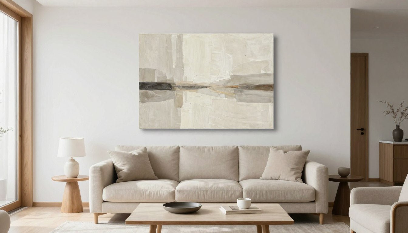
Neutral Abstract Canvas Print
This minimalist abstract piece features a sophisticated blend of beige and cream tones with subtle texture that catches the light beautifully. The balanced composition includes both light and mid-tone values with just enough contrast to create visual interest without overwhelming your space.
Best placement: The horizontal format makes this piece ideal for placement above a sofa or console table, where its subtle movement creates a sense of calm energy.
Lighting tip: Illuminate with warm-white (3000K) lighting at a 30° angle to enhance the textural brushwork without creating glare on the canvas surface.

Neutral Essence Minimalist Abstract
This earth-toned abstract embraces the trending warmer neutral palette with sand, clay, and soft umber hues. Its organic composition creates a grounding presence while maintaining an airy, contemporary feel through thoughtful negative space.
Best placement: Perfect for creating a focal point in reading nooks or conversation areas where its warm tones can enhance the intimate atmosphere.
Lighting tip: Pair with lighting in the warmer spectrum (2700-3000K) to enhance the rich earthy undertones and create a cozy, inviting ambiance.

Circle of Tones Geometric Minimalist
This geometric piece centers on a perfect circle motif that creates a strong yet quiet focal point. The gradient of neutral tones from ivory to taupe demonstrates effective value contrast while maintaining a cohesive, minimal aesthetic.
Best placement: The balanced, symmetrical composition makes this piece versatile for centered placement above fireplaces or between windows where it creates architectural harmony.
Lighting tip: Use neutral white lighting (3500K) positioned to eliminate shadows and maintain the clean, precise appearance of the geometric form.

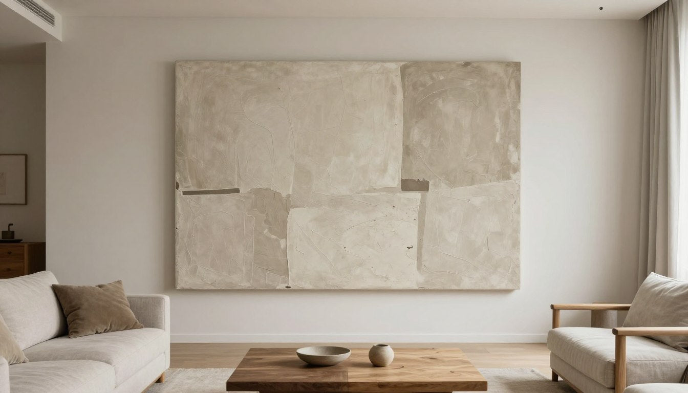
Original Neutral Textured Painting with Arched Design
This original painting exemplifies how texture elevates neutral art, featuring plaster-like surfaces with dimensional relief. The arched design creates an architectural reference that adds sophistication while the textural elements ensure visual interest from every angle.
Best placement: Makes a striking statement in transitional spaces like entryways or at the end of hallways where its textural details can be appreciated up close.
Lighting tip: Position lighting at a sharp angle (around 45°) to create dramatic shadows that highlight the dimensional texture and enhance the piece's sculptural quality.

Whispered Lines Textured Beige Original
This original painting demonstrates the "quiet luxury" aesthetic through rich textural brushwork and subtle linear elements. The predominantly beige palette appears anything but boring thanks to the dimensional surface that creates constant interplay with light.
Best placement: Ideal for placement in dining areas or formal living rooms where its refined presence enhances sophisticated entertaining spaces.
Lighting tip: Use high-CRI (95+) lighting with a warm-white temperature (3000K) to faithfully render the nuanced tonal variations and highlight the textural details.

Minimalist Abstract Line Canvas
This piece demonstrates perfect value contrast with its elegant line work in deep charcoal against a cream background. The minimalist composition creates visual interest through the tension between flowing lines and generous negative space, embodying the "less is more" philosophy.
Best placement: Works beautifully in minimalist or Scandinavian-inspired spaces, particularly above low-profile furniture where its linear elements can create a sense of height.
Lighting tip: Use crisp, neutral lighting (3500-4000K) to maintain the sharp contrast between the dark lines and light background without adding unwanted color cast.
FAQ
What size wall art should I choose for above a sofa?
For art above a sofa, aim for a width that's approximately 2/3 to 3/4 the length of your sofa. For a standard 84-inch sofa, look for artwork (or a grouping) around 56-63 inches wide. Height should be proportional, typically 24-36 inches for most living rooms. Remember that too-small art will look disconnected and lost, while oversized pieces may overwhelm the space.
How high should I hang wall art in a living room?
In living rooms, the general rule is to position the center of your artwork at approximately 57-60 inches from the floor (standard eye level). However, when hanging art above furniture like a sofa, prioritize keeping the bottom edge 6-12 inches above the furniture rather than strictly adhering to the eye-level rule. This creates a visual connection between the furniture and artwork.
How do I keep neutral wall art from looking boring?
Prevent neutral art from appearing flat by focusing on pieces with: 1) Textural elements that create dimension, 2) Strong value contrast between light and dark neutrals, 3) Interesting composition with clear focal points, 4) Subtle pattern or line work, and 5) Layered tones rather than a single flat color. Proper lighting is also essential—even the most interesting neutral piece can look dull under poor lighting.
What frame color is best for neutral interiors?
For warm neutral interiors (beige, cream, oat), natural wood frames in oak, walnut, or maple enhance the organic feel. For cool neutral spaces (gray, greige), matte black frames provide crisp definition without heaviness. Soft gold or champagne frames work as versatile transitional options in either setting. The frame should complement both the artwork and your existing decor rather than competing for attention.
What lighting is best for artwork (CRI/Kelvin)?
For optimal artwork lighting, use bulbs with a Color Rendering Index (CRI) of 90+ to accurately reveal subtle tonal variations. For color temperature, warm white (2700K-3000K) creates an inviting atmosphere for most living spaces, while neutral white (3500K-4000K) provides clearer color accuracy for detailed or cooler-toned pieces. Position lights at approximately 30 degrees from the artwork's vertical plane to minimize glare while maximizing visibility.
Can I mix neutral wall art with colorful decor?
Absolutely! Neutral wall art provides an excellent backdrop for colorful accessories and furniture. The key is to ensure the neutral tones in your artwork share undertones with your colorful elements. For example, warm neutral art pairs beautifully with terracotta, rust, and gold accents, while cool neutral pieces complement blue, green, and silver elements. This creates a cohesive look while allowing your colorful items to stand out.
Conclusion
Selecting the perfect neutral wall art for your living room isn't about finding something that simply blends in—it's about choosing pieces that enhance your space through thoughtful consideration of undertones, texture, scale, and composition. When done right, neutral art creates a sophisticated foundation that elevates your entire room.
Remember that the most successful neutral spaces balance restraint with intentional moments of contrast and texture. Whether you prefer the airy simplicity of minimalism, the organic warmth of natural elements, or the refined details of quiet luxury, there's a neutral art piece that can perfectly express your aesthetic while maintaining the serene, timeless quality that makes neutral palettes so enduring.
As you explore the curated selections from Rossetti Art or discover other pieces that speak to you, focus on how the artwork makes you feel in your space rather than simply how it matches your decor. The best neutral wall art creates not just visual harmony but an emotional response—a sense of calm, sophistication, and home.

Leave a comment
This site is protected by hCaptcha and the hCaptcha Privacy Policy and Terms of Service apply.