In our increasingly digital and perfection-driven world, there's a growing desire to create homes that feel authentic, grounded, and peaceful. Wabi-sabi wall art offers a thoughtful approach to decorating that celebrates imperfection, natural materials, and quiet beauty. This Japanese-inspired aesthetic doesn't demand attention—instead, it invites pause and reflection, transforming your space into a serene sanctuary where you can truly breathe.

What wabi-sabi means in interior design (in simple words)
Wabi-sabi isn't just a design trend—it's a philosophy with deep roots in Japanese culture. At its core, wabi-sabi embraces the beauty found in imperfection, impermanence, and incompleteness. When applied to our homes, it creates spaces that feel honest, lived-in, and deeply connected to nature.
Beauty in imperfection + authenticity (not "messy," but intentional)
Wabi-sabi celebrates the cracks, wear, and asymmetry that tell a story. Unlike the pristine perfection often showcased in design magazines, wabi-sabi finds beauty in the authentic. A handmade ceramic vase with slight irregularities, a wooden table with visible grain, or wall art with textural variations—these imperfections add character rather than detract from beauty.

Natural materials + time-worn textures (linen, wood, stone, clay)
Wabi-sabi interiors favor materials that age gracefully and connect us to the earth. Think unbleached linen that softens with each wash, untreated wood that develops a patina over years, stone with natural variations, and clay pieces that showcase the artist's hand. These materials bring warmth and tactile comfort to spaces that might otherwise feel cold or impersonal.
"Wabi-sabi reminds us that beauty lies in the humble, imperfect moments—the weathered edge of a frame, the subtle texture of handmade paper, the quiet presence of a simple form."
The wabi-sabi wall art look (color, texture, and negative space)
When selecting wall art that embodies wabi-sabi principles, focus on pieces that feel grounded and quietly expressive. The power of wabi-sabi art lies not in bold statements but in subtle details that reveal themselves over time.
Muted palettes: warm whites, sand, stone, ink, clay
Wabi-sabi wall art typically features a restrained color palette drawn from nature. Look for warm whites, sandy beiges, stone grays, soft blacks, and earthy clay tones. These colors create a sense of calm and allow the textural elements to take center stage. Occasionally, you might find muted greens or subtle blues that reference natural elements like moss or weathered copper.

Texture is the "emotion": plaster-like surfaces, brush marks, raw canvas feel
In wabi-sabi wall art, texture creates emotional depth. Look for pieces with plaster-like surfaces, visible brush marks, or the raw feel of natural canvas. These tactile qualities invite closer inspection and create visual interest without relying on bold colors or complex imagery. The subtle interplay of light and shadow across textured surfaces brings these pieces to life throughout the day.
Negative space and quiet composition (let the wall breathe)
Wabi-sabi compositions value restraint and breathing room. Rather than filling every inch with detail, these pieces embrace negative space—allowing the eye to rest and the mind to quiet. Simple, asymmetrical arrangements feel more natural and less contrived than perfectly balanced compositions.

Find Your Wabi-Sabi Style
Discover which calm, textured pieces would best complement your space with our free style assessment.
Take the Free Style QuizHow to style wabi-sabi wall art in a calm modern home
Styling wabi-sabi wall art isn't about following rigid rules—it's about creating a space that feels balanced, intentional, and deeply personal. These guidelines will help you incorporate wabi-sabi pieces in a way that enhances their quiet beauty.
One statement piece > many small pieces (restful focal point)
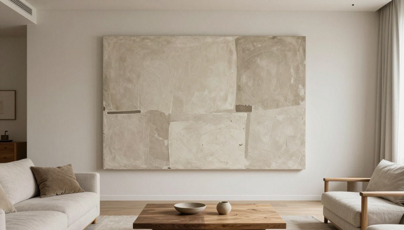
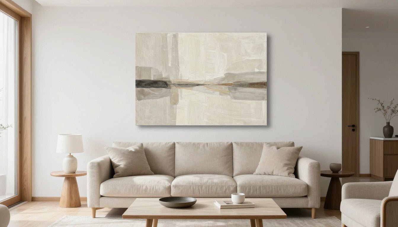
Rather than cluttering walls with numerous small artworks, wabi-sabi styling often favors a single, thoughtfully chosen piece that can serve as a restful focal point. This approach creates visual calm and allows the textural details of the artwork to be fully appreciated. A large-scale textured canvas above a sofa or bed can anchor a room without overwhelming it.

Off-center placement + asymmetry done gently
Wabi-sabi embraces natural asymmetry, but in a thoughtful way. Consider placing artwork slightly off-center on a wall, or creating a gentle imbalance by pairing a wall piece with a tall plant or floor lamp on one side. This subtle asymmetry feels more organic and lived-in than perfect centering.
Pairing rules: art + one sculptural object + one natural textile
When styling around your wabi-sabi wall art, embrace the power of three. Pair your artwork with one sculptural object (like a ceramic vessel or wooden bowl) and one natural textile (such as a linen throw or wool cushion). This creates a balanced vignette without overcrowding the space. Allow each element room to breathe.

Frames and finishes: matte, wood tones, soft metals, no high-gloss overload
Choose frames that complement the wabi-sabi aesthetic—natural wood tones, matte black, or soft metals with a patina. Avoid high-gloss finishes that feel too polished or reflective. For many textured pieces, a floating frame or no frame at all allows the artwork's edges and dimension to become part of the experience.
Lighting: the hidden ingredient that makes wabi-sabi feel "alive"
The right lighting transforms wabi-sabi wall art, bringing its subtle textures and tonal variations to life. Thoughtful illumination is perhaps the most overlooked aspect of styling these pieces effectively.
Warm vs neutral light (why 3000K–4000K is the sweet spot for art)
For wabi-sabi wall art, aim for lighting in the 3000K–4000K range. This spectrum provides enough warmth to enhance earthy tones without the yellowish cast of very warm bulbs (below 3000K) or the clinical feel of cool lighting (above 4000K). At around 3000K, clay tones and warm neutrals appear rich and inviting, while 3500K–4000K brings out more detail in textural pieces.

Use high CRI (90+) so neutrals don't turn dull/green
Color Rendering Index (CRI) measures how accurately a light source reveals colors compared to natural daylight. For wabi-sabi art with subtle neutral tones, a high CRI of 90+ ensures those delicate sand, stone, and clay hues appear true to life rather than dull or slightly green. This is especially important for textured pieces where the interplay of light and shadow creates much of the visual interest.
Angle tips to avoid glare (especially for canvas prints)
Position lighting at a 30-degree angle to your wall art to minimize glare while maximizing textural visibility. For canvas or textured pieces, adjustable track lighting or wall-mounted picture lights allow you to experiment with angles until you find the perfect illumination that highlights texture without creating hot spots or reflections.
Common Lighting Mistake: Overhead lighting directly above artwork creates harsh shadows that flatten textural details. Instead, position light sources at an angle to create gentle shadows that enhance dimensional qualities.
Room-by-room styling ideas
Each room in your home offers unique opportunities for incorporating wabi-sabi wall art. These room-specific guidelines will help you create spaces that feel cohesive, calm, and thoughtfully curated.
Living room: textured neutrals above sofa, layered linen + wood
In living spaces, a large textured piece in neutral tones creates a grounding focal point above a sofa or sideboard. Layer natural elements like linen cushions, a wooden coffee table, and perhaps a ceramic vessel to echo the textural qualities of your wall art. Keep accessories minimal—a few carefully chosen pieces will have more impact than many small objects.

Bedroom: softer palette, low contrast, "stillness" mood
For bedrooms, choose wabi-sabi art with an even softer palette and lower contrast to enhance the restful atmosphere. Pieces with gentle movement or horizontal compositions can create a sense of stillness. Position art where it can be appreciated from bed, perhaps above the headboard or on an adjacent wall within your line of sight.
Entryway/hall: narrow wall, one quiet piece, one vessel, one branch
Entryways benefit from the simplicity of wabi-sabi styling. For narrow hallways or entry walls, select a vertical piece that works with the proportions of the space. Pair with a single vessel on a slim console table and perhaps one natural element like a dried branch or small plant. This creates a welcoming moment that sets the tone for your home without overwhelming a typically small space.

Home office: minimal forms to reduce visual noise
In work spaces where focus is essential, wabi-sabi wall art with minimal forms and ample negative space helps reduce visual noise. Consider pieces with simple line work or subtle tonal variations rather than busy compositions. Position at eye level when seated to create a contemplative focal point that supports concentration rather than distracting from it.
Need Help Finding the Perfect Piece?
Our curated collection features handpicked wabi-sabi wall art for every room in your home.
Explore the CollectionProduct recommendations: wabi-sabi wall art for your calm modern home
These carefully selected pieces embody wabi-sabi principles while offering versatile styling options for different spaces in your home. Each recommendation balances texture, simplicity, and quiet beauty to create a sense of calm.

Sand & Clay Textural Canvas
Why it fits wabi-sabi: Hand-applied plaster-like texture with subtle tonal variations creates depth without overwhelming a space. The irregular surface catches light differently throughout the day.
Best room + placement: Living room above sofa or bedroom above headboard. The warm neutral palette works beautifully with natural wood tones and linen textiles.
Lighting tip: Illuminate with 3000K lighting (warm white) with 90+ CRI to enhance the sandy tones and textural details.

Ink Landscape Abstract
Why it fits wabi-sabi: Fluid brushstrokes on handmade paper embrace controlled imperfection. The organic composition suggests landscape elements without literal representation.
Best room + placement: Home office or entryway. The vertical format and contemplative quality make it perfect for narrower walls where you want to create a moment of pause.
Lighting tip: Position a 3500K light at a 30-degree angle to highlight the paper's texture without creating glare on the ink surface.

Natural Linen Wall Hanging
Why it fits wabi-sabi: Handwoven linen with natural dye variations celebrates textile traditions. Each piece features unique irregularities in weave and color that tell a story of handcraft.
Best room + placement: Bedroom or dining area where its soft texture adds warmth. Works beautifully paired with wooden furniture and ceramic vessels.
Lighting tip: Use 3000K-3500K lighting positioned to create gentle shadows that highlight the textural weave pattern.

Clay Relief Wall Sculpture
Why it fits wabi-sabi: Hand-formed clay elements create a dimensional piece that bridges art and sculpture. The organic arrangement and subtle variations in tone embody natural imperfection.
Best room + placement: Dining room or living room where its sculptural quality can be appreciated from different angles. Creates beautiful shadow play throughout the day.
Lighting tip: Angle lighting from above at 45 degrees using 3500K bulbs to maximize dimensional shadows across the textured surface.

Organic Line Study
Why it fits wabi-sabi: Simple line work on textured paper celebrates restraint and the beauty of the hand-drawn mark. The irregular strokes and asymmetrical composition feel natural rather than contrived.
Best room + placement: Home office or bedroom where its quiet simplicity supports focus and rest. Works well in a grouping with other minimal pieces.
Lighting tip: Use diffused 4000K lighting to clearly reveal the delicate line work without harsh shadows.

Weathered Wood Composition
Why it fits wabi-sabi: Reclaimed wood pieces showcase natural aging and patina. The material tells a story of time and elements, with each mark and variation adding to its character.
Best room + placement: Entryway or living room where its organic warmth creates a welcoming presence. Pairs beautifully with both modern and rustic elements.
Lighting tip: Use warm 3000K lighting to enhance the honey and amber tones in the wood grain.
Frequently Asked Questions
What makes wall art "wabi-sabi"?
Wabi-sabi wall art embraces imperfection, natural materials, and simplicity. Look for pieces that feature handmade qualities, textural elements, asymmetrical composition, and a muted, earthy palette. Rather than perfect execution, wabi-sabi art celebrates the beauty of the process—visible brushstrokes, uneven textures, or natural variations in materials. The piece should feel authentic rather than mass-produced, with a quiet presence that doesn't demand attention but rewards closer observation.
Can wabi-sabi work in a modern apartment?
Absolutely! Wabi-sabi wall art actually provides the perfect counterbalance to the clean lines and sometimes sterile feel of modern apartments. The textural elements and natural materials bring warmth and soul to contemporary spaces. In fact, the contrast between minimal architecture and the organic qualities of wabi-sabi art creates a compelling visual dialogue. For modern apartments, consider larger-scale pieces with subtle texture rather than small, detailed works to maintain a sense of spaciousness while adding depth and interest.
How do I style art without clutter (negative space)?
Embracing negative space is key to wabi-sabi styling. Start by selecting fewer, more meaningful pieces rather than filling every wall. Allow at least 6-8 inches of empty wall space around each artwork to let it "breathe." When styling shelves or surfaces near your wall art, follow the rule of thirds—leave at least one-third of the space empty. Group objects intentionally rather than spreading them evenly, and edit ruthlessly, keeping only items that serve a purpose or bring genuine joy. Remember that the empty space is not "missing" something—it's an intentional design element that creates visual calm.
What frames match wabi-sabi?
The best frames for wabi-sabi wall art are those that feel natural and understated. Look for simple wood frames in natural finishes that show the grain—oak, walnut, or maple with matte or oil finishes rather than high-gloss. Thin metal frames in matte black or aged brass can also work well. For many textured pieces, floating frames that allow the edges to remain visible preserve the artwork's dimensional quality. Some wabi-sabi pieces, particularly canvas works or textile art, may need no frame at all. Whatever frame you choose, it should complement rather than compete with the artwork.
Best light bulbs for art (Kelvin + CRI)?
For wabi-sabi wall art, look for bulbs in the 3000K-4000K range with a CRI (Color Rendering Index) of 90 or higher. The 3000K temperature provides a warm light that enhances earthy tones without appearing yellow, while 3500K-4000K offers slightly cooler light that reveals more textural detail. The high CRI ensures colors appear true to life—particularly important for subtle neutral palettes where even slight color distortion would be noticeable. LED bulbs from brands that specialize in art lighting typically offer these specifications. Avoid bulbs above 4000K as they create a cool, clinical light that diminishes the warmth of natural materials.
How to build a calm gallery wall (asymmetry + odd numbers)?
For a wabi-sabi inspired gallery wall, embrace gentle asymmetry and odd numbers. Start with 3 or 5 pieces that share a common element—similar palette, complementary textures, or thematic connection. Arrange them with varying spacing rather than perfect alignment, allowing some areas to breathe more than others. Position your anchor piece (usually the largest) slightly off-center, then build around it. Maintain at least 2-3 inches between frames, and vary the spacing slightly for a more organic feel. Use pieces with ample negative space within their compositions to prevent visual overwhelm. The overall arrangement should feel balanced but not perfectly symmetrical—much like arrangements found in nature.
Embracing wabi-sabi: the art of imperfect beauty
Wabi-sabi wall art offers more than decoration—it provides a visual reminder to embrace imperfection, slow down, and find beauty in simplicity. In our homes, these thoughtfully chosen pieces create spaces that feel authentic, grounded, and deeply restful. They don't shout for attention but rather invite us to pause, notice subtle details, and appreciate the quiet poetry of natural materials and honest craftsmanship.
As you incorporate wabi-sabi wall art into your home, remember that there are no rigid rules—only the invitation to create spaces that feel true to you, that honor the passage of time, and that provide sanctuary from the noise and perfectionism of the outside world. Your home becomes not a showcase of flawlessness, but a celebration of authentic living.
Explore our curated collection of Rossetti Art wabi-sabi wall pieces to find the perfect expression of calm, textured beauty for your modern home.
Discover Your Perfect Wabi-Sabi Piece
Browse our full collection of handcrafted wall art that brings calm, textural beauty to modern spaces.
Explore the Collection
Leave a comment
This site is protected by hCaptcha and the hCaptcha Privacy Policy and Terms of Service apply.