The relationship between light and textured wall art creates a living, breathing experience that transforms your space throughout the day. Unlike flat prints, textured paintings engage with light in dynamic ways, revealing new dimensions, shadows, and colors as the sun moves across the sky. This sensory dance between illumination and texture turns a static wall piece into an ever-changing visual experience that continues to captivate and surprise long after installation.
Why Textured Wall Art Changes Throughout the Day

Texture Creates Micro-Shadows (the "Relief" Effect)
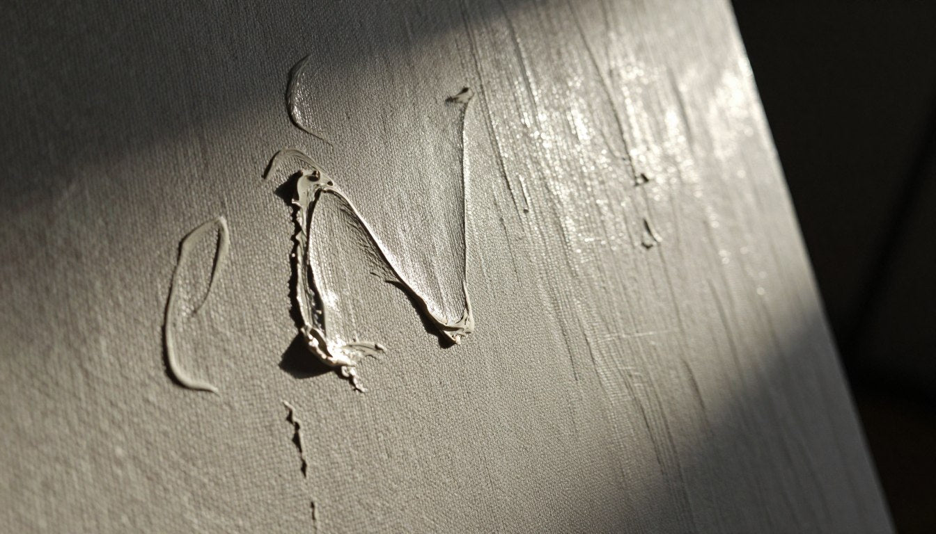
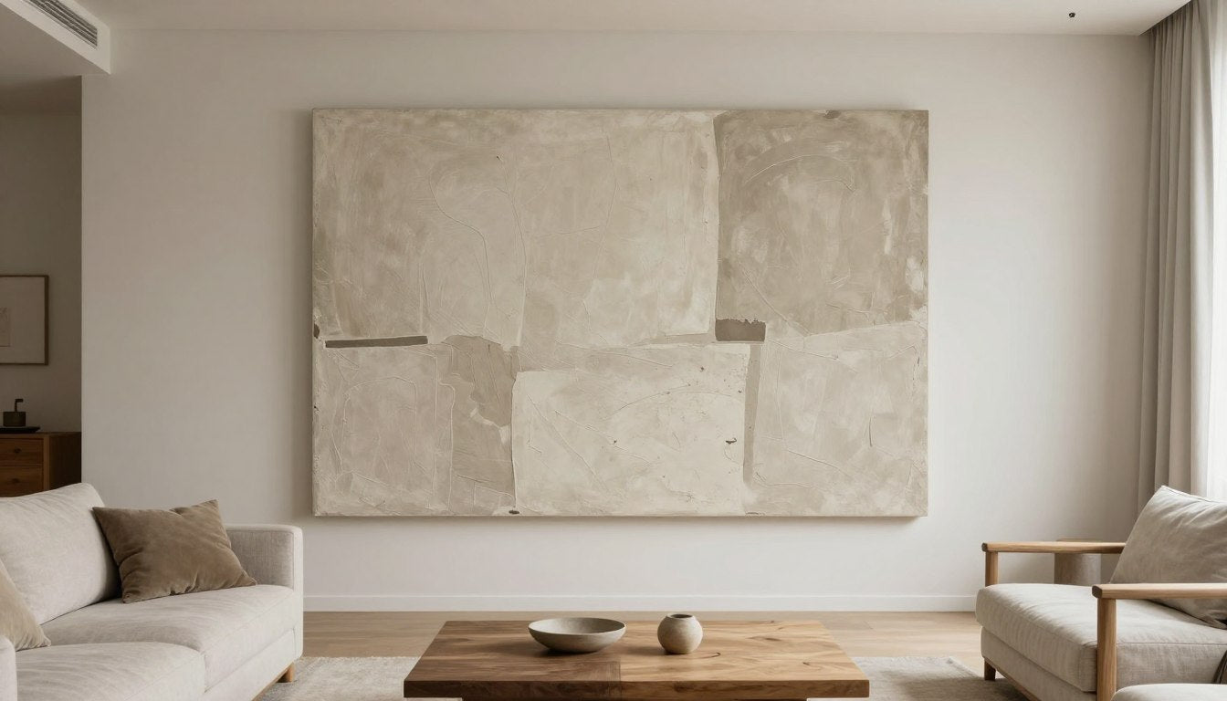
Textured wall art features raised surfaces and depressions that interact with light in complex ways. As light strikes these dimensional elements, it creates micro-shadows that emphasize the depth and relief of the piece. The higher the texture, the more dramatic this effect becomes. Each ridge, peak, and valley on the canvas captures or blocks light, creating a topographical landscape of highlights and shadows.
This relief effect is what gives textured art its sculptural quality. Unlike flat prints that merely reflect light evenly, textured surfaces interact with it, creating visual depth that changes as your viewing angle shifts. The resulting play of light and shadow adds a three-dimensional quality that flat reproductions simply cannot achieve.
Color Shifts with Temperature (Cool Daylight vs Warm Evening Bulbs)
Light temperature dramatically affects how we perceive color in textured artwork. Morning light tends to be cooler and bluer, bringing out crisp details and enhancing blue and green tones. Evening light, whether natural golden hour or artificial warm bulbs, intensifies reds, oranges, and yellows while softening blues.
This temperature shift means a single piece can display different color personalities throughout the day. A painting with warm undertones might appear subtle in morning light but glow with unexpected richness as evening approaches. This natural variation keeps the artwork feeling fresh and engaging over time.
Gloss, Varnish, and Canvas Weave: Why Some Pieces Glow and Others Soften
The finish of a textured piece significantly impacts its relationship with light. Glossy varnishes reflect light more directly, creating brilliant highlights and deeper shadows that emphasize texture. These finishes make colors appear more saturated and vibrant, especially in direct light.
Matte finishes, by contrast, diffuse light more evenly across the surface. This creates a softer, more subtle interplay of light and shadow that works beautifully in spaces with multiple light sources. The canvas weave itself also contributes to this effect, with rougher textures diffusing light differently than smoother surfaces.
Morning, Afternoon, Evening — What Actually Changes

Morning Light = Softer Shadows, Gentle Contrast
Morning light brings a special quality to textured wall art. The low angle of early sunlight creates gentle, elongated shadows that stretch across the textured surface. This oblique illumination reveals subtle details and variations that might be missed in overhead lighting. The cooler color temperature of morning light also tends to enhance blues and greens while softening warmer tones.
This gentle contrast creates a calm, contemplative mood that's perfect for starting the day. Textured pieces with subtle color variations and delicate relief work particularly shine in this light, revealing their nuanced craftsmanship.
Midday Light = Flatter (Unless Side-Lit), Higher Clarity
As the sun rises higher, direct overhead light can flatten the appearance of texture somewhat, reducing the dramatic shadows that create depth. However, this higher-intensity light brings exceptional clarity and true color representation. Details become crisp and defined, allowing you to appreciate the precision of the artist's technique.
Side-lit rooms are the exception to this rule. When midday light enters from windows perpendicular to the artwork, it creates strong raking light that maximizes texture and creates bold shadow patterns. This is when highly textured pieces truly come alive with dimensional contrast.
Golden Hour = Warmth, Drama, Deeper Reds/Yellows
The hour before sunset brings what photographers call "golden hour" light—a warm, amber illumination that transforms textured art. This light intensifies warm colors, making reds, oranges, and yellows glow with unexpected richness. The low angle creates dramatic, elongated shadows that emphasize every ridge and valley in the texture.
This magical light turns even subtle textures into dramatic landscapes of light and shadow. Pieces with warm color palettes and pronounced texture reach their peak visual impact during this time, creating a cozy, intimate atmosphere perfect for evening gatherings.
Night Lighting = Spotlight "Theatre" (and Potential Glare)
Artificial lighting transforms textured art into a controlled theatrical experience. Directional spotlights can create intentional shadow patterns that highlight specific textural elements. This focused illumination allows you to emphasize certain aspects of the piece while minimizing others.
However, poorly positioned artificial lighting can create unwanted glare, particularly on glossy finishes. This flattens texture and obscures detail. The color temperature of your bulbs also significantly impacts how the artwork appears—warm bulbs enhance reds and yellows, while cooler LEDs bring out blues and greens.
The Best Lighting Setup for Textured Wall Art (Practical Guide)

The "45° Rule" for Spotlights to Reduce Glare
The most effective way to light textured wall art is to follow the 45-degree rule. Position your light source at approximately 45 degrees from the center of the artwork. This angle prevents direct reflection into the viewer's eyes (which causes glare) while still providing enough illumination to highlight texture.
For optimal results, the light should be positioned so that it's angled toward the center of the piece. This creates balanced illumination that reveals texture without creating hot spots or excessive shadows. Adjustable track lighting or wall-mounted fixtures work best for achieving this precise positioning.
Raking Light for Maximum Texture (When to Use It, When to Avoid It)
Raking light—illumination that comes from a sharp side angle—dramatically emphasizes texture by creating strong shadows across the surface. This technique is ideal for highlighting highly textured pieces with subtle color variations, as it brings the dimensional qualities to the forefront.
However, raking light should be used cautiously with pieces that have both fine detail and heavy texture. The strong shadows can sometimes obscure intricate elements. It's also best avoided for pieces with very glossy finishes, as it can create distracting reflections that compete with the artwork itself.
Bulb Checklist (CRI, Kelvin Range, Dimmers)
When selecting bulbs for art lighting, three factors matter most: Color Rendering Index (CRI), color temperature (Kelvin), and adjustability. Choose bulbs with a CRI of 90+ to ensure accurate color reproduction. For color temperature, 2700K-3000K creates a warm, inviting atmosphere, while 3500K-4000K provides a more neutral, gallery-like illumination.
Dimmable fixtures offer valuable flexibility, allowing you to adjust brightness based on time of day and ambient light conditions. LED options have improved dramatically in recent years, offering excellent color rendering while remaining cool enough to prevent potential damage to artwork.
Room Direction Tips (North/South-Facing Windows)
The orientation of your room significantly impacts natural lighting conditions. North-facing rooms receive consistent, diffused light that's ideal for appreciating subtle textures without harsh shadows. South-facing spaces get stronger, more direct sunlight that creates dramatic texture but may require sheer curtains to soften the intensity.
East-facing rooms receive bright morning light that gradually softens throughout the day—perfect for pieces that benefit from both dramatic and subtle lighting. West-facing spaces experience the golden hour effect most intensely, making them ideal for artwork with warm color palettes.
Hanging Height + Distance from Windows (Prevent Fading and Hotspots)
To protect your textured wall art while optimizing its appearance, position pieces at least 2 feet away from direct sunlight. UV rays can fade pigments over time, particularly organic and red-based colors. If a piece must be placed near windows, consider UV-filtering glass or conservation framing.
The ideal hanging height places the center of the artwork at approximately 57-60 inches from the floor—average eye level for most adults. This positioning ensures comfortable viewing while allowing proper appreciation of how light interacts with the textured surface from a natural viewing angle.
How to Choose the Right Piece Based on Your Light

If Your Room is Bright: Choose Calmer Palettes / Strong Shapes
Bright, sun-filled rooms intensify colors and create strong shadows on textured surfaces. In these spaces, artwork with more subdued color palettes prevents visual overwhelm while still allowing texture to create interest. Look for pieces with strong compositional shapes and moderate texture that won't become too dramatic in intense light.
Matte finishes work particularly well in bright rooms, as they diffuse light rather than reflecting it sharply. This creates a softer, more balanced appearance even in direct sunlight. Blues, greens, and neutrals tend to remain stable and pleasing in bright conditions, while very saturated reds and oranges can sometimes become overwhelming.
If Your Room is Moody: Choose Luminous Contrasts and Warm Accents
In rooms with limited natural light, textured artwork with higher contrast and luminous elements creates visual energy and depth. Pieces that incorporate metallic elements, like gold or silver leaf, catch and amplify available light. Warm accent colors—amber, terracotta, or burnt orange—bring a sense of warmth and intimacy to darker spaces.
Glossier finishes can also help in low-light environments by reflecting and maximizing available illumination. Consider pieces with pronounced texture that creates dramatic relief even in subtle lighting. Strategic art lighting becomes especially important in these spaces to reveal the full dimensional quality of the work.
If You Hate Glare: Pick Matte Looks + Avoid Direct Spotlight Angles
For spaces where glare is a concern—perhaps due to multiple windows or challenging lighting conditions—choose textured art with matte or semi-matte finishes. These surfaces diffuse light rather than reflecting it directly, reducing the likelihood of glare while still revealing texture beautifully.
When lighting these pieces, avoid positioning spotlights directly opposite viewing positions. Instead, use multiple, softer light sources or adjustable fixtures that can be fine-tuned to eliminate reflection points. Textured pieces with subtle color variations rather than high-contrast elements also tend to be more forgiving in glare-prone environments.
Curated Picks — Textured-Feeling Pieces That Shift Beautifully in Light

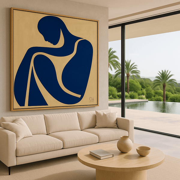
The Dreamer in Red: Contemplative Depth That Evolves With Light
What first captures attention in "The Dreamer in Red" is its compelling balance of muted red against black and cream tones. This square composition creates an immediate sense of contemplative depth through its abstract figurative minimalism. The textured surface catches light in subtle ways that transform the piece throughout the day.
In morning light, the cooler tones emerge, bringing forward the subtle cream highlights and creating a serene, meditative quality. As evening approaches, the red elements deepen and warm, giving the piece a more emotive, intimate presence. Side lighting reveals the delicate texture variations that add dimensional complexity to the minimalist composition.
This piece finds its perfect home in a living room or study where it can be viewed throughout the day's changing light. Its contemplative nature makes it ideal for spaces dedicated to reflection or conversation. The square format creates versatile placement options, working equally well as a standalone focal point or as part of a thoughtful gallery arrangement.
Available as a museum-quality canvas print on a handcrafted poplar hardwood floater frame, "The Dreamer in Red" arrives ready to hang with all necessary hardware. Each print is signed with the artist's initials and year, creating a gallery-ready presentation that requires no additional framing.
Blue Human: Dynamic Texture That Captures Changing Light
The first impression of "Blue Human" comes from its captivating blue palette and expressive abstract form. The textured surface creates a sense of movement and emotional resonance that shifts dramatically as light conditions change throughout the day.
Morning light brings out the piece's cooler undertones, emphasizing its contemplative quality and revealing subtle texture variations. As daylight intensifies, the dimensional aspects create micro-shadows that add visual complexity. In evening light, the blues deepen and take on a more mysterious quality, while spotlighting creates dramatic shadow play across the textured surface.
This versatile piece works beautifully in bedrooms and home offices, where its calming blue tones create a sense of tranquility while its changing appearance provides ongoing visual interest. It also makes a striking statement in entryways, where varying light conditions throughout the day showcase its dynamic qualities.
Crafted with premium canvas and fade-resistant inks, this museum-quality print comes on a handcrafted hardwood frame, ready to hang. Each piece is made to order and signed with the artist's initials, ensuring authenticity and attention to detail that elevates any interior.
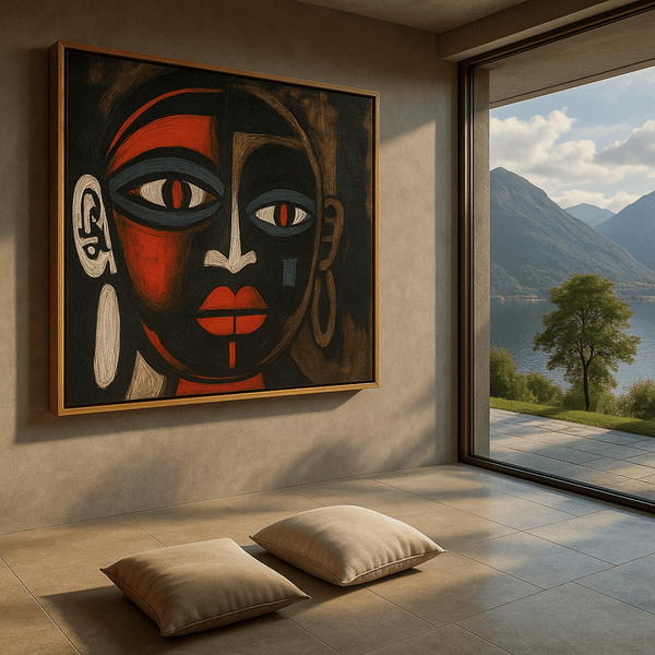
Tribal Essence: Bold Textures That Transform With Illumination
The immediate impact of "Tribal Essence" comes from its bold red, black, white, and blue palette arranged in an expressive abstract portrait format. This square composition radiates cultural elegance and primal energy through its textured surface that dramatically transforms under different lighting conditions.
In bright daylight, the contrasting colors create a vibrant, energetic presence with clearly defined textural elements. As evening approaches, the reds deepen to rich burgundy tones while the textural shadows intensify, creating a more mysterious, contemplative mood. Directional lighting emphasizes the dimensional aspects, revealing layers of detail not immediately apparent in diffused light.
This statement piece commands attention in dining rooms and living spaces, where its shifting appearance creates ongoing visual interest. Its cultural resonance also makes it perfect for spaces where you entertain and engage in meaningful conversation. The bold presence works particularly well in rooms with neutral furnishings where it can serve as the primary color element.
Printed on museum-quality canvas and stretched over a handcrafted poplar hardwood floater frame, "Tribal Essence" arrives ready to display. The premium materials ensure color fidelity and longevity, while the artist's signature adds authenticity to this striking piece.
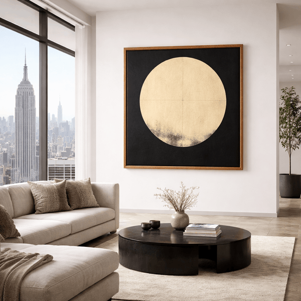
Lunar Silence: Luminous Texture That Glows in Changing Light
What immediately draws the eye to "Lunar Silence" is its striking minimalist composition—a golden circle emerging from deep black depths. This original painting creates an immediate sense of cosmic mystery and meditative calm through its restrained palette and luminous central element.
The textural interplay between the golden circle and the surrounding darkness transforms dramatically throughout the day. Morning light brings a subtle, ethereal quality to the gold tones, while evening illumination causes the circle to glow with unexpected warmth and presence. In low light conditions, the piece takes on an almost mystical quality, with the golden element appearing to float in space.
This sophisticated piece creates a focal point of calm elegance in bedrooms and meditation spaces, where its shifting luminosity can be appreciated in moments of reflection. It also works beautifully in dining areas, where evening lighting enhances its warm glow during intimate gatherings.
As an original painting, "Lunar Silence" represents a one-of-a-kind investment in fine art. The piece requires approximately 1-2 weeks processing time before shipping, ensuring it arrives in perfect condition. Its timeless composition and quality craftsmanship make it a centerpiece that will continue to reveal new aspects for years to come.
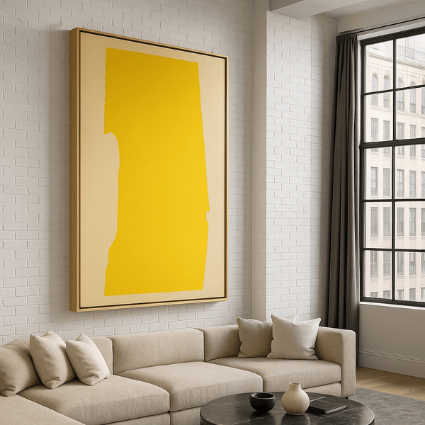
Golden Stillness: Subtle Texture That Captures Sunlight
The first impression of "Golden Stillness" comes from its radiant sunlight yellow and sandy beige palette that immediately brightens any space. This original painting features subtle textural elements that interact with light in delicate, sophisticated ways throughout the day.
Morning light brings out the cooler undertones in the beige elements, creating a fresh, optimistic presence. As the day progresses, the yellow tones intensify, reaching their peak luminosity during golden hour when the piece seems to glow from within. Even in artificial evening light, the textural variations continue to create subtle shadow play that adds dimensional interest to the minimalist composition.
This uplifting piece transforms kitchens and breakfast nooks, where its sunny disposition creates a welcoming atmosphere. It also works beautifully in home offices and creative spaces, where its warm energy and shifting appearance inspire productivity and creative thinking throughout the day.
Crafted with premium acrylics on fine linen canvas, "Golden Stillness" comes in an elegant aluminum floater frame that complements its contemporary aesthetic. As an original painting, it represents a unique investment that requires approximately 1-2 weeks processing time before shipping. The quality materials and craftsmanship ensure this piece will maintain its beauty and impact for generations.
Quick FAQ
What is textured wall art, and why does it look different in different light?
Textured wall art features three-dimensional surface elements that create relief and depth. These raised areas catch light and cast micro-shadows that change as lighting conditions shift throughout the day. Unlike flat prints, textured pieces interact with light rather than simply reflecting it, creating a dynamic visual experience that evolves from morning to night.
What lighting is best for textured paintings—spotlights or ambient?
A combination works best. Directional spotlights positioned at approximately 45 degrees highlight texture by creating defined shadows, while ambient lighting ensures the piece remains visible even when accent lights are off. For maximum texture emphasis, adjustable track lighting allows you to experiment with different angles to find the most dramatic or subtle effect based on the specific piece.
How do I avoid glare on canvas prints?
To minimize glare on canvas prints, position lights at 45-degree angles rather than directly opposite viewing positions. Choose fixtures with diffusers or frosted bulbs that soften light. For pieces with glossier finishes, consider matte-finish picture lights specifically designed for artwork. Finally, be mindful of natural light sources—adjustable blinds or sheer curtains can help manage reflections from windows.
What bulb temperature (Kelvin) makes colors look most natural?
For most artwork, bulbs in the 2700K-3000K range (warm white) create a pleasing, gallery-like appearance that's flattering to most color palettes. For pieces with predominantly cool colors (blues, greens), you might prefer 3500K (neutral white). The most important factor is consistency—using the same temperature throughout a space prevents the artwork from appearing to change color as you view it from different angles.
Does sunlight fade art, and where should I hang it?
Yes, direct sunlight can fade artwork over time, particularly pieces with organic pigments. Hang textured wall art at least 2 feet away from direct sun exposure, or protect it with UV-filtering glass or acrylic. North-facing rooms provide ideal natural light that highlights texture without harsh direct rays. If sun exposure is unavoidable, consider UV-filtering window films or rotating especially valuable pieces seasonally.
Should I choose rolled, stretched, or framed canvas prints?
For textured wall art, stretched or framed options best preserve the dimensional quality of the piece. Stretched canvas on a quality hardwood frame (like those used for Rossetti Art prints) provides a contemporary, gallery-ready look that allows the texture to remain the focus. Floater frames add a refined finish while creating visual separation from the wall. Rolled canvas requires additional framing steps that might compromise the textural impact.
Conclusion

Textured wall art creates a living relationship with light that transforms your space throughout the day. From the gentle shadows of morning to the dramatic relief of golden hour and the theatrical spotlight of evening, these dimensional pieces offer an ever-changing visual experience that flat prints simply cannot match.
By understanding how light interacts with texture, color, and finish, you can select pieces that will perform beautifully in your specific environment. Whether you're drawn to the contemplative depth of "The Dreamer in Red," the luminous mystery of "Lunar Silence," or the sunny optimism of "Golden Stillness," textured art adds a sensory dimension that continues to reveal new aspects over time.
Elevate Your Space with Textured Art
Explore the complete collection of canvas prints and original paintings by Chiara Rossetti. Each piece is crafted with museum-quality materials to create a lasting impression that evolves with the changing light in your home.
Explore the Collection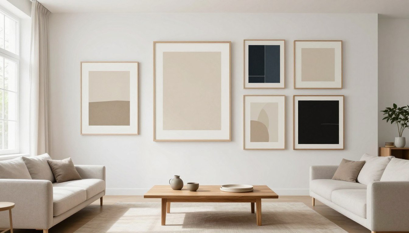
Leave a comment
This site is protected by hCaptcha and the hCaptcha Privacy Policy and Terms of Service apply.