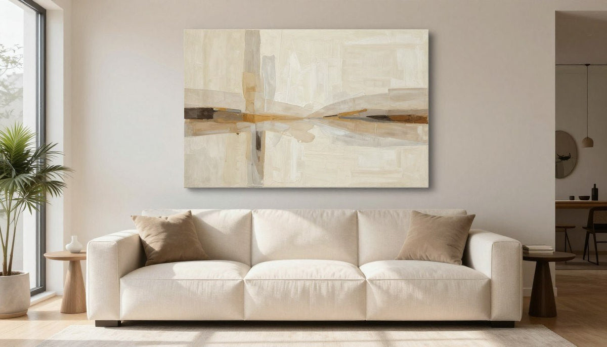
Modern homes thrive on calm visual environments, and beige abstract wall art establishes a steady foundation without cluttering the senses. Earthy undertones soften stark architecture while blending effortlessly with wood, plaster, and soft upholstery.
Rooms turn flat when neutral elements share identical textures, flat finishes, and uniform mid-tones. Layering rich coffee tones, varying surface textures, and framing the composition restores visual weight and keeps the wall engaging.

Styling Ideas for Beige Abstract Wall Art in Modern Spaces
Curated canvas prints allow neutral walls to carry distinct character through tonal shifts and balanced proportions. Adding subtle accents or selecting multi-panel layouts introduces natural movement across open wall spans.
Curated Neutral Canvas Prints
Explore balanced earth tones with free shipping across all standard and oversize canvas sizes.
1. Ground High Ceilings with Warm Amber Depths
Open Plains brings together golden amber, warm cream, raw sienna, deep brown, soft grey, and ivory across formats ranging from 24x16 to 81x54 in. The deep brown and sienna foundations establish weight along baseboards, anchoring tall wall expanses. Placing warm downlighting above the piece brings out the creamy gradations across the surface.
Styling Tip: Hang this print opposite natural wood furniture to echo the amber and sienna pigments across the room.
2. Break Up Wide Living Room Walls with Multi-Panel Flow
Ochre Divide divides black, ivory, and burnt terracotta across a three-panel format available in sizes from 16x24 to 53x75 in. The rhythm of three distinct panels creates natural negative space, preventing expansive white walls from overwhelming the eye. The burnt terracotta warms cool paint while the black bands deliver immediate structural definition.
Styling Tip: Leave two to three inches between each panel to give the eye a clean resting point between tones.
3. Harmonize Cool Gray Architecture with Earthy Tan
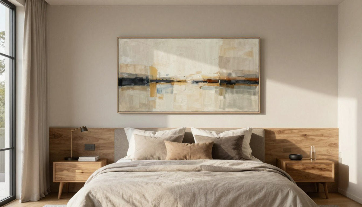
Low Water balances soft gray, pale blue-gray, warm tan, ochre, and charcoal black accents in sizes from 24x16 to 81x54 in. This balanced palette bridges the gap between cold slate tile and warm honey oak decor. Its charcoal black accents cleanly ground the softer blue-gray passages.
Styling Tip: Position this print near concrete or stone features to let the tan and ochre warm up surrounding industrial materials.
4. Introduce Dramatic Visual Weight Using Deep Chocolate
Amber Drift utilizes burnt umber, dark chocolate, raw sienna, warm beige, and near-black across dimensions from 24x16 to 81x54 in. Dark chocolate and near-black passages prevent neutral rooms from floating away into visual monotony. The raw sienna and warm beige areas lift the dark zones so the composition stays approachable.
Styling Tip: Pair dark compositions with an optional floater frame handcrafted from poplar hardwood to provide crisp separation from lighter paint.
5. Soften Minimalist Layouts with Gentle Geometry
Whispered Balance features warm beige, ivory white, and taupe across balanced square dimensions from 20x20 to 58x58 in. The quiet transition from taupe to ivory creates an uncluttered presence suitable for reading corners and bedrooms. Its restrained structure pairs naturally with tactile bouclé chairs and natural linen drapery.
Styling Tip: Mount square compositions at seated eye level in dining rooms or bedrooms for an intimate, restful focal point.

Warm beige prints mounted over wood furniture create natural visual harmony without demanding aggressive wall colors.
Building Contrast so Neutral Artwork Does Not Look Flat
A room decorated strictly in mid-tone beige risks looking washed out if surfaces reflect identical light values. Pairing prints with varied materials and thoughtful accent tones gives neutral color schemes depth and architectural purpose.
To avoid flat walls, interior layouts should balance three distinct contrast elements: tactile surface textures, crisp dark points, and deliberate color temperature shifts. Exploring warm-toned living rooms earthy palettes texture the best abstract art pairings reveals how tactile contrast activates subtle wall colors.
Textural Variation
Offset smooth canvas finishes against rough limewash walls, woven jute rugs, or ribbed ceramic vessels. Surface variation keeps the entire vignette dynamic under changing daytime light.
Black Accents
Slender black metal lamp bases, dark curtain rods, or dark picture frames sharpen soft cream paint. These small anchor points stop light neutrals from dissolving together.
One Bold Color
Introduce a single muted accent tone, such as forest olive, rust velvet, or mustard ochre, through throw pillows. The art anchors the backdrop while the accent energizes the floor plane.

Black hardware accents outline gentle wall art tones, creating clear boundaries within modern neutral rooms.
Choosing the Proper Canvas Dimensions Above Furniture
Selecting incorrect artwork dimensions remains a frequent hurdle when styling modern living spaces. A canvas that spans too small looks lost like a floating stamp, while an oversized print can crowd nearby architectural trim.
When placing artwork above a central piece of furniture, balance the width to preserve intentional negative space. Reviewing living room wall art the 2/3 rule above a sofa layout examples outlines how to size central focal points accurately. Selecting neutral wall art for living room walls also requires factoring in ceiling clearance so the composition sits comfortably within normal sight lines.
Leave six to eight inches of open breathing space between the back of your couch cushions and the bottom edge of the frame. This spacing maintains visual connection to the furniture without crowding seating comfort.
For long sectionals, a wide multi-panel triptych or an expansive 81x54 in landscape orientation distributes color smoothly across the seating area. In smaller dens or home offices, a dedicated 24x16 in or square 36x36 in canvas provides focused balance without overwhelming compact wall space.

Centering art with balanced side margins grounds seating arrangements and maintains clear wall proportions.
Neutral Palette Guide and Canvas Construction
Different neutral pigment blends influence the atmosphere of a room based on undertone warmth and saturation. Pairing wall art pigments thoughtfully with existing architectural materials prevents mismatched undertones.
| Tone | Feels like | Pair with | Good room |
|---|---|---|---|
| warm beige | Gentle warmth | Natural oak wood | Inviting open living rooms |
| taupe | Balanced calm | Warm stone gray | Restful modern bedrooms |
| terracotta/rust | Grounded energy | Raw iron accents | Dynamic dining areas |
| dark brown | Deep intimacy | Polished brass | Cozy quiet home libraries |
| cream | Crisp light | Muted olive tones | Sunlit breakfast nooks |
Our canvas prints are printed on artist-grade poly-cotton canvas using UV- and fade-resistant HP latex inks certified under UL GREENGUARD Gold. Each piece is hand-stretched over a 1.25-inch hardwood stretcher frame, presenting a satin-matte, low-glare finish that resists harsh reflection. An optional floater frame handcrafted from poplar hardwood adds clean edge refinement, and all selections arrive ready to hang.
Every piece is made to order, with production completed in 3 to 5 business days followed by 8 to 10 business days shipping with tracking. Orders include free shipping, alongside a 30-day full refund policy on standard sizes to help you style your space with total confidence.
See It on Your Wall Before You Buy
Check how dimensions and neutral palettes complement your furniture using our instant visualizer.
Frequently Asked Questions
What color wall goes with beige abstract art?
Warm white, soft cream, and muted greige provide harmonious, subtle backdrops for beige abstract art. For stronger drama, deep charcoal, olive green, or navy walls create crisp contrast that highlights the artwork's lighter ivory and tan pigments, keeping the entire composition distinct and readable across the room.
Is beige wall art boring?
Beige art is not boring when layered with intentional contrast and varied values. Choosing artwork with deep espresso tones, raw sienna accents, or tactile visual brushwork prevents visual flatness. Surrounding the canvas with textured textiles, dark wood, or black metal accents brings dynamic energy into the space.
What colors go with brown wall art?
Brown artwork pairs naturally with creamy off-whites, warm beige, camel, and muted terracottas for a tonal earth-inspired environment. To add cool balance, incorporate sage green, pale blue-gray, or soft slate. Metallic brass accents and matte black fixtures also cleanly frame deep chocolate and umber pigments.
How big should neutral art be above a sofa?
Artwork above a sofa should span approximately two-thirds to three-quarters of the furniture's total width. A piece sized within this proportion prevents the wall from feeling sparse or top-heavy. Maintaining six to eight inches between the sofa back and frame supports clean, cohesive visual alignment.
Does beige art work with a gray sofa?
Beige artwork works exceptionally well with a gray sofa when the print incorporates bridging tones such as soft gray, charcoal, or taupe. This mix of cool seating and warm wall elements creates a sophisticated transitional palette, especially when tied together with tan or cream throw pillows.
Creating Depth with Modern Neutral Art
Styling beige and brown abstract wall art transforms modern rooms into grounded, serene retreats when contrast and scale guide your choices. Mixing deep chocolate tones, textured surroundings, and properly proportioned canvas sizes keeps neutral walls rich and visually compelling. Use the Live Preview button on any product page to see the ideal piece on your own wall.

About the Author
Chiara Rossetti
Chiara Rossetti is the founder of Rossetti Art, a canvas print and original art brand. She writes about interior design, wall art styling, and the art of making a home feel alive.

Leave a comment
This site is protected by hCaptcha and the hCaptcha Privacy Policy and Terms of Service apply.