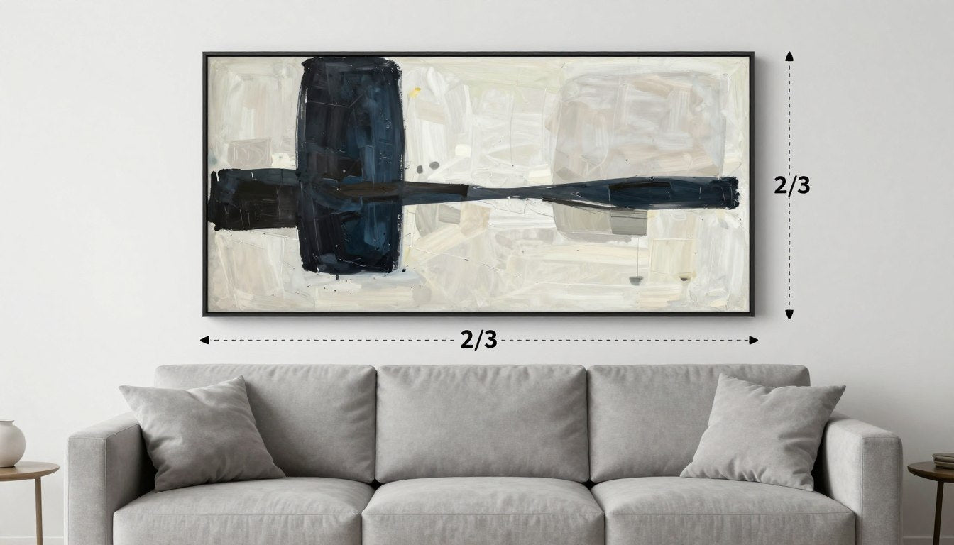
That blank wall above your sofa might be the most important design opportunity in your entire living room. When styled correctly, it creates a focal point that anchors your space and reflects your personal style. When done poorly, it can make even the most beautiful furniture look unfinished. The difference often comes down to one simple principle: the 2/3 rule for wall art.
This design guideline helps you use the 2/3 rule to choose the right size artwork for your sofa wall, ensuring balanced proportions that feel intentional rather than accidental. Whether you're hanging a statement canvas, creating a gallery wall, or arranging a triptych, understanding this principle will transform how your living room feels.
Quick Answer (TL;DR)
- The 2/3 rule states that wall art should span approximately two-thirds the width of your sofa for proper visual balance
- For a standard 84" sofa, aim for artwork around 56" wide (either one piece or a grouped arrangement)
- Hang art so the bottom edge sits 6-8 inches above your sofa back
- Center artwork over the sofa, not the wall
- Keep spacing consistent (2-3 inches) between multiple pieces
- For sectionals, center art over the main sofa portion, not the entire L-shape
- One large piece often creates more impact than multiple small pieces

What Is the 2/3 Rule (and Why It Works Visually)
The 2/3 rule is a design principle that suggests your wall art should span approximately two-thirds the width of the furniture it hangs above. This proportion creates a visual relationship between the art and sofa that feels balanced and intentional rather than random or disconnected.
The Proportion Principle (Sofa Is the "Base," Art Is the "Crown")
Think of your sofa as the foundation and your wall art as the crown that completes it. When these elements are proportionally related, they create harmony. Art that's too small looks like it's floating aimlessly, while pieces that extend beyond the sofa can feel overwhelming.
This principle works because it follows the same visual balance found throughout design and nature. The sofa grounds the composition while the art draws the eye upward, creating a complete visual story when properly proportioned.

When to Break It (Very Tall Ceilings, Ultra-Minimal Rooms)
Like all design rules, the 2/3 guideline has exceptions. In rooms with exceptionally high ceilings, you might go larger (3/4 or even full sofa width) to fill the vertical space appropriately. In ultra-minimal spaces, a smaller, more understated piece can create an intentional negative space effect.
The key is understanding that the 2/3 rule is a starting point, not a rigid requirement. Your specific room proportions, ceiling height, and personal style all influence the final decision.
The Fast Math (Sofa Width → Ideal Art Width)
Converting your sofa measurements to ideal artwork dimensions is straightforward. Simply measure your sofa's full width and multiply by 0.66 (or 2/3) to find your target art width.
Common Sofa Widths + Target Art Widths
| Sofa Width | Target Art Width (2/3 Rule) | Best Single Piece Size | Best Multi-Piece Option |
| 60" (5 ft) | 40" | 36" × 24" or 40" × 30" | Set of 2: 18" × 24" each |
| 72" (6 ft) | 48" | 48" × 36" or 45" × 30" | Triptych: 3 pieces at 16" × 20" each |
| 84" (7 ft) | 56" | 55" × 40" or 60" × 36" | Set of 3: 18" × 24" each |
| 96" (8 ft) | 64" | 60" × 40" or 65" × 45" | Set of 4: 16" × 20" each |

Sectionals: Measure the "Visual Mass," Not the Entire L
For sectional sofas, focus on the main portion where people sit facing forward, not the entire L-shape. Measure the width of this main section and apply the 2/3 rule to that measurement. This creates a focal point that relates to how people actually experience the room.
Alternatively, you can create two separate art moments—one above the main sofa section and another above the chaise—but the primary wall art should follow the 2/3 rule for the main sofa segment.
Height Rules Above a Sofa
Getting the height right is just as important as the width. Art hung too high creates a disconnected feeling, while pieces hung too low risk being bumped or looking cramped.
Distance from Sofa Back
The bottom edge of your artwork (or the lowest piece in a grouping) should sit 6-8 inches above the back of your sofa. This creates enough breathing room while maintaining a visual connection between the furniture and art.
For sofas with very low backs (under 30 inches tall), you might increase this to 8-10 inches. For sofas with high backs (over 40 inches), you can reduce it to 4-6 inches to keep everything in proportion.

Centerline Guidance (and How to Adjust for Tall Pieces)
As a secondary check, the center of your artwork should hang at approximately eye level, which is typically 57-60 inches from the floor for most adults. This height creates comfortable viewing without neck strain.
For very tall pieces, you may need to adjust slightly lower so the bottom edge still maintains the proper 6-8 inch clearance above the sofa. When in doubt, the sofa-to-art relationship takes priority over the strict eye-level rule.
Need help hanging your artwork securely? Learn how to hang large art securely (renter-friendly too) without damaging your walls.
Layout Examples (Templates You Can Copy)
The 2/3 rule gives you the ideal width, but how you fill that space depends on your style preferences and the room's overall design. Here are seven proven layouts that consistently look balanced and intentional.
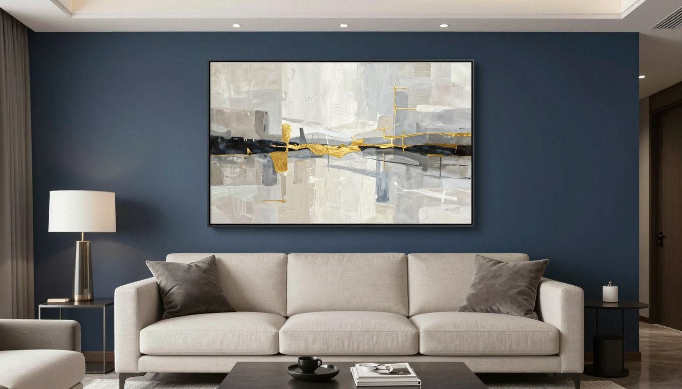
Layout A — One Statement Canvas
A single large canvas creates maximum impact with minimal fuss. This approach works particularly well in modern, minimalist, and contemporary spaces where clean lines are valued.

For maximum impact, choose a piece with visual weight that can hold the wall. Our statement canvas prints sized for above-sofa walls come ready to hang and create an instant focal point.
Layout B — Diptych (Two Panels)
A diptych consists of two complementary pieces displayed side by side. Together, they should span about 2/3 the width of your sofa. This layout creates a sense of balance while allowing for more visual interest than a single piece.

Keep spacing between panels consistent (2-3 inches) and align the tops and bottoms perfectly for a polished look.
Layout C — Triptych (Three Panels)
A triptych uses three coordinated pieces to create one cohesive image or theme. This layout adds rhythm and movement while still reading as one unified artwork.

For triptychs, maintain equal spacing between all three pieces (typically 2-3 inches) and ensure they're perfectly level with each other.
Layout D — Two Pieces Side-by-Side (Balanced Pair)
Unlike a diptych, which forms one continuous image, a balanced pair features two separate but complementary artworks. This layout works well when you want to combine different subjects that share a color palette or theme.

When using a balanced pair, keep the frames identical and the sizes similar to create cohesion despite having different images.
Layout E — Stacked Pair (Vertical Emphasis)
For walls with higher ceilings or when you want to draw the eye upward, a stacked arrangement places one piece above another. This layout works well in spaces where you want to emphasize height.

For stacked arrangements, the bottom piece should still maintain the 6-8 inch clearance above the sofa, and keep 2-3 inches of space between the pieces.
Layout F — Mini Gallery (Curated, Not Cluttered)
A small, curated gallery wall can create a personalized focal point above your sofa. The key is treating the entire arrangement as one unit that follows the 2/3 rule, rather than a random collection of frames.

For gallery walls, use consistent frame styles and maintain even spacing (2-3 inches) between all pieces. Plan the entire arrangement before hanging to ensure balanced composition.
Layout G — Shelf + Lean (With One Anchor Piece)
A picture ledge or shallow shelf mounted above your sofa creates a flexible display that can be easily changed. This approach works well for those who like to refresh their look seasonally.

When using a shelf, position one larger anchor piece in the center (following the 2/3 rule for its width) and add a sculptural counterpoint on a side table near the sofa to create dimension and interest.
Frame & Finish Notes (So It Looks Curated)
The right frame and finish can elevate your wall art from simply decorative to truly designer-worthy. These details help integrate your art with the rest of your living room for a cohesive look.
Floater Frames, Thin Frames, Matte Finishes
For contemporary spaces, consider these frame options:
- Floater frames give canvas prints a floating effect and add a refined edge without overwhelming the artwork — see our full guide to the canvas print with floating frame and why it looks better above a sofa
- Thin metal frames in black or brushed metal offer clean lines that complement modern interiors
- Natural wood frames in light or medium tones add warmth to neutral spaces
- Matte finishes on both frames and the artwork itself reduce glare and create a sophisticated look

Match your frame finish to other elements in your room for cohesion—black frames echo black furniture legs or lighting, while wood tones can complement your coffee table or side tables. Quality matters as much as style: a canvas printed with archival pigment inks stays vibrant for decades — here's exactly how long canvas prints last and what affects their lifespan.
Common Mistakes + Quick Fixes
Even with the 2/3 rule as your guide, there are several common pitfalls that can throw off your wall art display. Here's how to identify and fix the most frequent issues.
Too Small → Add Width with a Diptych/Triptych
The most common mistake is choosing artwork that's too small for the wall space. This creates a disconnected, floating effect that makes both the art and sofa look out of proportion.

Quick fix: If your current art is too small, consider creating a diptych or triptych by adding complementary pieces on either side. Alternatively, reframe your existing piece with a larger mat to increase its visual footprint.
Too High → Drop to Correct Distance
Artwork hung too high creates a disconnected feeling and draws attention to the empty space between the sofa and art rather than the art itself.

Quick fix: Lower your artwork so the bottom edge sits 6-8 inches above the sofa back. This simple adjustment immediately creates a more intentional, designed look.
Too Busy → Reduce Pieces, Add Negative Space
Too many small pieces scattered above a sofa can create visual chaos rather than a cohesive focal point. This is especially true when frames, sizes, and styles vary widely.

Quick fix: Edit your collection down to fewer, larger pieces. Use matching frames to create cohesion, and arrange them with consistent spacing. Sometimes less truly is more.
Recommended Next Reads
Explore Art Styles
Not sure which art style works best in your living room? From abstract to minimalist, learn about different styles to find your perfect match.
Art Print Sizing Guide
Dive deeper into art print dimensions, standard sizes, and how to choose the perfect proportions for any wall in your home.
Ready to Transform Your Living Room Wall?
Browse our curated collection of canvas prints and wall art sized perfectly for above-sofa placement. Each piece is crafted to create a stunning focal point that follows the 2/3 rule.
Shop Canvas PrintsFrequently Asked Questions
What is the 2/3 rule for wall art above a sofa?
The 2/3 rule states that your wall art should span approximately two-thirds the width of your sofa. This proportion creates visual balance between the furniture and artwork, making the arrangement feel intentional rather than random. For example, if your sofa is 84 inches wide, your artwork (or the combined width of a grouping) should be around 56 inches.
How high should art be hung above a couch?
The bottom edge of your artwork should be positioned 6-8 inches above the back of your sofa. This creates enough breathing room while maintaining a visual connection between the furniture and art. As a secondary check, the center of your artwork should hang at approximately eye level (57-60 inches from the floor for most adults).
Should wall art be centered over the sofa or the room?
Wall art should be centered over the sofa, not the wall or room. Your furniture arrangement creates zones within the room, and artwork should relate directly to these zones. Center your art to the sofa even if that means it's not centered on the wall itself.
How do I apply the 2/3 rule to a sectional?
For sectional sofas, measure only the main portion where people sit facing forward (not the entire L-shape). Apply the 2/3 rule to this measurement and center your artwork above this section. This creates a focal point that relates to how people actually experience the room.
Is a triptych better than one large canvas above a sofa?
Neither is inherently better—it depends on your style preference and room design. A single large canvas creates a bold, simplified statement that works well in modern spaces. A triptych adds rhythm and movement while still reading as one cohesive artwork. Both can be equally effective when they follow the 2/3 rule and are hung at the proper height.
How much space should be between two pieces above a couch?
For a balanced look, maintain 2-3 inches of space between pieces hung side by side above a couch. This spacing creates enough separation to distinguish individual pieces while still allowing them to read as one cohesive arrangement. Consistent spacing is more important than the exact measurement—whatever gap you choose, keep it uniform throughout your arrangement.
Perfect Proportions Make Perfect Spaces
The 2/3 rule for wall art above a sofa isn't just a designer secret—it's a practical formula that anyone can use to create a balanced, professional-looking living room. By following this simple proportion guideline, along with proper height placement and thoughtful layout choices, you can transform that blank wall into a focal point that anchors your entire space.
Remember that while rules provide helpful structure, your personal style ultimately guides the final decision. Use these principles as a starting point, then trust your eye to make adjustments that feel right for your unique space. The best designed rooms always balance timeless principles with personal expression.
Ready to explore artwork for your living room? Browse the full Rossetti Art collection to find pieces perfectly sized for above your sofa.
Leave a comment
This site is protected by hCaptcha and the hCaptcha Privacy Policy and Terms of Service apply.