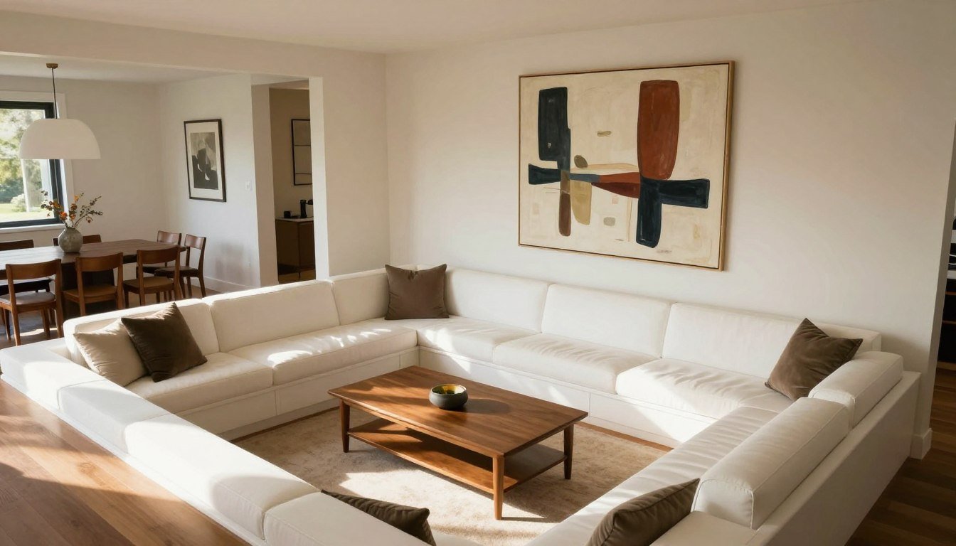
The iconic conversation pit is making a stylish comeback in modern homes. These sunken living spaces, popular in the 1960s and 70s, are once again becoming focal points in contemporary design. But styling these unique architectural features presents specific challenges—especially when it comes to art placement. With their lower sightlines and surrounding walls, conversation pits require a thoughtful approach to create a cohesive, visually stunning space. Let's explore how to perfectly style your sunken seating area with art that enhances rather than overwhelms.

Quick Answer (TL;DR)
Looking to choose the right scale for a sunken lounge? The unique proportions of conversation pits require careful consideration of art dimensions and placement.
What a Conversation Pit Changes About Styling
Lower Eye Level = Different Art Height Rules

In standard living rooms, the rule of thumb is to hang art at eye level—typically 57-60 inches from the floor to the center of the piece. However, conversation pits change this equation dramatically. When seated in a sunken area, your eye level is significantly lower, often 8-12 inches below standard height.
This means art should be hung lower than you might instinctively place it. The center of your artwork should align with the eye level of someone seated in the pit, not standing at floor level. This subtle adjustment makes a tremendous difference in how your art is experienced from within the conversation space.
You're Seen From Every Angle (Art Must "Read" in the Round)

Unlike traditional living rooms where seating often faces one direction, conversation pits typically feature seating that faces inward from multiple directions. This means your art will be viewed from various angles and distances simultaneously.
Consider how your art pieces "read" from different positions within the pit. Art that looks stunning from one angle might be barely visible or awkwardly framed from another. This is why many designers recommend fewer, larger statement pieces rather than numerous small works that can create visual clutter when viewed from changing perspectives.
The "Anchor / Orbit / Balance" Framework
Anchor Wall (The Room's Visual North Star)

Every well-designed conversation pit needs a visual anchor—a wall that serves as the room's focal point. This is typically the wall opposite the entry steps or the longest uninterrupted wall. Your anchor wall should feature your most significant art piece, which sets the tone for the entire space.
For maximum impact, consider one large statement canvas as the anchor. An oversized piece creates a powerful focal point that can be appreciated from anywhere in the pit. The scale should be proportional to the wall—generally covering 50-75% of the available wall space for dramatic effect.
Orbit Pieces (Secondary Moments That Support, Not Compete)
Once your anchor is established, you can introduce orbit pieces—secondary artworks that complement rather than compete with your main focal point. These should be smaller in scale and more subtle in visual impact.
Orbit pieces work best on adjacent or opposite walls, creating visual interest without drawing attention away from your anchor. Consider how these secondary pieces relate to your main artwork—they should share elements of color, style, or theme to create a cohesive experience.
Balance (Texture + Color + Negative Space)

The final element of our framework is balance—the thoughtful distribution of visual weight throughout your conversation pit. This includes not just your art pieces but also textural elements, color distribution, and perhaps most importantly, negative space.
Don't feel compelled to fill every wall. Negative space gives the eye places to rest and helps emphasize your carefully chosen art pieces. A common mistake is overcrowding the walls around a conversation pit, which can make the space feel chaotic rather than inviting.
Where Art Goes Best Around a Sunken Seating Area
The Main Wall Opposite the Steps
The wall you see immediately upon descending into the pit is prime real estate for your anchor piece. This wall naturally draws the eye as people enter the space, making it the ideal location for your statement artwork.
When selecting art for this wall, consider the journey into your conversation pit. The piece should be visible from above before entering the pit, then reveal more detail and impact as guests descend and take their seats.
Fireplace Wall vs TV Wall (Choosing One Hero)

Many conversation pits feature either a fireplace or a television as a built-in focal point. When this is the case, you face a critical decision: should your art compete with or complement this existing feature?
In most cases, it's best to choose one hero. If your fireplace is architecturally significant, let it shine and place more subtle artwork on adjacent walls. If you're working with a TV wall, consider art that can coexist with the screen—perhaps flanking it with a pair of vertical pieces that create balance without competition.
Corners and Landings (The Overlooked Zones)
The transitional spaces around your conversation pit—corners, landings, and step areas—offer excellent opportunities for secondary art moments. These often-overlooked zones can house smaller pieces that create visual interest without demanding center stage.
Corner installations or small sculptures on built-in ledges can add personality and depth to your design. These areas are perfect for more experimental or playful pieces that might be too bold for your main walls.
Art Scale & Placement Rules for Low Seating
| Pit Type | Best Anchor Wall | Best Art Format | Hanging Height Note | Lighting Tip | Avoid This |
| Square | Wall opposite steps | One XL canvas | Lower centerline by 8-10" | Picture light above | Multiple small frames |
| U-shaped | Back of the U | Diptych or triptych | Lower centerline by 6-8" | Sconces flanking art | Competing focal walls |
| Circular | Longest wall section | Sculpture + wall piece | Standard height at entry point | Ambient plus focused | High hanging position |
| Step-down zone | Fireplace or opposite | Tonal mini-gallery | Graduated heights | Recessed ceiling spots | Busy patterns/themes |
The Lower-Centerline Rule (Why You Hang Slightly Lower)
As mentioned earlier, the standard art hanging height doesn't apply to conversation pits. Instead, follow the lower-centerline rule: hang your art with its center point 48-52 inches from the floor level of the pit (not the main floor level). This adjustment ensures your art is properly positioned for seated viewing.
For particularly deep pits, you might go even lower—as much as 44-46 inches from the pit floor to the center of the artwork. The deeper your pit, the more dramatic this adjustment should be. To test your placement, sit in various positions within the pit and note where your eye naturally falls on the wall.
Looking for secure hanging for statement pieces? Proper installation is crucial, especially for larger works in conversation pits.
Big Canvas vs Diptych/Triptych

When choosing between a single large canvas or a multi-panel arrangement like a diptych or triptych, consider the architecture of your pit and the viewing experience you want to create.
A single large canvas creates a bold, unified statement that can be taken in at once. This works particularly well in square or rectangular pits with a clear focal wall. Multi-panel arrangements, on the other hand, create a more dynamic visual rhythm that guides the eye across the space—ideal for curved or U-shaped conversation pits where viewers naturally scan the room.
Spacing from Ledges, Built-ins, and Rails
Conversation pits often feature architectural elements like ledges, built-in shelving, or safety rails. Your art placement should respect these features while creating visual harmony.
As a general rule, maintain at least 8-10 inches of space between the bottom of your artwork and any horizontal element like a ledge or rail. This prevents the art from feeling crowded or competing with the architectural feature. For built-in shelving, consider art that aligns with the top of the shelves to create a clean, intentional line.
5 Styling Recipes That Look Intentional (Not Busy)
Recipe 1 — One XL Statement Canvas + Calm Surroundings

Best for: Square or rectangular pits with one clear focal wall
Do this: Select one oversized canvas (at least 48" x 60" for impact) in a style that captures your pit's intended mood. Hang it centered on your anchor wall with the lower-centerline adjustment. Keep surrounding walls intentionally minimal.
Avoid this: Adding competing art pieces on adjacent walls or cluttering the space below with too many objects.
Suggested art format: Large-scale abstract, landscape, or color field canvas that creates atmosphere rather than requiring close inspection of details.
Recipe 2 — Diptych with Strong Negative Space

Best for: Wider pits where a single piece might feel insufficient
Do this: Choose two complementary pieces that work as a pair but maintain 8-12 inches of negative space between them. Align their centers at the lower eye level height. The negative space becomes part of the composition.
Avoid this: Hanging the pieces too close together (which negates the diptych effect) or selecting pieces that don't clearly relate to each other.
Suggested art format: Two vertical canvases or framed prints with complementary colors or themes that create dialogue across the negative space.
Recipe 3 — Tonal Gallery (Same Frame Profile, Fewer Pieces)

Best for: Pits with multiple seating orientations or limited wall space for one large piece
Do this: Select 5-7 pieces maximum, all with identical frames and a consistent color palette. Arrange them with intentional spacing (at least 3-4 inches between frames) in a configuration that feels balanced but not rigid.
Avoid this: Using too many pieces, mixing frame styles, or creating a gallery that extends too high up the wall.
Suggested art format: Collection of medium-sized prints in identical frames, sharing a cohesive color story or theme.
Recipe 4 — Texture Wall + Minimal Art (Limewash/Plaster Friendly)

Best for: Pits with architectural interest or textured wall treatments
Do this: Let your textured wall (limewash, plaster, brick, etc.) be the star by adding just one or two art pieces that complement rather than compete with the surface. Position them asymmetrically for a more organic feel.
Avoid this: Overcrowding the textured wall or choosing art with patterns that fight with the wall texture.
Suggested art format: Simple, high-contrast pieces that stand out against the textured background—often black and white or monochromatic works perform best.
Recipe 5 — Sculpture + One Wall Piece (Less Wall Clutter)

Best for: Pits with built-in ledges, shelves, or step features
Do this: Combine a three-dimensional sculptural piece placed on a ledge or shelf with one complementary wall piece. The sculpture activates the space while the wall art provides context and balance.
Avoid this: Choosing a sculpture that's too small to make an impact or placing it where it might be a tripping hazard.
Suggested art format: Abstract or organic sculpture paired with a wall piece that shares material qualities, color, or thematic elements.
Lighting the Pit Like a Gallery
Sconces, Picture Lights, Lamp Glow

Proper lighting transforms how art is experienced in your conversation pit. Unlike standard rooms, the sunken nature of these spaces creates unique lighting challenges and opportunities.
Picture lights mounted above major pieces provide focused illumination that draws attention to your art. Wall sconces flanking artwork create a more ambient glow while still highlighting your pieces. For built-in seating areas, consider hidden LED strips that wash light up the walls, creating a subtle gallery effect.
Avoiding Glare from Low Angles
The lower seating position in conversation pits makes glare a particular concern. Overhead lighting can create reflections on glossy or glass-covered artwork that weren't apparent during installation.
To minimize glare, use lighting with adjustable angles that can be directed precisely at your art without creating reflections. For framed pieces, consider museum glass with anti-reflective properties. Canvas prints naturally avoid glare issues, making them ideal choices for conversation pits.
Common Mistakes (and Quick Fixes)

FAQ
What is a conversation pit and why is it back in 2026?
A conversation pit is a sunken seating area, typically built a few steps down from the main floor level, creating an intimate, enclosed space for socializing. These architectural features were extremely popular in the 1960s and 70s before falling out of favor. They're experiencing a revival in 2026 because they address several contemporary design needs: they create natural "zones" in open floor plans, encourage face-to-face interaction in our digital age, and satisfy our current appetite for distinctive architectural features with retro appeal—but reimagined with cleaner lines and more minimalist styling than their 70s predecessors.
Where should the main artwork go in a sunken living room?
The ideal placement for your main artwork is on the anchor wall—typically the wall opposite the entry steps or the longest uninterrupted wall of the conversation pit. This wall naturally draws the eye as people enter the space and can be seen from most seating positions. If your pit has a fireplace or built-in TV, you'll need to decide whether your art complements these features (perhaps flanking them) or if you'll establish a separate focal wall elsewhere in the space.
Should art be hung lower in a conversation pit?
Yes, art should be hung lower in a conversation pit to account for the lower eye level of seated guests. While the standard recommendation for hanging art is 57-60 inches from the floor to the center of the piece, in conversation pits you should adjust this down to 48-52 inches from the pit floor to the center of the artwork. The deeper your pit, the lower you might need to position your art for optimal viewing.
What size artwork works best above sunken seating?
Larger pieces generally work better in conversation pits than smaller ones. For anchor walls, consider pieces that are at least 36" x 48" or larger to create proper impact when viewed from across the pit. If using a collection of smaller works, group them cohesively so they read as one larger composition. The scale should be proportional to your wall—aim for your art to occupy 50-75% of the available wall space for dramatic effect.
How do you style a conversation pit with a TV or fireplace?
When styling a conversation pit with a TV or fireplace, decide whether this built-in element will be your primary focal point or if you'll establish art as a separate focus. For TV walls, consider flanking the screen with vertical art pieces that complement rather than compete with it. With fireplaces, you might place a statement piece above the mantel if proportions allow, or create an art moment on an adjacent wall. The key is establishing a clear hierarchy rather than creating competing focal points.
Can you do a gallery wall around a conversation pit without clutter?
Yes, but with restraint. For a successful gallery wall in a conversation pit, limit yourself to 5-7 pieces maximum, use consistent framing, maintain generous spacing between pieces (at least 3-4 inches), and stick to a cohesive color palette or theme. Position the gallery at the appropriate lower height for seated viewing, and avoid extending it too high up the wall. A tonal gallery with matching frames creates cohesion without the visual chaos that can come with more eclectic approaches.
What lighting works best for art in a sunken lounge?
The most effective lighting combines ambient illumination with focused art lighting. Picture lights mounted above major pieces provide direct illumination, while wall sconces create a softer glow. Recessed ceiling spots can work if they're adjustable and positioned to avoid glare. For built-in seating areas, consider hidden LED strips that wash light up the walls. The key is creating layers of light that highlight your art while maintaining the intimate atmosphere that makes conversation pits special.
Are canvas prints or framed art better for a conversation pit?
Canvas prints often work better in conversation pits for several reasons: they don't create glare issues like glass-covered frames can, they tend to be lighter and easier to secure to walls (important for larger statement pieces), and their three-dimensional quality adds subtle texture to the space. That said, framed art can work beautifully if you use non-reflective museum glass and ensure secure mounting. The best choice depends on your specific pit design and the modern styles that suit conversation pits.
Recommended Next Reads

Ultimate Guide to Art Print Sizes
Learn how to select the perfect print dimensions for any space in your home.
Read More
How to Hang Canvas Prints Without Nails
Discover secure, wall-friendly methods for displaying your art.
Read More
6 Modern Art Styles You Need to Know
Explore contemporary styles that perfectly complement sunken living spaces.
Read MoreElevate Your Conversation Pit With Perfect Art Placement
The conversation pit revival offers a unique opportunity to create a truly distinctive living space. By following our Anchor/Orbit/Balance framework and implementing these styling recipes, you can transform your sunken seating area into an art-enhanced conversation starter. Remember that in these intimate spaces, thoughtful curation matters more than quantity—choose pieces that spark dialogue and complement your pit's architecture.
Explore the Full Rossetti Art Collection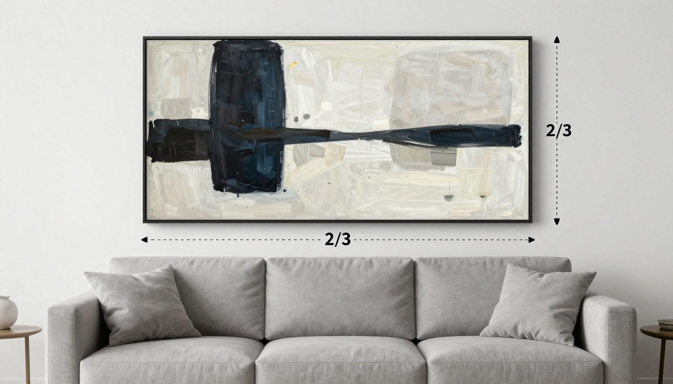
Leave a comment
This site is protected by hCaptcha and the hCaptcha Privacy Policy and Terms of Service apply.