The perfect accent wall isn't just about bold paint or textured wallpaper—it's about creating a thoughtful focal point that anchors your entire living room. When paired with the right statement canvas art, an accent wall transforms from a simple design element into the soul of your space. Whether you're a homeowner looking to refresh your living area or a renter seeking temporary solutions, these designer-approved styling methods will help you use the right scale for a focal wall and create a stunning visual impact that elevates your entire home.
Quick Answer (TL;DR)
- Choose one wall that naturally draws the eye (typically behind the sofa or opposite the entrance)
- Select a statement canvas that occupies 2/3 to 3/4 of the wall width for proper scale
- Hang artwork at eye level (57-60" from floor to center)
- Create color harmony between your wall and art (either complementary or tonal)
- Add dimension with proper lighting (picture lights or angled sconces)
- Keep the wall decluttered—one statement piece is more impactful than multiple small items
- For best results, try the "Tonal Minimalism" method with a large-scale neutral canvas
The Accent Wall + Statement Art Rule

Why One Strong Piece Beats Many Small Pieces on a Focal Wall
Interior designers consistently recommend one statement canvas over multiple small pieces for accent walls. A single large-scale artwork creates a clear focal point that immediately draws the eye and anchors the room. Multiple small pieces can create visual clutter and dilute the impact of your accent wall. Studies show that rooms with a single statement piece are perceived as more cohesive and intentionally designed than those with scattered smaller artworks.
The 3 Levers: Color Harmony, Scale, and Negative Space
Creating a successful accent wall with statement canvas art relies on three fundamental principles:
- Color Harmony: Your wall color and canvas art should either complement each other (opposite on the color wheel) or work within the same tonal family. This creates visual cohesion and prevents the elements from competing.
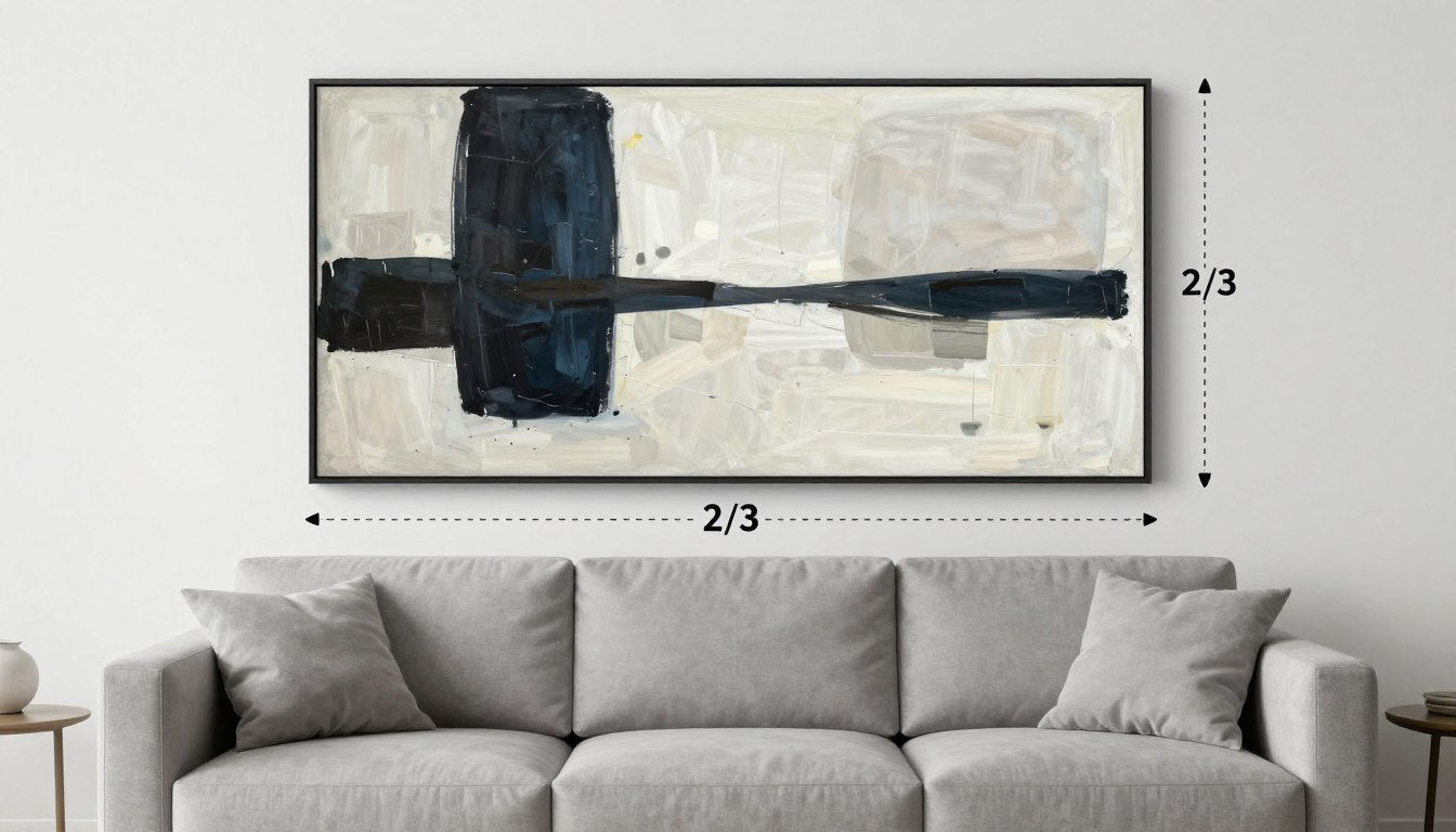
- Scale: The canvas should be proportionate to the wall—typically 2/3 to 3/4 of the wall width when placed above furniture. Too small, and it looks disconnected; too large, and it overwhelms.
- Negative Space: Allow breathing room around your statement piece. The empty wall space frames your art and prevents the composition from feeling crowded or chaotic.
When these three elements work in harmony, your accent wall becomes a sophisticated design statement rather than just a colorful backdrop. Browse our statement canvas prints for focal walls to find pieces that balance these principles perfectly.
The Scale & Placement Cheat Sheet

Above Sofa Sizing Rule
For canvas art above a sofa on an accent wall, follow the 2/3 rule: your artwork should be approximately two-thirds the width of the sofa beneath it. For a standard 84" sofa, aim for canvas art around 56" wide. This proportion creates visual balance and prevents the art from looking disconnected from the furniture below.
Centerline Height Rule
The industry standard for hanging art is 57-60 inches from the floor to the center of the artwork—roughly eye level for the average person. When placing art above furniture, ensure there's 8-10 inches of space between the top of the furniture and the bottom of the frame. This creates proper visual spacing while maintaining the centerline principle.
Spacing from Ceiling/Edges
Leave at least 12 inches between your canvas and the ceiling to prevent a cramped appearance. For side spacing, aim for equal distances on both sides of the artwork to create symmetry. In general, the larger the wall, the more negative space you'll want to maintain around your statement piece to create proper framing and emphasis.
Proper placement is crucial for creating impact. Learn more about how to hang a statement piece securely, even if you're renting and can't use nails.
7 Ways to Style an Accent Wall With Statement Canvas Art
1. Tonal Minimalism: Same-Family Neutrals + One Large Canvas

Best for: Contemporary spaces, Scandinavian-inspired interiors, and those seeking a timeless, sophisticated look.
Do this: Select a wall color and canvas art within the same color family—think variations of beige, greige, or warm neutrals. The subtle tonal shifts create depth without overwhelming the space. Choose a large-scale canvas with minimal detail and soft color transitions.
Avoid this: High-contrast elements or busy patterns that disrupt the serene, cohesive feel. Tonal minimalism relies on subtlety—too many competing elements will undermine the sophisticated effect.
Suggested art type: Abstract minimalist pieces with gentle color gradients or textural elements in neutral tones. Browse by palette and mood to find the perfect neutral canvas for your space.
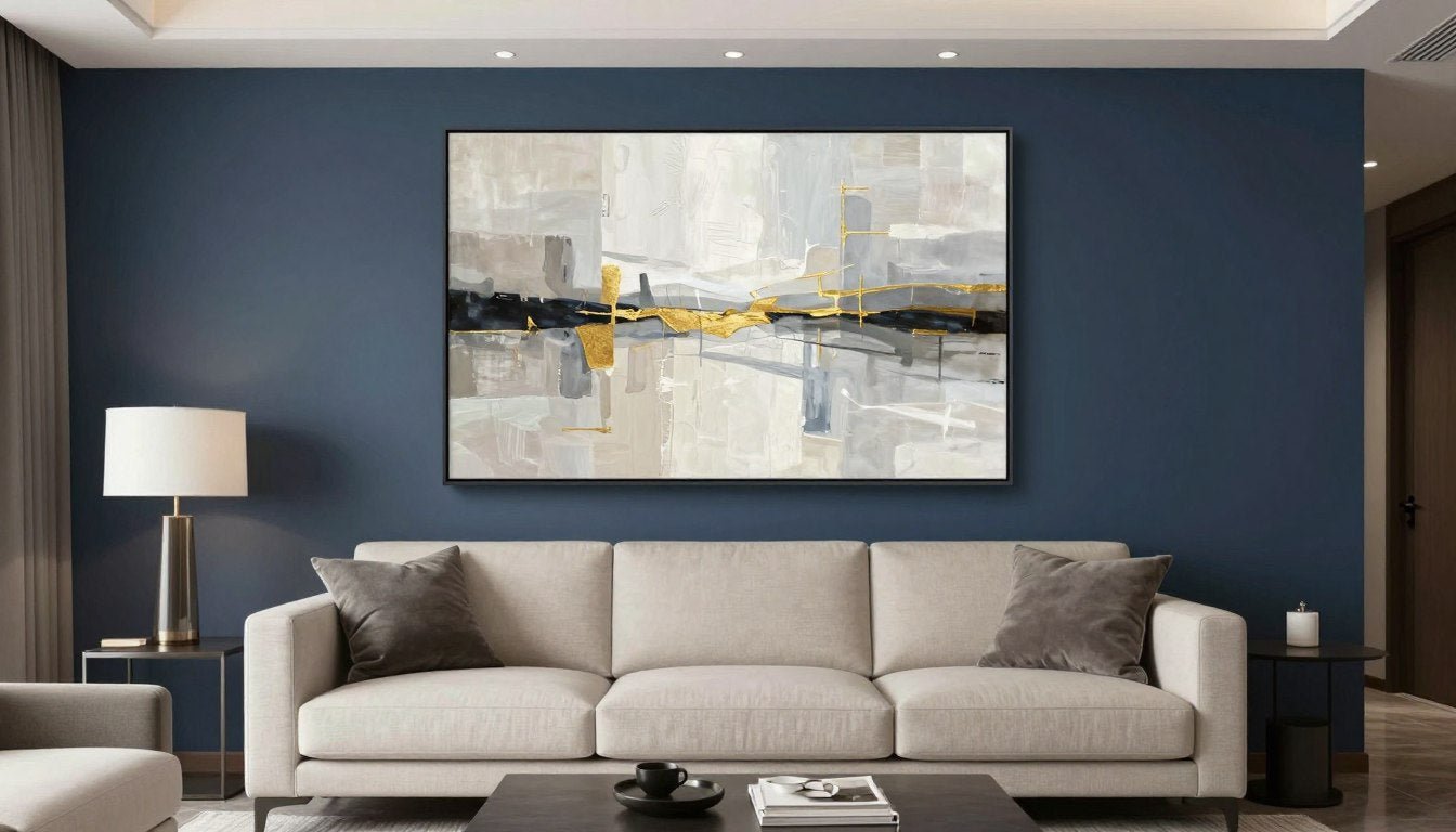
2. High-Contrast Modern: Dark Wall + Light Art (or Reverse)

Best for: Contemporary spaces, dramatic interiors, and those who want to make a bold statement.
Do this: Create striking visual tension with a dark accent wall (navy, charcoal, deep green) paired with light-colored canvas art—or vice versa. The stark contrast immediately draws the eye and creates a powerful focal point. Add a picture light above the canvas to enhance the dramatic effect.
Avoid this: Competing bold elements elsewhere in the room. Let the high-contrast wall and art be the star of the show, with supporting furniture and decor in more subdued tones.
Suggested art type: Minimalist black and white photography, high-contrast abstract pieces, or geometric art with strong negative space. Choose a modern style that suits your accent wall for maximum impact.
3. Texture-on-Texture Done Right: Limewash/Wood Slats + Clean-Edged Abstract

Best for: Organic modern spaces, earthy interiors, and those seeking depth and dimension.
Do this: Balance a highly textured wall (limewash, wood slats, plaster) with canvas art that has clean lines and defined edges. This creates a pleasing contrast between the organic texture of the wall and the more structured art. Choose canvas art with a simple composition that won't compete with the wall texture.
Avoid this: Heavily textured or busy artwork that creates visual competition with the wall texture. The goal is balance—let either the wall or the art provide the textural interest, not both.
Suggested art type: Geometric abstracts, line drawings, or color-block pieces with defined edges and minimal detail. The simplicity of the art allows the textured wall to shine while still creating a cohesive focal point.
4. Color Echo Styling: Pull 1-2 Colors from the Canvas into Pillows/Rug

Best for: Cohesive, intentional spaces where every element feels connected and thoughtful.
Do this: Select 1-2 secondary colors from your statement canvas and repeat them in smaller decor elements throughout the room—throw pillows, vases, or a single furniture piece. This creates a subtle thread that ties the room together without being too matchy-matchy.
Avoid this: Using too many colors from the artwork or being too literal with the matching. Subtle echoes work better than exact duplications across multiple items.
Suggested art type: Multi-colored abstract pieces, landscapes with a defined palette, or any canvas with 2-3 distinct colors that can be easily incorporated into your decor. Explore the full Rossetti Art collection to find pieces with colors that complement your existing decor.
5. The "Floating Frame" Upgrade: Framing That Makes It Look Curated

Best for: Elevating canvas art to look more curated and gallery-worthy, perfect for sophisticated spaces.
Do this: Choose a floating frame that creates a slight gap between the canvas and frame edge, giving the impression that the art is floating within the frame. This simple upgrade instantly makes canvas prints look more expensive and intentionally selected. Opt for thin metal frames for contemporary spaces or wood for warmer interiors.
Avoid this: Heavy, ornate frames that overwhelm the canvas or distract from the art itself. The frame should enhance, not compete with, your statement piece.
Suggested art type: Any canvas can benefit from a floating frame, but this technique particularly elevates abstract pieces and photography. The professional presentation makes even more affordable canvas prints look like gallery investments.
6. Layered Lighting: Picture Light + Side Lamp = Gallery Feel

Best for: Creating a museum-quality display and adding depth through strategic lighting.
Do this: Install a picture light directly above your statement canvas to create focused illumination that highlights the artwork. Complement this with a side lamp nearby to create layered lighting that adds dimension and drama. This professional lighting approach instantly elevates your accent wall to gallery status.
Avoid this: Harsh overhead lighting that creates glare on the canvas surface. Also avoid placing lamps that cast shadows across the artwork.
Suggested art type: Pieces with texture, dimension, or subtle color variations that benefit from directed lighting. Artworks with metallic elements or high-contrast details particularly shine under focused picture lights.
7. Mixed Medium Moment: Statement Canvas + Small Sculptural Accent Nearby

Best for: Creating dimension and visual interest through contrasting materials and forms.
Do this: Pair your statement canvas with a small sculptural element nearby—a wall-mounted sculpture, ceramic piece, or textural object that complements but doesn't compete with the canvas. This creates a curated vignette that adds depth and sophistication to your accent wall.
Avoid this: Placing too many objects near the canvas or choosing sculptural elements that clash stylistically. The sculptural accent should feel like a thoughtful addition, not a random object.
Suggested art type: Any statement canvas can work, but pieces with strong compositional elements that can be echoed in sculptural form work especially well. Add a sculptural counterpoint near the accent wall to create a designer-worthy display.
Accent Wall + Statement Art Match Matrix
| Accent Wall Type | Best Art Style | Best Palette Strategy | Recommended Canvas Size | Frame Choice | Lighting Tip | Avoid This |
| Painted (Bold Color) | Minimal Abstract | Complementary | L-XL (36"+ width) | Thin Metal Floater | Picture Light Above | Busy Patterns |
| Painted (Neutral) | Bold Geometric | 1 Accent Color | L (30-40" width) | Unframed or Floater | Angled Sconces | Low Contrast Art |
| Wallpaper | Line Art | Monochrome | M-L (24-36" width) | Thin Frame | Indirect Lighting | Competing Patterns |
| Wood Slats | Clean Geometric | Tonal | L (30-40" width) | No Frame | Side Lighting | Textured Art |
| Limewash/Plaster | Soft Organic | Tonal | XL (40"+ width) | Floater Frame | Diffused Lighting | Hard-Edged Art |
Accent Wall Types (and the Art That Suits Each)
Painted Walls

Painted accent walls offer the most versatility and are ideal for both homeowners and renters. For bold colored walls (navy, emerald, terracotta), choose canvas art with complementary colors or contrasting neutrals. For neutral painted walls, you have more freedom with your canvas selection—consider a bold, colorful piece that creates visual interest against the subtle backdrop.
Wallpaper

Wallpapered accent walls require careful art selection to avoid visual competition. For busy patterns, choose simple, minimal canvas art with clean lines and limited color palette. For subtle textured wallpaper, you have more flexibility—consider pieces with stronger visual elements. The key is balance: if your wallpaper is the star, your canvas should be the supporting actor, and vice versa.
Wood Slats

Wood slat accent walls add natural texture and warmth to a space. The linear nature of slats pairs beautifully with geometric or abstract canvas art that features clean lines and defined shapes. Avoid overly busy or highly detailed canvas prints that would compete with the texture of the wood. Instead, opt for pieces with strong compositional elements and a limited color palette that complements the wood tone.
Limewash/Plaster Texture

Textured limewash or plaster walls create a soft, organic backdrop that pairs beautifully with more fluid, organic canvas art. The subtle movement in both the wall texture and the artwork creates a harmonious relationship. Choose canvas prints with soft color transitions and flowing forms rather than rigid geometric shapes. This combination creates a sophisticated, layered look that's both contemporary and timeless.
Mistakes That Make Accent Walls Look Busy (Fixes)
Too Many Competing Focal Points

The Problem: Multiple art pieces, mirrors, shelves, and decorative objects all competing for attention on your accent wall.
The Fix: Embrace the "less is more" approach. Remove smaller decorative elements and focus on one statement canvas as your primary focal point. If you want to include additional elements, limit them to 1-2 small complementary pieces that support rather than compete with your main artwork.
Art Too Small

The Problem: Undersized canvas art that looks disconnected from the furniture and lost on the wall.
The Fix: Scale up. Your statement canvas should be approximately 2/3 to 3/4 the width of the furniture it hangs above. For a standard sofa, aim for canvas art that's at least 40-60 inches wide. The proper scale creates visual connection and makes the entire arrangement feel intentional.
Wrong Sheen/Lighting Glare

The Problem: Harsh lighting creating glare on your canvas art, making it difficult to appreciate the details and colors.
The Fix: Adjust your lighting strategy. Install picture lights above the artwork or use angled sconces that illuminate the canvas without creating direct glare. For highly reflective canvas prints, consider a matte finish or add a non-glare acrylic glazing if framed. Proper lighting not only eliminates glare but also enhances the visual impact of your statement piece.
Recommended Next Reads
Ultimate Guide to Art Print Sizes
Learn everything about selecting the perfect size art print for any wall in your home, with specific recommendations for living rooms, bedrooms, and more.
How to Hang Canvas Prints Without Nails
Discover renter-friendly solutions for securely hanging statement canvas art without damaging your walls—perfect for accent wall styling.
6 Modern Art Styles You Need to Know
Explore the most popular contemporary art styles and learn which ones work best for statement canvas art on your living room accent wall.
FAQ
Should you put art on an accent wall or leave it plain?
In most cases, an accent wall benefits from statement art that enhances its impact. While a boldly colored or textured wall can stand alone, adding the right canvas art creates a more intentional, designed look. The key is balance—if your wall has a busy pattern or pronounced texture, choose simpler art with clean lines. For solid-colored accent walls, you have more flexibility with your art selection.
What size canvas art works best above a sofa on an accent wall?
For canvas art above a sofa on an accent wall, follow the 2/3 rule: your artwork should be approximately two-thirds the width of the sofa beneath it. For a standard 84" sofa, aim for canvas art around 56" wide. The bottom edge of the frame should be 8-10" above the sofa back. This proportion creates visual balance and prevents the art from looking disconnected from the furniture below.
How high should statement art be hung in a living room?
The industry standard for hanging art is 57-60 inches from the floor to the center of the artwork—roughly eye level for the average person. When placing art above furniture, ensure there's 8-10 inches of space between the top of the furniture and the bottom of the frame. This creates proper visual spacing while maintaining the centerline principle.
Can you do wallpaper + statement canvas art together?
Yes, wallpaper and statement canvas art can work beautifully together when properly balanced. The key is to avoid visual competition. For busy wallpaper patterns, choose simple, minimal canvas art with clean lines and a limited color palette. For subtle textured wallpaper, you have more flexibility with your art selection. Consider pulling one color from the wallpaper into your canvas art to create cohesion.
What's the best color accent wall for modern living rooms in 2026?
For 2026, designers are embracing rich, earthy tones for accent walls in modern living rooms. Deep terracotta, olive green, and muted navy are particularly on-trend. These colors create warmth and sophistication while providing an excellent backdrop for statement canvas art. For a more timeless approach, consider charcoal gray or deep teal, which pair beautifully with both neutral and colorful artwork.
How do you light a statement canvas without glare?
To light a statement canvas without creating glare, use angled lighting rather than direct overhead lights. Picture lights mounted above the artwork or adjustable wall sconces positioned to cast light across the canvas surface work well. For rooms with abundant natural light, consider canvas prints with a matte finish rather than glossy. If using glass or acrylic glazing over your canvas, opt for museum-quality non-glare options.
Can you mix a canvas print with a painting in the same room?
Absolutely! Mixing canvas prints with original paintings creates visual interest and depth in your living room. The key is to maintain some connecting element—similar subject matter, complementary color palettes, or consistent framing styles. For your accent wall, choose either the canvas print or the painting as your statement piece, then incorporate the other artwork elsewhere in the room to create a cohesive look.
How do you keep an accent wall from looking cluttered?
To prevent a cluttered accent wall, embrace the "less is more" approach. Focus on one statement canvas as your primary focal point rather than multiple smaller pieces. Allow for adequate negative space around your artwork—this "breathing room" frames the piece and prevents visual chaos. Limit additional decorative elements to 1-2 complementary items that support rather than compete with your main artwork. Finally, ensure proper scale—undersized art can make an accent wall feel disjointed and busy.
Transform Your Living Room With Statement Canvas Art
Ready to create a stunning accent wall in your living room? Browse our curated collection of statement canvas prints designed to perfectly complement any accent wall style. From minimalist abstracts to bold geometrics, find the perfect piece to elevate your space.
Explore Rossetti Art Collection
Leave a comment
This site is protected by hCaptcha and the hCaptcha Privacy Policy and Terms of Service apply.