
Choosing the perfect accent wall color is only half the design equation. The art you pair with it completes the story. This comprehensive guide walks you through selecting the ideal accent wall location, choosing colors that work with your lighting, and pairing each with complementary artwork that elevates your space. Whether you're a minimalist who loves neutrals or a color enthusiast ready to make a bold statement, we've created a repeatable system to help you create a designer-worthy accent wall that perfectly showcases your art.
Accent Wall Color—What It Is and Why It Works
An accent wall uses color to create a focal point, add depth, and bring personality to a space. When done right, it draws the eye to the most important area of a room while creating visual interest that plain, single-color rooms often lack. The strategic use of color on just one wall allows you to experiment with bolder hues without overwhelming your space.

Accent Wall vs Feature Wall vs Color-Drenching
While often used interchangeably, these terms have subtle differences. An accent wall typically uses paint to highlight one wall in a contrasting color. A feature wall might incorporate texture, wallpaper, paneling, or architectural elements beyond just paint. Color-drenching, the newest trend, takes the opposite approach by painting all walls, trim, and sometimes ceiling in the same color for an immersive effect.
For our purposes, we're focusing on painted accent walls and how to pair them with the perfect artwork to create a cohesive, designer-worthy look.
When Not to Do an Accent Wall
Not every room benefits from an accent wall. Skip this technique when:
- Your room is very small with no clear focal point (it can make the space feel choppy)
- The room already has bold patterns or multiple colors competing for attention
- The wall you're considering has too many doors, windows, or architectural breaks
- You're trying to highlight a wall with unattractive features (like misplaced outlets or vents)
- The room has an unusual shape that would be emphasized in a negative way
The most successful accent walls enhance a room's natural strengths rather than trying to distract from its weaknesses.
Step 1 — Choose the Right Wall (Designer Rules)
The first step in creating a successful accent wall is selecting the right surface. This decision sets the foundation for everything that follows, including what art will look best in the space.

The "Natural Focal Point" Rule
The most effective accent walls highlight a room's natural focal point—the area your eye is naturally drawn to when you enter. This might be:
- The wall behind the bed in a bedroom
- The fireplace wall in a living room
- The back wall in a hallway or entryway
- The wall a sofa sits against
- A wall with built-in shelving or architectural interest
When you enter a room, notice where your gaze naturally lands. That's often your best candidate for an accent wall and the perfect place to showcase complementary artwork.
TV Wall, Fireplace Wall, Bed Wall: What Changes?
Different focal points require different approaches to both color and art pairing:
TV Wall: Opt for darker, matte colors that reduce screen glare and create a theater-like experience. Art placement becomes trickier—consider flanking the TV with vertical pieces or creating an asymmetrical arrangement that balances the TV's visual weight.
Fireplace Wall: The fireplace is already a strong focal point, so your accent color should complement rather than compete with it. Consider the fireplace materials when choosing your color. Art is typically placed above the mantel, so scale becomes crucial—too small and it will look lost.
Bed Wall: This is one of the most common and successful accent wall locations. The color sets the mood for the entire room, and the art above the bed becomes a central design element. Consider the scale of your headboard when selecting and placing artwork—a low profile bed might need a larger art piece than one with a tall headboard.
Dining Room Wall: The wall behind a dining table creates an elegant backdrop for meals. Art in this space should be placed at eye level when seated and should relate to the dining experience—either through subject matter (subtle food themes) or by creating the right mood (convivial for family dining, sophisticated for formal spaces).
Step 2 — Choose a Color That Survives Real Lighting
The same paint color can look dramatically different depending on your room's lighting. Understanding how light affects color is essential for choosing an accent wall color that looks good throughout the day and pairs well with your art.

Undertones Explained (Warm, Cool, Neutral)
Every color has an undertone—a subtle hue that emerges under certain lighting conditions. Understanding undertones is crucial for both your accent wall and the art you'll pair with it:
- Warm undertones have hints of yellow, orange, or red and create cozy, inviting spaces
- Cool undertones contain hints of blue, green, or purple and create calm, refreshing spaces
- Neutral undertones are balanced and versatile, working well with most art styles
When selecting art for your accent wall, consider how its colors will interact with the undertones in your paint. Complementary undertones create harmony, while contrasting undertones create energy and visual interest.
North vs South Light + Evening Lighting
The direction your windows face dramatically affects how colors appear:
North-facing rooms receive cool, bluish light that can make colors appear more muted. Warm accent colors like terracotta, gold, or warm greens can balance this effect. Art with warmer tones or metallic elements helps brighten these spaces.
South-facing rooms get warm, yellow-tinted light that intensifies colors. Cool accent colors like blues, greens, and purples work well here. Art with crisp whites and cool tones maintains its integrity in this light.
East-facing rooms receive bright morning light that turns bluer as the day progresses. Versatile colors that look good in both warm and cool light work best. Consider how your art will look in both morning and afternoon light.
West-facing rooms get warm afternoon light that can create glare on glossy art surfaces. Consider matte-finished art or proper glass glazing to reduce this effect. Colors appear warmer in the evening, so factor this into your accent wall color choice.
Remember that evening lighting changes everything. Test your color and art pairings under both natural and artificial light before committing.
Sample Strategy (Swatches, Large Boards, Day/Night Test)
Never skip the sampling phase. Follow this testing strategy for foolproof results:
- Start with paint swatches to narrow down your color family
- Get sample pots of 2-3 final contenders
- Paint large boards (at least 2'x2') rather than directly on the wall
- Move the boards around the room at different times of day
- View them in both natural and artificial lighting
- Hold up your intended artwork next to the samples
- Take photos to review objectively
This methodical approach ensures your accent wall color will look good in all lighting conditions and create the perfect backdrop for your art.
Need help visualizing color and art pairings?
Our Color Palettes + Abstract Wall Art Pairing Guide provides a comprehensive framework for matching colors to complementary artwork.
Explore Our Pairing GuideStep 3 — Pick a Color Family (Room-by-Room)
Different rooms serve different purposes and benefit from specific color families. Here's our room-by-room guide to choosing accent wall colors and their ideal art pairings.

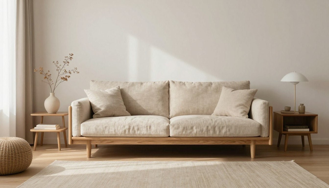
Warm Neutrals (Sand, Caramel, Clay)
Warm neutrals create inviting, versatile spaces that work well in living rooms, entryways, and dining areas. These colors provide a sophisticated backdrop that lets your art take center stage.
Best warm neutral accent colors:
- Benjamin Moore Pale Oak (OC-20) - soft, warm greige
- Sherwin Williams Accessible Beige (SW 7036) - versatile light beige
- Benjamin Moore Muslin (OC-12) - warm off-white with yellow undertones
- Sherwin Williams Kilim Beige (SW 6106) - rich caramel beige
- Benjamin Moore Shaker Beige (HC-45) - classic warm beige
Best art pairings:
- Textural abstract pieces with depth and dimension
- Black and white photography with warm mats
- Art with gold or bronze accents
- Landscapes in complementary earth tones
- Sculptural pieces that cast interesting shadows
Deep Moody Colors (Charcoal, Forest, Navy)
Deep, moody colors create dramatic, cozy spaces perfect for bedrooms, home offices, and intimate seating areas. These bold choices make art pop dramatically against their rich backgrounds.

Best deep moody accent colors:
- Benjamin Moore Hale Navy (HC-154) - classic deep navy
- Sherwin Williams Iron Ore (SW 7069) - soft charcoal
- Benjamin Moore Salamander (2050-10) - rich forest green
- Sherwin Williams Urbane Bronze (SW 7048) - deep warm brown
- Benjamin Moore Kendall Charcoal (HC-166) - perfect mid-dark gray
Best art pairings:
- High-contrast black and white prints
- Art with metallic details (gold, silver, copper)
- Minimalist line drawings in white frames
- Photography with dramatic lighting
- Abstract pieces with pops of bright color
Earthy Greens
Green accent walls bring nature indoors and work beautifully in living rooms, bedrooms, and home offices. They create a calming backdrop that pairs well with both bold and subtle artwork.
Best earthy green accent colors:
- Benjamin Moore October Mist (1495) - soft sage green
- Sherwin Williams Evergreen Fog (SW 9130) - muted sage with gray undertones
- Benjamin Moore Cushing Green (HC-125) - olive with gray undertones
- Sherwin Williams Rookwood Sash Green (SW 2810) - rich historical green
- Benjamin Moore Saybrook Sage (HC-114) - classic light sage
Best art pairings:
- Botanical prints and nature photography
- Abstract landscapes with earthy tones
- Black and white portraits
- Art with terracotta or rust accents
- Textural fiber art in natural materials
Blues That Don't Turn "Baby Blue"
Blue accent walls create serene, sophisticated spaces in bedrooms, bathrooms, and living areas. The key is choosing blues with the right undertones to avoid an unintentionally juvenile look.

Best sophisticated blue accent colors:
- Benjamin Moore Van Deusen Blue (HC-156) - deep blue with gray undertones
- Sherwin Williams Smoky Blue (SW 7604) - muted blue with gray-green undertones
- Benjamin Moore Gentleman's Gray (2062-20) - blue-black with depth
- Sherwin Williams Indigo Batik (SW 7602) - medium blue with subtle purple undertones
- Benjamin Moore Normandy (2129-40) - dusty medium blue
Best art pairings:
- Seascapes and water-inspired abstracts
- Architectural photography in black and white
- Modern portraits with limited color palettes
- Geometric prints with complementary colors
- Art with silver or chrome accents
Terracotta / Oxblood Accents (How to Keep It Refined)
Rich, earthy reds create warm, inviting spaces that work well in dining rooms, libraries, and living areas. The key is choosing sophisticated red tones that avoid looking like primary colors.
Best refined red accent colors:
- Benjamin Moore Dinner Party (AF-300) - sophisticated terracotta
- Sherwin Williams Fired Brick (SW 6335) - earthy red with brown undertones
- Benjamin Moore Raspberry Blush (2008-30) - coral-terracotta
- Sherwin Williams Carnelian (SW 7580) - rich oxblood
- Benjamin Moore Caliente (AF-290) - vibrant but sophisticated red
Best art pairings:
- Black and white photography with dark frames
- Abstract art with complementary blues or greens
- Vintage maps or architectural drawings
- Minimalist line art in simple frames
- Art with gold or brass accents
Looking for the perfect art for your accent wall?
Browse our collection of Abstract & Geometric Canvas Prints designed to complement a variety of accent wall colors.
Shop Abstract ArtThe Accent Wall + Art Pairing Rules (Where You'll Outrank)
The art you choose for your accent wall can either elevate the entire space or detract from it. Follow these designer rules to create perfect pairings every time.

If the Wall is Dark → How to Avoid "Black Hole"
Dark accent walls create drama but can visually recede, creating a "black hole" effect if not properly balanced with the right artwork.
- Use high-contrast art - Black and white or light-colored art pops against dark backgrounds
- Consider art with metallic elements - Gold, silver, or copper details reflect light and add dimension
- Opt for larger scale pieces - Small art can get lost on dark walls
- Add proper lighting - Picture lights or track lighting directed at the art prevents it from disappearing
- Choose art with visual weight - Bold graphics or strong compositional elements stand up to dark backgrounds
Our Black & White Canvas Prints collection offers perfect high-contrast options for dark accent walls.
If the Wall is Bright → How to Keep It Adult
Bright accent walls can energize a space but risk looking childish if not paired with sophisticated artwork.
- Choose art with subtle colors that complement but don't compete with the wall
- Look for pieces with negative space to give the eye visual rest
- Consider black and white or monochromatic art to balance the wall's color
- Select art with sophisticated subject matter - abstract, architectural, or minimalist subjects
- Use elegant framing to elevate the overall presentation
Our Line Art Canvas Prints provide elegant simplicity that balances bright accent walls beautifully.
Frame Finishes That Elevate (Black, Walnut, Gold)
The right frame finish is crucial for creating a cohesive look between your accent wall and artwork.
Black frames work with almost any accent wall color and create a clean, modern look. They're especially effective against light or bright walls where they provide definition and contrast.
Walnut and wood tones add warmth and pair beautifully with earthy colors like greens, blues, and terracottas. The natural variation in wood complements these organic hues.
Gold and brass frames add luxury and light reflection, working particularly well with deep, moody colors like navy, forest green, and charcoal. The metallic finish catches light and prevents dark walls from feeling flat.
White and light frames create a gallery-like effect and work well with mid-tone accent walls. They can make artwork appear to float on darker walls but may lack definition against very light accent colors.
For a foolproof approach, echo elements from your room in your frame choice—match wood tones to furniture or metal finishes to hardware and fixtures.
Size & Placement: Make the Accent Wall Look Intentional
The size and placement of your artwork are just as important as the art itself. Follow these designer guidelines to create a polished, intentional look.

The 2/3 Sizing Rule for Art Above Furniture
The 2/3 rule is a designer secret for perfectly proportioned art placement. When hanging art above furniture:
- The width of your artwork (or grouping) should be approximately 2/3 the width of the furniture below it
- For a sofa that's 84 inches wide, your art should be roughly 56 inches across
- This proportion creates visual balance and prevents art from looking too small or overwhelming
- The rule applies whether you're using a single large piece or a grouping of smaller works
Learn more about perfect proportions in our guide to The 2/3 Rule for Wall Art.
Gallery Wall Layouts (Grid vs Salon)
Gallery walls add dimension and personality to accent walls, but the layout style dramatically affects the overall feel:
Grid layouts create order and symmetry, working well with:
- Modern and contemporary spaces
- Matching frames for cohesion
- Similar sized artwork or photographs
- Bright or bold accent wall colors that need visual structure
Salon-style layouts create organic, collected looks, working well with:
- Eclectic and bohemian spaces
- Mixed frame styles and sizes
- Varied artwork types and dimensions
- Neutral or subtle accent wall colors that let the arrangement shine

For detailed instructions on creating perfect gallery walls, check out our guide on How to Mix and Match Art Prints for a Stunning Gallery Wall.
Quick Placement Guide by Room
Different rooms have different ideal placement strategies for accent wall art:
Living Room: Hang art at eye level (approximately 57-60 inches from the floor to the center of the piece). When placing above furniture, leave 8-10 inches of space between the furniture and the bottom of the art.
Dining Room: Art should be hung slightly lower (at seated eye level) when placed above a dining table. Consider the height of your chairs and table when determining placement.
Bedroom: For art above the bed, center the piece horizontally and place it 6-8 inches above the headboard. If you have a tall headboard, you may need to adjust higher.
Hallway: In narrow hallways, art can be hung slightly higher than standard eye level to create the illusion of width. Create a gallery along the length of an accent wall for maximum impact.
For more detailed placement strategies, explore our Room-by-Room Modern Wall Art Guide.
10 Accent Wall Mistakes (And How to Fix Them)
Even design professionals occasionally make these common accent wall mistakes. Learn how to avoid them for a flawless finished look.

Wrong Saturation, Wrong Wall, Wrong Sheen
These fundamental mistakes can undermine your accent wall before you even hang the art:
Mistake #1: Too-saturated color
Fix: Step down 1-2 shades from your initial color choice. What looks moderate on a swatch often looks intense on a full wall.
Mistake #2: Choosing the wrong wall
Fix: Select the natural focal point wall or the one with the least architectural breaks (windows, doors, etc.).
Mistake #3: Using glossy paint
Fix: Choose matte or eggshell finishes for accent walls to reduce glare and create depth. Save semi-gloss for trim.
Mistake #4: Ignoring undertones
Fix: Always test paint samples next to your existing colors to ensure undertones complement rather than clash.
Mistake #5: Accent wall without purpose
Fix: Ensure your accent wall highlights something meaningful—furniture, art, or architecture.
Mistake #6: Competing with busy patterns
Fix: If you have patterned furniture or rugs, choose a more subtle accent color that complements rather than competes.
Art Too Small / Too High / Too Glossy
Even with the perfect accent wall color, these art-hanging mistakes can diminish your design:
Mistake #7: Art too small for the wall
Fix: Size up—art should fill approximately 2/3 to 3/4 of the available wall space above furniture. When in doubt, go bigger.
Mistake #8: Hanging art too high
Fix: The center of your artwork should be at eye level (approximately 57-60 inches from the floor) when standing, or 8-10 inches above furniture.
Mistake #9: Glossy frames creating glare
Fix: Use non-glare glass or acrylic for frames, especially on walls opposite windows. Alternatively, choose canvas prints which eliminate glare issues entirely.
Mistake #10: Mismatched art style
Fix: Ensure your art style complements both your accent wall color and your overall décor style for a cohesive look.
For more guidance on selecting the right size artwork, explore our Ultimate Guide to Art Print Sizes.
Curated "Art That Works" by Accent Wall Color (Rossetti Art)
Finding the perfect art for your accent wall doesn't have to be guesswork. We've curated collections specifically designed to complement popular accent wall colors.
Dark Accent Walls (Monochrome + Gold Accents)
Dark accent walls create drama and sophistication. The right artwork adds contrast and prevents the wall from feeling like a visual void.

For dark accent walls in charcoal, navy, or deep forest green, consider:
- High-contrast black and white prints that pop against the dark background
- Minimalist line art that creates visual breathing space
- Art with metallic accents that catch and reflect light
- Abstract pieces with white or light neutral elements
- Photography with dramatic lighting that complements the mood
Explore our Black & White Canvas Prints and "Ink Reverie" minimalist canvas print for perfect dark wall pairings.
Green Accent Walls (Line Art + Earthy Abstracts)
Green accent walls bring nature indoors and create a calming atmosphere. The right artwork enhances this connection to the natural world.

For sage, olive, or emerald green accent walls, consider:
- Botanical line drawings that enhance the natural theme
- Abstract landscapes with earthy tones
- Black and white photography of natural subjects
- Art with complementary terracotta or rust accents
- Minimalist pieces that allow the wall color to remain prominent
Our Line Art Canvas Prints collection offers elegant options that complement green accent walls beautifully.
Blue Accent Walls (Structured Abstracts + Minimal Portraits)
Blue accent walls create serene, sophisticated spaces. The right artwork enhances this tranquility while adding visual interest.

For navy, dusty blue, or teal accent walls, consider:
- Structured abstract pieces with geometric elements
- Minimal portraits that create an emotional connection
- Seascapes or water-inspired art that enhances the blue theme
- Art with complementary orange or yellow accents for subtle contrast
- Black and white photography in white frames for a crisp look
Our Figurative & Portrait Canvas Prints and "Monochrome Reverie" portrait canvas work beautifully with blue accent walls.
Warm Neutral Accent Walls (Texture + Sculptural Pieces)
Warm neutral accent walls create versatile, inviting spaces. The right artwork adds dimension and visual interest to these subtle backdrops.

For beige, taupe, or warm gray accent walls, consider:
- Textural art with dimensional elements
- Sculptural pieces that cast interesting shadows
- Abstract art with subtle color variations
- Photography with warm tones and rich contrast
- Mixed media pieces that add visual complexity
Explore our Modern Sculptures for Home Decor and Original Black & White Paintings for perfect warm neutral wall companions.
Find Your Perfect Art Pairing
Browse our complete collection of wall art designed to complement any accent wall color.
Shop All CollectionsAccent Wall Color-to-Art Pairing Matrix
Quick Answers: Accent Wall + Art Pairing
Dark walls (charcoal, navy, forest): High-contrast art, metallic accents, larger scale pieces
Green walls (sage, olive, emerald): Botanical prints, earthy abstracts, black frames
Blue walls (navy, dusty blue, teal): Structured abstracts, minimal portraits, white or gold frames
Warm neutral walls (beige, taupe): Textural art, sculptural pieces, walnut frames
Terracotta/red walls: Black and white photography, complementary blue accents, black frames
| Accent Wall Color Family | Best Undertone Match | Best Trim Color | Best Art Palette | Best Frame Finish | Best Subject Style | Avoid | Rossetti Art Pick |
| Charcoal | Cool or neutral | Crisp white | Monochrome, metallic accents | Black or gold | Abstract, architectural | Small pieces, muddy colors | Black & White Canvas |
| Navy | Cool | White or cream | Blues, whites, gold accents | Gold or white | Seascapes, portraits | Yellow undertones, glare | Portrait Canvas |
| Forest Green | Warm | Cream or greige | Earth tones, metallics | Gold or walnut | Botanical, abstract | Red-toned art, plastic frames | Line Art Canvas |
| Terracotta | Warm | White or cream | Blues, neutrals, black | Black or walnut | Photography, line art | Competing warm colors | Ink Reverie |
| Warm Beige | Warm | White or matching | Textural neutrals, pops of color | Walnut or black | Textural abstract, landscapes | Cool grays, thin frames | Abstract Canvas |
| Sage Green | Neutral | White or cream | Neutrals, terracotta accents | Natural wood or black | Botanical, minimal | Purple tones, busy patterns | Modern Sculptures |
FAQs
Which wall should be the accent wall in a living room?
The best accent wall in a living room is typically the natural focal point—often the wall where your TV or fireplace is located, or the wall your sofa sits against. If you have an architecturally interesting wall (with built-ins or a unique feature), that's also an excellent choice. Avoid walls with too many windows or doors, as these breaks disrupt the visual impact of your accent color.
What are the best accent wall colors for a small room?
In small rooms, consider these accent wall color strategies: 1) Cool colors like soft blues and greens can make a space feel larger, 2) Dark colors on a far wall can create depth when the other walls are light, 3) Warm neutrals like soft terracotta or caramel add warmth without overwhelming the space. Avoid extremely bright or saturated colors in small rooms, as they can make the space feel confined. The accent wall should be the farthest wall you see when entering the room to create maximum depth.
Should the accent wall be darker or lighter than the other walls?
Traditionally, accent walls are darker than surrounding walls to create contrast and visual interest. However, there are no hard rules—a lighter accent wall can work in a room with darker surrounding walls, especially in spaces with limited natural light. The key is contrast: your accent wall should be at least 2-3 shades different from your other walls to create noticeable distinction. For subtle elegance, stay within the same color family but go darker; for dramatic impact, choose a complementary color.
What accent wall colors go with white walls?
White walls provide a versatile backdrop for almost any accent wall color. For a sophisticated look, consider deep navy blue, forest green, charcoal gray, or rich terracotta. For a more subtle approach, try greige, sage green, dusty blue, or warm taupe. The undertone of your white walls matters—warm whites (with yellow undertones) pair well with warm accent colors, while cool whites (with blue undertones) complement cool accent colors. The art you choose can bridge these colors, incorporating elements of both your white walls and accent color.
How do I choose an accent wall color with warm vs cool lighting?
In rooms with warm lighting (yellow-tinted bulbs or west/south-facing windows), cool colors like blues and greens can balance the warmth, though they may appear slightly more muted. In spaces with cool lighting (north-facing windows or cool LED bulbs), warm accent colors like terracotta, gold, or warm greens can add balance and prevent the space from feeling cold. Always test paint samples in your specific lighting conditions at different times of day. Remember that evening lighting dramatically changes how colors appear, so test your color under both natural and artificial light.
What art looks best on a dark accent wall?
Dark accent walls pair beautifully with high-contrast artwork that prevents the wall from becoming a visual "black hole." Consider black and white photography or prints, art with significant white space, pieces with metallic elements (gold, silver, copper) that reflect light, or art with bright pops of color. Scale is important—larger pieces typically work better on dark walls than smaller ones. Proper lighting is essential; consider picture lights or track lighting directed at the artwork to ensure it stands out against the dark background.
Can I do an accent wall behind a TV or should it stay neutral?
An accent wall behind a TV can work beautifully with the right approach. Choose darker, matte colors that reduce glare and create a theater-like experience—deep navy, charcoal, forest green, or rich brown work well. Avoid highly saturated or bright colors that can compete with screen content and cause eye fatigue. For art placement, consider flanking the TV with vertical pieces or creating an asymmetrical arrangement that balances the TV's visual weight. The key is creating a cohesive media wall where the TV becomes part of the overall design rather than competing with it.
What's the best paint finish for an accent wall?
Matte or eggshell finishes are ideal for accent walls. These low-sheen finishes reduce glare, hide imperfections, and create depth that enhances darker colors. Matte offers the most forgiving surface for walls with imperfections but can be harder to clean. Eggshell provides a subtle, sophisticated sheen with improved durability and cleanability. Avoid high-gloss finishes on accent walls, as they reflect too much light and can create distracting glare, particularly problematic for walls featuring artwork or TVs. If you want added texture, consider specialty finishes like limewash or plaster for a "soft accent" effect.
Creating the perfect accent wall is about more than just choosing a bold color—it's about creating a focal point that enhances your space and showcases your personal style through carefully selected art. By following our accent wall color guide and art pairing system, you can create a designer-worthy look that transforms your home. Remember that the most successful accent walls tell a cohesive story where color and art work together to create a space that feels intentional, balanced, and uniquely yours.
Ready to complete your accent wall?
Browse our complete collection of wall art designed to complement any accent wall color.
Explore Our Color + Art Pairing Guide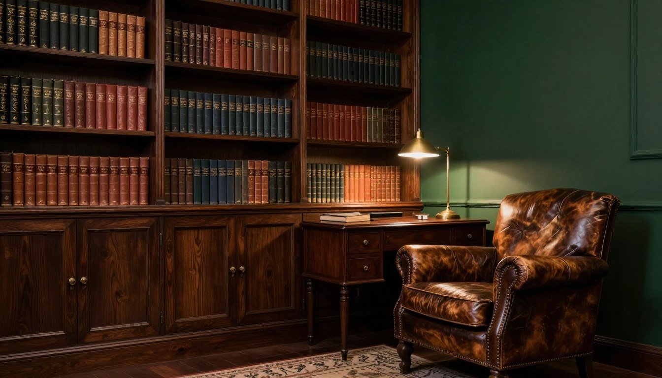
Leave a comment
This site is protected by hCaptcha and the hCaptcha Privacy Policy and Terms of Service apply.