
The difference between a room that feels thoughtfully curated and one that simply looks "decorated" often comes down to color harmony. When your abstract wall art and color palette work in concert, the space resonates with intention rather than happenstance. This guide will help you create that elusive sense of purpose—where each color choice feels deliberate and each art piece looks as though it was made specifically for your space.
Whether you're starting with a blank canvas or working with existing decor, we'll walk you through the designer's approach to creating color relationships that feel both sophisticated and effortless. The goal isn't perfection—it's creating a space that feels authentically yours while adhering to principles that make your art truly shine.
Quick Answers (TL;DR)
- Identifying Undertones: Hold a pure white paper next to your wall/furniture to reveal whether undertones are warm (yellow/red/orange), cool (blue/green/purple), or neutral (true grays).
- Contrast Level: For subtle integration, choose art with colors already present in your room. For statement pieces, select complementary colors (opposite on the color wheel) to your dominant palette.
- The 1-Accent Rule: Choose one accent color from your art and repeat it 2-3 times throughout the room in small doses (pillows, vases, books) to create visual cohesion.
- Frame Finish Guide: Black frames create definition and work with any palette; white frames brighten and modernize; natural oak adds warmth; metallic finishes (gold, silver) add luxury and reflect your palette's undertone.
The Designer Method (Do this before you shop)
Professional designers rarely select art on impulse. Instead, they follow a methodical approach that ensures harmony between your space and the artwork you choose. Before browsing collections or visiting galleries, take these five essential steps to prepare your space and clarify your vision.

Step 1 — Undertone
Every color has an undertone that falls into one of three categories: warm, cool, or neutral. Identifying your room's dominant undertone is the foundation of successful art pairing.
"The undertone is the soul of your color palette. Miss this step, and even the most beautiful art can feel oddly disconnected from your space."
To identify undertones in your space:
- Hold a pure white sheet of paper against your walls, furniture, and textiles
- Warm undertones will make the white paper appear cooler by comparison (revealing yellows, reds, oranges)
- Cool undertones will make the white paper appear warmer (revealing blues, greens, purples)
- Neutral undertones will have minimal contrast with the white paper
Step 2 — Intensity (muted vs saturated)
Color intensity refers to how vibrant or subdued a color appears. Rooms with primarily muted colors (those mixed with gray or their complement) pair best with art that contains at least one element of similar intensity. Conversely, spaces with saturated colors can support art with either high saturation for drama or muted tones for balance.
Assess your room's intensity level by asking:
- Do colors in your space appear bright and vivid (saturated) or soft and subdued (muted)?
- What is the ratio of saturated to muted elements?
- Which intensity level do you want your art to emphasize or balance?
Step 3 — Accent color (repeat it)
Identify one distinctive color from your chosen artwork that can serve as an accent throughout your space. This color should appear in small doses (approximately 10% of your visual field) to create cohesion without overwhelming the room.
For example, if your abstract piece contains a striking cobalt blue, incorporate this same blue in:
- A small vase or decorative object
- The spine of books on your shelf
- A throw pillow or textile trim
This repetition creates a visual rhythm that makes your art selection feel intentional rather than random. For a sophisticated approach to incorporating accent colors in your space, explore our guide to mixing and matching art prints.
Step 4 — Contrast level
Determine whether your art should blend harmoniously with your space or create a dramatic focal point through contrast. This decision influences both color selection and placement.
For subtle integration (low contrast):
- Select art containing colors already present in your room
- Choose pieces with similar value (lightness/darkness) to your walls
- Consider art with soft transitions between colors
For statement pieces (high contrast):
- Choose art with colors complementary to your dominant palette
- Select pieces with strong value differences from your walls
- Consider art with bold, defined shapes or color blocks
Step 5 — Frame finish + materials
Your frame choice significantly impacts how art integrates with your space. Consider both the frame's finish and how it relates to other materials in your room.
Frame finish guidelines:
- Black frames: Create definition and work with any palette; best for creating focus
- White frames: Brighten and modernize; ideal for contemporary spaces
- Natural wood: Adds warmth and organic texture; complements earthy palettes
- Metallic finishes: Gold adds warmth; silver adds coolness; both add luxury
For a truly cohesive look, echo your frame material in at least one other element in the room, such as furniture legs, lighting fixtures, or decorative hardware.
Palette-to-Abstract Wall Art Pairing Matrix
This comprehensive matrix serves as your quick-reference guide for selecting abstract art that perfectly complements your room's color scheme. Use it to identify the most effective approach based on your existing palette.
| Palette | Undertone | Best Art Approach | Anchor Color to Repeat | Frame Finish | Room Effect | Example |
| Warm Neutrals (beige/sand/clay) | Warm | Blend + subtle accent | Terracotta or burnt sienna | Natural oak or gold | Grounded, inviting | Neutral Abstract |
| Cool Neutrals (stone/grey/taupe) | Cool | Contrast with warm elements | Slate blue or sage green | Black or silver | Sophisticated, calm | Whispers of Sand |
| Monochrome (black/white/charcoal) | Neutral | Single bold accent color | Any jewel tone | Match dominant tone (black or white) | Contemporary, bold | Ethereal Motion |
| Earthy Tones (terracotta/ochre/sienna) | Warm | Harmonize with blues/greens | Teal or navy | Walnut or bronze | Organic, balanced | Wabi-Sabi Collection |
| Jewel Tones (deep blue/emerald/ruby) | Mixed (typically cool) | Complement with neutrals + one matching jewel tone | Gold or cream | Gold or black | Luxurious, rich | Bold Abstract |
| Coastal Blues (navy + cream + airy whites) | Cool | Blend with varying blue intensities | Sand or soft coral | White or natural | Serene, expansive | Silent Curves |
| Glam Metallics (black + gold, blush + gold) | Warm | High contrast with metallic elements | Burgundy or emerald | Gold or brass | Dramatic, luxe | Gold Styling Guide |
Palette-by-Palette Pairing Guide
Each color palette creates a distinct emotional experience in your space. Let's explore the unique characteristics of each palette and how to pair it with the perfect abstract art.
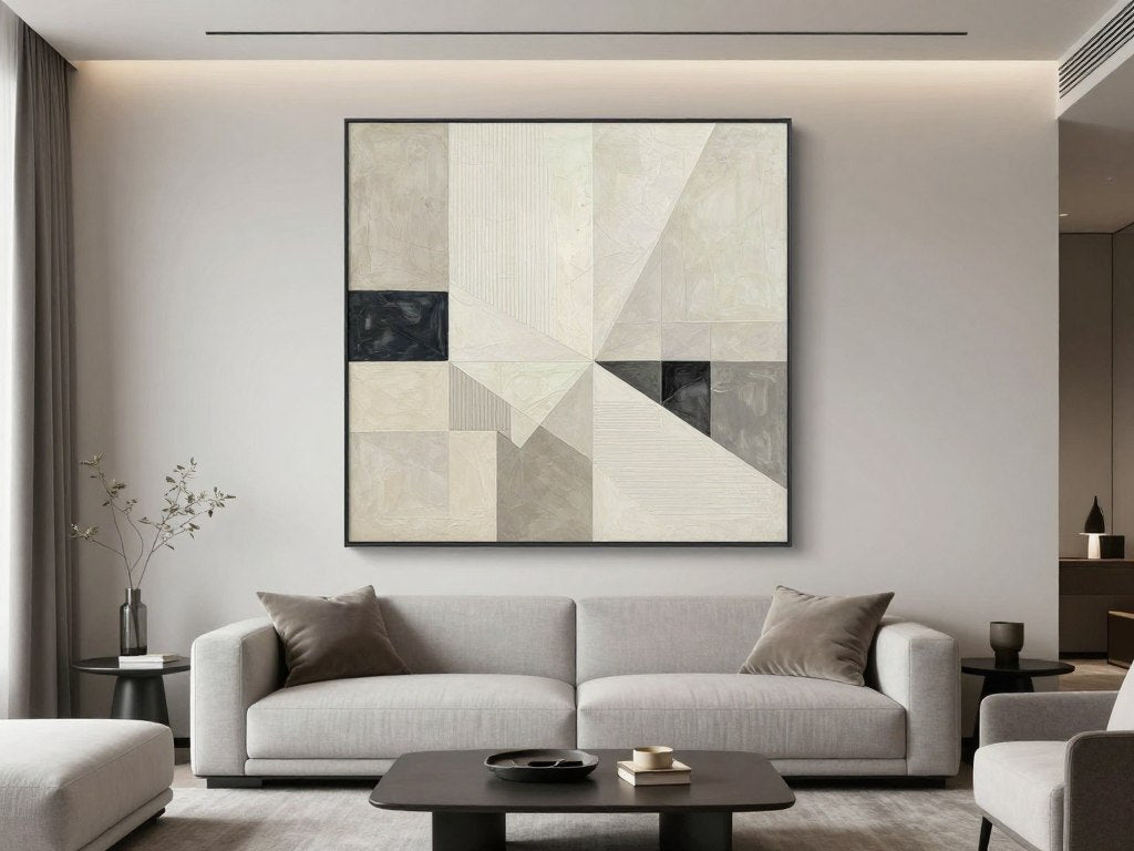
Warm Neutrals (beige/sand/clay)
Warm neutral palettes create spaces that feel welcoming, grounded, and timeless. These earthy tones provide an excellent foundation for both subtle and statement art pieces.

What it feels like: Cozy, inviting, and timeless—warm neutrals create spaces that feel like a gentle embrace.
Best art color strategy: Choose abstract pieces that incorporate your neutral palette while introducing one or two subtle accent colors. Look for art with:
- Beige, sand, and clay as dominant colors
- Soft terracotta, burnt sienna, or amber accents
- Textural elements that add depth without disrupting the calm palette
Best materials/textures to pair: Natural linen, raw wood, handmade ceramics, and textured textiles enhance the organic quality of warm neutral spaces.
Cool Neutrals (stone/grey/taupe)
Cool neutral palettes create sophisticated, calm environments that serve as perfect backdrops for both subtle and bold abstract art.

What it feels like: Sophisticated, calm, and contemporary—cool neutrals create spaces with an air of refined elegance.
Best art color strategy: Introduce warmth through your art to balance the coolness of the palette. Look for pieces with:
- Slate blue or sage green as connecting elements
- Warm accents like rust or ochre to create balance
- High contrast between light and dark elements for visual interest
Best materials/textures to pair: Polished stone, sleek metals, glass, and velvet add dimension to cool neutral spaces without disrupting their calm sophistication.
Monochrome (black/white/charcoal)
Monochromatic palettes create bold, contemporary spaces that can serve as galleries for dramatic abstract art.

What it feels like: Contemporary, bold, and gallery-like—monochromatic spaces create dramatic backdrops for art.
Best art color strategy: Use art to introduce a single bold accent color that becomes the room's signature. Consider:
- Black and white art with one vibrant jewel tone
- Pieces with strong geometric elements or fluid, organic shapes
- High contrast compositions that command attention
Best materials/textures to pair: Leather, chrome, lacquered surfaces, and textured black or white textiles add depth to monochromatic spaces.
Earthy Tones (terracotta/ochre/sienna)
Earthy palettes create warm, organic spaces that connect with nature and provide rich backgrounds for complementary abstract art.
What it feels like: Organic, warm, and grounded—earthy tones create spaces that feel connected to nature.
Best art color strategy: Balance warmth with cool complementary colors. Look for pieces with:
- Teal, navy, or forest green elements to balance the warmth
- Earthy base tones that echo your palette
- Organic shapes and textures that enhance the natural feel
Best materials/textures to pair: Terracotta, woven natural fibers, hammered metals, and raw wood enhance the organic quality of earthy spaces. For a serene approach to earthy palettes, explore our wabi-sabi styling guide.
Discover Our Wabi-Sabi Collection
Embrace the beauty of imperfection with our curated collection of wabi-sabi inspired abstract art—perfect for earthy, organic interiors.
Explore the CollectionJewel Tones (deep blue/emerald/ruby)
Jewel-toned palettes create rich, luxurious environments that pair beautifully with abstract art featuring metallic accents or complementary colors.

What it feels like: Luxurious, rich, and dramatic—jewel tones create spaces with depth and character.
Best art color strategy: Balance intensity with neutral elements and metallic accents. Look for pieces with:
- One jewel tone that matches your palette, complemented by neutrals
- Gold or silver accents that add luminosity
- Rich textures or layered elements that echo the depth of jewel tones
Best materials/textures to pair: Velvet, polished metals, marble, and glass enhance the luxurious quality of jewel-toned spaces.
Coastal Blues (navy + cream + airy whites)
Coastal palettes create serene, expansive spaces that pair beautifully with abstract art featuring fluid movements and natural elements.

What it feels like: Serene, expansive, and refreshing—coastal blues create spaces that feel open and tranquil.
Best art color strategy: Embrace varying intensities of blue complemented by neutral accents. Consider pieces with:
- Multiple blue tones from navy to pale sky
- Sand, soft coral, or cream accents
- Fluid, organic shapes that evoke water and movement
Best materials/textures to pair: Natural linen, bleached wood, rope, and glass enhance the airy quality of coastal spaces.
Glam Metallics (black + gold, blush + gold)
Metallic-accented palettes create dramatic, luxurious spaces that pair beautifully with bold, high-contrast abstract art.
What it feels like: Dramatic, luxurious, and sophisticated—metallic palettes create spaces with undeniable presence.
Best art color strategy: Embrace high contrast and complementary jewel tones. Look for pieces with:
- Bold black and white elements with metallic accents
- Rich complementary colors like burgundy or emerald
- Dynamic compositions that match the drama of the space
Best materials/textures to pair: Polished metals, mirror, lacquer, and plush textiles enhance the glamorous quality of metallic-accented spaces.
Frames, Finishes & Materials (designer polish)
The frame you choose is not merely a border—it's a crucial design element that can either elevate or diminish your art's impact. Professional designers consider frames as the transitional element between art and architecture.

Consider these designer insights when selecting frames:
Frame Finish Selection Guide
- Black frames: Create definition and visual punctuation. They work with any palette and help the eye focus on the art itself. Best for spaces where you want the composition, rather than the color, to be the primary focus.
- White frames: Brighten and expand artwork, creating an airy, gallery-like effect. Ideal for contemporary spaces and art with delicate details or lighter palettes.
- Natural wood frames: Add warmth and organic texture. Oak, walnut, and maple each bring different undertones that should complement your room's wood elements. Perfect for creating cohesion in spaces with visible wood architecture or furniture.
- Metallic frames: Add luminosity and luxury. Gold frames warm artwork and pair beautifully with warm undertones; silver and chrome cool artwork and complement cool undertones. Reserve for pieces you want to elevate as special focal points.
Material Consistency
For a cohesive look, echo your frame material in at least one other element in the room:
- Match black frames with black furniture legs, lighting fixtures, or hardware
- Pair natural wood frames with similar wood tones in furniture or architectural elements
- Coordinate metallic frames with hardware, lighting, or decorative objects of the same finish
Matting Considerations
For works on paper or prints that benefit from matting:
- White or off-white mats create breathing room around vibrant abstract art
- Colored mats should be used sparingly and only when they pick up a subtle tone from the artwork
- The width of the mat should be proportional to both the artwork and the frame
Remember that framing is both functional and aesthetic—it protects your investment while enhancing its visual impact. For a comprehensive collection of framed abstract pieces, explore our canvas print collection.
Gallery Walls: Keeping Color Cohesive
Creating a gallery wall that feels curated rather than chaotic requires thoughtful color coordination. The goal is to create visual connections between diverse pieces while maintaining enough variety to keep the arrangement interesting.

The One-Accent Rule
The simplest way to create cohesion in a gallery wall is to identify one distinctive color that appears in at least 60% of your pieces. This color becomes the visual thread that ties diverse artworks together.
For example:
- A gallery wall with predominantly black and white pieces might use deep blue as the connecting accent
- A collection of abstract landscapes might use a particular shade of green as the common element
- A diverse collection might be unified by a consistent gold or rust accent throughout
Using Black and White as Visual Resets
Black and white pieces function as "visual palate cleansers" in a gallery wall. They create breathing room between more colorful works and prevent the arrangement from becoming visually overwhelming.
Strategic placement tips:
- Place a black and white piece between two colorful works with different palettes
- Use black and white pieces to anchor the corners or edges of your arrangement
- Create rhythm by alternating color and black/white pieces in a deliberate pattern
Frame Consistency
When creating a gallery wall with diverse art styles, consistent framing creates immediate cohesion. Consider these approaches:
- Identical frames: Using the same frame for all pieces creates maximum cohesion (ideal for very diverse art)
- Color-coordinated frames: Using different frame styles in the same color family (all black, all natural wood)
- Intentionally mixed frames: Limiting to 2-3 frame styles/colors that complement each other
For more detailed guidance on creating stunning gallery walls, explore our mix and match art prints guide.
Create Your Perfect Gallery Wall
Browse our curated sets of complementary canvas prints designed to work together in gallery arrangements.
Shop Canvas SetsCommon Mistakes (and quick fixes)
Even experienced decorators occasionally make these common color pairing mistakes. Fortunately, each has a straightforward solution that can transform your space without requiring a complete redesign.

Too Matchy-Matchy
The problem: Selecting art that perfectly matches your furniture or walls can create a flat, uninspired look that lacks visual tension.
The fix: Maintain your color family but introduce variation in:
- Intensity (pair muted room colors with more saturated versions in your art)
- Value (if your room is primarily light, include some darker elements in your art)
- Temperature (add slightly warmer or cooler variations of your dominant color)
Too Many Accents
The problem: Art with too many bold colors can compete with your space rather than enhance it, creating visual chaos.
The fix: Simplify by:
- Choosing art with a more limited palette (2-3 main colors)
- Selecting pieces where bold colors appear in smaller proportions
- Using larger areas of neutral space within the composition to balance vibrant elements
Wrong Undertone Clash
The problem: Art with cool undertones in a warm-toned room (or vice versa) can create an uncomfortable visual disconnect.
The fix: Create intentional bridges by:
- Adding transitional elements that contain both warm and cool tones
- Selecting art with primarily compatible undertones plus small accents of the opposite
- Using frames that match your room's undertone to help integrate art with contrasting undertones
Glare + Lighting Issues
The problem: Poor lighting or reflective glass can obscure colors and details in your art, diminishing its impact.
The fix: Optimize visibility by:
- Using museum glass or non-glare acrylic for framed pieces in bright rooms
- Installing adjustable picture lights or track lighting specifically for your art
- Repositioning art away from direct light sources or windows that cause glare
- Considering canvas prints which eliminate glass-related glare issues entirely
For rooms with challenging lighting conditions, explore our high-contrast abstract pieces that maintain visual impact even in variable light.
Designer Checklist (7 steps)
Follow this streamlined process to achieve professional-quality results when pairing abstract art with your color palette. This checklist distills the essential steps into a quick, actionable plan you can complete in just 10 minutes.

-
Identify your room's dominant color and undertone
Take a photo of your space in natural light. What color occupies the most visual space? Is it warm, cool, or neutral? -
Determine your desired contrast level
Decide whether you want your art to blend harmoniously or create a bold focal point. For subtle integration, stay within your palette. For drama, look to complementary colors. -
Select your anchor color
Choose one distinctive color from your art that you'll repeat in small doses throughout your space (in accessories, textiles, or other decor elements). -
Choose your frame finish
Select a frame that either complements your furniture finishes or intentionally contrasts with them. Ensure the frame enhances rather than competes with the artwork. -
Test the lighting effect
Before final placement, hold your art in its intended location at different times of day. Note how natural and artificial light affect the colors and visibility. -
Create balance with accessories
Add 2-3 small accessories in your anchor color within the same visual field as your artwork to create cohesion and intentionality. -
Step back and assess
View your space from different angles and distances. The art should feel connected to your palette while adding visual interest and depth.
Frequently Asked Questions
Should abstract art match my room's color scheme exactly?
No, exact matching often creates a flat, uninspired look. Instead, aim for art that either:
- Contains some colors from your palette but introduces new complementary elements
- Features similar colors but in different intensities or values
- Creates intentional contrast through complementary colors
The goal is harmony and conversation between your art and space, not perfect uniformity.
How do I choose art for a room with multiple color schemes?
For open-concept spaces or rooms with distinct color zones:
- Look for abstract art that incorporates elements from each zone's palette
- Choose pieces with neutral backgrounds and accents that reference your various color schemes
- Consider using the art as a transitional element that helps blend from one color zone to another
Alternatively, select art for each distinct area that works specifically with that zone's palette.
What size abstract art works best for different rooms?
Size guidelines for maximum impact:
- Living rooms: Large pieces (36"+ on the longest side) or grouped arrangements for substantial walls
- Dining rooms: Medium to large pieces that can be appreciated from across the table
- Bedrooms: Medium pieces above the bed (approximately 2/3 the width of the headboard)
- Hallways: Series of smaller pieces or vertical compositions that draw the eye forward
Always consider the wall's dimensions—art should occupy approximately 2/3 to 3/4 of the available wall space for proper proportion.
How do I pair abstract art with patterned furniture or wallpaper?
When working with patterns:
- Match the scale—large, bold patterns pair well with simpler, more graphic abstract art
- Small, intricate patterns work better with abstract art that has more negative space
- Pull one or two colors from your pattern to feature in your art selection
- Consider black and white or monochromatic abstract art as a visual rest from busy patterns
The key is creating balance—if your patterns are busy, your art should be simpler, and vice versa.
Can I mix different abstract styles in the same room?
Yes, with these guidelines:
- Maintain color cohesion across different styles
- Create visual connections through similar framing
- Vary the scale and composition for interest
- Group by style in distinct areas rather than randomly mixing
For example, geometric abstracts can work beautifully with fluid, organic abstracts if they share a common color palette or are framed similarly.
How do I incorporate trendy colors in abstract art without dating my space?
To stay current while maintaining longevity:
- Use trendy colors in smaller proportions within the artwork
- Select pieces where trend colors are balanced by timeless neutrals
- Choose abstract compositions that focus on form and texture rather than solely on color
- Consider trendy colors in easily changeable accessories rather than investment art pieces
Remember that truly good abstract art transcends trends through compositional strength and emotional resonance.
What lighting is best for showcasing abstract art colors?
Optimal lighting considerations:
- Color temperature: 2700K-3000K (warm white) enhances warm colors; 3500K-4000K (cool white) enhances blues and greens
- CRI (Color Rendering Index): Choose bulbs with 90+ CRI for true color representation
- Positioning: Aim light at a 30° angle to minimize glare
- Types: Adjustable track lighting, picture lights, or wall washers provide ideal illumination
Avoid direct sunlight on valuable pieces, as UV exposure can cause fading over time.
How do I use abstract art to correct color imbalances in my room?
Strategic art selection can address common room issues:
- Too cool: Choose art with warm accents (reds, oranges, golds) to add balance
- Too warm: Introduce art with cool elements (blues, greens, purples) to create refreshing contrast
- Too neutral: Select art with vibrant color pops to energize the space
- Too colorful: Use art with substantial neutral areas to create visual rest
The right abstract piece can function as color therapy for rooms that feel slightly off-balance.
Creating Your Personal Color Story
The most successful spaces tell a color story that feels both intentional and personal. When abstract art and your palette work in harmony, the result transcends mere decoration—it creates an environment that resonates emotionally and visually.
Remember that there are no absolute rules in color pairing, only principles that guide us toward harmony. The perfect abstract piece for your space is one that speaks to you personally while respecting the color conversation already happening in your room.
As you apply the frameworks and insights from this guide, trust your eye and your instincts. The goal isn't perfection but intention—creating spaces where every element, including your abstract art, feels purposefully chosen rather than randomly placed.
Rossetti Art offers a curated collection of abstract pieces designed to complement a wide range of color palettes and interior styles. From subtle neutrals to bold statements, each piece is created to serve as both a focal point and a harmonious element within your unique space.
Discover the Perfect Piece for Your Palette
Browse our collection of contemporary abstract art, thoughtfully created to enhance modern interiors.
Explore Canvas Prints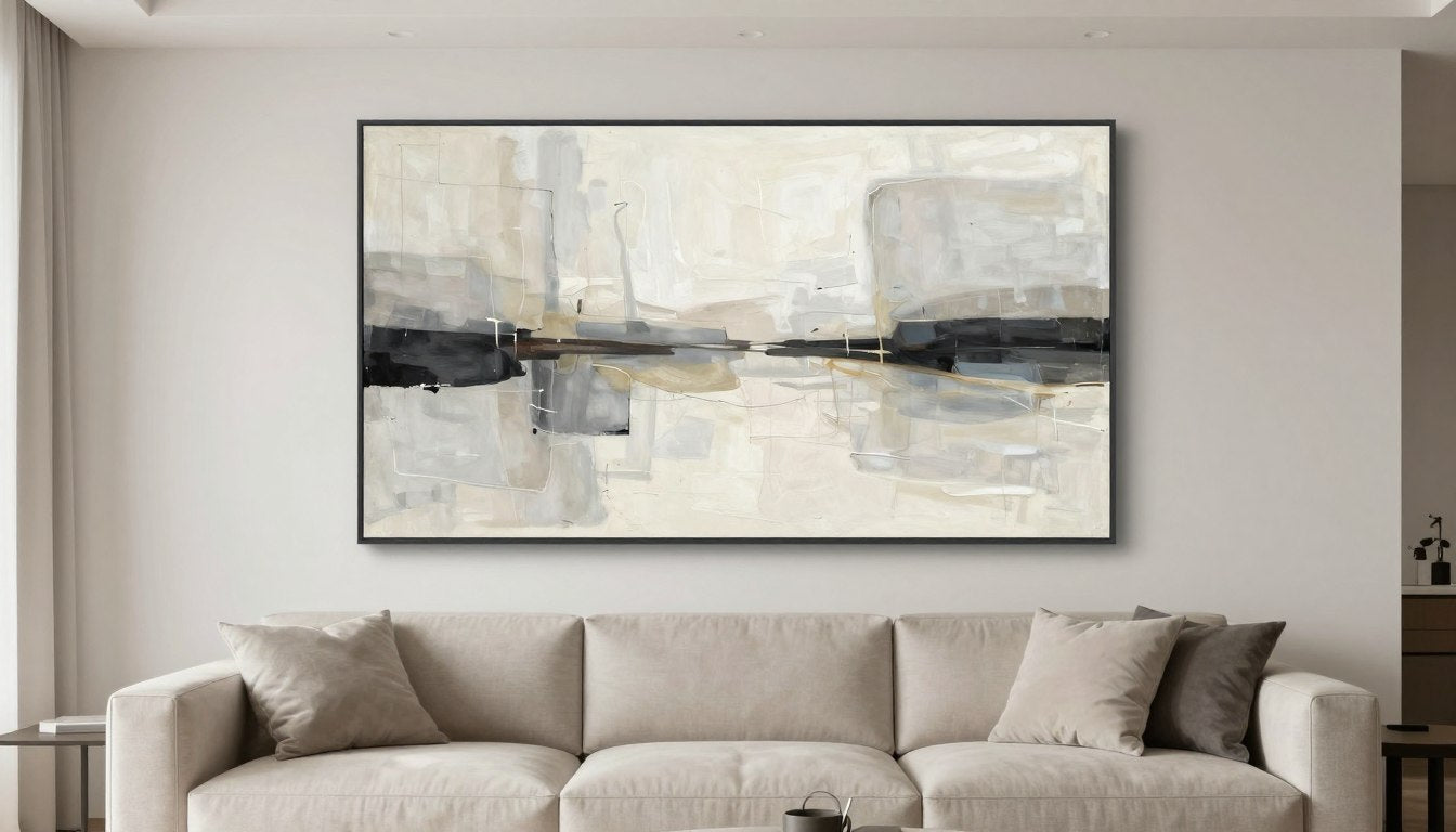
Leave a comment
This site is protected by hCaptcha and the hCaptcha Privacy Policy and Terms of Service apply.