
The difference between a room that feels complete and one that's missing something often comes down to the wall art. Modern abstract wall art, with its expressive forms and versatile aesthetic, has become a designer favorite for transforming spaces. But knowing exactly how to style it—where to place it, what size to choose, and how to make it feel intentional rather than random—requires understanding the framework professional designers use.
In this comprehensive guide, we'll reveal the exact rules interior designers follow when styling abstract art in any room. You'll learn the proper scale, ideal height, and placement strategies that make abstract art look expensive and intentional. Whether you're decorating a living room, bedroom, or narrow hallway, these principles will help you style modern abstract wall art with designer-level confidence.
Quick Answers (Designer TL;DR)
- Ideal Width Rule: Choose art that's 2/3 to 3/4 the width of the furniture it hangs above (sofa, bed, console)
- Ideal Height: Center your art at eye level (57-60 inches from the floor to the center of the piece)
- Gallery Wall Spacing: Maintain 2-3 inches between frames for visual breathing room
- Living Room: Large statement piece or triptych above sofa; 8-10 inches above furniture
- Bedroom: Serene, horizontal pieces above headboard; 6-8 inches above furniture
- Dining Room: Bold, conversation-starting piece at seated eye level
- Hallway/Entry: Vertical pieces or gallery wall with consistent framing
- Office: Calming, focused pieces that enhance concentration
The Designer Framework: 4 Rules That Make Abstract Art Look Expensive

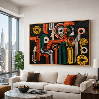
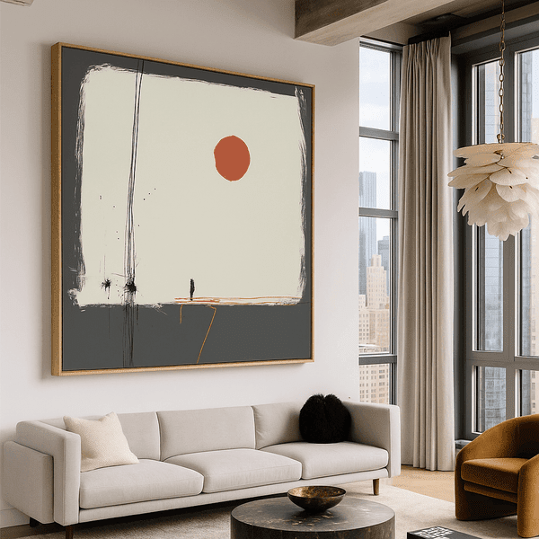
Perfect scale: This abstract piece demonstrates the 2/3 rule, creating visual balance above the sofa
Rule 1 — Scale (the "2/3" shortcut)
The most common mistake in styling abstract wall art is choosing pieces that are too small for the space. Professional designers follow the "2/3 rule" – selecting art that spans approximately two-thirds to three-quarters of the width of the furniture it hangs above. This proportion creates visual balance and prevents the art from looking like an afterthought.
For example, if your sofa is 84 inches wide, your ideal art piece (or combined width of a gallery arrangement) should be around 56-63 inches. This 2/3 rule for wall art applies to beds, consoles, sideboards, and any furniture piece you're hanging art above.
Rule 2 — Palette (repeat 1–2 tones)
Abstract art works best when it connects with your existing color palette. Designers recommend choosing pieces that pull 1-2 colors from your room's existing scheme. This creates a cohesive look without being overly matched. The art should complement your space, not compete with it.
For neutral rooms, abstract art can introduce a controlled pop of color. In colorful spaces, consider abstract pieces that incorporate your accent colors while adding new visual texture. This balanced approach ensures your abstract art enhances the room rather than overwhelming it.

Notice how the negative space around this geometric piece enhances its visual impact
Rule 3 — Negative space + breathing room
Designers understand that what surrounds art is just as important as the art itself. Negative space – the empty area around your abstract piece – creates visual breathing room that allows the art to make its statement. Avoid cluttering walls with too many pieces or placing art too close to architectural elements like windows or doorways.
For single pieces, allow at least 6-8 inches of wall space on all sides. For gallery arrangements, maintain consistent spacing between pieces (typically 2-3 inches) to create a cohesive grouping that reads as a single visual unit. This gallery wall spacing approach creates a polished, curated look.
Rule 4 — Texture + material (canvas vs original vs sculpture)
The physical qualities of your abstract art contribute significantly to its impact. Designers strategically choose between different mediums based on the room's purpose and existing textures:
- Canvas prints offer clean, contemporary appeal with a slight texture that works in most modern spaces
- Original paintings with visible brushstrokes and textural elements add depth and tactile interest
- 3D sculptures or textured wall art create dramatic focal points and cast interesting shadows
Consider textured wall art for spaces that feel flat or need dimensional interest. In rooms with many existing textures, simpler canvas prints may provide better balance. The key is creating contrast while maintaining harmony with your overall interior.
The Wall Art Placement Guide (Room-by-Room)
| Room | Best Placement | Ideal Width Rule | Ideal Center Height | Gap Above Furniture | Best Art Type | Designer Tip |
| Living Room | Above sofa/mantel | 2/3-3/4 of sofa width | 57-60" from floor | 8-10" | Large canvas or triptych | Scale matters most here - go bigger than you think |
| Bedroom | Above headboard | 2/3 of headboard width | 10-12" above headboard | 6-8" | Horizontal canvas, serene palette | Choose calming abstracts with gentle movement |
| Dining Room | Above sideboard/buffet | 2/3-3/4 of furniture width | Seated eye level | 8-10" | Bold statement piece | Choose conversation-starting pieces with energy |
| Entry/Hallway | Center of wall | 2/3 of available wall width | 60" from floor | 8" above console | Vertical canvas or gallery | Use art to create depth in narrow spaces |
| Office | Opposite desk/Behind desk | 2/3 of desk width | Seated eye level | 8-10" | Focused, minimal abstract | Choose pieces that enhance concentration |
| Open-Plan Space | Zone dividers | Proportional to zone size | 57-60" from floor | 8-10" | Cohesive series or large statement | Use art to visually define different areas |
Living Room (above sofa / mantel)
The living room typically features your most significant abstract art investment. For above-sofa placement, center the piece with 8-10 inches of space between the bottom of the frame and the top of the sofa. The art should be approximately 2/3 the width of the sofa to create proper scale.
For fireplace mantels, choose a piece that's slightly narrower than the mantel width and position it 4-6 inches above. Abstract art with movement works particularly well in living spaces, creating visual energy in conversation areas.

A black and white abstract triptych creates sophisticated impact in this airy living space
Bedroom (above headboard / beside bed)
Bedrooms call for abstract art that promotes relaxation. Position art above the headboard with the bottom edge 6-8 inches above the furniture. For pieces beside the bed, align the center at seated eye level (approximately 42-45 inches from the floor).
Choose abstract pieces with soothing color palettes and gentle movement rather than high-contrast or energetic compositions. Horizontal formats typically work best above beds, while vertical pieces are ideal for narrow walls beside nightstands.
Dining Room (sideboard + statement piece)
Dining rooms offer an opportunity for more dramatic abstract art that sparks conversation. Position statement pieces above sideboards or buffets with the center at seated eye level. Since dining is a social activity, bold abstract pieces with rich colors or interesting textures work particularly well.
For dining rooms with round tables, consider circular or organic abstract forms to echo the table shape. This creates visual harmony while maintaining the dynamic energy that makes dining spaces engaging.

A vibrant abstract statement piece transforms this dining area into a conversation starter
Entry + Hallway (narrow spaces)
Entries and hallways benefit from abstract art that creates depth and visual interest in typically narrow spaces. Vertical compositions work well here, drawing the eye upward to create the illusion of height. For narrow hallways, consider a series of smaller abstract pieces that create rhythm and movement.
In entryways, choose abstract art that sets the tone for your home's overall aesthetic. This first impression piece should hint at the design language used throughout your interior while making a confident statement.
Office (focus + calm)
Home offices require abstract art that enhances concentration rather than distracting from it. Position pieces opposite your desk where you can glance up occasionally for visual relief. Geometric abstract art with structured compositions often works well in workspaces, providing visual interest without overwhelming energy.
Consider abstract pieces in blues, greens, or neutral tones that promote focus and calm. Avoid overly stimulating compositions with jarring contrasts or frenetic movement that might disrupt concentration.
Open-plan spaces (how to "zone" with art)
In open-plan living areas, abstract art helps define different functional zones without physical barriers. Use larger pieces to anchor specific areas like dining or conversation spaces. While maintaining a cohesive style throughout, subtle variations in abstract art can signal transitions between zones.
Consider using a consistent color palette across different abstract pieces to maintain flow while varying the scale and composition to distinguish between areas. This creates visual boundaries while preserving the openness that makes these spaces appealing.
Gallery Wall Styling (So It Looks Curated, Not Cluttered)

A well-executed gallery wall maintains consistent spacing while mixing orientations
Spacing rule + layout planning on the floor
Professional designers follow a consistent spacing rule for gallery walls: maintain 2-3 inches between frames. This creates visual connection while providing enough separation for each piece to breathe. Before hanging, arrange your entire gallery layout on the floor or use paper templates on the wall to visualize the final composition.
Start with your largest or most impactful abstract piece as an anchor, typically positioned slightly off-center. Build outward from this focal point, maintaining balanced visual weight throughout the arrangement. This gallery wall planning approach ensures a cohesive, intentional look.
Mixing orientations + anchor pieces
Effective gallery walls combine both horizontal and vertical abstract pieces to create visual interest. Use larger pieces as anchors to ground the composition, then fill in with smaller works. While variety adds interest, maintain some consistency in subject matter or style across your abstract collection.
For a contemporary look, consider an asymmetrical arrangement that still maintains overall balance. This creates a more dynamic, collected-over-time feeling that showcases your abstract art as a curated collection rather than a matching set.
Frames and consistency
Frame selection significantly impacts how your abstract gallery wall reads visually. Designers typically recommend one of two approaches:
- Unified framing: Using identical frames creates cohesion when displaying diverse abstract styles
- Curated variety: Using 2-3 complementary frame styles (like black, white, and natural wood) adds interest while maintaining harmony
For most contemporary interiors, thin frames with clean lines complement modern abstract art without competing for attention. Consider how your frame choice either highlights or contrasts with your abstract pieces – black frames can make colorful abstracts pop, while white frames create a lighter, more spacious feeling.
Choosing the Right Piece: Canvas Print vs Original Painting vs Sculpture
An original textured painting adds tactile dimension to this minimal space
When canvas prints are the smartest choice
High-quality canvas prints offer exceptional versatility and value for many interior applications. They're ideal for:
- Larger spaces where original art might be cost-prohibitive
- Rooms with changing light conditions (UV-resistant inks prevent fading)
- Creating cohesive multi-piece displays or gallery walls
- Achieving a clean, contemporary aesthetic with minimal maintenance
Look for canvas prints with gallery-wrapped edges and proper stretching for a professional appearance. Abstract and geometric canvas prints work particularly well in modern interiors, offering bold visual impact without overwhelming the space.
When originals change the whole room
Original abstract paintings create unmatched presence and become the gravitational center of a room. They're worth the investment when:
- You need a true focal point that commands attention
- The space feels flat and needs textural dimension
- You're creating a collector's atmosphere with artistic significance
- The room serves as a showcase for entertaining or important gatherings
Original abstracts with textural elements catch light differently throughout the day, creating a living quality that changes with viewing angle and lighting conditions. This dynamic quality makes them particularly effective in spaces where you spend significant time.
How to use a sculpture like a "3D focal point"
Modern sculptures and three-dimensional wall art create dramatic focal points that extend beyond the flat plane of the wall. Consider these pieces when:
- You want to create unexpected visual interest
- The room has dramatic directional lighting that will cast interesting shadows
- You're working with a minimalist interior that needs a statement element
- You want to break up large expanses of wall without using multiple pieces
Position sculptural elements where they can be viewed from multiple angles, allowing their three-dimensional qualities to be fully appreciated. Consider how lighting interacts with the piece throughout the day to maximize its impact.

A sculptural wall piece creates dramatic dimension and casts intriguing shadows
Common Mistakes (And the Quick Fixes Designers Use)
Mistake: Hanging Art Too High
One of the most common errors is positioning abstract art too high on the wall, creating a disconnected feeling. This typically happens when hanging art based on standing height rather than viewing position.
Designer Fix: Center your art at eye level, approximately 57-60 inches from the floor to the center of the piece. When hanging above furniture, position the bottom edge 8-10 inches above the furniture surface.
Mistake: Choosing Art That's Too Small
Undersized art looks like an afterthought and fails to make the impact that abstract pieces should deliver. This is especially problematic above larger furniture pieces like sofas.
Designer Fix: Follow the 2/3 rule for proper scale. For a standard 84-inch sofa, your art should be approximately 56-63 inches wide (either as a single piece or combined gallery arrangement).
Mistake: Improper Lighting
Abstract art with textural elements or metallic accents needs proper lighting to reveal its full dimensional quality. Poor lighting creates glare or fails to highlight the piece effectively.
Designer Fix: Position adjustable lighting 30-36 inches from the wall at a 30-degree angle to illuminate art without creating glare. Consider picture lights for important pieces or art-specific LED lighting.
Mistake: Ignoring the Room's Purpose
Selecting abstract art without considering the room's function can create visual discord. Energetic, high-contrast pieces might work in social spaces but disrupt relaxation in bedrooms.
Designer Fix: Match the energy of your abstract art to the room's purpose – calming, horizontal pieces for bedrooms; more dynamic compositions for living and dining areas; focused, structured abstracts for workspaces.
Shop the Look (Curated Abstract Art Selections)
Minimalist Abstract
Clean lines and subtle movement make minimalist abstracts perfect for contemporary spaces seeking calm sophistication.
Geometric Abstract
Structured geometric compositions bring order and visual rhythm to spaces while maintaining contemporary appeal.
Statement Abstract
Bold, colorful abstracts create instant focal points and set the tone for spaces that embrace expressive energy.
Designer Styling Checklist
- Pick a palette (repeat 1–2 tones from your room)
- Choose scale (follow the 2/3 rule)
- Set height (center at 57-60 inches from floor)
- Add texture (include at least one tactile element)
- Control spacing (maintain consistent gallery wall breathing room)
- Light it properly (position lighting to avoid glare)
Ready to transform your space with perfectly styled abstract art? Explore Rossetti Art's curated collection of canvas prints, original paintings, and modern sculptures designed to elevate any interior.
Browse Abstract Art CollectionFAQ
How high should I hang abstract wall art in a living room?
In living rooms, hang abstract wall art so the center of the piece is at eye level, approximately 57-60 inches from the floor. When hanging above furniture like a sofa, position the bottom edge of the frame 8-10 inches above the furniture surface. This creates proper visual connection between the art and furniture while maintaining an accessible viewing height. For larger or taller pieces, you may need to adjust slightly lower to maintain proper balance.
What is the 2/3 rule for wall art, and does it work for gallery walls?
The 2/3 rule states that your wall art should be approximately two-thirds to three-quarters the width of the furniture it hangs above. For example, if your sofa is 84 inches wide, your ideal art width would be around 56-63 inches. For gallery walls, this rule applies to the entire arrangement as a visual unit – the combined width of your gallery should follow the 2/3 rule relative to the furniture below. This creates proper scale and prevents the common mistake of choosing art that's too small for the space.
How much space should be between frames in a modern gallery wall?
For modern gallery walls featuring abstract art, maintain consistent spacing of 2-3 inches between frames. This provides enough separation for each piece to be appreciated individually while creating a cohesive visual grouping. Consistent spacing is more important than the exact measurement – whether you choose 2, 2.5, or 3 inches, keep that same spacing throughout the entire arrangement. For more minimal, contemporary looks, slightly wider spacing (3-4 inches) can create a more expansive, curated feel.
Should I choose a triptych or one large canvas above a sofa?
Both options can work beautifully when properly scaled. Choose a triptych (three-panel artwork) when you want to create horizontal movement across the wall or when you have a particularly wide sofa that would require an exceptionally large single canvas. A triptych set also works well in contemporary spaces with clean lines. Choose one large canvas when you want maximum impact from a single statement piece or when your abstract art features a composition that would be disrupted by panel divisions. The key factor is proper scale – either option should follow the 2/3 rule relative to your sofa width.
How do I match abstract wall art to my color palette without making it "too matchy"?
To create cohesion without being overly matched, select abstract art that incorporates 1-2 colors from your existing palette while introducing complementary hues. For example, if your room features navy and gray, choose an abstract piece that includes these colors but also introduces related tones like teal or silver. Another approach is selecting abstract art in a neutral palette with just small accents of your room's color. The goal is connection, not exact matching – your art should complement the space while maintaining its own visual interest and integrity.
Canvas print vs original painting: what looks more "designer"?
Both options can achieve a designer look when properly selected and placed. Original paintings offer unique textural qualities, one-of-a-kind status, and often greater depth that catches light in distinctive ways. They're ideal for key focal points or special rooms. High-quality canvas prints offer exceptional versatility, consistent coloration, and the ability to achieve significant scale at accessible price points. Many designers use a mix of both – original paintings for primary focal points and quality canvas prints for secondary spaces or gallery arrangements. The "designer look" comes more from proper scale, thoughtful placement, and quality framing than from the medium itself.
What size wall art works best for narrow hallways or entryways?
For narrow hallways and entryways, vertical compositions work best, typically in a 2:3 or 1:2 ratio (width to height). For standard hallways (3-4 feet wide), abstract pieces around 16-24 inches wide and 24-36 inches tall create proper scale without overwhelming the space. Consider a series of smaller coordinating pieces (16x20 inches) spaced 4-6 inches apart to create rhythm and movement down a long hallway. For entryways, a slightly larger statement piece (24-30 inches wide) can create an impactful first impression. In both spaces, avoid pieces that protrude significantly from the wall to maintain proper clearance.
How do I light wall art to avoid glare?
To properly light abstract wall art without creating glare, position adjustable lighting at a 30-degree angle from the wall, approximately 30-36 inches away from the art surface. For framed pieces under glass, use diffused lighting rather than direct spotlights to minimize reflection. LED picture lights mounted above the frame provide even illumination for important pieces. For textured original paintings or three-dimensional art, directional lighting from slightly off-center creates interesting shadows that highlight the dimensional qualities. Always use warm-toned lighting (2700-3000K) rather than cool white, which can distort colors and create a clinical feeling.
Leave a comment
This site is protected by hCaptcha and the hCaptcha Privacy Policy and Terms of Service apply.