Can a single bold piece change how your living space feels — without overwhelming it?
This quick guide will help you choose the right wall art size, hang at a comfortable eye line, and plan placements that transform space without guesswork in your home.
We’ll flag the essential numbers you’ll use: center the piece at 140–150 cm from the floor, fill about 60–75% of a blank wall, keep 15–20 cm above sofas or consoles, and space frames 5–15 cm for a neat gallery wall. If you hang two or more pieces, treat them as one unit and find the group center.
This Australian-friendly guide mixes metric and inches, compares canvas paintings with prints, and previews room-by-room tips for living areas, bedrooms, entries, and hallways. Beginners get simple mockups and tools for plasterboard, brick, or concrete walls so you can plan before you drill.

Key Takeaways
- Center artwork at 140–150 cm from the floor for a natural eye line.
- Fill 60–75% of open wall space to keep proportions pleasing.
- Leave 15–20 cm above furniture and 5–15 cm between gallery frames.
- Treat grouped pieces as a single unit to find the visual center.
- Use mockups and local hanging techniques for plasterboard, brick, or concrete.
- Mix metric and inches for easy measurement of Australian products.
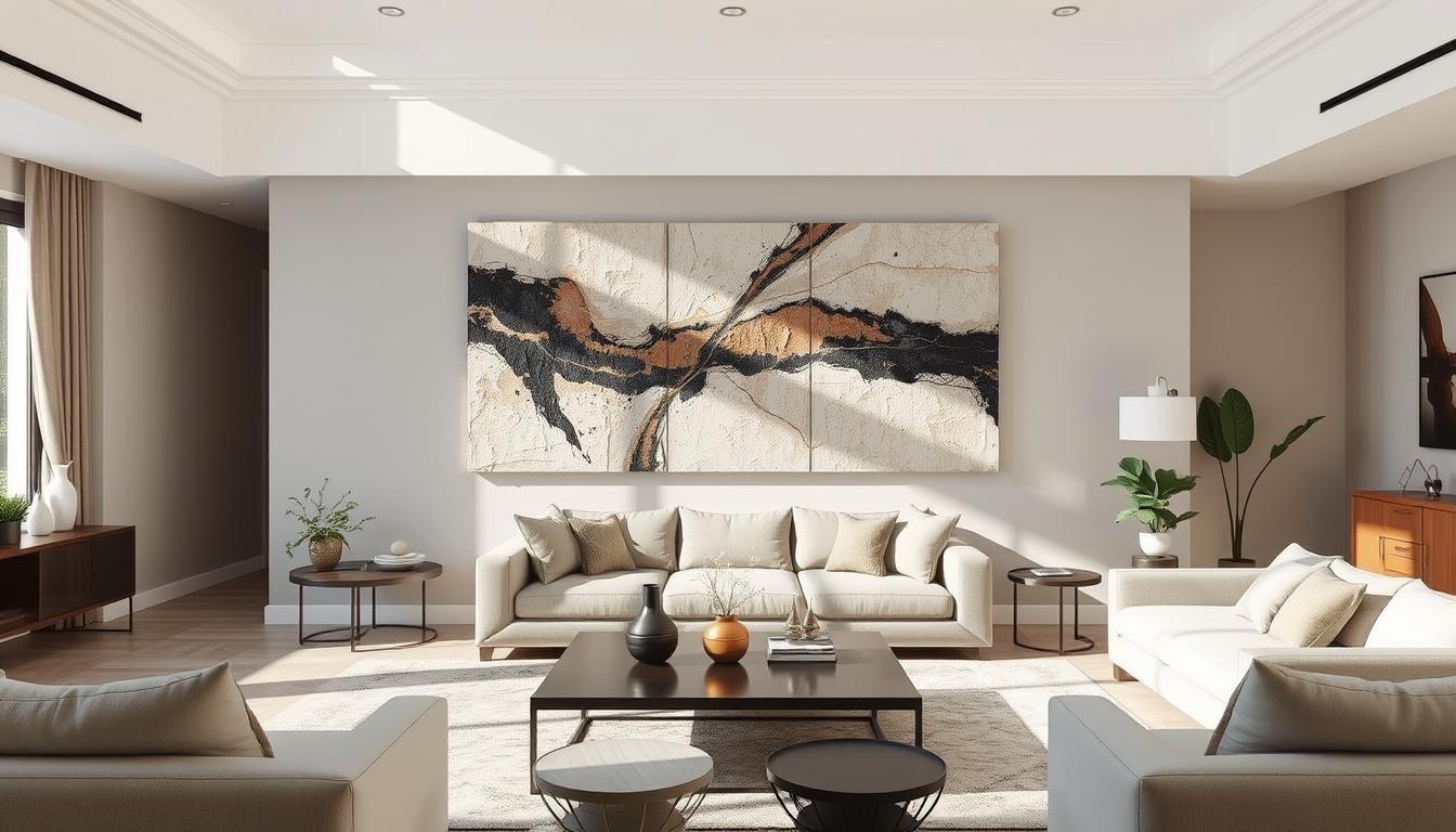
Why Large Textured Wall Art Transforms a Room Without Overwhelming It
Textured canvases bring a new sense of depth that changes how a living area feels without stealing attention.
Visible brushstrokes and layered paint create shadow and relief that catch the eye. This natural play of light gives a wall a sculptural quality and a clear focal point.
Proportion matters more than sheer size. A piece that sits comfortably over a sofa or spans the right portion of a wall reads calm and composed. When the width matches furniture, the whole space feels intentional.
Test the look first with paper templates or a phone mockup. Trial layouts reduce stress and avoid needless holes in plasterboard, brick, or concrete.
- Material adds mood: hand-painted canvases enrich light and depth compared with flat prints.
- Think of big pieces as anchors that simplify styling — fewer small prints needed.
- Leave breathing space around the work so it reads refined and not overpowering.
| Benefit | Why it helps | Quick tip |
|---|---|---|
| Depth & Presence | Layered paint throws subtle shadows that draw the eye | Position where natural light enhances texture |
| Proportion | Fits furniture width to create composure | Use templates to test scale before hanging |
| Styling Simplified | A single statement reduces the need for many prints | Pick colors that echo cushions or rugs |
Measure First: Size, Scale, and Proportion Rules That Always Work
A confident size choice begins with simple math: measure, calculate 60–75%, then compare to standard canvases.
For blank walls, aim to fill about 60–75% of the open span. For example, a 4 m-wide wall gives roughly 2.4–3.0 m of visual width to cover. If the ceiling is 3 m high, 1.8–2.25 m vertical coverage keeps proportions balanced.
Over furniture, use the half-to-two-thirds rule: artwork should be about 1/2 to 2/3 the width of the piece below. A 7 ft (84 in) sofa suits art about 42–63 in wide, with a 15–20 cm (6–8 in) gap above the furniture top.
Common sizes and mixing units
Match in-room measurements in centimeters, then check inch-based product listings. Popular horizontal canvases include 36" x 24" (91 x 61 cm) and 48" x 36" (122 x 91 cm). Verticals like 24" x 36" (61 x 91 cm) and squares such as 36" x 36" (91 x 91 cm) are easy to source.
- Measure the full wall span and multiply by 0.6–0.75 to find target width.
- Plan grouped pieces so the total width follows the same 1/2–2/3 rule above furniture.
- Use a tape on the wall to preview size and confirm no switches or vents conflict with hanging.
| Common Shape | Inches | Centimeters |
|---|---|---|
| Horizontal | 36" x 24" | 91 x 61 cm |
| Square | 36" x 36" | 91 x 91 cm |
Eye Level and Hanging Height: The Sweet Spot for Comfortable Viewing
Find the ideal hanging height so your artwork greets viewers at a natural eye line.
As a universal starting point, centre the artwork at 140–150 cm (55–59 in) from the floor. This height suits most households and keeps the look consistent across walls.
To find the centre, measure the piece (or group) and mark the midpoint. Then transfer that mark to the wall and allow for the hanging hardware. Use a tape marked in both inches and centimetres for clarity.
"Treat grouped pieces as a single unit: find the cluster’s centre so the whole set hangs at the same comfortable height."
Practical tweaks
- Lower the centre slightly over mantels or consoles so the composition ties to furniture.
- For low ceilings, place art in the lower third quadrant to avoid crowding the ceiling.
- Do a sitting-test in living areas — seated eye should still align comfortably with the centre.
- Use a level to draw a faint centre line across textured walls before final fixing.
| Scenario | Suggested centre height | Quick tip |
|---|---|---|
| Standard room | 140–150 cm | Use tape for a mockup |
| Over mantel/console | 140 cm or slightly lower | Keep 15–20 cm above furniture top |
| Gallery cluster | Centre of group at 140–150 cm | Measure whole group as one unit |
Art Placement on Blank Walls: Creating a Confident Focal Point
A blank expanse can become the strongest design move in your home with a clear plan.
A single large piece that fills about 60–75% of the available span becomes a true focal point. For a 4 m wall aim for roughly 2.4–3.0 m of coverage. A canvas near 250 x 200 cm suits very wide walls when you want a single statement.
Grouped pieces work the same way: design the total width and height so the cluster hits the same coverage range. Keep gaps of 5–15 cm between frames so the layout reads cohesive, whether grid or organic.
Single vs grouped works
Choose one large piece for a clean, minimal look that ties a space together quickly. Pick multiple prints when you want storytelling, varied texture, or a layered gallery wall feel.
For low ceilings under 8 ft, hang work in the lower third from the top to keep proportions human-scaled. Always test with paper templates on the wall to compare a big canvas against a multi-piece plan.
Above Sofas, Beds, and Consoles: Get the Gap and Width Right
A neat gap and the right width make a piece feel anchored to your sofa or console.
Keep a clean 15–20 cm (6–8 in) gap above sofas, beds, and consoles so the artwork connects with furniture without seeming to rest on it.
Perfect spacing and sizing
Size the work at about 1/2 to 2/3 of the furniture width. For an 84 in sofa, aim for roughly 42–63 in total span.
For grouped pieces, plan the total width the same way so the set reads as a single visual unit.
Centering, alignment, and frames
Center the composition to the furniture, not always to the whole wall. This keeps the vignette intentional in the room.
- Echo finishes: match frames to metal or timber tones in nearby furniture, handles, or lamps for cohesive style.
- Keep gaps consistent between prints so the cluster feels balanced.
Two- and three-piece arrangements
Treat multiple pieces as one unit: align the group centre with the furniture centre. Maintain even spacing so the set reads like a single piece.
"While seated, the centre of the artwork should sit comfortably at eye level to avoid a neck tilt."
Use painter’s tape to mark frame edges on the wall. Also confirm switches and outlets won’t clash with your layout before you drill.
Hanging Artwork Over Fireplaces: Scale, Symmetry, and Visual Calm
Above a hearth, the right piece can steady a whole living area with calm proportion and a clear focal point.
Size the artwork to the fireplace opening for a reliable proportion that avoids crowding the mantel edges. This rule works even when the mantel is wider or trimmed with moulding.
Lower the centre a touch below standard eye height so the composition ties to the mantel and does not seem to float. Centre precisely for symmetry, or balance a single canvas with matching sconces to keep a calm, architectural rhythm.
- Keep it simple: one strong artwork usually outperforms many small pieces above a hearth.
- Confirm the wall type behind the chimney breast and use correct anchors for brick, plasterboard, or masonry.
- Choose non‑glare glazing or a matte canvas to reduce reflections from flames and windows.
- Align the artwork with seating so the fireplace remains the natural focal point of the room.
- If the surround is bold, pick quieter prints or paintings; if the surround is plain, a textured canvas can add depth.

"Fit the piece to the opening, not the mantel width — it’s the simplest way to get the look right."
Room-by-Room Art Placement: Living Rooms, Bedrooms, Hallways, and More
Place pieces so each space feels purposeful — whether you pick one bold canvas or a curated cluster.
Living room
In the living room you can anchor seating with a single striking work or build a gallery wall to tell a story. A single statement ties the furniture together and simplifies styling.
When you choose a gallery, treat the group as one unit. Keep gaps consistent so the layout feels intentional and guides flow through the space.
Bedroom
For calm, aim for symmetry above the bed. Pair frames or pick a centered piece about two-thirds of the bed width.
Hang it roughly 15–20 cm above the headboard so the composition reads connected without crowding the headspace.
Hallways and entries
Use vertical pieces to emphasise height and keep sightlines clear along corridors. Rhythm is key — regular spacing creates a gallery-like feel that moves the eye down the passage.
In narrow areas, pick shallow frames and check clearances so prints won’t catch bags or shoulders as people pass.
"Place key artwork where you see it most — opposite the sofa, at the hall end, or greeting you at the entry."
- Tailor to personal style: bold abstracts for social zones; softer landscapes for rest.
- Favoured finishes: choose resilient glazing or sealed canvases for family living spaces.
- Unify multiples with consistent frames or colors so the set reads cohesive, not matchy-matchy.
- For more detail, consult a practical wall art size and placement guide.
Large Textured Wall Art: Sizing, Placement, and Room Balance
A well-chosen canvas can add tactile depth while keeping your layout calm and cohesive.
Balancing texture with furniture and decor
Textured surfaces cast subtle shadows that make a piece feel more present than flat prints. Pair them with simpler materials — timber, matte metals, or plain upholstery — so the texture reads as a feature, not competition.
Echo one or two colours from the artwork across cushions or a rug. This keeps visual weight steady and lets the depth shine without extra clutter.
Match shapes to wall proportions
Use horizontal canvases like 36" x 24" (91 x 61 cm) or 48" x 36" (122 x 91 cm) for wide spans. Choose verticals such as 24" x 36" (61 x 91 cm) for narrow walls to add height. Squares (24" x 24" and 36" x 36") are flexible across many spaces.
Try paper templates on the wall to test how each shape interacts with nearby furniture and negative space. A textured canvas can read larger than its numbers, so aim for about 60–75% coverage of the open span.
"One strong piece suits busier walls; grouped pieces work best on calmer walls where repetition won't feel crowded."
- Coordinate the edge finish (gallery wrap vs framed) with the room’s style.
- Leave breathing space around the edges so textured artwork reads curated, not cramped.
Gallery Wall vs. One Large Statement: How to Choose for Your Space
Deciding between a multi-piece gallery and one bold canvas starts with how you want the space to feel.
Test scale before you drill. Cut paper templates or use a phone mockup to try a gallery wall and a single statement on the same span.

Planning layouts with paper templates and digital mockups
Paper templates let you move shapes quickly. Digital mockups show exact scale and colour in seconds.
Photograph each option and compare. This makes it easy to choose which look fits your living room or other room.
Ideal spacing between frames: 5-15 cm for a polished look
Keep 5–15 cm between frames to avoid clutter and keep a gallery-quality geometry. Consistent gaps make a group read as a single composition.
- Anchor the group on a central axis or a key piece and build outward for balance.
- Mix rectangles, squares, and a soft shape or two; repeat frame finishes to unify the set.
- On small walls, fewer larger pieces often read calmer than many tiny prints.
- Galleries are easy to expand; a single statement is easier to light and style symmetrically.
"Try both mockups, photograph the results, then live with the images for a day to see which option feels right."
| Option | Pros | Best for |
|---|---|---|
| Gallery wall | Personality, variety, easy to grow | Long corridors, feature walls, storytelling spaces |
| One statement | Immediate impact, cleaner styling, simple lighting | Sofas, mantels, small walls needing calm |
| Hybrid | Single focal piece with a few accents for depth | Living room feature with mixed textures |
Want more practical tips? Try test layouts before you hang to save time and get the best impact in your home.
Color, Lighting, and Materials: Design Moves That Create a Focal Point
Smart use of colour, finish, and light will make your chosen work read as the natural centre of the room.
Start by picking two or three colours from the artwork and repeat them subtly across cushions, rugs, and ceramics. This ties the piece to surrounding decor and helps the whole space feel cohesive without overworking the palette.
Use soft, warm lamps to flatter muted tones. Add adjustable spotlights when you want to intensify bold pigments or reveal surface relief on canvas art. Test each option at night and during daylight—the same artwork can read very differently.
Practical tips:
- Pick two or three colours from the artwork and repeat them in textiles and accessories for a unified look.
- Use warm lamps for earthy palettes; set directional spots to accent layered surfaces without causing glare.
- Choose matte frames or low‑reflective glazing for prints near windows so the image stays legible in bright light.
- Balance sheen across materials—pair a glossy vase with a textured throw so nothing competes with the artwork.
"Try dimmers or smart bulbs to shift mood: the same wall art can transform space from lively to calm in moments."
For more practical ideas on styling a large living wall, see this guide on how to decorate a large living room wall: decorate a large living room wall.
Secure, Straight, and Safe: Tools and Techniques for Hanging Artwork
Hanging artwork well is more than aesthetics — it’s about choosing the right fixings, testing layout, and using basic safety steps so pieces stay level and secure.
Match fixings to your wall type. Plasterboard often needs toggle bolts or purpose-made picture hangers that spread load. Brick and concrete require masonry anchors and a hammer drill. Always check weight ratings for anchors before you start.
Must-have tools: a stud finder, quality spirit level, tape measure, pencil, drill/driver, and good anchors. For heavy or wide frames, consider French cleats or a two-hook method to share weight and stop tilting.
Pro alignment tricks
Use painter’s tape or full-size paper templates to preview height and spacing. Tape templates lets you test the look at the suggested height and the 5–15 cm gaps used for gallery layouts without marking the paint.
Measure to the hanging hardware, not just the top of the frame. Mark exact hook points on the template, transfer them to the wall, then install anchors. This gets the height from floor to centre right first time.
- Two-hook hanging resists tilt — use it for long frames or grouped pieces.
- Wire tension: loop equal lengths and add slight tension so frames sit flush after hanging.
- Work with a helper for large pieces and wear eye protection when drilling into masonry.
"A final pass with a level and soft corner pads keeps frames straight and prevents paint scuffs."
| Wall type | Recommended fixing | Best for |
|---|---|---|
| Plasterboard | Toggle bolts, rated picture hangers | Light to medium framed prints and canvases |
| Brick / Concrete | Masonry anchors, sleeve plugs, hammer drill | Heavy pieces, long-term installations |
| Stud-backed (timber) | Wood screws into stud, French cleat for wide frames | Very heavy frames or shelves below art |
Conclusion
A few reliable numbers and a short checklist will make choosing the right piece painless.
Core rules: fill about 60–75% of a blank span, centre the work at 140–150 cm (55–59 in) from the floor, leave 15–20 cm above furniture, and treat grouped pieces as a single unit with 5–15 cm gaps.
Preview with paper templates or a digital mockup, match anchors to your wall type, and echo colours with lighting and accessories to finish the look. Start at eye level, then tweak for mantels or seated living zones.
Use this short checklist—measure, mock up, mark, mount—to reach a calm, stylish result that will truly transform space in your home. This guide helps you choose the art perfect for each point in your layout.
Enhance Your Space with Unique Modern Masterpieces by Chiara Rossetti

Are you inspired by the innovative mediums and conceptual depth highlighted in our exploration of contemporary art? You’re not alone! Today’s art enthusiasts are seeking cultural relevance and emotional connections in their artwork. However, finding pieces that resonate with modern themes and fit your unique style can be a challenge. That’s where we come in!

At Rossetti Art, we specialize in canvas prints, original paintings, and modern sculptures that celebrate the spirit of now. Each piece created by Chiara Rossetti brings a personal touch that connects deeply with current social narratives—just like the modern masterpieces discussed in the article. Don’t miss out on the chance to elevate your home decor with breathtaking artwork that speaks to your values and aesthetic. Explore our collection today and find your perfect piece! Act now, and transform your space into a gallery of inspiration!

FAQ
How do I choose the right size so a big piece creates a focal point without dominating the room?
Aim to fill roughly 60–75% of the blank wall area above furniture. For above a sofa or console, pick art that spans about half to two-thirds of the furniture width. That keeps the piece prominent but in harmony with the room’s scale.
At what height should I hang a large canvas for comfortable viewing?
Place the center of the work at about 140–150 cm (55–59 in) from the floor. Raise or lower slightly for high ceilings, over mantels, or when the artwork sits above low-profile furniture; adjust so viewing feels natural from the main sightline.
Should I choose one statement piece or a grouped arrangement for my living room?
Use one strong piece when you want a clear focal point and visual calm. Choose a grouped arrangement if you want texture, variety, or to tell a story. Groupings should read as a single unit — keep spacing tight (5–15 cm) and align centers or edges for cohesion.
How much gap should I leave between artwork and furniture tops like sofas or beds?
Keep the bottom edge about 15–20 cm (6–8 in) above the furniture top. This gap visually connects the piece to the furniture while preserving breathing room so the wall doesn’t feel crowded.
What’s the best approach for hanging art above a fireplace?
Choose a scale that balances the mantel and hearth — not smaller than the mantel width unless paired with decor. Center the work on the fireplace and maintain symmetry when possible. If the ceiling is low, place the artwork slightly lower than usual for comfort.
How can I arrange art in a hallway or entry where sightlines are narrow?
Use vertical or narrow formats to complement the corridor. Keep consistent spacing and align centers at the standard eye level for continuity. For entries, select a bold piece that reads from the doorway and anchors the space.
What shape of piece works best for different wall proportions?
Horizontal works well above long furniture and wide walls. Vertical pieces suit tall, narrow walls or stair landings. Squares offer a balanced look for centered placements. Match the artwork shape to the wall’s proportions to maintain harmony.
How do I make textured surfaces stand out without clashing with furniture?
Echo subtle tones from the artwork in cushions, rugs, or throws to create visual links. Use layered lighting — wall washers or adjustable spotlights — to reveal texture without creating harsh shadows that compete with nearby pieces.
What tools and fixings do I need to hang heavy pieces safely?
Use a stud finder for timber studs, and heavy-duty anchors or masonry plugs for brick or concrete. Have a level, tape measure, and two-hook support or cleat system for large works. Painter’s tape helps mark positions before drilling.
Can I mix metric and imperial measurements when planning art for an Australian home?
Yes. Many designers mix centimeters and inches. Convert measurements consistently and mock up layouts with templates or digital tools to ensure proportions translate correctly across systems.
How far apart should frames be in a gallery wall so it reads as one cohesive display?
Keep spacing between frames about 5–15 cm (2–6 in). Closer spacing makes the grouping feel like a single statement; wider spacing creates a looser, breathable gallery. Lay pieces out on the floor or use paper templates to refine spacing first.
When should I lower or raise standard hanging height for special cases?
Lower the center for seating clusters or when artworks hang above headboards. Raise slightly for exceptional ceiling heights or to emphasize vertical lines. Prioritize comfortable sightlines from where people will spend most time in the room.
How do lighting choices affect textured and dimensional pieces?
Soft natural light reveals true color, while directional spotlights highlight texture and depth. Avoid direct harsh sunlight that can fade materials. Use dimmable fixtures and adjust beam angles to enhance relief without causing glare.
What frame styles and finishes work best to create a cohesive look with furniture?
Select frames that echo room finishes — warm woods with warm-toned furniture, black or metal frames for modern interiors. For heavy texture pieces, a simple slim frame keeps focus on surface depth; ornate frames can add formality if the room supports it.


Leave a comment
This site is protected by hCaptcha and the hCaptcha Privacy Policy and Terms of Service apply.