Can a single print change how you feel in a living space? That question sits at the heart of this guide. Minimal wall art uses clean lines, limited palettes, and negative space to bring calm and sophistication to any home.
This introduction shows what to expect: simple size rules, hanging height tips, and how to pick prints or canvas that fit each room. You’ll learn to treat the wall as part of the whole design so every piece supports daily living with quiet impact.
We’ll cover benefits, materials, color choices, and a full room-by-room walkthrough. You’ll also get Scandinavian-inspired ideas and practical rules—like eye-level centering and spacing above furniture—that make your space feel balanced and intentional.
By the end, choosing art pieces will feel straightforward and budget-friendly. Expect cleaner looks, subtle statements, and designs that evolve with your personal style.

Key Takeaways
- Simple forms and proper placement turn blank walls into curated focal points.
- Use size and height rules to make each room feel balanced and welcoming.
- High-quality prints and framed paper offer budget-smart sophistication.
- Scandinavian motifs pair well with light wood, cozy textiles, and daylight.
- Consistent spacing and eye-level centering create gallery-level results.
What Is Minimalist Wall Art? Clean Lines, Negative Space, and Quiet Impact
Clean geometry and empty space turn simple prints into calming focal points on any wall.
Minimalist wall art reduces visual noise by using simple shapes, clear line work, and a restrained palette. This approach gives the wall breathing room and helps the space feel tranquil.
Negative space is intentional empty area around the subject. It lets the eye rest and makes the room feel less busy. When used well, negative space helps the piece quietly anchor the living area without shouting over furniture or decor.
Limited palettes—often neutrals or monochrome—shift attention to form and line. Even small prints or a single canvas can read as composed and deliberate when color is kept simple.
- Quiet impact: the piece supports daily life rather than competing with it.
- Easy to coordinate: fewer colors and elements mean the art pairs well with many styles in the home.
- Versatile materials: the composition matters more than whether it’s prints or stretched canvas.
Quick checklist: clear line direction, generous negative space, and a simple palette usually indicate a minimalist piece. These pieces work in the living room, bedrooms, and quiet offices.
Why Minimal Art Works: Calm, Versatility, and Sophistication for Modern Homes
Quiet, uncluttered prints help a space feel calmer after a long day.
Uncluttered compositions cut visual noise and can lower ambient stress in the living areas of a home. Simple imagery and lots of negative space let the eye rest, so the room reads as restorative rather than busy.
Limited palettes and streamlined forms make wall art flexible. These pieces coordinate with many furniture finishes and decor choices, which simplifies updates over time. You can swap prints or canvas seasonally and still keep a cohesive look.
- Curated restraint: quiet compositions elevate living spaces without feeling formal.
- Budget-smart options: framed fine art paper and giclée prints offer crisp detail at lower cost.
- Bridge rooms: recurring colors or line motifs create flow from the living room to the bedroom.
In open-plan homes, pared-back artwork unifies sightlines and calms transitions between zones. These pieces pair beautifully with natural materials like wood, linen, and stone, adding warmth without clutter.
| Benefit | Why it works | Practical tip |
|---|---|---|
| Serenity | Uncluttered imagery reduces visual load | Choose single-subject prints with ample white space |
| Versatility | Limited palettes match many finishes | Pick neutral tones that echo furniture or textiles |
| Cost-effective sophistication | High-quality prints mimic originals affordably | Opt for giclée or museum-weight paper and simple frames |
Next up: the following section explains when to choose canvas versus framed prints and what to look for in paper, inks, and mounting.
Materials and Formats: Prints, Canvas, and Framed Fine Art for Every Space
Paper, canvas, and finish shape the look, texture, and longevity of any artwork you bring into your home.
Compare canvas to framed prints: canvas adds subtle surface texture and a gallery feel at larger sizes. Framed fine art paper gives crisp edges, mat options, and a polished presentation that suits many rooms.
When to choose canvas: pick canvas for expansive walls or above a sofa in the living room where one large piece can anchor the space. Texture on canvas adds depth and hides glare, making it ideal for bigger statement pieces.
When to choose framed prints: framed works fit bedrooms, hallways, and gallery groupings. Heavy fine art paper and mats create breathing room and structure, while glass or acrylic protects paper from dust and humidity.
Quality cues: paper weight, inks, and longevity
Look for heavier fine art papers (about 260–280 gsm) and archival or pigment inks for long life. Choose giclée prints if you want high-fidelity reproduction and subtle gradients in minimalist designs.
Consider non-glare acrylic or museum glass to avoid reflections, especially opposite windows. In kitchens, sealed canvas or framed prints with acrylic fronts are easier to wipe clean than exposed paper.
- Avoid direct sunlight to reduce fading.
- Dust lightly; reserve professional cleaning for delicate pieces.
- Test layout with painter’s tape to confirm scale before ordering.
- Use a consistent frame color or canvas edge to unify pieces across rooms.
| Format | Strength | Best use |
|---|---|---|
| Canvas | Texture, scale, low glare | Large walls, above sofas, open spaces |
| Framed fine art paper | Crisp detail, matting, protection | Bedrooms, hallways, gallery walls |
| Giclée print | High-fidelity color, fine gradients | Close-view pieces and detailed designs |
Design DNA: Color Palettes, Black-and-White Contrasts, and the Power of Texture
How you mix blacks, neutrals, and one accent decides whether a wall whispers or speaks. A limited palette simplifies coordination with furniture and textiles. It also gives the room a calm, unified feel.
Black-and-white prints—from line drawings to photography—highlight form and line. Even small works read strong when contrast is clear. Use monochrome pieces to anchor a narrow wall or group.
Texture is a silent amplifier. Canvas weave, toothy fine art paper, or layered mediums add warmth without clutter. Mix linen mats and raw wood frames for subtle depth that the eye notices as richness.
- Quick palette method: pull two-to-three hues from textiles or rugs, then pick prints that echo those tones for harmony.
- One accent: use a single colored piece sparingly to add a controlled spark.
- Line direction: horizontal lines soothe and widen; verticals lift and draw the eye upward.
Test swatches and paper samples under home light before committing. These choices carry across a gallery wall or a single large canvas, where consistent palette and texture create quiet harmony in the living space.
Minimal Art for Walls: A Room-by-Room Styling Guide
Scale and placement turn simple prints into cohesive statements above sofas and consoles.
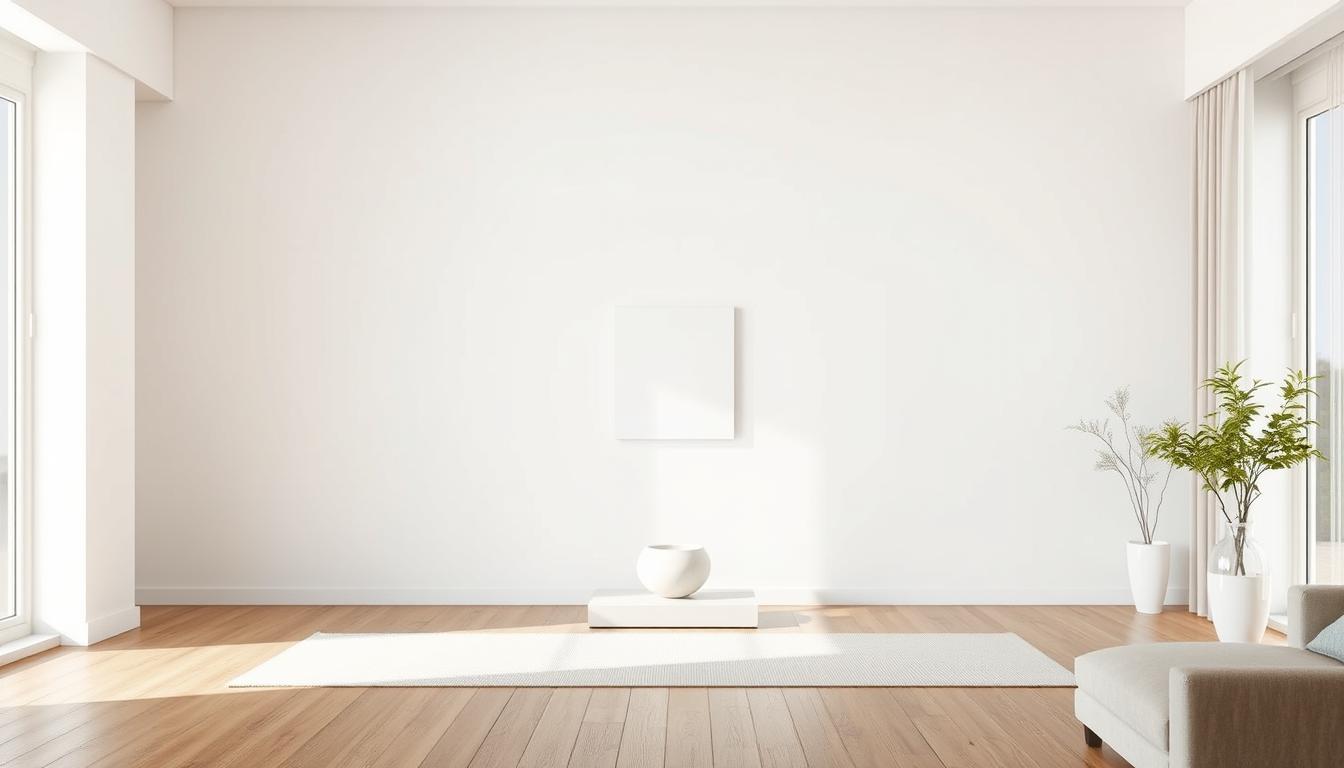
Living room foundations: choose a canvas or framed print that spans roughly two-thirds to three-quarters the width of your sofa. Center the piece at eye level (57–63 inches) and leave 6–8 inches of clearance above the sofa back for a comfortable visual gap.
Living room foundations
Balance large furniture with a large statement; pair narrow seating with two medium prints to create rhythm. Align edges and visual weights so the wall and furniture feel connected.
Bedroom serenity
Pick restful subjects like soft abstracts or monochrome line work. Symmetrical pairs above the headboard add order and calm the sleeping space.
If the wall is tall, stack two prints vertically or hang slightly lower so the work stays linked to the bed.
Kitchen character
Use sealed canvas or framed prints under glass or acrylic near prep areas. These finishes resist grease and wipe clean easily. Small playful pieces add personality without crowding counters or shelves.
Home office focus
Place geometric forms or motivational typography in your line of sight to support concentration. Keep palettes subdued so long work sessions stay comfortable.
- Consider traffic: hang where it is naturally viewed, like above a console or opposite seating.
- Use consistent frame finishes across rooms for subtle continuity through the home.
- Mix prints and canvas only when palette and scale are aligned; mock sizes with painter’s tape before committing.
| Space | Best format | Key sizing rule |
|---|---|---|
| Living room | Large canvas or framed print | Cover ~66–75% of sofa width; hang 57–63" center |
| Bedroom | Paired prints or single lower-hung canvas | Symmetry above headboard; stack if wall is tall |
| Kitchen | Sealed canvas or glazed frames | Small to medium pieces away from direct heat; wipeable surface |
| Home office | Geometric or typographic prints | Place within direct sightline; subdued palette |
Quick tip: try this types of wall art reference to compare formats and finishes before you buy.
Scandinavian-Inspired Minimalism: Nature Motifs, Geometry, and Warm Neutrals
Scandinavian-inspired pieces lean on quiet nature motifs and gentle geometry to make a space feel warm and orderly.
Use soft, abstract landscapes—mountain curves or river lines—and simple shapes to bring organic rhythm to the wall. These designs pair well with light woods and wool textiles, creating calm harmony across the room.
Pairing with light woods, cozy textiles, and natural light
Keep frames pale—natural oak, bleached ash, or slim white—to preserve the style. Place one large canvas above a sofa as a focal point, then echo its hues with smaller prints in nearby rooms to build home-wide harmony.
"Repeat simple forms to create rhythm; the eye reads repetition as calm,"
- Texture tip: combine wool throws and cotton pillows to warm the space without crowding the wall.
- Contrast: subtle black white silhouettes sharpen shapes while keeping the palette soft.
- Placement: hang where daylight grazes the surface, but avoid harsh direct sun to protect inks.
Small spaces benefit most: restrained palettes make rooms feel larger and airier. Tie in plants or dried branches so the artwork feels integrated rather than isolated. For extra guidance on Scandinavian style, see this Scandinavian design resource.
Size and Scale Rules That Transform Walls Without Overwhelming
The right proportions let prints and canvas anchor a living area without crowding it. Good scale makes the wall read as planned and calm. Use simple rules to keep pieces confident and well placed.
Over furniture: proportional width and ideal spacing
Center art at about 57–63 inches from the floor to match common sightlines. This creates a natural, comfortable view.
Above sofas or consoles, pick art that is roughly two-thirds to three-quarters of the furniture width. Leave 6–8 inches of clearance above the furniture so the piece stays linked but not cramped.
Large walls: single statement vs. grouped harmony
For a broad wall, use one oversized canvas that spans about 60–75% of the available width. Alternatively, arrange grouped prints so they read as a single composition.
Keep consistent frame sizes or aligned edges and allow 2–3 inches between frames. This breathing room helps multiple pieces feel cohesive.
In narrow rooms, favor horizontal formats to widen the space. For high ceilings, stack or use tall pieces to lift the eye. Test layouts with taped rectangles before you buy to confirm proportion.
| Situation | Recommended scale | Practical tip |
|---|---|---|
| Above sofa | 66–75% of sofa width | Center at 57–63" from floor; leave 6–8" above furniture |
| Large blank wall | Single canvas 60–75% span or grouped prints | Use 2–3" spacing between frames for grouped layouts |
| Narrow room | Wide, horizontal formats | Place low to widen sightlines |
| High ceiling | Vertical or stacked pieces | Use tall artwork to draw eye upward |
Frames, Mats, and Mounts: Simple Ways to Elevate Minimalist Artwork
Choosing the right frame and mount can change how your prints sit and feel on the wall. A slim matte-black metal frame sharpens lines, while natural oak warms the space and pairs well with soft textiles.
Mats add deliberate breathing room. A white mat creates white space that makes line work and negative areas read cleaner. Use slimmer mats for delicate drawings and wider mats for bolder prints to tune the visual weight.
Floating frames lift canvas pieces off the surface and add subtle depth without fuss. In bright rooms, choose non-glare acrylic or museum glass to cut reflections and keep the artwork visible from many angles.
Consistency matters: use the same frame finish or profile across a room so multiple pieces read as a calm group. Match frame proportions to the design—thin profiles for fine line work, slightly wider for bold shapes.
- Secure hardware and weight-appropriate anchors for safe mounting.
- Level carefully so groups form a single calm plane on the wall.
- Test small sample corners against paint to ensure the finish feels integrated with your home.
For more on selection and trends, see this framed wall art trends. Subtle presentation choices extend the life and elegance of your prints and canvas while keeping your living spaces cohesive.
Gallery Wall Basics for Minimal Styles: Layouts, Spacing, and Flow
Pick one dominant print and let smaller pieces orbit it to form a balanced layout. This anchor sets scale, makes spacing simple, and gives the whole composition a calm center.
Anchors, rhythm, and breathing room
Start with a medium-to-large piece and hang it at eye level. Build outward with consistent gaps—2 to 3 inches between frames—so the wall reads as intentional rather than cluttered.
Keep breathing room around the overall group. Avoid pushing frames into corners, moldings, or door casings. That negative space helps the gallery stay calm in the living or dining area.

Mixing orientations and keeping cohesion
Mix portrait and landscape pieces to create rhythm, but tie them together with a shared palette, matching frames, or recurring subjects. Use black white photos or line drawings as a unifying thread and add one accent print sparingly.
- Vary sizes: larger pieces near the center, smaller toward edges.
- Align edges or centerlines to keep visual order.
- Lay layouts on the floor first, then transfer with paper templates to protect the wall.
Final tip: center the overall gallery at eye level and check sightlines from seating so this wall art strengthens the room and the home’s calm flow.
Statement Pieces Done Right: Placement, White Space, and Viewing Angles
"Repeat simple forms to create rhythm; the eye reads repetition as calm,"
One bold piece can instantly set the visual order of a wall and make the whole space read as intentional.
Scale matters: aim for about 60–75% of the available width so the artwork feels confident rather than lost. Leave generous margins around the work so negative space can do the heavy lifting.
Center the piece at eye level and then check sightlines from sofas, dining chairs, and common entries. Walk the room and view the print from seating to ensure the composition reads naturally.
Choose canvas when you want subtle surface texture to register across the living area. Pick framed prints when you need crisp lines or precise photography.
Keep surrounding decor low-key if the piece is bold. If the design is spare, warm woods and textiles stop the room from feeling stark.
Measure twice and mock with painter’s tape before drilling. For tall ceilings, consider a vertical statement to lift the eye.
Final tip: resist flanking a strong focal canvas with competing pieces; let one statement define the wall and the room’s mood. Use secure, adjustable hardware so you can nudge height and alignment after final viewing.
Light It Like a Pro: Ambient, Accent, and Daylight Strategies for Art
Good lighting reveals color, texture, and the quiet details that make wall pieces sing. Layered lighting—ambient, accent, and controlled daylight—lets you shape how prints and canvas read at different times of day.
Ambient light provides even room brightness so the wall and surrounding space feel balanced. Use dimmers to adapt the baseline light level between day and evening.
Accent fixtures highlight the work itself. Aim adjustable heads or picture lights at about a 30-degree angle to avoid glare and hotspots on glazed prints.
Avoiding glare on glass; caring for canvas
Choose non-glare acrylic or museum glass when prints face bright windows. This reduces reflections while keeping contrast clear.
Keep canvas away from continuous direct sun and intense heat. Allow space between lamps and the surface to prevent heat buildup. Dust gently with a soft brush and maintain stable humidity to protect the surface.
- Use 2700K–3000K color temperature to flatter neutrals and black-and-white pieces.
- Fine-tune beam spread so the light hits the artwork, not the surrounding wall edges.
- In small living spaces, wall sconces with adjustable shades serve as compact accent lamps.
| Layer | Purpose | Practical tip |
|---|---|---|
| Ambient | Overall room balance | Install dimmers; keep consistent color temperature |
| Accent | Focus on wall art | Aim fixtures at 30°; use adjustable heads to avoid glare |
| Daylight | Animate color and texture | Use UV-filtering treatments and non-glare glazing when needed |
Final way to test: install lights, place the piece, then view from seating and entries. Small aim tweaks often remove reflections and improve how prints and canvas look in real use.
Real-Home Challenges: Small Spaces, High Ceilings, and Awkward Walls
Every home has quirks. Narrow alcoves, tall ceilings, and oddly angled walls can feel like obstacles, but they also offer chances to make bold, calm choices that suit daily life.
Small spaces: use tall, narrow prints or vertical stacking to stretch the eye upward. A single column of pieces or one slim canvas creates the sense of height without clutter.

Vertical stacking, mirrors, and asymmetry that works
Mirrors act like quiet partners. Place a simple mirror beside or within a grouping to bounce light and enlarge the perceived space while keeping the palette light and calm.
High ceilings benefit from floor-to-ceiling galleries or a vertical column of canvas. This avoids the “floating” look and makes the wall feel intentional.
For slanted or oddly offset walls, embrace asymmetry. Align pieces to a functional anchor such as a console, chair, or vent. Use cohesive frames and consistent gaps so the composition reads tidy, not chaotic.
- Pick tall prints in tight rooms to lift the sightline.
- Use mirrors sparingly to amplify light and view.
- Test layouts with painter’s tape before hanging hardware.
- Consider custom ratios when standard frames don’t fit an awkward wall.
- In long hallways, repeat similar prints with steady gaps to guide movement.
Final tip: map sightlines in living zones with obstacles, then place pieces where the eye naturally rests. Consistent spacing and unified frames hold asymmetry together and keep the wall calm and confident.
Conclusion
Small changes — a different frame, slight shift in height, or new lighting — often transform the whole wall.
Clean lines, a restrained palette, and generous negative space help wall art calm the living space and add quiet sophistication.
Use simple size and spacing rules, pick quality prints or canvas, and finish with mats and a slim frame to keep the look elegant without weight.
Adjust lighting to reduce glare and highlight texture; these tweaks change the impact more than you expect.
The same principles work in studios and large homes alike. Start with one choice, mock it up, and build gradually so pieces form harmony with furniture and personal style.
Measure, test, and choose with confidence — one calm decision can transform your home.
Enhance Your Space with Unique Modern Masterpieces by Chiara Rossetti

Are you inspired by the innovative mediums and conceptual depth highlighted in our exploration of contemporary art? You’re not alone! Today’s art enthusiasts are seeking cultural relevance and emotional connections in their artwork. However, finding pieces that resonate with modern themes and fit your unique style can be a challenge. That’s where we come in!

At Rossetti Art, we specialize in canvas prints, original paintings, and modern sculptures that celebrate the spirit of now. Each piece created by Chiara Rossetti brings a personal touch that connects deeply with current social narratives—just like the modern masterpieces discussed in the article. Don’t miss out on the chance to elevate your home decor with breathtaking artwork that speaks to your values and aesthetic. Explore our collection today and find your perfect piece! Act now, and transform your space into a gallery of inspiration!
FAQ
How do I choose the right size artwork above a sofa?
Aim for artwork that spans about 60–75% of the sofa width. If you have a 72-inch sofa, choose a piece or group totaling roughly 43–54 inches wide. Keep bottom of the frame about 6–12 inches above the back of the sofa so the composition reads as a single visual plane with the furniture.
When should I pick canvas over framed prints?
Choose canvas for a softer, texture-forward look and when you want an unframed, gallery-style presence. Framed prints work well when you need crisp edges, easier protection with glass, or a more formal feel. Consider traffic and humidity—canvas tolerates kitchen and bathroom environments better if properly sealed.
What are quick quality cues to spot a well-made print?
Check paper weight (200–300 gsm or higher for fine art), archival inks labeled pigment-based, and color accuracy. Look for acid-free mats and backing, clean edges, and consistent color saturation. Trusted galleries and brands like MoMA Design Store, Saatchi Art, or Printful list these specs clearly.
How can I create a cohesive gallery wall without clutter?
Start with one anchor piece, then add smaller works around it, keeping consistent spacing (2–3 inches). Use a limited palette or repeating frame style to unify the collection. Maintain breathing room by avoiding too many small items; negative space is part of the minimalist look.
What color palette works best for a calm bedroom?
Soft neutrals, warm greys, muted blues, and black-and-white contrasts create serenity. Add subtle texture through linen or a framed monochrome print to keep the room visually interesting without overpowering the restful mood.
How do I protect artwork from glare and sun damage?
Use museum-grade, UV-protective glazing on framed pieces and position art away from direct sunlight. For glossy glass, angle the frame slightly downward or install non-reflective acrylic. Rotate exposed works periodically to limit long-term fading.
Can I mix orientations and still maintain harmony?
Yes—mixing horizontal and vertical works adds rhythm. Balance orientation by arranging pieces so visual weight is distributed evenly. Use consistent mat sizes or frame colors to maintain cohesion when mixing formats.
What materials are easiest to clean in a kitchen or entryway?
Opt for sealed canvases, acrylic prints, or framed prints behind non-reflective acrylic rather than paper-only works. These surfaces wipe clean gently with a soft, damp cloth. Avoid untreated paper or delicate watercolors in high-traffic or humid spots.
How do I scale art on a large, empty wall?
For tall walls, choose a single large statement piece or create a grouped arrangement that together fills at least two-thirds of the wall’s visual width. Consider a vertical stack or triptych to emphasize height, and keep spacing consistent for a polished look.
What framing choices suit a Scandinavian-inspired interior?
Light wood frames, thin black metal profiles, or simple white mats complement Scandinavian decor. Keep frames minimal and pair them with natural textiles and plants to reinforce the warm, understated aesthetic.
How can I introduce texture without disrupting minimal style?
Use tactile materials like linen-wrapped canvases, paper collage, or lightly textured gesso. Subtle relief and matting add depth while keeping the overall composition calm. Choose one textured piece per wall to avoid visual noise.
What’s the best height to hang art in a home office?
Hang art so the center sits at eye level—roughly 57–60 inches from the floor. If it’s above a desk, place the bottom edge 8–12 inches above the desk surface to keep the work visible without crowding the workspace.
How do I treat awkward walls like short stretches or corners?
Use vertical stacking or narrow triptychs on short walls to draw the eye upward. In corners, consider a single tall piece that bridges both planes or mirror panels to create depth. Keep scale modest and maintain negative space to avoid a cramped feel.
What framing and mat options elevate simple prints?
Thin, high-quality frames in black, white, or natural wood and crisp, acid-free mats make prints look intentional and refined. A double mat in subtle tones adds depth without competing with the work. Choose archival backing and hanging hardware rated for the piece’s weight.
How do I light artwork to highlight details without causing damage?
Use LED picture lights or adjustable recessed lighting with a warm color temperature (2700–3000K). Position lights at a 30-degree angle to reduce glare and hotspots. Keep radiant heat low and avoid prolonged direct exposure to preserve pigments.
Can small spaces handle grouped artwork?
Absolutely. Grouped pieces can create a focal point in a compact room. Use tighter spacing (1–2 inches) and consistent frame finishes to avoid visual clutter. A vertical arrangement can make ceilings feel taller, while a horizontal cluster can expand perceived width.


Leave a comment
This site is protected by hCaptcha and the hCaptcha Privacy Policy and Terms of Service apply.