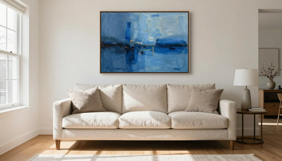
Blue abstract art for living room walls introduces visual balance, rich color depth, and an immediate sense of calm. Selecting the right canvas involves coordinating the undertone of the blue with your room lighting and balancing the canvas width against your seating.
Room daylight exposure, existing furniture upholstery, and wall dimensions determine whether a deep navy statement or an airy ice blue print creates the best atmosphere. Evaluating these factors beforehand helps you choose a piece that anchors the room naturally without clashing with your decor.
Curated Blue Canvas Prints for Modern Living Rooms
Every made-to-order piece ships free with tracking to your doorstep. Browse our collection of ready-to-hang blue wall art designed to transform your primary gathering space.

Why Blue Works in a Living Room
Blue carries a unique visual neutrality that few other primary hues can match in home decor. It commands presence as a focal point while receding enough into the background to keep the room feeling restful.
Because living rooms serve multiple purposes throughout the day, the color palette needs to transition smoothly from morning sunlight to evening lamplight. Blue maintains its clarity across shifting color temperatures, avoiding the muddiness that can affect warm hues under artificial light. It pairs easily with natural wood grains, polished stone, and woven upholstery textiles.
An abstract presentation keeps blue from feeling thematic or predictable. Rather than referencing literal landscapes or seascapes, blue abstract compositions rely on gradient shifts, gestural brushwork, and contrasting values to create architectural depth. This artistic structure anchors expansive drywall surfaces and brings cohesion to eclectic seating arrangements.
Cool tones naturally recede from the eye, which gives the impression of expanded wall space in compact or narrow living rooms. Opting for blue abstract compositions provides depth without visual clutter.

Abstract blue compositions anchor open wall space while reflecting shifts in natural daylight.
Blue Shades and the Mood They Create
The undertone and saturation of blue establish the emotional baseline of your entire living room. Darker pigments absorb light to create intimacy, while pale and greyed blues reflect ambient light to open up the room.
Navy blue brings tailored formality, grounding high ceilings and complementing rich architectural millwork. Cobalt blue injects vibrant energy, creating an dynamic focal point that draws attention across open floor plans. Teal introduces a hint of yellow or green warmth, bridging modern design with mid-century organic tones.
Soft blue and dusty blue provide subtle texture on expansive walls without overwhelming pale interior palettes. Ice blue features crisp, cool undertones that maximize natural light in north-facing rooms that lack warm afternoon sun. Comparing these values allows you to select a canvas that matches both your lighting conditions and your preferred room atmosphere.
| Shade | Mood | Pairs well with | Best size above a sofa |
|---|---|---|---|
| Navy | Grounded | Warm beige | Two-thirds sofa width for visual stability |
| Cobalt | Energetic | Crisp white | Three-quarters sofa width as a focal centerpiece |
| Teal | Inviting | Ochre gold | Two-thirds sofa width to balance warm accents |
| Dusty blue | Relaxed | Soft grey | Diptych set spanning three-quarters sofa width |
| Ice blue | Airy | Charcoal | Large single canvas to expand compact walls |
For an elevated balance of cobalt blue, midnight navy, soft grey, and ivory, look at Blue Human. Available in square dimensions from 20x20 to 58x58 in, this canvas print introduces bold visual structure into contemporary seating areas.

Different shades of blue establish distinct emotional baselines across living room walls.
How Big Blue Art Should Be Above a Sofa
Proportion determines whether a wall hanging looks intentional or misplaced. When positioning blue abstract art above your primary seating, select an arrangement that spans two-thirds to three-quarters of the sofa width.
An artwork smaller than two-thirds of the couch appears visually detached, floating adrift against the surrounding drywall. Conversely, a frame extending wider than the sofa edges overpowers the seating area and disrupts the vertical balance of your room. You can review detailed layout diagrams in our guide to Living Room Wall Art: The 2/3 Rule Above a Sofa.
Vertical placement is equally critical for a cohesive look. Hang the bottom edge of the canvas roughly six to ten inches above the top of the sofa backrest. This spacing keeps the artwork connected to the furniture grouping while leaving comfortable headroom for seated guests.
When hanging a diptych or triptych, calculate the two-thirds to three-quarters span by measuring the total width of all panels combined, including two to three inches of wall space between each frame.

Sizing artwork between two-thirds and three-quarters of sofa width anchors the furniture grouping.
Colors That Pair with Blue Wall Art
Balancing blue with thoughtful interior accents prevents the living room from feeling sterile or uninviting. Strategic pairings draw out secondary undertones within the abstract brushwork and connect the canvas to surrounding decor.
White, beige, and grey provide timeless foundational support. Crisp white trims sharpen cobalt or navy pigments, while warm beige and oatmeal upholstery soften cool values to make the space feel cozy. Subtle grey accents offer an understated monochromatic transition that highlights the composition of the canvas.
Warm metallic and complementary colors create dynamic contrast. Gold hardware and ochre lighting fixtures bring warmth that counters deep indigo tones, which follows core principles of Color theory. Muted orange accents, such as terracotta cushions or rust-colored throws, provide visual energy directly opposite blue on the color wheel. Explore our comprehensive Color Palettes & Abstract Wall Art Pairing Guide for complete palette recipes.
Warm Complementary Pairings
- Ochre gold and brass accents add welcoming warmth to cool palettes.
- Burnt rust and terracotta create high-contrast focal points.
- Warm beige and cream soften geometric and gestural brushstrokes.
Cool Monochromatic Pairings
- Charcoal and slate grey can feel austere if room lighting is dim.
- Pure brilliant white requires natural sunlight to avoid a stark hospital look.
- Matching too many blue accessories can flatten room dimensions.
If your room features warm wood or brass details, consider Harbor Reverie. With its blend of deep teal, cerulean blue, ochre gold, burnt rust, ivory cream, and black ink accents, this canvas bridges warm and cool elements across sizes ranging from 24x16 to 81x54 in.
Three Common Mistakes When Choosing Blue Abstract Art
Selecting artwork involves practical layout choices that extend beyond personal taste. Avoiding common decorating errors protects your investment and ensures your living room remains visually balanced.
The first mistake is ignoring the room's natural lighting direction. North-facing rooms receive cool, diffuse light that can make stark navy or icy blue art appear chilly and flat. South-facing spaces receive intense warm rays that make saturated blues sing, but north-facing walls benefit from blue artwork infused with warm ivory or ochre undertones.
The second mistake is hanging artwork too high on the wall. Placing the canvas near the ceiling disconnects it from your furniture, creating visual tension. The visual midpoint of the canvas should hang at eye level, roughly fifty-seven to sixty inches from the floor, when displayed on an open wall.
The third error is purchasing an undersized canvas to save wall space. A small art print placed on an expansive living room wall looks hesitant and under-proportioned. If your seating area spans eight feet, a single modest canvas will fail to anchor the space unless grouped into a cohesive gallery set.
Avoid matching your wall art directly to the exact color of your sofa fabric. A canvas that repeats your upholstery hue without contrasting values tends to disappear into the room.
Five Distinct Blue Abstract Canvas Prints
Selecting the right canvas depends on your color goals, wall dimensions, and framing preferences. Our made-to-order collection offers distinct compositions printed on artist-grade poly-cotton canvas using fade-resistant HP latex inks.
- Blue Human: Features cobalt blue, midnight navy, soft grey, and ivory. Available in square formats from 20x20 to 58x58 in, offering bold visual impact for modern spaces.
- Harbor Reverie: Combines deep teal, cerulean blue, ochre gold, burnt rust, ivory cream, and black ink accents. Sized from 24x16 to 81x54 in, perfect for bridging warm leather furniture with cool walls.
- Cobalt Current: Highlights dynamic black, cobalt blue, turquoise, cream, silver, and orange accents. Sized from 20x20 to 58x58 in, bringing high-contrast graphic energy above low-profile couches.
- Chalk Drift & Chalk Line: A coordinated two-piece diptych set featuring dusty blue, cream white, and black. Ranging from 20x20 to 58x58 in per piece, ideal for wide living room walls requiring flexible spacing.
- Cyan Fan: An elongated composition showcasing cyan blue, cobalt, white, and soft ice blue. Available in panoramic proportions from 20x10 to 80x40 in, fitting seamlessly over wide sectionals.
Each canvas is hand-stretched over a 1.25-inch hardwood stretcher frame with a satin-matte, low-glare finish that reduces reflections from living room windows. An optional floater frame handcrafted from poplar hardwood is available to give the outer border a finished, modern edge.
Production takes 3 to 5 business days, followed by 8 to 10 business days shipping with tracking. Orders ship free, and standard sizes include a 30-day full refund policy.
For an active interplay of bold turquoise and warm details, consider Cobalt Current. Its sharp black, cobalt blue, turquoise, cream, silver, and orange accents anchor modern lounges with architectural flair.
See Artwork in Your Space Before You Buy
Selecting artwork online becomes straightforward when you can preview how scale and color integrate with your living room furniture. Every product page features an interactive Live Preview button that projects the canvas directly onto your own wall using your smartphone camera.
See It on Your Wall Before You Buy
Test various canvas dimensions and color palettes against your couch and wall color in real time before placing your order.
Frequently Asked Questions
What color goes with blue abstract art?
Neutral tones such as warm beige, ivory, cream, and soft grey pair effortlessly with blue abstract canvases. If you want a bolder interior look, introduce ochre gold fixtures, mustard yellow accents, or burnt terracotta cushions to provide balanced warmth against cool blue pigments.
What size blue art should I hang above a sofa?
Wall artwork should measure roughly two-thirds to three-quarters the entire width of your sofa. For example, an eight-foot couch works best with an artwork arrangement spanning five to six feet across, which can be achieved through one large horizontal canvas or a coordinated multi-panel print set.
Is blue wall art too cold for a living room?
Blue wall art does not make a living room feel cold when balanced with warm decorative textures. Choosing prints with teal, rust, or cream accents, and pairing them with natural wood furnishings, woven wool rugs, and warm ambient lighting keeps the room feeling comfortable and inviting.
Does blue abstract art work in a small room?
Blue abstract art performs exceptionally well in compact living areas because blue naturally recedes from the human eye. Softer shades like ice blue, dusty slate, and pale cerulean open up confined drywall, giving the visual illusion of greater room depth without cluttering small spaces.
Can I hang blue art in a bedroom too?
Blue artwork works wonderfully in bedrooms because cool tones promote psychological calm and restful sleep. For optimal proportions and headboard alignment tips, consult our dedicated guide on Bedroom Wall Art Placement to create a soothing and cohesive sleeping sanctuary.
Bringing Blue Abstract Art into Your Home
Blue abstract art provides an enduring visual anchor that balances modern color palettes and anchors living room seating. By selecting the right undertone, sizing the canvas to two-thirds or three-quarters of your sofa width, and pairing it with warm neutrals, you can create a refined and comfortable focal point.

About the Author
Chiara Rossetti
Chiara Rossetti is the founder of Rossetti Art, a canvas print and original art brand. She writes about interior design, wall art styling, and the art of making a home feel alive.


Leave a comment
This site is protected by hCaptcha and the hCaptcha Privacy Policy and Terms of Service apply.