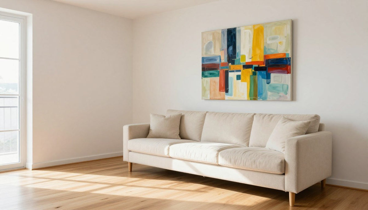
Neutral rooms provide a restful backdrop, but without a deliberate focal accent, beige, white, and grey palettes can feel unfinished. Hanging colorful abstract art delivers instant energy and depth while preserving the calming atmosphere of your home. A single dynamic canvas anchors the entire seating area, transforming blank walls into intentional interior architecture.
Finding the right balance depends on your furniture proportions, lighting conditions, and how thoughtfully you repeat accent tones across the room. Grounding your design in deliberate scale and curated color choices keeps bold pigments harmonious rather than chaotic.

Why One Colorful Abstract Art Piece Transforms a Neutral Room
Displaying a single colorful artwork prevents visual competition in spaces finished with quiet wall paints and understated upholstery. When multiple bold canvases fight across the same sightline, the eye wanders without finding a clear resting place. One carefully chosen statement print creates an architectural anchor that guides your entire room layout.
Abstract Canvas Prints
Select canvas artwork with free shipping across all standard sizes.
Neutral surfaces act like matting around fine art, giving saturated pigments room to breathe. Review the visual structure explored in Colorful Contemporary Painting to observe how non-representational compositions activate modern spaces. Integrating bold designs such as Abstract Geometric Canvas Prints brings purposeful warmth to stark interiors while protecting the room from decorative overload.

A dedicated focal print introduces character while leaving surrounding walls uncluttered.
Sizing and Selecting Your Statement Piece
Selecting the right canvas dimensions matters just as much as choosing the right pigment palette. Undersized artwork looks adrift above substantial seating, while an oversized canvas crowds adjacent architectural trims. Maintaining clean visual relationships between furniture and wall decor creates an organic, deliberate balance.
- Measure your sofa width and calculate two-thirds to three-quarters of that total span for the ideal canvas width.
- Leave approximately six to ten inches of vertical clearance between the top of the sofa back and the bottom of the canvas frame.
- Choose vertical canvas orientations for tall ceilings and wide square formats for low, expansive modular sectionals.
For expansive living room walls, our recommended pick is Split Horizon, featuring rich burnt orange, coral pink, and deep teal across dimensions from 20x20 to 58x58 inches.

Proportioning canvas width to two-thirds of the sofa creates clean vertical symmetry.
The 2-Color Echo Rule for Balanced Styling
The easiest way to integrate vivid artwork into a neutral room is the two-color echo rule. Instead of attempting to match every pigment present on the canvas, pull just one or two accent tones and repeat them in a throw pillow, a glazed ceramic vase, or an area rug. This simple practice connects your wall art to the physical room without overwhelming your senses.
Understanding foundational concepts from Color theory helps you balance warm and cool temperatures across furnishings. You can also explore The Power of Color in Art: What Each Hue Says About Your Personality to pinpoint the exact emotional register you wish to cultivate.
| Room base | Colors to pull from the art | Where to repeat them | Art size |
|---|---|---|---|
| White | Teal and coral | Cushions and vase | Select large formats up to 60x60 in |
| Beige | Warm olive, red | Ceramic bowl, rug | Aim for two-thirds of sofa width |
| Grey | Cobalt and red | Throw and cushion | Match two-thirds of seating width |
| Wood | Orange, deep navy | Accent cushions | Use square sizes up to 58x58 in |
| Black | Marigold yellow | Tabletop vase | Choose medium to large focal prints |

Echoing one warm tone in small textiles links the canvas naturally to your furniture.
Where Colorful Art Works Best Around the House
Vibrant abstract canvases perform exceptionally well across several high-traffic zones in a neutral home. Positioning color art thoughtfully allows each space to establish its own mood while maintaining a cohesive overarching design aesthetic.
Living Room and Entry
Hang large formats centered over primary seating or facing the front door to create an immediate, welcoming focal statement.
Bedroom Retreats
Mount artwork featuring calming cool hues above headboards to preserve restfulness while lifting cream or oatmeal bedding.
Home Workspaces
Display energizing reds, yellows, and deep blues directly across from your desk to stimulate creative thinking throughout workday hours.
For open hallways and family gathering zones, our recommended pick is Held, showcasing tomato red, grass green, cobalt blue, marigold yellow, and black across sizes ranging from 16x24 to 53x75 inches.

Entryways provide an ideal transition zone for expressive, saturated abstract prints.
Three Common Decorating Mistakes to Avoid
Introducing saturated color into a serene palette requires restraint and careful spatial awareness. Keeping clear design boundaries protects your interior from disjointed visual tension.
Avoid scattering small, mismatched colorful prints across adjacent walls, as fragmented arrangements create visual noise. Never try to match every single tone from your canvas in surrounding lamps, pillows, and rugs, which results in a rigid showroom look. Finally, do not select an undersized canvas that floats unconnected above wide sofas and credenzas.
Review additional layout considerations detailed in Decorating Your Home Ideas: Color Palettes & Abstract Wall Art Pairing Guide to align proportions properly before making any final purchases.
Our Five Picks
Each of our Rossetti Art canvas prints is printed on artist-grade poly-cotton canvas using UV- and fade-resistant HP latex inks that carry UL GREENGUARD Gold certification. The canvas is hand-stretched over a 1.25-inch hardwood stretcher frame with a satin-matte, low-glare finish, arriving ready to hang with an optional floater frame handcrafted from poplar hardwood. Pieces are made to order, requiring 3 to 5 business days for production, followed by 8 to 10 business days of tracked shipping, covered by free shipping and a 30-day full refund on standard sizes.
- Split Horizon: Burnt orange, coral pink, and deep teal in dimensions from 20x20 to 58x58 inches.
- Chromatic Divide: Cherry red, deep black, warm olive, burnt orange, and cream in sizes from 20x20 to 60x60 inches.
- Held: Tomato red, grass green, cobalt blue, marigold yellow, and black in sizes from 16x24 to 53x75 inches.
- Jazz: Burnt orange, white, soft pink, golden yellow, black, magenta, and deep navy in formats from 20x20 to 58x58 inches.
- Chromatic Bloom: Cobalt blue, vivid red, golden yellow, forest green, coral, lilac, and warm ivory in sizes from 20x20 to 60x60 inches.
Our top recommendation for bringing dynamic color to neutral living spaces is Chromatic Bloom, offering versatile square proportions that suit both light and dark interior foundations.
See It on Your Wall Before You Buy
Every product page has a Live Preview button that shows the artwork on your own wall before you buy.
Frequently Asked Questions
How do I add color to a neutral living room?
Start by mounting a single vibrant canvas as your central focal point on an open wall. Next, select one or two secondary tones directly from the artwork and repeat them across nearby accents like a throw blanket, ceramic vase, or patterned rug. This technique anchors the room while keeping the backdrop calm.
What size colorful art should go above a sofa?
Select a canvas that measures between two-thirds and three-quarters of your sofa width. Hanging a piece within this specific proportion creates visual balance across the seating area without crowding adjacent lighting or shelving. It also prevents the artwork from appearing undersized relative to heavy upholstered living room furniture pieces.
Will colorful art clash with my furniture?
Colorful artwork pairs easily with neutral furnishings because white, cream, grey, and natural wood backdrops provide quiet breathing room. Tension only occurs when multiple competing patterns fight for dominance. By keeping large furniture surfaces solid and repeating selected artwork hues in small accessories, the overall interior feels cohesive rather than chaotic.
How many colors should the art have?
Abstract compositions can feature several dynamic tones, ranging from three distinct shades to seven harmonious pigments. The total count matters less than how you distribute those colors throughout the space. Repeating just one or two prominent hues in your room accessories maintains order and keeps the surrounding atmosphere restful.
Can colorful art work in a minimalist room?
Minimalist spaces thrive when paired with a bold abstract piece because clean lines and uncluttered walls give pigments room to breathe. The artwork serves as the singular visual anchor, adding warmth and personality without adding physical clutter. A single expressive canvas preserves simplicity while enlivening the entire room.
Bringing Balanced Color into Your Space
Styling colorful abstract art within a neutral interior allows you to celebrate saturated pigments without sacrificing calm visual simplicity. Anchoring your wall with a correctly proportioned canvas and repeating two subtle accent hues establishes immediate character. Measure your space, select the palette that resonates with your home, and let your artwork define the room.

About the Author
Chiara Rossetti
Chiara Rossetti is the founder of Rossetti Art, a canvas print and original art brand. She writes about interior design, wall art styling, and the art of making a home feel alive.

Leave a comment
This site is protected by hCaptcha and the hCaptcha Privacy Policy and Terms of Service apply.