Colors have a profound impact on our lives, influencing our moods, emotions, and even our perceptions of ourselves. The colors we choose can reveal a lot about our personality, showcasing our confidence, creativity, and emotional depth. By delving into the world of color psychology, we can uncover the intricacies of human personality and the role that colors play in shaping our identities.

The Psychology Behind Colors in Artistic Expression
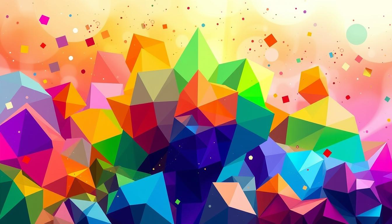
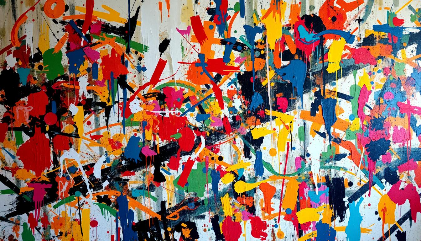
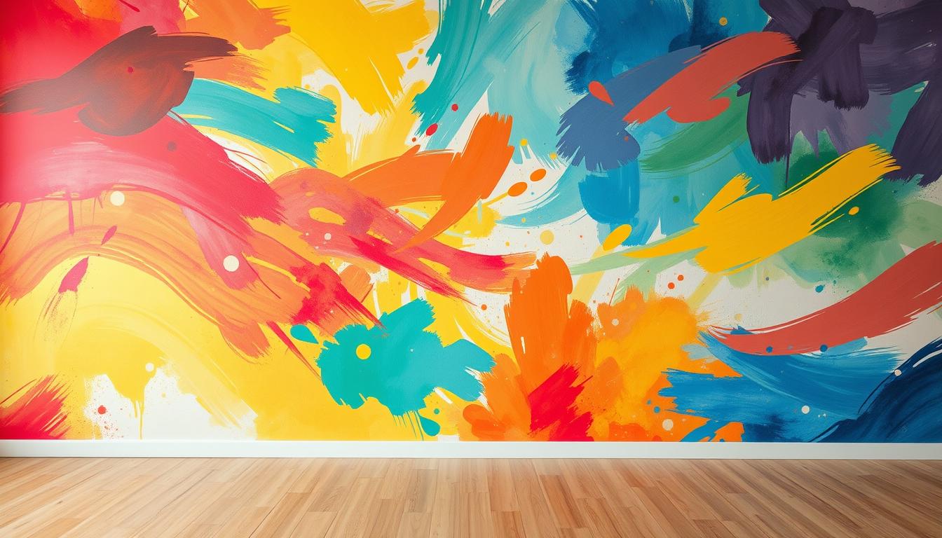
The use of color in art is a powerful tool that can evoke emotions, convey messages, and create a lasting impression on the viewer. Colors can influence an individual's mood, perception, and emotional state, making them a crucial element in the creation of art.
Warm colors like red and orange are often associated with energy, passion, and excitement. In contrast, cool colors such as blue and green tend to evoke feelings of calmness and serenity. Understanding the emotional impact of colors is essential for artists to convey their intended message.
Throughout history, colors have been imbued with symbolic meanings that vary across cultures. For example, in many Asian cultures, red is a symbol of good luck and prosperity, while in some African cultures, it is associated with death and mourning. Artists must consider these cultural nuances when selecting colors for their artwork.
The psychology behind color is complex, and artists must carefully consider their color palette to convey the intended message. By selecting colors that resonate with their audience, artists can create a lasting impression and evoke the desired emotional response.
Recent Discoveries in Color Psychology and Art
Recent studies have shown that color preferences can reveal significant insights into an individual's personality traits. The application of color psychology in art has led to the creation of more nuanced and emotionally resonant works.
By understanding the psychological impact of different colors, artists can craft pieces that evoke specific emotional responses from their audience. This knowledge enables artists to create more impactful and engaging art.
Red: The Color of Passion and Energy
The color red is a powerful symbol that evokes strong emotions and is often associated with passion, energy, and love. People drawn to this color tend to be confident, adventurous, and charismatic leaders.
Individuals who favor red are often outgoing and sociable, with a natural flair for drama and creativity. However, it's essential to strike a balance between expressing oneself and being considerate of others.
Those who surround themselves with the color red are often passionate and energetic, with a strong desire to take on new challenges.
Blue: Tranquility and Depth in Character
The color blue is often associated with feelings of serenity and tranquility. It is a color that can evoke a sense of calmness and peacefulness, making it a popular choice among artists and designers.
Individuals who prefer blue tend to be more introverted and value deep, meaningful relationships. They are often more thoughtful and reflective, preferring to consider their thoughts and emotions before expressing themselves.
Incorporating blue into art can add a sense of depth and tranquility, making it a versatile color for artists to work with. Whether used as a primary color or as an accent, blue can evoke a range of emotions and moods.
By understanding the significance of blue in art and design, we can better appreciate its role in creating a sense of calmness and serenity. This color has the power to evoke feelings of tranquility and peace, making it a popular choice among artists and designers.
Yellow and Orange: Optimism, Energy, and Intellectual Curiosity
The colors yellow and orange are often associated with warmth, energy, and optimism. These vibrant hues have a profound impact on human emotions, making them a popular choice among artists.
The Psychology Behind Yellow and Orange
Yellow is often linked with sunshine and represents hope and happiness. It's a color that can stimulate mental activity and encourage creativity. Orange, a blend of red and yellow, symbolizes enthusiasm and playfulness, making it a popular choice for artists looking to add a dynamic element to their work.
When used together, yellow and orange create a palette that is both vibrant and uplifting. Artists often use these colors to add a pop of color to their work, drawing the viewer's attention to specific elements or emotions. The combination of yellow and orange can evoke feelings of joy, optimism, and warmth, making it ideal for artworks that aim to inspire and uplift.

Green: Balance, Growth, and Harmony
Green is a calming color that represents growth, harmony, and balance in our lives. Associated with nature, it symbolizes new beginnings and renewal. The various shades of green, from light mint to deep forest, evoke different emotions and moods, making it a versatile color for artistic expression.
The Significance of Green
Green is often linked with feelings of calmness and serenity. It's a color that can represent good luck, prosperity, and fertility in many cultures. In interior design, green is used to create a soothing atmosphere, promoting relaxation and reducing stress.

The use of green in art and design can have a profound impact on our well-being. By incorporating green into our surroundings, we can create a sense of balance and harmony, leading to a more peaceful and calming environment.
In conclusion, green is a multifaceted color that holds significant meaning in various aspects of our lives. Its connection to nature, growth, and harmony makes it a popular choice for artistic expression and design.
Purple and Pink: Creativity, Spirituality, and Compassion
The colors purple and pink are intricately linked with creativity and spirituality. Purple, often associated with luxury and grandeur, is a color that commands respect. Pink, on the other hand, is softer and more nurturing, evoking feelings of warmth and compassion.
Artists who incorporate these colors into their work often aim to convey a range of emotions and moods. Purple is associated with creativity, wisdom, and grandeur, while pink is linked to nurturing and compassion. By using these colors, artists can add depth and complexity to their work.
The Significance of Purple
Purple has long been a color associated with luxury, creativity, and wisdom. It's a color that can evoke feelings of grandeur and majesty, making it a popular choice for artists looking to convey a sense of opulence and extravagance.
The Role of Pink
Pink, on the other hand, is often associated with nurturing and compassion. It's a color that can evoke feelings of warmth and comfort, making it a popular choice for artists looking to convey a sense of softness and gentleness.
By incorporating purple and pink into their work, artists can create a unique and captivating visual experience that engages the viewer on multiple levels.
The Power of Color in Art: What Each Hue Says About Your Personality
Colors play a significant role in art, influencing how we perceive and interpret a piece. The use of color can evoke emotions, convey messages, and create a lasting impression on the viewer.
Understanding the Psychology of Color
The psychology of color is a complex field that studies how different hues affect human behavior and emotions. Research has shown that colors can significantly impact our mood, energy, and personality traits. For instance, the color red is often associated with passion and energy, while blue is linked to feelings of calmness and serenity.
Artists use color to convey emotions and ideas, making it a crucial element in the creative process. By understanding the psychology of color, artists can create pieces that evoke specific emotions and reactions in their audience.
Black, White, and Gray: Sophistication, Clarity, and Balance
Monochromatic color schemes have a unique ability to evoke a sense of sophistication and elegance in art and design. The use of different shades of a single color can create a visually appealing and harmonious palette that is both timeless and versatile.
What Monochromatic Preferences Reveal About Personality
Individuals who prefer monochromatic color schemes often value simplicity and elegance. This preference can indicate a personality that is reserved, introspective, and appreciative of subtle nuances. By choosing a monochromatic palette, individuals can convey a sense of sophistication and refinement.
Balancing Colorful and Neutral Elements
To create a balanced and harmonious space, it's essential to consider the interplay between monochromatic colors and other design elements. By incorporating different textures and patterns, individuals can add depth and visual interest to a room without compromising its monochromatic aesthetic.
The key to successfully incorporating monochromatic colors into a space is to strike a balance between different shades and textures. By doing so, individuals can create a cohesive and visually appealing environment that reflects their personality.
Finding Your Color Identity Through Art Selection
Discovering your color identity is a personal journey that involves understanding your personality, preferences, and the ambiance you wish to create in your living space. It's about finding the colors that resonate with you and reflect your inner self.
How to Choose Artwork That Resonates with Your Personality
Choosing the right artwork can be a daunting task, but it can be simplified by considering your personality traits and the mood you want to create in your home. If you're outgoing, you might prefer bold and bright colors. On the other hand, if you're more reserved, you might lean towards calmer, more muted tones.
- Consider the colors that you are drawn to and how they make you feel.
- Think about the style of your home decor and how the artwork will fit into it.
- Experiment with different combinations to find what works best for you.
Creating a Personal Color Story
Creating a personal color story involves more than just picking colors you like. It's about crafting a narrative that reflects your personality and style. To do this, start by identifying a few core colors that resonate with you. Consider how these colors can be used together to create a cohesive look that reflects your personality and style.
Conclusion: Embracing the Colorful Dimensions of Your Personality
As we explore the connection between color and personality, we uncover a deeper understanding of ourselves and the world around us. The colors we are drawn to reveal aspects of our personality, from the bold and vibrant to the calm and serene.
By embracing our unique preferences and understanding the psychology behind our color choices, we can cultivate a more profound appreciation for the beauty and complexity of human expression.
Visit Rossetti Art to continue exploring the fascinating world of color and art.

## FAQ
### Q: What is the significance of color in art?
The significance of color in art lies in its ability to evoke emotions and convey meaning. Different colors can elicit different emotional responses and can be used to create a specific mood or atmosphere in a piece of art.
### Q: How does color psychology relate to personality traits?
Color psychology suggests that an individual's color preferences can reveal aspects of their personality, such as their emotional state, values, and behavior.
### Q: What is the connection between color and emotional expression?
Colors can be used to express and evoke emotions, with different colors associated with different emotional responses.
### Q: How can I use color to enhance my art collection?
By understanding the emotional and psychological impact of different colors, you can curate a collection that reflects your personality and style.
### Q: What are some common color palettes used in art?
Common color palettes include monochromatic, complementary, and analogous color schemes, each creating a unique visual effect.
### Q: How can I determine my personal color palette?
To determine your personal color palette, consider your favorite colors, the colors that evoke emotions in you, and the overall aesthetic you want to achieve.
### Q: Can color preferences change over time?
Yes, color preferences can change over time as a person's tastes, experiences, and emotions evolve.
### Q: How can I incorporate color into my home decor?
You can incorporate color into your home decor through artwork, furniture, and accessories, using colors that reflect your personality and style.
### Q: What is the significance of color in art therapy?
Color is used in art therapy to help individuals express and process their emotions, promoting healing and self-discovery.
### Q: How can I use color to enhance my mood?
By surrounding yourself with colors that evoke positive emotions, you can improve your mood and overall well-being.
Leave a comment
This site is protected by hCaptcha and the hCaptcha Privacy Policy and Terms of Service apply.