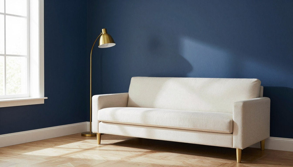
When deciding what colors go with navy blue, the most reliable pairings are white and cream, tan and beige, gold and brass, blush pink, warm gray, mustard yellow, terracotta, and sage green. These shades balance deep blue tones by introducing lightness, earthy warmth, or lively contrast across walls, furniture, and accent decor.
The right combination depends on the natural lighting in the room and the overall mood you want to establish. Deep blue can anchor a bright, airy living room or create an intimate, cozy atmosphere in a bedroom when matched with complementary finishes.

Why Navy Works as a Neutral in a Room
Navy blue carries enough visual weight to ground a room in the same way charcoal or black does, but it brings added color depth. Because it contains both cool blue notes and dark undertones, it flatters natural wood, crisp painted trim, and woven fabrics without clashing.
Using navy as a foundation allows wall art, accent chairs, and tabletop accessories to stand out cleanly. It works across traditional molding, flat modern drywall, kitchen cabinetry, and large statement canvases.
Navy blue serves as an anchor rather than an overwhelming shade when balanced with lighter surfaces, allowing you to swap accent pieces as seasons change.
Navy Blue Pairings at a Glance
Selecting the right partner shade shapes how bright, warm, or formal your room feels. The table below outlines how each core pairing performs across different living spaces.
| Pairing | Mood | Best rooms | Easy way to try it |
|---|---|---|---|
| White and cream | Crisp | Living room | Add off-white linen curtains and light cushions against a dark blue sofa. |
| Tan and beige | Warm | Family room | Introduce a jute area rug and caramel leather accent seating. |
| Gold and brass | Polished | Dining room | Swap cabinet hardware or hang a framed mirror with a metallic frame. |
| Blush pink | Gentle | Bedroom | Layer soft rose throw blankets across a midnight blue duvet. |
| Warm gray | Tailored | Home office | Paint surrounding walls in greige and hang deep blue wall art. |
| Mustard yellow | Lively | Reading nook | Place an ochre velvet cushion on a dark blue accent armchair. |
| Terracotta | Grounded | Entryway | Display baked clay planters and rust runners against blue millwork. |
| Sage green | Calming | Guest room | Group leafy potted plants alongside soft green accent ceramics. |
Crisp Contrast: White and Cream
Pairing navy blue with pure white or soft cream creates timeless visual clarity. White sharpens the deep navy base, while cream softens the contrast and adds welcoming warmth to the room.
This combination suits main living rooms, entryways, and master bedrooms where natural light needs to bounce freely. Cream walls also prevent navy furniture from feeling heavy or cold.
How to use it: Paint baseboards and window frames in warm cream to soften the boundary between your flooring and navy feature walls.
Multi-toned blue canvas artwork with pale details reinforces this light-and-dark dynamic. The square canvas print Arctic Azure pours bright cyan into deep navy, offering balanced color variation against pale off-white walls.

“Arctic Azure” — bright cyan melting into deep navy. View the piece →

Grounded Warmth: Tan and Beige
Tan, camel, and beige balance the cool temperament of navy by introducing earthy neutrality. This pairing feels casual yet composed, making it ideal for relaxed living rooms, dens, and open family spaces.
Natural materials like woven wool rugs, rattan lamp shades, and light leather chairs highlight the blue without creating stark divisions. Exploring palettes like colors that go with brown shows how warm wood tones harmonize effortlessly alongside deep blue tones.
How to use it: Anchor a dark navy sofa over a wide sandy beige area rug to keep your flooring visibly light and grounded.
Warm Radiance: Gold and Brass
Gold and brass finishes introduce reflective warmth that contrasts directly with the matte depth of navy blue. The yellow undertones in brass illuminate the dark blue, giving living and dining rooms a refined atmosphere.
Wall sconces, side table legs, picture frames, and curtain rods in brushed gold break up large fields of navy paint effectively.
How to use it: Install brushed brass cabinet hardware and lighting fixtures in a navy blue kitchen or study to catch the light.

Soft Balance: Blush Pink
Blush pink introduces a delicate counterpoint to navy blue, removing any heaviness from the dark shade. The gentle red undertones in pale pink warm the room while maintaining a tranquil, inviting feel.
This pairing excels in bedrooms, powder rooms, and creative sitting areas where you want comfort without high visual drama. Pale rose velvet cushions, linen bedding, or subtle drapery work seamlessly alongside navy accents.
How to use it: Pair navy blue velvet pillows with a dusty blush linen throw across an upholstered accent bench.
Subtle Harmony: Warm Gray
Warm gray provides a smooth tonal bridge between white trim and navy walls. Unlike cool industrial concrete grays, warm gray contains subtle beige or taupe undertones that keep the room comfortable.
This palette fits home offices, quiet reading rooms, and hallways where quiet visual continuity is desirable. A horizontal format print like Indigo Drift, featuring deep navy, midnight blue, steel blue, icy pale blue, and near-black, layers tone-on-tone blue values effortlessly against warm gray walls in sizes ranging from 24 x 16 to 81 x 54 in.

“Indigo Drift” — navy, midnight and steel blue in horizontal format. View the piece →

Energetic Accent: Mustard Yellow
Mustard yellow provides an intentional complementary pop against navy blue. Because yellow and blue sit opposite each other on the color wheel, their pairing produces natural visual excitement without feeling chaotic.
Using deeper ochre and mustard tones rather than bright lemon prevents the room from feeling childish. For example, the horizontal canvas print Golden Hour blends dusty blue, dove grey and a golden sun with a dark boat silhouette, pulling both color families together across a single focal point.
How to use it: Place a mustard yellow ceramic lamp base or a pair of patterned ochre cushions on a dark navy settee.

“Golden Hour” — dusty blue clouds with a golden sun. View the piece →
Earthy Depth: Terracotta
Terracotta brings sun-baked, red-orange warmth that cuts straight through the cool stillness of navy blue. This combination feels grounded and organic, drawing inspiration from natural stone and coastal clay cliffs.
Terracotta floor tiles, rust-colored wool throws, and raw earthenware pots add textural variety. This combination works particularly well in dining rooms, casual breakfast nooks, and transitional sunrooms.
How to use it: Use unglazed terracotta planters and rust linen napkins to warm up a dining space finished with navy accent walls.
Restful Nature: Sage Green
Sage green sits right next to blue on the color wheel, creating an analogous palette that feels organic and calm. The silvery undertones in sage mute the intensity of deep blue, evoking quiet coastal and forest landscapes.
Discovering harmonious earth tones in articles like colors that go with green shows how blending natural greens with navy provides an understated environment for living areas and guest bedrooms.
How to use it: Hang sage green curtains around windows in a navy room to frame garden views with soft natural color.
How to Bring Navy into a Room with Wall Art
Introducing navy blue through wall art is one of the most flexible ways to anchor an interior without repainting entire walls. Artwork delivers color presence while letting you control the exact proportion of dark tones in the room.
When selecting canvas pieces from the Rossetti Art blue wall art collection, keep several practical display guidelines in mind:
- Scale canvas art to cover roughly two-thirds the width of the furniture below it, such as a sofa, headboard, or console table.
- Mount deep blue canvases against off-white, cream, or warm gray walls to create a crisp frame that highlights the artwork.
- Echo the secondary colors found inside the print, such as golden yellow, icy blue, or dove grey, through rugs and accent pillows.
Rossetti Art prints are printed on poly-cotton canvas with UV- and fade-resistant HP latex inks that are UL GREENGUARD Gold certified. Each piece is hand-stretched over a 1.25-inch hardwood stretcher frame with a satin-matte finish, available with an optional handcrafted poplar hardwood floater frame, made to order, ready to hang, and delivered with free shipping.

Three Decorating Mistakes to Avoid with Navy
Navy blue is versatile, but balancing a deep shade requires attention to surrounding lighting and textures. Avoiding three common missteps will help keep your interior comfortable and balanced.
- Skipping warm materials: Pairing navy solely with cool gray or pure stark white can leave a room feeling chilly, so always introduce wood, tan leather, or brass.
- Ignoring light exposure: Painting all four walls navy in a north-facing room with limited windows can make the space feel smaller and dim.
- Using identical flat surfaces: A dark color needs surface texture, such as woven rugs, linen drapery, and matte canvas prints, to prevent walls from appearing flat.
Preview Artwork on Your Own Wall
See How Navy Artwork Looks in Your Space
Every product page includes a Live Preview button that displays the selected artwork directly on your own wall using your smartphone camera.
Try Live Preview →🎨 FREE ROOM-BY-ROOM ART GUIDE
Get our free guide to choosing art for every room, with color and size tips.
Download Free →Frequently Asked Questions
What is the best color to compliment navy blue?
Crisp white and warm cream serve as the most versatile complements to navy blue. They create clean contrast that keeps living rooms and bedrooms feeling bright, open, and balanced, while allowing darker furniture and wall art to stand out without competing for visual attention.
What colors make navy blue look rich?
Warm metallics like gold and brass, alongside rich terracotta, caramel tan, and deep ochre, make navy blue look exceptionally luxurious. These warm hues counteract the coolness of navy, drawing out its deep midnight tones and creating a polished, layered interior aesthetic.
What colors do not go with navy blue?
Very dark charcoal, muddy dark browns, and stark jet black often clash with navy because their values are too similar, creating a muddy, indistinct appearance. Overly saturated royal purple and electric neon hues also create harsh visual vibration when set alongside dark navy walls.
What color makes navy blue pop?
Mustard yellow and vibrant ochre provide the strongest energetic pop against navy blue. Because yellow sits directly opposite blue on the color wheel, even small mustard accent pillows, lamp bases, or wall art accents deliver immediate, lively visual contrast.
What pairs well with navy blue?
Natural wood finishes, woven jute rugs, camel leather, and muted sage greens pair naturally with navy blue. These organic textures and soft earthy shades balance the deep saturation of navy, producing an inviting, grounded atmosphere across living rooms, offices, and dining spaces.
Building Your Navy Blue Palette
Choosing what colors go with navy blue comes down to balancing its deep undertones with light surfaces, natural wood, or warm metallic accents. Start with one primary partner shade across your walls or area rugs, then layer secondary accents through framed canvas prints and decorative textiles to complete your room.
Keep Reading
About the Author — Chiara Rossetti is the founder of Rossetti Art, a canvas print and original art brand. She writes about interior design, wall art styling, and the art of making a home feel alive.

About the Author
Chiara Rossetti
Chiara Rossetti is the founder of Rossetti Art, a canvas print and original art brand. She writes about interior design, wall art styling, and the art of making a home feel alive.


Leave a comment
This site is protected by hCaptcha and the hCaptcha Privacy Policy and Terms of Service apply.