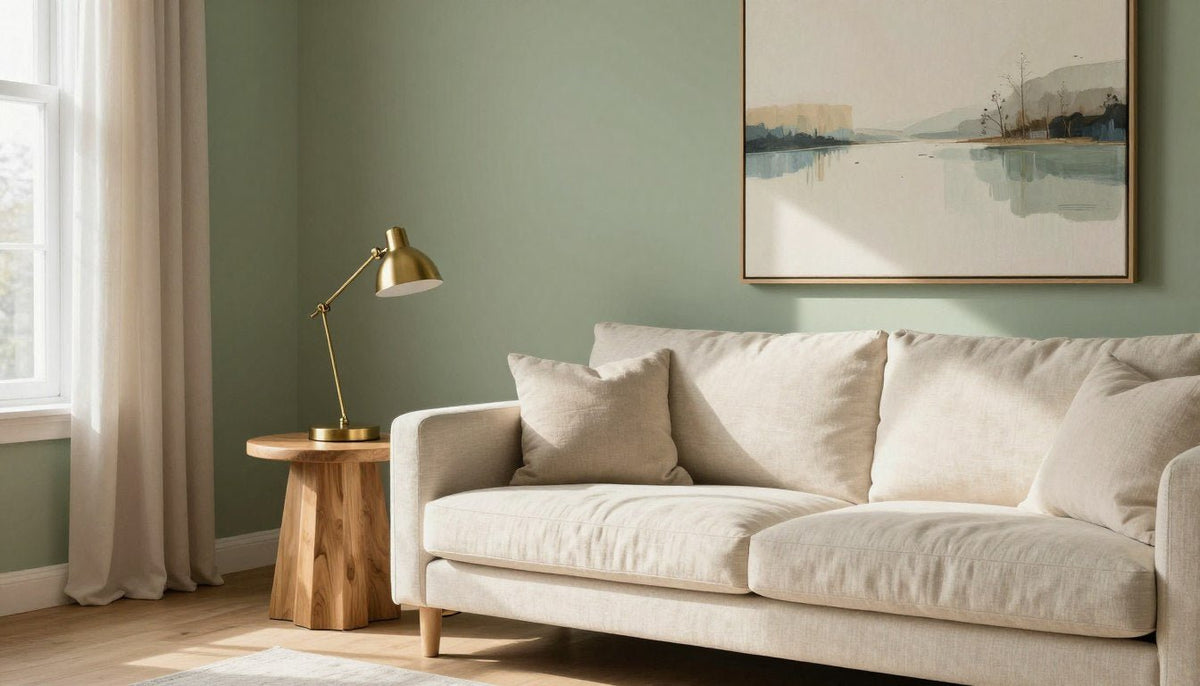
Sage green pairs effortlessly with cream, blush pink, terracotta, sandy beige, warm gray, black accents, navy blue, gold or brass, and natural wood. Because sage carries soft gray and yellow undertones, it functions as a grounded neutral that balances both crisp accents and earthy hues across modern living spaces.
Choosing the right complement depends on room orientation, available daylight, and whether the goal is an airy backdrop or a moody, cocooning interior. Balancing light reflectance values and undertones helps prevent green walls from feeling flat, washed out, or unexpectedly cold throughout the day.

Understanding Sage Green Undertones and Why It Works
Ready to Refresh Your Sage Green Walls?
Discover handcrafted canvas prints designed to bring balance, organic texture, and subtle color harmonies to any living space, shipped straight to your door with free shipping.
Shop Green Wall Art →Sage green sits right on the boundary between warm and cool, making it one of the most adaptable shades in home decor. It is fundamentally a muted green softened with a heavy dose of slate gray, frequently touched by faint yellow undertones. This unique blend keeps the pigment from feeling chilly while muting the bright intensity common to mint, kelly, or leaf green.
In north-facing rooms with cool, shadow-heavy daylight, sage green reads cooler, leaning closer to soft lichen or eucalyptus. In south-facing or west-facing rooms with warm sunlight, the golden base activates, turning the shade into a gentle, mossy neutral. Because it mirrors foliage found in nature, the human eye registers sage as peaceful and easy to live with over long periods.
To identify the primary undertone of your paint swatch, place it directly against pure white printer paper in midday natural light. A slate-blue tilt signals a cooler sage, whereas a buttery cast reveals a warmer base that pairs naturally with earth tones.
This chameleon quality allows sage to work either as a primary wall color or as an accent shade on cabinetry and interior doors. Instead of demanding center stage, it grounds surrounding furniture while giving colorful canvas prints and metallic fixtures a calm, organic surface to stand out against.

Nine Classic Color Pairings for Sage Green Walls
Knowing what color goes with sage green comes down to deciding whether you want subtle tonal harmony or bold graphic contrast. Here are nine reliable color pairings that bring out the best in sage green, along with practical tips for using each one successfully.
| Pairing | Mood | Best rooms | Easy way to try it |
|---|---|---|---|
| Cream | Airy | Living room | Add soft woven throw blankets and ivory canvas prints. |
| Blush Pink | Gentle | Bedrooms | Hang floral or ribbon abstract prints with rose accents. |
| Terracotta | Earthy | Dining room | Introduce unglazed clay pottery and rust-toned pillows. |
| Sandy Beige | Relaxed | Hallways | Mount a triptych of neutral landscape wall panels. |
| Warm Gray | Tailored | Home office | Combine charcoal trim with pale dove gray upholstery. |
| Black Accents | Graphic | Kitchens | Use matte black sconces and structured linear artwork. |
| Navy Blue | Classic | Study | Incorporate deep midnight blue rugs and painted built-ins. |
| Gold & Brass | Luminous | Powder room | Install brushed warm metal hardware and mirror frames. |
| Natural Wood | Organic | Open layout | Place white oak consoles and hardwood floating frames. |
Cream and Warm White: Pure stark white can make muted sage green look dirty or unwashed by comparison. Cream, vanilla, and soft buttermilk whites share the gentle yellow undertones that make sage feel welcoming. Use warm white on baseboards, picture rails, and window casings to frame sage walls cleanly without harsh visual friction.
Blush Pink: Red sits opposite green on the color wheel, making pink its natural complementary partner. A dusty blush or muted rose creates an enchanting botanical feel against sage without leaning juvenile. For a balanced art centerpiece, consider Sage Ribbon Bloom, which features sage green, blush pink, cream, forest green, ochre, and terracotta on poly-cotton canvas hand-stretched over a 1.25-inch hardwood stretcher frame with a satin-matte finish and an optional handcrafted poplar hardwood floater frame.
Terracotta: Rich clay, rust, and burnt sienna inject warmth into cooler sage rooms. This pairing pulls inspiration directly from Mediterranean courtyards, where potted plants rest against sun-baked brick. You can read more about coordinating warm earth tones in our guide to colors that go with brown.
Sandy Beige: When high contrast feels overwhelming, sandy beige offers a peaceful low-contrast environment. Layering wheat tones, travertine accents, and soft stone colors against sage produces a restorative, nature-inspired setting. A great wall styling option is Soft Shoreline, a beige set of 3 vertical panels printed on poly-cotton canvas with UV- and fade-resistant HP latex inks that arrives ready to hang. Explore complementary ideas in our overview of beige abstract wall art.
Warm Gray: Because sage contains significant gray pigment, pairing it with warm greige or slate feels effortless. Keep the gray on the warmer side, with taupe or brown undertones, rather than cool icy grays that battle green pigments. Check our comprehensive breakdown of colors that go with green for step-by-step palette recommendations.
Black Accents: Without crisp definition, muted green rooms can sometimes appear unmoored or muddy. Matte black hardware, slim picture frames, and iron light fixtures ground sage green walls instantly. The multi-panel print Ink Ledger, featuring black, ivory, and cream across a set of 3 vertical panels, provides sharp graphic structure while respecting the soft background tones of the wall.
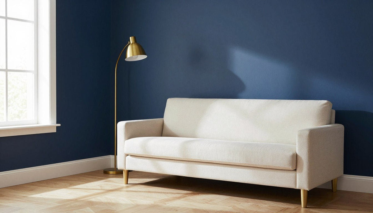
Navy Blue: Deep nautical blue sits adjacent to green, creating an analogous palette filled with depth and maturity. Dark navy velvet chairs or deep indigo accent walls provide a moody anchor against pale sage. This combination works exceptionally well in dining rooms and home libraries where dramatic, layered light creates an intimate evening atmosphere.
Gold and Brass: Warm metallic elements act like concentrated sunshine against herbal wall colors. Brushed brass, antique gold, and satin bronze pop against the quiet desaturation of sage green without looking flashy. Choose muted or brushed finishes rather than mirror-polished chrome, which can feel stark next to earthy paints.
Natural Wood: Timber brings out the organic soul of sage green. Pale woods like white oak, birch, and ash keep rooms light and Scandinavian in spirit, while rich walnut and warm teak add mid-century sophistication. Hardwood furniture and timber floating frames create an immediate bridge between interior walls and the natural world outside.

Organic Pastels
Combining blush and cream with herbal green creates a fresh, welcoming focal point suitable for bedrooms and relaxed sitting areas.

Tonal Neutrals
Sandy beige and muted taupe provide a grounding companion that maintains a tranquil, low-contrast atmosphere across living spaces.

Graphic Contrast
Sharp ivory, cream, and black lines introduce architectural clarity, keeping muted wall colors feeling structured and deliberate.
How to Use Sage Green in Wall Art Across Your Home
Wall art allows you to test color combinations before picking up a paint roller or committing to large-scale upholstery. Displaying canvas artwork that features sage green alongside coordinating secondary shades pulls your rugs, furniture, and lighting into a single cohesive narrative.
When selecting canvas art for a sage green wall, seek pieces that introduce lighter tints and grounded darker tones. If your wall is painted in a mid-tone sage, an artwork containing ivory, ochre, terracotta, or forest green will pop forward rather than blending invisibly into the background. Choosing larger formats, such as square statement sizes ranging from 20 x 20 up to 58 x 58 inches, prevents the art from looking dwarfed by large wall planes.
Framing matters just as much as canvas color. An optional handcrafted poplar hardwood floater frame provides a clean reveal between the canvas edge and the wall, giving the art a tailored gallery look without covering any printed surface.
In open-plan spaces, hanging multi-panel sets establishes visual rhythm across wide expanses of wall. Our made to order canvas prints are printed on poly-cotton canvas using UV- and fade-resistant HP latex inks that carry UL GREENGUARD Gold certification, and arrive ready to hang with free shipping. Explore our curated green wall art collection to discover prints tailored to every room size.

Three Decorating Mistakes to Avoid With Sage Green
While sage is exceptionally forgiving, certain pitfalls can leave a room feeling dull, muddy, or uncomfortably chilly. Avoiding three common missteps will keep your palette fresh, intentional, and inviting year-round.
Never rely solely on tiny paper paint chips under retail store fluorescent tubes. Always test paint swatches on multiple walls of your home and observe them across sunrise, midday sunlight, and nighttime artificial lighting.
1. Overlooking Natural Light and Room Direction: Placing a cool-toned sage green in a dim, north-facing room without warm light fixtures can produce a dreary, cement-like atmosphere. Match your pairing to the room orientation by introducing creamy textiles, warm terracotta tones, and incandescent lamplight to balance cool external light.
2. Flat Monochrome Without Textural Contrast: Matching your walls, sofa, curtains, and rugs in identical tones of smooth sage creates an uninspiring hospital-scrub effect. Layer varied textures like chunky bouclé, unglazed ceramics, woven grasses, and satin-matte canvas finishes to inject depth into monochromatic schemes.
3. Clashing Undertones in Wood Flooring and Trim: Placing cool sage directly against honey-orange oak trim or cherry red cabinets can result in an accidental clash if the undertones fight. Balance orange-heavy wood with warm, yellow-leaning sage varieties, or use neutral cream baseboards to create a smooth buffer between timber and wall paint.
Unsure How Artwork Will Look on Your Wall?
See your favorite art print in your actual room before ordering. Every product page includes an interactive Live Preview button that shows the exact piece scaled on your own wall via your phone or tablet camera.
Try Live Preview →🎨 FREE ROOM-BY-ROOM ART GUIDE
Get our free guide to choosing art for every room, with color and size tips.
Download Free →Frequently Asked Questions
Does sage green go with gray?
Yes, sage green pairs naturally with gray because sage contains slate undertones. To keep the space feeling cozy and layered, choose warm grays, charcoal, or greige rather than icy blue-grays. Layering in off-white woodwork or natural wood furniture prevents gray and sage combinations from feeling too somber.
Is sage green warm or cool?
Sage green is balanced right in the middle, leaning slightly cool due to its gray base while carrying soft yellow warmth. Because of this dual nature, it adapts to surrounding light, reading warmer in south-facing sunlit spaces and cooler in shaded or north-facing interior rooms throughout the day.
Is sage green still in style in 2026?
Sage green remains widely embraced in modern interior design because homeowners continue gravitating toward calming, biophilic shades inspired by nature. Rather than treating it as a fleeting color trend, designers now use sage green as an enduring alternative neutral that functions much like beige, taupe, or soft gray.
What colors look well with sage green?
Colors that look well with sage green include warm neutrals like cream and sandy beige, contrasting earth tones like terracotta and ochre, and crisp grounding accents such as matte black or deep navy. Metallic accents like brushed brass and natural timber also coordinate harmoniously alongside its gentle herbal surface.
What color best compliments sage green?
Blush pink and warm cream are the best complementary colors for sage green. Because pink sits directly opposite green on the artist color wheel, soft blush produces an instant, pleasing visual balance. Cream softens this pairing further, keeping the overall palette fresh, sophisticated, and comfortable in any room.
Bringing Your Sage Green Palette Together
Pairing colors with sage green comes down to balancing its gray undertones with warm creams, rich earth tones, and tactile natural surfaces. Whether through paint, wooden furniture, or curated canvas wall prints, introducing thoughtful accent hues creates a harmonious room that stays inviting and comfortable across every season.
Keep Reading
About the Author — Chiara Rossetti is the founder of Rossetti Art, a canvas print and original art brand. She writes about interior design, wall art styling, and the art of making a home feel alive.

About the Author
Chiara Rossetti
Chiara Rossetti is the founder of Rossetti Art, a canvas print and original art brand. She writes about interior design, wall art styling, and the art of making a home feel alive.

Leave a comment
This site is protected by hCaptcha and the hCaptcha Privacy Policy and Terms of Service apply.