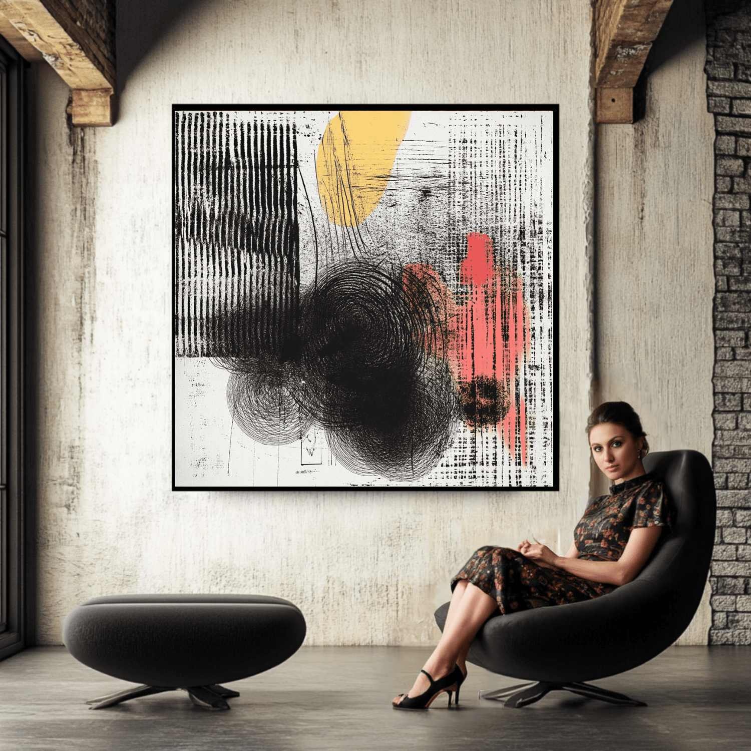
Textured Canvas Wall Art: How to Add Depth and Dimension to Your Walls
Does your wall feel flat even though the room has good furniture, color, and light? Textured canvas wall art can add visual movement without making the space feel crowded.

Quick Answer
Textured canvas wall art adds depth through layered shapes, tonal contrast, directional marks, and carefully balanced composition. These canvas prints create a tactile-looking effect through the artwork itself while remaining flat printed pieces. Choose the scale, palette, and contrast level to support the room rather than compete with it.
In this article:
What Makes Textured Canvas Work?
Texture in a printed artwork is often created by layers of color, shadow-like marks, rough-looking edges, and overlapping forms. A black white abstract may use soft gray transitions to suggest depth. A warm neutral piece may use sand, cream, and clay tones to create quiet movement.
This is different from a raised surface. The dimensional impression comes from the visual design printed on the canvas. For a short explanation of the category, read What Makes Textured Wall Art Different From a Flat Print?
The best textured wall art gives the eye somewhere to travel. It may include a strong central shape, broken lines, or layered color fields. The composition feels rich from close range but calm from across the room.
How to Choose Textured Canvas Wall Art by Room
Start with the room’s function. A living room can handle larger abstract paintings and deeper contrast. A bedroom often benefits from softer edges and a restrained palette. In a dining area, a confident geometric piece can echo the clean lines of the table and chairs.
| Room | Useful direction | CTA opportunity |
| Living room | Large textured wall art with balanced contrast | Explore a collection by color and size |
| Bedroom | Muted abstract forms and gentle movement | Compare minimalist textured options |
| Dining area | Structured shapes with a focused palette | Browse geometric canvas art |
| Entryway | Vertical work that creates an arrival point | Choose one clear statement piece |
Match the visual energy
If the room already has patterned rugs, bold upholstery, or many objects, choose a simpler textured painting. If the furniture is plain, a more layered abstract textured work can bring needed character.
Ready to find a textured wall art style that fits your room?
Browse abstract shapes, neutral palettes, and geometric compositions in one focused collection. Start with the room, then narrow your choice by scale and mood.
Use Color and Composition to Create Depth
Color contrast is one of the fastest ways to make a wall feel layered. A cream background with charcoal marks can look crisp. Black gray combinations feel modern and grounded. White mountain textured imagery can bring a lighter, landscape-inspired mood without adding many colors.
For a calm home, look for two or three main tones. More colors can work, but they should repeat elsewhere in the room. A rust mark may connect with a cushion. A soft green area may echo a plant or painted cabinet.
Read the artwork from two distances
- From across the room, check whether the main shape is easy to understand.
- From a closer distance, look for layered details and controlled variation.
- Notice whether the edges feel intentional or merely crowded.
- Compare the artwork with the wall color in both daylight and evening light.
A strong abstract painting does not need to explain itself. It needs to create a stable visual center. That quality helps textured wall art feel considered instead of dated.
Get the Scale and Placement Right
Scale changes the effect more than many shoppers expect. A small piece may disappear above a wide sofa. A large textured wall can feel dramatic, but only when nearby furniture gives it breathing room.
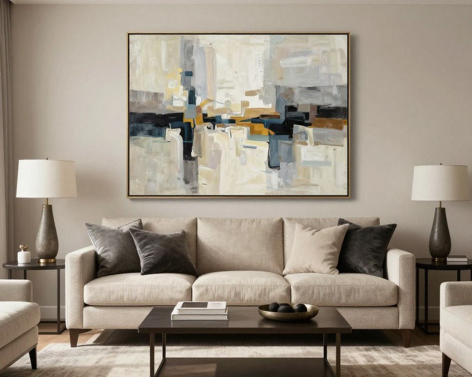
As a starting point, choose artwork that spans about two-thirds to three-quarters of the furniture below it. Hang the center near eye level. Above a sofa or console, leave a modest visual gap so the artwork and furniture read as one group.
For a narrow wall, consider a vertical canvas or a small canvas set. For a wide wall, one large textured canvas art piece may look cleaner than several unrelated paintings. Use a grouping only when the pieces share color, spacing, or composition.
Test before you commit
Use paper shapes or a digital mockup to test the footprint. Mark the outer corners on the wall. This simple step can prevent a common mistake: choosing a beautiful piece that is too small for the space.
Pair Textured Wall Art With Lighting and Furniture
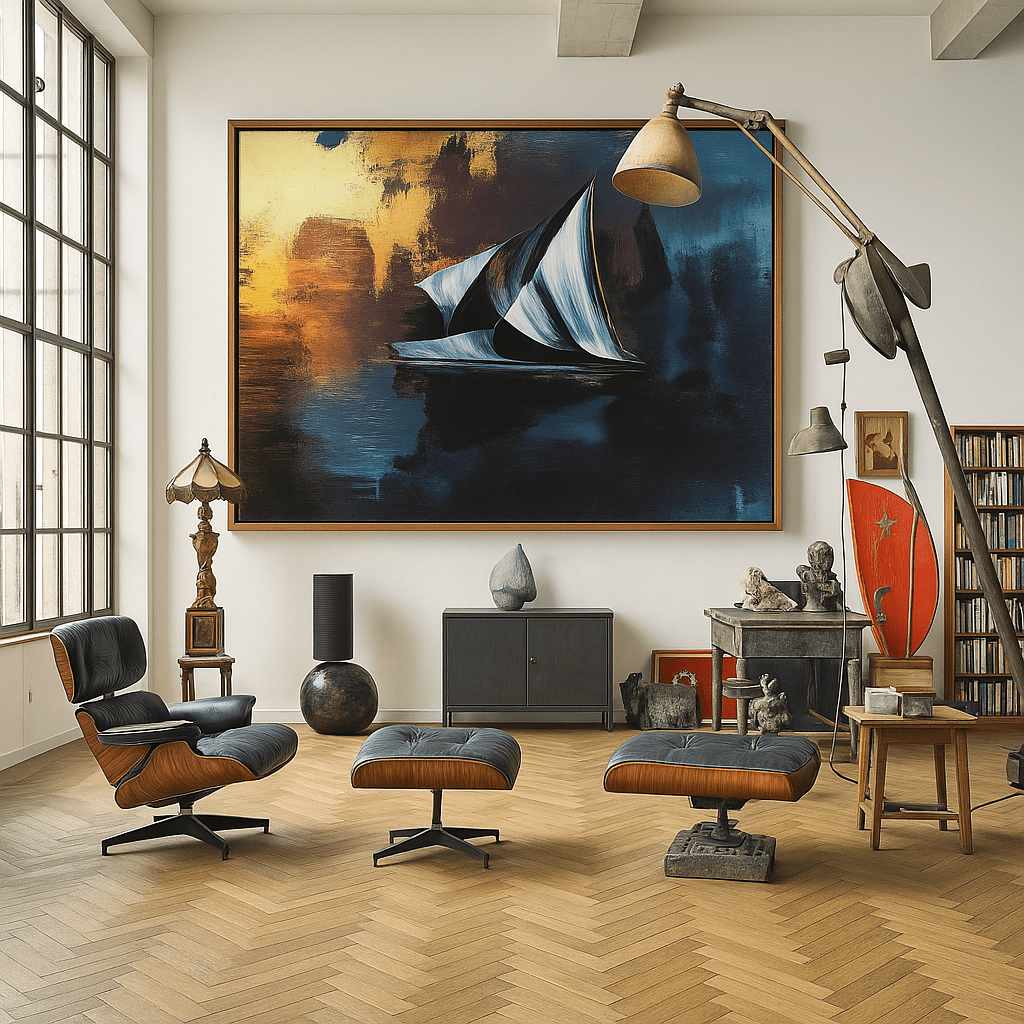
Light reveals detail. Place the artwork where daylight can reach it without creating glare. In the evening, a nearby lamp or adjustable picture light can reveal subtle tonal changes. The goal is even illumination, not a harsh spotlight.
Furniture should support the artwork’s visual direction. Rounded furniture pairs well with soft organic forms. Clean-lined furniture supports geometric painting and sharp color blocks. Natural wood can warm a black white composition. Metal accents can reinforce a more graphic abstract textured look.
Keep the surrounding wall quiet. A crowded shelf directly below a detailed canvas can weaken its impact. Instead, repeat one or two colors through small objects. This creates connection without copying every shade.
For general lighting guidance, review the U.S. Department of Energy lighting guidance. For color planning, Benjamin Moore’s color tools can help you compare related tones.
Still comparing flat-looking art with a more layered visual style?
Learn how visual depth, finish, and composition change the way a canvas reads on the wall. Use the guide before choosing a piece for a high-traffic room.
How to Avoid a Busy or Dated Look
Too much visual activity usually comes from poor balance, not from texture itself. If the artwork has strong marks, keep the frame and nearby decor simple. If the room has intense pattern, select a more restrained textured painting.
Helpful signs
- Repeated tones connect with the room.
- The focal shape is visible from a distance.
- Negative space gives the eye a rest.
- The finish feels suited to the room’s natural light.
Warning signs
- Every color in the room competes for attention.
- The artwork is too small for the furniture.
- Several unrelated paintings create visual noise.
- Gloss or glare hides the layered details.
Choose one visual lead
Let either color, shape, or texture-like detail lead the composition. When all three are equally strong, the wall may feel unsettled. A successful abstract textured wall gives the eye a clear first impression and quieter details to discover later.
Five Ways to Compare Textured Canvas Art
Textured Reflections
Use Abstract Canvas Print — Textured Reflections as a reference when comparing layered abstract movement with a modern room.

Whispered Halo Texture
The Minimalist Wall Art — Whispered Halo Texture example suits a quieter selection process built around space, softness, and restraint.

Rhythmic Fusion
Compare bold movement and structured color through Abstract Canvas Print — Rhythmic Fusion.

Luminous Echo
A rippled, layered surface look through Abstract Canvas Print — Luminous Echo, suited to a cooler, more graphic palette.

Abstract Confluence
A black-and-white dimensional ripple pattern via Abstract Canvas Print — Abstract Confluence, useful for a monochrome room.
Key Takeaways
- Choose visual layering, tonal contrast, and strong composition for a dimensional effect.
- Match the artwork’s energy to the room’s furniture, function, and light.
- Use scale carefully, especially above sofas, consoles, and beds.
- Keep nearby decor simple when the artwork has rich abstract details.
- Use collection CTAs for browsing and educational CTAs for reassurance.
- Compare the artwork in daylight and evening light before making a final choice.
Keep Reading
Frequently Asked Questions
What is textured canvas wall art?
It is canvas artwork designed with layered marks, tonal shifts, overlapping forms, and dimensional-looking details. The effect is visual and printed flat on canvas.
Does textured wall art need to be raised?
No. A carefully designed canvas print can suggest depth through contrast, shape, and layered artwork without a raised surface.
Which rooms suit textured canvas art?
Living rooms, bedrooms, dining areas, offices, and entryways can all work. Choose the scale and color intensity based on the room’s furniture and light.
How do I stop abstract textured wall art from looking busy?
Limit competing colors, leave breathing room around the piece, and let one visual feature lead. Simple surrounding decor helps layered details remain clear.
Should canvas art match my furniture?
It does not need to match exactly. Repeat one or two tones from the furniture, rug, or accessories so the artwork feels connected to the room.
Bring Depth to the Wall With Intention
The best textured wall art does more than fill an empty space. It gives the room a focal point, adds visual rhythm, and supports the mood already present. Begin with scale, then consider palette, contrast, lighting, and the amount of detail your room can hold.
When those choices work together, a textured canvas becomes part of the architecture of the room. It adds dimension without demanding attention from every corner.

Leave a comment
This site is protected by hCaptcha and the hCaptcha Privacy Policy and Terms of Service apply.