
How much wall art is too much? A designer's guide to balance
How much wall art is too much when you want your home to feel collected, not crowded?
There is no universal artwork limit. The right amount depends on scale, spacing, visual weight, room function, and how each piece relates to the furniture below it. A thoughtful arrangement can hold many pieces and still leave a room feeling calm.

Quick Answer
Wall art usually feels balanced when the overall composition uses about 60% of the available wall area, while a single piece or grouped arrangement spans close to two-thirds of the furniture beneath it. The 70/30 rule protects roughly 30% of the visual composition as breathing room. These are flexible design tools, not strict laws.
In this article:
- The 70/30 rule
- The 2/3 rule for furniture
- The 60% wall-coverage guideline
- How to balance wall art by room
- Key Takeaways and conclusion
- Frequently Asked Questions
- Keep Reading
The 70/30 Rule: Leave Room for the Eye
What the ratio means
The 70/30 rule suggests that about 70% of a wall composition may be art, while 30% remains negative space. It refers to the visual relationship between art, frames, furniture, and the surrounding wall. It is not a command to cover exactly 70% of a wall.
Interior designers use the ratio to check whether a display has enough breathing room. If the wall decor reaches every edge, the room may feel busy. If the display is tiny, the wall can feel unfinished rather than refined.
Concrete examples
| Wall size | Art composition | Remaining breathing room |
|---|---|---|
| 48 × 60 in / 122 × 152 cm | About 34 × 42 in / 86 × 107 cm | Open border around the grouping |
| 72 × 84 in / 183 × 213 cm | About 50 × 59 in / 127 × 150 cm | Clear wall at the sides and top |
| 96 × 120 in / 244 × 305 cm | About 67 × 84 in / 170 × 213 cm | Extra openness near architecture |
For a gallery wall, measure the outside edges of the full arrangement. Include frame widths and gaps. A group of six small pieces can follow the same visual logic as one large canvas.

Signs the ratio needs adjusting
- Reduce coverage near windows, doors, fireplaces, and shelves.
- Allow more open wall around a highly detailed or colorful focal point.
- Use a larger arrangement on a tall, empty wall so the room does not feel top-heavy.
- Step back from the wall and view the overall style from the doorway.
The 2/3 Rule for Wall Art
Measure the furniture first
The 2/3 rule says that art should span roughly two-thirds the width of the furniture below it. This creates a visual anchor without making the display look wider than the sofa, console, bed, or sideboard.
| Furniture width | Recommended total art width | Metric example |
|---|---|---|
| 60 in sofa | About 40 in | 152 cm sofa → 102 cm art |
| 72 in sofa | About 48 in | 183 cm sofa → 122 cm art |
| 84 in sofa | About 56 in | 213 cm sofa → 142 cm art |
| 96 in sofa | About 64 in | 244 cm sofa → 163 cm art |
Calculate a multi-piece arrangement
Total art width includes every piece and every gap. For three 16-inch / 41-cm frames with two 3-inch / 8-cm gaps, the composition is 54 inches / 137 cm wide. That may suit a sofa close to 81 inches / 206 cm wide.
Keep the center of the arrangement near average eye level. In most rooms, the midpoint of the display sits around 57–60 inches / 145–152 cm from the floor. Above furniture, leave about 6–10 inches / 15–25 cm between the furniture top and the lowest frame edge. Adjust for unusually tall furniture and household viewing habits.

Do you want one calm, wide piece instead of many small frames?
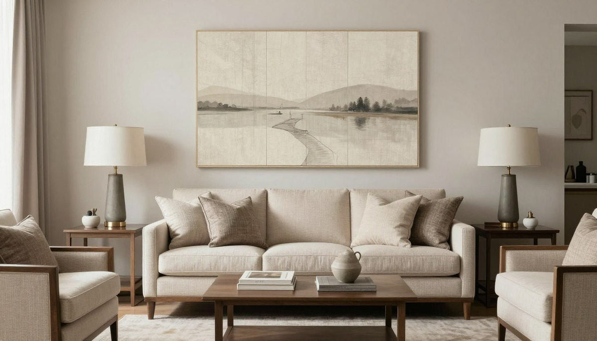
A neutral horizontal canvas can create a quiet focal point while preserving open space. Explore Coastal Silence Horizon when your room needs softness and visual length.
The 60% Wall-Coverage Guideline
Estimate the right scale
The 60% guideline helps answer how large wall art should be when the wall itself, rather than the furniture, is the main reference. Measure the usable wall area. Exclude doors, windows, built-ins, and other features. Then consider an artwork or arrangement that fills about half to three-fifths of that visual field.
| Wall dimensions | Recommended art or arrangement width | Metric width |
|---|---|---|
| 8 × 8 ft / 244 × 244 cm | 48–60 in | 122–152 cm |
| 10 × 8 ft / 305 × 244 cm | 60–72 in | 152–183 cm |
| 12 × 9 ft / 366 × 274 cm | 72–86 in | 183–218 cm |
Adjust the guideline around a fireplace, a narrow hallway, a stair wall, or a wall with several openings. A tall ceiling may need vertical art. A low ceiling often benefits from a horizontal piece or a compact set of three.
For additional planning guidance, review the Architectural Digest guide to hanging art and the Smithsonian’s guide to looking at art. The goal is not mathematical perfection. It is a room that feels visually settled.

How to Balance Wall Art in Every Room
Too much art versus art that is too small
A wall may feel crowded when several pieces compete for the same focal point, colors have no relationship, or spacing changes from frame to frame. Yet many pieces can work when they share a palette, frame finish, subject, or clear rhythm.
Art that is simply too small creates a different problem. It leaves large, accidental gaps and can make furniture look oversized. Before adding more pieces, try enlarging the main work or grouping small pieces into one deliberate gallery wall.
Spacing and arrangement rules
- Leave 2–4 inches / 5–10 cm between frames in a compact gallery wall.
- Use 4–6 inches / 10–15 cm between larger canvases with strong visual weight.
- Align a set of three by its center line, top edge, or bottom edge.
- Keep frame finishes related when the artwork already contains many colors.
- Step back often. A display should read as one composition from across the room.
To create a gallery wall, begin with the largest piece. Add medium pieces around it, then use small pieces to close gaps. Keep the outside shape intentional: a rectangle, a soft grid, or a balanced organic cluster. The gallery feels complete when another piece would weaken the rhythm rather than improve it.

Style by room
Living room
Use the sofa as the anchor. One large canvas works well above a long sofa. A gallery wall suits a more collected home.
Bedroom
Choose quieter palettes and softer subjects. Keep the display centered over the bed and avoid a crowded headboard wall.
Hallway and entry
Repeat a frame finish or color. Narrow art, a vertical piece, or a small sequence can guide the eye without narrowing the passage.

Is your living room missing a confident focal point?
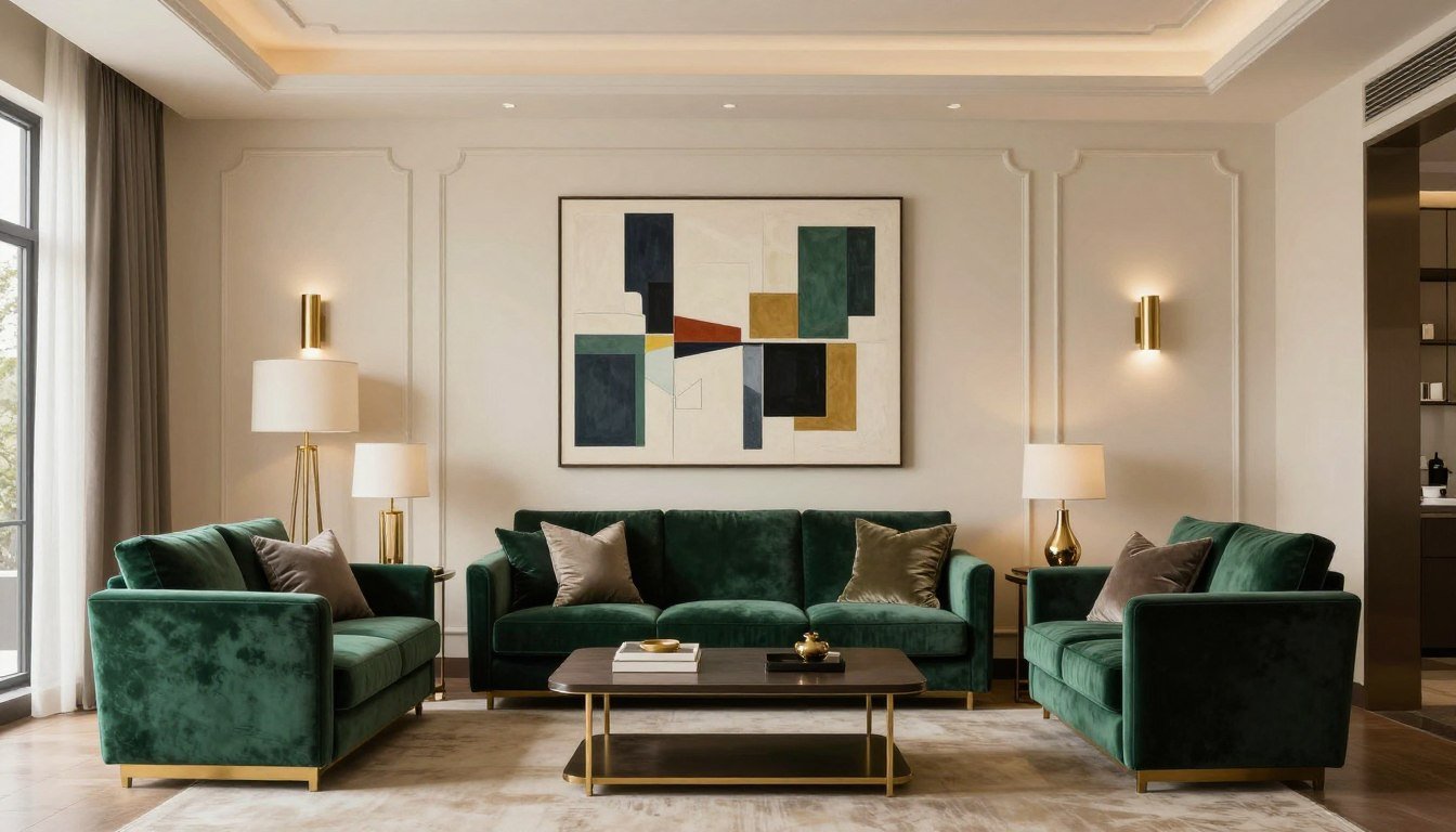
Use one color-rich work to give the room direction, then let the surrounding decor stay restrained. Browse Green and Gold Wall Art for a more expressive arrangement.
Open-plan spaces and bold decor
In an open-plan living and dining space, do not decorate every wall independently. Repeat one color or material across zones. A piece near the dining table can echo a canvas near the sofa without matching it exactly.
Bold art needs negative space. Pair a vivid work with neutral furnishings, simple frames, and fewer competing objects. For a modern cabin or lodge, Retro Snowboarder Canvas Print Art can tell a distinctive story without requiring a crowded wall.


Key Takeaways
- 70/30: Let art occupy most of the composition while preserving about 30% negative space.
- 2/3: Aim for art that spans about two-thirds of the furniture below it.
- 60%: Use roughly 60% of the usable wall as a starting point, then adjust for architecture.
- Leave 2–4 inches / 5–10 cm between compact frames and more space around larger works.
- Visual balance matters more than the number of pieces in the room.
- One large canvas can feel calmer and more premium than several disconnected small pieces.
Conclusion: when is enough actually enough?
So, how much wall art is too much? It becomes excessive when the pieces compete with one another, remove breathing room, or have no visual relationship with the room. A wall can hold one painting, a set of three, or many gallery pieces and still feel intentional.
Measure the furniture, check the usable wall, and consider the room’s overall style before adding another piece. Choose art that gives the eye somewhere to rest. The best display is not the fullest one. It is the one that makes your home feel alive.

Frequently Asked Questions
Keep Reading
- Large Canvas Wall Art Buyer’s Guide
- How to Choose Wall Art for Vaulted Ceilings
- A Guide to Sets of 3 Wall Art
For more considered canvas prints and original paintings, visit Rossetti Art.


About the Author — Chiara Rossetti is the founder of Rossetti Art, a canvas print and original art brand. She writes about interior design, wall art styling, and the art of making a home feel alive.

About the Author
Chiara Rossetti
Chiara Rossetti is the founder of Rossetti Art, a canvas print and original art brand. She writes about interior design, wall art styling, and the art of making a home feel alive.

Leave a comment
This site is protected by hCaptcha and the hCaptcha Privacy Policy and Terms of Service apply.