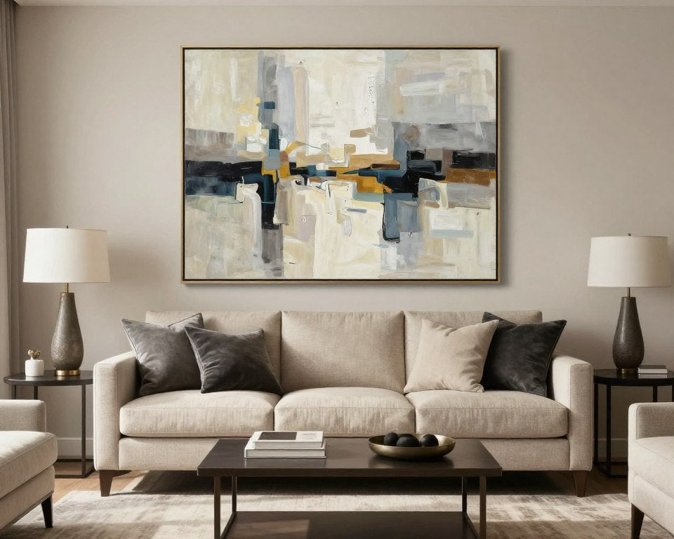
Living Room Canvas Wall Art: How to Choose a Style That Fits Your Space
What should your living room feel like when you walk in: calm, warm, bold, or quietly refined? The right canvas can answer that question before anyone says a word.
Quick Answer
Choose living room canvas wall art by matching its mood to your furniture, wall color, lighting, and daily life. Use related colors for a calm look, or choose one strong contrast when the room needs a focal point. A curated canvas collection makes the final choice easier.
In this article:
- Start with the room’s style
- Build a useful color palette
- Match art to the mood
- Connect art with furniture
- Create a focal point
- Open and traditional rooms
- Curate a gallery wall
- Consider light and materials
- Explore focused canvas choices
- Use CTAs that support decisions
- Key takeaways
- Further reading
- Frequently Asked Questions
Start With the Living Room’s Style
Begin with the largest visual elements. Look at the sofa, rug, flooring, and window treatments. Your canvas does not need to match every detail. It should feel connected to at least two existing features.
Modern rooms often suit crisp shapes, controlled contrast, and clean negative space. Minimalist rooms benefit from art with a limited palette. Warm rooms can handle natural forms, soft landscapes, and earthy canvas art.

Build a Color Palette That Feels Intentional
Choose one dominant color, one supporting color, and one small accent. For example, beige walls, a charcoal sofa, and a muted gold detail create a calm base with gentle contrast.
Art can repeat a color from the room, introduce a nearby shade, or provide a deliberate counterpoint. A print with rust, black, and cream can warm a gray room. Blue-green tones can make a sunny space feel cooler.
- Repeat a color from the rug for visual unity.
- Use gold in small amounts so it feels refined, not busy.
- Choose low-contrast tones for rest and high contrast for energy.

Match Canvas Art to the Mood You Want
Calm and collected
Choose soft shapes, pale neutrals, misty landscapes, or restrained abstract canvas art. These choices work well where people read, rest, or host quiet conversations.
Warm and grounded
Look for clay, sand, olive, brown, and sunlit cream. Desert cactus themes, organic forms, and warm landscapes can make a large room feel more welcoming.
Bold and expressive
Use a strong print when the furniture is simple. Orange, cobalt, deep green, or black can give the room a clear point of view.


Let the Furniture Guide the Art
Furniture gives canvas art its visual context. A low sofa can support a broad horizontal composition. A tall bookcase or fireplace may work better with vertical movement. Keep sizing simple and focus first on proportion.
| Room feature | Useful canvas direction | Design effect |
|---|---|---|
| Gray sofa | Warm beige, rust, or muted gold | Adds warmth and depth |
| Light wood | Earthy, cream, or olive art | Supports a natural feeling |
| Dark furniture | Light ground with clear contrast | Prevents the room from feeling heavy |
For detailed proportions, use this room-by-room art sizing guide. It keeps the technical choice brief while helping you avoid a canvas that feels lost or crowded.

Make One Piece the Focal Point
A focal point should attract attention without making the room feel forced. Pick one canvas with a clear shape, unusual subject, or confident color. Let nearby decor support it rather than compete with it.
Remove small objects that interrupt the view. Repeat one color from the canvas in a cushion, vase, or book. This small echo helps the art feel designed into the room.
Ready to find a canvas that gives your room a clear point of view?
Browse a focused collection of modern, warm, and expressive pieces selected for living spaces.

Choose Art for Open or Traditional Rooms
Open-concept spaces
Open rooms need art that connects zones. Repeat a color seen near the dining or kitchen area. Avoid a print that looks correct from only one angle.
Traditional living rooms
Traditional rooms can support more symmetry, classic landscapes, botanical subjects, or a carefully balanced pair. A modern abstract can still work when its colors relate to the rug and upholstery.

Curate a Gallery-Style Wall
A gallery wall should feel collected, not random. Start with one anchor print. Add two or three supporting works with a shared color, subject, or visual rhythm.
- Mix large and small pieces with a clear anchor.
- Keep the palette consistent across the group.
- Use different subjects only when the colors connect.
For a quieter gallery, combine black-and-white work with one muted color print. For a more relaxed look, mix landscapes, floral forms, and abstract canvas art.


Consider Light, Texture, and Materials
Natural light changes how a print reads during the day. Bright rooms can carry deeper tones. Dim rooms often benefit from lighter grounds and open compositions.
Canvas adds softness beside glass, metal, stone, and wood. If the room already has many textures, choose art with a calm surface and simple forms. If the room feels flat, use expressive brushwork or layered color.

Key Takeaways
- Let your sofa, rug, and flooring set the palette — art should connect to at least two existing features, not fight them.
- Pick one dominant color, one supporting color, and one small accent for a palette that feels intentional, not accidental.
- Choose one focal piece with a clear shape or confident color, then let the rest of the room support it.
- Open-concept rooms need art that repeats a color from nearby zones; traditional rooms can carry more symmetry.
- A gallery wall should read as curated — start with one anchor print and add supporting pieces that share color or rhythm.
Explore Focused Canvas Choices
Quiet silhouette
Silent Grace suits rooms that need calm movement, shape, and a refined neutral presence.
Minimal contrast
Cross of Silence works with modern furniture, pale walls, and a black-and-white visual language.
Geometric warmth
Solar Equilibrium brings orange, black, and beige energy to a restrained room.


Use CTAs That Support the Reader’s Decision
Retail collection pages often ask visitors to browse or shop. An editorial page can improve that path by explaining why a product fits. The best CTA appears after a useful insight, uses one clear action, and avoids pressure.
Still unsure whether the canvas will feel balanced above your furniture?
Review proportion guidance before you compare your favorite print with the sofa, wall, and surrounding decor.
Use direct product buttons for warm visitors. Use educational links for readers who are still comparing. This two-step path serves both browsing and purchase intent.

Further Reading on Living Room Styling
Keep Reading
Frequently Asked Questions
What style of canvas art works best in a living room?
The best style supports the room’s furniture, colors, and mood. Abstract, minimalist, earthy, floral, and landscape canvas art can all work when the palette feels connected.
Should wall art match the sofa?
It does not need to match exactly. Repeat one sofa color, use a related shade, or create intentional contrast with a clear accent color.
Is canvas art good for an open-concept room?
Yes. Choose a print that shares color or mood with nearby zones so the living area feels connected to the kitchen or dining space.
Make the Room Feel Like Yours
The strongest living room canvas wall art choice is not simply the most colorful or expensive piece. It is the one that supports your furniture, reflects your mood, and gives the room a memorable visual center. Start with style, narrow the palette, and choose one canvas that feels personal.

Leave a comment
This site is protected by hCaptcha and the hCaptcha Privacy Policy and Terms of Service apply.