The perfect piece of wall art can transform a modern interior from simply stylish to absolutely stunning. Yet finding that perfect balance of size, placement, and style often feels like an elusive design secret. Whether you're refreshing your living space or starting from scratch, understanding the fundamental rules of modern interior design wall art is essential for creating a cohesive, gallery-worthy home.
This comprehensive guide brings together expert insights on everything from the classic 2/3 sizing rule to room-specific placement strategies that interior designers swear by. We'll explore how different art styles complement various modern design aesthetics and provide actionable formulas you can apply immediately to elevate your space.
Quick Answers (TL;DR)

Best modern wall art sizes for living rooms: 36"×24" to 60"×40" (91×61cm to 152×102cm) for above sofas; follow the 2/3 rule for proper proportions.
Best modern wall art sizes for bedrooms: 36"×24" to 48"×32" (91×61cm to 122×81cm) for above beds; aim for 2/3 the width of the headboard.
The 2/3 rule explained: Your wall art should be approximately two-thirds the width of the furniture it hangs above. For example, a 72" sofa would pair well with a 48" wide art piece or grouping.
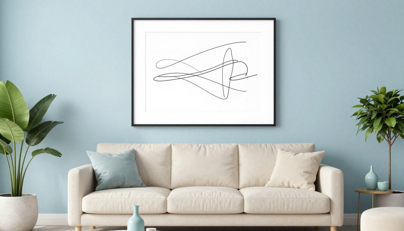
Best modern styles: Abstract geometric, minimalist line art, monochrome photography, and textured canvas work exceptionally well in modern interiors.
Fast collection tip: Match your interior style (Scandinavian, Industrial, Mid-century, etc.) to corresponding art styles using our decision matrix below.
What Counts as "Modern Interior Design" Today?

Modern interior design has evolved significantly from its mid-century origins. Today's modern aesthetic embraces clean lines, intentional minimalism, and thoughtful material selection—but with a warmer, more livable approach than the stark modernism of decades past.
While contemporary design refers to what's current right now, modern design draws from specific principles: functional spaces, uncluttered environments, and an emphasis on form following function. Modern interiors typically feature neutral color palettes, natural materials, and strategic pops of color or texture.
Wall art serves as the critical finishing element that makes modern interiors feel intentional rather than incomplete. In spaces defined by restraint, wall art provides the perfect opportunity to introduce personality, color, and visual interest without compromising the clean aesthetic that defines modern design.
As warm minimalist interiors continue gaining popularity, wall art has become even more important—offering the warmth and character that prevents minimalist spaces from feeling cold or sterile. The right piece doesn't just decorate a wall; it completes the design narrative of your entire space.
Explore Our Best-Selling Modern Art
Discover our curated collection of canvas prints perfect for modern interiors.
Shop Best SellersThe Designer Sizing Rule (Use This Before You Shop)

The 2/3 Rule (with a worked example)
The 2/3 rule is the designer's secret to perfectly proportioned wall art. This principle states that your art should be approximately two-thirds the width of the furniture it hangs above. This creates visual balance and ensures your art neither overwhelms nor disappears in your space.
For a 72-inch sofa, multiply the width by 2/3: 72 × (2/3) = 48 inches. Your ideal art width is approximately 48 inches—either as a single piece or a grouped arrangement.
This formula works for any furniture piece: beds, consoles, dining tables, or desks. For a deeper dive into the 2/3 rule, consider how this principle creates visual harmony by establishing proper proportional relationships between your furniture and art.
Hanging height + spacing (gallery wall vs single)
Proper hanging height is just as important as width. The center of your artwork should hang at approximately 57-60 inches from the floor—roughly eye level for most adults. This creates a gallery-like presentation that feels intentional and professional.
For gallery walls, maintain 2-3 inches of space between frames for visual breathing room. When hanging art above furniture, ensure the bottom edge sits 6-8 inches above the furniture to create a visual connection without feeling crowded.
Single large pieces should follow the same eye-level principle, but when in doubt, slightly lower is better than too high. For multi-piece layouts, treat the entire arrangement as a single unit when applying the center-at-eye-level rule.
Modern Wall Art Placement Checklist
- 2/3 Rule Width Check: Measure your furniture width and multiply by 2/3 to find your ideal art width.
- Hanging Height: Center your art at 57-60 inches from the floor (eye level) when not above furniture.
- Furniture Clearance: Position art 6-8 inches above furniture for proper spacing.
- Frame Spacing: Allow 2-3 inches between frames in gallery arrangements.
- Light/Glare Assessment: Check for glare from windows or lighting fixtures at different times of day.
- Color Temperature Test: Evaluate whether your art's color temperature (warm vs. cool) complements your space.
- Scale Verification: Step back 6-8 feet to ensure your art doesn't feel too small or overwhelming for the wall.
Modern Interior Design Wall Art Decision Matrix

| Interior Style | Best Art Style | Best Palette | Recommended Sizes | Best Collections |
| Warm Minimalist | Line art, abstract organic | Neutral, earth tones | Medium to large (30"×20" to 48"×32") | Line Art Collection |
| Scandinavian | Minimalist, nature-inspired | Black & white, muted blues | Medium (24"×16" to 36"×24") | Black & White Collection |
| Japandi | Botanical, abstract minimal | Neutral, black, subtle greens | Medium to large (30"×20" to 40"×30") | Botanical Collection |
| Industrial | Abstract geometric, urban | Black & white, rust, blue | Large (36"×24" to 60"×40") | Abstract & Geometric |
| Mid-century | Geometric, retro abstract | Bold accent colors, mustard | Medium to large (30"×20" to 48"×32") | Abstract & Geometric |
| Contemporary | Bold abstract, photography | High contrast, vibrant | Large to oversized (40"×30" to 72"×48") | Canvas Prints Hub |
This decision matrix helps you quickly identify which art styles, color palettes, and sizes work best with your specific modern interior style. For a more detailed guide to abstract art in modern spaces, consider how different abstract styles can enhance various room functions and moods.
Find Your Perfect Abstract & Geometric Art
Explore our curated collection of abstract and geometric canvas prints.
Shop Abstract & GeometricRoom-by-Room Modern Wall Art Guide

| Room | Best Placement | Sizing Rule | Recommended Size Range | Layout Type |
| Living Room | Above sofa, fireplace, console | 2/3 width of furniture | 36"×24" to 60"×40" (91×61cm to 152×102cm) | Single statement, triptych |
| Bedroom | Above bed, opposite bed | 2/3 width of headboard | 36"×24" to 48"×32" (91×61cm to 122×81cm) | Single piece, diptych |
| Dining Room | Above sideboard, accent wall | 2/3 width of table or sideboard | 36"×24" to 48"×36" (91×61cm to 122×91cm) | Statement piece, set of 2-3 |
| Hallway/Staircase | Staggered along wall | 60-75% of wall width for gallery | Multiple 16"×12" to 24"×18" (41×30cm to 61×46cm) | Gallery wall, series |
| Home Office | Behind desk, video call background | 2/3 width of desk | 24"×16" to 36"×24" (61×41cm to 91×61cm) | Single piece, grid of 4 |
| Kitchen | Open wall, near dining area | Proportional to wall space | 16"×12" to 30"×20" (41×30cm to 76×51cm) | Single piece, set of 2 |
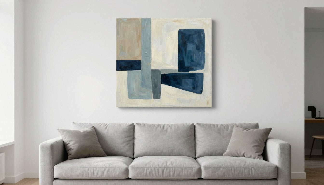
Living Room (above sofa, fireplace, console)
The living room offers prime wall art real estate, particularly above the sofa. For this placement, follow the 2/3 rule religiously—a 78" sofa pairs beautifully with a 52" wide art piece or grouping. Maintain 6-8" of space between the bottom of your art and the top of your sofa.
For fireplace placements, the art should be approximately 3/4 the width of the fireplace opening, hung with the bottom edge 4-6" above the mantel. Console tables benefit from art that's slightly narrower than the table itself, creating a framed vignette effect.
Our room-by-room modern wall art guide offers additional living room-specific insights for creating a cohesive look that balances your existing furniture and architectural features.

Bedroom (above bed + calm palettes)
Bedroom art should create a serene atmosphere while maintaining proper proportions. For above-bed placement, your art should span approximately 2/3 the width of your headboard or bed frame. A queen bed (60" wide) works well with a 40" wide art piece or arrangement.
Choose calming color palettes and subjects for bedroom art—abstract landscapes, minimalist line art, or subtle textures work particularly well. If your bedroom features bold accent colors, select art that incorporates these colors in a more subdued way.
For minimal bedroom styling, consider a single oversized piece rather than a busy gallery arrangement to maintain the restful atmosphere essential for sleep spaces.
Discover Our Line Art Collection
Explore our minimalist line art prints perfect for bedrooms and calm spaces.
Shop Line Art CollectionDining Room (bold focal point)
Dining rooms offer an opportunity for more dramatic art statements. Since this space is used primarily for gathering rather than relaxation, you can embrace bolder colors, larger scales, and more eye-catching compositions.
For art above a sideboard or buffet, follow the 2/3 rule while considering the height of any table lamps or decor that might sit beneath it. For dining rooms without sideboards, consider an accent wall with a large statement piece positioned centrally.
Abstract art with food-related themes, still lifes with subtle culinary references, or high-contrast black and white photography all work exceptionally well in dining spaces, creating conversation starters for dinner guests.
Hallway / Staircase (gallery wall spacing)

Hallways and staircases present unique opportunities for gallery-style arrangements that tell a visual story as you move through the space. For these transitional areas, consistency in framing creates cohesion while allowing for variety in the artwork itself.
When creating a hallway gallery, maintain 2-3" of space between frames and align either the tops or centers of frames for a polished look. For staircases, follow the angle of the stairs by hanging pieces at consistent heights relative to the stair treads rather than the floor.
Consider a thematic connection between pieces—similar color palettes, subject matter, or artistic styles—to create a curated feel rather than a random collection. For narrow hallways, smaller pieces prevent the space from feeling crowded.
Home Office (camera background friendly art)
With remote work now a permanent fixture, home office art serves dual purposes: personal inspiration and professional video call backdrop. Choose pieces that reflect your personal aesthetic while maintaining a polished, distraction-free background for virtual meetings.
For behind-desk placement, select art that sits at eye level when seated, creating an engaging backdrop without overwhelming the space. Abstract pieces in professional color palettes (blues, greens, neutrals) work particularly well for this dual purpose.
Consider how your art appears on camera—high contrast pieces with simple compositions tend to read better on video than intricate details that might appear busy or pixelated in digital formats.
Kitchen (small-to-medium, wipeable mindset)
Kitchens benefit from art that can withstand the unique challenges of the space—moisture, food splatter, and temperature fluctuations. Canvas prints with protective coatings or framed pieces behind glass offer practical solutions for kitchen art.
Size-wise, kitchens typically call for smaller to medium pieces that don't compete with cabinetry and appliances. Open wall spaces near dining areas, above coffee stations, or flanking windows provide ideal placement opportunities.
For kitchen-specific art placement, consider pieces that complement rather than match your kitchen colors—art that picks up secondary tones from backsplashes or accent pieces creates subtle cohesion without feeling contrived.
Choosing Colors for Modern Interiors (Without "Matching" Everything)

The most sophisticated modern interiors avoid the "matching sets" approach in favor of thoughtful color coordination. Here are three proven strategies for selecting art colors that enhance your space without falling into the matchy-matchy trap:
Neutrals + One Accent Strategy
This approach pairs a primarily neutral art piece (whites, grays, blacks) with a single bold accent color that connects to another element in your room. The accent might appear as just 10-20% of the artwork but creates a powerful visual connection to a furniture piece, rug, or decorative object.
Example: A primarily white and gray abstract with touches of terracotta that connect to your accent pillows or ceramic vase.
Monochrome Strategy
Monochrome doesn't mean boring—it means exploring the full range of a single color family. A black and white art piece with varied textures and tones adds sophisticated depth to colorful rooms, while a blue monochrome piece can explore everything from pale sky to deep navy within a single composition.
This strategy works particularly well in spaces with architectural interest or textural elements that benefit from color simplicity in the artwork.
Explore Our Black & White Collection
Discover our sophisticated black and white canvas prints.
Shop Black & White CollectionMuted Color Strategy
Muted colors—those toned down with gray or their complementary color—create sophisticated harmony in modern interiors. These "quiet" colors still provide visual interest without shouting for attention.
Look for art featuring dusty blues, sage greens, muted terracottas, or soft ochres that complement your existing color palette without directly matching it. These subdued tones create depth and interest while maintaining the restrained elegance that defines modern interiors.
Choosing the Right Format

Single Statement Piece vs Sets
The choice between a single large piece and a coordinated set depends on both your space and the effect you want to create. Single statement pieces create bold focal points with maximum impact, ideal for minimalist spaces or rooms where you want one dominant visual element.
Art sets—diptychs (2 pieces), triptychs (3 pieces), or larger groupings—create rhythm and movement across a wall. They're particularly effective for wider walls where a single piece might feel lost or insufficient.
When choosing between these formats, consider:
- Wall width: Wider walls (over 6 feet) often benefit from sets that can span the appropriate distance.
- Ceiling height: Lower ceilings pair better with horizontally-oriented pieces or sets, while high ceilings can accommodate taller vertical pieces.
- Room complexity: Busier rooms with many design elements often benefit from the simplicity of a single statement piece.
When Triptychs Work Better Than One Oversized Piece
Triptychs and multi-panel sets offer several advantages in specific situations:
- Awkward wall proportions: Very wide, low walls that would require an uncomfortably wide single piece.
- Visual rhythm: When you want to create movement that draws the eye across the space.
- Practical considerations: Easier transportation and installation compared to very large single pieces.
- Flexible arrangement: Can be hung with varying spacing to fit different wall dimensions.
For maximum impact with multi-panel art, maintain consistent spacing between pieces (typically 2-3 inches) and treat the entire grouping as a single unit when applying the 2/3 rule to furniture below.
Discover Our Canvas Print Sets
Explore our curated collection of 2-3 piece canvas print sets.
Shop Canvas Print SetsTextures & Materials (Why Textured Art Works in Modern Homes)

Modern interiors often feature clean lines and smooth surfaces that can sometimes feel flat or cold. Textured wall art introduces much-needed dimension and tactile interest that creates visual warmth without cluttering the space.
Textured art works particularly well in modern homes because:
- It creates visual interest even within minimalist color palettes
- It adds depth through shadow play as lighting changes throughout the day
- It introduces organic elements that soften architectural rigidity
- It creates focal points that don't rely on bold colors that might clash with your design scheme
When incorporating large textured wall art, balance is key. Pair highly textured pieces with simpler surrounding elements to prevent visual competition. In rooms with existing textural elements (like exposed brick or natural wood), choose art with complementary rather than competing textures.
For maximum impact, position textured art where natural or directional lighting will enhance its dimensional qualities. Angled lighting creates shadows that highlight texture, while diffused lighting softens textural elements for a more subtle effect.
Common Mistakes (And How to Fix Them Fast)

| Common Mistake | Why It Happens | Fast Fix |
| Hanging art too high | Intuition often leads us to hang art higher than optimal viewing height | Center your art at 57-60" from the floor; when above furniture, position bottom edge 6-8" above furniture |
| Art too small for the wall | Fear of overwhelming the space; budget constraints | Follow the 2/3 rule; for sofas, art should be 2/3 the width of the sofa (e.g., 48" art for 72" sofa) |
| Ignoring the room's scale | Focusing on the wall alone without considering the entire room | Step back 8-10 feet to assess proportion; art should occupy 2/5 to 3/5 of available wall space |
| Matching art exactly to decor | Desire for cohesion leads to overly coordinated selections | Choose art with 1-2 colors from your room's palette plus one new accent color |
| Crowded gallery walls | Adding pieces over time without overall planning | Maintain 2-3" between frames; remove pieces until arrangement occupies 60-75% of wall area |
| Ignoring lighting considerations | Focusing on daytime appearance only | Add picture lighting or adjust existing lighting to highlight art; check for glare at different times |
The good news about these common mistakes is that they're all easily fixable with simple adjustments. For more detailed guidance on creating the perfect art print sizes and frames for your space, explore our comprehensive sizing guide.
Frequently Asked Questions
What wall art looks best in modern interior design?
Modern interior design pairs exceptionally well with abstract geometric art, minimalist line drawings, monochrome photography, and textured canvas pieces. The key is selecting art with clean compositions that complement rather than compete with the architectural elements of modern spaces. Abstract pieces with limited color palettes, large-scale photography with simple subjects, and textural works that add dimension without visual clutter are all excellent choices for modern interiors.
How big should art be above a sofa?
Art above a sofa should be approximately 2/3 the width of the sofa, with the bottom edge positioned 6-8 inches above the sofa back. For a standard 72-inch sofa, your art (or art grouping) should be around 48 inches wide. Height should be proportional to width, typically 2/3 to 3/4 the width dimension. For example, a 48-inch wide piece might be 32-36 inches tall. This creates visual balance while ensuring the art makes a proper impact relative to the furniture below.
What is the 2/3 rule for wall art?
The 2/3 rule states that wall art should be approximately two-thirds the width of the furniture it hangs above. This proportion creates visual harmony by ensuring the art is neither too small (appearing disconnected) nor too large (overwhelming the furniture). To apply this rule, simply measure your furniture width and multiply by 2/3. For example, a 60-inch dining table would pair well with art that's about 40 inches wide. This rule applies to sofas, beds, consoles, and other furniture pieces.
What's the best modern art style for minimalist interiors?
Minimalist interiors pair beautifully with art that embraces similar principles of restraint and intentionality. Line art with simple, continuous lines, monochromatic abstract pieces, and black and white photography with strong compositional elements all complement minimalist spaces without disrupting their clean aesthetic. Look for pieces with ample negative space, limited color palettes, and strong geometric or organic forms that add interest without visual clutter.
Should wall art match the rug/sofa?
Rather than directly matching your wall art to your rug or sofa, aim for thoughtful coordination. Your art should relate to your furnishings through complementary colors, similar tonal qualities, or thematic connections—but exact matching often creates a flat, uninspired look. Instead, choose art that includes 1-2 colors from your existing palette plus one new element that adds depth and interest. This creates cohesion while maintaining visual hierarchy and preventing the "furniture showroom" effect.
What sizes work for gallery walls?
Effective gallery walls typically combine varied sizes within a cohesive framework. A good starting point is to include a mix of small (8"×10", 11"×14"), medium (16"×20", 18"×24"), and large (24"×36") pieces. The entire arrangement should follow the 2/3 rule relative to furniture below, occupying approximately 60-75% of the available wall space. Maintain consistent spacing between frames (2-3 inches) and consider using templates or paper mockups to plan your arrangement before hanging. For more detailed guidance, check our standard canvas sizes guide.
How high should I hang wall art?
The center of your artwork should hang at approximately 57-60 inches from the floor—roughly eye level for most adults. This creates a gallery-like presentation that feels intentional and professional. When hanging art above furniture, ensure the bottom edge sits 6-8 inches above the furniture to create a visual connection without feeling crowded. For gallery walls or groupings, treat the entire arrangement as a single unit when applying the center-at-eye-level rule.
Finding Your Perfect Modern Wall Art

The perfect piece of modern interior design wall art does more than fill empty space—it completes your design narrative, adds personality to your home, and creates the finished look that distinguishes thoughtfully designed interiors from works-in-progress.
By following the sizing, placement, and style guidelines in this guide, you've gained the designer knowledge needed to select wall art with confidence. Remember that the most successful modern interiors balance clean lines and intentional minimalism with personal touches that make the space uniquely yours.
At Rossetti Art, we've curated collections specifically designed to complement modern interiors across various styles—from warm minimalist to industrial, Scandinavian to mid-century. Our canvas prints are sized according to the principles outlined in this guide, making it easy to find pieces that will work perfectly in your space.
Explore Our Complete Canvas Collection
Discover the perfect modern wall art for your space.
Shop Canvas Prints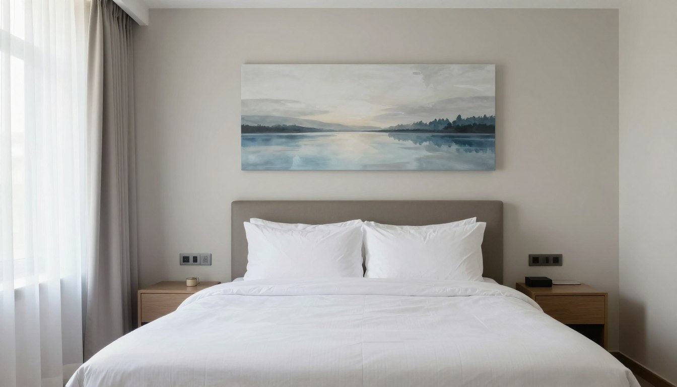
Leave a comment
This site is protected by hCaptcha and the hCaptcha Privacy Policy and Terms of Service apply.