
Kitchens deserve thoughtful art just as much as living rooms. Yet many homeowners hesitate, unsure where to hang pieces among cabinets, backsplashes, and appliances. This guide removes the guesswork from kitchen wall art placement, providing practical rules for sizing, positioning, and color coordination that respect the unique challenges of cooking spaces.
Whether you're working with a cozy breakfast nook, narrow wall strips between cabinets, or an open-concept kitchen, you'll find designer-approved strategies that balance aesthetics with the practical realities of steam, splashes, and heat zones. Let's transform those blank kitchen walls into personalized statements that enhance your daily cooking experience.
TL;DR: Kitchen Wall Art Essentials
- Hang art at 57-60" from floor to center (eye level) or 6-8" above countertops/furniture
- Keep art 24-30" away from steam sources and splash zones near sinks
- For dining nooks, choose art 2/3 to 3/4 the width of your table
- Narrow wall strips work best with vertical pieces (16"×24" or 20"×30")
- Match art palette to cabinet hardware for cohesion (brass → warm tones; chrome → cool tones)
- Use glass-fronted frames in humid areas; canvas in low-splash zones
- Align art with cabinet lines rather than fighting architectural elements
- Test layouts with paper templates before committing to nail holes
- For open shelving areas, choose minimal art with plenty of negative space
The Kitchen Wall Art Placement Map
Different kitchen zones have unique requirements for art placement. This comprehensive map guides you through the ideal approach for each area, considering practical concerns like heat, steam, and architectural elements.
| Kitchen Wall Type | Best Orientation | Best Layouts | Safe Clearances | Suggested Sizes | Hanging Height | Color Strategy | Common Mistake |
| Empty Wall | Horizontal | Single large piece or 3×3 gallery | 24" from cooking areas | 30"×40" (76×102cm) or 36"×48" (91×122cm) | 57-60" to center | Statement piece with accent colors | Choosing too small for scale |
| Between Cabinets | Vertical | Single tall piece | 18" from stovetop | 16"×24" (41×61cm) or 20"×30" (51×76cm) | Centered in space | Blend with cabinet color | Fighting cabinet lines |
| Above Coffee Station | Square or horizontal | Pair or trio | 12" above equipment | 16"×16" (41×41cm) or 20"×20" (51×51cm) | 8" above station | Complement equipment finishes | Placing too low (steam damage) |
| Above Bar Cart | Horizontal | Single statement piece | 8" above cart | 24"×36" (61×91cm) | 6-8" above cart | Echo glassware or bottle colors | Competing with bar cart items |
| Dining Nook | Horizontal or square | Single large or gallery wall | N/A | 2/3 to 3/4 table width | 57-60" to center | Warm, inviting palette | Hanging too high |
| Pantry Door | Vertical | Single tall piece | N/A | 16"×24" (41×61cm) | 57-60" to center | Subtle, neutral palette | Blocking door swing |
| Open-Shelf Zone | Horizontal | Single minimal piece | N/A | 24"×30" (61×76cm) | Between or above shelves | Minimal palette with negative space | Visual competition with shelves |

Kitchen wall art placement guide with recommended positions and clearances
Best Places for Wall Art in a Kitchen (With Quick Rules)
Certain areas in your kitchen naturally lend themselves to wall art. Let's explore the most effective spots and how to maximize their impact.
Dining Nook / Breakfast Corner
The wall behind a breakfast table or banquette is prime real estate for art that anchors your dining experience. This area is typically free from cooking splashes and steam, making it ideal for statement pieces.

Quick Rules:
- Choose art that's 2/3 to 3/4 the width of your table
- Hang at eye level (57-60" to center) when standing
- For banquettes, lower slightly to account for seated viewing
- Consider morning light conditions to avoid glare
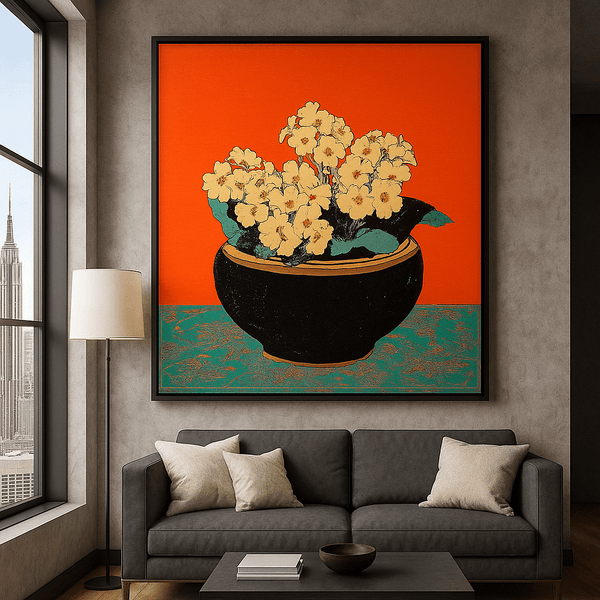
Perfect for Dining Nooks
The "Colorful Stroll" canvas brings vibrant energy to breakfast conversations while maintaining a sophisticated aesthetic that works with most kitchen finishes.
Coffee Station Wall
The wall above a coffee bar or tea station offers an opportunity for a small statement piece that enhances your morning ritual. This area benefits from themed art that complements your coffee setup.

- Position art at least 12" above coffee makers to avoid steam damage
- Choose smaller pieces (16"×16" or 20"×20") that don't overwhelm the station
- Consider a pair or trio of coordinated pieces for visual interest
- Select colors that complement your coffee equipment finishes
Pantry Door / Utility Door
Narrow wall spaces beside pantry doors or utility closets provide perfect opportunities for vertical art pieces that might otherwise be difficult to place.

- Choose tall, narrow pieces (16"×24" or 12"×36")
- Ensure art doesn't interfere with door handles or swings
- Center in the available wall space
- Select subtle designs that don't demand too much attention
Narrow Wall Strips Between Openings
Those slender wall sections between doorways, windows, or cabinet groupings can be transformed from awkward spaces into design features with the right art approach.

- Vertical orientation works best (16"×24" or 12"×36")
- Center in the available space
- Choose art with visual weight at the center rather than the edges
- Consider a series of small squares stacked vertically for extra-narrow spaces
Open-Shelf Zones
Walls with open shelving require a delicate balance—art should complement rather than compete with displayed items.

- Choose art with plenty of negative space
- Opt for minimal compositions that won't create visual clutter
- Position between shelves or above the top shelf
- Select colors that complement both your dishes and kitchen palette
Looking for the perfect kitchen art?
Explore our collection of abstract and geometric canvas prints designed to complement modern kitchens.
Browse Abstract & Geometric CollectionBest Sizes for Kitchen Wall Art (By Situation)
Choosing the right size art for your kitchen space is crucial for visual balance. Here are specific recommendations for common kitchen scenarios.

Above a Small Dining Table
- Round table (36" diameter): 24"×30" (61×76cm) or 30"×30" (76×76cm)
- Square table (36"×36"): 24"×36" (61×91cm)
- Rectangular table (36"×48"): 30"×40" (76×102cm)
- Size Rule: Art width should be 2/3 to 3/4 of table width
Narrow Wall Strip
- 12" wide wall: 8"×10" (20×25cm) or 11"×14" (28×36cm)
- 18" wide wall: 12"×18" (30×46cm) or 16"×20" (41×51cm)
- 24" wide wall: 16"×24" (41×61cm) or 20"×30" (51×76cm)
- Size Rule: Art width should be 65-75% of wall width
Over a Console/Sideboard
- 36" wide console: 24"×36" (61×91cm)
- 48" wide console: 36"×48" (91×122cm) or 30"×40" (76×102cm)
- 60" wide console: 40"×60" (102×152cm) or gallery of 3 pieces
- Size Rule: Art width should be 2/3 to 3/4 of furniture width
Small "Moment" Above a Coffee Bar
- 24" wide station: pair of 11"×14" (28×36cm)
- 36" wide station: 24"×24" (61×61cm) or trio of 8"×10" (20×25cm)
- 48" wide station: 30"×30" (76×76cm) or pair of 16"×20" (41×51cm)
- Size Rule: Total art width should be 50-75% of station width
Simple Size Decision Formula
For horizontal art above furniture:
- Minimum width = Furniture width × 0.5
- Ideal width = Furniture width × (0.65 to 0.75)
- Maximum width = Furniture width × 0.8
For empty walls, measure the available wall space between architectural elements and multiply by 0.6-0.75 to find your ideal art width.
When working with kitchen wall art, remember that scale matters tremendously. Art that's too small will look lost and disconnected, while pieces that are too large can overwhelm the space. For more detailed guidance on sizing art throughout your home, explore our guide on large textured wall art sizing and placement.
Color Pairing for Kitchens (Finish → Palette)
Creating harmony between your kitchen finishes and wall art colors is essential for a cohesive look. Use this chart to identify the perfect art palette based on your existing kitchen elements.
| Cabinet Color | Countertop | Hardware | Best Art Palette | Designer Move |
| White/Cream | Marble/Quartz | Brass | Warm neutrals, terracotta, soft gold | Echo brass tones in art and repeat in tea towels |
| White/Cream | Marble/Quartz | Chrome | Cool blues, grays, silver accents | Pull one blue tone into small appliances |
| Black/Charcoal | Marble/Quartz | Brass | High contrast B&W with gold accents | Add small brass objects that echo art tones |
| Wood (Medium) | Butcher Block | Black | Earth tones, forest greens, russet | Repeat wood tone in art frames and stools |
| Wood (Light) | White/Quartz | Black | Scandinavian blues, soft black, white | Echo black hardware in minimal art lines |
| Green | Marble/Quartz | Brass | Botanical greens, cream, gold accents | Pull the exact cabinet green into art selection |
| Blue | White/Quartz | Chrome | Coastal blues, whites, silver tones | Match art blues precisely to cabinet shade |
| Greige | Marble/Quartz | Black | Warm grays, black, white, subtle accent | Add one vibrant accent color in art and accessories |

Blending vs. Accent Palettes
When selecting kitchen wall art colors, you have two primary approaches:
Blending Palette
- Art colors closely match existing kitchen elements
- Creates a harmonious, cohesive look
- Ideal for kitchens with strong architectural features
- Works well in open-concept spaces where visual continuity matters
Accent Palette
- Art introduces new colors as intentional accents
- Creates energy and visual interest
- Best when accent color appears in small doses elsewhere
- Works well in neutral kitchens that need personality
For more inspiration on creating color harmony throughout your home, check out our guide on how to mix and match art prints for a stunning gallery wall.
Perfect for Wood & Brass Kitchens
Our "Retro Floral Canvas Print" features warm tones that beautifully complement wood cabinets and brass hardware, creating a cohesive look that enhances breakfast nooks and coffee stations.
Styling Recipes (8 Quick Kitchen Looks)
Need inspiration? Here are eight designer-approved kitchen art styling approaches you can implement today.
Minimal Scandinavian
Best for: White kitchens with light wood
Palette: Black, white, pale blue
- Single large piece with plenty of negative space
- Thin black frame or frameless canvas
Size: 30"×40" horizontal
Warm Modern
Best for: Wood cabinets with brass hardware
Palette: Terracotta, ochre, cream
- Abstract with warm color blocks
- Natural wood or brass frame
Size: 24"×36" horizontal
Botanical Fresh
Best for: Green cabinets or plant-filled kitchens
Palette: Various greens, white, brass
- Abstract botanical or modern leaf motifs
- Thin brass frame or canvas
Size: Set of three 16"×20" vertical
Coastal Calm
Best for: Blue cabinets or white kitchens
Palette: Blues, whites, sand tones
- Abstract seascape or geometric with blue focus
- White or natural wood frame
Size: 24"×30" horizontal
High Contrast Drama
Best for: Black or very dark kitchens
Palette: Black, white, single bright accent
- Bold geometric or high contrast abstract
- Thin black frame or canvas
Size: 36"×36" square
Breakfast Nook Gallery
Best for: Dining area walls
Palette: Coordinated 2-3 color scheme
- Grid of 4-6 related pieces
- Identical frames with consistent spacing
Size: 16"×16" squares in grid
Coffee Corner Moment
Best for: Above coffee stations
Palette: Warm browns, blacks, cream
- Abstract with subtle coffee tones
- Pair of coordinating pieces
Size: Two 12"×16" vertical
Vertical Statement
Best for: Narrow wall strips
Palette: Simple, limited color scheme
- Single tall piece with vertical movement
- Thin frame that matches hardware
Size: 16"×24" or 20"×30" vertical

For more inspiration on minimal art approaches that work beautifully in kitchens, explore our room-by-room minimal art styling guide.
Kitchen-Proof Styling Rules (5-Minute Checklist)
Essential Kitchen Art Checklist
- Choose "clean" compositions - Avoid visually busy art near cluttered countertops or complex backsplashes
- Respect safety clearances - Keep art at least 24" from stovetops and 18" from sink splash zones
- Align with architecture - Position art to complement cabinet lines rather than fight them
- Consider lighting conditions - Use matte finishes or glass with anti-glare coating where pendant lights might cause reflection
- Echo existing elements - Pull 1-2 colors from backsplash, countertop, or accessories into your art selection
- Scale appropriately - Use the 2/3 rule for dining areas; go vertical for narrow spaces
- Test before committing - Create paper templates of your art and tape them up to visualize placement
- Protect from kitchen conditions - Use glass-fronted frames in humid/splash-prone areas; canvas in drier zones

Testing art placement with paper templates ensures perfect positioning
Common Mistakes (And Fast Fixes)
Even design professionals occasionally make these kitchen art missteps. Here's how to avoid them or fix them quickly.
Too Small for the Space
Small art on large walls creates a disconnected, floating effect that feels unintentional.
Fast Fix: Group small pieces into a gallery, or swap for a piece that's at least 2/3 the width of the wall section or furniture below.
Hung Too High
Art placed above eye level creates psychological distance and feels disconnected from the space.
Fast Fix: Rehang at 57-60" from floor to center (standard eye level) or 6-8" above countertops/furniture.
Fighting Cabinet Lines
Art that ignores the strong horizontal and vertical lines of cabinetry creates visual tension.
Fast Fix: Align art with cabinet edges or center between architectural elements.
Glare Issues
Glass-fronted art placed opposite windows or under direct lighting creates distracting reflections.
Fast Fix: Use anti-glare glass, canvas prints, or reposition to avoid direct light paths.
Visual Clutter Near Countertops
Busy, detailed art competing with active countertop areas creates visual chaos.
Fast Fix: Choose simpler compositions with more negative space for busy kitchen zones.
Placement in Splash/Heat Zones
Art too close to cooking areas or sinks risks damage from steam, heat, and splashes.
Fast Fix: Relocate art at least 24" from heat sources and 18" from splash zones, or add protective glass.

Before and after: Correcting common kitchen art placement mistakes
Curated Rossetti Art Picks for Kitchens (By Mood)
Based on our kitchen design expertise, we've selected pieces from the Rossetti Art collection that work exceptionally well in kitchen environments.
Clean Minimal
These airy, minimal pieces create a sense of calm in busy kitchen spaces. Their clean compositions and ample negative space prevent visual competition with architectural elements.
Colorful Abstract Canvas Print
This vibrant modern wall art piece brings controlled color to minimal kitchens without overwhelming the space. Its balanced composition works beautifully above dining nooks or on empty kitchen walls.
Warm & Inviting
These pieces feature warm terracotta tones and wood harmonies that enhance the natural materials often found in kitchen spaces. They're perfect for creating a welcoming atmosphere in dining nooks and breakfast corners.
Retro Floral Canvas Print
The warm terracotta tones and bold flower pot design make this piece ideal for kitchens with wood elements and brass hardware. Its inviting energy creates the perfect atmosphere for morning coffee or casual dining areas.
Color Pop
These vibrant pieces add playful energy to kitchen accent walls. They're especially effective in neutral kitchens that need a focal point or personality boost.
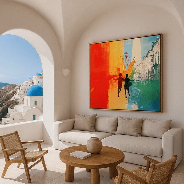
Colorful Stroll
This vibrant abstract urban wall art brings energy and movement to neutral kitchens. Its dynamic composition creates a conversation piece perfect for modern dining nooks or as a focal point on an empty kitchen wall.
For more inspiration on incorporating geometric elements into your kitchen design, explore our guide on abstract geometric wall art trends.
Frequently Asked Questions
Where should I hang art in a kitchen?
The best places for kitchen wall art include dining nook walls, empty walls opposite cabinets, above coffee stations (with proper clearance from steam), narrow wall strips between openings, and beside pantry doors. Avoid areas directly behind sinks or stovetops where splashes and steam could damage artwork. Always hang at eye level (57-60" from floor to center) or 6-8" above countertops and furniture.
What size wall art works best in a small kitchen?
In small kitchens, opt for medium-sized pieces (16"×20" to 24"×30") rather than multiple small pieces that can create visual clutter. For narrow wall strips, choose vertical orientations (16"×24" or 12"×36"). Above small dining tables, select art that's approximately 2/3 the width of the table. When space is extremely limited, consider a single statement piece rather than multiple smaller works.
Can I put wall art near the stove or sink?
It's best to keep valuable art at least 24" away from stovetops and 18" from sink splash zones. If you must place art in these areas, use pieces with protective glass fronts and ensure they're properly sealed against moisture. Canvas prints should be kept in drier zones away from direct steam and splashes. Consider kitchen-specific prints that can be easily replaced if damaged in these high-risk areas.
How do I match wall art to cabinet and countertop colors?
For a cohesive look, either select art that contains colors found in your cabinets and countertops (blending approach) or choose complementary colors that create intentional contrast (accent approach). Hardware finishes provide excellent cues—brass hardware pairs beautifully with warm tones, while chrome and black hardware work well with cooler palettes. For wood cabinets, echo the wood tone in your art selection or frame choice.
What height should I hang wall art above a dining nook table?
For dining nooks, center your art at 57-60" from the floor when standing, or approximately 4-8" above the top of chair backs when seated. The goal is to create a visual connection between the table and art. For banquette seating, you might position the art slightly lower (54-57" center height) to account for the seated viewing position. Always ensure the bottom edge of the frame clears the heads of seated diners.
Should kitchen wall art be framed or canvas?
Both options work well depending on placement. Glass-fronted frames offer better protection in humid or splash-prone areas, as they can be wiped clean and protect the art from moisture. Canvas prints work beautifully in drier zones and offer a contemporary, frameless look that integrates well with modern kitchens. For areas near cooking zones, glass-fronted frames are preferable, while dining nooks and coffee stations can accommodate either style.
Elevate Your Kitchen with Thoughtfully Placed Art
Kitchen wall art isn't just decorative—it's transformative. By following the placement maps, sizing guides, and color pairing strategies in this resource, you can confidently select and position art that enhances your cooking space while respecting its unique challenges.
Remember that kitchens deserve the same thoughtful art approach as living spaces. Whether you're working with a small breakfast nook, narrow wall strips between cabinets, or an open-concept kitchen, the right art in the right place creates a more personal, inviting environment for daily cooking and gathering.
Ready to transform your kitchen walls?
Explore our collection of canvas prints designed to complement modern kitchens and enhance your daily cooking experience.
Browse Canvas Print Collection

Leave a comment
This site is protected by hCaptcha and the hCaptcha Privacy Policy and Terms of Service apply.