
Can one understated canvas change how a whole room feels? This question frames why precise shapes and calm tones matter in today’s homes. Readers will see how structured compositions bring balance to living rooms, stairways, and home offices across Canada.
Geometric abstraction synthesizes form, proportion, and color into a clear design language that fits 2025 interiors. It pairs well with clean framing, shared palettes, and measured spacing to make gallery arrangements look intentional rather than improvised.
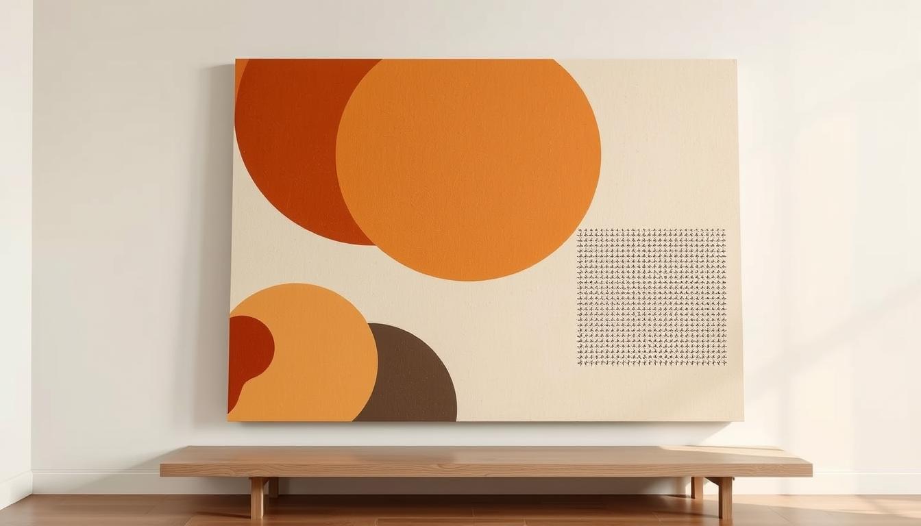
Muted Form Funk — Minimalist Abstract Canvas for Modern Interiors is highlighted as an example of a calming, minimalist canvas that anchors condo walls and single-family homes with soft tones and durable, eco-friendly materials.
Expect practical guidance on placement, finish choices, and sustainable prints so readers can pick pieces that last and create cohesive decor plans for focused, calmer spaces.
Key Takeaways
- Structured compositions offer balance and a timeless look for Canadian interiors.
- Placement, consistent framing, and palette cohesion make gallery displays feel intentional.
- Muted Form Funk works as a calming focal canvas for living rooms and work zones.
- Finish, materials, and sustainable prints affect longevity and daily wear.
- The guide links trend context to clear, actionable steps for choosing prints and arranging spaces.
Why Abstract Geometric Wall Art Is the Aesthetic Language of 2025
Sharp shapes and calm proportions have moved from galleries into everyday rooms and screens. This shift makes wall art feel familiar in Canadian living spaces.
Muted Form Funk exemplifies the look: soft geometric blocks and clean lines that sit well above a sofa or inside a curated cluster. It matches wood tones and neutral textiles to keep rooms warm, not sterile.
From galleries to daily life
Design motifs now appear across apps, furniture, tiles, and lighting. That ubiquity helps simple art read as natural on walls and in hallways.
Structure as comfort
Golden ratios, rhythmic patterns, and clear lines offer a steady visual logic. This gives people a quiet sense of order amid change.
"Measured spacing and cohesive framing turn modest shapes into confident statements."
- Everyday fit: Scales well for apartments and larger homes.
- Curated calm: Negative space and texture prevent overload.
- Built to last: A timeless way to invest in long-term style.
| Feature | Why it Works | Home Example |
|---|---|---|
| Visual logic | Uses proportion and rhythm to soothe the eye | Above a dining table |
| Scale options | Adaptable to condos and houses | Single large canvas or small cluster |
| Material warmth | Textured papers and wood frames add tactility | Paired with warm wood shelving |
Abstract Geometric Wall Art: A Modern Interior Trend Explained
Lines, circles, and measured color planes can act like furniture for the eye, shaping how a room reads.
Definition and roots: This movement removes obvious subjects and focuses on shapes, rhythm, and proportion. It traces back to ancient tessellations and sacred patterns, then to pioneers like Mondrian and Malevich.
Muted Form Funk shows how restraint works: calm color fields, clear proportion, and generous negative space that suit open-plan living and compact condos alike.
From pioneers to present
Op art added optical rhythm; today’s digital tools add precision. Canvas prints, murals, and digital installations reimagine classic forms with crisp grids and subtle gradients.
- Color: Muted palettes soothe; bold fields create focal energy.
- Negative space: It lets patterns breathe and prevents overwhelm in small rooms.
- Formats: Framed prints to gallery-wrapped canvas fit different budgets and styles.
"Proportion and restraint help a single print anchor sightlines and define conversation zones."
Trend Drivers: Digital Design, Generative Tools, and Immersive Platforms
Digital tools and new platforms are reshaping how designers craft crisp, rule-driven compositions for today's homes. Advances in software, AI, and VR make it easy to produce and preview precise visual systems before a print or canvas is ordered.
Algorithmic aesthetics
Golden ratios, sacred geometry, and recursive grids inform many contemporary designs. Viewers do not need to know the math to feel the calm these forms bring.
Tech-enabled creativity
AI-assisted workflows create near-endless variations of patterns and prints. VR galleries let buyers place works virtually, so they see scale and color on their wall first.
Minimalism with personality
Negative space, careful color blocking, and matte textures soften busy, screen-filled rooms. That balance keeps energy steady and makes rooms feel composed.
Muted Form Funk acts as a quiet counterpoint to complex generative pieces. It offers measured forms that temper high-energy works and help curated spaces remain cohesive.
| Driver | Effect | Home Result |
|---|---|---|
| Algorithmic rules | Consistent proportion and rhythm | Calm focal pieces |
| Generative AI | Wide variety of prints | More choices for curated walls |
| Immersive previewing | Better scale and color confidence | Fewer returns, smarter buys |
Where It Works Best at Home: From Living Rooms to Stairways
A well-sized canvas can guide sightlines and set the mood for living spaces. Thoughtful placement turns prints into functional design tools that shape flow and focus in Canadian homes.
Living room focal points: above the sofa or fireplace
Center large-scale works above the sofa or mantel to create a clear focal point. Measure the sofa width and choose a canvas about two-thirds to three-quarters that span to balance furniture and sightlines.
Muted Form Funk performs well here as a calming living room focal point that anchors seating and conversation zones.
Kitchen corners and backsplashes: structure meets function
Place structured prints near shelving or backsplash lines to echo cabinetry geometry. Keep compositions minimal so they complement busy kitchens without competing with task surfaces.
Home offices: clarity, focus, and clean lines for productive spaces
Use a measured, minimal print at the periphery of the desk to support concentration. Cooler palettes and simple grids reduce visual noise and make the room feel organized.
Stairway galleries: rhythmic compositions in motion
Sequence ascending formats and mixed sizes with steady spacing to create a rhythmic climb. Vertical orientations work well for tall landings and tight condo stairwells in Canada.
Consistent frames — black, white, or natural wood — unify varied compositions across rooms with different light and finishes.
- Size and center above sofas or fireplaces to establish the main focal point and guide furniture layout.
- Echo cabinetry geometry with structured prints near shelves or backsplashes without cluttering function zones.
- Place minimal prints in home offices; cool tones help focus and calm.
- Use ascending arrangements on stairs for rhythm; leverage wall height for vertical pieces.
- Map electrical and natural light before hanging to avoid glare and protect color fidelity.
Mixing Styles: Balancing Geometry with Organic Forms
Combining crisp forms with organic curves lets rooms feel planned and alive. This approach pairs the neutral, geometric anchor Muted Form Funk with softer pieces to make welcoming spaces across Canadian homes.
Softening angles with curves and botanicals
Pair sharp-edged prints with rounded shapes, flowing abstracts, or botanical photography. The curve of a vase or a leafy plant lowers visual tension and invites touch.
Unity through color: cohesive palettes across prints and frames
Choose a shared palette—sandy beige, midnight blue, or burnt sienna—to link different styles. Neutral frames (black, white, or natural wood) keep variety from feeling chaotic.
Spacing and breathing room: negative space as design tool
Use one or two large anchors and surround them with smaller, quieter works. Keep even gaps so negative space becomes deliberate and gives bold pieces room to read clearly.
- Test layouts on the floor before drilling to refine scale and balance.
- Edit a cluster down if it feels crowded—less often reads as more.
| Goal | How to do it | Result |
|---|---|---|
| Soften contrast | Pair sharp prints with plants or rounded decor | Warmer, welcoming rooms |
| Maintain unity | Use 1 shared palette and neutral frames | Cohesive gallery across walls |
| Preserve clarity | Anchor with large pieces and breathe with spacing | Visible rhythm and lasting balance |
Color Stories and Contrast: Muted Palettes vs. Bold Statements

Palette strategy turns prints and furnishings into a coordinated system rather than separate accents. This helps a room read as intentional, whether in a Toronto condo or a Vancouver bungalow. Color roles—anchor neutrals, bright accents, and mid-tone bridges—create visual order and guide sightlines.
Muted forms for calm beiges, charcoals, and warm neutrals
Beige, charcoal, and warm neutrals build serene bases that suit open-plan interiors and smaller rooms. They pair well with neutral sofas and warm woods to let prints breathe.
Vibrant contrasts: electric blues, intense yellows, and reds
Bright hues inject energy and serve as single statement pieces within a quieter gallery. Pair bold color with white or black details to refine edges and control saturation on large walls.
Black-and-white balance for depth and definition
Monochrome geometry gives crisp depth that reads well beside metallic accents or natural wood. Muted Form Funk acts as a calming counterweight when a vivid color piece anchors the composition.
- Test in daylight: watch how south-facing walls shift tones.
- Sample from textiles: pull color from rugs and pillows to link pieces.
| Palette | Effect | Use |
|---|---|---|
| Neutrals | Calm anchor | Large canvases, sofas |
| Vibrant hues | Directed energy | Single statement print |
| Black & white | Crisp depth | Gallery lines and framing |
Scale, Proportion, and Placement for Canadian Homes
Proper scale and placement make a printed canvas feel like it belongs to the room, not pasted onto it. Thoughtful sizing helps pieces act as a calm point in living spaces and bedrooms across Canadian homes.
Sizing canvas prints to couches, beds, and dining walls
As a rule of thumb, choose artwork width at about 2/3 to 3/4 of the sofa, headboard, or buffet. This creates a balanced focal point and keeps furniture and sightlines aligned.
Condo-friendly layouts: vertical pieces and curated clusters
Vertical canvas formats leverage tall ceilings and narrow walls in condos. Curated clusters work well on dining or lounge walls when consistent gaps of 2–3 inches are kept.
- Start with one hero canvas print and build outward in measured increments to avoid overshooting wall boundaries.
- Balance visual weight: denser geometry or darker tones sit closer to furniture anchors; lighter pieces can lift the composition higher.
- Use blue painter’s tape mockups to test scale and sightlines before drilling.
"Place the strongest piece centrally; let supporting works echo scale and tone."
| Situation | Rule | Result |
|---|---|---|
| Above sofa | Artwork = 66–75% of sofa width | Balanced focal point |
| Condo narrow wall | Use vertical canvas or slim triptych | Emphasizes height without crowding |
| Clustered dining wall | Start with hero piece; 2–3 inch gaps | Readable group from across the room |
How to Build a Gallery Wall with Geometric Abstraction
Begin by spreading every frame on the floor; that low view reveals how pieces converse and balance. This lets the planner test rhythm, edge relationships, and consistent gaps before any holes are drilled.
Floor-first planning: test flow, rhythm, and gaps
Lay out all prints and frames on the floor in the intended order. Step back 8–10 feet to judge how the grouping reads from a typical room vantage.
Mixing shapes and orientations without visual chaos
Mix portrait, landscape, and square formats so the geometry feels alive. Keep gaps uniform—2–3 inches is a reliable rule—to preserve visual balance.
Anchoring the story: centering around one statement piece
Select a definitive anchor, such as Muted Form Funk, and radiate supporting designs around that focal point. Repeat one color or line weight across two or three prints to create a subtle thread.
Framing choices: black, white, and natural woods for cohesion
Neutral frames keep attention on composition. Using two frame tones can add quiet variety while maintaining cohesion.
| Step | Action | Result |
|---|---|---|
| Floor layout | Arrange all pieces and step back | Refined rhythm and scale |
| Mix formats | Combine portrait, landscape, square | Dynamic, lively grouping |
| Anchor | Place Muted Form Funk centrally | Clear focal point for the wall |
| Hang | Map studs and use proper hardware | Secure, level installation on walls |
Quality and Sustainability: Materials, Finishes, and Longevity

Material choices determine how a piece performs under sunlight and frequent handling. High-definition canvas prints deliver crisp edges and clear color transitions, which matters for precise geometry and visual depth.
Finish matters: matte reduces glare and adds soft depth, while glossy boosts saturation and crisp detail in lower-glare spots. For bright living spaces and open-plan homes, choose a matte finish—Muted Form Funk is ideal in this format to control reflection.
Eco-minded materials and ink
Recycled cotton canvas and low-VOC inks cut environmental impact without sacrificing image fidelity. UV-resistant coatings and tight stretcher bars protect prints from fading and sagging in sunny rooms.
Durability in daily life
Construction quality—accurate color profiling, stable frames, and tight stretch—keeps designs crisp on the wall. Place durable finishes in hallways and stairwells to withstand touch and cleaning.
| Feature | Benefit | When to choose |
|---|---|---|
| Matte finish | Glare control, subtle depth | Bright rooms, open-plan spaces |
| Gloss finish | High vibrancy, crisp detail | Low-glare spots, accent pieces |
| Recycled cotton & low-VOC inks | Eco-friendly, stable color | Eco-minded buyers and sunlit homes |
| UV coating & solid frame | Fade resistance, structure | High-traffic walls and long-term display |
"Choose high-definition canvas prints and smarter materials to keep compositions true and lasting."
From Trend to Personal Story: Customization and Character
Commissioned pieces bridge personal history and measured composition to make a home feel uniquely lived-in. They let owners move beyond photo prints toward original designs that carry private meaning.
Personalized pieces and 1/1 formats
One-off commissions create exclusivity and emotional weight. Clients can ask artists to echo the palette, module size, or line weight of Muted Form Funk so the new work reads like family to the collection.
Urban, cultural, and pop influences
Graffiti motifs, city grids, and pop references add energy without derailing a calm palette. Using one unifying element—color, scale, or motif—keeps the wall cohesive while letting cultural cues show personality.
- Select one unifying thread: color, line weight, or module size to tie pieces together.
- Embed personal symbols: subtle maps, numbers, or ratios for intimate meaning.
- Match finishes: choose frames and matte or gloss consistent with existing pieces.
"Customization transforms a passing trend into a lasting home story."
Spotlight: Muted Form Funk — Minimalist Abstract Canvas for Modern Interiors
A single restrained canvas can reset a room’s energy and create a steady visual heartbeat. Muted Form Funk offers calm geometry, measured color blocking, and enough negative space to read well from conversational distance.
Clean lines, subtle shapes, and a calming focal point
Muted Form Funk is a minimalist canvas that uses clean lines and subtle forms to sit quietly above sofas and consoles. Its restrained palette makes it an immediate focal point for a living room without overwhelming adjacent walls.
Pairing ideas: neutral sofas, textured rugs, and warm woods
For layered comfort, pair this canvas with a neutral sofa, a textured rug, and warm wood accents. Use black or natural wood frames for nearby pieces so the anchor integrates into broader decor.
- High-definition canvas prints with a matte finish preserve legibility in bright rooms.
- Flank the main canvas with two smaller canvas prints in related tones to extend the composition.
- Translate the piece to a home office to support clarity during long work sessions.
See the canvas and ordering details at https://rossettiart.com/products/canvas-print-muted-form-funk-minimalist-abstract-canvas-for-modern-interiors.
Conclusion
Small design moves—consistent gaps, unified frames, and the right finish—deliver big returns in daily calm.
Geometric prints translate structure into calm for Canadian homes, making living spaces feel intentional and warm. Consider Muted Form Funk as a versatile starting piece to set scale, tone, and a clear focal point for the room.
Pick one strong canvas, keep gaps even, and use matching frames to unite varied works. Choose matte finishes, recycled cotton canvases, and low‑VOC inks for glare control and longevity.
Let color strategy guide mood: muted tones for serenity, bold pieces for impact, and black‑and‑white geometry for lasting depth. Personalize with a custom work or urban accent to turn a trend into a lasting story.
Thoughtful placement, material choices, and proportion unlock balance and depth—making walls feel purposeful, lived‑in, and ready for everyday life.
Enhance Your Space with Unique Modern Masterpieces
Are you inspired by the innovative mediums and conceptual depth highlighted in our exploration of contemporary art? You’re not alone! Today’s art enthusiasts are seeking cultural relevance and emotional connections in their artwork. However, finding pieces that resonate with modern themes and fit your unique style can be a challenge. That’s where we come in!

At Rossetti Art, we specialize in canvas prints, original paintings, and modern sculptures that celebrate the spirit of now. Each piece created by Chiara Rossetti brings a personal touch that connects deeply with current social narratives—just like the modern masterpieces discussed in the article. Don’t miss out on the chance to elevate your home decor with breathtaking artwork that speaks to your values and aesthetic. Explore our collection today and find your perfect piece! Act now, and transform your space into a gallery of inspiration!
FAQ
What makes abstract geometric canvas prints a good fit for living rooms and common areas?
Geometric pieces offer clean lines and clear shapes that create a strong focal point without overwhelming a room. They balance scale and proportion, bringing visual order that complements sofas, fireplaces, and shelving. These works also play well with various textures—linen cushions, wool rugs, and wood furniture—so they integrate into many decor styles.
How should one choose size and placement for a statement piece above a sofa?
Measure the sofa width and aim for artwork that spans about two-thirds to three-quarters of that length. Hang the center of the piece around eye level, roughly 57–60 inches from the floor, adjusting for ceiling height and furniture profile. Leave breathing room on the sides so the composition reads as intentional, not crowded.
Are muted palettes or bold contrasts better for small spaces and condos?
Muted palettes—beiges, charcoals, and warm neutrals—help small rooms feel calm and cohesive. Bold contrasts can work, too, but use them sparingly: one vibrant canvas or a single framed print creates impact without shrinking the space. Vertical pieces and curated clusters also suit narrow walls in condos.
How can someone mix these prints with organic decor like plants or rounded furniture?
Soften sharp angles by pairing geometric prints with curved furniture and botanicals. Use textiles with subtle motifs or natural fibers to bridge the visual gap. Choose a unifying color from the art and repeat it in cushions or planters to create harmony between the structured and the organic.
What framing options keep compositions cohesive across a gallery wall?
Stick to one or two frame styles—black metal, slim white, or natural wood—to maintain unity. Matting can add uniform spacing and let narrow frames feel deliberate. Consistent frame choices help diverse sizes and orientations read as a single, curated installation.
How do algorithmic and generative designs influence today's patterns and forms?
Generative tools introduce precise ratios, repeating motifs, and complex symmetry that were harder to produce by hand. Designers use these tools to explore new proportions and layering effects, creating fresh visual logic that still respects balance, rhythm, and human scale.
What material and finish choices matter for longevity and everyday rooms?
High-definition canvas with archival inks resists fading in sunlit rooms, while matte finishes reduce glare and read well at different angles. For eco-minded shoppers, canvases made from recycled fibers and low-VOC inks offer sustainability without sacrificing print quality. Consider UV-protective coatings for south-facing walls.
Can one create a gallery wall using mixed orientations without it looking chaotic?
Yes. Start with a dominant central piece and arrange supporting works around it, keeping consistent spacing and an invisible baseline or centerline to guide alignment. Mix vertical and horizontal pieces by alternating orientation and balancing visual weight, rather than mirroring every element.
How do these pieces affect mood and perceived energy in a room?
Clean geometry can bring a sense of order and calm, while bold color blocks and high-contrast shapes increase visual energy. Designers use this intentionally: soothing palettes for bedrooms and focused, higher-contrast pieces in home offices or entryways to set tone and personality.
Are custom or limited-edition designs worth the investment?
Custom and 1/1 formats let homeowners express identity and tell a personal story through scale, color, and material choices. Limited editions often use higher-quality materials and careful printing, which helps retain value and ensures the piece fits the space precisely—both practical and expressive benefits.
Leave a comment
This site is protected by hCaptcha and the hCaptcha Privacy Policy and Terms of Service apply.