
The interior design landscape is shifting in 2026, moving away from stark minimalism toward spaces that feel more personal, layered, and intentionally curated. Modern abstract wall art stands at the center of this evolution, with emerging trends that emphasize warmth, tactile qualities, and meaningful expression over purely decorative elements.
This guide translates the defining 2026 trends into practical rules for selecting and styling abstract wall art. Whether you're refreshing a single room or reimagining your entire home, you'll find actionable guidance on colors, shapes, and placement strategies that feel current without sacrificing timelessness.
TL;DR: 2026 Abstract Wall Art Essentials
- Choose oversized statement pieces (60-75% of furniture width) for maximum impact
- Embrace rich neutrals (caramel, taupe, warm browns) as your foundation palette
- Incorporate at least one accent from the Pinterest 2026 palette: Persimmon, Cool Blue, Jade, Plum Noir, or Wasabi
- Select organic, biomorphic shapes for calm spaces; geometric structure for energetic ones
- Hang art at 57-60 inches from floor to center (eye level) in most rooms
- For above-sofa placement, position bottom edge 8-10 inches above furniture
- Repeat 1-2 colors from your art in textiles or accessories for cohesion
- Embrace "color drenching" by coordinating art with wall color in at least one room
- Mix textures intentionally: pair canvas prints with framed pieces for dimension
- Choose one dominant shape family per room to maintain visual harmony
What's Driving Interior Decorating Trends in 2026 (In Plain English)
The pendulum is swinging away from the cool, stark minimalism that dominated the early 2020s. Instead, 2026 interiors embrace warmth, character, and personal expression. This shift is reflected in four key movements:
- Rich neutrals and warmth: Caramel, taupe, and warm browns replace cool grays as the foundation of sophisticated spaces.
- Personal, lived-in spaces: Perfectly styled, Instagram-ready rooms are giving way to interiors that feel collected, curated, and genuinely reflective of their inhabitants.
- Statement art pieces: Oversized, impactful wall art takes center stage, often serving as the room's anchor rather than an afterthought.
- Color as immersion: "Color drenching" (coordinating walls, art, and furnishings in related tones) creates cohesive, enveloping environments that feel intentional and grounding.
These trends aren't about chasing what's momentarily fashionable, but rather about creating spaces with longevity, comfort, and personal resonance. The right abstract wall art serves as both an expression of these values and a focal point that ties a room together.
The 2026 Abstract Wall Art Trend Matrix
| Trend Signal (2026) | Key Colors | Best Shapes | Best Rooms | Best Materials/Finishes | Do/Don't Rule | Rossetti Art Pick |
| Rich Neutrals Renaissance | Caramel, taupe, warm browns, cream | Organic, fluid forms with soft edges | Living room, bedroom, home office | Natural wood frames, linen canvas | DO layer with textural elements; DON'T pair with cool grays | Muted Form Funk |
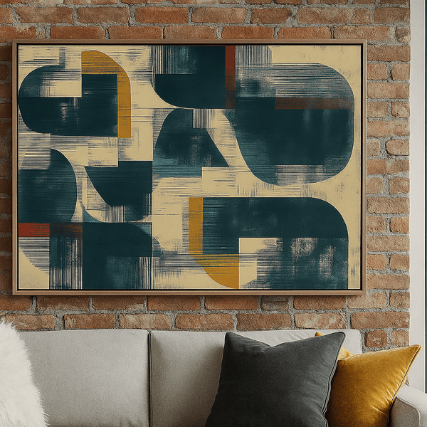
| Persimmon Accent | Persimmon, terracotta, burnt orange | Geometric, bold blocks, defined lines | Dining room, entryway, creative spaces | Brass accents, matte canvas | DO use as a focal point; DON'T overwhelm with too many competing colors | Fire Form Flow |
| Cool Blue Serenity | Cool blue, powder blue, slate | Minimal line, negative space, subtle curves | Bedroom, bathroom, meditation spaces | White frames, gallery glass | DO pair with natural textures; DON'T mix with warm oranges | Ink Reverie |
| Jade & Plum Noir Luxury | Jade green, plum noir, deep emerald | Structured geometric, grid compositions | Living room, library, sophisticated spaces | Velvet furnishings, dark wood frames | DO embrace dramatic scale; DON'T crowd with small accessories | Celestial Mosaic |
| Wasabi Energy | Wasabi, chartreuse, vibrant green | Dynamic, asymmetrical, high-contrast | Kitchen, workout space, creative studio | Metal frames, high-gloss finish | DO use as an energizing accent; DON'T place in relaxation spaces | Radiant Echo |
| Monochrome Mastery | Black, white, charcoal, ivory | Minimal line art, negative space, subtle texture | Any room needing visual calm and structure | Simple black or white frames, matte finish | DO pair with textural elements; DON'T place in rooms lacking natural light | Monochrome Reverie |
2026 Color Trends → How to Translate Them Into Wall Art
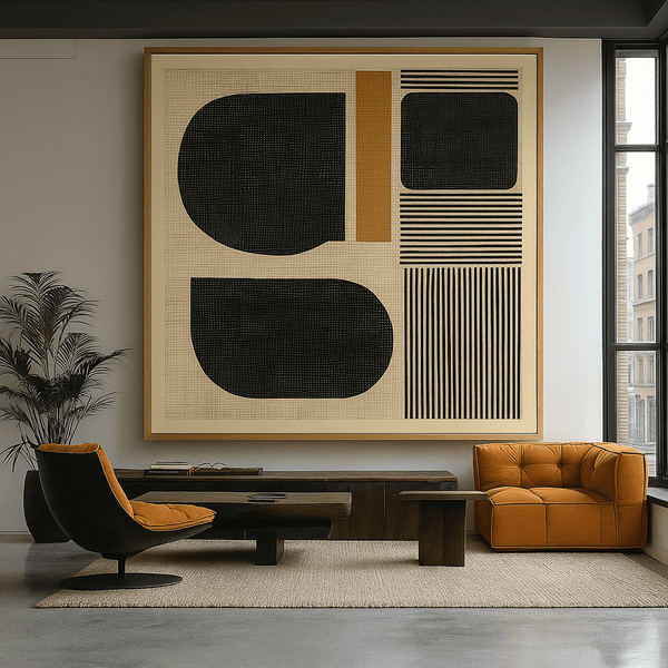
Rich Neutrals (Brown, Taupe, Caramel) Done "Gallery-Style"
Rich neutrals form the foundation of 2026's most sophisticated interiors. These warm, earthy tones create depth and grounding while remaining versatile enough to evolve with your space over time.
Best with: Natural wood frames, linen canvas, and brass accents. The combination of these materials enhances the organic quality of neutral tones, creating spaces that feel both refined and relaxed.
Placement rule: Create a gallery arrangement with varied neutral pieces, maintaining consistent spacing (2-3 inches between frames) and a cohesive framing style. This approach adds visual interest while maintaining the calm sophistication that neutrals provide.
For a perfect example of this approach, explore Abstract Charcoal Flow, which uses subtle texture and tonal variation to create depth within a neutral palette.

The Pinterest 2026 Palette (Persimmon, Cool Blue, Jade, Plum Noir, Wasabi) as Accent Strategy
Pinterest's 2026 color forecast highlights a vibrant yet sophisticated palette that balances energy and elegance. These colors work best as intentional accents within a more neutral framework.
Best with: Clean-lined furniture, mixed metal finishes, and plenty of negative space to let these colors breathe and make their statement without overwhelming the room.
Placement rule: Choose one dominant color from the palette for your statement art piece, then echo smaller touches of that same color in accessories or textiles. This creates cohesion without overwhelming the space.
The dynamic energy of Radiant Echo captures this approach perfectly, introducing vibrant color as a focal point that can anchor an otherwise neutral room.

Warm Minimal Palettes for Calm Rooms
Warm minimalism represents the evolution of the stark minimalist trend, maintaining clean lines and uncluttered spaces while introducing warmth through color and texture. This approach is particularly effective in bedrooms and contemplative spaces.
Best with: Textural elements like bouclé, linen, and unfinished wood. These materials add depth and interest without introducing visual noise, maintaining the calm simplicity that defines warm minimalism.
Placement rule: In calm spaces, position a single, impactful piece centered on the wall at eye level (57-60 inches from floor to center). Allow at least 12 inches of breathing room on all sides to preserve the minimal aesthetic.
The subtle depth and restrained palette of Muted Form Funk exemplifies this approach, offering visual interest without disrupting the tranquility of a minimal space.

For more insights on how large-scale art can transform a space, explore our guide to Giant Canvas Prints: Creating Statement Walls with Oversized Canvas Art.
Shapes & Compositions That Look Most "2026"
Organic / Biomorphic Shapes (Soft, Calm, Tactile)
Organic, biomorphic shapes draw inspiration from nature, featuring soft, flowing lines and irregular forms that feel both familiar and abstract. In 2026, these shapes represent a counterpoint to the digital precision that dominates our screens.
These forms work particularly well in spaces dedicated to relaxation and restoration, creating a visual environment that feels naturally calming rather than rigidly structured.
To incorporate this trend effectively, look for pieces with:
- Soft, curved edges rather than sharp angles
- Flowing, continuous lines that guide the eye gently
- Forms that suggest natural elements without directly depicting them
- Subtle texture that adds tactile interest

Geometric Structure (Grids, Bold Blocks, Crisp Lines)
Geometric compositions offer a counterbalance to organic forms, providing visual structure and energy through precise shapes and intentional arrangements. In 2026, geometric abstract art embraces bold simplicity rather than complex patterns.
These structured compositions work well in spaces where focus and energy are desired, from home offices to social areas where conversation and activity are central.
Key elements of 2026's geometric trend include:
- Clean, decisive lines with intentional weight and presence
- Bold color blocking with clear delineation between hues
- Grid-based compositions that create visual rhythm
- Asymmetrical balance that feels dynamic yet controlled

Minimal Line + Negative Space (Quiet Luxury)
Minimal line art represents the evolution of minimalism, maintaining simplicity while introducing just enough visual interest to create presence. This approach embodies the "quiet luxury" aesthetic that values subtlety over showiness.
These restrained compositions excel in sophisticated spaces where understated elegance is the goal, from primary bedrooms to formal living areas.
Defining characteristics of this trend include:
- Sparse, intentional linework with significant negative space
- Limited color palette, often monochromatic or with a single accent
- Suggestion rather than explicit representation
- Refined execution that reveals mastery through restraint

Shape Pairing Rule
For visual harmony, select one dominant shape family as your primary visual language in each room, then introduce a secondary shape family as an accent or counterpoint. For example, pair a large organic abstract as your focal point with smaller, geometric pieces as complementary elements. This creates intentional contrast without visual chaos.
To explore more about geometric abstract art and its impact on modern interiors, read our detailed guide on Abstract Geometric Wall Art: A Modern Interior Trend Explained.
Styling Rules (Room-by-Room)
Living Room
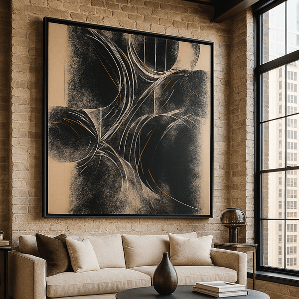
As the central gathering space in most homes, living rooms benefit from statement art that anchors the room and reflects its energy. In 2026, oversized abstract pieces take precedence over gallery walls in this space.
Statement scale rule: For maximum impact, choose art that spans 60-75% of the width of the furniture it hangs above. For sofas, this typically means pieces (or groupings) between 36-60 inches wide.
Above-sofa width rule: Position the bottom edge of artwork 8-10 inches above the sofa back, creating visual connection without risk of contact when seated.
When to go oversized: In living rooms with high ceilings (9+ feet), consider extra-large pieces that extend upward to draw the eye and create vertical balance. In open-concept spaces, use oversized art to define and anchor the living area as distinct from adjacent spaces.

Bedroom
Bedrooms call for art that supports rest and reflection, with compositions that feel balanced and palettes that induce calm. Abstract art in these spaces should contribute to the room's restful atmosphere rather than energize it.
Calmer palettes guidance: Choose pieces with limited color variation and lower contrast ratios. Blues, soft neutrals, and muted earth tones promote relaxation, while bold reds and energetic yellows can disrupt sleep.
Symmetry guidance: In primary bedrooms, embrace symmetrical arrangements above the bed to reinforce feelings of balance and harmony. This can mean a single centered piece or a perfectly balanced grouping (such as a triptych or two identical pieces at the same height).
For guest bedrooms, you have more flexibility to introduce asymmetrical arrangements that add visual interest while still maintaining an overall sense of calm through color and composition.

Dining Room
Dining rooms benefit from art that encourages conversation and complements the social nature of the space. Abstract pieces here should contribute to the atmosphere without competing with the table setting or dining experience.
Horizontal flow guidance: Choose horizontally-oriented pieces or groupings that echo the shape of the dining table, creating visual harmony and a sense of intentional design.
Warmth note: Incorporate pieces with warm tones (amber, terracotta, gold) that enhance the dining experience by making food and conversation feel more inviting.
Lighting consideration: Ensure dining room art is properly illuminated, either through strategic ceiling lighting or dedicated art lights. This becomes especially important in evening dining scenarios when ambient light is lower.

Entryway/Hallway
Entryways and hallways offer prime opportunities for art that makes an immediate impression and establishes your home's aesthetic. These transitional spaces benefit from pieces that draw the eye forward and create visual rhythm.
Vertical rhythm guidance: In narrow hallways, create movement through a series of vertically-oriented pieces that lead the eye down the corridor. Maintain consistent spacing (4-6 inches) and alignment (centered at the same height) for a gallery-like effect.
Sets/series recommendation: Consider diptychs, triptychs, or curated series of related abstract works that tell a visual story as you move through the space. This approach creates cohesion while maintaining visual interest throughout longer hallways.
For entryways specifically, a single impactful piece that captures your home's overall aesthetic makes a strong first impression and sets expectations for the design language throughout the rest of your space.

Home Office
Home office art should support focus and creativity without becoming distracting. Abstract pieces in work spaces can inspire without overwhelming, creating an environment conducive to productivity.
Focus-friendly composition guidance: Choose pieces with clear structure and intentional composition rather than chaotic or overly busy designs. Geometric abstracts with defined lines or minimal abstracts with significant negative space work particularly well.
Camera background tip: In the era of video calls, consider how your office art appears on camera. Position key pieces within your video frame, ensuring they're visible but not dominating. Avoid high-glare finishes that can create distracting reflections during calls.
Abstract art with a horizontal orientation often works best behind desks, creating a sense of expansiveness that can make the workspace feel larger and more open.

For additional guidance on creating cohesive art arrangements throughout your home, see our article on How to Mix and Match Art Prints for a Stunning Gallery Wall.
Color Drenching With Art (How to Do It Without Regret)
"Color drenching" refers to the technique of using the same color or closely related tones across multiple surfaces in a room—walls, trim, furnishings, and yes, art. This approach creates a cohesive, immersive environment that feels intentionally designed rather than piecemeal.
When done thoughtfully, color drenching with art creates spaces that feel both bold and sophisticated. The key is understanding the different levels of intensity and choosing the approach that best suits your space and comfort level.
3 Levels of Color Drenching
- Soft Tonal: The most accessible approach, using variations of the same color family with different intensities. Example: Pale sage walls with deeper olive art and forest green accents.
- Full Drench: A more committed approach where walls, trim, and major furnishings share very similar tones. Example: Terracotta walls, rust-colored sofa, and abstract art in burnt orange and copper.
- Accent Drench: Using a bold color strategically across art and accessories while keeping walls neutral. Example: Neutral walls with multiple pieces featuring cobalt blue, plus blue vases, pillows, and a throw.

What Art Should Do in Each Level
| Drenching Level | Art's Role | Best Abstract Styles | Placement Strategy |
| Soft Tonal | Introduce variations within the color family, adding depth through different tones | Gradient abstracts, watercolor-inspired pieces with tonal variation | Center a larger piece that contains multiple shades within your color family |
| Full Drench | Reinforce the dominant color while adding textural interest | Textural monochromatic pieces, abstracts with dimensional elements | Position art to create color continuity across the room, connecting colored walls |
| Accent Drench | Serve as the color anchor that other elements echo | Bold color-block abstracts, geometric pieces with strong color presence | Use multiple pieces to distribute the accent color throughout the space |
"Color drenching creates a sense of intention that elevates even simple spaces. When art participates in this color story rather than fighting against it, the result is a room that feels curated rather than coincidental."
Common Mistakes in Trend Decorating (And Fixes)
Common Mistakes
- Chasing too many trends at once: Incorporating every trend creates visual chaos and lacks personal authenticity.
- Art too small for the space: Undersized pieces look like afterthoughts and fail to make an impact.
- Palette mismatch: Art that clashes with your existing color scheme creates visual tension rather than harmony.
- Glare/wrong finish: Failing to consider light sources leads to art that can't be properly seen due to reflections.
- No negative space: Crowding walls with too many pieces diminishes the impact of each individual work.
Simple Fixes
- Choose 1-2 key trends that resonate with your personal style and existing décor, then commit to them fully.
- Follow the 60-75% rule: Art should span 60-75% of the furniture width it hangs above.
- Use the color wheel: Choose art with at least one color that already exists in your space for built-in harmony.
- Test before committing: Hold art in place at different times of day to check for glare issues.
- Embrace restraint: Allow each piece room to breathe with adequate wall space around it.

Understanding the psychological impact of art placement and color can help you avoid these common mistakes. Learn more in our article on The Psychology of Art: How Wall Art Shapes Your Mood at Home.
Curated Rossetti Art Picks (Match the 2026 Trends)
Calm Minimal / Negative Space
Muted Form Funk
Perfect for bedrooms and contemplative spaces, this piece embodies warm minimalism with its subtle organic forms and rich neutral palette. The balanced composition creates presence without demanding attention.
Ink Reverie
This zen-inspired minimal piece uses flowing lines and abundant negative space to create a meditative focal point. Ideal for home offices or any space where calm focus is desired.
Monochrome Reverie
This sophisticated monochromatic piece creates visual interest through texture rather than color, making it exceptionally versatile. Its timeless quality works in virtually any space requiring visual sophistication.
Geometric Structure
Abstract Geometric Shapes
This structured geometric piece brings energy and visual rhythm to spaces that benefit from clear organization and focus. Ideal for home offices and dining areas where conversation and activity thrive.
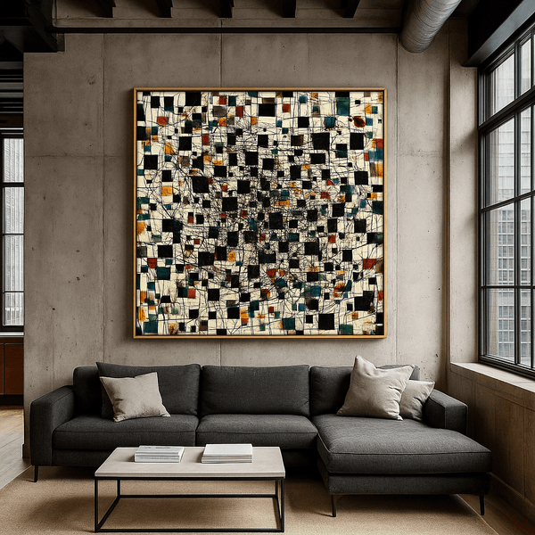
Celestial Mosaic
Embracing the Jade & Plum Noir luxury trend, this sophisticated piece brings depth and structure to formal living spaces and areas where visual richness is desired.
Bold Geometric Harmony
With its mid-century modern influence, this piece brings structured energy to contemporary spaces. The clear composition and defined shapes create a sense of order that works particularly well in open-concept areas.
Accent Color Statements
Radiant Echo
This vibrant piece incorporates colors from the Pinterest 2026 palette to create a dynamic focal point. Perfect for neutral spaces that need an energizing element or rooms where conversation and creativity are central.
Fire Form Flow
Embracing the Persimmon trend from the 2026 palette, this warm, energetic piece brings life to dining rooms and social spaces. Its fluid composition creates movement that draws the eye and stimulates conversation.
Abstract Charcoal Flow
This sophisticated black minimalist piece creates drama through texture rather than color. Its strong presence works beautifully in spaces with architectural interest or as a counterpoint to more colorful elements.
Explore Our Complete Collection
Discover our full range of modern abstract wall art, including pieces that perfectly align with 2026's defining trends. From rich neutrals to bold geometric statements, find the perfect canvas to transform your space.
Browse Abstract & Geometric Canvas PrintsMini-Glossary: 2026 Abstract Art Terms
Color Drenching
Using the same color or closely related tones across multiple surfaces in a room (walls, trim, furnishings, art) to create a cohesive, immersive environment.
Rich Neutrals
Warm, sophisticated neutral tones like caramel, taupe, and warm browns that create depth and grounding while remaining versatile.
Tonal Layering
Using multiple shades within the same color family to create depth and visual interest without introducing contrasting hues.
Negative Space
The empty or unoccupied areas in an artwork that provide visual breathing room and help define the positive elements.
Organic Geometry
Geometric shapes with softened edges or irregular proportions that reference natural forms while maintaining structural clarity.
Biomorphic Shapes
Abstract forms that suggest living organisms or natural elements without directly representing them, often featuring curved, flowing lines.
Grid Composition
Artwork structured around an underlying grid system, creating visual order through alignment and spatial relationships.
Triptych
A three-panel artwork intended to be displayed together as a unified piece, often with a continuous design or related elements across all panels.
Diptych
A two-panel artwork intended to be displayed together, creating a complete composition or related visual statement.
Gallery Wall
A curated arrangement of multiple artworks displayed together on a single wall, creating a collective visual impact.
Matte vs. Glazed Finish
Matte finishes absorb light and reduce glare, creating a soft, sophisticated look; glazed finishes have a reflective quality that enhances color vibrancy but may create glare.
Warm Minimalism
An approach that maintains the clean lines and uncluttered spaces of minimalism while introducing warmth through color, texture, and natural materials.
Contrast Ratio
The degree of difference between the lightest and darkest elements in an artwork, affecting its visual impact and energy level.
Visual Rhythm
The pattern of movement created through repetition, progression, or alternation of elements in an artwork, guiding the viewer's eye through the composition.
Anchoring Piece
A dominant artwork that serves as the focal point in a room, establishing the color palette and visual theme for the space.
2026 Styling Rules for Abstract Art (Designer Standard)
Essential Checklist
- Choose 1 dominant mood for each room: calm (organic shapes, lower contrast), bold (geometric, high contrast), graphic (structured, defined lines), or warm (rich tones, textural elements).
- Pick your palette method: tonal (variations within one color family), complementary (colors opposite on the color wheel), or accent pop (neutral base with one vibrant accent).
- Decide statement scale: single oversized piece (60-75% of furniture width), coordinated set (diptych/triptych), or curated gallery wall (5+ pieces with consistent framing).
- Follow proper hanging height: center of art at 57-60 inches from floor in most rooms; bottom edge 8-10 inches above furniture when hanging above pieces.
- Repeat 1-2 colors from your art in textiles or accessories to create visual connections throughout the room.
- Mix shapes intentionally: select one hero shape family per room (organic, geometric, or minimal) and use it consistently in your primary pieces.
- Conduct a lighting/glare check: view art placement at different times of day to ensure proper visibility without distracting reflections.
- Maintain frame/canvas consistency: within each room, either commit to all framed pieces with similar framing or all canvas prints for a cohesive look.
For a deeper understanding of how sustainable materials and production methods are influencing art trends in 2026, read our article on Handcrafted Eco-Friendly Decor: How Sustainable Canvas Art is Redefining Interior Design.
Frequently Asked Questions
What colors are trending in 2026 for home decor?
The 2026 color landscape is defined by two key directions: rich neutrals (caramel, taupe, warm browns) that create depth and grounding, and the Pinterest 2026 palette featuring Persimmon, Cool Blue, Jade, Plum Noir, and Wasabi as accent colors. These warm, earthy tones are replacing the cool grays and stark whites that dominated previous years, reflecting a broader shift toward interiors that feel more personal and lived-in.
Is oversized wall art still in style in 2026?
Yes, oversized wall art is a defining trend for 2026, with large-scale pieces taking precedence over gallery walls in many spaces. The current approach favors statement pieces that span 60-75% of the furniture width they hang above, creating impactful focal points that anchor a room. This trend reflects the broader movement toward intentional, curated spaces where fewer, more significant pieces make a stronger impression than many smaller elements.
How do I choose abstract art colors for my living room?
Select abstract art colors for your living room by first identifying your room's base palette and the mood you want to create. For a harmonious approach, choose art with at least one color that already exists in your space, then add 1-2 new colors that complement your existing scheme. For 2026, consider incorporating rich neutrals as your foundation, then adding one accent from the Pinterest palette (Persimmon, Cool Blue, Jade, Plum Noir, or Wasabi) for contemporary relevance. Remember that living rooms benefit from colors that encourage conversation and connection—warm tones tend to create inviting atmospheres, while cool tones can create calm but may feel less energetic.
What's the best height to hang wall art?
The designer standard is to position the center of your artwork at 57-60 inches from the floor, which corresponds to average eye level. When hanging art above furniture, position the bottom edge 8-10 inches above the furniture to create visual connection without excessive gap. For dining rooms, consider hanging slightly lower (center at 54-57 inches) to account for seated viewing. In rooms with unusually high ceilings (10+ feet), you may adjust slightly higher, but resist the temptation to hang art too high—a common mistake that disconnects the piece from the room's lived experience.
Should I frame canvas prints?
Canvas prints traditionally don't require framing, as the wrapped edges create a finished look. However, for 2026, we're seeing increased interest in "floating frames" for canvas—minimal frames that create a small gap between the canvas and frame, adding architectural interest without covering any of the image. If you choose to frame canvas prints, maintain consistency within each room (either all framed or all unframed). Framing adds formality and definition, while unframed canvas has a more contemporary, casual feel. The decision should align with your overall interior style—traditional spaces often benefit from framing, while modern minimalist spaces may prefer the clean look of unframed canvas.
How do I mix organic and geometric shapes without creating visual clutter?
To successfully mix organic and geometric shapes without creating visual chaos, follow the "Shape Pairing Rule": select one dominant shape family as your primary visual language, then introduce the secondary shape family as an accent or counterpoint. For example, if your main artwork features fluid, organic forms, you might add a small geometric piece or geometric-patterned textiles as complementary elements. Maintain cohesion through consistent color palette across both shape families, and ensure adequate negative space around each piece. This creates intentional contrast that feels designed rather than accidental, adding visual interest while maintaining harmony.
Elevate Your Space with Timeless Abstract Art
The interior decorating trends of 2026 point toward spaces that feel more personal, intentional, and grounded in both comfort and visual sophistication. Modern abstract wall art stands at the center of this evolution, offering endless possibilities for expressing your unique aesthetic while creating rooms that feel current without chasing fleeting fads.
At Rossetti Art, we curate collections that balance trend awareness with timeless appeal, ensuring that the pieces you select today will continue to resonate for years to come. Explore our Abstract & Geometric Canvas Prints and Original Abstract Paintings to discover pieces that perfectly align with 2026's defining aesthetic directions.
For those drawn to the organic, wabi-sabi aesthetic that's gaining prominence in 2026, our Wabi-Sabi Art Collection offers pieces that celebrate imperfection and natural beauty—a perfect complement to the year's emphasis on authenticity and personal expression.
Transform Your Space Today
Browse our curated collection of modern abstract wall art, featuring pieces that perfectly align with 2026's defining trends while offering timeless appeal and exceptional quality.
Explore the Collection
Leave a comment
This site is protected by hCaptcha and the hCaptcha Privacy Policy and Terms of Service apply.