Nearly 90% of visual cues reach the brain in under a tenth of a second, and color drives much of that instant response. Research shows hues trigger bodily shifts before conscious thought, so a single framed piece can change how a room feels almost immediately.

Blue tones often calm and sharpen focus, while red can raise heart rate and appetite. Green eases eye strain and soothes fatigue. These quick physiological reactions explain why people notice a shift in energy when a canvas or print appears on a wall.
This introduction frames wall art as a targeted design tool. Rather than repainting an entire room, residents can use concentrated color to tune atmosphere, align a space with daily routines, and support comfort. The article will pair evidence-based insight with clear steps so readers feel confident choosing pieces that match purpose and existing decor.
Key Takeaways
- Color affects the brain in milliseconds and alters bodily states.
- Specific hues produce predictable results: calm, arousal, relief.
- Wall art offers a surgical way to change a room without major renovations.
- Design choices can align a space with daily tasks and well-being.
- The guide blends evidence and practical tips for confident selection.
Why Wall Art Matters: Setting the Mood and Purpose of Your Space
Artwork places color and imagery where they matter, letting each room do its job better. A single piece can energize a social corner or calm a private nook without repainting walls.
Warm colors and lively subjects boost conversation and appetite in living rooms and dining areas. Cool palettes and serene scenes help bedrooms and reading spaces feel restful.
Individual pieces act like modular design tools. They let residents update feeling and style quickly while keeping fixed finishes intact.
Balanced proportions of hues avoid overstimulation. When color is used in measured amounts, it reinforces intended emotions and prevents visual fatigue.
- Use bold accents to signal social spaces.
- Choose muted tones for rest and focus.
- Place pieces to guide flow from one room to the next.
Later sections match pieces and palettes to specific rooms so readers can fine-tune atmosphere with precision. Thoughtful selection supports comfort and a coherent sense of home.
Inside the Mind: How Color and Visual Stimuli Shape Emotions
Wavelengths reach eyes in milliseconds, and feelings follow almost instantly. The brain converts color data into bodily signals before conscious thought. That split-second processing explains why a piece on a wall can lower tension or raise alertness within moments.
Milliseconds to meaning: Visual input triggers rapid responses. Red often increases heart rate and appetite, while blue can lower blood pressure and reduce stress. Green eases eye strain, making reading and screen work more comfortable when art sits in regular sightlines.
Cultural context and personal history shape reactions too. White may mean purity in one culture and mourning in another. A childhood memory tied to a hue can flip expected emotions, so two people in the same space may feel differently.
- Observe reactions: test prints before major paint changes.
- Match purpose: choose color to support each room’s function and reduce stress.
Color Psychology in Action: What Each Hue Does to Your Mood
Colors act like mood shortcuts, steering energy and calm with a single glance. Below are practical notes on how specific hues affect feelings and where to place matching wall art for best effect.
Red
Energy and appetite: Red boosts conversation and hunger, so it works well in dining rooms and social zones.
Avoid heavy red in bedrooms because it can disrupt relaxation and sleep. Deep burgundy can add sophistication when used as an accent.
Blue
Calm and focus: Blue lowers stress and blood pressure. Mid to navy tones support productivity in home offices and soothe bedrooms and baths.
Green
Balance and restoration: Green ties to nature and reduces eye strain, making it versatile across rooms. Wall art in green helps restore mental energy during long days.
Yellow
Joy and creativity: Soft yellow lifts mood in breakfast nooks and work corners. Intense yellow should be limited where relaxation is a priority.
Purple
Imagination and luxury: Lavender soothes, while deep plum adds drama and richness. Match tone to the room’s intended feeling.
Orange
Warmth and connection: Orange blends red’s vigor and yellow’s cheer. It energizes kitchens and studios but pairs best with cool accents to avoid overwhelm.
Neutrals & Metals
White opens space; gray calms; black gives depth. Beige and brown ground a room, while metallic gold adds refined warmth as an accent.
Pink & Teal
Soft pink soothes; bold pink energizes. Teal and turquoise refresh a space and work well in baths, coastal rooms, or as lively accent wall art.
"Use art to deliver targeted color where it matters most—no repaint required."
- Tip: Match hue intensity to function—soft tones for rest, stronger hues for social or creative areas.
- Test: Try a print before committing to large pieces on walls to check real-world responses.
Room-by-Room Guide: Matching Art and Colors to Everyday Living
Matching pieces to daily routines helps each living area feel purposeful and balanced. This short guide turns color theory into clear choices for common rooms. It shows what to hang, where to place it, and which hues support each activity.

Living rooms: Conversation, warmth, and balanced energy
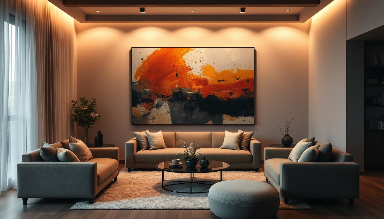
For living rooms, favor warm neutrals, soft blues, and earth tones. Large statement pieces or a curated gallery wall can anchor a palette and invite connection.
Place a main piece over the mantel or sofa to guide sightlines. Use smaller works near seating to keep conversation areas welcoming.
Bedrooms: Rest-first palettes and calming imagery
Bedrooms perform best with cool blues, gentle greens, and warm neutrals. Hang soothing landscapes or minimal scenes opposite the bed for a calming sightline.
Avoid bright reds and intense yellows to reduce stress and encourage better sleep.
Home offices: Focus, clarity, and sustainable creativity
Home offices thrive with blue-toned art to sharpen concentration and green botanicals or landscapes to ease eye strain. Add sparing light-yellow accents to spark creativity without distraction.
Kitchens and dining rooms: Appetite, connection, and cozy hospitality
Kitchens and dining rooms benefit from warm hues—red, terracotta, and earthy tones—to boost appetite and cozy hospitality. Balance these with neutral frames or mats for lasting comfort.
"Choose scale and placement so art serves function: anchor, soothe, focus, or invite."
Beyond Color: Shapes, Patterns, and Composition That Influence Well-Being
Geometry, curves, and spacing quietly signal the brain how to use a room.
Geometric order—grids, straight lines, and repeated angles—gives a sense of clarity. It supports focus and a tidy mental state by creating predictable visual cues. This approach suits work areas and rooms that need clear function.
Organic flow—soft curves, botanical motifs, and irregular outlines—encourages calm and natural connection. It brings a gentle rhythm that eases tension and supports relaxation in bedrooms or lounges.
Scale, rhythm, and white space
Repetition creates comfortable predictability, while controlled irregularity invites creativity without chaos.
Leave ample negative space around groups to let each piece breathe. Proper scale and spacing reduce clutter and keep balance front and center.
- Mix elements—pair a geometric print with an organic piece to tune mood precisely.
- Modular formats—photo tiles or small frames—allow easy experiments at low cost.
| Effect | Typical Elements | Best Rooms | Design Tip |
|---|---|---|---|
| Focus | Grids, straight lines | Home office, studio | Use tight spacing and cool tones |
| Relaxation | Curves, botanical shapes | Bedroom, reading nook | Allow generous white space |
| Creativity | Abstract, irregular forms | Studio, playroom | Mix scales and unexpected pairings |
"Use form and layout to make a room serve intention, not just look pretty."
Thoughtful composition places balance and harmony before decoration. When art, placement, and negative space work together, the environment supports daily routines and a healthy mental rhythm.
Design Like a Pro: 60-30-10 and Color Combinations That Work
A clear proportion system helps a designer balance bold hues and quiet backdrops.
60-30-10 breaks a room into dominant, secondary, and accent. Sixty percent is a base; thirty gives depth; ten adds punch. Wall art often fills that thirty or ten percent role, so a framed piece can set secondary tone or act as an accent.
Monochromatic schemes build richness with shade, value, and texture. Using varied fabrics, frames, and layered art introduces tactile interest without competing colors.
Complementary pairs like blue and orange offer high impact. Control proportion—think 70-30—to avoid visual tension. For a living room, keep blue dominant and let orange accents appear in small art elements.
Analogous choices deliver natural flow. Blues next to greens create a calm, cohesive sense across rooms. Triadic and split-complementary setups add energy while keeping balance; let art introduce a third or nuanced accent.

"Use proportion and careful accents so warm colors add impact without overwhelm."
- Reliable combos: navy‑gold, sage‑blush, charcoal‑mustard, cream‑terracotta, teal‑coral, black‑white + one accent.
- Frames and metallic elements amplify cohesion and tie palettes together.
The Psychology of Art: How Wall Art Shapes Your Mood at Home
A carefully chosen image can cue calm, focus, or conversation the moment one enters a room. Start by naming what people do there most. Match subject and palette to that activity.
Selecting subject and palette
For sleep and quiet, favor cool landscapes or minimal abstracts in soft tones. For social or creative areas, pick warmer, energized pieces that invite interaction.
Personal connection matters: photos or meaningful scenes boost comfort and lasting appeal.
Placement strategies: focal points, sightlines, and light
Anchor a wall with one strong focal piece rather than many small ones. Hang art at eye level for typical seating or standing positions so it reads naturally.
Check light. Use lighter compositions where natural light is low. In bright spots, stronger contrast keeps colors vivid and prevents glare.
"Place with purpose: let scale and sightlines make the work serve the space."
- Keep groupings balanced so walls feel composed, not cluttered.
- Consider frames and mats to unify varied pieces and protect color under different lighting.
When selection and placement align, a piece gains real impact. It shapes a calm environment and a clear sense of function while strengthening emotional connection in the home.
Personalization and Photo Tiles: Emotional Connection on Your Walls
Modular photo tiles let people shape daily feeling with images that matter most. Art engages reward centers and can release dopamine when a viewer recognizes a happy memory. Personal imagery deepens that effect and strengthens emotional connection to spaces.
Memory, meaning, and dopamine: Choose family moments, travel shots, or nature scenes to boost happiness and calm. These subjects make small pieces feel important and familiar.
Curating tiles by color, subject, and pattern
Match colors to rooms: soft blues and greens for relaxation in bedrooms, warm orange accents for energy in offices. Keep a restrained palette so tiles support mood without overwhelming a space.
Pick layouts by function. Use geometric grids to aid focus in work areas and organic arrangements to encourage rest in lounges and bedrooms.
- Scale: align tile size with furniture and wall span.
- Mix: combine personal photos with nature imagery to ground feelings and add texture.
- Placement: hang where people pass often—entryways, halls, living zones—to reinforce positive moments.
"Personal pieces turn simple walls into daily sources of comfort and creativity."
Practical Tips, Common Mistakes, and 2025 Trends
Before buying, test how natural and artificial light reveal true pigment and contrast on your walls. Check north versus south orientation and view samples at morning and evening. This helps avoid surprises and ensures chosen pieces read as expected in daily use.
Assessing light, size, and existing decor before you buy
Measure wall height and width so scale fits furniture and sightlines. Match frames and mats to existing finishes to keep a coherent style.
Avoiding color overload and ignoring room function
Limit bold colors to two or three hues and balance with neutrals. Too many intense tones can raise stress and reduce intended calm.
Budget-smart strategies: Quality prints, seasonal rotation, and framing
Prioritize quality prints and consistent framing to lift a collection affordably. Rotate pieces seasonally to refresh feeling without major expense.
2025 colors: Rich sages, inky blue-grays, terracotta, and burgundy warmth
Trend note: rich sage green, inky blue-gray, terracotta, and dramatic burgundy add warmth and sophistication. Use landscapes or neutral backgrounds to anchor impact, then test pops of orange or green in small accents.
"Small checks save time and money: light, scale, and context determine long-term satisfaction."
- Evaluate lighting for accurate color reads.
- Scale art to wall size to avoid clutter.
- Use metallic frames or textured mats to tie elements across rooms and areas.
Conclusion
, Conscious choices in palette and scale let residents tune energy across spaces. They shape mood and guide behavior with small, deliberate moves. This approach uses proven psychology and simple placement to adjust daily life.
Proportion, palette, and placement create lasting harmony and balance. Use art as a focused tool on a wall or above seating to support bedrooms, work areas, and social rooms. Test samples in real light before big changes.
Personal images add comfort and a deeper sense of belonging. Observe how pieces influence the environment over time and refine choices to keep atmosphere supportive and clear.
Enhance Your Space with Unique Modern Masterpieces
Are you inspired by the innovative mediums and conceptual depth highlighted in our exploration of contemporary art? You’re not alone! Today’s art enthusiasts are seeking cultural relevance and emotional connections in their artwork. However, finding pieces that resonate with modern themes and fit your unique style can be a challenge. That’s where we come in!

At Rossetti Art, we specialize in canvas prints, original paintings, and modern sculptures that celebrate the spirit of now. Each piece created by Chiara Rossetti brings a personal touch that connects deeply with current social narratives—just like the modern masterpieces discussed in the article. Don’t miss out on the chance to elevate your home decor with breathtaking artwork that speaks to your values and aesthetic. Explore our collection today and find your perfect piece! Act now, and transform your space into a gallery of inspiration!
FAQ
How does wall artwork influence emotions in living spaces?
Artwork on walls sends visual cues that change energy and feeling in a room. Colors and imagery trigger quick brain responses that can raise alertness, calm nerves, or boost creativity. For example, warm hues and dynamic compositions energize social areas, while cool tones and soothing scenes promote rest and focus.
Which colors work best for bedrooms and why?
Soft blues, muted greens, and gentle lavenders support relaxation and lower stress. These hues slow heart rate and reduce arousal, helping sleep. Avoid intense reds or bright oranges near beds because they can increase alertness and disrupt rest.
What art choices improve focus in a home office?
Pieces with cool blues, balanced greens, and clean geometric lines help concentration. Moderate contrast and uncluttered composition reduce visual distraction. Small accents of warm color can lift mood without breaking focus.
Can art change how large or small a room feels?
Yes. Large-scale pieces or murals create intimacy in big rooms and make small rooms feel grand when placed at eye level. Lighter colors and horizontal compositions expand perceived space, while darker tones and dense detail can make areas feel cozier.
How do cultural background and personal history affect color reactions?
Color meanings differ across cultures and individuals. Personal memories tied to an image or hue can override general associations. That’s why testing art in the actual space and considering occupant preferences yields better emotional fit than relying on rules alone.
What role do shapes and patterns play in mood?
Geometric shapes and repeating patterns suggest order and focus, useful in work areas. Organic forms and flowing patterns feel calming and foster creativity. Mixing both provides balance: structure where needed, softness where comfort matters.
How should one use the 60-30-10 rule with wall art?
Treat walls and major furnishings as the 60% base, secondary colors in textiles or secondary art as 30%, and bold art or accents as 10%. Use art to introduce that 10% pop or to reinforce the 30% layer, keeping harmony across the scheme.
Are personal photos effective as mood-enhancing pieces?
Yes. Personal imagery triggers memory and dopamine release, boosting comfort and connection. Curate photo tiles by color and subject to match room function—calm scenes for bedrooms, lively family moments for social spaces.
What common mistakes should be avoided when choosing wall art?
Avoid color overload, oversized pieces that overwhelm sightlines, and artwork misaligned with room function. Ignore neither light conditions nor scale; both influence how color and detail read in real life.
Which color combos are timeless and versatile for home decor?
Reliable pairs include navy and gold for sophistication, sage and blush for calm warmth, and charcoal with mustard for modern contrast. These schemes translate well across living rooms, kitchens, and offices when balanced correctly.
How do trends like rich sage and inky blue-gray fit practical decorating?
Trend colors such as rich sage or terracotta add contemporary warmth and pair well with natural materials. Use them in accents or statement art to update a room without expensive renovation. They work across many rooms and complement neutral backdrops.
How important is lighting when displaying art?
Very important. Natural and artificial light change how hues appear and influence mood. Position art to take advantage of soft natural light for calming pieces and use adjustable lighting to highlight energy-driven artwork without glare.
Leave a comment
This site is protected by hCaptcha and the hCaptcha Privacy Policy and Terms of Service apply.