
Warm vs cool isn't a color — it's an undertone + lighting problem. That perfectly curated room that somehow feels "off"? It's likely due to clashing undertones that create subtle visual tension. The good news? You don't need to start over. In this comprehensive guide, we'll show you three proven methods to balance warm and cool tones: match, bridge, and contrast. Understanding these principles will transform how you approach interior design and help you create spaces that feel intentionally cohesive rather than accidentally assembled. The psychology of art shows us that visual harmony significantly impacts how we feel in a space.
TL;DR: Balancing Warm vs Cool Tones
- Warm undertones = yellow/red/orange base, cool undertones = blue/green/purple base
- 3 balancing methods: Match (harmonize similar undertones), Bridge (use connectors like art/texture/wood), Contrast (intentional opposites with buffer elements)
- Lighting temperature: 2700–3000K warm/"gallery-like", 3500K more neutral for bold cool palettes
- Most clashes happen because wood/metal choices fight the room's undertone
Warm vs Cool Tones (What It Means in Real Rooms)

Undertone vs Color
The difference between a color and its undertone is crucial to understand. While a color is what you immediately see (blue, green, beige), the undertone is the subtle hue beneath it that gives the color its character. For example, a beige can have a pink (cool) undertone or a yellow (warm) undertone. These subtle differences explain why some "neutral" rooms still feel distinctly warm or cool.
Quick Visual Cues
Training your eye to spot undertones takes practice, but these visual cues help:
- Warm whites have a creamy, yellow cast (think eggshell or vanilla)
- Cool whites have a blue or gray cast (think crisp paper or snow)
- Icy gray has blue undertones and feels distinctly cool
- Greige (gray-beige) has warm undertones that soften its appearance
- Warm metals include brass, gold, and copper
- Cool metals include chrome, silver, and stainless steel
How to Identify Undertones (2-Minute Test)

"The white paper test is the designer's secret weapon for identifying undertones. It instantly reveals what your eye might miss."
Use this quick checklist to identify the undertones in your space:
The White Paper Test
- Hold a pure white sheet of paper next to the color
- In natural light, observe how the color appears
- If it looks yellowish, orange, or reddish against the paper, it has warm undertones
- If it looks bluish, greenish, or purplish, it has cool undertones
The Metal Test
- Hold gold and silver items against the surface
- Notice which metal looks more harmonious
- If gold looks better, the undertone is warm
- If silver looks better, the undertone is cool
For more detailed guidance on identifying color palettes that work together, check out our palette-to-art pairing matrix.
The 3 Balancing Methods (Your Framework)

Method 1 — Match (Harmonize Undertones)
The simplest approach is to match undertones throughout a space. This creates a harmonious, cohesive feel that's naturally pleasing to the eye.
How to Match Undertones:
- Identify your dominant undertone (warm or cool)
- Choose materials that share that undertone
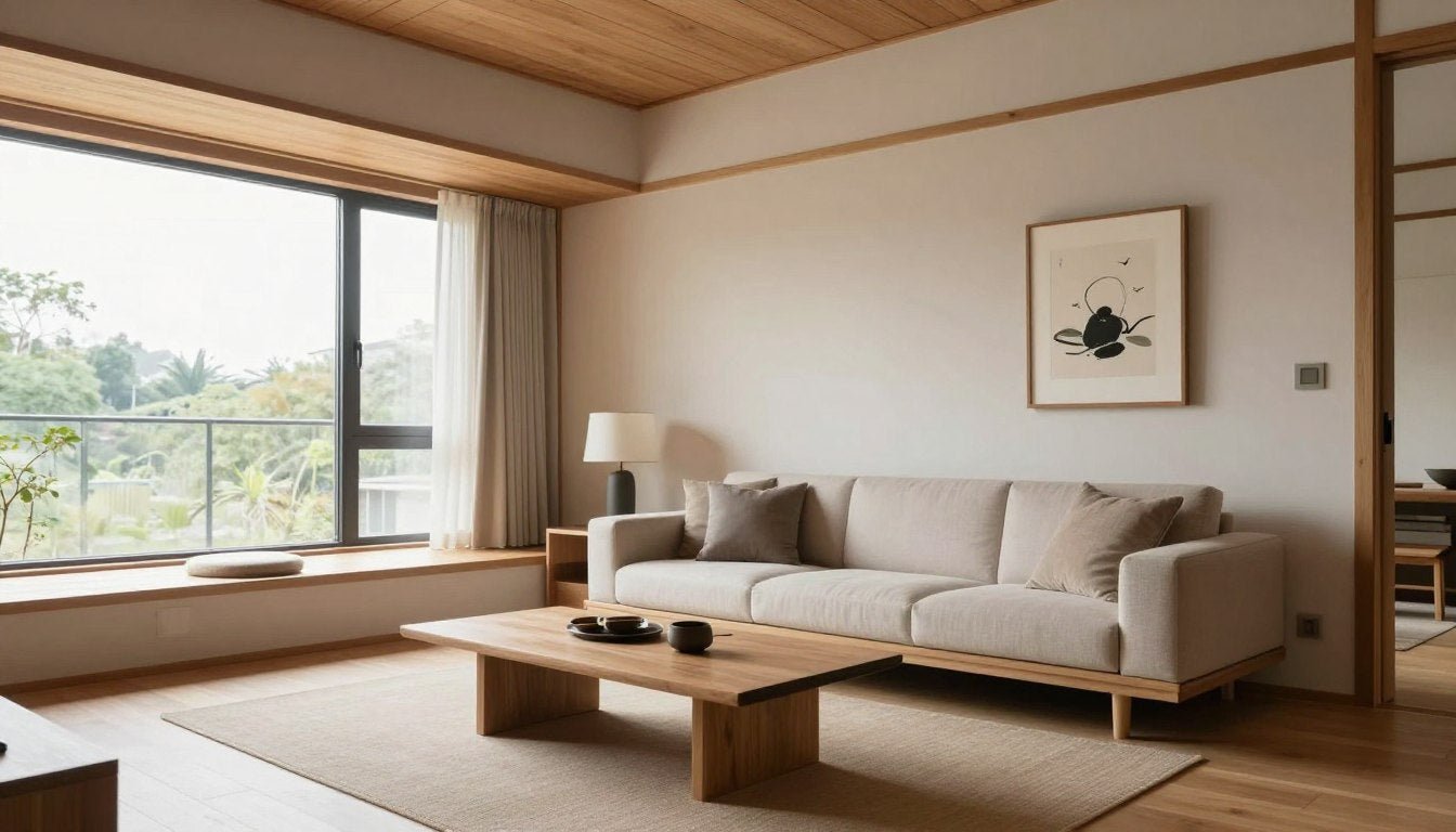
- For warm spaces: opt for brass fixtures, honey-toned woods, and cream fabrics
- For cool spaces: choose chrome fixtures, gray-toned woods, and crisp white fabrics
Method 2 — Bridge (Use a Connector)
When you have both warm and cool elements that can't be changed, you need a bridge. This is where art becomes your most powerful tool.
Effective Bridge Elements:
- Art with both undertones - pieces that contain both warm and cool colors create visual connections
- Natural textures - materials like jute, leather, or stone can bridge temperature extremes
- Transitional woods - medium-toned woods like walnut work with both warm and cool palettes
- Metallic accents - mixed metals or bronze can bridge between warm and cool
Method 3 — Intentional Contrast (Only with a "Buffer")
Sometimes, deliberate contrast creates dynamic, interesting spaces—but only when it feels intentional rather than accidental.
Keys to Successful Contrast:
- Use the 80/20 rule: 80% dominant undertone, 20% contrasting undertone
- Include "buffer" elements that contain both temperatures
- Repeat the contrasting undertone at least 3 times to make it look deliberate
- Use high-contrast art as a focal point that ties both temperatures together
The Warm/Cool Balance Matrix (Linkable Asset #1)
| Room Base Palette | Dominant Materials | Metal Finishes | Best "Bridge" Move | Art Direction | Recommended Collections |
| Warm (beige, terracotta) | Warm wood (oak, pine) | Brass, gold | Add calm contrast via B&W elements | High contrast B&W or cool minimal | Black & White Canvas Prints |
| Cool (gray, blue) | Glass, chrome, concrete | Silver, chrome | Add warmth via textured neutrals | Warm abstract or textural pieces | Wabi-Sabi Wall Art |
| Neutral (greige, oatmeal) | Mixed materials | Mixed metals | Use art as bridge: 1-2 warm notes + 1 cool note | Abstract with mixed temperature palette | Abstract & Geometric Canvas Prints |
| Cool (white, blue-gray) | White marble, light wood | Chrome, nickel | Add organic elements and warm lighting | Botanical or nature-inspired | Botanical & Nature Canvas Prints |
| Warm (cream, caramel) | Leather, dark wood | Antique brass, bronze | Add crisp lines and geometric elements | Line art or geometric | Line Art Canvas Prints |
| Mixed (intentional) | Wood + metal | Brass + chrome | Use multi-piece art set with varied tones | Canvas print sets with complementary pieces | Canvas Print Sets |
| Cool (charcoal, navy) | Dark wood, velvet | Matte black, gunmetal | Add warm human element | Figurative or portrait art | Figurative & Portrait Canvas Prints |
| Urban cool (concrete, steel) | Industrial materials | Raw steel, aluminum | Add structured warmth through urban scenes | Cityscape or architectural art | Cityscape & Urban Canvas Prints |
For more specific guidance on selecting art for different rooms, our room-by-room wall art guide provides tailored recommendations.
Lighting Kelvin Guide (The Hidden Reason Rooms Feel "Off") (Linkable Asset #2)

Even perfect color combinations can be ruined by the wrong lighting temperature. As explained in our guide on how light changes a painting throughout the day, the Kelvin temperature of your bulbs dramatically affects how colors are perceived.
| Kelvin Range | How It Feels | Works Best With | What Can Go Wrong | Fix Suggestion |
| 2700K-3000K (warm white) | Gallery-like, cozy, inviting | Warm palettes, traditional spaces, warm minimalist designs | Can make cool colors appear muddy or dull | Add high-contrast art with white elements to maintain crispness |
| 3500K (neutral white) | Balanced, versatile, natural | Mixed undertone spaces, transitional designs | Can feel slightly clinical without texture | Add textural elements and art with depth |
| 4000K+ (cool white) | Crisp, alert, modern | Cool palettes, contemporary spaces, offices | Can feel sterile, harsh, and unwelcoming | Avoid for living spaces; if necessary, balance with warm textiles and art |
"The right lighting temperature is like the perfect frame for a masterpiece—it either enhances or diminishes everything in the room."
Common Problems + Fast Fixes (Linkable Asset #3)

| Symptom | Likely Cause | Fast Fix | Recommended Collection |
| Room feels cold/sterile | Too many cool undertones + cool lighting (4000K+) | Add warm-toned art and textiles; switch to 3000K bulbs | Wabi-Sabi Wall Art |
| Room feels too orange/heavy | Warm wood + warm walls + warm lighting (2700K) | Add cool contrast through art; consider 3500K lighting | Black & White Canvas Prints |
| Blue walls feel harsh | Cool wall + cool furniture without warm balance | Add warm wood elements and art with warm accents | Botanical & Nature Canvas Prints |
| Mixed metals look messy | Random mixing without intentional bridging | Add art that contains both metal tones; follow the rule of 3 | Abstract & Geometric Canvas Prints |
| Gray sofa clashes with wood floor | Cool furniture + warm flooring without connection | Add art and textiles that contain both gray and wood tones | Canvas Print Sets |
For more guidance on selecting neutral art that works with various undertones, see our guide to neutral wall art undertones.
Room-by-Room Mini Playbook

Bedroom
- Favor warm undertones for restful atmosphere
- Use 2700K-3000K lighting for evening relaxation
- If using cool colors, balance with warm textiles and wood
- Art should promote calm through balanced undertones
Living Room
- Match undertones to desired mood (warm for cozy, cool for spacious)
- Use the 80/20 rule for intentional contrast
- Art should be the bridge between fixed elements (flooring and walls)
- Consider 3000K lighting for versatility
Kitchen-Dining
- Counter and cabinet undertones should harmonize
- Use art to bridge between cool stone and warm wood
- 3500K lighting works well for task areas
- Metal finishes should match or intentionally contrast
Office
- Balance cool productive colors with warm accents
- Use 3500K-4000K lighting for focus areas
- Add art with energizing but balanced undertones
- Incorporate plants to bridge between warm and cool elements
For more detailed recommendations on art placement and selection by room, check out our room-by-room wall art guide.
FAQs
What Kelvin temperature is best for displaying art?
For most art, 2700K-3000K (warm white) creates a gallery-like atmosphere that enhances colors while maintaining a cozy feel. If your art contains primarily cool tones, 3500K (neutral white) can help those colors appear more vibrant while still feeling natural. Avoid 4000K+ lighting for art display as it can create harsh shadows and diminish the warmth in paintings.
Can I mix warm wood with cool gray walls?
Yes, but you need a bridge element. This popular combination works best when you add art that contains both warm brown/wood tones and cool gray elements. Without this bridge, the contrast can feel accidental rather than intentional. The Abstract & Geometric Canvas Prints collection offers several pieces that effectively bridge these undertones.
How do I fix clashing undertones with art?
Art is the perfect solution for clashing undertones because it can visually connect disparate elements. Choose pieces that contain colors from both your warm and cool elements. For example, if you have cool gray furniture and warm wood floors, select art that incorporates both gray and warm brown/gold tones. The art creates a visual bridge that makes the contrast appear intentional rather than accidental.
What's the difference between warm minimalism and cool minimalism?
Warm minimalism incorporates natural materials, textural elements, and a palette of creams, beiges, and warm neutrals. It feels cozy while maintaining clean lines. Cool minimalism uses crisp whites, grays, and blues with sleek materials like glass and chrome. It feels more spacious and contemporary. For more on creating a warm minimalist space, see our guide to warm minimalist interior design.
Should all rooms in a home have the same undertone?
Not necessarily. While maintaining some consistency helps with flow, each room can have its own undertone personality based on function. For example, bedrooms might benefit from warmer undertones for relaxation, while home offices might use cooler undertones for focus. The key is making transitions between spaces feel intentional through bridging elements in connecting areas.
How do I choose art that works with both warm and cool tones?
Look for pieces that contain elements of both temperature ranges. Abstract art with a mix of warm and cool colors works well, as do nature scenes that naturally combine both (think blue sky with warm earth tones). The Best Sellers collection features many pieces specifically selected for their ability to bridge different undertones.
Conclusion

Understanding the interplay between warm and cool tones transforms how you approach interior design. Rather than seeing clashing undertones as a problem requiring a complete redesign, you now have three strategic methods—Match, Bridge, and Contrast—to create harmony in any space. Remember that art is the bridge that makes warm and cool feel intentional rather than accidental. Rossetti Art collections are specifically curated to help solve these common design challenges, offering pieces that can transform a space from visually discordant to perfectly balanced.
Ready to Bridge Your Warm and Cool Tones?
Explore our curated collections designed to solve common undertone challenges and transform your space.
Shop Best-Selling Bridge Pieces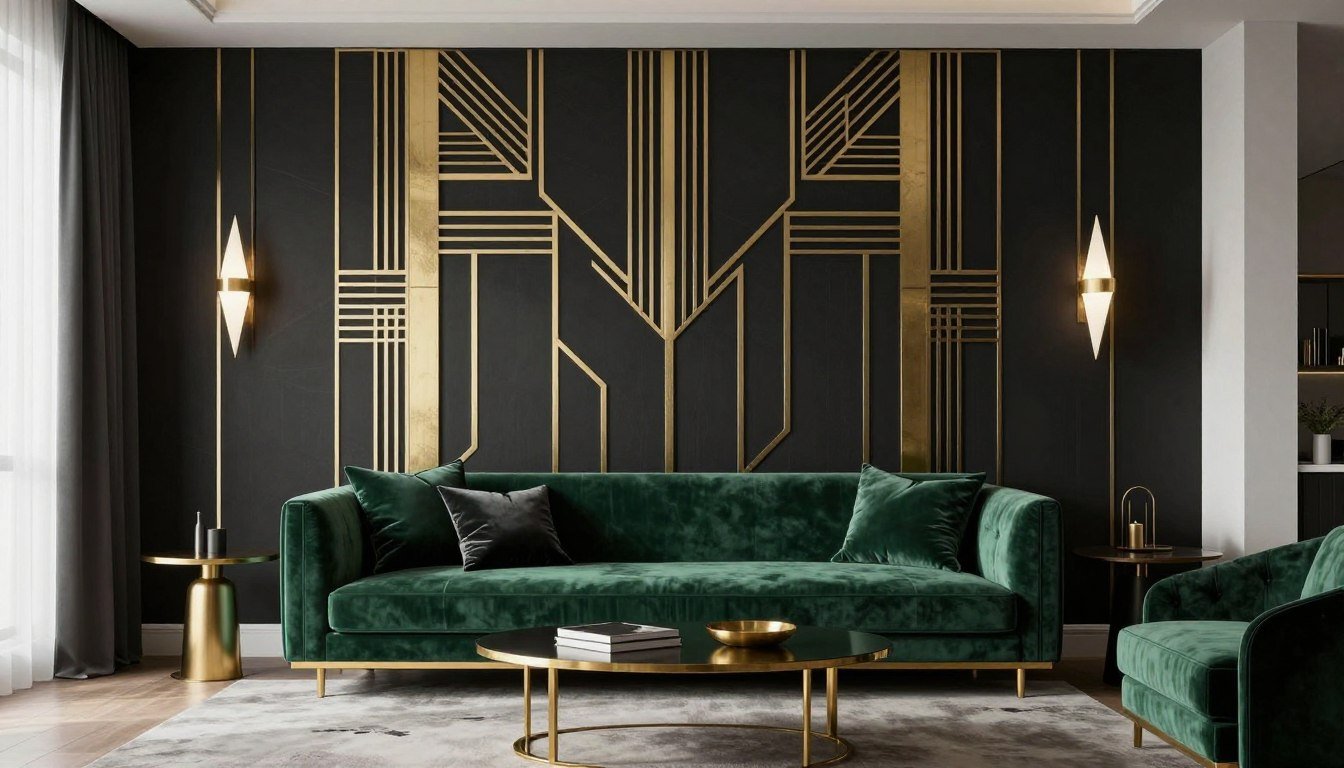
Leave a comment
This site is protected by hCaptcha and the hCaptcha Privacy Policy and Terms of Service apply.