There is a particular kind of wall art that stops the room from trying too hard. It does not shout. It does not fill every corner with colour or motion. Instead, it holds a quiet authority — the kind that makes a living room feel like somewhere you actually want to be. That is wabi sabi wall art, and in 2026 it is one of the most searched styles in interior design.
Wabi sabi is a Japanese philosophy rooted in the acceptance of imperfection, impermanence and the beauty of things in their natural, unfinished state. Applied to wall art, it means pieces that feel organic, textured and intentionally understated — not minimalist for minimalism's sake, but calm because calm is enough.
Quick Answer
Wabi sabi wall art embraces imperfection, natural texture and quiet beauty. Look for organic shapes, earthy neutrals, subtle grain, and abstract compositions that feel handmade rather than manufactured. It works in living rooms, bedrooms and entryways — anywhere you want atmosphere without visual noise.

What Is Wabi Sabi Art?
The wabi sabi aesthetic originated in 15th-century Japan as a reaction against ostentation. Wabi refers to the beauty found in simplicity and nature — the grain of weathered wood, the moss on a stone, the mark left by a hand. Sabi refers to the beauty of age and passage — the patina that accumulates over time, the evidence of a thing's story.
In wall art, these ideas translate into compositions that feel found rather than designed. Abstract pieces with visible brushwork. Organic forms that echo stones or water or earth. Palettes built around cream, sand, warm grey, charcoal and ochre. The point is never perfection — it is the presence of something that feels real.
Wabi sabi wall art is not the same as minimalism, though they share a respect for negative space. Minimalism removes. Wabi sabi accepts. A wabi sabi piece might have visible texture, a raw edge, or a composition that is deliberately off-balance — and that asymmetry is the point. It creates a sense of movement and life that mathematically perfect art cannot.

"Ground" — Neutral abstract wall art canvas in warm cream and sand tones. View the piece →
How to Recognise Wabi Sabi Wall Art
Not every neutral, organic-looking piece is wabi sabi. The philosophy is specific. Here is what to look for when shopping for wabi sabi wall art:
Organic forms over geometric precision. Wabi sabi favours shapes that echo nature — curves that are not quite circles, lines that are not quite straight. If a composition looks as though it could have occurred naturally, that is a good sign.
Visible texture and process. Wabi sabi art reveals how it was made. You might see the grain of canvas through thin pigment, the evidence of a palette knife, or layers of paint that build depth over distance. The work does not hide itself.
Earthy, muted palettes. Cream, warm white, taupe, terracotta, rust, charcoal, sage, stone — these are the colours of natural materials in their unprocessed state. Wabi sabi avoids high saturation. It prefers the colour of things as they actually are in diffused light.
Asymmetry and intentional imbalance. A composition might place most of its visual weight to one side, leaving the other side to breathe. This creates a tension that is resolved by looking — not by the artwork being centred or symmetrical.
Quiet, not empty. Wabi sabi has presence. It is not a blank canvas. But it does not compete with the room. It settles into it.

Which Rooms Suit Wabi Sabi Art Best?
Wabi sabi wall art is remarkably versatile because its palette is neutral and its mood is calm. It does not clash with other colours — it recedes to let the room speak. That said, certain rooms are particularly well matched.
Living rooms benefit enormously from a wabi sabi anchor piece. A large canvas in warm neutral tones above a sofa or on a feature wall can settle the energy of the entire room. It works with linen sofas, natural wood floors, and rattan accessories — but it also pairs well with darker, more contemporary furniture because the contrast creates depth rather than conflict.
Bedrooms are natural homes for wabi sabi art. The philosophy's emphasis on calm and acceptance aligns perfectly with the function of a bedroom — a space for rest and renewal. Abstract pieces in cream, sand and sage green hang particularly well above beds, where they are the last thing you see at night and the first in the morning.
Entryways benefit from art that makes a considered first impression without being aggressive. Wabi sabi pieces do this naturally — they welcome rather than announce.
Not sure how a piece will look in your specific space? Use our Live Preview tool on every product page — it lets you visualise the artwork at scale on your actual wall, or upload a photo of your room to see it in context before you buy.

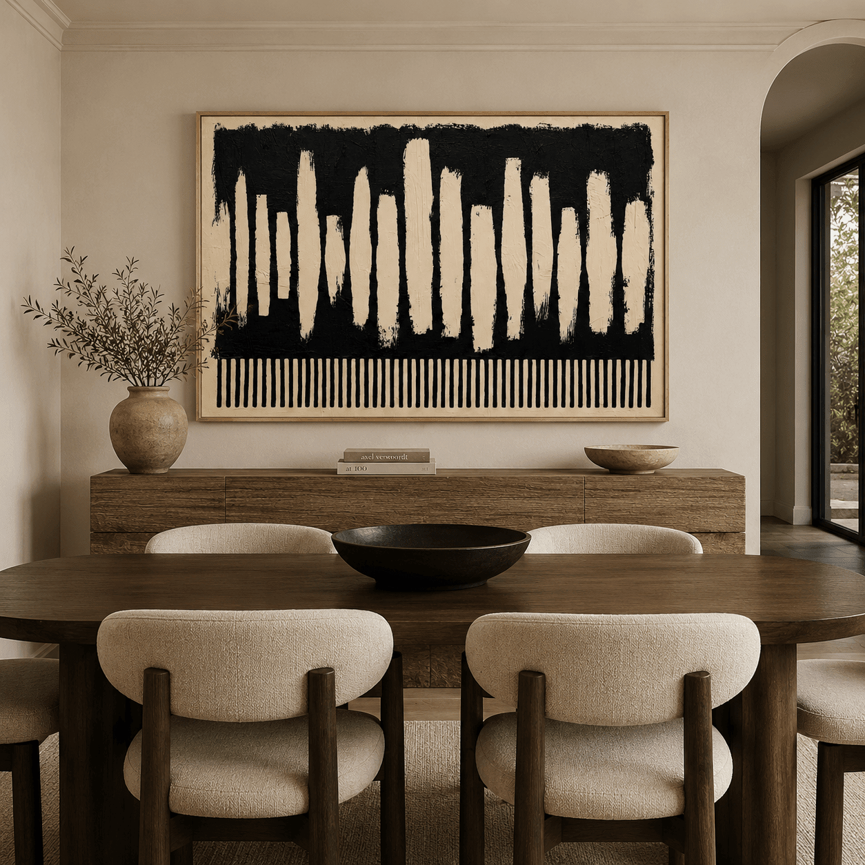
"Carbon Tide" — Textured original painting in dark neutral tones with visible palette knife work. View the piece →
How to Style Wabi Sabi Art on Your Walls
The primary rule of styling wabi sabi wall art is to resist the impulse to add more. The art works best when given space — room to breathe and to be the focal point without competition from too many surrounding elements.
For a single large piece, hang it so the centre is roughly at eye level — around 57 to 60 inches from the floor. If the piece is going above furniture, aim for 6 to 8 inches of clearance between the top of the furniture and the bottom of the frame. This creates a visual connection between the two without them touching.
Wabi sabi art pairs naturally with other natural materials: unglazed ceramics, dried botanicals, hand-thrown pottery, raw linen. The art and the objects around it should feel like they come from the same world. Avoid highly polished or synthetic materials nearby — they create a dissonance the wabi sabi piece cannot reconcile.
For a gallery wall in a wabi sabi style, consider grouping several pieces of similar palette but different scale. Leave more space between frames than you normally would — the breathing room is part of the composition. Odd numbers of pieces (three or five) tend to feel more organic than pairs or squares.
🎨 FREE ART STYLE FINDER QUIZ
Not sure if wabi sabi is the right style for your space? Take our free Art Style Finder Quiz — answer 7 questions about your room and preferences and discover which art aesthetic fits your home best.
Download Free →Colour Palettes That Work with Wabi Sabi Wall Art
Choosing the right colour palette is where many people go wrong with wabi sabi art. The temptation is to match the piece exactly to the room's existing colours — but wabi sabi works better when it is given a degree of independence. The palette should feel like it belongs in the same family, not the same sentence.
Canvas prints at Rossetti Art are produced with archival pigment inks rated fade-resistant for 75+ years, so the subtle, complex tones of wabi sabi pieces — the difference between warm cream and cool grey, or between ochre and sand — hold their accuracy over time. The canvas is hand-stretched over a kiln-dried pine wood frame, and the 1.5-inch profile means no additional framing is needed.
The oak floater frame option, crafted from solid wood with a natural grain finish, is particularly well suited to wabi sabi art. The visible gap between canvas and frame adds a layer of deliberate imperfection — a small asymmetry that reinforces the philosophy of the piece it holds.
Explore the full range of wabi sabi-influenced pieces at Abstract Canvas Prints, and our hand-painted Original Paintings for pieces with genuine texture and process.
Frequently Asked Questions
What colours are typical in wabi sabi wall art?
Wabi sabi art typically uses earthy, muted tones derived from natural materials: warm white, cream, sand, taupe, warm grey, charcoal, sage green, ochre, terracotta and rust. High saturation colours are avoided — the palette should feel like undyed, unprocessed natural matter in soft light.
Is wabi sabi wall art the same as minimalist art?
They share an appreciation for space and restraint, but they are philosophically different. Minimalism is about reduction — removing everything unnecessary. Wabi sabi is about acceptance — embracing imperfection, natural process and the passage of time. Wabi sabi art often has more visible texture and intentional asymmetry than strict minimalism.
What size wabi sabi canvas print works best in a living room?
For a feature wall behind a sofa, a canvas of 30×40 inches or larger creates the most impact. For smaller living rooms or secondary walls, 20×24 or 24×30 inches works well. The key is proportion — the art should occupy roughly two-thirds of the wall width above any furniture it hangs over. Our Live Preview tool on every product page helps you see the exact size in your space before you commit.
Can wabi sabi art work in a modern interior?
Yes — in fact, wabi sabi art often performs best in contemporary interiors because it provides the warmth and human quality that highly designed, sleek spaces can lack. A textured earthy canvas against a concrete or white plaster wall, or above a minimalist marble-topped sideboard, creates a layered tension that makes both the art and the room more interesting.
What is the difference between wabi sabi and japandi style?
Japandi combines Japanese wabi sabi with Scandinavian minimalism — the result is restrained, functional and serene. Wabi sabi on its own is warmer and more accepting of imperfection. Japandi interiors often use darker, cooler palettes (charcoal, black, deep navy) alongside natural wood, while pure wabi sabi spaces tend toward warmer, lighter neutrals. Both styles benefit from the same approach to art: one considered piece, given space to breathe.
For more on choosing the right style of art for your home, explore our abstract canvas prints or browse the full collection at Rossetti Art.
Keep Reading
About the Author — Chiara Rossetti is the founder of Rossetti Art, a canvas print and original art brand. She writes about interior design, wall art styling, and the art of making a home feel alive.
Leave a comment
This site is protected by hCaptcha and the hCaptcha Privacy Policy and Terms of Service apply.