The way light moves across a textured surface can completely transform how a piece of art feels in your home. Textured wall art for living room spaces brings a dimensional quality that flat prints simply cannot achieve, creating visual interest that shifts throughout the day as natural light changes.
This depth makes textured art particularly powerful in living rooms, where you spend significant time and want walls that feel dynamic rather than static. The raised surfaces catch shadows and highlights, adding architectural interest to your space without renovation.

What Is Textured Wall Art and Why It Transforms Living Rooms
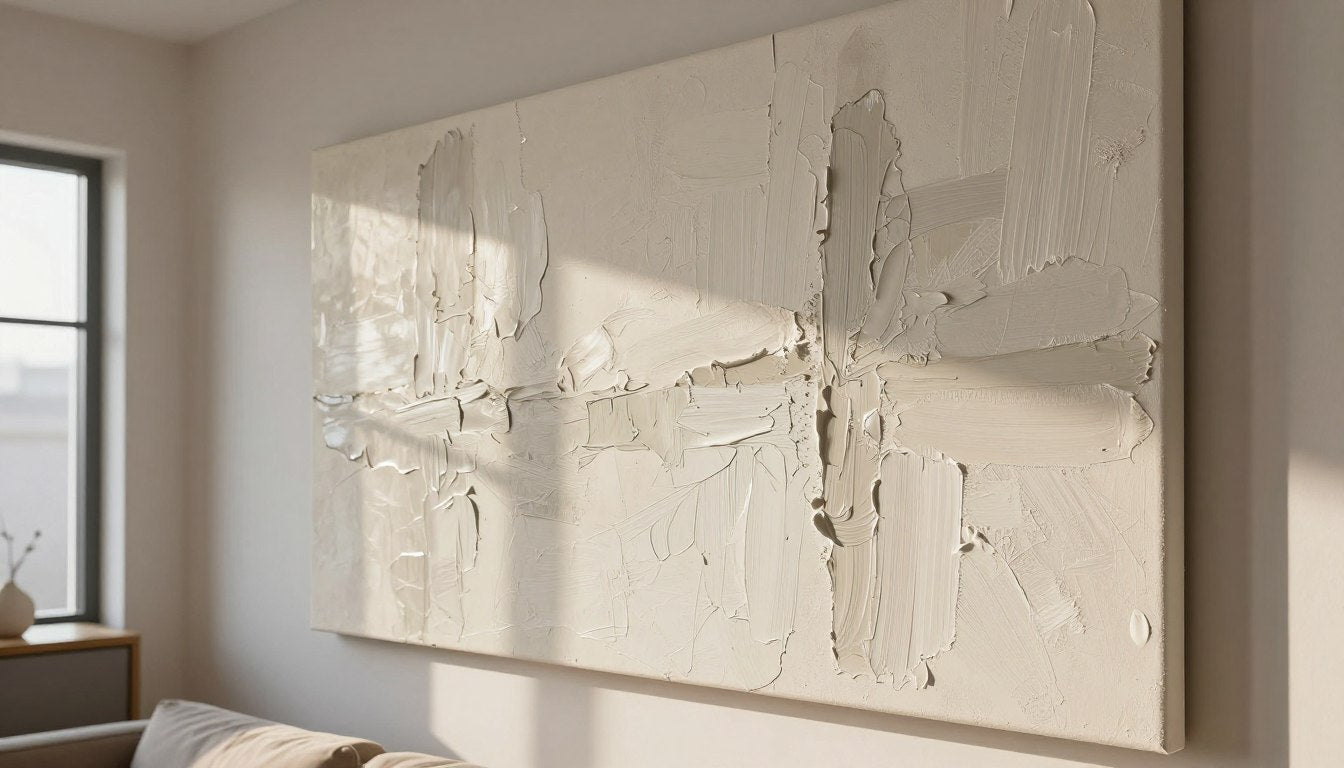
Textured wall art refers to artwork with raised or dimensional surfaces that create physical depth beyond the flat canvas or paper. Unlike standard prints, textured pieces feature actual relief—whether through thick paint application, mixed media elements, or specialized printing techniques that replicate brushstrokes.
This dimension fundamentally changes how art interacts with your room. The texture catches light differently at various times of day, making the piece feel alive and responsive to your environment. Morning sunlight might highlight ridges and valleys in gold tones, while evening lamps create dramatic shadows that emphasize depth.

Benefits of Textured Art in Living Spaces
The physical presence of textured artwork adds architectural interest without structural changes. In rooms with minimal molding or flat walls, texture brings visual complexity that makes the space feel more designed and intentional.
Textured pieces also create conversation starters. Guests naturally want to examine the technique up close, asking about the artist's process or the materials used. This engagement factor makes your living room feel more dynamic and personally curated.

How Texture Impacts Room Atmosphere
The tactile quality of textured art softens the hard surfaces common in living rooms—glass coffee tables, smooth leather sofas, and polished wood floors. By introducing organic, hand-worked surfaces, you balance the visual weight of modern furnishings.
Color behaves differently on textured surfaces too. A single hue might appear as multiple shades depending on how light hits raised and recessed areas. This complexity allows textured art to coordinate with various colors in your room without feeling too matched or stiff.

For living rooms specifically, texture adds warmth. The hand-crafted quality—whether genuine or expertly replicated—communicates care and artistic intention. This matters in the room where you gather, relax, and welcome others into your home.
When selecting living room canvas prints, consider how texture interacts with your existing furniture and architectural elements. The right piece should feel like a natural extension of your design vision rather than an afterthought.

Key Insight: Textured wall art transforms living rooms by adding physical dimension that responds to changing light throughout the day, creating dynamic visual interest that flat prints cannot achieve while softening hard modern surfaces.

Types of Textured Wall Art: From Canvas to Original Paintings
Understanding the different types of textured art helps you choose pieces that align with your budget, aesthetic preferences, and quality expectations. Each category offers distinct visual and tactile characteristics.
Original Textured Paintings
Original textured paintings represent the highest level of craftsmanship and investment. Artists build up paint layers using techniques like impasto, where thick paint creates dramatic three-dimensional surfaces. These pieces often use palette knives to sculpt paint directly onto canvas, creating genuine relief.

The beauty of original paintings lies in their uniqueness. No two pieces are identical, and the artist's hand is visible in every brushstroke and texture decision. Light catches authentic paint ridges in ways that cannot be fully replicated, creating subtle depth variations.
For collectors who value authenticity and are willing to invest, textured original paintings offer heirloom-quality pieces that often appreciate in value. Each work represents hours of artistic labor and creative vision.

Gallery-Quality Textured Canvas Prints
Modern printing technology allows for faithful reproduction of textured artwork. Gallery-quality textured canvas prints use specialized techniques to replicate the dimensional qualities of original paintings, creating raised surfaces that mimic brushstrokes and palette knife work.
These prints typically employ gel mediums or texture overlays applied during the printing process. When properly executed with archival inks and UV-resistant coatings, the result is a piece that captures most of the visual impact of an original at a fraction of the cost.

The advantage of canvas prints lies in accessibility. You can enjoy sophisticated textured art without the investment required for originals. Quality matters significantly here—inferior prints may lack depth or use texture that feels artificial rather than organic.
Hand-Stretched Canvas Options
Premium canvas wall art comes stretched over pine wood frame or similar quality materials. Hand-stretched canvas ensures proper tension and durability, preventing sagging or warping over time.

Frame Presentation Choices
Many textured pieces work beautifully with an oak floater frame, which creates a shadow gap between canvas edge and frame. This presentation style emphasizes the artwork as an object, highlighting its dimensional qualities.

Mixed Media Textured Art
Mixed media pieces combine painting with additional materials—fabric, paper, metal, or found objects. These artworks create texture through layering different elements, each contributing its own surface quality and visual interest.

In living rooms, mixed media works particularly well for eclectic or bohemian design schemes. The varied textures add tactile richness that complements spaces filled with diverse furniture styles and decorative objects.
3D Sculptural Wall Art
Some textured wall decor extends beyond canvas to include sculptural elements—wood panels, metal work, or dimensional assemblages. These pieces blur the line between painting and sculpture, creating significant physical depth.

Sculptural wall art works best in living rooms with ample wall space and minimal competing visual elements. The dramatic shadows and physical presence require room to breathe and be appreciated from multiple viewing distances.
Quality Indicator: When evaluating textured canvas art, examine whether the texture feels organic and varied or repetitive and artificial. Quality pieces show intentional texture placement that enhances the composition rather than uniform coating.

Each type of textured art brings different strengths to your living room. Consider your budget, design aesthetic, and the level of authenticity you desire when choosing between original paintings, high-quality prints, or alternative texture approaches.
Choosing the Right Texture Style for Your Living Room Design
The texture style you choose should complement your existing design aesthetic while adding the dimensional interest you seek. Different interior styles benefit from specific texture approaches.
Texture for Modern and Contemporary Living Rooms
Modern spaces typically feature clean lines and minimal ornamentation. Textured wall art in these rooms should feel sophisticated rather than busy. Look for pieces with subtle texture variation—gentle brushstrokes or refined impasto that adds interest without overwhelming the room's streamlined aesthetic.

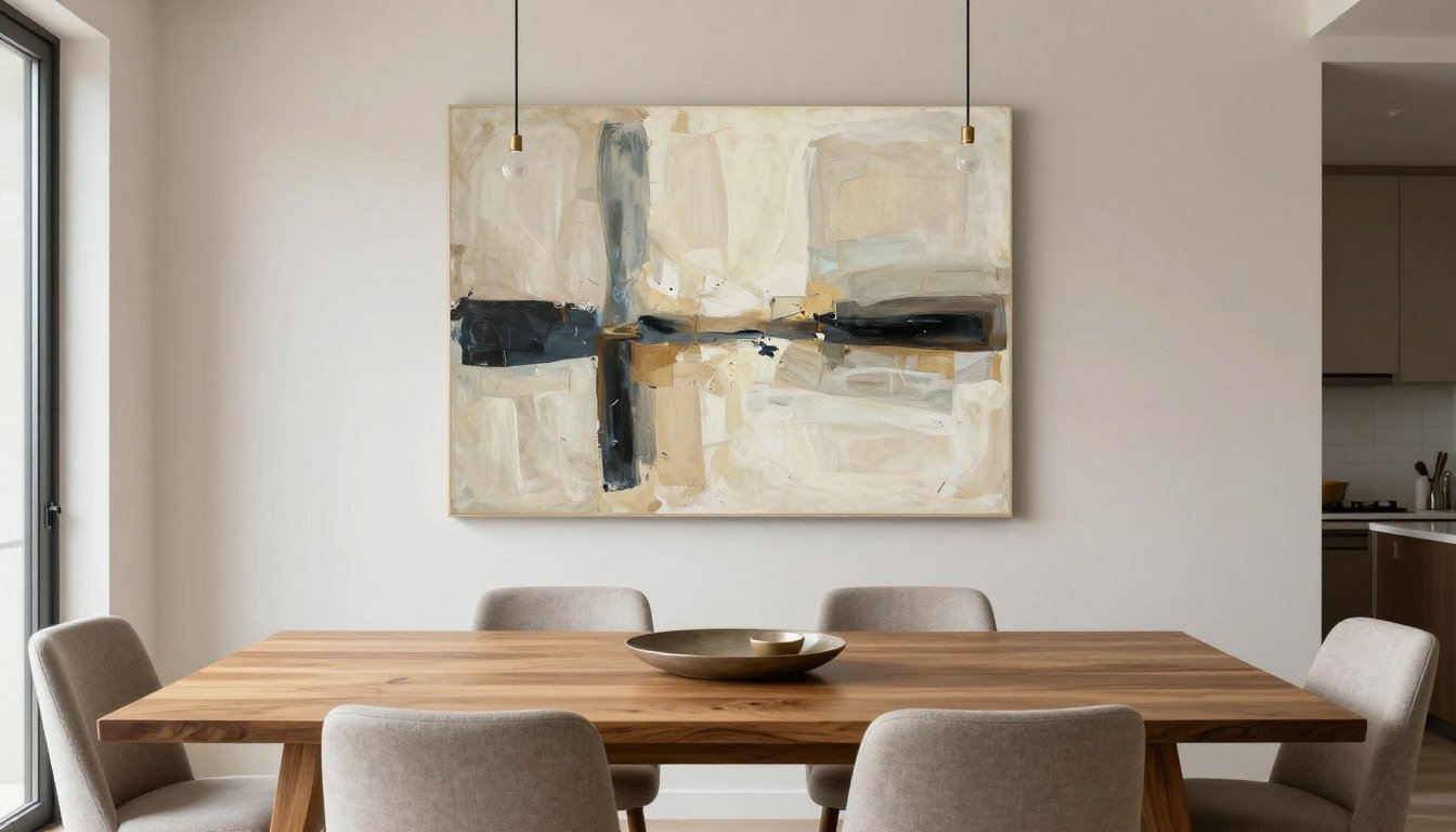
Monochromatic or limited color palettes work exceptionally well for contemporary settings. The texture itself becomes the focal point, creating visual interest through dimensional variation rather than color contrast. Black and white textured pieces offer timeless sophistication.
Geometric texture patterns also suit modern design. Abstract compositions with structured texture application—horizontal strokes, grid-like impasto, or methodical layering—echo the architectural precision of contemporary spaces.

Texture for Traditional and Transitional Spaces
Traditional living rooms embrace more ornate detail and classical elements. Textured art in these spaces can be bolder and more expressive. Rich impasto landscapes, heavily textured florals, or abstract pieces with dramatic paint buildup complement traditional furnishings.

Transitional design—blending traditional and contemporary elements—offers flexibility in texture choice. These spaces work well with textured art that balances sophistication and approachability. Medium texture depth and versatile color palettes bridge different style elements.

Frame Style Considerations
Traditional spaces often call for framed textured art. An oak floater frame or traditional gallery frame provides structure while maintaining focus on the texture. The frame should complement rather than compete with the dimensional qualities of the piece.
Contemporary spaces frequently display unframed canvas, where the hand-stretched canvas wraps around the sides. This presentation emphasizes the art as object and showcases the entire textured surface.
Texture for Bohemian and Eclectic Living Rooms
Bohemian design celebrates texture and layering. These living rooms can accommodate heavily textured art with bold color combinations and expressive brushwork. Mixed media pieces with varied surface elements particularly suit eclectic spaces.

Don't shy away from texture complexity in these spaces. The room's existing visual richness can handle dramatic dimensional art. Consider colorful textured pieces that pull together various hues present in your furnishings and accessories.
Layering multiple textured pieces also works in eclectic settings. Create gallery walls mixing different texture types, sizes, and styles for a collected-over-time aesthetic.

Texture for Scandinavian and Minimalist Interiors
Scandinavian design prioritizes simplicity, natural materials, and restrained color palettes. Textured art in these spaces should feel organic and understated. Look for pieces with gentle texture reminiscent of natural elements—soft brushstrokes suggesting water movement or subtle impasto evoking weathered surfaces.

Neutral color palettes work best—whites, greys, soft beiges, and muted earth tones. The texture provides visual interest without introducing color complexity that might feel excessive in minimalist settings.
Single large-scale pieces often work better than multiple smaller works in Scandinavian spaces. One substantial textured artwork creates a focal point without cluttering the visual field.
When to Choose Subtle Texture
- Modern or minimalist design schemes
- Small living rooms where drama might overwhelm
- Spaces with already significant visual complexity
- When seeking sophisticated, understated elegance
- Rooms with abundant pattern in furniture or textiles
When to Choose Bold Texture
- Traditional or eclectic design styles
- Large living rooms needing visual impact
- Minimally decorated spaces requiring focal points
- When making art the primary design statement
- Rooms with simple, solid-color furnishings

Your living room's existing style provides essential context for texture selection. The right textured piece of art should feel like it has always belonged in your space, enhancing rather than fighting your established design direction.
Size and Placement Guide: Making Textured Art Work in Your Space
Proper sizing and placement determine whether textured wall art enhances your living room or falls flat. The dimensional quality of textured pieces requires thoughtful consideration of viewing distance and spatial relationships.
Determining the Right Size for Your Wall
The general rule suggests art should cover approximately two-thirds to three-quarters of the furniture width beneath it. For a standard sofa measuring 84 inches, aim for art between 56-63 inches wide. This proportion creates visual balance without overwhelming the space.

However, textured art can sometimes work slightly smaller than flat prints because the dimensional quality adds visual weight. A heavily textured piece measuring 50 inches might have similar impact to a flat print measuring 60 inches.
Room size also influences scale decisions. In compact living rooms, one large textured piece often works better than multiple smaller works. The singular focal point prevents visual clutter while maximizing texture impact.
Large-Scale Textured Art
Oversized textured pieces (60+ inches) create dramatic statements in spacious living rooms. The texture becomes more immersive at this scale, almost enveloping viewers in the dimensional surface.

Medium and Small Textured Pieces
Smaller textured works (under 36 inches) suit intimate spaces or work effectively when grouped. The texture remains impactful at close viewing distances, rewarding detailed examination.

Height and Placement Guidelines
Hang textured art so the center sits at eye level, typically 57-60 inches from the floor. This standard gallery height ensures comfortable viewing and proper appreciation of the dimensional surface.
When placing art above furniture, leave 6-12 inches between the furniture top and the artwork's bottom edge. This breathing room prevents the piece from appearing cramped while maintaining visual connection to the furniture below.

Lighting Considerations for Placement
Textured art requires strategic lighting placement to maximize dimensional impact. Natural light from windows creates beautiful shadow play, but position art to avoid direct sunlight, which can fade colors despite UV-resistant coatings.

Artificial lighting should come from the side or at an angle to emphasize texture. Overhead track lighting or picture lights create shadow definition that highlights the relief. Flat frontal lighting diminishes dimensional qualities.
Sizing Tool: Uncertain about the perfect dimension for your wall? Before purchasing, cut paper templates to size and tape them to your wall. Live with the size for several days to confirm it feels right in your space.
Multiple Piece Arrangements
When hanging multiple textured pieces, maintain consistent spacing—typically 2-4 inches between frames or canvases. The texture itself adds visual complexity, so resist overcrowding arrangements.

Triptychs and diptychs work particularly well with textured art. The continuous or related imagery across panels emphasizes the dimensional surface while creating expansive visual impact.
For gallery walls incorporating textured pieces, balance texture weight across the arrangement. Distribute heavily textured works evenly rather than clustering them, which prevents visual imbalance.

Focal Wall Selection
Choose your living room's focal wall thoughtfully for textured art placement. The wall behind the sofa or facing the entrance typically serves as the primary focal point, making it ideal for showcase textured pieces.
Avoid placing textured art on walls with competing architectural features—fireplaces, built-in shelving, or large windows. The texture deserves its own stage rather than battling other visual elements.

Room Flow Consideration: In open-concept living spaces, position textured art where it's visible from multiple areas but doesn't create visual confusion with adjacent rooms' decor. The texture should anchor the living zone specifically.
Proper sizing and placement transform textured canvas wall art from mere decoration to architectural element. Take time to measure, test placements, and consider lighting before committing to final installation.
Styling Textured Wall Art with Your Existing Decor
Successfully integrating textured art requires considering how it interacts with furniture, textiles, and accessories already in your living room. The goal is cohesion without overly matching every element.
Balancing Texture Throughout the Room
Textured wall art should complement, not duplicate, existing textures. If your living room features heavy textile layering—chunky knit throws, velvet pillows, woven rugs—consider textured art with cleaner, less busy surfaces to prevent visual overload.

Conversely, in minimalist spaces with predominantly smooth surfaces—leather sofas, glass tables, polished wood—heavily textured art adds necessary tactile interest. The dimensional artwork provides textural contrast that prevents the room from feeling sterile.
Coordinating with Furniture Styles
Your furniture style influences which textured art works best. Mid-century modern furniture pairs beautifully with abstract textured pieces featuring organic brushwork and retro color palettes. The period-appropriate aesthetic creates design harmony.

Contemporary furniture with clean lines welcomes geometric textured art or minimalist abstracts. The sophisticated simplicity of both elements creates a cohesive modern aesthetic without competing for attention.
Traditional furniture can handle more elaborate textured pieces. Consider works with classical composition or refined impasto technique that echoes the craftsmanship evident in quality traditional furnishings.

Scale Relationships Matter
Match the visual weight of your textured art to your furniture scale. Delicate furniture pieces can be overwhelmed by heavily textured, oversized art. Substantial furniture can handle—and often requires—larger, bolder textured works.
A sectional sofa with significant physical presence needs proportional art. A petite loveseat pairs better with moderately sized textured pieces that don't dwarf the furniture.
Color Coordination Without Matching
Avoid literal color matching between textured art and decor. Instead, look for tonal relationships or complementary hues. If your sofa is navy blue, textured art with warm copper or rust tones creates pleasing contrast rather than flat coordination.

Pull accent colors from the textured painting into smaller decor elements—throw pillows, vases, or books. This technique distributes color throughout the space while maintaining the art as the primary color source.
Neutral textured art offers maximum flexibility. White texture, grey abstracts, or beige-toned pieces coordinate effortlessly with changing decor, allowing you to update accessories without replacing art.
Styling Around Textured Art
Once you've placed textured wall art, style adjacent areas to enhance rather than distract. On console tables or shelves near the artwork, use objects with contrasting textures—smooth ceramics, polished metal, or sleek glass—to emphasize the art's dimensional quality.

Avoid placing busy patterns directly adjacent to textured art. The competing visual complexity diminishes both elements. Position patterned textiles and wallpaper at a distance where they don't create visual conflict.
Seasonal Styling Flexibility
Quality textured canvas art provides a permanent foundation for seasonal decor updates. The texture itself remains constant while surrounding elements rotate with the seasons.

In winter, layer cozy textiles and warm metallics around your textured art. Summer styling might introduce lighter fabrics and brighter accent colors, while the dimensional artwork anchors the room through all transformations.
"The beauty of investing in quality textured wall art is its versatility. While trends come and go, the dimensional quality and craftsmanship remain perpetually engaging, adapting to your evolving style without requiring replacement."
Creating Conversation Areas Around Art
Position seating to encourage appreciation of your textured art. Angle chairs slightly toward the wall featuring your primary piece, creating natural viewing angles during conversation. This arrangement makes the art part of your living experience rather than background decoration.

In smaller living rooms, ensure pathways allow close examination of texture. Guests should be able to approach the art comfortably without awkward furniture navigation.
When styling textured art with existing decor, remember that the dimensional quality itself is a design element. Let the texture do some of the decorative work, reducing the need for excessive accessorizing around it.
Color Coordination: Matching Textured Art to Your Living Room Palette
Color selection for textured wall art significantly impacts how successfully it integrates into your living room. The physical dimension of texture affects how colors appear, creating complexity beyond flat prints.
Understanding Color Behavior on Textured Surfaces
A single color applied to textured surfaces appears as multiple shades depending on how light hits raised and recessed areas. Deep valleys catch shadow, appearing darker, while peaks catch highlights, appearing lighter. This natural variation creates visual richness from seemingly simple color choices.

This behavior means textured art in neutral tones—greys, beiges, taupes—offers surprising visual interest. What might appear monotonous on flat prints becomes dynamic on dimensional surfaces.
Monochromatic Textured Art
Monochromatic textured pieces work exceptionally well in living rooms with complex color schemes. The single hue simplified color coordination while the texture provides sophisticated visual engagement.

Black and white textured art offers timeless versatility. The contrast creates graphic impact while the texture adds warmth that prevents stark, cold aesthetics. These pieces coordinate with virtually any color palette you introduce through furnishings.
All-white textured canvases might seem risky, but they create stunning effects. The texture becomes purely sculptural, with white-on-white shadows creating subtle depth. These pieces suit minimalist or Scandinavian living rooms where simplicity reigns.

Limited Color Palette Approaches
Textured art with limited color palettes—two to three hues—offers coordination flexibility while maintaining visual interest. These pieces can pull together disparate colors in your room without appearing overly matched.

Choose one dominant color from your existing palette and one complementary accent. The texture will create natural variations of both hues, providing more visual complexity than the simple two-color selection suggests.
Colorful and Multi-Hued Textured Art
Bold, colorful textured art makes powerful statements in neutral living rooms. If your furniture, walls, and floors are predominantly neutral, vibrant textured art introduces personality and energy without permanent commitment.

When working with colorful textured pieces, avoid competing patterns elsewhere in the room. Let the dimensional artwork be the primary color and pattern source, keeping textiles and accessories in solid hues pulled from the painting.
Warm Color Palettes
Warm-toned textured art—reds, oranges, yellows, warm browns—creates cozy, inviting atmospheres. These colors advance visually, making the art feel closer and more enveloping, ideal for large living rooms that might otherwise feel cavernous.

Cool Color Palettes
Cool-toned textured art—blues, greens, purples, cool greys—creates calm, serene environments. These colors recede visually, which can make smaller living rooms feel more spacious while maintaining sophisticated presence through texture.

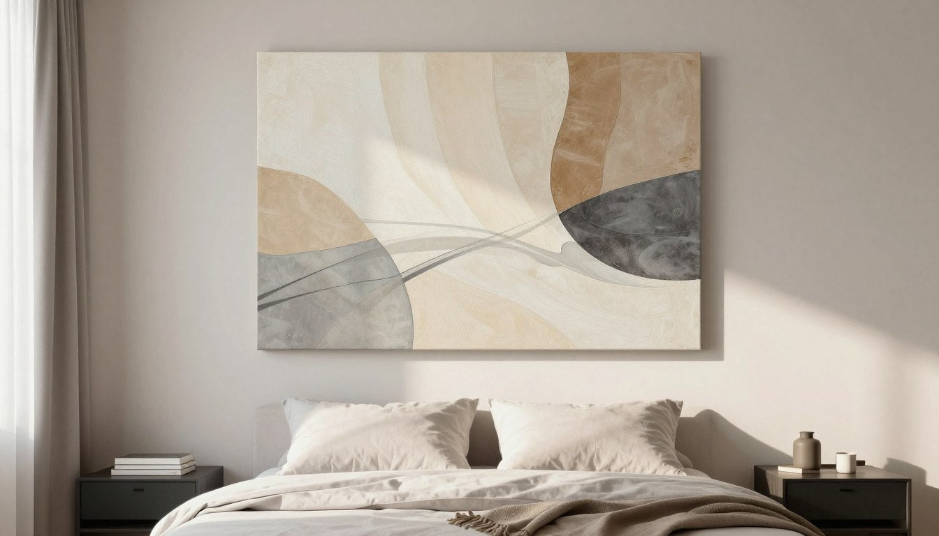
Earth Tones and Natural Colors
Earth-toned textured art—ochres, siennas, umbers, sage greens—connects interior spaces to nature. The organic colors combined with hand-worked texture create particularly harmonious effects, suitable for transitional and organic modern living rooms.

These natural hues coordinate effortlessly with wood furniture, stone elements, and botanical accessories. The color range allows flexibility while maintaining cohesive earth-connected aesthetics.
Metallic Accents in Textured Art
Some textured pieces incorporate metallic elements—gold leaf, copper paint, or silver accents. These catch light dynamically, adding glamour and luxury to living rooms.

Metallic textured art works particularly well in rooms with metallic accessories—brass lamps, gold-framed mirrors, or copper accents. The shimmer coordinates without requiring exact metal matching.
Color Caution: Always view art samples in your actual living room lighting before purchasing. Colors appear dramatically different under warm incandescent versus cool LED lighting. What looks amazing in store might disappoint in your specific lighting conditions.
Changing Color Schemes
If you enjoy updating your living room color scheme periodically, invest in textured art with versatile color palettes. Multi-hued abstracts or sophisticated neutrals adapt to evolving decor without requiring art replacement.

Alternatively, build a collection of textured pieces that you rotate seasonally or when redesigning. Storing and swapping art allows fresh perspectives while protecting your investment.
Color selection in textured wall decor balances personal preference with practical coordination. The dimensional quality means even conservative color choices create visual excitement, giving you permission to be bolder—or more restrained—than you might with flat prints.
Explore abstract canvas prints to discover how texture and color combine in versatile pieces that adapt to evolving design visions.
Lighting Considerations: Maximizing the Impact of Texture
Proper lighting transforms textured wall art from interesting to extraordinary. The play of light across dimensional surfaces creates shadow effects that change throughout the day, making the artwork feel alive and responsive.
Natural Light and Textured Art
Natural light offers the most beautiful illumination for textured canvas pieces. Morning light might create soft, gentle shadows that emphasize texture subtly, while afternoon sun produces more dramatic contrast with sharper shadow definition.

However, direct sunlight poses risks. Even UV-resistant coatings can't prevent all fading over years of continuous sun exposure. Position textured art perpendicular to windows rather than directly opposite, allowing indirect natural light to illuminate the piece without direct sun damage.
North-facing walls receive consistent, diffused natural light throughout the day without harsh direct sun. This makes northern walls ideal for displaying valuable textured original paintings or gallery-quality prints you want to preserve.

Artificial Lighting Strategies
Artificial lighting gives you control over how texture appears, particularly important for evening viewing when natural light fades. The key principle: angle your light source rather than positioning it directly in front of the artwork.
Picture Lights and Track Lighting
Picture lights mounted above textured art create dramatic downward shadows that emphasize relief. Adjustable track lighting offers flexibility to angle beams at 30-45 degrees, the optimal range for texture emphasis.

LED picture lights provide energy efficiency without heat damage. Older halogen fixtures generate significant heat that can damage canvas and paint over time, particularly with close mounting.
Ambient and Accent Lighting
Layered lighting—combining ambient room light with focused art lighting—creates the most sophisticated effect. Recessed ceiling lights provide general illumination while spotlights or picture lights accent the textured art specifically.

Side lighting from floor lamps or wall sconces can beautifully illuminate textured pieces mounted nearby. The lateral light direction creates shadow play that changes as you move through the room, adding dynamic viewing experiences.
Color Temperature Considerations
Light bulb color temperature significantly affects how textured art appears. Warm white (2700-3000K) creates cozy, inviting atmospheres that enhance warm-toned artwork. Cool white (3500-4100K) suits contemporary spaces and cool-toned pieces.

Daylight bulbs (5000-6500K) most accurately represent colors as they appear in natural light, ideal if color accuracy matters for your textured artwork. Many collectors use daylight bulbs in art-viewing areas for this reason.
Avoiding Common Lighting Mistakes
- Direct overhead lighting that flattens texture
- Harsh spotlights creating glare on glossy surfaces
- Insufficient lighting making texture invisible
- Mixing multiple color temperatures in one space
- Positioning lights too close causing heat damage
- Ignoring how shadows fall throughout the day
Lighting Mistakes to Avoid
- Angled lighting emphasizing dimensional relief
- Adjustable fixtures for seasonal light changes
- Dimmer switches for viewing flexibility
- Consistent color temperature throughout room
- Proper distance preventing heat exposure
- Testing lighting at different times before installation
Effective Lighting Practices
Seasonal Lighting Adjustments
Natural light changes dramatically with seasons. Summer sun enters at higher angles with longer daylight hours, while winter sun is lower and less intense. Consider adjusting artificial lighting seasonally to compensate.

In winter, you might increase artificial lighting intensity to compensate for shorter days. Summer might require less artificial light but more attention to shading windows to prevent direct sun exposure during long daylight hours.
Texture and Shadow Play
The entire purpose of lighting textured art is creating shadow definition that emphasizes dimensional qualities. Experiment with different light angles—even slightly moving a lamp changes how shadows fall across the textured surface.

Heavily textured impasto pieces require stronger directional lighting to fully appreciate the relief. Subtle texture works with softer, more diffused lighting that creates gentle rather than dramatic shadows.
Lighting Test: Before permanent installation, temporarily position your textured art and test lighting at different times of day. Live with the placement for several days, noting how changing light affects the piece. This prevents disappointing permanent installations.
Proper lighting doesn't just illuminate textured art piece—it activates the dimensional surface, transforming static decoration into dynamic visual experience. Invest time in lighting strategy; the effort pays dividends in enjoyment every day.
Quality and Materials: What Makes Gallery-Quality Textured Art
Understanding quality indicators helps you invest in textured wall art that maintains its beauty for years. Not all textured pieces offer the same longevity or visual impact—materials and construction methods significantly affect durability and appearance.
Canvas Quality and Preparation
Premium textured art begins with quality canvas. Gallery-quality pieces use heavyweight canvas (typically 340-450 GSM) that can support dimensional paint application without sagging or rippling. Lighter weight canvas may buckle under heavy texture.

Properly prepared canvas receives multiple gesso layers creating a stable, archival surface. This preparation prevents paint from directly contacting raw canvas fibers, which would accelerate deterioration over decades.
Hand-stretched canvas ensures proper tension and corner construction. Machine-stretched canvas may have inconsistent tension or weak corner joints that fail over time, particularly with the weight of textured paint applications.

Frame and Support Structure
The frame supporting your textured canvas must be robust enough to handle the artwork's weight. Cheap pine frames may warp or split, especially with heavily textured original paintings that can be surprisingly heavy.
Quality frames use kiln-dried pine wood frame or similar hardwoods with proper joinery—corner joints should be glued and stapled or screwed for maximum strength. The frame depth (typically 0.75" to 1.5") should be substantial enough to support the canvas without flexing.

Floating frames, particularly oak floater frame options, require equally careful construction. The gap between canvas and frame means the canvas must be self-supporting without relying on frame contact for stability.
Paint Quality and Archival Standards
Original textured paintings should use professional-grade acrylic or oil paints formulated for archival longevity. Student-grade paints may fade, yellow, or crack over time, particularly in thick textured applications.

For textured canvas wall art prints, archival inks are essential. Pigment-based inks resist fading far better than dye-based alternatives. Combined with UV-resistant coatings, archival inks ensure your printed textured art maintains color vibrancy for decades.
Texture Application Methods
How texture is created affects both appearance and durability. In original paintings, texture should be applied in multiple layers allowing proper drying between applications. Single-layer texture risks cracking as the paint cures.

For textured prints, gel mediums should be applied precisely to replicate original brushwork patterns. Mass-produced texture that uniformly covers the entire surface appears artificial compared to thoughtfully applied dimensional elements that enhance the composition.
Quality Indicators in Textured Prints
High-Quality Textured Prints
- Texture varies according to the composition
- Raised areas align with brushstrokes in the image
- Smooth gradations between textured and flat areas
- Consistent texture depth throughout
- Clean edges without texture bleeding
- Archival inks with UV protection
Lower-Quality Textured Prints
- Uniform texture coverage regardless of image
- Repetitive patterns unrelated to composition
- Abrupt transitions between textured areas
- Inconsistent or thin texture application
- Sloppy edges with excess texture material
- Standard inks prone to fading
Made-to-Order Advantages
Made to order textured art allows customization of size, color variations, and texture intensity. This approach also ensures freshness—newly created pieces haven't spent months in warehouse storage where temperature and humidity fluctuations might affect materials.

Custom work typically comes directly from production to your home, avoiding the handling damage risks associated with mass-produced pieces cycling through multiple distribution points.
Protective Coatings and Finishes
Quality textured art receives protective varnish or coating after completion. This layer shields against dust accumulation in texture crevices, minor moisture exposure, and UV light damage.
The finish also affects appearance—matte varnishes preserve the original paint surface appearance, while gloss finishes add depth and color saturation but may create glare under certain lighting.

Packaging and Shipping Quality
Even exceptional textured art can be damaged by poor packaging. Quality sellers protect textured surfaces with foam or bubble wrap before boxing, ensuring texture doesn't get crushed during transit.
Corner protectors prevent frame damage, and moisture barriers protect against humidity exposure during shipping. The packaging investment indicates the seller's commitment to delivering undamaged artwork.

"True quality in textured wall art reveals itself over time. Premium materials and proper construction maintain their beauty for decades, while inferior pieces show deterioration within months or a few years. The initial price difference pales compared to the longevity gap."
Certifications and Guarantees
Reputable textured art sellers offer guarantees on materials and craftsmanship. Look for commitments to archival standards, UV resistance specifics, and return policies that allow in-home evaluation.
For original paintings, certificates of authenticity documenting materials used, creation date, and artist signature add value and provide provenance for future sale or insurance purposes.

Investing in gallery-quality textured art means selecting pieces built to last. The combination of premium materials, expert construction, and archival standards ensures your textured wall art for living room remains beautiful for decades, justifying the initial investment many times over.
Mixing Textured and Flat Art: Creating a Balanced Gallery Wall
Combining textured and flat art pieces creates visual hierarchy and prevents sensory overload. A gallery wall mixing dimensions offers more sophistication than uniform texture throughout.
Principles of Mixing Textures
The fundamental principle: use textured pieces as focal points with flat prints providing supporting context. One or two textured works among five to seven total pieces creates effective visual interest without overwhelming complexity.
Position your most heavily textured piece at the gallery wall's center or primary viewing point. This establishes it as the anchor, with flatter pieces supporting rather than competing with the dimensional work.
Size Relationships in Mixed-Texture Galleries
Textured pieces can command attention even at smaller sizes due to their dimensional presence. A 24x24 inch textured canvas might have visual weight equal to a 30x40 inch flat print, allowing more flexible size combinations.

Avoid clustering all textured pieces together. Distribute them across your gallery wall arrangement so the eye travels through various depths and surface qualities as it moves across the display.
Color Coordination in Mixed-Texture Arrangements
Color relationships become even more important when mixing textures. The textured pieces will naturally draw more attention, so ensure their colors coordinate with or intentionally contrast against the flatter works.

Monochromatic gallery walls work beautifully with mixed textures. Using only black and white or shades of grey across both textured and flat pieces creates unity while the dimensional variation provides visual interest.
Alternatively, let your textured piece be the primary color source, with flat prints in neutral tones or black and white images that won't compete for color attention.
Frame Consistency Versus Variety
When mixing textures, frame consistency helps unify the arrangement. Using matching frames—such as uniform black frames or matching oak floater frame style—creates cohesion despite different surface qualities.

Alternatively, display textured pieces unframed while flat prints receive frames. This visual distinction emphasizes the dimensional works as special objects while the framed prints provide structured context.
Spacing and Arrangement Strategies
Proper spacing becomes critical with mixed textures. Allow 2-4 inches between pieces, but consider slightly more space around heavily textured works to give their dimensional quality breathing room.

Grid arrangements work well for mixed-texture galleries, providing structure that prevents the various depths from feeling chaotic. The regular spacing and alignment create order while the texture variation provides interest.
Asymmetrical Mixed-Texture Layouts
Organic, asymmetrical arrangements allow textured pieces to anchor irregular compositions. Place your textured work off-center with flat prints clustered asymmetrically around it, creating dynamic visual flow.

Symmetrical Mixed-Texture Layouts
Symmetrical arrangements with textured centerpiece and balanced flat prints on either side create formal, orderly presentations. This approach suits traditional living rooms and provides calming visual structure.

Subject Matter Coordination
When mixing textured and flat art, coordinate subject matter or theme. An abstract textured centerpiece might be surrounded by flat botanical prints, or textured landscapes could be mixed with flat nature photography.

Avoid completely random subject mixing when working with multiple textures. The varying dimensions already create complexity—subject continuity provides needed visual thread connecting the pieces.
Lighting Considerations for Mixed-Texture Galleries
Lighting a gallery wall with mixed textures requires compromise. Angled lighting that emphasizes textured pieces may create glare on flat prints behind glass. Aim for balanced illumination that favors the textured works slightly without washing out flat pieces.

Consider individual picture lights for textured focal pieces if your gallery wall is large. This allows precise lighting control for dimensional works while ambient room lighting handles the flatter surrounding pieces.
Gallery Wall Strategy: Plan your arrangement on the floor before hanging. Photograph the layout from standing height to preview how the mixed textures will read on the wall. This prevents costly wall holes from trial-and-error hanging.
Successfully mixing textured and flat art requires thoughtful planning but rewards with sophisticated, museum-quality gallery presentations that showcase your collecting vision and design sophistication.
For versatile pieces that work beautifully in mixed-texture arrangements, explore modern wall art collections offering both textured and flat options designed to coordinate seamlessly.
Maintenance and Care for Textured Wall Art
Proper maintenance preserves your textured art investment for decades. The dimensional surface requires specific care approaches different from flat prints or paintings behind glass.
Regular Dusting and Cleaning
Dust accumulates in the crevices and valleys of textured surfaces more readily than on flat artwork. Address this with gentle regular dusting rather than waiting for visible buildup.

Use a soft, natural-bristle brush—like a clean makeup brush or artist's brush—to lightly sweep dust from textured areas. Brush in one direction rather than circular motions, which can push dust deeper into texture.
Avoid feather dusters, which can catch on raised paint and potentially damage texture. Similarly, never use compressed air, which can drive dust particles into paint pores or even dislodge loose paint fragments.
Dealing with More Stubborn Dirt
For textured canvas that has accumulated more than surface dust, slightly dampened microfiber cloths can gently clean without water saturation. The cloth should be barely damp—wring it thoroughly before use.

Never spray cleaning solutions directly onto textured art. If needed, lightly dampen your cloth with water only—never chemical cleaners—and gently dab rather than rub textured areas.
For original paintings with varnish protection, consult a professional art conservator before attempting any cleaning beyond basic dusting. Original works may require specialized care beyond general maintenance.
Protecting from Environmental Damage
Temperature and humidity fluctuations affect textured art, particularly canvas pieces. Avoid hanging textured wall art in locations with extreme temperature changes—near heating vents, air conditioning units, or fireplaces.

Bathrooms and kitchens pose humidity risks for textured canvas. Moisture can cause canvas to expand and contract, potentially leading to texture cracking or mold growth in extreme cases.
Maintain indoor humidity between 40-60% and relatively stable temperatures (65-75°F) for optimal art preservation. These conditions suit both human comfort and artwork longevity.
UV Protection and Light Exposure
While quality textured art includes UV-resistant coatings, no protection is absolute. Minimize direct sunlight exposure to prevent long-term fading, particularly for vibrant colors.

Window treatments—sheer curtains, UV-filtering films, or adjustable blinds—help control direct sun exposure during peak daylight hours. This protection becomes especially important for south-facing walls receiving intense afternoon sun.
Handling and Moving Textured Art
When moving or rehanging textured pieces, handle with care to avoid damaging dimensional surfaces. Always grasp the frame or canvas edges, never the painted surface where oils from your hands can transfer.

For heavily textured original paintings, consider wearing clean cotton gloves during handling to prevent any skin oil transfer. Even minor oil deposits can attract dust and potentially damage varnish over time.
Transport textured art face-up when possible. If vertical transport is necessary, protect the textured surface with soft foam or bubble wrap that doesn't compress the texture.
Long-Term Storage Considerations
If you need to store textured artwork, choose climate-controlled spaces with stable temperature and humidity. Attics and basements often experience extremes that can damage canvas and paint.

Store pieces upright rather than stacked flat, which can compress texture. Use acid-free protective coverings and ensure adequate air circulation to prevent moisture accumulation.
Professional Maintenance and Restoration
For valuable original textured paintings or damage beyond basic care, consult professional art conservators. They can clean, repair, and restore textured works using specialized techniques that preserve artistic integrity.
Restoration Warning: Never attempt to repair damaged texture yourself. Amateur restoration—adding paint, regluing separated sections, or touching up faded areas—almost always decreases artwork value and can cause permanent damage. Professional intervention is worth the investment.
Pet and Child Considerations
If you have pets or young children, position textured art higher on walls—beyond curious hands or jumping pets. The raised texture naturally invites touching, which can transfer oils and gradually degrade protective coatings.

Consider acrylic glazing for particularly valuable textured pieces in high-traffic family spaces. While traditional glass would flatten against texture, custom-spaced acrylic can provide protection while maintaining viewing quality.
Maintenance Schedule
| Frequency | Maintenance Task | Method |
| Weekly | Light dusting | Soft natural-bristle brush, gentle one-direction strokes |
| Monthly | Detailed dusting | Careful brushing of all textured areas and edges |
| Quarterly | Inspection | Check for damage, fading, or environmental issues |
| Semi-annually | Deeper cleaning | Barely-damp microfiber cloth if needed (canvas only) |
| Annually | Professional assessment | For valuable originals, professional conservation review |
Regular maintenance preserves both beauty and value of textured wall art for living room display. The minor effort required—primarily gentle dusting—protects your investment for generations, allowing the dimensional artwork to remain a cherished focal point in your home.
Frequently Asked Questions About Textured Wall Art
Q: What is the best type of textured wall art for a living room?
A: The best textured wall art for living rooms depends on your design style and budget. Abstract textured canvas prints offer versatility and affordability, working well with most decor styles. For traditional spaces, textured landscape or floral paintings create warmth. Contemporary rooms benefit from geometric textured abstracts with clean lines. Original textured paintings provide maximum authenticity and value appreciation but require larger investment. Gallery-quality textured prints with archival inks offer excellent middle ground—authentic-looking texture at accessible price points. Consider your room's existing texture balance; spaces with smooth, modern furniture benefit from heavier texture, while rooms with abundant textiles work better with subtle dimensional art.
Q: How do I clean textured canvas wall art without damaging it?
A: Clean textured canvas using a soft natural-bristle brush for regular dusting, brushing gently in one direction to lift dust from dimensional crevices. Perform this weekly to prevent buildup. For deeper cleaning, use a barely-damp microfiber cloth—wring thoroughly before use so it's only slightly moist. Gently dab rather than rub textured areas. Never spray liquids directly onto canvas or use chemical cleaners, which can damage paint and varnish. Avoid feather dusters or compressed air, which can catch on raised paint or drive dust deeper into texture. For valuable original paintings, consult professional art conservators rather than attempting cleaning yourself. Always handle textured art by the frame edges, never touching the painted surface, to prevent oil transfer from your hands.
Q: Can textured wall art fade over time in living rooms?
A: Yes, textured wall art can fade over time if exposed to direct sunlight, though quality pieces with UV-resistant coatings and archival inks resist fading significantly longer. To minimize fading, position textured art away from direct sun exposure—perpendicular to windows rather than opposite them. North-facing walls receive consistent diffused light without harsh direct sun, making them ideal for valuable pieces. Use window treatments like sheer curtains or UV-filtering films during peak sunlight hours. For original paintings, professional varnish application provides additional protection. Modern printing technologies combined with archival materials mean quality textured canvas prints can maintain color vibrancy for decades with proper care. If you notice early fading signs, relocate the piece to a lower-light position promptly to prevent further color loss.
Q: What size textured wall art should I choose for above my sofa?
A: Textured wall art above a sofa should span approximately two-thirds to three-quarters of the sofa's width. For a standard 84-inch sofa, aim for art between 56-63 inches wide. However, textured pieces can work slightly smaller than flat prints because dimensional quality adds visual weight—a 50-inch heavily textured canvas might have similar impact to a 60-inch flat print. For vertical sizing, leave 6-12 inches between the sofa back and the artwork's bottom edge. The art's center should sit at eye level (57-60 inches from floor) for proper viewing. In small living rooms, one large textured piece often works better than multiple smaller works. Use our Wall Art Size Calculator to determine the perfect dimension for your specific wall and furniture proportions before purchasing.
Q: Is textured wall art more expensive than regular prints?
A: Textured wall art typically costs more than standard flat prints due to additional production complexity. Original textured paintings command premium price ranging from hundreds to thousands of dollars, reflecting artistic labor and materials. Gallery-quality textured canvas prints fall in the mid-range—more expensive than basic posters but significantly less than originals. The texture application process—whether hand-painted impasto or gel medium printing techniques—requires additional time, materials, and expertise. However, the investment often justifies itself through increased visual impact and longevity. Quality textured pieces maintain their dimensional appeal indefinitely, while flat prints may feel dated or less engaging over time. Consider price per year of enjoyment rather than just initial cost. Many find textured art's daily visual pleasure worth the premium over flat alternatives.
Q: How does lighting affect textured wall art in living rooms?
A: Lighting dramatically transforms textured wall art appearance by creating shadows that emphasize dimensional relief. Natural light changes throughout the day—morning sun creates gentle shadows while afternoon light produces stronger contrast. For optimal effect, position artificial lights at 30-45 degree angles rather than directly overhead or frontal, which flattens texture. Adjustable track lighting or picture lights offer control over shadow intensity. Light color temperature also matters: warm white (2700-3000K) enhances warm-toned art, while cool white (3500-4100K) suits contemporary pieces. Dimmer switches allow adjustment for different times and moods. Side lighting from floor lamps creates dynamic viewing as you move through the room. Test lighting from various angles before final installation to maximize your textured art's dimensional impact.
Q: Can I mix textured and flat art in the same gallery wall?
A: Yes, mixing textured and flat art creates sophisticated gallery walls with visual hierarchy and dimensional interest. Use one or two textured pieces as focal points among five to seven total works—this prevents overwhelming complexity while providing engaging dimension. Position your most heavily textured piece at the arrangement's center or primary viewing point, with flatter supporting pieces around it. Maintain consistent framing—matching frames or uniform presentation style—to unify different textures. Allow slightly more spacing around textured works (3-4 inches versus 2-3 inches for flat pieces) to give dimensional quality breathing room. Coordinate color palettes across all pieces, often letting textured art be the primary color source with flat prints in neutrals. Grid arrangements work well for mixed-texture galleries, providing structure that prevents chaos. Avoid clustering all textured pieces together; distribute them for balanced visual flow.
Bringing Your Living Room to Life with Textured Wall Art
The dimensional quality of textured wall art transforms living rooms from simple spaces into dynamic environments that respond to changing light and engage viewers at multiple levels. Unlike flat decoration, texture creates physical presence that makes your walls feel architecturally interesting without renovation.
Whether you choose heavily impasted original paintings or expertly crafted textured canvas prints, the dimensional surface adds sophistication that elevates your entire design scheme. The interplay of light and shadow across raised brushstrokes brings your walls to life, creating visual interest that shifts throughout each day.

The key to successfully incorporating textured art lies in thoughtful selection—considering your existing design style, proper sizing for your space, quality materials that endure, and lighting that emphasizes dimensional beauty. When these elements align, textured wall art becomes more than decoration; it becomes an integral architectural feature that defines your living room's character.
Your living room deserves art that does more than fill wall space. It deserves pieces that create conversation, catch light beautifully, and reward close examination with hand-crafted detail. Textured wall art delivers all of this while coordinating with your existing decor and adapting to evolving design visions.
Discover Your Perfect Textured Art
Ready to add dimensional beauty to your living room? Explore our curated collection of textured canvas prints and original paintings, each piece crafted with gallery-quality materials and designed to transform your space. From subtle textures to dramatic impasto, find artwork that speaks to your style.

Leave a comment
This site is protected by hCaptcha and the hCaptcha Privacy Policy and Terms of Service apply.