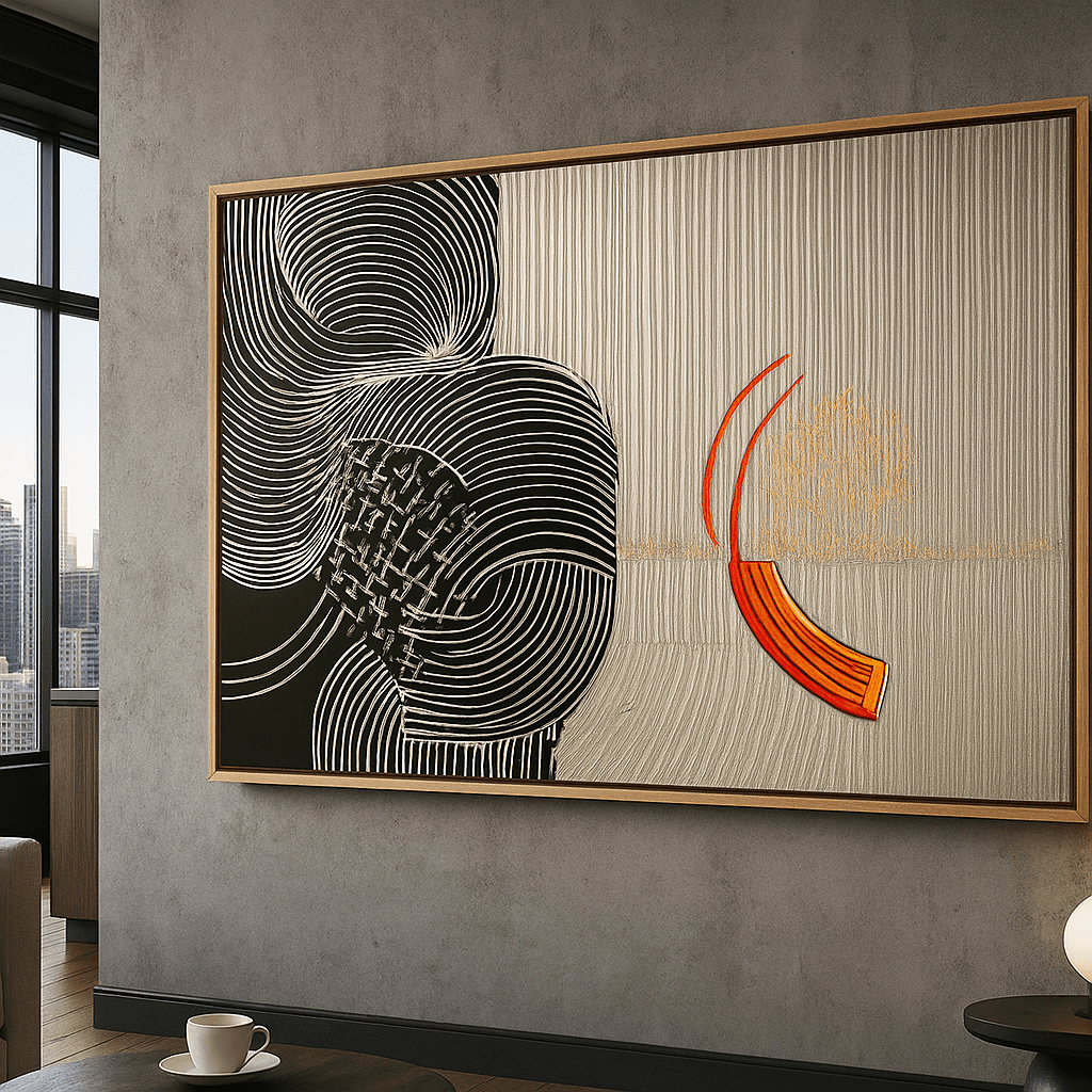
Painting waves can bring movement, rhythm, and a sense of space to a home. A wave artwork may feel calm, dramatic, coastal, modern, or completely abstract depending on its color, scale, texture, and composition.
This guide explains how to choose painting waves for your room, how to match ocean-inspired wall art to your existing palette, how to select the right size, and how to create a coastal feeling without turning the whole space into a theme.
Choose painting waves by the feeling you want first: calm, energetic, warm, or dramatic. Then match the artwork to your wall’s proportions, connect one or two colors to the room, and use surrounding negative space to keep the composition open.
Painting Waves: How to Choose Ocean-Inspired Wall Art for Your Home
Why painting waves works in interior design
Painting waves can bring movement, rhythm, and a sense of space to a room. Unlike a purely decorative pattern, an ocean-inspired artwork gives the eye a visual journey: the sweep of a wave, the contrast between foam and water, or the meeting point between sea and sky.
Wave art can feel dramatic, serene, coastal, modern, or highly abstract. The right piece depends less on whether your home is officially “coastal” and more on the atmosphere you want the room to create.

Choose the mood first
Before comparing colors and sizes, decide how you want the artwork to feel.
This first decision prevents the artwork from being chosen only because it contains blue. Two wave paintings can share a subject while creating completely different experiences.

Select the right colors
Look at the colors already present in the room. Blue and teal work naturally with white, beige, grey, natural wood, and many warm neutrals. If the room already has cool tones, a wave painting with sand, cream, coral, or ochre can keep the space from feeling visually cold.
You can also use the artwork to introduce a new accent. In that case, repeat only a small detail from the painting elsewhere in the room—for example, in a cushion, ceramic object, or vase. This creates connection without turning the room into a themed set.
Pay attention to value as well as hue. A pale ocean painting may disappear on a very light wall, while a dark, high-contrast wave artwork may dominate a room with already-heavy furniture.
Choose the right size and orientation
Measure the wall before browsing artwork. Above a sofa or console, the piece should relate to the width of the furniture below it. A horizontal wave composition often works well above long furniture because its direction follows the line of the room.
Vertical wave art can be effective in a narrow wall, beside a doorway, or in a room with tall proportions. A square composition can create a strong central focal point and works particularly well when the surrounding furniture is balanced and symmetrical.
Use paper or painter’s tape to mark the approximate dimensions on the wall. Stand back from different parts of the room and check whether the artwork feels visible from the main seating position.
How to style wave art by room
Living room
Use painting waves as the main focal point above the sofa, or place a larger work on the wall opposite the seating area. Keep accessories simple enough that the artwork’s movement remains easy to see.
Bedroom
Choose quieter water movement and lower contrast for a restful effect. A soft horizontal artwork above the bed can reinforce a sense of width and calm.
Dining room
A more expressive ocean composition can add energy to the dining area. Pair it with wood, linen, and warm lighting to balance cooler water tones.
Bathroom
For a bathroom, consider the overall moisture and care requirements of the specific product and display location. A coastal-inspired palette can work beautifully, but the art should be placed where it is protected from direct splashes and excessive humidity.
Hallway or entryway
A vertical wave painting can make a narrow passage feel more intentional. Choose a composition that reads clearly at a distance, since viewers will often see it while walking past.
Ocean art without a beach-theme interior
You do not need driftwood, rope, shells, or nautical accessories to make wave art work. In a modern home, pair an abstract ocean painting with clean-lined furniture and a limited palette. In a warm minimalist home, look for softened water tones and natural textures. In a colorful interior, choose a piece that includes one or two existing accent colors.
The goal is not to recreate a seaside room. It is to use the artwork’s movement and color to support the character of your own space.
Frequently asked questions
Is painting waves suitable for a modern living room?
Yes. Abstract wave paintings can work especially well in modern interiors because they add organic movement to clean architectural lines and simple furniture.
What colors go with ocean-inspired wall art?
Ocean-inspired art commonly works with white, cream, beige, grey, natural wood, teal, and muted green. Warmer accents such as terracotta or ochre can add balance to a cool palette.
Should wave art be horizontal or vertical?
Choose the orientation that fits the wall and furniture. Horizontal works often suit sofas and sideboards, while vertical compositions can make narrow or tall wall areas feel more complete.
Can I use ocean art if my home is not coastal?
Absolutely. Choose an abstract or modern composition and style it with the materials and colors already present in your home rather than adding nautical accessories.
Closing thought
The best painting waves for your home is the one that supports the mood, scale, and palette of the room. Start with atmosphere, measure carefully, and use the artwork as a source of movement—not as a reason to redesign the entire space.
Explore Rossetti Art’s ocean-inspired canvas art and compare ideas in the wall art size guide.
About the author
Chiara Rossetti is the founder and creative voice behind Rossetti Art, sharing practical guidance on collecting and styling art at home.
How to compare two wave paintings
When two artworks share blue or teal tones, compare their movement rather than their subject alone. One may have a quiet horizon and broad open space; another may have visible brush movement and a stronger sense of energy. Decide whether you want the eye to rest or travel.
Look at the balance between water, sky, foam, and empty space. A work with more open sky can make a room feel lighter. A composition dominated by dark water can create drama and depth. Neither is automatically better; the right choice depends on the furniture, lighting, and emotional direction of the room.
Also compare the artwork at the size you are considering. Details that look subtle in a small thumbnail may become a powerful texture at a larger format. Conversely, a composition that feels balanced in a large image may feel too busy if selected in a smaller size.
Materials that complement ocean-inspired art
Natural materials are an easy way to support wave art without creating a themed interior. Pale or medium wood can warm blue and grey. Linen and cotton can reinforce a relaxed feeling. Ceramic and stone add a quiet tactile contrast. Brushed metal can make a more dramatic wave composition feel contemporary.
Use these materials sparingly. If the artwork is already highly expressive, a few calm supporting elements are enough. A room filled with shells, nautical signs, rope, and blue accessories can make the artwork feel predictable. The more abstract the painting, the more freedom you have to style it through material and light instead of literal decoration.
Placement details that affect the result
Hang the artwork where it can be viewed comfortably, not so high that it feels disconnected from the furniture. Above a sofa or sideboard, use the furniture as the visual reference point. In a hallway, check the sightline from both ends. In a bedroom, consider the position from the bed as well as from the doorway.
Avoid placing the canvas where a door, chair, or tall plant repeatedly interrupts the composition. If the wall receives strong direct light, consider whether another wall will offer better viewing conditions. The best location is not always the largest empty wall; it is the wall where the artwork can be seen and protected.
A buyer checklist for painting waves
Before choosing, confirm:
You can also compare the practical guidance in <a href="/blogs/news/wall-art-size-guide">the Wall Art Size Guide</a> and <a href="/blogs/news/how-to-choose-the-right-canvas-print-size-for-your-space">the Canvas Print Size Guide</a> before finalizing the format.
Final styling advice
Painting waves works best when the artwork is treated as an atmosphere-setter rather than a theme instruction. Let the movement of the water add softness to clean lines, let the palette connect quietly to the room, and leave enough space for the composition to breathe. A single well-chosen wave artwork can make a room feel more open, more collected, and more personal.
How to make wave art feel contemporary
A wave painting can look contemporary when the rest of the styling is edited and intentional. Pair a simplified composition with clean-lined furniture, a restrained rug, and one or two tactile materials. Let the artwork provide the organic movement while the room provides structure.
For a softer result, combine pale water tones with warm white walls, light wood, linen, and ceramic. For a stronger result, use deep blue or teal beside charcoal, black, walnut, or brushed metal. For an eclectic room, repeat one unexpected color from the artwork in a small object rather than adding multiple nautical references.
The frame can also guide the style. A clean presentation feels light and modern. A hardwood floater frame can give the work more architectural presence. Whatever finish you choose, make sure it relates to the room’s existing wood or metal details rather than competing with them.
Choosing wave art for open-plan spaces
In an open-plan living and dining area, the artwork can help define a zone without adding a physical divider. A horizontal composition above the sofa can establish the living area, while a smaller related work may support the dining side if the two pieces share a palette. Avoid using two equally dominant artworks where they compete across the same sightline.
In a small room, an artwork with open space and lighter tones can prevent the wall from feeling crowded. In a large room, a more substantial piece or a carefully spaced pair may be needed to maintain visual proportion. Use the room’s longest viewing distance when judging scale.
A final decision test
Before ordering, ask yourself four questions: Does the painting create the right feeling? Does the color work with the room’s natural and artificial light? Does the selected size make sense above the furniture? And can the room support the artwork without adding a collection of themed accessories?
If the answer is yes to all four, the work is likely to remain satisfying after the first impression fades. The best ocean-inspired art is not simply attractive online; it continues to make the room feel more considered every day.


KEEP READING

About the Author
Chiara Rossetti
Chiara Rossetti is the founder of Rossetti Art, a canvas print and original art brand. She writes about interior design, wall art styling, and the art of making a home feel alive.

Leave a comment
This site is protected by hCaptcha and the hCaptcha Privacy Policy and Terms of Service apply.