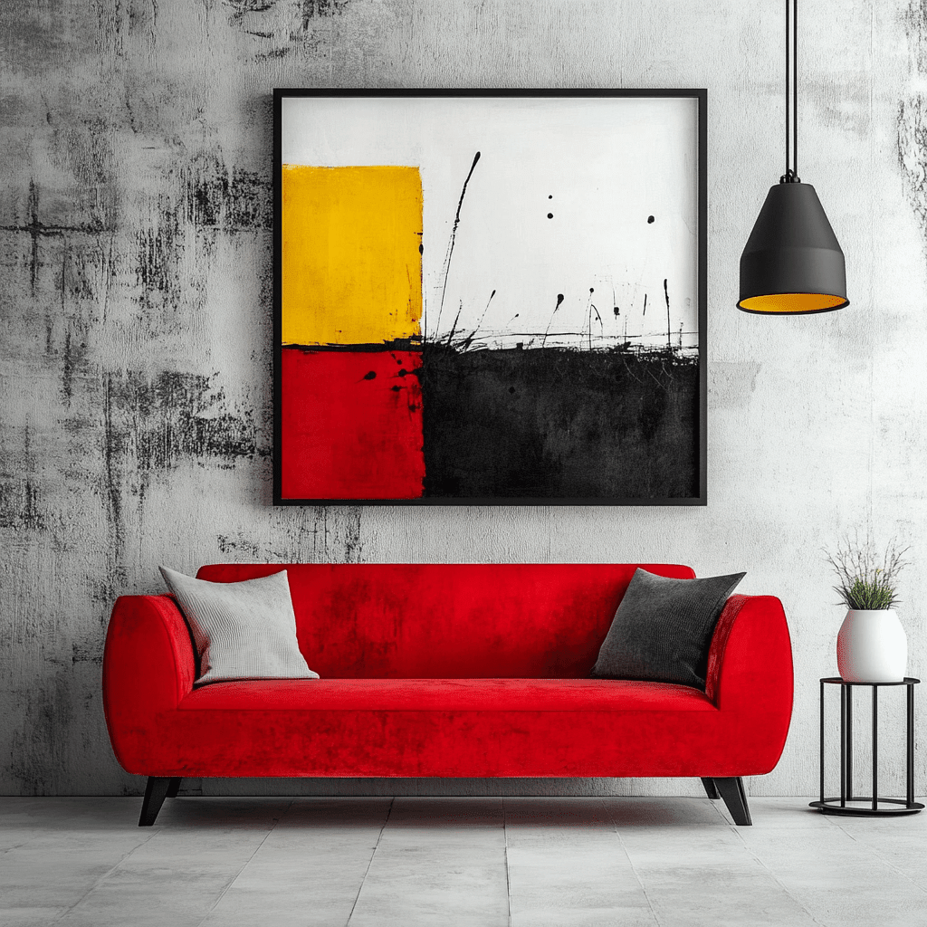
Color field painting is a powerful way to bring atmosphere, color, and visual breathing room into a home. Instead of asking the viewer to identify a detailed scene, it uses broad areas of color, subtle transitions, scale, and light to shape how a room feels.
This guide explains what color field painting means, how to choose a piece for your space, how to work with color and scale, and how to style abstract color field wall art without making the room feel over-designed.
Color field painting is abstract art built around expansive areas of color rather than detailed objects. Choose a work by mood first, then connect its palette to your room, measure the wall carefully, and give the artwork enough negative space to act as the visual anchor.
Color Field Painting: What It Is and How to Style It at Home
What is color field painting?
Color field painting is a form of abstract painting that uses broad areas, or “fields,” of color as the main subject. Instead of relying on detailed objects, recognizable figures, or tightly controlled geometric shapes, the artwork creates mood through color, scale, edges, layering, and the relationship between neighboring tones.
The result can feel calm, immersive, energetic, or contemplative. A successful color field painting does not simply add a color to a wall; it changes how the surrounding space feels.
The defining characteristics
Expansive areas of color
Large zones of related or contrasting color give the eye space to rest. The composition may be minimal, but it is not necessarily simple: subtle shifts in tone and texture can become the visual focus.
Emotion before narrative
Color field art is usually experienced rather than “read” like a picture. A warm palette can make a room feel intimate, while cool blues and greens can introduce a quieter atmosphere.
A strong relationship with light
Natural and artificial light can change how the colors are perceived throughout the day. Before choosing a piece, consider the direction of the room’s windows and whether the wall receives direct sunlight.
Scale matters
Because the composition depends on broad color relationships, the wrong size can weaken its impact. A piece that is too small may look disconnected from the furniture; an oversized canvas can become a confident focal point.
How to choose a piece for your room
Start with the room’s existing palette. Identify the dominant color, the secondary tones, and the accents you already repeat in textiles, wood, rugs, or upholstery. The artwork does not need to match every color exactly. It should either echo the palette or introduce a deliberate contrast.
For a calm interior, look for neighboring tones such as sand, cream, clay, blush, olive, or muted blue. For a more expressive room, choose a work with a stronger contrast or a brighter accent that already appears in a small decorative detail.
Next, measure the wall and the furniture below it. Above a sofa, sideboard, or bed, the artwork should feel connected to the furniture’s width rather than floating as an isolated mark. Leave enough breathing room around the piece so the color fields remain legible.
Finally, consider the visual weight of the rest of the room. If the furniture and accessories are detailed, a restrained color field composition can create balance. If the room is very minimal, a richer or more textural piece may provide the depth it needs.

How to style color field painting
Use it as the room’s anchor
Place the artwork where the eye naturally lands: above a sofa, on the wall opposite the entrance, or above a console in a spacious hallway. Keep nearby decoration edited so the main composition remains clear.
Repeat one color quietly
Pull one secondary tone from the artwork into a cushion, vase, throw, or small object. The repetition should be subtle. Matching every accessory to the painting can make the room feel staged rather than collected.
Pair it with natural materials
Wood, linen, wool, ceramic, and stone can soften a strong abstract composition. These materials add tactile contrast without competing with the artwork’s color relationships.
Combine it with other art carefully
If you are creating a gallery wall, use a shared element—such as a color, frame finish, or restrained palette—to connect the pieces. Avoid placing several equally dominant works beside one another unless the contrast is intentional.
Let the wall breathe
Color field painting benefits from negative space. A crowded shelf or a large number of competing wall objects can interrupt the visual experience. One well-placed canvas often has more impact than several unrelated decorations.
Color field painting for different rooms
Living room: Choose a horizontal or generously scaled composition above the sofa to create a calm focal point.
Bedroom: Softer, lower-contrast colors can support a restful atmosphere.
Dining room: Warmer tones can make the room feel welcoming, especially alongside wood and natural fibers.
Home office: Blue, green, or balanced neutral fields can add visual focus without creating clutter.
Entryway: A confident vertical piece can establish the home’s style immediately.
Frequently asked questions
Is color field painting the same as abstract art?
Color field painting is a type of abstract art. Its main emphasis is on large areas of color, atmosphere, and the interaction between tones rather than on recognizable subject matter.
Does color field art work in a minimalist home?
Yes. Its broad shapes and controlled palette can complement minimalist interiors, especially when the artwork is given sufficient wall space and the surrounding styling remains restrained.
Should the painting match my furniture?
It does not need to match exactly. A better approach is to connect it to the room through one repeated color, a complementary tone, or a shared feeling such as warmth, calm, or energy.
What size color field painting should I choose?
Choose a size that relates to the furniture and wall. Measure the available area first, then use removable paper or tape to test the outline before ordering.
Closing thought
Color field painting offers a way to bring atmosphere, color, and visual breathing room into the home. Choose a work that responds to your room’s light and palette, give it enough scale to be seen, and allow it to remain the clear visual anchor.
Explore Rossetti Art’s canvas print collection and read the related guide on how to choose the right canvas print size.
About the author
Chiara Rossetti is the founder and creative voice behind Rossetti Art, sharing practical guidance on collecting and styling art at home.
Choosing a palette that will still feel right later
A strong color field artwork should work with the room today while leaving enough flexibility for future changes. Neutral walls and larger furniture pieces may stay for years, while cushions, lamps, rugs, and accessories can change more often. For that reason, do not choose a painting only because it matches a temporary accent. Look at the larger structure of the room and ask whether the artwork can remain relevant if the smaller details change.
A restrained palette can be especially useful in a room that already has patterned upholstery or architectural detail. Cream, taupe, dusty rose, sage, charcoal, and softened blue can create depth without adding visual noise. A more saturated composition can work beautifully when the room has simple furniture and enough wall space to support the contrast.
When comparing two artworks, imagine each one in the room at different times of day. Which one still reads clearly in soft morning light? Which one becomes too intense under warm evening lamps? The right choice is usually the piece that creates the intended feeling across more than one lighting condition.
Framing, finish, and the surrounding wall
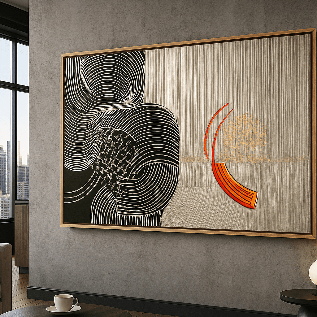
The finish around an artwork changes how it sits in the room. A clean gallery-wrap presentation can feel contemporary and informal, while a hardwood floater frame can add definition and make the piece feel more architectural. Consider the other finishes already present: wood furniture, metal lighting, painted trim, and the color of nearby frames.
Do not treat the frame as an afterthought when the artwork is intended for a prominent wall. A dark frame can increase contrast and visual weight. A lighter frame can preserve an airy feeling. If you are unsure, use Live Preview where available and compare the artwork against the actual wall and furniture proportions rather than judging the image in isolation.
The wall itself is part of the composition. Leave a margin around the work, avoid blocking switches or vents, and consider how the artwork will be seen while people move through the room. A color field painting needs enough uninterrupted space for its broad relationships to be noticed.
A practical selection checklist
Before ordering, ask:
This short process reduces buyer hesitation and helps the artwork feel intentional after it arrives.
For another perspective on abstract composition, read <a href="/blogs/news/understanding-abstract-art-definition-characteristics-and-abstraction">Understanding Abstract Art</a> and compare the color-led approach with <a href="/blogs/news/the-best-wall-art-nature-vs-abstract-art-for-your-walls">nature versus abstract art</a>.
Final styling advice
Color field painting is at its strongest when it is allowed to be both expressive and practical. It should give the room a focal point, but it should also live comfortably with the sofa, bed, desk, dining table, or entryway furniture around it. Choose the mood first, measure carefully, use the store’s Live Preview when available, and keep the final styling edited.
Making the artwork feel intentional, not isolated
The final result depends on what happens around the artwork as much as on the artwork itself. If the wall is completely empty and the furniture below is very small, even a beautiful color field painting can feel disconnected. If every nearby surface is filled, the composition can lose its calm. Aim for a relationship between the artwork, the furniture, and the breathing room around both.
A console, sideboard, or sofa can act as an anchor. Keep the objects below it low enough that they do not cut into the lower edge of the artwork. A plant, lamp, or ceramic piece can soften the transition between wall and furniture, but avoid placing tall objects directly in front of the most important color relationship.
If the room has several walls competing for attention, choose one primary art wall. The other walls can remain quieter or carry smaller works that share one color or material. This creates rhythm through the home without making every room feel identical.
When to choose original art instead of a canvas print
Color field ideas can appear in both canvas prints and original paintings. A canvas print may be the practical choice when you want a particular palette, a specific size, or a consistent finish for a room. An original painting may be more appropriate when the brushwork, surface variation, and one-of-a-kind character are central to the decision.
The best choice depends on what you value most: the visual language, the physical surface, the uniqueness, the size options, or the way the work supports the rest of the interior. Compare the product details and images carefully, and choose the format that fits both the artwork and the room.
A simple room-planning exercise
Take three photographs of the wall from the main seating position, the room entrance, and the side angle. Mark the approximate artwork boundary with removable tape or use a digital preview when available. Then remove one decorative object from the surrounding area. This small edit often makes the artwork easier to judge.
Leave the mock-up in place for a day if possible. Notice whether the palette still feels comfortable in different light and whether the scale feels balanced when you move around the room. The goal is not to eliminate all uncertainty, but to make the final decision based on the real room rather than a product thumbnail alone.


KEEP READING

About the Author
Chiara Rossetti
Chiara Rossetti is the founder of Rossetti Art, a canvas print and original art brand. She writes about interior design, wall art styling, and the art of making a home feel alive.

Leave a comment
This site is protected by hCaptcha and the hCaptcha Privacy Policy and Terms of Service apply.