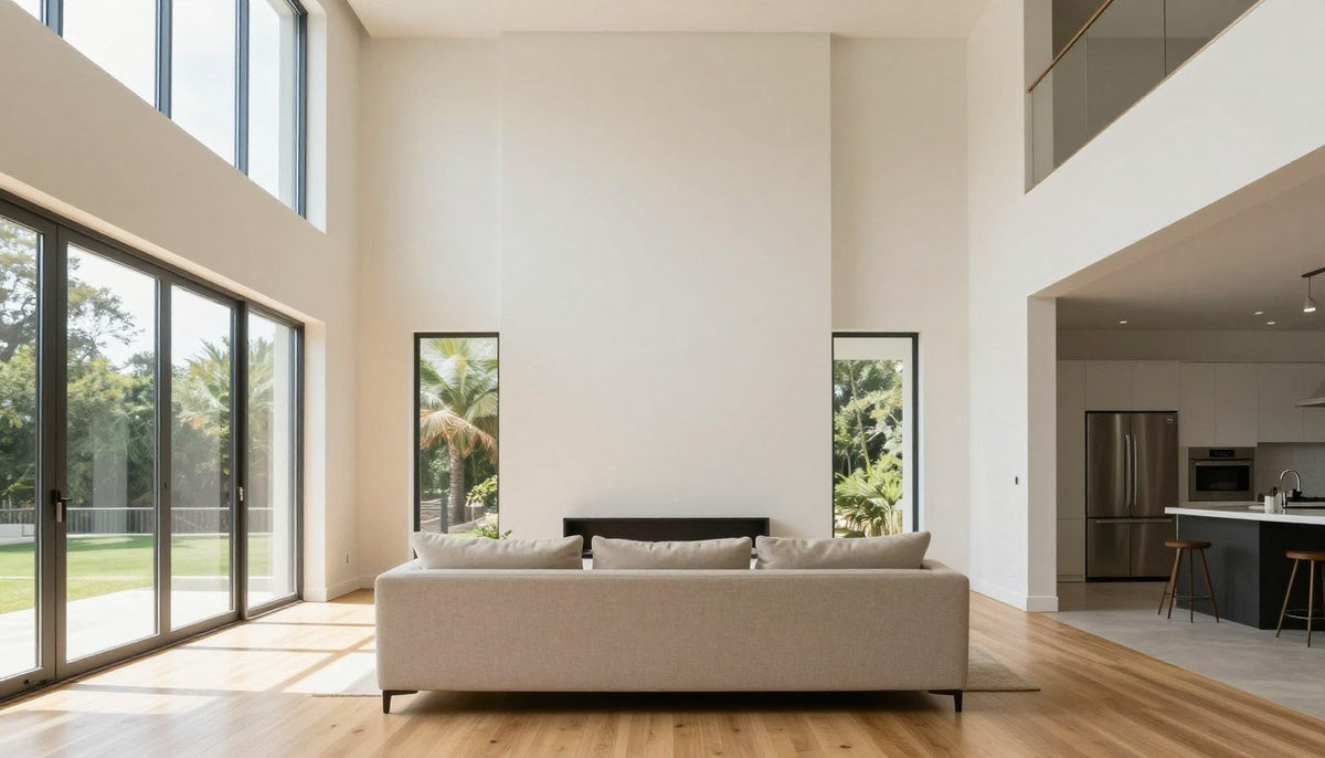
To fill a large empty wall, choose artwork scaled to about two thirds the width of the surrounding furniture or use a balanced arrangement of multiple pieces. Centering an oversized statement canvas instantly grounds the room and turns bare wall space into a deliberate focal point. Mixing structured art sets or pairing horizontal formats with credenzas resolves empty vertical height without visual clutter.
The layout of the room, ceiling height, and walking paths determine whether a single statement piece or an expansive collection works best. Prioritizing scale over quantity prevents the room from feeling disjointed or bare. Evaluating adjacent furniture widths establishes the baseline dimensions needed to balance open drywall across living rooms, bedrooms, and wide corridors.

Large Canvas Art for Expansive Walls
Wide open rooms require properly proportioned artwork that anchors the entire seating area without crowding adjacent walkways. Explore hand-stretched formats delivered directly with free worldwide shipping.
Quick Answer
To fill a large empty wall, hang one oversized canvas or a balanced pair or set, scaled to about two thirds the width of the furniture below. Choose a horizontal piece above sofas and beds and a vertical piece for tall, narrow walls.

What to put on a large empty wall?
On a large empty wall, hang a single oversized canvas, mount a coordinated pair or set, position a vertical statement artwork, assemble a cohesive gallery wall, display a horizontal piece above low furniture, or install a textured element. Select formats measuring approximately two thirds the width of nearby furniture to maintain visual balance.
A broad expanse of drywall often creates an awkward visual void that pulls attention away from surrounding decor. Leaving a vast surface completely unadorned can make even well-furnished interiors feel unfinished and cold. Implementing specific, proven display concepts solves the scale dilemma by matching appropriate dimensions and visual weight to the architectural proportions of the room.
- One large canvas: Hanging a single substantial artwork creates an immediate visual anchor for the entire space. A generous format eliminates the visual clutter of multiple frames while establishing a clean focal point. For a centered square layout, Golden Embrace offers two intertwined figures in soft ivory linework on deep black with bronze and golden ochre tones, available in sizes 20x20 to 58x58 in. Every piece is printed on artist-grade poly-cotton canvas with UV- and fade-resistant HP latex inks (UL GREENGUARD Gold certified) and hand-stretched over a 1.25-inch hardwood stretcher frame. Its satin-matte low-glare finish prevents harsh reflections, and an optional floater frame handcrafted from poplar hardwood, sized to fit the canvas, provides a finished border.
- A pair or set: Placing two matching or complementary vertical panels side by side covers significant width while introducing an intentional rhythm. Multi-panel installations make expansive walls manageable by distributing color and line work across separated borders. Spacing the canvases evenly preserves structural negative space between the frames.
- A vertical statement piece: Narrow alcoves, structural pillars, and high ceilings call for upward vertical movement. Choosing a tall portrait orientation guides the eye toward the crown molding or ceiling line. The artwork Labyrinth features concentric rounded rectangles in warm cream brushstrokes on deep crimson red across sizes 16x24 to 53x75 in. As another striking tall option, Midnight Gaze presents a calm front-facing figure in layered black with luminous white eyes and fine white contour lines across sizes 16x24 to 53x75 in. Made to order, each design arrives ready to hang, with delivery to the US in 5 to 7 business days.
- A gallery wall: Combining varied print sizes around a consistent theme transforms sprawling wall surfaces into an engaging focal point. Sticking to uniform framing materials or a shared palette helps different compositions look unified rather than chaotic. This approach fills broad expanses gradually while accommodating future layout changes.
- A horizontal piece above furniture: Low credenzas, long couches, and wide headboards pair naturally with wide panoramic wall art. Selecting an elongated orientation reflects the horizontal planes of the furniture sitting directly below. The landscape-style print Whispering Horizon spans sizes 24x16 to 81x54 in, incorporating soft ivory, warm beige, taupe, misty grey and deep charcoal in an atmospheric composition with pale peach clouds and a bright band of light. Applying the recommendations in The 2/3 Rule for Wall Art: What You Need to Know maintains balanced proportions between the frame and the console.
- A textured piece: Introducing dimensional tactile surfaces breaks up flat sheetrock. A canvas weave, a hardwood stretcher frame and an optional floater frame add subtle shadows and depth. Layering physical texture prevents monochromatic rooms from appearing stark.
Every specific wall layout calls for an art configuration suited to its distinct boundary conditions. A sofa demands wide horizontal anchoring, whereas an entryway requires compact sightlines that do not overwhelm passing foot traffic. Measuring the surrounding architectural features beforehand establishes clear boundaries for frame selection.
| Wall situation | What to hang | Size rule |
| long sofa wall | horizontal canvas | art about two thirds the width of the furniture below |
| tall narrow wall | vertical artwork | art filling roughly half to two thirds of the available vertical clearance |
| wall above a bed | wide landscape piece | art about two thirds the width of the headboard |
| hallway or entry wall | art pair or set | art covering about half the transit wall length with eye-level centering |
| wall beside a window | narrow vertical canvas | art matching roughly two thirds the height of the adjacent window frame |
Maintaining proper distance between the furniture top and the bottom edge of the frame prevents awkward gaps. Reviewing standard guidelines on How High to Hang Wall Art keeps the center of each canvas aligned with normal seated and standing eye levels.
How to decorate a long living room wall?
To decorate a long living room wall, divide the expansive surface into defined functional zones using furniture arrangements, then anchor each zone with balanced wall art. Hang wide artwork centered over the sofa, float secondary accent prints near reading chairs, and maintain consistent spacing to unify the room.
Extensive living room walls present the risk of looking like a monotonous corridor when left unarticulated. Treating a continuous partition as one unbroken surface often leads to undersized decorations scattered aimlessly across the room. Dividing the room into distinct lifestyle vignettes provides structural points of interest that make the entire room feel cohesive.

Begin by mapping out primary seating and entertaining spaces. Placing a substantial sofa against the main partition creates an anchor point for the largest visual display. Positioning a wide panoramic print directly overhead establishes a strong secondary horizon line that balances low furniture silhouettes, as detailed in Art Above Sofa.
Secondary areas along a long wall benefit from targeted treatments rather than continuous rows of matching pictures. A reading nook equipped with an armchair and task lamp works best with a dedicated vertical canvas, while a dry bar or credenza can support leaning prints. Maintaining equal sightlines and balanced margins between functional groupings helps prevent visual congestion.
Dividing a long living room wall into clear functional zones prevents the space from feeling like a continuous hallway. Center your primary artwork over the largest furniture piece, then align secondary prints with individual seating or storage arrangements.
Scale remains the decisive factor when selecting artwork for open living concepts. Undersized pictures tend to look isolated against vast fields of paint, accentuating the emptiness around them. Incorporating options from Extra Large Wall Art for Living Room provides the visual presence needed to fill horizontal expanses with confidence.
Color coordination across extended surfaces also requires discipline. Echoing two or three base tones from the living room rugs, upholstery, and drapes within the canvas prints unifies the wall with surrounding interior furnishings. Neutral fields paired with deep charcoal or warm earthy brushstrokes maintain understated elegance without competing with architectural light.
What are some creative ways to decorate an empty wall?
Creative ways to decorate an empty wall include combining asymmetrical picture arrangements, pairing oversized statement canvas prints with directional accent lighting, creating layered shelving displays, and mounting framed textile textures. These approaches add depth, invite personal expression, and transform broad vertical expanses into engaging design features.
Stepping beyond standard grid layouts allows an interior to reflect distinct personality while resolving awkward dimensions. Creative treatments work by introducing varied depths, tactile finishes, and dynamic light paths that alter how the flat surface is perceived throughout the day. Thoughtful variation prevents the room from feeling rigid or overly formal.

One inventive technique relies on calculated asymmetry. Instead of mounting a single piece dead center above a credenza, place an oversized canvas off-center to the left and balance the right side with a tall ceramic vase or architectural table lamp. This setup forms a dynamic visual triangle that keeps the eye moving fluidly across the installation.
Accent lighting acts as another powerful tool to elevate blank partitions. Installing dedicated surface sconces or ceiling-mounted picture lights casts warm illumination directly across the face of canvas prints, highlighting subtle brushwork and texture. The interplay of directed beams and soft ambient shadows brings flat walls to life as natural light fades.
- Pairing off-center oversized art with structural lighting fixtures creates an engaging asymmetrical balance.
- Layering leaning framed artwork on slim picture ledges allows frequent rearrangement without making new nail holes.
- Using bold vertical canvases alongside low-profile consoles draws the eye upward toward structural ceilings.
- Installing floating wall panels in contrasting finishes adds architectural substance behind smooth canvas prints.
Incorporating varied frame profiles also changes the spatial feel of an open wall. While standard frameless gallery-wrapped canvases deliver clean contemporary lines, an optional poplar hardwood floater frame introduces a floating border. The slim shadow gap between the canvas edge and the wood profile separates the artwork from the drywall surface.
Combining framed pieces with everyday functional decor offers another reliable path to visual interest. Flanking an expansive statement artwork with open wall shelving creates space for small sculptural pieces, stoneware, and bound volumes. This combination balances flat graphical compositions with real physical depth.

🎨 FREE GALLERY WALL PLANNER
Planning more than one piece? Download our free gallery wall planner.
Download Free →How to add texture to a blank wall?
To add texture to a blank wall, incorporate poly-cotton canvas prints, install wood slat paneling, apply textured wall coverings, or mount three-dimensional framed pieces. Physical textures cast natural micro-shadows that eliminate flat glare, add warmth, and soften the visual impact of plain plaster or drywall.
Flat walls painted in matte or eggshell finishes often look two-dimensional and static under ambient lighting. Introducing real physical texture breaks the uniformity by creating micro-shadows that respond naturally to sunlight moving across the room. Adding subtle dimensionality produces visual warmth without cluttering usable floor area.

The physical fabric of the artwork plays a major role in achieving this tactile quality. Artwork hand-stretched across a 1.25-inch hardwood stretcher frame projects outward from the wall, casting a defined perimeter shadow that separates the image from the paint behind it. The satin-matte low-glare finish ensures that the canvas texture remains visible from sharp angles without reflecting harsh ceiling lamps.
Wood slat paneling offers another structured way to build physical texture across plain walls. Thin vertical slats of oak, walnut, or ash mounted over dark felt backings add linear rhythm while establishing an organic backdrop for artwork. Centering a framed canvas directly on a slatted wood accent zone introduces a rich contrast between natural grain and painted brushwork.
Woven Canvas Depth
Artist-grade poly-cotton canvas presents a natural weave that catches natural light, softening flat sheetrock surfaces.
Hardwood Framing
A 1.25-inch stretcher frame creates a structural profile that extends outward, casting subtle perimeter drop shadows.
Poplar Floater Frames
An optional poplar hardwood floater frame establishes a clean visual recess that highlights physical craftsmanship.
Plaster finishes and limewash paints provide a subtle, tactile alternative for large blank partitions. Applying mineral-based washes creates cloudy, variegated surfaces that feel tactile even when completely dry. Hanging bold, high-contrast canvas art over mineral plaster grounds the subtle movement of the wall with crisp, deliberate forms.
Fabric elements, woven hangings, and structural wall rugs introduce soft materials that balance modern architecture. When thoughtfully curated alongside stretched canvas collections, these tactile accents make cavernous living rooms feel welcoming and complete. Balancing soft textures with solid hardwood-stretched art keeps the design sophisticated.
What is the 3-5-7 rule in decorating?
The 3-5-7 rule in decorating states that arrangements composed of odd numbers of items look more natural, balanced, and visually dynamic than even groupings. Arranging wall decor or tabletop accents in sets of three, five, or seven prevents rigid symmetry and encourages the eye to move smoothly across the display.
Human perception naturally seeks pairs and patterns. When presented with an even number of decor elements, the brain tends to organize them into rigid sets, creating a formal, static appearance. An odd number prevents instant pairing, creating a central anchor with flanking pieces that feels relaxed and comfortable.
In wall art layouts, this rule translates directly into multi-panel galleries and coordinated print clusters. A triptych composed of three vertical canvases hung side by side creates a rhythmic focal point that spans wide living room walls comfortably. For larger open surfaces, a set of five complementary prints creates an expansive narrative that guides the viewer across the entire wall.
This decorating guideline closely mirrors foundational compositional principles found across visual media, including the Rule of thirds. Aligning primary focal elements off-center along natural grid divisions produces organic tension and depth. Applying odd groupings allows you to distribute visual weight across a broad wall without forcing rigid, mirror-image symmetry.
When assembling odd-numbered clusters, vary the scale and orientation of secondary items while preserving an overarching visual link. Grouping one primary large canvas with two smaller complementary prints on the opposite side maintains weight balance while satisfying the three-element rule. Keeping uniform spacing between each frame unifies the entire arrangement into a single harmonious installation.
See It on Your Own Wall Before You Buy
Evaluating scale, odd groupings, and frame finishes is straightforward when you can preview artwork directly inside your room. Test dimensions and colors against your furniture before placing an order.
What to do with a free wall?
With a free wall, design a dedicated focal destination by pairing oversized artwork with an accent console, build an inviting reading nook with an armchair and floor lamp, or preserve intentional negative space. Scaling the decor to match room circulation keeps the surface engaging without impeding movement.
A completely open wall with no assigned architectural purpose offers tremendous creative flexibility. However, leaving it bare out of indecision makes an interior feel incomplete, while filling it haphazardly can obstruct walking paths. Defining a practical or visual purpose for the free wall anchors the surrounding living area.
Creating an accent vignette is one of the most effective ways to utilize an open wall. Positioning a shallow wooden console table against the baseboard provides a stable platform for tabletop lighting, stone catchalls, and small ceramic pieces. Centering a large canvas above the console creates a balanced, multi-layered vignette that feels intentional and complete.
Leaving a free wall partially open preserves healthy negative space in high-traffic hallways and open-plan rooms. Select one properly scaled canvas rather than crowding the perimeter with excess shelving or furniture.
In secondary spaces such as wide corridors or open dining areas, a free wall can serve as an inspiring private gallery. Selecting pieces with neutral tones, balanced line work, and satin-matte finishes brings life to transitional zones without demanding loud color contrasts. Sizing the artwork to roughly half the total transit length maintains comfortable proportions.
Intentional negative space remains an essential element of high-end interior styling. Not every square foot of sheetrock requires shelving, mirrors, or hanging frames. Mounting a single, thoughtfully proportioned piece from the Large Canvas Prints collection celebrates open wall margins while providing the room with a clean, captivating visual focus.

Conclusion
Transforming a large empty wall requires matching artwork scale to surrounding furniture dimensions and choosing formats that support the natural flow of the room. Whether you hang an oversized horizontal canvas, mount a vertical statement piece, or compose a balanced triptych, focusing on proportion yields an intentional focal point. Taking accurate measurements and visualizing the artwork in place prepares any living space for lasting visual harmony.
Keep Reading
About the Author — Chiara Rossetti is the founder of Rossetti Art, a canvas print and original art brand. She writes about interior design, wall art styling, and the art of making a home feel alive.

About the Author
Chiara Rossetti
Chiara Rossetti is the founder of Rossetti Art, a canvas print and original art brand. She writes about interior design, wall art styling, and the art of making a home feel alive.

Leave a comment
This site is protected by hCaptcha and the hCaptcha Privacy Policy and Terms of Service apply.