
Warm Minimalism Interior Design: The Complete Guide for 2025

The world of interior design continues to evolve. Yet one aesthetic stands out for creating spaces that feel both serene and welcoming. Warm minimalism interior design transforms the stark, cold approach of traditional minimalism into something far more livable.
This refined style maintains clean lines and intentional curation. It adds organic textures, natural materials, and subtle warmth. The result invites you in rather than keeping you at a distance.
Whether you're redesigning your entire home or refreshing a single room, this guide walks you through everything. You'll discover color palettes, furniture selection, texture layering, and the crucial role of art in completing your warm minimalist interior design vision.
What Is Warm Minimalism Interior Design?

Warm minimalist interior design represents a thoughtful evolution of minimalist principles. It retains the essence of "less is more" while rejecting clinical coldness. At its core, this aesthetic celebrates intentional curation, functional beauty, and subtle richness from natural materials.
The philosophy remains simple. Remove what doesn't serve you. But what remains should feel inviting and human.
How Warm Minimalism Differs from Traditional Minimalism
Traditional minimalism often embraces stark whites, hard edges, and austere approaches to decor. Warm minimalism softens these elements considerably through several key differences.
Color Approach
Traditional minimalism uses cool whites, grays, and black. Warm minimalism interior design incorporates warm whites, oatmeal, sand, and terracotta.
- Ivory instead of stark white
- Beige instead of gray
- Clay tones for accent
- Honey wood tones
Material Choices
Cold minimalism favors glass, chrome, and polished surfaces. Warm minimalism embraces natural, tactile materials.
- Natural wood over metal
- Linen over synthetic fabrics
- Clay and ceramic over plastic
- Natural stone over polished tile
Texture Strategy
Traditional spaces keep textures smooth and uniform. Warm minimalist spaces layer varied, tactile textures throughout.
- Slubby linen textiles
- Visible wood grain
- Textured plaster walls
- Handwoven elements
Shape Philosophy
Angular and geometric defines traditional minimalism. Organic curves characterize warm minimalist interior design.
- Rounded furniture edges
- Organic sculptural forms
- Flowing textile draping
- Natural material variations
This shift toward warmth creates spaces maintaining clarity and intention. They feel more inviting and genuinely livable. You want to spend time in them.
Warm Minimalism vs Cool Minimalism
Understanding the distinction helps you make deliberate design choices. Both approaches value simplicity, but they achieve different atmospheres.
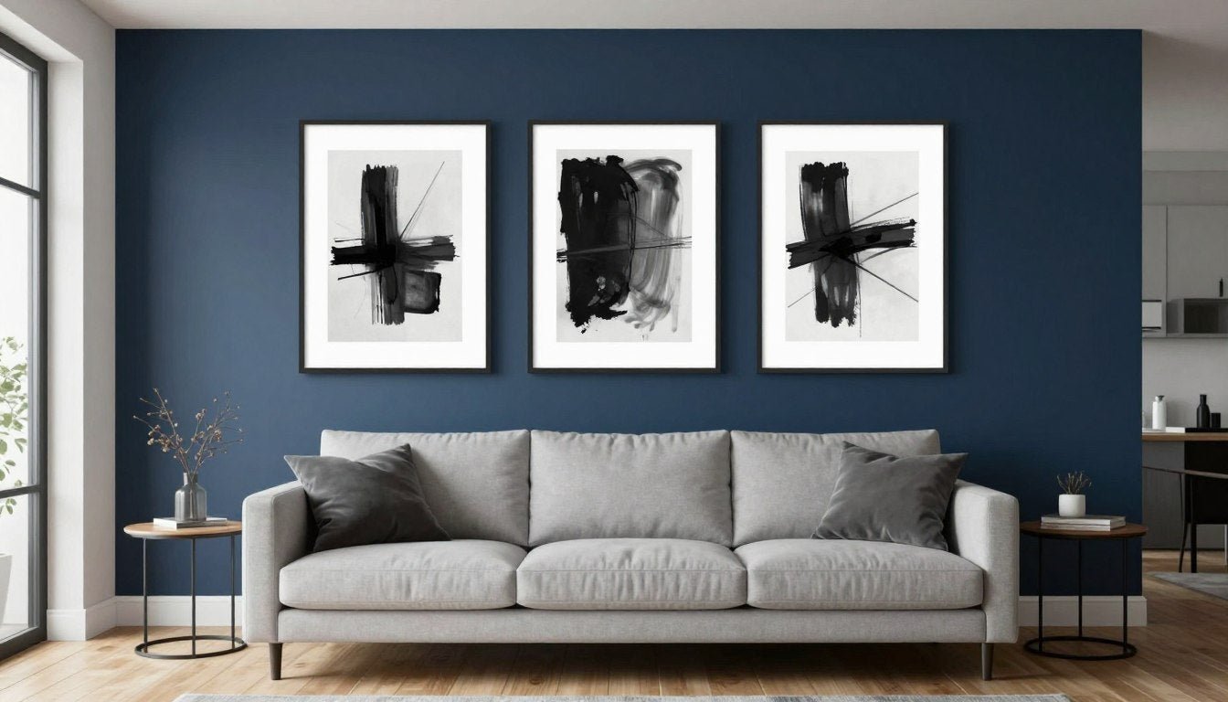
Cool Minimalism
- Embraces white, black, and cool grays throughout
- Favors glass, metal, and highly polished surfaces
- Creates dramatic contrast and visual tension
- Feels sophisticated but can appear austere
- Associated with ultra-modern, urban aesthetics
- Works well in contemporary gallery-like spaces
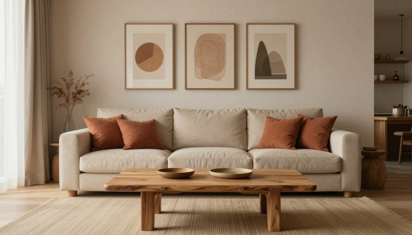
Warm Minimalism
- Embraces ivory, beige, and earth tones as foundation
- Favors wood, linen, and natural stone materials
- Creates subtle depth through texture variation
- Feels refined yet comfortable and genuinely inviting
- Works in both contemporary and traditional settings
- Encourages relaxation and daily comfort
Most people find warm minimalism more sustainable for long-term living. It doesn't sacrifice comfort for aesthetics. Instead, it finds beauty in comfort itself.
The Warm Minimalist Colour Palette

Color selection makes or breaks warm minimalist interior design. The palette requires careful attention to undertones. Unlike traditional minimalism's cool, stark approach, every hue needs subtle warmth.
Foundation Colors: Building Your Base
Your foundation colors cover approximately 60-70% of your space. They set the stage for everything else.
Warm whites form the essential starting point. Look for whites with ivory, cream, or yellow undertones rather than blue or gray. These create an immediately softer atmosphere than stark whites.
Oat and cream tones add the next layer. These soft beiges with yellow or pink undertones work beautifully for upholstery, bedding, and window treatments. They introduce subtle color while maintaining minimalist restraint.
Mid-Tone Colors: Adding Depth
Mid-tone neutrals occupy about 20-30% of your color distribution. They create visual interest without contrast.
Sand and Clay Tones
Medium beige with gold or orange undertones serves as your workhorse color. Use it for accent furniture, larger textiles, and even feature walls. Clay and terracotta bring earthy neutrals with red or orange undertones. These work perfectly for decorative accents and textural elements.
Taupe Variations
Taupe offers complex neutrals with brown and gray undertones. Choose warmer variations leaning toward brown rather than gray. This color excels for larger furniture pieces, area rugs, and mid-tone anchoring elements throughout your space.
Grounding Contrast: The Essential Dark Element
Every warm minimalist space needs one grounding contrast. This prevents the palette from feeling too flat or monotonous.
- Charcoal provides soft black with warm undertones, less harsh than pure black
- Umber delivers deep, rich brown adding depth without heaviness
- Ink offers blue-black providing contrast while maintaining sophistication
Use these darker elements sparingly. Perhaps as picture frames, chair legs, or hardware. They define the space while maintaining overall warm serenity.
Testing Undertones in Your Actual Space
Undertones shift dramatically depending on lighting conditions. Never trust a small swatch in store lighting alone.

Test samples in morning, midday, and afternoon light. Check how colors appear in both direct and indirect sunlight. Note if colors appear more yellow or washed out in bright conditions.
Evaluate the same samples under your actual artificial lighting. Check if colors appear too yellow or gray under lamps. Test with both ambient and task lighting active. Consider how shadows affect color perception.
This thorough testing ensures your warm minimalist interior design maintains intended feeling regardless of time or lighting conditions. The investment in proper testing prevents costly repainting later.
Furniture and Texture in a Warm Minimalist Home

Materials and finishes transform minimalism from cold to cozy. Warm minimalist interior design relies heavily on natural, tactile materials. They add depth and character without visual clutter.
Essential Materials for Warm Minimalism
The foundation of this aesthetic lies in three key material categories. Each brings distinct qualities that layer together beautifully.
Wood Selection
Light oak adds warmth without heaviness, perfect for larger furniture pieces. Walnut provides rich contrast and depth, ideal for accent pieces and surfaces.
Ash offers subtle grain and neutral tone that works everywhere. Maple creates honey-toned warmth in flooring and cabinetry.
Stone Choices
Travertine brings texture with warm undertones for surfaces and accents. Limestone offers soft, matte appearance perfect for minimalist bathrooms.
Sandstone provides subtle texture and natural warmth. Creamy marble adds elegant movement without overwhelming spaces.
Textile Options
Linen's natural slub adds instant character to upholstery and bedding. Wool provides depth and coziness in rugs and throws.
Cotton canvas delivers durability with subtle texture. Bouclé adds dimensional interest in accent pieces.
Combining these materials creates layered, tactile environments. The natural variations add subtle visual interest compensating for restrained color palettes.
Furniture Selection Guidelines
Choose furniture with clean lines but soft edges. Avoid harsh angles. Look for pieces with visible craftsmanship and material quality.
Invest in fewer, higher-quality pieces. A beautiful solid wood dining table outperforms three mediocre furniture items. Quality materials age gracefully, developing character over time.
Scale matters enormously. Furniture should feel substantial without overwhelming. Leave breathing room between pieces. Negative space remains essential in minimalist design.
The Finish Makes the Difference
Finish selection significantly impacts how light interacts with your space. Softer finishes generally work better for warm minimalist interior design.
| Finish Type | Best Applications | Avoid Using For |
| Matte/Flat | Walls, cabinetry, large furniture pieces where soft light absorption creates calm | High-traffic surfaces requiring frequent cleaning or heavy use areas |
| Eggshell/Low Sheen | Living area walls, hallways, bedrooms where slight reflection adds depth | Ceilings where slight sheen can highlight imperfections |
| Satin | Woodwork, doors, kitchen and bathroom walls needing durability | Large wall expanses where reflection can create too much visual activity |
| Semi-Gloss | Trim, small decorative pieces, areas needing maximum durability | Large furniture, walls, or any dominant visual elements |
Matte and low-sheen finishes create soft, diffused looks enhancing calm quality. They reduce glare and create forgiving surfaces hiding minor imperfections. Reserve higher-sheen finishes for small accents or areas requiring additional durability.
Layering Texture Without Adding Clutter
Texture becomes the primary vehicle for emotional resonance in warm minimalist spaces. Layer different textures strategically.
- Combine smooth linen with nubby bouclé for textile contrast
- Pair polished wood surfaces with rough-hewn wooden accessories
- Layer matte ceramics with subtle sheen in metallic accents
- Mix flat-weave rugs with chunky knit throws for depth
- Include both architectural textures (plaster walls) and decorative textures (woven baskets)
The interplay of varied textures creates sensory richness. This compensates for restrained color palettes without overwhelming the eye.
Choosing Art for a Warm Minimalist Space

Art plays a crucial role in warm minimalist interior design. It adds visual interest, texture, and personality without cluttering the space. The right art piece becomes the soul of a minimalist room.
Many people struggle with art selection for minimalist spaces. They fear adding too much or choosing the wrong piece that disrupts carefully curated calm. Understanding a few key principles eliminates this uncertainty.
Why Art Matters in Warm Minimalism
In spaces with limited decorative elements, each piece carries more visual weight. Art becomes a focal point by default. It can anchor an entire room's aesthetic.
Warm minimalist interior design particularly benefits from textural art. Where traditional minimalism might feature stark photography or graphic prints, warm minimalism calls for pieces with physical depth and organic qualities.
The right artwork softens walls without busy patterns. It adds warmth through color and texture while maintaining visual calm. Art completes the space rather than competing with it.
Scale and Placement Fundamentals
Proper sizing dramatically impacts art's effectiveness. Too small, and pieces look lost. Too large, and they overwhelm.

Follow the two-thirds rule for art above furniture. Your artwork or grouping should measure approximately two-thirds to three-quarters the width of the furniture below. This creates visual balance and ensures adequate presence.
Hang art at eye level, typically 57-60 inches from floor to the center of the piece. When hanging above furniture, position the bottom edge 8-10 inches above the furniture back. This creates connection between furniture and art.
In hallways and open walls, maintain the eye-level rule. Don't hang art too high, a common mistake making spaces feel disconnected.
Texture-First Art Selection
In warm minimalist spaces, texture often matters more than subject matter. Look for pieces with visible brushwork, plaster, or mixed media elements.
Tone-on-tone works explore subtle variations within limited palettes. These pieces add sophistication without color distraction. They reward closer viewing while maintaining calm from a distance.
Organic forms and shapes echo natural elements essential to warm minimalism. Flowing lines, rounded shapes, and nature-inspired abstracts complement the aesthetic beautifully. Avoid rigid geometric patterns that feel too cold.
Discover Art Perfectly Curated for Warm Minimalist Spaces
Explore our handpicked collection of textured abstracts, earth-tone canvases, and neutral wall art designed specifically to enhance warm minimalist interiors. Each piece features the organic textures and subtle color variations that make minimalism feel inviting.
Canvas Prints and Floater Frames
Canvas prints offer excellent options for warm minimalist interior design. They provide texture through the canvas weave itself. Gallery-wrapped canvases create depth by extending the image around edges.
Floater frames elevate canvas prints beautifully. These frames create a small gap between the canvas and frame, making artwork appear to "float" within the frame. This adds subtle sophistication while maintaining the minimalist aesthetic.
Choose floater frames in natural wood tones for warmth. Light oak works beautifully in airy spaces. Walnut provides grounding in rooms needing more depth. Avoid ornate frames that compete with the art itself.
Matte black floater frames offer crisp definition without harshness. They work particularly well with neutral and earth-tone artwork, creating just enough contrast to define the piece.
Color Considerations for Minimalist Art
Stick to earth tones and warm neutrals in your art selection. Beige, sand, terracotta, warm gray, and soft umber all complement warm minimalist palettes perfectly.
Avoid bright, saturated colors unless used extremely sparingly. Even then, keep them muted. A piece with subtle rust or sage tones works better than vibrant red or bright green.
Monochromatic pieces in cream, beige, or taupe create sophisticated focal points. They add presence through texture and scale rather than color contrast.
If you love subtle color, choose art with warm undertones. A piece featuring soft terracotta, muted ochre, or dusty rose can add gentle color while maintaining cohesion.
Subject Matter That Works
Abstract art suits warm minimalism exceptionally well. It avoids literal representation, maintaining the simplified aesthetic. Look for pieces suggesting landscapes, organic forms, or textural explorations.
Minimalist line drawings with simple, fluid forms complement the style. Single-line sketches or subtle botanical illustrations add elegance without busyness.
Photography works when featuring natural subjects in neutral tones. Desert landscapes, misty mountains, or close-ups of natural textures all align with warm minimalism principles.
Avoid busy patterns, multiple focal points, or highly detailed representations. These contradict minimalist principles and create visual noise.
Creating Cohesion Across Multiple Rooms
If selecting art for minimalist spaces throughout your home, maintain visual connection. Choose pieces sharing similar color families or textural qualities.
You don't need matching art in every room. Instead, aim for a family resemblance. Perhaps all pieces feature earth tones, or all share organic shapes, or all include visible texture.
Consistency in framing creates cohesion. If you use natural wood floater frames in the living room, continue that choice in the bedroom and hallway.
Vary the scale and orientation to suit each space. A large horizontal piece suits the living room, while a vertical piece fits a narrow hallway. The unifying elements create flow despite these variations.
Room by Room: Living Room, Bedroom, Hallway

Applying warm minimalist interior design principles varies by room function. Each space presents unique opportunities for expressing this aesthetic while serving its purpose.
Living Room: Creating the Gathering Heart
The living room often serves as your home's heart. It balances comfort with intentional design most visibly.
Start with one anchoring furniture piece. A comfortable, clean-lined sofa in textural neutral fabric sets the tone. Choose linen, bouclé, or other tactile materials adding warmth through touch.
Create conversation areas with breathing room between pieces. Avoid pushing all furniture against walls. Float pieces to define zones while maintaining flow.
Layer textiles thoughtfully. A simple wool or jute rug grounds the seating area. Add 2-3 textural cushions in tonal neutrals. Drape a chunky knit or linen throw over the sofa for warmth.
For art placement, follow the two-thirds rule. Artwork should measure approximately two-thirds the width of your sofa. Position it 8-10 inches above the sofa back. Consider a large textured abstract piece in earth tones as your focal point.
Lighting matters enormously. Layer ambient, task, and accent lighting. Use warm-toned bulbs (2700-3000K) throughout. Add table lamps with linen or cotton shades for soft, diffused light.
- Choose one substantial coffee table in natural wood rather than multiple small tables
- Include living plants in simple ceramic pots for organic elements
- Display 1-3 meaningful objects rather than many small decorations
- Use closed storage to hide visual clutter like remotes and magazines
- Maintain clear sight lines across the room for spacious feeling
Bedroom: Prioritizing Calm and Comfort
The bedroom should exemplify warm minimalism's most serene qualities. This space demands softness and low contrast.

Minimize color contrast. Keep the palette soft and tonal. Walls in warm white or ivory, bedding in oatmeal or sand, and wood furniture in light oak create harmonious calm.
Invest in quality bedding. Linen or high-thread-count cotton in warm neutrals feels luxurious. Layer for texture—a fitted sheet, flat sheet, lightweight blanket, and textured throw create depth.
Limit furniture to essentials. A bed, two nightstands, and perhaps one chair or bench suffice. Each piece should feature clean lines and warm wood tones.
Bedroom art should promote relaxation. Choose serene, low-contrast pieces. Soft abstracts, minimal landscapes, or textural pieces in gentle neutrals work beautifully. Explore bedroom canvas prints that keep the mood calm and cohesive. Avoid busy patterns or high-contrast pieces that activate rather than calm.
Keep the space above your headboard for one substantial art piece rather than multiple small frames. This creates a focal point without visual clutter.
Lighting requires special attention. Install dimmer switches for overhead lights. Include soft bedside lighting (2700K bulbs) for reading. Consider a small accent light highlighting your art piece.
Hallway: Making Transitions Meaningful
Hallways offer opportunities to set tone while connecting spaces. They shouldn't be afterthoughts in warm minimalist interior design.
Create one quiet focal point. A textural console table, striking mirror, or statement art piece introduces your aesthetic. This single element should feel considered and beautiful. For narrow transitions and welcoming first impressions, browse entryway wall art.
Incorporate subtle storage maintaining clean lines. A narrow console with drawers or a wall-mounted shelf with concealed brackets keeps keys and mail organized without clutter.
Hallway lighting welcomes guests and family. Warm, inviting light from a simple pendant or wall sconces creates atmosphere. Avoid harsh overhead lighting that feels institutional.
For narrow hallways, resist the urge to over-decorate. One well-chosen piece of neutral wall art makes more impact than a gallery wall of small frames.
If your hallway has wall space, consider a series of two or three similarly-framed pieces. They should share a color palette and spacing should feel generous rather than crowded.
- Paint hallways in the same warm neutral as adjacent rooms for flow
- Keep the floor clear except for one runner rug if the space feels cold
- Ensure adequate lighting—dark hallways feel uninviting
- Maintain consistency in hardware finishes throughout
- Use hallways to transition between color temperatures in different rooms
Each room in your warm minimalist home should feel connected yet suited to its function. The living room can handle more visual interest. The bedroom needs maximum serenity. The hallway provides transitional calm.
Mistakes to Avoid in Warm Minimalist Decorating

Even with good intentions, certain pitfalls undermine warm minimalist interior design. Understanding these common mistakes helps you avoid them from the start.
Beige-on-Beige Boredom
The problem manifests as flat, monotonous spaces where everything blends together. No visual interest emerges. The room feels lifeless despite following a neutral palette.
The solution requires introducing textural variation through different materials. Pair smooth surfaces with rough ones. Combine matte finishes with subtle sheen. Layer similar tones in different textures.
Add value contrast with a few darker elements. A charcoal throw pillow, umber picture frame, or black hardware creates depth. These darker touches define the space without overwhelming it.
Consider one statement piece with subtle pattern or movement. Perhaps textured wall art or a rug with tonal pattern variation. This adds interest while maintaining the calm aesthetic.
Think about textural wall treatments. Lime wash or Venetian plaster adds subtle dimension to walls. This creates visual interest through light and shadow play rather than color.
Cold, Harsh Lighting
Spaces feel clinical and unwelcoming despite warm-toned furnishings. The culprit usually hides in plain sight—your light bulbs.
Replace cool bulbs (4000K and above) with warm options between 2700-3000K. This single change transforms atmosphere immediately. Cool white light makes even beige look gray.
Add table and floor lamps with fabric shades. These provide diffused warmth impossible to achieve with recessed lights alone. Position them at different heights for dimensional lighting.
Install dimmer switches wherever possible. They allow you to adjust lighting intensity throughout the day. Bright light works for morning energy. Dimmed warmth creates evening coziness.
Choose high-CRI bulbs (Color Rendering Index of 90 or above). These accurately render warm tones in your textiles, wood, and art. Standard bulbs can muddy subtle color distinctions.
Layer lighting sources at different heights. Overhead ambient lighting, mid-level table lamps, and low accent lights create depth and warmth impossible with one light source.
Undersized or Poorly Placed Art
Art looks disconnected and lost on large walls. The room feels incomplete despite following other minimalist principles.
Follow the two-thirds rule strictly. Art should measure at least two-thirds the width of furniture below it. Larger often works better than smaller in minimalist spaces.
Consider large-scale pieces for impact. In minimalism, one substantial piece outperforms several small ones. It creates a focal point without clutter.
For smaller artworks, create thoughtful groupings rather than scattering them. Gallery walls work if executed with generous, consistent spacing and unified framing.
Hang art at proper height. Center should sit at eye level, approximately 57-60 inches from the floor. This feels natural and creates visual connection.
Find Perfectly Scaled Art for Your Minimalist Space
Browse our collection of canvas prints available in multiple sizes, ensuring you find the perfect scale for any room. From subtle textured pieces to bold earth-tone abstracts, each artwork comes ready to hang with optional floater frames.
Mixing Too Many Wood Tones
Different wood finishes throughout one space create visual chaos. Oak, walnut, cherry, and mahogany all fighting for attention disrupts minimalist calm.
Choose one primary wood tone for your space. Light oak for airy rooms, walnut for grounded spaces, or ash for neutral versatility. Let this dominate your furniture and architectural elements.
Allow one accent wood tone at most. If your primary wood is light oak, perhaps walnut appears in one side table or picture frame. This intentional contrast adds interest.
Match wood undertones to your overall palette. Cool-toned woods suit cool minimalism. Warm-toned woods with honey or red undertones suit warm minimalist interior design.
Neglecting Negative Space
Every surface holds something. Every corner contains furniture. The room feels cluttered despite minimal items.
Negative space isn't emptiness—it's intentional breathing room. It allows your carefully chosen pieces to shine. Allow key pieces to stand alone with adequate space around them.
Create visual pauses between furniture groupings. Not every area needs activation. Some spaces should simply flow between functional zones.
Use single statement pieces as focal points. Let them command attention through isolation rather than competing elements. A beautiful art piece needs wall space to breathe.
Balance open areas with zones of gentle visual interest. The goal isn't barren emptiness but thoughtful distribution of elements.
Forgetting Comfort in Pursuit of Aesthetics
The space looks beautiful in photos but feels unwelcoming to live in. Furniture proves uncomfortable. Surfaces feel too precious to use.
Warm minimalism must function for daily life. Choose comfortable seating even if it costs more. You'll actually use and enjoy your space.
Include soft textiles liberally. Throws, cushions, and rugs aren't clutter—they're essential comfort elements. Select them in your neutral palette.
Design for your actual life. If you read daily, include good task lighting and a comfortable chair. If you entertain, ensure adequate seating.
Allow some personality. Warm minimalism isn't about erasing yourself from your space. Display a few meaningful objects. Choose art you genuinely love.
Frequently Asked Questions
What's the difference between warm minimalism and cold minimalism?
Cold minimalism features stark whites, blacks, grays, and materials like glass, chrome, and polished surfaces. It creates a crisp, contemporary feel with angular geometric elements. Warm minimalism uses ivory, beige, taupe, earth tones, and materials like wood, linen, and natural stone. It incorporates more texture and organic shapes, resulting in a more inviting, comfortable atmosphere. Both value simplicity, but warm minimalism prioritizes livability and comfort alongside aesthetics.
What colors work best in warm minimalist interior design?
The ideal warm minimalist palette includes warm whites with yellow or red undertones, ivory, oatmeal, sand, taupe, clay, and terracotta. These should be complemented by natural wood tones in oak, walnut, or ash. Add one darker grounding element like charcoal, umber, or soft black for depth and contrast. The key is selecting colors with warm undertones—avoiding anything with blue or gray undertones that reads cool. Test all colors in your actual lighting conditions before committing.
What art style suits warm minimalist spaces?
Textural abstracts with visible brushwork or mixed media elements work beautifully in warm minimalist interior design. Look for tone-on-tone pieces exploring subtle variations within limited palettes, organic forms and shapes echoing natural elements, and pieces with physical depth rather than just printed images. Earth-tone abstracts, minimal line drawings with fluid forms, and photography featuring natural subjects in neutral tones all complement the aesthetic. Avoid busy patterns, bright colors, or highly detailed representations that create visual noise.
Can I use patterns in warm minimalism?
Yes, but with significant restraint. Patterns should be subtle, organic, and limited in contrast. Think tonal variations like tone-on-tone textiles, natural material variations like wood grain or stone veining, and subtle geometric patterns in very similar values. A rug with tonal pattern or cushions with barely-there texture qualify. Avoid high-contrast patterns, busy prints, multiple patterns in one space, or anything that competes for visual attention. When in doubt, choose texture over pattern for visual interest.
Creating Your Warm Minimalist Haven

Warm minimalist interior design offers a thoughtful approach to creating spaces that feel both serene and welcoming. This aesthetic doesn't ask you to sacrifice comfort for style or personality for simplicity.
By focusing on quality materials over quantity of items, intentional curation over impulse decoration, and subtle textural variation over bold patterns, you create homes supporting wellbeing. These spaces feel visually calm yet emotionally nurturing.
Remember that warm minimalism evolves with you. Start with foundational principles—warm neutral palettes, natural materials, quality over quantity. Layer in texture through varied materials and finishes. Add carefully selected art that brings texture and warmth to walls.
Most importantly, create a space reflecting how you actually live. Warm minimalism should enhance your daily life, not restrict it. If you love cooking, make your kitchen beautiful and functional. If you read constantly, create the perfect reading corner. If you entertain often, ensure comfortable seating for guests.
The beauty of this aesthetic lies in its flexibility. Warm minimalist principles work in small apartments and large homes, contemporary builds and traditional structures, urban lofts and suburban houses. The common thread is intentionality—every element serves a purpose and brings you joy.
Complete Your Warm Minimalist Vision
Transform your thoughtfully designed space with art that embodies warm minimalist principles. Our curated collection features textured abstracts, earth-tone canvases, and neutral pieces specifically selected to enhance calm, inviting interiors. Each piece arrives ready to hang, with premium canvas quality and optional natural wood floater frames.
As you implement these principles, be patient with the process. Warm minimalism develops over time. You don't need to furnish and decorate everything immediately. In fact, living with less while you discover what you truly need and love often leads to better decisions.
Pay attention to how your space makes you feel. If something doesn't contribute to calm or comfort, it doesn't belong—even if it looks beautiful in isolation. Trust your instincts about what creates warmth and serenity for you specifically.
The goal isn't creating a perfect magazine-worthy space. It's crafting a home where you feel relaxed, focused, and genuinely happy. That's the true measure of successful warm minimalist interior design.
Leave a comment
This site is protected by hCaptcha and the hCaptcha Privacy Policy and Terms of Service apply.