
Your living room walls tell a story about who you are. Empty walls feel cold and unfinished. The right wall art transforms your space from ordinary to extraordinary.
Choosing artwork for your living room isn't just about pretty pictures. It's about scale, placement, and creating a focal point that pulls the entire room together.
This guide reveals the exact formulas designers use to select perfectly sized wall art. You'll learn placement rules that professional decorators follow. And you'll discover how to match contemporary styles to your existing space.
Whether you're working with a small apartment or a spacious family room, these principles work. Modern wall art for living room spaces follows specific rules. Master these rules, and you'll create a gallery-worthy space.
Understanding Wall Art Scale for Living Room Spaces
Scale determines whether your artwork looks intentional or like an afterthought. Too small, and it disappears. Too large, and it overwhelms the space.

The Two-Thirds Rule for Sofa Wall Art
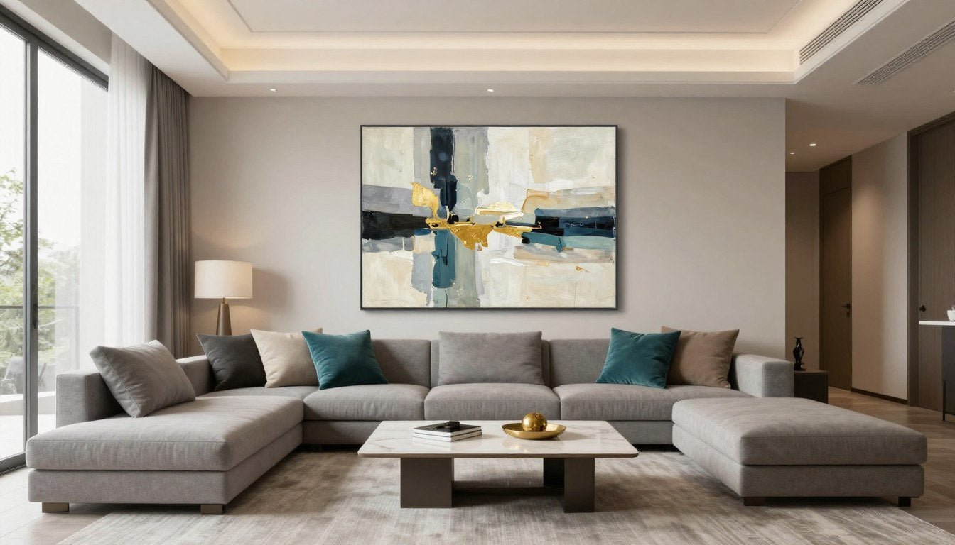
The most important rule in living room wall art placement is the two-thirds rule. Your artwork should span approximately two-thirds the width of the furniture beneath it.
For a standard 84-inch sofa, aim for art that's 56 to 60 inches wide. This creates visual balance. The piece feels substantial without overpowering the furniture.
A common mistake is choosing art that's too small. A 24-inch canvas above a full-size sofa looks lost. It creates awkward visual gaps that make the room feel disjointed.
Small Sofas (60-72 inches)
Choose artwork 40 to 48 inches wide. Single large pieces work well. Consider abstract canvas prints for modern impact.

Standard Sofas (78-90 inches)
Select pieces 52 to 60 inches wide. This is the most common furniture size. Large wall art or a three-piece gallery wall works beautifully here.

Sectional Sofas (96+ inches)
Go for 64 to 72 inches wide, or create a gallery wall spanning the entire length. Oversized statements work. See options in living room canvas art.

Ceiling Height Considerations
Standard 8-foot ceilings require different approaches than 10 or 12-foot walls. Height affects both artwork size and placement strategy.
In rooms with 8-foot ceilings, vertical space is limited. Choose horizontal or square compositions. They maximize impact without drawing the eye too far up.
High ceilings give you freedom to go tall. Vertical artwork emphasizes ceiling height. Multi-panel installations that reach upward make the room feel even more spacious.
- 8-foot ceilings: Keep art height between 24-36 inches maximum
- 9-10 foot ceilings: Art can reach 48-60 inches in height
- 11+ foot ceilings: Consider floor-to-ceiling gallery walls or oversized vertical pieces
- Measure your wall space before shopping to avoid returns
- Account for furniture height when calculating available wall space
Room Size and Art Proportions
A 200-square-foot living room needs different artwork than a 400-square-foot space. Room volume, not just wall size, matters.
Small living rooms benefit from one statement piece. Multiple artworks can make tight spaces feel cluttered. Focus on quality over quantity.

Large living rooms can handle gallery walls with multiple pieces. They need the visual weight to fill the space. Empty walls in big rooms feel cold and unfinished.
Calculate your wall's square footage. Multiply width by height in inches. Your artwork should cover roughly 40-60% of that area for optimal balance.
Modern Living Room Wall Art That Makes an Impact
If you love contemporary design, these curated prints bring sophisticated style into any space. Each piece is professionally sized to create the perfect focal point above your sofa.

Bold Abstract Geometry
Make a statement with contemporary shapes and rich color palettes. Perfect for modern spaces that need a conversation starter.

Minimalist Line Art
Clean lines and monochrome palettes complement any color scheme. Ideal for Scandinavian or contemporary minimalist design.

Botanical Elegance
Bring nature indoors with oversized botanical prints. These pieces add organic warmth to sleek modern interiors.
Perfect Height Placement for Living Room Wall Art
Height placement makes or breaks your wall art display. Even perfectly sized artwork looks wrong at the wrong height.

The 57-60 Inch Center Point Rule
Art galleries follow a universal standard. They hang artwork so the center sits at 57 to 60 inches from the floor. This matches average eye level.
In living rooms, this rule still applies when viewing art while standing. However, you'll mostly view your living room art while seated. That changes things.
When hanging art above a sofa, position it 6 to 8 inches above the furniture. This creates visual connection between the pieces without feeling cramped.
Measure from the floor to the top of your sofa back. Add 6 to 8 inches. The bottom edge of your artwork should hit this mark.
- Standard sofa (32-36 inches high): Art bottom should be 38-44 inches from floor
- Low-profile modern sofa (28-30 inches high): Art bottom at 34-38 inches
- High-back sofa (38-40 inches high): Art bottom at 44-48 inches
- Always measure from floor to intended hanging point before installing
- Use a level to ensure your artwork hangs straight
Hanging Art on Empty Walls
Walls without furniture underneath follow different rules. Return to the gallery standard of 57 to 60 inches at center.
This height works whether you're standing in conversation or walking through the space. It creates comfortable sightlines throughout the room.

For larger pieces, prioritize the 60-inch center even if it means the bottom edge sits lower. The center point matters most for viewing comfort.
Entryway walls and hallways connecting to your living room use the same 57-60 inch center standard. Consistency creates flow between spaces. Check entryway wall art for suitable pieces.
Multi-Panel and Gallery Wall Height
Gallery walls require a different approach. Treat the entire grouping as one piece. Find the center point of the complete arrangement.
Layout your gallery wall on the floor first. Measure the total height and width. The center of this entire layout should hit 57-60 inches on your wall.
This means some pieces will hang higher and some lower than the standard. That's correct. The grouping's center is what matters.
Planning Your Gallery Layout
Start with your largest piece as the anchor. Build around it with smaller complementary works. Maintain 2-3 inches of space between frames.
Odd numbers look more dynamic than even groupings. Three, five, or seven pieces create visual interest. Symmetrical arrangements feel formal. Asymmetrical feels casual and collected.
Use paper templates taped to the wall before hammering nails. This lets you experiment with arrangements risk-free. Move pieces around until spacing feels right.

Spacing Guidelines
- Tight spacing (2 inches): Creates cohesive, intentional look
- Medium spacing (3-4 inches): Most forgiving and versatile
- Wide spacing (5+ inches): Makes small collections feel larger
- Keep spacing consistent throughout the entire gallery
- Allow 8-12 inches of empty wall space around the entire grouping

Choosing the Right Style for Your Living Room
Style matching determines whether your wall art enhances your space or clashes with it. The right artwork echoes your room's existing design language.

Modern and Contemporary Wall Art
Modern wall art for living room spaces emphasizes clean lines and bold simplicity. It avoids fussy details. The focus stays on form, color, and composition.
Abstract pieces work beautifully in modern interiors. Geometric patterns complement angular furniture. Monochromatic palettes reinforce minimalist aesthetics.
Contemporary wall art for living room design pushes boundaries. It includes current artistic trends. Think bold brushstrokes, mixed media textures, and unexpected color combinations.
- Abstract expressionism adds energy to neutral modern spaces
- Geometric minimalism complements mid-century modern furniture
- Black and white photography works with any modern color scheme
- Oversized single pieces make stronger statements than multiple small works
- Metal finishes in frames echo modern hardware and fixtures
Browse abstract canvas prints for pieces that define contemporary style. These works anchor modern living rooms with sophisticated visual impact.

Transitional and Versatile Artwork
Not every living room fits neatly into one style category. Transitional spaces blend traditional comfort with modern sensibility. These rooms need artwork that bridges both worlds.
Unique wall art for living room spaces often falls into this category. It combines classical subjects with contemporary execution. Think landscape paintings with abstract techniques. Or portrait art with bold graphic styling.
Botanical prints work across multiple design styles. They bring natural elements indoors without committing to a single aesthetic. See options at botanical wall art prints.

Portrait Art
Modern interpretations of classical portraiture bridge traditional and contemporary. Faces add human warmth to any space without limiting your style direction.

Landscape Paintings
Timeless scenes executed with contemporary techniques satisfy multiple tastes. They work especially well in homes shared by people with different style preferences.

Line Art
Simple continuous-line drawings suit minimalist and traditional spaces equally. Their simplicity doesn't compete with other decor. Find options at line art canvas prints.
Color Coordination Strategies
Colors in your artwork should echo or complement your room's existing palette. This doesn't mean exact matching. It means creating visual harmony.
Pull one or two accent colors from your artwork and repeat them in throw pillows or accessories. This ties the piece into your overall design.

Neutral artwork gives you flexibility to change accent colors seasonally. Black and white pieces work with any color scheme. Explore black and white canvas prints for versatile options.
Bold colorful art can introduce new colors to a neutral room. This adds personality without repainting walls or replacing furniture. It's the easiest way to update your space.
Monochromatic Schemes
Using different shades of one color creates sophisticated depth. A navy blue sofa pairs beautifully with artwork featuring navy, sky blue, and teal variations.
This approach feels cohesive and intentional. It works particularly well in modern and minimalist spaces where restraint creates impact.
- Choose art with 3-5 shades of your dominant color
- Include both light and dark values for contrast
- Add texture through brushstrokes or mixed media
- White or cream backgrounds prevent the space from feeling too dark
Complementary Color Strategy
Opposite colors on the color wheel create vibrant energy. Blue and orange. Purple and yellow. Red and green. These combinations demand attention.
Use this strategy when you want your artwork to be the room's focal point. The color contrast naturally draws the eye.
- Keep one color dominant (70%) and use its complement as accent (30%)
- Muted versions of complements feel more sophisticated than pure hues
- Add neutral elements to give the eye places to rest
- Consider seasonal rotation if bold colors feel overwhelming year-round
Match This Vibe to Your Space
From bold abstracts to serene landscapes, find wall art that speaks to your style and fits your measurements perfectly. Each collection is curated to complement specific living room aesthetics and size requirements.
Frame and Canvas Options for Living Room Art
How you present your artwork affects its impact as much as the artwork itself. Frame and mounting choices change the entire feel of a piece.

Gallery-Wrapped Canvas Prints
Gallery-wrapped canvases eliminate the need for frames. The image wraps around the edges of the stretcher bars. The sides become part of the artwork.
This modern presentation style works beautifully in contemporary spaces. It creates a floating effect on the wall. The artwork feels like a window into another dimension.
The edges should show either a continuation of the image or a solid color that complements the work. Avoid white edges unless your walls are white.
- Depth matters: 1.5-inch depth works for most spaces
- Consider 2-inch depth for larger pieces above 40 inches wide
- Ensure stretcher bars are solid wood, not particle board
- Check that corners are properly stapled or wrapped
- Gallery wrap works best with contemporary and modern interiors
Quality canvas prints from Rossetti Art arrive ready to hang. No framing needed. No assembly required.

Floater Frames for Modern Elegance
A floater frame creates a small gap between the canvas edge and the frame. The artwork appears to float within the frame. This adds depth and dimension.
This frame style works particularly well with contemporary and transitional interiors. It provides the finished look of a frame while maintaining modern simplicity.
Floater frames come in various finishes. Black and white remain most popular for modern spaces. Natural wood brings warmth to contemporary designs. Metallic finishes add glamour.
Choosing Floater Frame Colors

Black floater frames create dramatic contrast. They work with any wall color. They make artwork pop against light walls and recede elegantly against dark walls.
White frames disappear against white walls. The focus stays entirely on the artwork. This works beautifully in minimalist and Scandinavian designs.
Natural wood frames add organic warmth. Oak, walnut, and maple complement both traditional and modern pieces. They bridge style gaps beautifully.
Frame Width Guidelines
- Small art (under 24 inches): 1-inch frame width
- Medium art (24-48 inches): 1.5 to 2-inch frame width
- Large art (48+ inches): 2 to 3-inch frame width
- Match frame width to artwork scale for proper proportions
- Thinner frames feel more modern; thicker frames feel more substantial
- Maintain consistent frame style throughout a gallery wall

Traditional Framing Options
Traditional frames with matting suit classic and transitional living rooms. They add formality and protection. The mat creates breathing room around the artwork.
This presentation style works especially well with photography, prints, and works on paper. Original paintings typically skip the mat and go straight into the frame.
Consider professional framing for valuable or sentimental pieces. Museum-quality materials protect artwork from UV damage and aging. This matters for investment pieces and family photos.

If you're drawn to fine art, explore original paintings that add unique character. These pieces often come unframed, giving you complete control over presentation.
Gallery Wall Design for Living Room Impact
Gallery walls let you display multiple pieces as one cohesive installation. Done right, they create stunning focal points. Done wrong, they look cluttered and chaotic.

Planning Your Gallery Layout
Start with a plan. Measure your wall space. Decide on the overall shape of your gallery. Will it fill a square area? Stretch horizontally? Rise vertically?
The shape should complement your wall and furniture. Above a long sofa, horizontal rectangles work best. On narrow walls, vertical arrangements make sense.
Lay out your entire gallery on the floor before touching the wall. Photograph it. Live with that photo for a day or two. Adjust until it feels right.
- Odd numbers (3, 5, 7 pieces) create more dynamic arrangements
- Start with your largest piece as the anchor
- Mix horizontal and vertical orientations for visual interest
- Maintain 2-3 inches between all pieces consistently
- Keep the outer edges relatively aligned for a finished look
- Allow 8-12 inches of empty wall around the entire grouping
Cohesive vs. Eclectic Gallery Approaches
Cohesive galleries share a common element. Same frame style. Similar color palettes. Matching subjects or artistic styles. This creates sophisticated unity.
Eclectic galleries mix different elements intentionally. Various frames. Mixed subjects. Different artistic periods. This creates collected-over-time character.

Cohesive Gallery
Works best in modern and minimalist spaces. Creates clean, intentional impact. Easier to plan and execute. Feels designed and curated. Shop canvas print sets for pre-coordinated options.

Eclectic Gallery
Perfect for transitional and traditional rooms. Shows personality and history. Requires more careful curation. Feels personal and organic. Takes time to build properly.

Hybrid Approach
Combines elements of both styles. Mix subjects but keep frames consistent. Or vary frames but stick to one color palette. Offers flexibility with structure.
Grid vs. Salon Style Arrangements
Grid arrangements align pieces in rows and columns. Every frame is equidistant. This creates order and calm. It works beautifully in modern spaces.
Plan grid galleries with mathematical precision. Spacing must be exactly consistent. Even small variations disrupt the symmetry.

Salon style mimics traditional European galleries. Pieces cluster organically. Different sizes mix freely. The outer edges form a rough shape, but the interior flows naturally.
This style offers more creative freedom. It's forgiving of spacing variations. It feels collected and curated. It works across all design styles.

Grid Gallery Tips
- Use identical frame sizes for pure grid look
- Calculate exact spacing before starting installation
- Mark every hanging point with painter's tape first
- Install center pieces first, then work outward
- Use a level religiously - even 1-degree off shows in grids
- Consider 4, 6, or 9 pieces for complete symmetry
Salon Style Tips
- Start with largest piece slightly off-center as anchor
- Build outward, filling negative space organically
- Step back frequently to assess overall balance
- Mix frame colors and styles for authentic collected feel
- Allow 2-4 inch spacing variation for organic flow
- Keep outer perimeter relatively aligned despite interior chaos
Color and Texture Selection for Living Room Art
Color and texture in artwork affect room mood as powerfully as paint colors. These elements create atmosphere. They influence how people feel in your space.

Understanding Color Psychology
Colors trigger emotional responses. Blue calms. Red energizes. Green balances. Yellow uplifts. Choose colors based on how you want your living room to feel.
Cool colors (blues, greens, purples) make spaces feel larger and more serene. They work well in south-facing rooms with abundant warm light. They counterbalance intense sunlight.
Warm colors (reds, oranges, yellows) make spaces feel cozy and intimate. They energize north-facing rooms that lack natural warmth. They add missing vibrancy.
- Navy blue creates sophisticated calm without feeling cold
- Emerald green adds luxury and balances busy family spaces
- Rust and terracotta bring earthy warmth to contemporary rooms
- Soft blush pink adds warmth without overwhelming minimalist designs
- Charcoal and black create dramatic focal points in light spaces
For versatile options that work with any mood, browse black and white canvas prints. These pieces adapt to changing color schemes and seasonal decor updates.
Texture in Two-Dimensional Art
Canvas prints can simulate texture through printing techniques. Brushstroke textures add dimension to flat surfaces. This creates visual interest and prevents artwork from looking like basic posters.
Genuine texture comes from painting techniques. Thick impasto application creates physical ridges. Palette knife work adds sculptural quality. Original paintings offer authentic texture. See original paintings for pieces with real dimensional quality.

Mixing textures throughout your room creates layered sophistication. Smooth glass and metal surfaces benefit from textured artwork. Rough natural materials like jute or wood pair beautifully with smooth, sleek art.
High-Texture Art Applications
Thick textured pieces work as statement focal points. They demand attention. Use them sparingly - one per wall maximum.
These pieces perform best with dramatic lighting. Side lighting emphasizes shadows and depth. Track lighting or picture lights showcase texture beautifully.

- Install picture lights to emphasize texture through shadows
- Keep surrounding decor simpler to let texture shine
- Avoid placing high-texture art in tight corners where it can't be appreciated
Subtle Texture Balance
Gentle texture adds interest without overwhelming. It works in multiples and gallery walls. It creates depth while maintaining sophistication.
Canvas grain naturally provides subtle texture. Enhanced with light brushstroke printing creates dimensional quality without being obvious.

- Subtle texture works in both modern and traditional spaces
- Combine with varied frame depths for additional dimensional interest
- Layer with textured throw pillows and rugs for cohesive design
Seasonal Color Rotation Strategy
Consider rotating artwork seasonally if you love change. Summer might call for bright, energetic pieces. Winter might prefer moody, contemplative works.
This strategy requires planning. Store off-season pieces properly. Use acid-free materials. Keep artwork in climate-controlled spaces away from extreme temperature and humidity.
Invest in versatile foundation pieces that stay year-round. Rotate accent pieces only. This maintains continuity while allowing seasonal freshness.

Budget and Quality Considerations
Quality artwork is an investment. It affects your daily environment. It influences how guests perceive your home. Understanding quality markers helps you spend wisely.

Identifying Quality Canvas Prints
Not all canvas prints are created equal. Quality differences affect longevity, appearance, and value. Know what to look for before purchasing.
Museum-quality canvas uses archival materials. The canvas itself should be thick, substantial cotton or poly-cotton blend. Thin, flimsy canvas indicates lower quality.
Check the print resolution. Zoom in on product photos. You should see smooth color transitions, not pixelation or banding. Poor resolution looks acceptable in thumbnails but disappointing on your wall.
- Archival inks resist fading for 100+ years versus 5-10 for standard inks
- Gallery-grade canvas should be at least 400gsm weight
- Solid wood stretcher bars prevent warping over time
- UV-protective coatings preserve colors in sunny rooms
- Hand-stretched corners look cleaner than stapled corners
- Quality pieces come with hanging hardware already installed
Shop confidently at Rossetti Art where museum-quality standards apply to every piece. Free worldwide shipping means no compromises on quality.
Investment Pieces vs. Trend Pieces
Balance timeless investment pieces with trendy accents. Investment pieces anchor your design for years. Trend pieces let you experiment without major commitment.
Allocate 70-80% of your budget to classic pieces you genuinely love. These should transcend trends. Neutral colors, timeless subjects, quality materials.

Reserve 20-30% for trendy pieces you can swap out. These follow current color trends or popular styles. Smaller sizes keep costs reasonable for pieces you might replace.
Original artwork always holds value better than prints. If budget allows, invest in original paintings from emerging artists. Explore options at original paintings for pieces that appreciate over time.
Investment Piece Characteristics
- Neutral or classic color palettes that transcend trends
- Subjects with enduring appeal (abstracts, landscapes, portraits)
- Highest quality materials and construction
- Proper sizing - not too small for your space
- Pieces that genuinely move you emotionally
- Works from established artists or limited editions
- Professional framing with museum-quality materials
- Appropriate for your space for 5-10+ years minimum
Trend Piece Strategy
Trend pieces refresh your space without major investment. They let you experiment with current styles and colors. Change them out when trends shift.
Buy smaller sizes for trend pieces. A 16x20 or 20x24 inch print costs significantly less than a 40x60 inch piece. You can afford to replace it.
Digital prints cost less than original art. This makes sense for pieces you'll rotate. Save original art budget for investment pieces you'll keep long-term.

Where to Allocate Your Budget
If you have $1000 to spend on living room wall art, how should you divide it? This breakdown creates maximum impact.
| Budget Allocation | Percentage | Purchase Strategy | Example Items |
| Primary Focal Point | 50-60% | One large, high-quality statement piece above sofa | 48x36 inch museum-quality canvas or original painting |
| Secondary Pieces | 25-30% | 2-3 medium pieces for adjacent walls or smaller gallery | 24x18 inch framed prints or canvas |
| Accent Art | 10-15% | Small pieces for shelves, side tables, or personal spaces | 8x10 inch prints in simple frames |
| Quality Framing | 10-15% | Professional framing for special pieces or family photos | Custom framing with UV glass and archival matting |
This allocation ensures your largest, most visible piece gets appropriate investment. Secondary pieces support the design without draining your budget. Small accents add personality.
Lighting for Living Room Artwork
Proper lighting makes or breaks artwork display. Even the most beautiful piece looks dull in poor lighting. Strategic illumination adds drama and emphasis.

Natural Light Considerations
Natural light changes throughout the day. Morning light differs from afternoon light. Consider your room's orientation when placing artwork.
South-facing walls receive intense, warm light most of the day. This can fade artwork over time. Use UV-protective glass or coatings. Or choose walls perpendicular to windows for valuable pieces.
North-facing walls get cooler, more consistent light. This works well for artwork that needs reliable visibility. Colors appear truest in northern light.
- Avoid hanging valuable art in direct sunlight paths
- East-facing walls work well - gentle morning light, shaded afternoons
- West-facing walls see dramatic evening light but harsh afternoon sun
- Rotate artwork seasonally if sun angles cause fading concerns
- Use sheer curtains to diffuse intense direct sunlight
Artificial Lighting Options
Dedicated artwork lighting creates gallery ambiance. It draws attention to your pieces. It makes your living room feel curated and intentional.
Picture lights mount directly above or below frames. They create focused illumination. LED versions run cool, preventing heat damage to artwork.

Track lighting offers flexibility. Adjust direction as you move or change artwork. Multiple fixtures can highlight several pieces simultaneously.
Recessed spotlights work in rooms with ceiling space for installation. They provide clean, unobtrusive lighting. Angle them at 30 degrees from the wall to minimize glare.
Picture Light Installation
Mount picture lights 2-3 inches above the frame top. The light should spread evenly across the entire piece without creating hot spots.
Choose light temperature carefully. Warm white (2700-3000K) creates cozy ambiance. Neutral white (3500-4000K) shows colors most accurately. Cool white (5000K+) feels too clinical for living rooms.

- Wireless LED picture lights eliminate wiring complications
- Battery-operated versions work for renters
- Hardwired lights look cleaner but require electrician
- Adjustable heads let you fine-tune light direction
Ambient Lighting Strategy
Layer lighting throughout your living room. Ambient overhead light provides base illumination. Task lighting serves specific functions. Accent lighting highlights artwork.
Dimmer switches give you control. Bright light works for active family time. Dimmed light creates intimate evening atmosphere. Your artwork adapts to both scenarios.

- Avoid placing lamps that cast shadows across artwork
- Use uplights to highlight wall art from below for dramatic effect
- Smart bulbs let you adjust color temperature by time of day
- Position furniture lamps to complement not compete with art lighting
Avoiding Common Lighting Mistakes
Too much light washes out artwork. Too little renders it invisible. Balance is essential. Your artwork should be noticeably illuminated without looking like a spotlight.
Glare ruins the viewing experience. If viewers see light reflection instead of the image, reposition the light source. Angle it slightly or move it farther from the wall.
Uneven lighting creates hot spots and shadows. The entire piece should receive relatively uniform illumination. Adjust fixture distance or add additional light sources as needed.

Room-Specific Wall Art Considerations
Living rooms serve multiple functions. Family rooms see heavy activity. Formal living rooms host guests. Your artwork strategy should match room usage.

Family Living Rooms
High-traffic family spaces need durable artwork hung safely. Kids and pets bring extra considerations. You still want beautiful art. You just need smart placement.
Hang valuable or fragile pieces above kid-reach height. Below 40 inches from the floor is vulnerable. Above 48 inches stays safer from little hands and flying toys.
Canvas prints work better than framed glass in family rooms. Glass breaks. Canvas bounces back from impacts. Gallery-wrapped edges eliminate sharp corners.
- Choose wipeable canvas coatings for easy cleaning
- Avoid white or light-colored art near dining or snack areas
- Secure hanging hardware with wall anchors, not just nails
- Consider playful subjects kids enjoy - animals, landscapes, colorful abstracts
- Shop animal canvas prints for family-friendly options
- Save investment pieces for formal spaces with less activity

Formal Living Rooms
Formal spaces allow more refined artwork choices. These rooms showcase your taste to guests. They permit more delicate and valuable pieces.
Statement pieces work beautifully here. Large-scale abstract art makes sophisticated impact. Original paintings add distinction. Gallery walls demonstrate curation skills.
Symmetry creates formality. Pair matching pieces on either side of a fireplace. Center a single large work on the main wall. Balance feels intentional and designed.

Contemporary Formal
Large-scale abstracts anchor modern formal spaces. Bold single pieces work better than busy gallery walls. Choose sophisticated color palettes. Explore abstract canvas prints.

Traditional Formal
Classical landscapes and portraits suit traditional formal rooms. Ornate frames add elegance. Symmetrical arrangements emphasize formality. Pair with antique furniture and rich fabrics.

Transitional Formal
Bridge traditional and modern with contemporary classics. Think modern interpretations of timeless subjects. Sleek frames with refined artwork. Approachable elegance.
Open Concept Considerations
Open floor plans connecting living room to dining room or kitchen need visual cohesion. Artwork should relate across zones while defining separate spaces.
Use consistent frame styles or color palettes throughout the open space. This creates flow. Vary the artwork subjects to distinguish zones. Abstract in living room, botanical in dining, for example.

Scale artwork appropriately for sightlines. You'll view living room art from the kitchen and vice versa. Pieces should look intentional from all angles.
Create focal points in each zone. The living room gets the primary art statement. Dining room receives secondary pieces. Kitchen might feature smaller accent works. This hierarchy guides the eye through the space naturally.
For dining room artwork specifically, see dining room wall art decor prints designed to complement meal spaces adjacent to your living room.
Common Wall Art Mistakes to Avoid
Even design-conscious people make predictable wall art mistakes. Recognizing these errors saves time and money. Learn from others' missteps.

Size and Scale Errors
The most common mistake is choosing artwork that's too small. People underestimate how much visual space they need to fill. Small art disappears on large walls.
Another frequent error is buying before measuring. You fall in love with a piece at the store. You get it home. It's completely wrong for your space.
Multiple small pieces scattered randomly create visual chaos. If you love small art, group it into an intentional gallery wall. Don't spread individual small pieces across large walls.
- Measure your wall and furniture before shopping
- Bring measurements with you to stores or reference them online
- Use painter's tape to map out artwork size on your wall before buying
- When in doubt, size up rather than down
- One large piece almost always works better than multiple small unrelated pieces

Placement and Height Mistakes
Hanging art too high is epidemic. People center it on the wall rather than at proper viewing height. This works in rooms with tall ceilings but looks wrong in standard spaces.
Placing artwork too close to furniture edges creates disconnection. The piece floats awkwardly. Maintain that 6-8 inch gap above furniture for proper visual connection.
Ignoring furniture in placement decisions causes problems. A perfectly hung piece might sit behind a floor lamp or plant, rendering it invisible. Consider the full room layout.
Quick Placement Checklist
- Center point at 57-60 inches on empty walls
- Bottom edge 6-8 inches above furniture top
- Step back 10 feet and evaluate from actual viewing distance
- Check sightlines from room entry points
- Ensure artwork doesn't hide behind lamps, plants, or speakers
- Verify it's visible from primary seating areas
- Consider both standing and sitting viewpoints

Common Height Errors
Too high: Artwork centers at 72+ inches. Neck strain to view. Common in rooms where people centered on wall height rather than viewer height.
Too low: Art bottom sits less than 4 inches above furniture. Feels heavy and compressed. Often happens when people overcompensate after hanging too high previously.
Inconsistent: Gallery wall pieces hung at different heights without intentional plan. Looks accidental. Maintain consistent top edges or center alignment in formal galleries.

Style Mismatch Issues
Choosing artwork that clashes with your room's design creates discord. A heavily ornate traditional painting looks lost in a minimalist modern space. Ultra-contemporary art feels out of place in classic traditional rooms.
You don't need perfect style matching. But there should be some connecting element. A shared color. A complementary mood. Similar level of visual complexity.
Avoid overly themed or literal art unless you commit fully. One beach painting doesn't create coastal style. It just looks random. Either embrace a theme fully or keep art more abstract and versatile.

If you're unsure of your style, stick with abstract pieces or black and white artwork. These transcend specific design styles and work across multiple aesthetics.
Mixing Wall Art with Other Decor Elements
Wall art doesn't exist in isolation. It interacts with mirrors, shelving, televisions, and architectural features. Successful rooms balance all these elements harmoniously.

Artwork and Mirrors
Mirrors and artwork compete for wall space. Both demand attention. Strategic placement prevents conflict.
Avoid hanging artwork directly across from mirrors. The reflection creates visual confusion. You see the back of the art or competing reflections.
Place mirrors perpendicular to artwork. The mirror reflects the room, including views of your art from different angles. This multiplies the artwork's impact.
- Large mirrors work opposite windows to reflect natural light
- Artwork goes on walls perpendicular to windows for even illumination
- Mix frames and mirrors on gallery walls sparingly - 80% art, 20% mirrors maximum
- Mirrors above sofas make rooms feel larger but artwork adds personality
- Consider your priority - light reflection or artistic expression

Television and Wall Art Balance
Televisions dominate modern living rooms. They're black rectangles when off. They demand attention when on. Balancing TV and artwork takes planning.
One approach: make art the focal point and minimize the TV. Use a cabinet that hides the screen when not in use. Or choose a TV with art mode that displays artwork when idle.
Another approach: embrace both. Place significant artwork on walls adjacent to the TV wall. Let the TV have its wall. Your art has prominence from other angles.
Avoid placing artwork directly above a wall-mounted TV. This creates awkward stacking. Neither element gets proper attention. The TV's blue glow washes out the art.
TV-Friendly Wall Art Strategies

- Gallery wall on fireplace wall, TV on adjacent wall works beautifully
- Large art statement opposite TV wall creates dual focal points
- Flank TV with narrow vertical art pieces for symmetry
- Use built-in shelving to integrate both TV and small art pieces
- Consider rotating seasonal art on TV wall when screen hides behind cabinet doors
Making Art the Priority
If artwork matters more than prominent TV placement, relegate the television to a less central location. Place it in a cabinet. Mount it on a side wall. Keep it smaller and less prominent.
Your main wall showcases significant artwork. The TV serves its function without dominating the design. This works especially well in formal living rooms where TV viewing isn't the primary activity.
Conversation-focused rooms benefit from this approach. The art becomes the talking point. The TV remains available but doesn't distract from the room's design purpose.
Floating Shelves and Display Ledges
Mixing shelves and artwork creates layered, collected looks. Picture ledges let you swap art easily. Floating shelves add three-dimensional interest.
Place shelves at different heights than artwork centers. If art centers at 60 inches, put shelves at 45 or 75 inches. This creates intentional rhythm rather than competing horizontal lines.

Keep shelf styling simple so it doesn't overwhelm artwork. A few choice objects work better than cluttered collections. The art should remain the star.
Picture ledges work beautifully for people who like changing displays. Lean canvas prints and framed pieces. Swap them seasonally. No nail holes required.
- Limit shelves to one wall if you have art on multiple walls
- Choose shelf colors that blend with walls or match artwork frames
- Style shelves with 50% negative space for breathing room
- Lean smaller art pieces on ledges, hang larger pieces traditionally
- Coordinate shelf objects' colors with artwork palette
Creating Strong Focal Points with Wall Art
Every room needs a focal point. It's where the eye naturally goes first. Wall art creates instant focal points when positioned strategically.

The Dominant Focal Point Rule
Your living room should have one primary focal point. Not three. Not five. One dominant element that anchors the entire space.
Traditionally, fireplaces served this role. In modern homes, the wall opposite the entry often becomes the focal point wall. This is where your largest, most significant artwork goes.
Everything else supports this focal point. Furniture faces it. Lighting emphasizes it. Secondary art pieces complement but don't compete.
- The focal point wall should be visible from the room's main entrance
- It should be the first thing guests notice when entering
- Your largest single piece or most impressive gallery wall goes here
- Arrange seating to face or include views of the focal point
- Lighting should emphasize the focal point, especially at night
Architectural Features as Partners
Work with your room's architecture. Fireplaces, built-ins, and large windows are established focal points. Your artwork should complement, not compete.
Above the fireplace is prime wall art real estate. The mantel provides natural grounding. The vertical chimney offers height. Use substantial pieces here that match the fireplace's visual weight.

Between windows, choose vertical pieces that emphasize ceiling height. Avoid wide horizontal art that competes with window width.
Built-in shelving offers opportunities for integrated art. Mix framed pieces on shelves with books and objects. This creates sophisticated collected looks. See integration ideas with office canvas art, which applies to living room built-ins as well.
Fireplace Wall Art Rules

- Art width should be 75-90% of fireplace width
- Leave 3-6 inches above mantel before art begins
- Center the piece on the fireplace, not the wall
- Horizontal pieces work best for wide fireplaces
- Square or vertical pieces suit narrow fireplaces
- Avoid highly flammable materials directly above heat sources
Window Wall Strategies

- Vertical art between windows emphasizes ceiling height
- Symmetrical pairs on either side of single window create balance
- Gallery walls work on walls perpendicular to windows for even light
- Avoid valuable art directly opposite intense western sun
- Use windows' natural frames to guide your artwork sizing
Color Contrast for Emphasis
Contrast makes your focal point artwork pop. Dark art on light walls. Vibrant colors against neutral backgrounds. This visual pop draws the eye.
If your walls are light, choose artwork with darker frames or bold colors. The contrast creates instant emphasis. The piece demands attention.
On dark walls, lighter artwork or bright colors create the same effect. The eye finds the contrast point immediately. That becomes your natural focal point.

Monochromatic rooms need texture contrast instead. A heavily textured piece stands out against smooth walls. Three-dimensional elements create shadows that attract attention.
Transform Your Living Room Today
Ready-to-hang, museum-quality canvas prints crafted by artist Chiara Rossetti. Each piece arrives gallery-wrapped and ready to display. Free worldwide shipping ensures your perfect wall art reaches you safely, no matter where you live. Transform your living room with art that makes a lasting impression.
Maintaining and Caring for Living Room Wall Art
Proper care preserves your artwork investment. Simple maintenance prevents damage. Your pieces should look beautiful for decades.

Regular Cleaning Practices
Dust accumulates on artwork just like furniture. Regular dusting prevents buildup that dulls colors and textures.
Use a soft, dry microfiber cloth for canvas prints. Gently wipe the surface. Never use water or cleaning solutions on canvas. Moisture can damage prints and cause warping.
For framed pieces behind glass, use standard glass cleaner on a cloth. Never spray directly on the frame. Moisture seeping behind glass causes mold and foxing.
- Dust artwork monthly in high-traffic living rooms
- Use a soft brush attachment on low suction for textured pieces
- Avoid feather dusters - they just move dust around
- Never touch canvas surfaces with bare hands - oils transfer
- Clean frames with furniture polish appropriate for the material
- Check hanging hardware annually and tighten as needed
Environmental Considerations
Your living room environment affects artwork longevity. Temperature, humidity, and light exposure all matter.
Avoid hanging artwork above heat sources. Fireplaces, radiators, and heating vents create temperature fluctuations. This causes materials to expand and contract, leading to cracking.
High humidity damages artwork. Living rooms in humid climates need dehumidifiers. Keep relative humidity between 40-50% for optimal preservation.

Direct sunlight fades even archival-quality prints over time. Rotate artwork seasonally if you have pieces in sun paths. Or use UV-protective glazing for valuable pieces.
Protecting Against Light Damage
UV rays cause the most damage. They break down pigments and materials. Even indirect bright light causes gradual fading over years.
Canvas prints with UV-protective coatings last longer in bright rooms. Glass-framed pieces benefit from UV-filtering glass.
- Close curtains during peak sun hours
- Use UV-filtering window film in south and west-facing rooms
- Rotate pieces between high-light and low-light walls annually
- Choose fade-resistant archival inks for sunny locations

Temperature and Humidity Control
Extreme temperature changes cause materials to expand and contract. Canvas tightens and loosens. Frame joints separate. Paint cracks.
Maintain consistent temperature year-round. Avoid hanging art on exterior walls in extreme climates - they're coldest in winter, hottest in summer.
- Keep room temperature between 65-75°F consistently
- Maintain 40-50% relative humidity
- Use hygrometers to monitor humidity levels
- Run dehumidifiers in humid climates
- Never hang artwork in bathrooms or near steamy kitchens

When to Seek Professional Conservation
Some damage requires professional attention. Attempting DIY repairs can make things worse. Know when to call experts.
Water damage, mold growth, and torn canvas need conservators. These specialists have training and materials you don't. The cost of professional repair is less than replacing damaged artwork.
Valuable original paintings always warrant professional care. For collection-quality pieces, establish a relationship with a conservator before problems arise. Regular professional inspections catch issues early.

For investment pieces and originals, see original paintings and consider professional framing and conservation from the start. Prevention costs less than repair.
Shopping for Living Room Wall Art: A Practical Guide
Smart shopping prevents expensive mistakes. Know what to look for before you buy. Understand return policies and quality markers.

Online Shopping Considerations
Buying art online offers massive selection but comes with challenges. Colors appear differently on screens. Sizes are hard to visualize. Smart strategies help.
Check actual dimensions carefully. A piece listed as 36x24 might seem large until you visualize it on your 96-inch wall. Use tape to outline the size on your actual wall.
Read multiple monitor and phone reviews noting color accuracy. If five reviewers say colors are more muted in person, that's valuable information. Look for customer photos showing artwork in actual rooms.
- Verify actual artwork dimensions, not just frame size
- Check if dimensions include frame or measure only the image
- Look for detailed images you can zoom into
- Read return policies before purchasing - restocking fees add up
- Compare prices including shipping - free shipping saves significantly
- Check production and shipping timeframes for time-sensitive purchases
Shop at Rossetti Art for transparent sizing, detailed product images, and free worldwide shipping. What you see is what you receive, backed by museum-quality standards.
In-Store Shopping Tips
Physical galleries and stores let you see actual colors and textures. But gallery lighting differs from home lighting. Viewing conditions affect perception.
Take photos of pieces you're considering. View them on your phone in your actual living room. This shows you how colors interact with your existing space.

Bring paint chips or fabric swatches from your living room. Compare them directly to artwork colors. This prevents mismatches you'd only notice after getting home.
Ask about return policies in person. Gallery pieces often have stricter return terms than chain retailers. Understand your options before committing to expensive pieces.
Questions to Ask Sellers
- What materials are used? (Canvas type, ink quality, frame construction)
- Is this archival quality with fade-resistant inks?
- What's included - hanging hardware, certificates, packaging?
- What's the return policy and timeframe?
- Are there restocking fees or return shipping costs?
- Can I see it in different lighting conditions?
Red Flags to Avoid
- Vague material descriptions
- No stated return policy
- Poor quality website or store appearance
- Prices that seem too good to be true
- Pushy sales tactics or time pressure
- No customer reviews or portfolio
Quality Indicators
- Heavy, substantial canvas weight
- Solid wood stretcher bars
- Smooth, even print surface
- Rich, deep colors without banding
- Professional packaging and presentation
- Clear care instructions provided
Budget Planning for Complete Room Art
Outfitting an entire living room with quality art requires planning. Start with your focal point piece. Add secondary pieces over time as budget allows.
Create a wish list with priority rankings. Your main wall art comes first. Side wall pieces can wait. Accent art fills in last.
Many quality galleries and online stores offer payment plans for larger pieces. This lets you invest in significant artwork without waiting years to save.
| Room Size | Recommended Total Budget | Primary Piece Budget | Secondary Pieces Budget | Timeline |
| Small (150-200 sq ft) | $300-$600 | $200-$400 | $100-$200 | 1-3 months |
| Medium (200-300 sq ft) | $600-$1,200 | $400-$700 | $200-$500 | 3-6 months |
| Large (300-400 sq ft) | $1,200-$2,500 | $700-$1,500 | $500-$1,000 | 6-12 months |
| Extra Large (400+ sq ft) | $2,500-$5,000+ | $1,500-$3,000 | $1,000-$2,000+ | 12-24 months |
These budgets assume quality canvas prints and framed pieces. Original artwork costs more but offers investment and uniqueness. Adjust based on your priorities and design goals.
Frequently Asked Questions About Living Room Wall Art
How big should wall art be for a living room?
Wall art should span approximately two-thirds the width of the furniture beneath it. For an 84-inch sofa, choose artwork 56-60 inches wide. For empty walls, consider both wall dimensions and viewing distance. Larger rooms need larger art to maintain proper visual balance. As a rule, artwork should cover 40-60% of the available wall space for optimal impact.
How high should I hang artwork above my sofa?
Position artwork 6-8 inches above your sofa's back. Measure from the floor to the top of your sofa, then add 6-8 inches. The bottom edge of your artwork should hit this mark. This creates visual connection between furniture and art without feeling cramped. For standard 32-36 inch tall sofas, art typically begins 38-44 inches from the floor.
What type of wall art is best for modern living rooms?
Modern living rooms work best with abstract art, geometric prints, minimalist line art, or contemporary photography. Choose pieces with clean lines and bold simplicity. Large-scale single pieces make stronger statements than multiple small works. Canvas prints with gallery wrapping (no frame) maintain modern aesthetics. Explore abstract canvas prints and black and white prints for versatile modern options.
Should living room wall art match my furniture?
Wall art doesn't need to match furniture exactly but should coordinate with your overall color scheme. Pull one or two accent colors from your artwork and echo them in throw pillows or accessories. This creates visual harmony without looking overly matched. Neutral furniture pairs well with bold colorful art. Colorful furniture benefits from more subdued artwork. The goal is complement, not match.
How do I arrange a gallery wall in my living room?
Start by laying out your entire gallery on the floor. Photograph it and live with that image for a day before committing. Treat the grouping as one piece - the center of the complete arrangement should hit 57-60 inches on your wall. Maintain consistent 2-3 inch spacing between all pieces. Start with your largest piece as the anchor and build around it. Use paper templates taped to the wall to experiment with arrangements before making nail holes.
What's better: canvas prints or framed prints?
Both work well depending on your style and needs. Canvas prints suit modern and contemporary spaces. They arrive ready to hang with no framing needed. Gallery-wrapped edges eliminate glass glare and create a floating effect. Framed prints work better in traditional spaces and offer protection behind glass. For family living rooms with kids, canvas prints are more durable - no glass to break. Quality matters more than format. Shop museum-quality canvas prints for ready-to-hang convenience.
How do I choose wall art colors for my living room?
Start by identifying your room's existing color palette. Choose artwork that either echoes these colors or introduces one complementary accent color. For neutral rooms, artwork can introduce bold color. For colorful rooms, neutral or monochromatic artwork provides visual rest. Consider your wall color - dark art pops on light walls, while light or bright art stands out on dark walls. Color psychology matters too: blues calm, reds energize, greens balance. Choose based on your desired room mood.
Can I hang artwork above my TV?
Technically yes, but it's not recommended. The TV's light washes out artwork when on, and the black screen competes visually when off. Neither element gets proper attention. Better strategy: place significant artwork on walls adjacent to your TV wall. Let the TV have its space while art dominates from other angles. If you insist on combining them, consider a TV with art mode that displays artwork when not in use, or use a cabinet that hides the screen completely.
How much should I spend on living room wall art?
Budget depends on room size and quality expectations. For a medium-sized living room (200-300 square feet), allocate $600-$1,200 total for complete wall art. Spend 50-60% on your primary focal point piece, 25-30% on secondary pieces, and 10-15% on accents and framing. Quality canvas prints range from $150-$800 depending on size. Original paintings start at $500 and increase significantly. Prioritize quality over quantity - one excellent large piece beats multiple cheap small ones.
How do I protect wall art from fading in sunny rooms?
Use UV-protective glazing for framed pieces or choose canvas prints with UV-protective coatings. Close curtains during peak sun hours (10 AM - 4 PM) or use UV-filtering window film. Avoid hanging valuable art in direct sunlight paths - place them perpendicular to windows instead. Rotate artwork seasonally if pieces sit in sun exposure. Archival quality inks resist fading better than standard printing. Maintain consistent temperature and 40-50% humidity to prevent material degradation. For sunny living rooms, these protections extend artwork life from years to decades.
Should I use one large piece or multiple small pieces?
One large piece typically makes stronger impact than scattered small pieces. A single statement artwork creates a clear focal point and looks intentional. Multiple small pieces work when arranged as an intentional gallery wall with consistent spacing and relationship. Random small pieces scattered on large walls look unplanned. For focal walls above sofas, one large piece (or cohesive gallery wall) works best. Save individual small pieces for secondary walls, shelves, or intimate corners where they can be appreciated up close.
What's the difference between canvas prints and original paintings?
Canvas prints are high-quality reproductions of artwork or photographs printed on canvas material. They offer affordability and accessibility to art styles you love. Original paintings are one-of-a-kind works created by artists, featuring real paint application and unique texture. Originals cost significantly more but offer investment value, uniqueness, and authentic texture you can see and feel. For most living rooms, quality canvas prints provide beautiful, affordable solutions. Reserve original paintings for investment pieces or when authentic one-of-a-kind work matters to you. Explore original paintings by Chiara Rossetti for unique pieces.
Bringing Your Living Room Vision to Life
Wall art transforms living rooms from empty spaces into personal sanctuaries. The right pieces reflect who you are. They create atmosphere and conversation.
Start with measurements. Know your space before you shop. Apply the two-thirds rule for sizing. Follow the 6-8 inch gap above furniture. These simple formulas prevent expensive mistakes.

Choose artwork that speaks to you personally. Trends come and go. Your emotional connection to pieces sustains long after trends fade. Trust your instincts while following these practical guidelines.
Quality matters more than quantity. One excellent piece beats five mediocre ones. Invest in museum-quality materials. Your walls deserve artwork that lasts decades, not years.
Visit Rossetti Art's blog for ongoing inspiration and design tips. Explore curated collections created specifically for modern living spaces. Find pieces that make your house feel like home.
Your living room awaits transformation. Armed with these scale and placement rules, you're ready to create a space that impresses guests and comforts family. The perfect wall art is out there. Now you know exactly how to find it, size it, and display it beautifully.

Leave a comment
This site is protected by hCaptcha and the hCaptcha Privacy Policy and Terms of Service apply.