Terracotta Wall Art for the Warm Earth-Tone Interior Trend in 2026
Terracotta Wall Art brings the warmth of fired clay, sun-baked earth, and soft desert color to a room. In 2026, this grounded palette feels especially fresh beside sage green, warm cream, walnut, natural linen, and aged brass.
This guide will help you choose the right tone, size, format, and frame for your home. You will also find practical ways to use canvas wall art in a living room, bedroom, home office, entryway, or sunroom.
Table of Contents
- Why Terracotta Is Having a Moment in 2026 Interiors
- Terracotta and Sage: The Pairing Designers Keep Coming Back To
- Textured Original Paintings for an Earthy, Handmade Feel
- How Terracotta Wall Art Works in Neutral and White Rooms
- Sizing a Terracotta-Toned Statement Piece for Your Wall
- Canvas Prints, Framed Art, and Finish Choices
- Choosing Terracotta Art for Each Room
- A Simple Buying Guide for Terracotta Art
- Frequently Asked Questions
Quick Answer: What Is Terracotta Wall Art?
Terracotta wall art uses clay-inspired colors such as rust, cinnamon, burnt orange, rose brown, and warm red. It is trending in 2026 because these earth tones make modern rooms feel softer and more lived-in. Abstract art, canvas prints, and original paintings let you add the color without repainting the entire wall.

Original Paintings for Sale
Why Terracotta Is Having a Moment in 2026 Interiors
Terracotta has a natural visual weight. It is warmer than beige but calmer than a bright orange. The color can feel rustic in one setting, refined in another, and softly modern when paired with simple shapes. That flexibility explains why it works across many styles, from boho and Mediterranean rooms to mid century modern spaces.
Many homeowners are also looking for interiors that feel less polished and more personal. A terracotta art print can add that sense of ease without making a room feel busy. A broad wash of rust may echo a clay vessel, while a small mark of red-brown can warm a pale wall.
Look at the other colors already in your room before choosing a print. Cream upholstery, woven rugs, walnut furniture, and aged brass usually welcome a deeper terracotta tone. If the room has pink-beige paint, choose a muted clay shade rather than a strong orange-red.
The strongest result often comes from repetition. Let the art share one color with a cushion, rug, vase, or curtain. The match does not need to be exact. A related tone is enough to make the room feel considered.
How the Color Changes the Mood
Light terracotta feels relaxed and airy. Rust feels richer and more grounded. Terracotta mixed with cream creates a gentle contrast, while terracotta with charcoal creates a sharper modern wall. In a dining area, a warm red-brown can feel social and inviting. In a bedroom, a dusty clay tone is quieter.
Terracotta and Sage: The Pairing Designers Keep Coming Back To
Terracotta and sage work because they balance warmth and calm. Terracotta brings heat and energy. Sage introduces a soft green note that recalls herbs, olive leaves, and shaded landscapes. Together, they create an earth tone palette that feels natural without becoming predictable.
Use terracotta as the stronger note when your room needs focus. A canvas wall art piece with rust shapes can sit above a sage sofa or beside an olive throw. Reverse the balance when the furniture is already warm. A sage painting with small terracotta marks can connect a camel chair, clay vase, and wood floor.
For more ideas, read Rossetti Art's guide to sage green wall art. It can help you decide whether your room needs a green-led artwork or a warmer terracotta-led composition.
Color also affects how a room feels emotionally. The guide to the power of color in art offers another way to think about your choice. Instead of matching a trend, choose the mood you want to live with every day.
Use Contrast Without Making the Room Loud
Keep the largest furniture pieces quiet if the artwork has several shapes. Warm cream, oatmeal, and soft gray are useful anchors. Small black details, such as a lamp or picture light, can outline the composition and give the wall a modern finish.

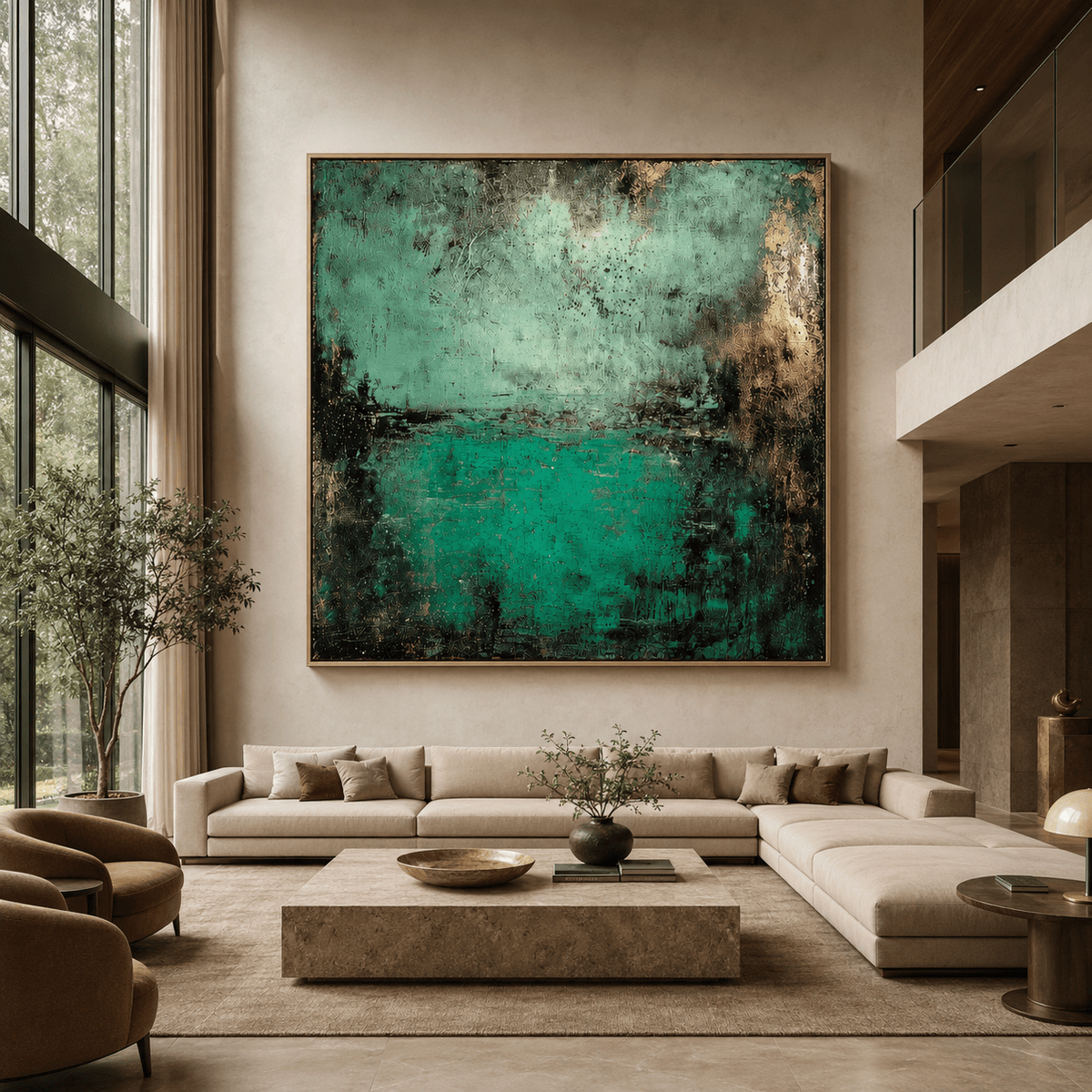
“Sage Reverie Horizon” — pair terracotta with sage as a designer combo
Textured Original Paintings for an Earthy, Handmade Feel
Texture gives a warm color more depth. A flat art print can be clean and striking, but a textured original painting changes as light moves across the surface. Raised ridges, scraped areas, and uneven marks create a handmade quality that works well with linen, wood, stone, and woven decor.
When shopping for textured abstract wall art, study the balance between open space and dense marks. An artwork with plenty of cream background may feel calm above a full bookcase. A composition with more rust and layered shapes may be better for a quiet wall that needs a strong focal point.
“Quiet Ridges” is a useful example of earthy minimalism. Its restrained palette can support a room with natural materials without competing with them. View Quiet Ridges when you want texture with a soft, neutral presence.
A handmade look does not require a rustic room. Place a textured terracotta piece in a century modern minimalist setting with a simple console, clear floor space, and one sculptural lamp. The contrast between the rough-looking surface and clean furniture can feel deliberate.
Wabi-Sabi and Imperfect Beauty
Wabi-sabi-inspired art celebrates variation, restraint, and the beauty of an unfinished-looking mark. It can soften a room filled with glass, acrylic glass, polished metal, or smooth cabinetry. The goal is not to make every object match. The goal is to introduce a surface that feels human.

“Quiet Ridges”
How Terracotta Wall Art Works in Neutral and White Rooms
White walls create a clean background for terracotta art, but not every white has the same effect. A warm white makes clay colors look soft and connected. A cool, blue-leaning white creates more contrast. If your wall looks slightly gray in morning light, choose a print with cream or muted rust rather than a bright orange tone.
Neutral rooms benefit from shape as well as color. Look for arches, circles, loose brush marks, horizontal bands, or irregular blocks. Shapes can echo furniture lines. For example, a rounded terracotta form can relate to a curved chair, while long horizontal marks can complement a low media console.
A framed canvas wall piece can make a white room feel finished without adding many accessories. Choose a hardwood floater frame if you want the artwork to appear separated from the frame edge. A handcrafted floater frame made from poplar hardwood adds warmth and works naturally with oak-look flooring, walnut furniture, or rattan.
Do not place too many small objects around one strong artwork. Give the wall room to breathe. One vase, one low plant, or one table lamp is often enough to support an abstract wall art piece.
Building a Quiet Color Story
Start with three main colors: a background neutral, a terracotta or rust accent, and one supporting color. Sage, dusty blue, olive, black, and warm wood can all work. Repeat the supporting color once or twice elsewhere in the room so the artwork feels part of the space rather than an isolated purchase.
Sizing a Terracotta-Toned Statement Piece for Your Wall
Size changes the impact of art more than many buyers expect. A small art print may add a thoughtful accent, while a large canvas wall piece can define the room. Above a sofa, aim for artwork that spans about two-thirds to three-quarters of the furniture width. This usually feels balanced without making the furniture look undersized.
For a narrow wall, a vertical canvas can emphasize ceiling height. A horizontal piece suits a sofa, credenza, bed, or dining bench. A square composition works well above a round table or in a compact entry. If you are considering a wall art set, arrange the pieces on the floor first and leave consistent gaps between them.
Use paper or painter's tape to mark the outside dimensions before ordering. Stand across the room and view the outline from the main doorway. This simple step can prevent the common mistake of choosing a piece that is too small for a large wall.
Hang the center of the artwork near eye level, adjusting slightly when it sits above furniture. Leave enough space between the lower edge and the sofa or console for the arrangement to feel connected. Avoid pushing a piece so high that the furniture and art look like separate zones.
Choosing Between One Piece and a Set
One large abstract artwork is usually the calmest choice. A two- or three-piece art set can add rhythm to a long wall, especially when the pieces share a palette. Keep the compositions related but not identical. A repeated terracotta tone can unify different shapes without creating a rigid pattern.
Canvas Prints, Framed Art, and Finish Choices
The format should match the feeling you want. A stretched canvas has a soft, gallery-like presence and works well in relaxed interiors. A framed art print offers a more defined edge. Framed canvas prints can bridge both looks, giving the image structure while keeping the tactile character of canvas.
Rossetti Art canvas pieces are hand-stretched over a 1.25-inch hardwood stretcher frame. They are printed with UV- and fade-resistant HP latex inks, UL GREENGUARD Gold certified, and finished with a satin-matte, low-glare finish. These details matter when the artwork will sit near a window or in a room with several light sources.
Use Live Preview before ordering when available. It helps you judge the artwork's scale against your wall and see whether the colors feel too strong or too quiet. A preview cannot replace natural light in your home, but it can reduce uncertainty about proportion.
For a more finished presentation, consider the handcrafted floater frame made from poplar hardwood. The small visual gap around the canvas gives the artwork definition while keeping the overall look light. It is a strong option for a modern wall, home office, or living room feature wall.
What to Check Before You Buy
- Confirm the finished dimensions, not only the image dimensions.
- Check whether the artwork arrives ready hang and whether hardware is included.
- Review the frame material and finish if you are coordinating with existing furniture.
- Compare the artwork's dominant tone with your wall under daytime and evening light.
- Choose a format that suits the room's traffic, furniture, and viewing distance.

Canvas Prints
Choosing Terracotta Art for Each Room
In a living room, use terracotta art to anchor the main seating area. A large canvas wall artwork above the sofa creates a clear focal point. Pair it with warm cream upholstery, a natural rug, and one or two dark accents. If the sofa is already colorful, select a neutral abstract artwork with small clay-colored marks.
In a bedroom, choose softer shapes and less contrast. Dusty terracotta, faded rose, and warm cream can feel restful beside linen bedding. A medium framed canvas wall piece above a dresser may be enough. Keep the surrounding decor simple so the artwork supports the quiet mood.
A home office can handle a stronger composition. Terracotta, rust, and charcoal give energy to a modern wall without the sharp feel of bright primary colors. Place the artwork where it can be seen during breaks, but avoid a reflective glass wall position directly opposite a window.
In a sunroom, let the palette connect with plants, woven furniture, and natural light. Sage, olive, clay, and pale yellow can create a relaxed garden-like atmosphere. Choose a finish that keeps glare low when sunlight moves across the room.
Small Spaces and Entryways
A narrow entry can benefit from one vertical piece rather than a crowded art print set. A small canvas art work above a slim console creates a welcoming first impression. Keep the color story tight: terracotta, cream, and wood are enough for a compact wall.
A Simple Buying Guide for Terracotta Art
Begin with the wall, not the product page. Measure the available width and height. Note nearby doors, switches, vents, and furniture. Then decide whether you want a statement piece, a supporting print, or a coordinated wall art set.
Next, identify the room's temperature. Warm wood, beige upholstery, and cream paint can support rich terracotta. Cool gray furniture may need a print that includes cream, muted sage, dusty blue, or charcoal. This prevents the art from looking disconnected from the rest of the decor.
Think about your preferred surface. If you like visible texture and an original feel, explore fine art and textured original paintings. If you want a consistent size or a flexible price point, compare canvas prints. A wall art print can also be a good way to test a color before committing to a larger piece.
Finally, choose the CTA that matches your confidence. If you are still comparing moods, take the style quiz. If you know you want a warm abstract, browse the collection. If one composition keeps holding your attention, open the product page and review dimensions, framing, finish, and Live Preview before purchasing.
Three Questions Before Ordering
- Will this tone support the furniture and light already in the room?
- Is the artwork large enough to hold the wall visually?
- Does the frame or edge finish suit the nearby decor?
🎨 FREE ART STYLE FINDER QUIZ
Not sure which style fits your space? Take the free art style finder quiz.

Original Abstract Paintings
Frequently Asked Questions
What colors pair well with terracotta wall art?
Warm cream, ivory, sage, olive, walnut, camel, and soft charcoal pair especially well with terracotta wall art. For a lighter living room, use cream walls, linen furniture, and sage accents. For stronger contrast, add matte black lighting or dark wood. Avoid matching terracotta with too many bright oranges, which can make the room feel visually hot.
Is terracotta a good color for a small room?
Yes. In a small room, choose a muted terracotta or a pale clay artwork with open background space. A vertical piece can make the wall feel taller, while a small horizontal canvas can widen a narrow area. Keep the frame slim or use a light poplar hardwood floater frame so the art adds color without visual bulk.
Does terracotta wall art work with cool-toned furniture?
It can. Choose a composition that includes warm cream, dusty blue, sage, or gray alongside the terracotta. Those bridge colors help the artwork relate to a cool gray sofa or blue-gray cabinet. Avoid a highly saturated orange-red piece unless you want a deliberate, high-contrast focal point in the room.
What size wall art works best in a terracotta color scheme?
Above a sofa or bed, choose a piece about two-thirds to three-quarters of the furniture width. For a narrow entry, a vertical canvas between 24 and 36 inches high can work well, depending on the wall. Use tape to mark the outer dimensions before ordering, and keep the artwork's center near eye level.
Bring Warmth to Your Wall
The right terracotta artwork can make a room feel warmer without overwhelming it. Start with the light, furniture, and mood you already have, then choose a composition that adds a natural point of focus. Explore the Canvas Prints collection for flexible wall styling, or browse Original Paintings for Sale when you want a more personal, one-of-a-kind presence.
Keep Reading
Color Palette: Terracotta, rust, sage, warm cream
Painting Style: Textured abstract, earthy minimalism
Suggested Interior Placement: Living room feature wall, bedroom, sunroom

Leave a comment
This site is protected by hCaptcha and the hCaptcha Privacy Policy and Terms of Service apply.