
Your walls hold incredible potential to shape the entire feel of your home. Whether you live in a cozy apartment or a spacious house, the right paint can create depth, add character, and reflect your personal style without breaking the bank.
This guide explores creative painting ideas for walls that work in real homes. You will discover techniques that range from simple weekend projects to more advanced designs that make a lasting impact on any room.
Each idea includes practical tips to help you achieve professional results. The goal is to inspire your next project and give you the confidence to transform your space with paint.
Transform Your Space with Ready-to-Hang Art
Skip the DIY effort and bring instant style to your walls with museum-quality canvas prints. These curated pieces deliver the same visual impact as custom paint techniques.

Abstract Geometric Prints
Bold shapes and modern color blocking create instant focal points. Perfect for living rooms and contemporary spaces.

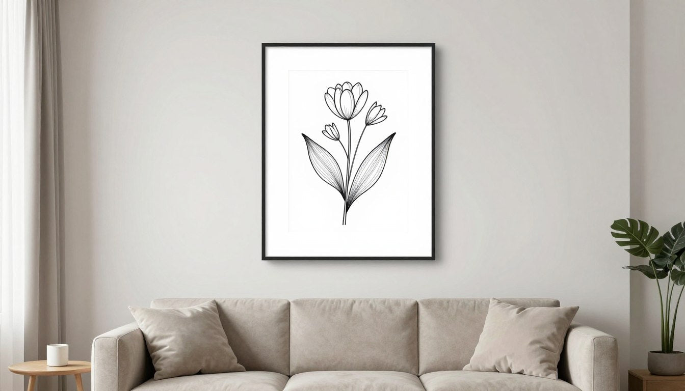
Botanical Line Art
Clean lines and nature-inspired designs bring calm energy to bedrooms and offices. Simple yet sophisticated.

Black & White Portraits
Timeless elegance that works with any color scheme. These pieces add depth without overwhelming your design.
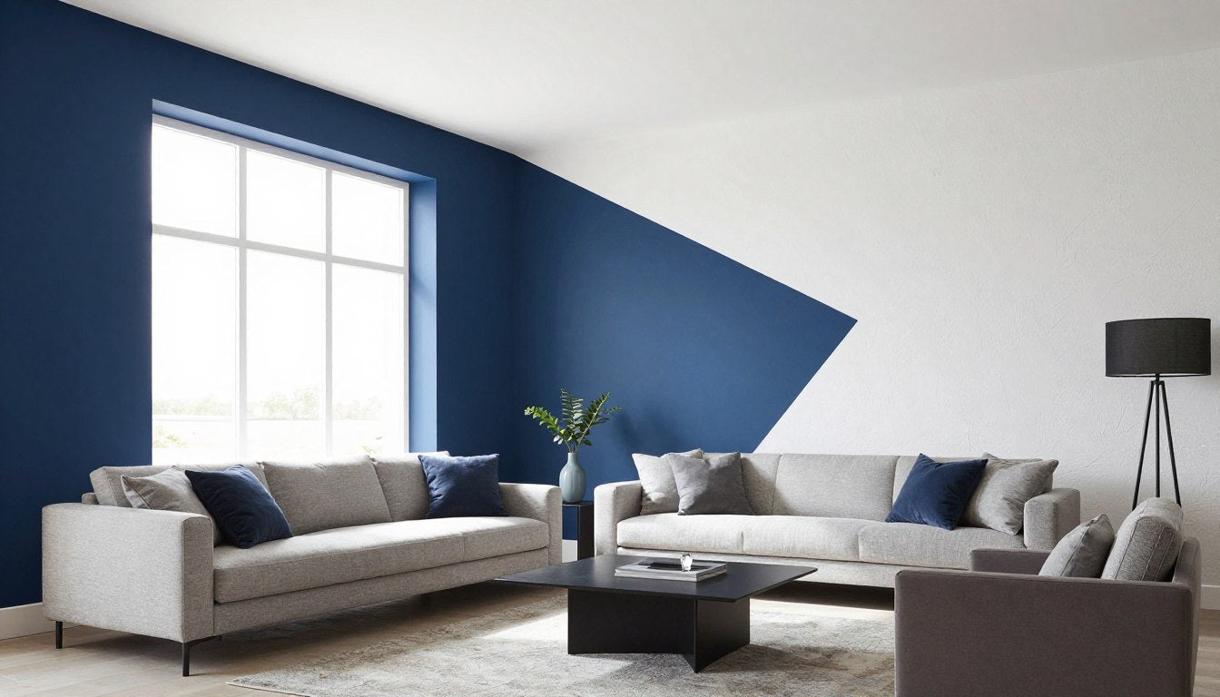
Accent Wall Painting Ideas That Create Visual Interest
An accent wall serves as the focal point of any room. This technique uses a different color or pattern on one wall while keeping the rest neutral.

The most effective accent walls appear behind beds, sofas, or dining tables. These locations naturally draw the eye and create a sense of purpose in the space.
Choosing the Right Wall for Your Accent
Select the wall that people see first when entering the room. This could be the wall opposite the door or the one with architectural features like a fireplace.
Dark colors work well in large rooms with plenty of light. Lighter shades suit smaller spaces where you want to add interest without closing in the area.
For living spaces, consider living room canvas art that complements your accent wall color and ties the whole design together.
Bold Color Combinations for Maximum Impact
Deep blue paired with soft gray creates a sophisticated look in bedrooms and home offices. The contrast adds depth while maintaining a calm atmosphere.
Terracotta or burnt orange against cream walls brings warmth to dining rooms and entryways. This combination feels inviting without being too intense.
Forest green works beautifully in spaces with natural wood furniture. The rich shade adds a touch of nature and pairs well with both modern and traditional design.
If you prefer ready-made solutions, explore abstract canvas prints that capture these color combinations in striking visual designs.
Texture Techniques for Accent Walls
A simple sponge technique creates subtle texture that catches light throughout the day. Apply your base color first, then use a damp sponge with a slightly different shade.
Rag rolling adds old-world charm to traditional interiors. Roll a bunched-up cloth over wet paint to create soft, irregular patterns.
For a modern look, use wide painter's tape to create geometric sections. Paint each section in varying shades of the same color family for a contemporary effect.
Geometric Painting Ideas for Modern Spaces
Geometric patterns bring structure and visual rhythm to plain walls. These designs range from simple stripes to complex angular shapes that transform entire rooms.
Horizontal Stripe Techniques
Horizontal stripes make rooms appear wider and ceilings lower. This effect works well in narrow hallways or small bedrooms where you want to create a sense of space.
Use painter's tape to mark perfectly straight lines. Measure carefully and apply the tape firmly to prevent paint from bleeding underneath.
Vary the stripe width for added interest. Combine thick and thin stripes in related colors for a custom look that feels intentional.
The same crisp lines appear in line art canvas prints without the time investment of taping and painting multiple coats.
Vertical Lines for Height
Vertical stripes draw the eye upward and make ceilings appear higher. This technique helps small rooms feel more spacious and airy.
Subtle tone-on-tone stripes work in formal spaces like dining rooms. Choose colors just two shades apart for an elegant, understated effect.
Bold contrasting stripes suit playful spaces like kids' rooms or creative home offices. The strong pattern adds energy and personality to the space.
Chevron and Herringbone Patterns
Chevron patterns create movement and direction on your walls. These zigzag designs work best as accent features rather than covering entire rooms.
Start by marking the center point of your wall. Work outward in both directions to ensure symmetry in your pattern.
Herringbone offers a more subtle geometric look. The staggered pattern adds sophistication to bedrooms and studies without overwhelming the space.
Planning these complex patterns requires time and precision. Alternatively, consider modern canvas wall art featuring geometric designs that deliver instant results.
Triangle and Diamond Designs
Scattered triangles in varying sizes create a contemporary mountain range effect. This design works beautifully in nurseries and kids' spaces.
Diamond patterns arranged in a grid bring Art Deco glamour to powder rooms and dressing areas. The repetition creates rhythm while the angles add interest.
Use metallic paint for some shapes to catch light and add dimension. Gold or copper triangles against a matte background create subtle luxury.
Ombre and Gradient Painting Techniques
Ombre effects transition smoothly from one color to another. This technique creates a peaceful atmosphere and works in nearly any room of your home.

Horizontal Ombre for Calming Spaces
A horizontal gradient from dark at the bottom to light at the top mimics natural sky effects. This creates a grounding feel perfect for bedrooms and meditation spaces.
Start with your darkest shade at the floor level. Work in sections, blending each color into the next while the paint is still wet.
Use a large, dry brush to blend the transitions. The key is working quickly and keeping a wet edge to avoid visible lines between colors.
Vertical Gradient Effects
A vertical gradient from one wall to another guides movement through a space. This technique works well in open-plan areas to define different zones.
The effect creates visual flow without the need for physical dividers. It subtly separates a living area from a dining space in a studio apartment.
Sunset and Sky-Inspired Gradients
Warm sunset colors transition from coral to pink to lavender. This dramatic look suits creative spaces and adds personality to home offices or studios.
Cool sky blues fading to soft whites bring serenity to bathrooms and bedrooms. The gentle transition creates a spa-like atmosphere.
Layer multiple related shades for depth. Five or six colors create a more realistic gradient than just two or three.
For those who want the look without the blending challenge, abstract art prints offer gradient effects in ready-to-hang formats.
Match This Vibe to Your Space
Discover curated art collections that bring these painting techniques to life. Each collection captures a distinct mood and style.
Stencil and Pattern Painting Ideas
Stencils offer an accessible way to add intricate designs to your walls. This technique allows you to create professional-looking patterns without artistic skills.

Moroccan and Global-Inspired Patterns
Moroccan tile patterns bring exotic elegance to powder rooms and accent walls. The intricate designs create a feature that rivals expensive wallpaper.
Use metallic paint over a matte base for added dimension. The shimmer catches light and makes the pattern feel more luxurious.
Position your stencil carefully and secure it with low-tack tape. Use a foam roller or stencil brush with minimal paint to prevent bleeding under the edges.
Botanical and Nature Motifs
Leaf and floral stencils suit bedrooms and bathrooms. Scatter them randomly for an organic feel or arrange them in a structured pattern.
Large-scale fern stencils create a tropical vibe in entryways. The oversized leaves make a statement without requiring complex application.
Small repeating botanical motifs work well as border designs. Run them along the ceiling line or around doorways for subtle decoration.
If stenciling feels too time-intensive, botanical wall art prints deliver nature-inspired beauty with zero effort.
Modern Geometric Stencils
Hexagon patterns arranged in a honeycomb design create contemporary feature walls. The repetition adds interest while maintaining a clean, modern aesthetic.
Use stencils in alternating colors for maximum impact. Paint some hexagons in your accent color and leave others in the base shade.
Start from the center of your wall and work outward. This ensures the pattern stays centered and balanced across the space.
Color Blocking Techniques for Bold Statements
Color blocking divides walls into distinct sections of different colors. This modern technique adds architectural interest to flat, featureless walls.
Two-Tone Wall Divisions
A horizontal division at chair rail height creates visual weight in the lower portion of a room. Paint the bottom third a darker shade and the top two-thirds a lighter color.
This technique makes high ceilings feel more intimate. The darker lower section anchors the space and makes it feel cozier.
Use painter's tape to create a perfectly straight division line. Press the tape down firmly and paint over the edge for the cleanest result.
A vertical division works in open-plan spaces to define different areas. Paint the wall behind your sofa one color and the dining area wall another related shade.
Multi-Color Block Arrangements
Create a patchwork effect with squares or rectangles of different colors. Use shades from the same family for a cohesive look.
Plan your layout on graph paper first. This helps you visualize the balance and ensures you have enough of each color.
Vary the size of your blocks for added interest. Mix large squares with smaller rectangles to create rhythm in the design.
Similar bold color combinations appear in pop art canvas prints with the advantage of instant installation.
Diagonal Color Splits
A diagonal division from corner to corner creates dynamic movement. This unconventional approach suits creative spaces and kids' rooms.
The angled line draws the eye upward and makes the room feel taller. Choose contrasting colors for maximum impact.
Measure carefully to ensure your diagonal runs true from corner to corner. Mark several points along the line before applying tape.
Textured Paint Finishes and Special Effects
Texture adds depth and dimension that flat paint cannot achieve. These techniques create visual interest through the play of light and shadow on your walls.

Sponging Techniques for Soft Texture
Natural sea sponges create organic, irregular patterns. Dip the sponge in paint, dab off the excess, and apply it to the wall with a gentle pouncing motion.
Layer two or three related colors for depth. Start with your lightest shade and add progressively darker tones.
Vary the pressure and angle of the sponge to avoid obvious repetition. The goal is a random, natural-looking texture.
Rag Rolling and Dragging
Rag rolling creates a soft, cloudy effect perfect for traditional interiors. Roll a bunched cloth through wet glaze to reveal the base coat underneath.
Work in small sections to keep the glaze workable. Have a partner help with large walls to maintain consistency.
Dragging produces fine, subtle lines that resemble linen fabric. Pull a dry brush through wet glaze in straight, vertical strokes.
Stippling for Fine Texture
Stippling creates a fine, speckled texture using a special brush or foam pad. Pounce the tool onto wet paint to create thousands of tiny marks.
This technique suits formal dining rooms and studies. The refined texture adds elegance without being too obvious.
Use similar tones for a subtle effect or contrasting colors for more drama. The texture becomes more apparent as light changes throughout the day.
Room-by-Room Painting Ideas for Every Space
Different rooms serve different purposes. The right paint approach enhances how each space functions and feels.
Living Room Paint Concepts
Living rooms benefit from paint that creates conversation and comfort. An accent wall behind the sofa anchors seating arrangements and defines the space.
Warm neutrals like greige or warm gray suit most living spaces. These shades provide a calm backdrop for furniture and art while feeling current.
Add visual interest with a subtle two-tone approach. Paint the wall behind your entertainment center a shade darker than the other walls.
Complement your paint choices with living room wall art that ties your color scheme together and adds personality.
Bedroom Color Strategies
Bedrooms require colors that promote rest and relaxation. Cool blues and soft greens create a peaceful environment that supports better sleep.
Paint the ceiling a shade lighter than the walls to make the room feel more expansive. This trick works especially well in smaller bedrooms.
A dark, moody color on all walls creates an intimate, cocoon-like atmosphere. Deep navy or charcoal gray can make a bedroom feel luxurious and restful.
Enhance the calm atmosphere with bedroom canvas prints in soothing colors that complement your wall choices.
Kitchen and Dining Room Approaches
Kitchens handle well with clean, bright colors that reflect light. White, soft gray, and pale blue create an airy feel that makes the space feel larger.
An accent wall in the dining area adds warmth and defines the eating space in open-plan layouts. Rich colors like deep green or burgundy stimulate appetite and conversation.
Paint the inside of open shelving a contrasting color for unexpected detail. A pop of color inside white shelves adds depth and interest.
Complete your dining space with dining room wall art that enhances the welcoming atmosphere.
Home Office Paint Ideas
Home offices need colors that enhance focus without causing fatigue. Mid-tone blues and greens promote concentration while remaining easy on the eyes.
Create a feature wall behind your desk with a color that energizes you. Bold accent walls work well here since you face them while working.
Avoid pure white, which can cause eye strain during long work sessions. Opt for warm white or light gray instead.
Add inspiration to your workspace with office canvas art that motivates and reflects your professional style.
Bathroom Painting Techniques
Bathrooms handle moisture well with semi-gloss or satin finishes. These sheens resist humidity and wipe clean easily.
Spa-like colors such as soft aqua, sage green, or warm taupe create a relaxing retreat. These shades work with white fixtures and natural materials.
A bold ceiling color adds unexpected personality to small powder rooms. The ceiling becomes a feature when the walls remain neutral.
Entryway and Hallway Ideas
Entryways make strong first impressions with bold color choices. A rich, welcoming shade like deep blue or warm terracotta sets the tone for your entire home.
Hallways often lack natural light. Use lighter shades to reflect available light and make these transitional spaces feel open.
Create a gallery wall effect with painted rectangles or squares in different shades. This adds interest to long, narrow hallways.
Welcome guests with entryway wall art that complements your paint and makes a memorable first impression.
Kids' Room Creative Concepts
Kids' rooms allow for playful experimentation. Chalkboard paint on one wall creates an interactive surface for creativity and learning.
Rainbow stripes bring energy and joy to nurseries and playrooms. Use painter's tape to create clean lines between each color.
Consider growth when choosing colors. Softer, more sophisticated shades transition better as children age than primary brights.
Add whimsy with kids' room wall art that grows with your child and complements your paint choices.
Creative Ceiling Painting Ideas
Ceilings offer an often-overlooked opportunity for color and design. The fifth wall can dramatically change how a room feels.

Accent Ceilings for Drama
A ceiling painted several shades darker than the walls creates intimacy in large rooms. This approach makes high ceilings feel more proportionate and cozy.
Metallic ceiling paint adds glamour to dining rooms and powder rooms. Gold or silver reflects light and creates a sense of luxury.
Match your ceiling color to your accent wall for a cohesive, wrapped effect. This technique works beautifully in bedrooms and studies.
Sky and Cloud Effects
A soft blue ceiling with wispy white clouds brings outdoor calm to kids' rooms and nurseries. Use a natural sponge to create realistic cloud shapes.
Ombre from deeper blue at the edges to lighter blue in the center mimics the natural sky. This creates depth and makes the ceiling appear higher.
Geometric Ceiling Designs
Paint ceiling beams or coffers in contrasting colors to highlight architectural features. This draws attention upward and adds dimension to the room.
Create a modern grid pattern with painter's tape. Alternate colors in each section for a contemporary coffered ceiling effect.
Essential DIY Tips and Techniques
Success with wall painting projects depends on proper preparation and technique. These practical tips ensure professional-looking results.
Surface Preparation Essentials
Clean walls thoroughly before painting. Dirt and grease prevent paint from adhering properly and cause finish problems.
Fill holes and cracks with spackling compound. Sand smooth once dry for an invisible repair.
Prime walls before applying bold or dark colors. Primer creates an even base and prevents the old color from showing through.
Tape and Masking Best Practices
Invest in quality painter's tape designed for delicate surfaces. Cheap tape bleeds and damages paint when removed.
Press tape down firmly along the edge where paint will meet. Use a plastic tool to seal the edge completely.
Remove tape while paint is still slightly wet. This prevents the dried paint from cracking or peeling away with the tape.
Paint Application Methods
Use a roller for large, flat areas. A 9-inch roller covers quickly while maintaining control.
Cut in edges with an angled brush before rolling. This creates clean lines around trim, ceilings, and corners.
Apply thin, even coats rather than one thick coat. Two thin coats look better and dry more evenly than one heavy application.
Working with Color
Test colors on your actual wall before committing. Paint large swatches and observe them at different times of day.
Light changes how colors appear. A shade that looks perfect in the store might feel completely different in your home's lighting.
Buy all paint for one room from the same batch. Even slight variations between batches become obvious once on the wall.
Understanding Color Psychology in Home Design
Colors affect mood and behavior in subtle but measurable ways. Understanding these effects helps you choose paint that supports how you want each space to feel.
Warm Colors and Their Impact
Red stimulates appetite and conversation. This makes it an excellent choice for dining rooms but too energizing for bedrooms.
Orange brings warmth and creativity. Use it in social spaces like kitchens and family rooms where you want to encourage interaction.
Yellow creates cheerfulness and energy. It works well in small doses but can feel overwhelming when used on all walls.
Cool Colors for Calm Spaces
Blue promotes relaxation and reduces stress. It suits bedrooms, bathrooms, and any space where you want to feel calm.
Green connects us to nature and creates balance. It works in virtually any room and pairs well with both warm and cool accent colors.
Purple adds sophistication and creativity. Lighter lavenders suit bedrooms while deeper purples create drama in living spaces.
Research from color psychology experts confirms these effects and offers deeper insights into color choices.
Neutral Colors as Foundations
White creates openness and reflects light. It serves as the perfect backdrop for colorful furniture and art.
Gray provides sophistication without coldness when you choose the right undertones. Warm grays contain beige notes while cool grays lean toward blue.
Beige and greige create warmth while remaining neutral enough to work with any decor style. These shades never feel dated or trendy.
Budget-Friendly Painting Strategies
Beautiful walls do not require unlimited budgets. Smart planning and creative approaches deliver impressive results at any price point.

Maximizing Impact with Minimal Paint
Paint just one accent wall instead of the entire room. This approach uses less paint while creating a strong focal point.
Use leftover paint for small projects like painting the inside of bookshelves or creating a geometric design with tape.
Sample pots work perfectly for testing ideas and creating small accent details. Use them for stencil projects or painted furniture accents.
Strategic Color Choices
Lighter colors require fewer coats to achieve full coverage. This saves both time and money on paint.
Neutral base colors allow you to change accent pieces over time. You can refresh the look with new art or textiles without repainting.
Work with what you have. If your trim is already a warm white, choose wall colors with warm undertones to avoid needing to repaint the trim.
DIY vs. Professional Help
Simple projects like single-color walls make excellent DIY projects. You save the cost of labor while gaining satisfaction from doing the work yourself.
Complex techniques like venetian plaster or intricate geometric patterns often justify professional help. The expertise ensures better results and saves time.
Prep work accounts for much of a painting project's time. You can hire professionals for the painting while doing the prep yourself to reduce costs.
Current Trends in Wall Painting
Design trends evolve, but certain painting ideas continue to gain popularity year after year. Understanding these trends helps you make choices that feel current without being dated.
Nature-Inspired Color Palettes
Earthy terracotta, sage green, and warm clay tones reflect the growing desire to bring nature indoors. These colors create grounding, peaceful spaces.
Botanical prints and nature motifs pair beautifully with these organic color choices. The combination reinforces connection to the natural world.
Complement earth-tone walls with botanical art prints that echo the natural color palette.
Moody Dramatic Interiors
Dark, saturated colors create sophisticated, intimate spaces. Deep navy, forest green, and charcoal gray appear increasingly in bedrooms and dining rooms.
These rich colors work best in rooms with good natural light. The darkness adds depth without making the space feel closed in.
Balance dark walls with lighter furniture and plenty of texture. This prevents the room from feeling too heavy or oppressive.
Minimalist Monochrome
All-white or all-gray rooms continue to appeal to those seeking calm, uncluttered spaces. The monochrome approach creates a gallery-like backdrop for life.
Vary the sheen rather than the color for subtle interest. Use matte on walls and semi-gloss on trim to create definition.
Add warmth with natural wood and textiles. This prevents the monochrome palette from feeling cold or sterile.
Enhance minimalist spaces with black and white art that maintains the clean aesthetic while adding visual interest.
Curved Lines and Organic Shapes
Soft, flowing curves replace harsh geometric angles in current design. Paint arched shapes on walls to create a softer, more organic feel.
This trend works especially well in children's rooms and bedrooms. The gentle curves create a calming, embracing atmosphere.
Use a string tied to a pencil as a simple compass to create perfect arcs and circles on your wall before painting.
According to Architectural Digest's trend forecasts, these organic approaches continue to gain momentum in residential design.
Seasonal Color Adjustments
Some homeowners enjoy refreshing their space seasonally. Strategic painting allows you to adapt your home's feel throughout the year.
Warm Weather Color Shifts
Lighter, brighter colors suit spring and summer months. Soft blues, pale greens, and crisp whites create an airy, fresh atmosphere.
These shades reflect light and make spaces feel cooler during warm months. The psychological effect of cool colors enhances physical comfort.
Cool Weather Coziness
Warmer, deeper colors create comfort during fall and winter. Rich burgundy, deep teal, and warm taupe make rooms feel more intimate and cozy.
Paint an accent wall in a seasonal color that you can easily repaint when weather changes. This allows seasonal shifts without painting entire rooms.
Removable Options
Peel-and-stick wallpaper offers seasonal flexibility without commitment. Apply it for a season and remove it when you are ready for a change.
Temporary wall murals serve the same purpose. They install easily and remove cleanly, perfect for renters or frequent redecorators.
Ready-to-Hang, Museum-Quality Canvas Art
Transform your walls instantly with professionally curated art. Every piece arrives ready to hang with free worldwide shipping. No painting, no waiting, no mess.
Why Choose Canvas Prints
- Museum-quality materials built to last
- Arrives ready to hang with included hardware
- Free shipping to any location worldwide
- Professional gallery-wrapped edges
- Fade-resistant inks for lasting beauty
- Satisfaction guaranteed on every order
Maintaining Your Painted Walls
Proper care extends the life and beauty of your painted walls. Simple maintenance keeps colors vibrant and surfaces looking fresh.
Cleaning Best Practices
Dust walls regularly with a soft cloth or vacuum brush attachment. This prevents buildup that dulls paint over time.
Spot clean marks with a damp sponge and mild soap. Avoid harsh cleaners that can damage paint finish or color.
Matte and flat finishes require gentler cleaning than semi-gloss or satin. Test your cleaning method in an inconspicuous spot first.
Touch-Up Strategies
Keep leftover paint in a tightly sealed container for future touch-ups. Label it with the room name and date for easy identification.
Feather touch-up paint into the surrounding area to avoid visible patches. Apply thin coats and blend the edges while wet.
Touch up scuffs and marks as soon as you notice them. Small repairs stay invisible while large damaged areas become obvious.
When to Repaint
Most painted walls need refreshing every five to seven years. High-traffic areas may require attention sooner.
Signs you need to repaint include fading color, visible wear patterns, or outdated color choices that no longer suit your style.
Kitchens and bathrooms benefit from more frequent repainting due to moisture and cooking residue. Plan to refresh these spaces every three to five years.
Eco-Friendly Painting Options
Environmental concerns influence paint choices for many homeowners. Healthier options exist that deliver beautiful results without harmful chemicals.
Low-VOC and Zero-VOC Paints
Volatile organic compounds contribute to indoor air pollution and health issues. Low-VOC paints reduce these emissions significantly.
Zero-VOC paints eliminate these chemicals entirely. They suit nurseries, bedrooms, and homes with chemical sensitivities.
Most major paint brands now offer low-VOC options in a full range of colors. Performance matches traditional paints while being safer for your family.
Natural and Mineral Paints
Clay and mineral-based paints use natural pigments and materials. These options appeal to those seeking the most natural approach.
Natural paints often have beautiful, subtle color variations that synthetic paints cannot replicate. The slight irregularity adds character and depth.
Milk paint offers an authentic historic finish perfect for period homes. It requires special preparation but delivers unmatched authenticity.
Responsible Disposal
Never pour leftover paint down drains. This contaminates water supplies and violates environmental regulations in most areas.
Dry out latex paint completely before disposal. Pour it into a cardboard box with kitty litter or sand to absorb the liquid.
Many communities offer paint recycling programs. Check with your local waste management facility for proper disposal options.
Finding Your Painting Inspiration
Inspiration comes from many sources. Building a collection of ideas helps clarify your vision before starting any project.
Digital Resources and Apps
Paint visualizer apps let you test colors on photos of your actual rooms. This technology removes much of the guesswork from color selection.
Social media platforms offer endless inspiration through home decor hashtags. Save images that resonate with your style to identify patterns in your preferences.
Design blogs provide detailed project breakdowns that teach techniques. Many include step-by-step photos that demystify complex painting projects.
For curated inspiration, visit the Rossetti Art blog for design ideas and color pairing suggestions.
Physical Inspiration Sources
Paint store sample cards help you compare colors side by side. Bring them home and view them in your actual lighting before deciding.
Home tours and model homes showcase current trends and professional styling. Pay attention to how designers use paint to enhance space.
Nature provides endless color inspiration. Notice how colors appear together in landscapes, flowers, and seasonal changes.
Creating a Vision Board
Collect images, paint chips, and fabric swatches that appeal to you. Arrange them together to see how elements work as a cohesive palette.
Include photos of rooms you love and colors that make you happy. Your vision board reveals patterns in your preferences.
Update your board as your taste evolves. This living document helps ensure your choices reflect your current style rather than past preferences.
Common Painting Mistakes to Avoid
Learning from common errors saves time, money, and frustration. These pitfalls trip up even experienced DIY painters.
Color Selection Errors
Choosing colors in store lighting leads to surprises at home. Always test paint in your actual space before buying gallons.
Ignoring undertones causes clashing colors. Every paint has warm or cool undertones that must work with your lighting and existing elements.
Going too bold without testing creates regret. Start with a smaller space or single wall before committing to intense colors throughout a room.
Preparation Shortcuts
Skipping primer costs more in the long run. You will need extra coats of paint to achieve even coverage.
Failing to clean walls leads to poor adhesion. Paint peels or bubbles when applied over dirt, grease, or moisture.
Inadequate masking creates sloppy edges. Take time to tape properly for clean, professional-looking lines.
Application Mistakes
Using cheap brushes and rollers shows in the finished work. Invest in quality tools that hold more paint and create smooth finishes.
Applying paint too thickly causes drips and uneven drying. Multiple thin coats always look better than one thick coat.
Rushing between coats leads to problems. Follow recommended drying times even when you are eager to finish the project.
Planning Failures
Underestimating paint quantity means running out mid-project. Calculate carefully and buy extra to avoid color matching issues later.
Ignoring room function leads to impractical choices. Consider durability and cleanability alongside aesthetics.
Forgetting about furniture and decor creates disconnection. Your paint should complement existing pieces or planned replacements.
Bringing Your Wall Painting Vision to Life
The right paint transforms walls from simple boundaries into defining features of your home. Whether you choose bold accent walls, intricate patterns, or subtle textures, your walls reflect your personal style.
Start with one room or even one wall. Small successes build confidence for larger projects. Test your ideas, gather your supplies, and trust your creative instincts.
For those who prefer instant results without the effort of painting, canvas art offers an elegant alternative. Professional prints deliver the same visual impact as painted walls with the flexibility to change as your style evolves.
Your walls hold unlimited potential. The techniques and ideas in this guide give you the foundation to create spaces that inspire and delight every day.
Frequently Asked Questions
What are the easiest wall painting ideas for beginners?
Single accent walls in solid colors offer the simplest starting point. Choose one wall to paint in a contrasting shade while keeping other walls neutral. This approach requires basic rolling skills and minimal taping. Horizontal stripes also work well for beginners when you use quality painter's tape and measure carefully. Both techniques deliver impressive results without requiring advanced painting experience.
How do I choose paint colors that work together?
Start with a color wheel to understand complementary and analogous relationships. Complementary colors sit opposite each other and create vibrant contrast. Analogous colors sit beside each other and create harmony. Test your chosen colors together in your actual space and observe them at different times of day. Light dramatically affects how colors appear. Consider your existing furniture and the mood you want to create in each room.
What finish should I use for different rooms?
Flat or matte finishes suit low-traffic areas like bedrooms and ceilings. They hide imperfections but clean less easily. Eggshell works well in living rooms and dining rooms, offering subtle sheen with reasonable durability. Satin finish suits kitchens, bathrooms, and hallways where you need moisture resistance and easy cleaning. Semi-gloss works best for trim, doors, and high-moisture areas. The higher the sheen, the more durable and cleanable the surface.
How much paint do I need for my project?
Measure your wall area in square feet by multiplying height times width. One gallon typically covers 350-400 square feet with one coat. Most projects require two coats, so divide your square footage by 200 to determine gallons needed. Add 10% extra for touch-ups and future repairs. Darker colors and textured techniques may require additional paint. Always buy all paint from the same batch to ensure color consistency.
Can I paint over dark walls with lighter colors?
Yes, but the process requires proper preparation. Apply a high-quality primer designed to block dark colors. This prevents the old color from showing through and reduces the number of topcoats needed. Expect to apply two to three coats of your new lighter color even with primer. The effort pays off with even, true color. Skipping primer means you might need five or more coats of light paint to achieve full coverage.
What is the best way to create straight lines when painting?
Use high-quality painter's tape designed for delicate surfaces. Press the tape down firmly along the edge using a plastic tool or credit card. This seals the edge and prevents paint from bleeding underneath. Apply paint away from the tape edge rather than toward it. Remove the tape while paint is still slightly wet to prevent dried paint from cracking or peeling. For very long lines, use a laser level to ensure perfectly straight placement.
How long should I wait between paint coats?
Latex paint typically dries to the touch in one to two hours but needs four hours before applying a second coat. Oil-based paints require longer, usually six to eight hours between coats. Humidity, temperature, and ventilation affect drying times. Cool, humid conditions extend drying time while warm, dry conditions speed it. Always follow the manufacturer's recommendations on your specific paint can. Rushing between coats causes problems like peeling and uneven finish.
Should I paint walls or ceiling first?
Paint the ceiling first to avoid splattering freshly painted walls. The ceiling is the messiest part of any painting project. Use an extension pole with your roller to reach the ceiling comfortably. After the ceiling dries completely, cut in the wall edges where they meet the ceiling. Then roll the walls from top to bottom. This order produces the cleanest results and reduces touch-up work.
What are alternatives to painting if I rent?
Removable wallpaper offers pattern and color without permanent changes. It installs easily and removes cleanly when you move. Large canvas art creates focal points similar to accent walls but moves with you. Tapestries and fabric wall hangings add texture and color. Lean large framed art against walls for impact without holes. These solutions let you personalize your space while keeping your security deposit intact.
How do I fix paint drips and mistakes?
Catch drips while wet by smoothing them out with your brush or roller. For dried drips, lightly sand the area smooth and apply a thin coat of paint to blend. Small mistakes like paint on trim clean up easily when caught quickly with a damp cloth. For larger errors, sand the area smooth, spot prime if needed, and repaint the section. Feather the edges into the surrounding area to avoid visible patches. Prevention through careful application and proper taping works better than fixing mistakes.
Leave a comment
This site is protected by hCaptcha and the hCaptcha Privacy Policy and Terms of Service apply.