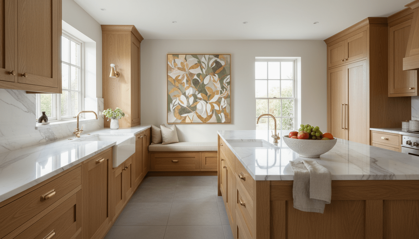
Kitchen Wall Art: Ideas, Placement and What Actually Works
The kitchen is the most-used room in the house and, almost always, the least decorated. Kitchen wall art tends to be an afterthought — a small quote print wedged between cabinets, or nothing at all — while the living room gets the statement pieces. That's backwards: this is the room where you spend your mornings, host half of every party, and stare at the same walls three times a day.
This guide covers what actually works on kitchen walls: the styles that feel curated rather than cliché, the spots where art belongs (and the two spots where it doesn't), and the sizing rules for the awkward wall spaces kitchens create.
Quick Answer
The best kitchen wall art is botanical, floral, or warm abstract — not literal food prints. Hang it on walls away from the stove and sink (a breakfast nook, the wall above open shelving, or a pantry-side wall), keep pieces at least 24" from direct steam and heat sources, and scale to the wall section: one medium piece per zone beats a scatter of small prints.

Why Kitchen Walls Play by Different Rules
Three things make the kitchen unlike any other room you'll hang art in:
- The environment is active. Steam, cooking heat, and the occasional oil splatter are real considerations. They don't rule out canvas — they just decide where it goes (more on that below).
- Wall space comes in fragments. Between cabinets, windows, and appliances, kitchens rarely offer one big uninterrupted wall. The art has to work with narrow verticals, short horizontals above shelving, and nook walls.
- The room already has a personality. Cabinetry color, countertop material, and backsplash pattern do a lot of visual talking. Kitchen art works best as a complement to that existing palette, not a competing statement.
This is also why the default approach — small novelty prints about coffee or wine — falls flat. They treat the kitchen as a joke room. Treat it like the most-lived-in room in your home, and the art choice changes completely.
Wall Art for Kitchen Decoration: Ideas That Aren't Cliché
These are the directions that consistently make a kitchen feel designed rather than decorated:
- Botanical and floral art. The natural first choice — plants, blooms, and organic forms echo the fresh ingredients and garden connection kitchens already imply, without spelling it out with a picture of a fork. A single strong botanical piece does more than five small herb prints.
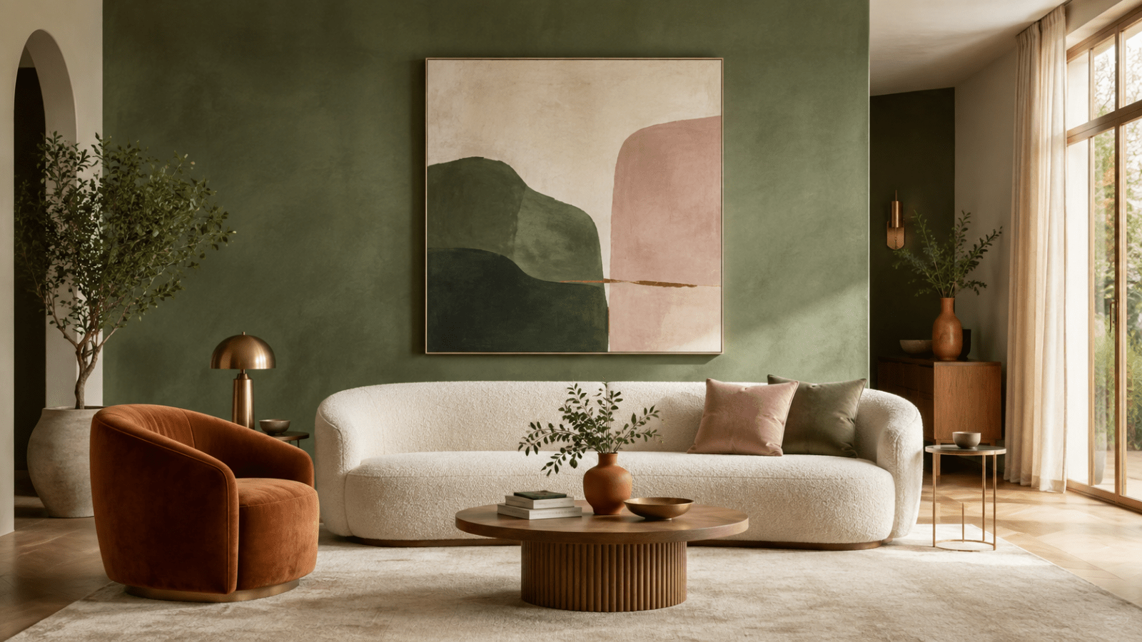
- Warm abstracts. Terracotta, ochre, sage, and cream tones bridge beautifully with wood cabinetry and stone counters. An abstract also survives trend cycles far better than themed prints.
- Minimalist line art. For modern kitchens with clean cabinet fronts, a black-line botanical or figure keeps the walls interesting without adding visual noise to an already-busy room.
- Vintage-style florals in black and white. A monochrome floral reads as timeless and pairs with literally any cabinet color — the safest confident choice for a rental or a kitchen you plan to repaint.

"Golden Bloom" — a modern abstract floral with warm, food-friendly tones that lift a kitchen wall without a single cliché. View the piece →
Where to Hang Wall Art in the Kitchen
| Spot | Why it works |
|---|---|
| Breakfast nook or eat-in corner | The best wall in most kitchens: away from cooking, viewed while seated, and large enough for one statement piece |
| Above open shelving or a sideboard | A horizontal piece 6"–10" above the top shelf ties the storage wall together |
| The "dead" wall by the pantry or doorway | Narrow vertical spaces suit portrait-orientation pieces or a stacked pair |
| Above a coffee or bar station | One medium piece turns a functional corner into a styled moment |
And the two places to skip: directly above or beside the stove (heat and grease will age any artwork fast) and right behind the sink, where daily splashes land. Keep art at least 24" clear of both zones and canvas holds up beautifully in a kitchen.
Sizing, Care and Steam-Proof Placement
Because kitchen wall sections are smaller, scale down from living-room rules: one medium piece (around 16"×24" to 24"×36") per wall zone usually beats a large statement canvas, and always beats a scatter of small frames. For a nook wall viewed from the table, apply the two-thirds rule against the table or bench below, just as you would in a dining space.
Care is simple: gallery-wrapped canvas needs an occasional light dusting with a dry microfiber cloth — nothing more. Rossetti Art canvas prints are made with UV- and fade-resistant HP latex inks designed to resist fading, printed on hand-stretched canvas over kiln-dried hardwood frames, so normal kitchen humidity from everyday cooking isn't a problem in the placement zones above. Before ordering, use the Live Preview tool on each product page to see the piece at true scale on your actual kitchen wall — especially useful for the odd-sized wall fragments kitchens create.
If you're styling an open-plan kitchen that flows into a dining or living area, repeat one element — an accent color or frame style — across the rooms so they read as connected; our set of 3 wall art guide covers how a matched set can carry a palette across a longer shared wall.
Shop Botanical & Nature Canvas Prints →
Frequently Asked Questions
What kind of wall art is best for a kitchen?
Botanical prints, warm abstracts, minimalist line art, and black-and-white florals work best. They complement the kitchen's existing materials and palette without resorting to literal food or coffee prints, which tend to read as filler rather than considered decor.
Is it OK to hang canvas art in the kitchen?
Yes — canvas handles normal kitchen conditions well, as long as it hangs away from direct heat and water. Keep pieces at least 24" from the stove and sink zones, and an occasional dusting is all the care a gallery-wrapped canvas needs.
Where should wall art go in a kitchen?
The best spots are the breakfast nook wall, above open shelving or a sideboard, narrow walls by the pantry or doorway, and above a coffee station. Avoid the wall sections directly above the stove and behind the sink.
What size should kitchen wall art be?
Smaller than living-room art: one medium piece around 16"×24" to 24"×36" per wall zone. Kitchens offer fragmented wall space, so a single well-scaled piece per section looks far more intentional than several small frames spread around the room.
How do I choose art colors for my kitchen?
Pull one color from what's already there — cabinetry, backsplash, or countertop veining — and choose art that repeats it. Warm neutrals, sage, terracotta, and monochrome palettes are the most forgiving across cabinet colors and finishes.
Browse All Canvas Prints →
Keep Reading
About the Author — Chiara Rossetti is the founder of Rossetti Art, a canvas print and original art brand. She writes about interior design, wall art styling, and the art of making a home feel alive.

About the Author
Chiara Rossetti
Chiara Rossetti is the founder of Rossetti Art, a canvas print and original art brand. She writes about interior design, wall art styling, and the art of making a home feel alive.

Leave a comment
This site is protected by hCaptcha and the hCaptcha Privacy Policy and Terms of Service apply.