
The right piece can change everything about how a room feels. Framed wall art for living room spaces brings personality, depth, and a sense of completion that bare walls simply can't achieve.
Your living room tells your story. Whether you lean toward bold abstract pieces or serene botanical prints, the art you choose becomes the visual anchor that ties your entire space together.
This guide walks you through everything from sizing and style selection to hanging techniques and frame choices. You'll learn how to create a living room that feels intentionally designed, not accidentally decorated.

Why Framed Art Transforms Your Living Room
Framed wall art for living room design serves as the finishing touch that elevates a space from functional to exceptional. Art anchors your furniture arrangement and creates visual interest at eye level where people naturally look when they enter a room.

The psychological impact runs deeper than aesthetics. Studies show that personalized spaces with meaningful art reduce stress and increase feelings of comfort. When you select pieces that resonate with you, your living room becomes a true sanctuary rather than just another room.
Canvas prints offer particular advantages for living room wall art. They're lightweight, which makes hanging straightforward. They won't crack or break if accidentally bumped. And gallery-quality canvas with archival inks maintains color vibrancy for decades without fading.

The Visual Weight Principle
Every piece of art carries visual weight. Large abstract pieces command attention and work well as statement focal points above sofas or fireplaces. Smaller framed prints create intimacy in reading nooks or beside windows.
Understanding visual weight helps you balance your room wall composition. Dark colors and busy patterns feel heavier than light, minimal designs. A single bold piece can balance an entire wall of furniture below it.

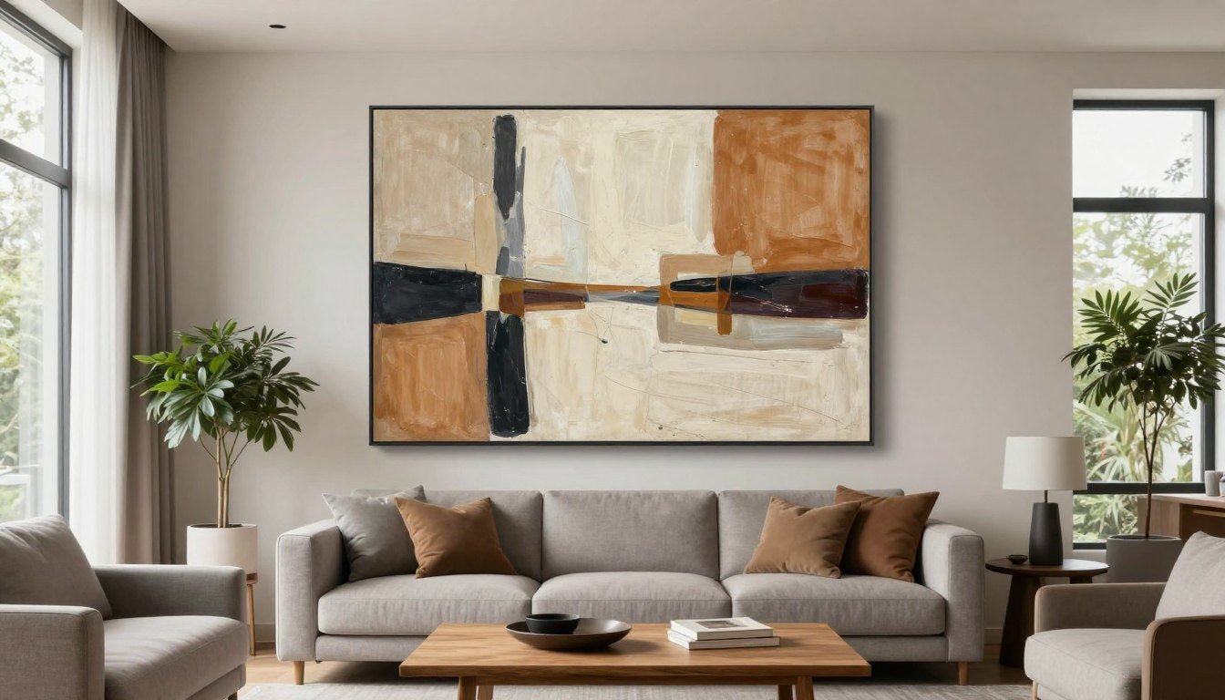
Your living room probably already has a focal point. Maybe it's a fireplace, a large window, or a media center. Artwork should enhance this natural focus rather than compete with it. Consider pieces from our Abstract Canvas Prints collection if you want bold statements that command attention without overwhelming.
Creating Emotional Atmosphere
Different art styles evoke distinct emotional responses. Landscape scenes bring calm and openness. Figurative portrait pieces add human connection and warmth. Geometric patterns inject energy and modern sophistication.
Think about how you want your living room to feel. If it's your primary gathering space for entertaining, you might choose conversation-starting pieces with bold colors or intriguing subjects. For a quiet retreat where you unwind, serene nature scenes or minimalist neutral abstracts create tranquility.

The beauty of made-to-order canvas prints lies in customization. You're not limited to whatever happens to be in stock at big-box stores. You can select pieces that genuinely speak to your aesthetic preferences and emotional needs.
Choosing the Right Size for Your Wall Space
Size selection intimidates many people more than any other aspect of choosing framed wall art for living room spaces. Get it wrong and the piece either disappears on the wall or overwhelms everything around it.

The golden rule states that artwork should occupy two-thirds to three-quarters of the furniture width below it. For a standard 7-foot sofa, look for pieces between 56 to 63 inches wide. This creates visual harmony without the art feeling cramped or lost.
Measuring Your Available Wall Space
Start with your actual wall dimensions. Measure the width of the wall or the furniture piece below where you plan to hang art. Then measure the vertical space from the top of your furniture to where the ceiling or architectural element begins.
Account for visual clearance. Leave 6 to 12 inches between the top of your sofa and the bottom of your artwork frame. This creates breathing room and prevents the piece from feeling squashed against furniture.

Ceiling height matters significantly. Standard 8-foot ceilings work well with medium-sized pieces between 24 to 36 inches tall. Higher ceilings in modern homes can accommodate oversized statement pieces reaching 48 inches or larger without overwhelming the space.
Single Statement Pieces vs. Multi-Panel Arrangements
A single large canvas creates bold impact with minimal effort. One stunning piece can anchor your entire living room wall design. This approach works particularly well in minimalist or contemporary spaces where simplicity reigns.
Multi-panel canvas print sets offer flexibility and visual rhythm. Triptychs spread across 60 to 80 inches of wall space create sophisticated gallery appeal. The space between panels adds dimension and allows each section to be appreciated individually while forming a cohesive whole.

Browse our Canvas Print Sets to see how multi-panel arrangements can transform longer walls or create balanced compositions in open-concept spaces.
Proportional Guidelines for Different Furniture
Above Sofas and Sectionals
Standard 7-foot sofa: 48-60 inch artwork width
Sectional or 9-foot sofa: 60-80 inch artwork width
Loveseat: 36-48 inch artwork width

Above Consoles and Accent Tables
Console table: Artwork 50-75% of console width
Sideboard: 60-80% of sideboard width
Narrow entryway table: 24-36 inch artwork width

Living Room Wall Art Style Guide
Your art style choice should reflect your personal aesthetic while complementing your existing decor. The wrong style clashes with your furniture and creates visual discord. The right style pulls everything together effortlessly.

Modern Abstract and Geometric Art
Abstract wall art brings contemporary sophistication to living room spaces. Bold brushstrokes, geometric shapes, and unexpected color combinations create focal points that spark conversation and inject personality.
This style works exceptionally well in modern, mid-century, or industrial interiors. The lack of representational imagery means abstract pieces won't date as trends change. A quality abstract canvas remains timeless for decades.

Minimalist neutral abstract pieces in beige, gold, and cream tones offer versatility. They provide visual interest without competing for attention, making them ideal for rooms where you want art present but not dominant.
Our Abstract Canvas Prints range from bold statement pieces to subtle minimalist designs, giving you options regardless of your confidence level with color.
Botanical and Nature-Inspired Prints
Botanical wall art brings the outdoors inside. Oversized leaf prints, floral close-ups, and landscape photography create organic warmth that softens modern spaces or enhances traditional rooms.

Nature scenes work universally across design styles. A serene forest landscape complements rustic farmhouse interiors. Tropical palm prints add resort-style freshness to contemporary spaces. Desert botanicals bring southwestern charm.
The calming effect of nature imagery makes botanical prints particularly suited for living rooms designed as relaxation spaces. Field studies show that even representations of nature reduce stress and improve mood.
Explore our Botanical Wall Art Prints for pieces that bring organic beauty without maintenance or watering concerns.

Black and White Photography and Line Art
Black and white wall art delivers sophisticated simplicity. Without color to distract, viewers focus on composition, contrast, and subject matter. This creates powerful visual statements with remarkable staying power.
Line art canvas prints work beautifully in minimalist spaces. Clean continuous lines create subjects ranging from faces to figures to abstract forms. The simplicity feels intentional rather than bare.

This style offers incredible versatility for room wall color schemes. Black and white art works with any wall color or furniture palette. You can completely redecorate around it without the art feeling out of place.
Consider pieces from our Line Art Canvas Prints or Black & White Canvas Prints collections for timeless pieces that transcend trends.
Statement Pieces and Pop Culture Art
Bold statement art announces personality immediately. Whether it's iconic pop art, movie legends, or vibrant cityscape photography, these pieces make rooms memorable.

Statement pieces work best as solo focal points. Don't compete with them by adding multiple attention-grabbing elements. Let one great piece command the space while keeping surrounding decor supportive rather than competitive.
Pop culture artwork adds personality and often serves as conversation starters. Music legends, cinema icons, or beloved characters make spaces feel personal and lived-in rather than showroom-perfect.
Placement and Hanging Techniques
Perfect art selection means nothing if placement feels off. Hanging height, spacing, and positioning dramatically affect how artwork integrates with your living room wall composition.

The 57-Inch Rule for Eye-Level Hanging
Professional galleries hang art with the center at 57 to 60 inches from the floor. This represents average eye level for most people and creates the most comfortable viewing experience.
Measure 57 inches up from your floor and mark lightly with pencil. This becomes the center point of your artwork, not the top and not the hanging hardware location. From this center mark, measure up half the height of your art piece to find where the top edge should sit.

The exception occurs when hanging above furniture. In these cases, maintain that 6 to 12-inch clearance between furniture top and art bottom, even if it pushes the piece slightly higher than the 57-inch standard.
Creating Balanced Arrangements
Balance doesn't mean symmetry. A large piece on one side of a room can be balanced by a grouping of smaller pieces or substantial furniture on the other side.
Visual weight determines balance. Dark colors, busy patterns, and large sizes carry more weight than light colors, simple designs, and small sizes. Distribute weight evenly across your room wall to avoid a lopsided feeling.
 📐 Not sure what size to choose? Use our free Wall Art Size Calculator → https://rossettiart.com/blogs/news/wall-art-size-calculator
 Spacing Guidelines for Multiple Pieces
When hanging multiple pieces together, maintain consistent spacing between frames. The standard gallery spacing falls between 2 to 4 inches between frames.
Tighter spacing creates a cohesive unit that reads as one large installation. Wider spacing allows each piece to maintain its individual presence while still relating to the group.
Horizontal Arrangements
- Align top edges for clean horizontal line
- Maintain equal spacing between all pieces
- Keep total width proportional to furniture below
- Use odd numbers (3 or 5) for visual interest

Grid Arrangements
- Works best with same-size frames
- Create perfect rows and columns
- Maintain equal spacing in all directions
- Ideal for 4, 6, or 9-piece collections

Hardware and Hanging Methods
Hand-stretched canvas on wood frames typically includes hanging hardware already attached. D-rings or sawtooth hangers come pre-installed, simplifying the hanging process.
For walls, picture hangers rated for your artwork weight provide the most secure hold. A 16x20 inch canvas typically weighs 2-4 pounds. A large 40x60 inch piece might reach 8-12 pounds. Check the weight rating on picture hangers before installing.

Wall anchors become necessary for drywall installations. Standard picture hangers work in studs, but anchors distribute weight across more wall surface when studs aren't conveniently located.
Consider professional installation for oversized pieces above 40 inches or arrangements involving multiple pieces. The investment ensures proper positioning and eliminates the frustration of multiple nail holes from trial-and-error hanging.
Frame Styles and Material Options
Frame selection affects the entire personality of your wall art. The right frame enhances the artwork and bridges it to your room decor. The wrong frame creates disconnect or cheapens an otherwise beautiful piece.

Gallery-Wrapped Canvas vs. Framed Prints
Gallery-wrapped canvas extends the image around the sides of the frame, creating a finished look that requires no additional framing. The artwork essentially becomes three-dimensional, with the image continuing around all four edges.
This frameless approach offers modern simplicity. Gallery-wrapped canvas feels contemporary and allows the art itself to take center stage without frame competition.

Traditional framed prints place the canvas or paper print behind glass within a frame. This creates a more formal presentation and offers glass protection, though gallery-quality canvas with UV-resistant printing rarely needs this extra barrier.
Wood Frame Options
Pine wood frames offer lightweight durability at accessible price points. The natural wood grain brings organic warmth without heavy visual weight. Pine takes stain beautifully, allowing for diverse finish options from natural blonde to deep espresso.

Oak floater frames create sophisticated gallery-style presentation. The frame appears to "float" around the canvas edge rather than overlapping it, creating shadow lines that add dimensional depth.
Oak's prominent grain pattern adds character and visual texture. The heavier density also provides sturdiness for larger pieces that need substantial support.

Stained and painted wood frames expand style possibilities endlessly. Black frames deliver modern drama. White frames brighten and airify spaces. Natural wood maintains organic warmth. Gold or silver leaf adds luxury.
Metal and Alternative Frame Materials
Metal frames suit contemporary and industrial spaces. Thin aluminum profiles create clean lines that barely interrupt the artwork. Brushed metal finishes add subtle texture without ornamental fussiness.

These frames work particularly well for black and white photography or minimalist wall art where simplicity is paramount. The frame becomes nearly invisible, allowing the image full focus.
Matching Frames to Interior Style
Modern & Contemporary
Clean lines and minimal ornamentation define modern frame choices.
- Thin black or white frames
- Gallery-wrapped canvas
- Brushed metal frames
- Floater frames with shadow gaps

Traditional & Classic
Ornate details and substantial frames suit traditional aesthetics.
- Wide decorative frames
- Gold or silver leaf finishes
- Rich wood tones like cherry or mahogany
- Matted prints with substantial borders

Rustic & Farmhouse
Natural materials and weathered finishes bring rustic charm.
- Reclaimed wood frames
- Distressed painted finishes
- Natural pine with visible grain
- Barnwood or driftwood textures

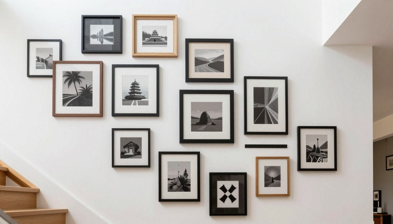
Creating Stunning Gallery Walls
Gallery walls transform blank living room wall space into curated collections that showcase personality and style. When executed well, they create visual impact impossible with single pieces alone.

Planning Your Gallery Wall Layout
Start by cutting paper templates matching your frame sizes. Tape these to the wall in various arrangements until you find a layout that feels balanced and intentional.
This paper template method eliminates guesswork and prevents unnecessary nail holes from rearranging. You can live with the paper version for days, adjusting until it feels perfect before committing to hardware.

Consider the overall shape your gallery wall creates. Rectangular arrangements suit walls above sofas. Organic salon-style groupings work beautifully on open walls without furniture below. Square or circular overall shapes create focal points on featured walls.
Mixing Frame Sizes and Orientations
Variety creates interest, but too much variety creates chaos. Limit yourself to 3-4 different frame sizes for cohesion. Mix horizontal and vertical orientations to create dynamic rhythm.

Place your largest piece slightly off-center as an anchor. Build around this focal point with medium and smaller pieces. This creates hierarchy that guides the eye through the composition.
Maintain relatively consistent spacing between all frames. The 2 to 4-inch spacing standard prevents pieces from feeling cramped while keeping the grouping cohesive.
Color and Theme Coordination
Unity matters more than matching. Your gallery wall pieces don't need identical subjects or styles, but they should share common threads.
Color provides the easiest unifying element. Choose pieces within a complementary color palette even if subjects vary. A gallery wall of botanical prints, abstract art, and line drawings can feel cohesive when colors coordinate.

Theme offers another unifying approach. All nature photography, all black and white pieces, or all minimalist abstracts create collections that feel intentional despite size and format variations.
Our curated Canvas Print Sets take the guesswork out of coordination. These pre-selected groupings ensure cohesion while offering variety.
Common Gallery Wall Mistakes to Avoid
Gallery Wall Best Practices
- Map layout with paper templates first
- Maintain consistent spacing between frames
- Choose 3-4 frame sizes maximum
- Unify with color palette or theme
- Place largest piece slightly off-center
- Keep overall shape intentional (rectangle, square, organic)
- Leave appropriate margins from ceiling and furniture
Common Gallery Wall Mistakes
- Hanging pieces too far apart (loses cohesion)
- Mixing too many frame styles (creates chaos)
- No unifying color or theme (feels random)
- Starting with nail holes instead of planning
- Hanging all pieces at same height (lacks rhythm)
- Overcrowding small walls (feels cluttered)
- Ignoring furniture scale below arrangement
Step-by-Step Gallery Wall Installation

Color Coordination and Visual Balance
Color creates emotional atmosphere and visual flow throughout your living room. The canvas art you choose either reinforces your color scheme or creates jarring disconnection.

Working with Existing Color Schemes
Your wall art should pull colors already present in your living room. Look at your largest furniture pieces, area rugs, and window treatments. These establish your base palette.
The 60-30-10 design rule applies to art selection too. Your dominant color appears in 60% of the room (usually walls and large furniture). Your secondary color covers 30% (often upholstery and window treatments). Accent colors fill the remaining 10%.

Choose artwork that incorporates all three color levels. A beige abstract canvas with gold accents and blue undertones ties together a room with cream walls, blue sofa, and gold accessories.
Creating Color Harmony
Complementary colors sit opposite each other on the color wheel. Blue and orange, purple and yellow, red and green create vibrant, energetic pairings perfect for statement pieces.
Analogous colors sit beside each other on the wheel. Blue, blue-green, and green create serene, cohesive palettes ideal for calming living spaces.

Monochromatic schemes use variations of a single color. Different shades, tints, and tones of blue create sophisticated, unified looks without overwhelming variation.
Neutral abstract pieces in beige, gold, and cream offer maximum versatility. These work with virtually any color scheme and allow you to update decor without replacing artwork.
Contrast and Visual Interest
Some contrast prevents monotony. An all-neutral room benefits from artwork introducing one accent color. An all-white space needs darker tones for grounding weight.

Value contrast matters as much as color contrast. Light rooms need some darker elements for depth. Dark rooms need light artwork to prevent cave-like heaviness.
Warm and cool color balance creates dimensional interest. Warm beige walls benefit from artwork with cool blue or green undertones. Cool gray spaces warm up with art featuring rust, gold, or terracotta accents.
Seasonal Color Flexibility
Artwork with neutral bases plus one accent color allows seasonal decor changes. A beige abstract with blue accents works year-round. Swap throw pillows and accessories from blue to coral for seasonal variety without replacing expensive canvas prints.

This approach maximizes your art investment. Gallery-quality pieces with UV-resistant archival inks maintain color accuracy for decades. Choose timeless palettes that transcend temporary trends.
Balancing Budget with Quality
Quality wall art represents an investment in your home's atmosphere and your daily environment. Understanding where to invest and where to save helps you build a collection that lasts.

What Quality Really Means in Canvas Prints
Gallery-quality canvas starts with the material itself. Professional-grade cotton-poly blends resist sagging and maintain tension for years. Cheap polyester canvas develops wrinkles and loses shape within months.
Archival inks matter enormously for longevity. Pigment-based inks maintain color accuracy for 100+ years when properly displayed. Dye-based inks fade noticeably within 2-3 years, especially in rooms with natural light.

UV-resistant coatings protect against sun damage. Living rooms typically receive substantial natural light through windows. Without UV protection, even quality inks deteriorate faster than expected.
Hand-stretched canvas over wood frames creates taut, professional presentation. Machine-stretched canvas often shows inconsistent tension, creating waves or loose spots that cheapen the overall appearance.
Investment Pieces vs. Trendy Decor
Invest in timeless pieces for primary spaces. Abstract art, classic landscapes, and sophisticated botanicals maintain relevance across decades and style evolution. These warrant higher quality materials and craftsmanship.
Trendy pieces serve different purposes. Pop culture art, highly saturated colors, or ultra-specific subjects may feel dated within 5 years. These work well as accent pieces you can replace without guilt as tastes change.

Your room wall focal point deserves investment-grade quality. This typically means the piece above your sofa or fireplace. Secondary walls can accommodate more budget-friendly options without diminishing overall impact.
Price vs. Value in Wall Art
The lowest price rarely represents the best value. A $50 canvas that fades within a year and requires replacement costs more over time than a $200 piece lasting decades.
Consider cost per year of enjoyment. A $300 investment piece providing 20+ years of beauty costs $15 annually. A $75 trendy piece lasting 3 years costs $25 annually. The premium option delivers better value.
Signs of Quality Worth Paying For
- Hand-stretched canvas with consistent tension
- Archival pigment-based inks specified
- UV-resistant coating for longevity
- Solid wood frame construction (pine or oak)
- Pre-installed hanging hardware
- Gallery-wrap with mirrored or extended image sides
- Made-to-order rather than mass-produced
- Clear information about materials and processes
Red Flags for Low Quality
- No information about ink or canvas type
- Suspiciously low prices for large sizes
- Mass-produced overseas drop-shipping
- Thin, flimsy canvas material
- No UV protection mentioned
- Staples visible from front on gallery-wrap
- Lightweight plastic or cardboard backing
- Blurry or pixelated image quality
Building Your Collection Over Time
You don't need to fill every wall immediately. Start with one statement piece for your main living room wall. Live with it for weeks or months before adding complementary pieces.
This gradual approach lets you discover what truly resonates. You might think you want all abstract art, then realize you crave botanical elements too. Starting slowly prevents costly mistakes.

Quality canvas prints from Rossetti Art offer made-to-order flexibility. Each piece is created when you order, printed with archival inks on hand-stretched canvas. This ensures you receive gallery-quality work rather than mass-produced inventory sitting in warehouses for months.
The investment in proper materials and processes shows immediately. Colors appear vibrant and accurate. Canvas tension remains taut without sagging. Frames feel substantial rather than flimsy. These tangible quality markers create daily enjoyment worth every dollar.
Frequently Asked Questions
Q: What size framed wall art works best above a standard sofa?
A: For a standard 7-foot sofa, choose artwork between 48-60 inches wide. The piece should occupy approximately two-thirds to three-quarters of the sofa width. Maintain 6-12 inches of clearance between the sofa top and the artwork bottom. For vertical dimensions, pieces between 24-36 inches tall work well with standard 8-foot ceilings. Larger sofas or sectionals can accommodate wider pieces up to 80 inches.
Q: How do I choose art colors that match my living room decor?
A: Start by identifying your existing color palette from furniture, rugs, and window treatments. Choose artwork that incorporates at least one of these existing colors to create visual cohesion. The 60-30-10 rule applies: your dominant room color should appear in 60% of the space, secondary color in 30%, and accent colors in 10%. Select art that bridges these color levels. Neutral abstract pieces in beige, gold, and cream offer maximum versatility and work with virtually any color scheme, allowing you to update decor without replacing artwork.
Q: What's the difference between gallery-wrapped canvas and framed prints?
A: Gallery-wrapped canvas extends the printed image around all four sides of the stretcher frame, creating a finished three-dimensional presentation that requires no additional framing. This modern approach allows the artwork edges to remain visible when hung. Framed prints place the canvas or paper behind glass within a separate frame structure. Gallery-wrapped options offer contemporary simplicity and eliminate frame costs, while traditional framing provides more formal presentation and glass protection. For living rooms, gallery-wrapped canvas with hand-stretched construction and archival inks provides durable, professional presentation without added framing expenses.
Q: How high should I hang wall art in my living room?
A: The professional gallery standard places the center of artwork at 57-60 inches from the floor, representing average eye level for most people. When hanging above furniture, prioritize the 6-12 inch clearance between furniture top and art bottom, which may push pieces slightly higher than the standard. For gallery walls with multiple pieces, align the visual center of the entire arrangement at 57-60 inches rather than each individual piece. This creates the most comfortable viewing experience and proper visual proportion within your room space.
Q: What makes canvas print quality worth the investment?
A: Quality canvas prints feature archival pigment-based inks that maintain color accuracy for 100+ years compared to cheap dye-based inks that fade within 2-3 years. Hand-stretched canvas over solid wood frames creates taut, professional presentation without sagging or wrinkles. UV-resistant coatings protect against sun damage in naturally lit living rooms. Professional-grade cotton-poly canvas blends resist deterioration far better than cheap polyester materials. Made-to-order production ensures you receive fresh prints with optimal color vibrancy rather than mass-produced inventory. These quality factors create artwork that enhances your space for decades rather than requiring replacement within months.
Q: Can I mix different art styles in one living room?
A: Yes, mixing styles creates visual interest and personality when unified by common elements. Coordinate pieces through color palette, frame style, or overall aesthetic mood rather than requiring identical subjects. A gallery wall might combine abstract art, botanical prints, and line drawings successfully if they share complementary colors. Limit yourself to 2-3 distinct styles to maintain cohesion rather than creating chaos. Place your primary style as the dominant element with secondary styles as supporting accents. The key is intentional curation rather than random collection. Mixed-style arrangements work particularly well in eclectic or transitional living rooms where flexibility suits the overall design approach.
Q: How do I create a gallery wall that looks professional?
A: Start by cutting paper templates matching your frame sizes and tape them to the wall in various arrangements until finding a balanced layout. This eliminates guesswork and prevents unnecessary nail holes. Maintain consistent 2-4 inch spacing between all frames for cohesion. Limit yourself to 3-4 different frame sizes maximum to prevent chaos. Place your largest piece slightly off-center as an anchor, then build around it with medium and smaller pieces. Unify the collection through coordinated color palette or theme even when mixing subjects and styles. The overall shape should feel intentional whether rectangular, square, or organic salon-style. Live with your paper template arrangement for 24-48 hours before committing to hardware installation.
Transform Your Living Space
The right framed wall art for living room spaces changes everything about how your home feels. It's the difference between a house and a space that truly represents who you are.
Start with pieces that speak to you personally. Trust your instincts on color and style while following the practical guidelines for sizing and placement. Your living room should reflect your aesthetic preferences, not generic showroom perfection.

Remember that quality materials make the difference between art that enhances your space for decades and prints that fade and disappoint within months. Archival inks, UV-resistant coatings, and hand-stretched canvas create lasting beauty worth the investment.
Discover Gallery-Quality Canvas Prints
Transform your living room with hand-stretched canvas prints featuring archival inks, UV-resistant protection, and expert craftsmanship. Each piece is made to order ensuring you receive vibrant, gallery-quality artwork designed to last for generations.
Your walls tell your story. Make sure they're telling the story you want.
Explore our Canvas Prints.

Leave a comment
This site is protected by hCaptcha and the hCaptcha Privacy Policy and Terms of Service apply.