
The design world moves in cycles. Right now, curves and retro 1960s styles are capturing hearts across America. Homeowners are embracing the optimism and comfort of an era that celebrated bold shapes and fearless color.
This isn't just nostalgia. It's a reaction to years of stark minimalism. People crave warmth and character in their homes. The flowing lines and playful patterns of the 60s offer exactly that.
In this guide, you'll discover why this vintage aesthetic resonates today. You'll learn practical ways to incorporate retro-inspired canvas art and curved furniture into your space. Whether you're redesigning one room or your entire home, these timeless design principles will help you create spaces that feel both fresh and familiar.
If You Love Curves and 1960s Vibes, Here Are 3 Prints That Bring That Retro Energy Into Your Space
These curated canvas prints capture the essence of mid-century modern design with bold colors, organic shapes, and timeless appeal.

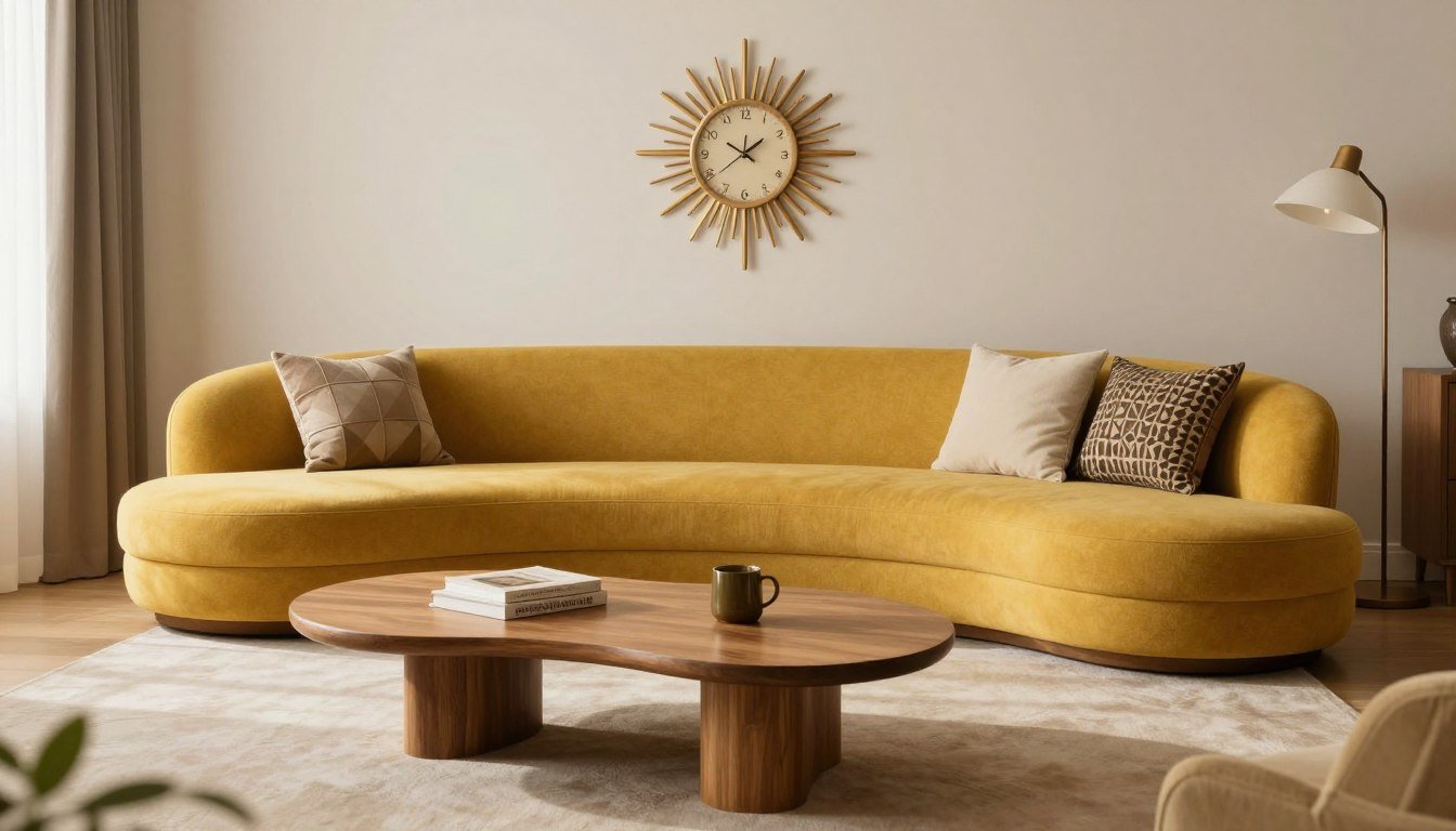
Abstract Geometric Curves
Bold shapes meet vintage color palettes in this stunning piece.


The Optimism of the 1960s Era That Still Resonates Today

The 1960s marked a turning point in home design. Technology was advancing rapidly. Space exploration captured imaginations. This optimism flowed directly into interior design choices that celebrated the future.
Designers embraced new materials like molded plastic and fiberglass. These innovations allowed for curved, organic shapes that were impossible before. The era moved away from the rigid formality of the 1950s.
Families wanted homes that reflected comfort and casual living. The formal parlor gave way to the family room. Open floor plans became popular. Design focused on bringing people together rather than keeping them apart.
Today's homeowners are drawn to this same optimistic spirit. After years of minimalist spaces that can feel cold, the warmth of 60s design offers welcome relief. The art and decor of this era reminds us that homes should feel joyful.
Why Curved Furniture and Organic Shapes Define This Style

Curves became the signature of 60s interior design for good reason. They represented a break from the straight lines and sharp angles that dominated earlier decades. This shift reflected changing attitudes about comfort and lifestyle.
The era's designers looked to nature for inspiration. Organic shapes mimicked forms found in plants, shells, and water. This biophilic approach created spaces that felt more human and less institutional.
Key Furniture Pieces That Showcase Curves
Several iconic furniture pieces from this era remain popular today. The egg chair wraps around the sitter in a protective embrace. Curved sofas create conversation areas that draw people together. Kidney-shaped coffee tables add visual interest without sharp corners.
Materials played a crucial role too. Molded plywood allowed for gentle curves in chairs and tables. Fiberglass enabled designers to create sculptural seating. Even glass got the curved treatment in bubble lamps and rounded lighting fixtures.
How Organic Shapes Impact Room Flow
Curved furniture changes how people move through a room. Sharp corners create barriers. Flowing lines guide movement naturally. This makes spaces feel larger and more welcoming.
The psychological impact matters too. Research shows that curved shapes reduce stress and create feelings of safety. This explains why people instinctively prefer rounded forms in their homes.
Bold Colors and Patterns That Defined the 1960s Interior

Color exploded in 60s homes. Orange, avocado green, and harvest gold dominated kitchens. Living rooms featured burnt orange, teal, and mustard yellow. These warm, earthy tones reflected the era's connection to nature.
Patterns were equally bold. Geometric shapes appeared everywhere—on wallpaper, fabrics, and rugs. Circles, starbursts, and abstract designs created visual energy. Unlike the subtle patterns of earlier decades, 60s designs demanded attention.
Popular Color Combinations From the Era
- Orange and teal for living spaces
- Avocado green with harvest gold in kitchens
- Brown and orange for warm, earthy feels
- White with bright accent colors for contrast
- Psychedelic combinations for bold statements
These color choices weren't random. They reflected the decade's experimental spirit. People wanted their homes to express personality and joy. Safe, neutral palettes felt too conservative for the times.
Pattern mixing was encouraged. A room might combine geometric wallpaper, floral curtains, and striped upholstery. This layering created depth and visual interest. The key was maintaining a consistent color palette to unify diverse patterns.
Space Age Design Elements in Modern Homes

The space race profoundly influenced 1960s interior design. As astronauts explored the cosmos, designers brought that futuristic vision into American homes. The result was an aesthetic that still fascinates today.
Materials and finishes mimicked spacecraft technology. Chrome and stainless steel appeared on furniture legs and fixtures. White plastic furniture suggested the clean, functional interiors of space capsules. Even lighting took on a cosmic quality with globe and sputnik chandeliers.
Key Space Age Design Features
Furniture shapes became more sculptural and futuristic. Pod chairs cocooned sitters in molded plastic shells. Hanging bubble chairs suspended from ceilings created floating seating areas. These pieces looked like they belonged in a science fiction film.
Technology integration was another hallmark. Built-in televisions and stereo systems became focal points. Control panels for lighting and heating suggested spaceship command centers. The home itself became a kind of personal spacecraft.
Color choices reinforced the space age theme. Metallic silver and white dominated. When color appeared, it was often in bold, primary hues. This palette created a clean, forward-looking aesthetic that contrasted sharply with traditional home decor.
Match This Vibe to Your Space
Ready to bring retro curves and 1960s style into your home? Explore our curated collections that capture this timeless aesthetic with modern quality.
Materials and Textures That Brought Comfort to 1960s Interiors

Material choices in the 1960s reflected both technological advances and a renewed appreciation for natural textures. This combination created interiors that felt modern yet warm and inviting.
Teak wood became the premium choice for furniture. Its rich, warm tones and beautiful grain patterns added organic character. Danish modern pieces in teak remain highly sought after today. The wood's durability meant these pieces could last generations.
Natural and Synthetic Materials Working Together
Designers mixed natural materials with new synthetics. Wool fabrics in rich textures covered furniture alongside sleek vinyl upholstery. This combination offered both comfort and easy maintenance—important for busy families.
Ceramics and pottery added handcrafted touches. Large floor vases and decorative bowls in earthy glazes brought artisanal quality to mass-produced interiors. These pieces often featured organic, asymmetrical shapes that complemented curved furniture.
Texture Layering in 60s Spaces
Texture layering was key to avoiding sterile spaces. Shag carpets provided tactile comfort underfoot. Nubby textured fabrics on sofas invited touch. Smooth glass and rough ceramic created contrast. Even walls got textural treatment with grasscloth or textured paint.
Natural fibers played important roles. Jute rugs added casual elegance. Rattan and wicker brought tropical flair. These materials connected indoor spaces to nature—a value that resonates strongly with today's homeowners.
How 1960s Lighting Design Creates Focal Points

Lighting transformed from purely functional to sculptural art in the 1960s. Fixtures became conversation pieces and design statements. This era proved that lighting could shape a room's entire character.
The arc lamp became an icon of the decade. Its sweeping curved arm brought light exactly where needed without table clutter. These floor lamps created intimate reading nooks or illuminated dining tables from unexpected angles.
Statement Lighting Fixtures
Pendant lights took on bold, playful forms. Globe pendants in colored glass created mood lighting. Sputnik chandeliers with multiple arms and bulbs referenced space age themes. These fixtures drew the eye upward and added vertical interest to rooms.
Materials expanded beyond traditional options. Plastic shades in bright colors became affordable and popular. Paper lanterns brought soft, diffused light. Metal mesh created dramatic shadow patterns. Each material offered different lighting qualities and visual effects.
Layered Lighting Approaches
Designers began using multiple light sources in single rooms. Table lamps, floor lamps, and overhead fixtures worked together. This layering let homeowners adjust ambiance for different activities and times of day.
Dimmer switches appeared more frequently. They gave people control over brightness levels. This technology supported the era's emphasis on comfort and personalization. Homes could shift from bright and energetic to soft and relaxing with a simple adjustment.
Transforming Your Living Room With Retro 1960s Style

The living room offers the perfect canvas for 60s-inspired design. This social space benefits from the era's emphasis on comfort and conversation. Start with furniture arrangement that encourages interaction rather than just TV viewing.
A curved sofa creates an inviting conversation area. Position it to face other seating rather than electronics. Add a low-profile coffee table—kidney-shaped if you're feeling authentic. These arrangements mirror the decade's focus on family and social connection.
Adding Retro Elements to Modern Spaces
You don't need to recreate a 1960s room completely. Strategic touches bring the vibe without overwhelming your space. Abstract geometric canvas prints add instant retro appeal. Choose pieces with curves and period-appropriate colors.
Accent furniture makes a strong impact. One iconic 60s chair—like an Eames lounge or egg chair—can anchor the entire aesthetic. Pair it with modern pieces for a curated, collected look rather than a museum recreation.
Color and Pattern Integration
Introduce vintage colors through textiles and accessories. Throw pillows in mustard, teal, and orange cost little but deliver big visual impact. A geometric area rug can tie the color scheme together while defining the seating area.
Wall art plays a crucial role. Large-scale pop art prints capture the era's bold spirit. Look for pieces with organic shapes, sunburst patterns, or abstract geometric designs. These become focal points that set the room's tone.
Bringing 1960s Character to Bedrooms and Dining Spaces

Bedrooms benefit from the 1960s emphasis on comfort and personal expression. This decade moved away from matching bedroom sets toward more individualized spaces. The result feels collected and personal rather than catalog-perfect.
Start with the bed as your focal point. A curved or upholstered headboard in a rich color like teal or burnt orange makes a statement. Pair it with simple, low-profile nightstands—preferably in warm wood tones. This combination balances boldness with restraint.
Creating Peaceful Retro Bedrooms
Lighting matters enormously in bedrooms. Ceramic table lamps with textured bases add both light and decorative interest. Consider an arc lamp for reading—it saves nightstand space while providing excellent task lighting. Dimmer switches let you control the mood.
Canvas art for bedrooms should feel calming yet interesting. Abstract pieces with organic curves work beautifully. Choose colors that complement your textiles—the art should tie the room together rather than compete for attention.
Dining Spaces With 60s Flair

Dining rooms embraced casual elegance in the 1960s. Formal dining gave way to comfortable spaces for everyday family meals. This shift influences how we approach dining spaces today.
The tulip table became an icon for good reason. Its single pedestal base and round or oval top create flow in the room. The smooth, sculptural form embodies 60s design principles. Modern reproductions offer this look at various price points.
Dining Room Lighting and Decor
A statement chandelier centers the dining space. Sputnik designs or globe cluster pendants capture the era perfectly. Hang it low enough to illuminate the table but high enough that it doesn't obstruct conversation or views.
Wall decor should be bold and graphic. Large-scale canvas prints for dining rooms create conversation starters. Choose pieces with movement and energy—abstract designs or pop art that energizes the space without overwhelming it.
The Psychology Behind 1960s Color Choices

Color choices in 60s interiors weren't accidental. They reflected psychological research about how hues affect mood and behavior. Designers used this knowledge to create spaces that felt welcoming and energizing.
Warm colors dominated because they encourage social interaction. Orange promotes enthusiasm and conversation. Yellow brings optimism and mental clarity. These colors made sense for family rooms and kitchens where people gathered.
How Different Colors Shape Room Atmosphere
Earthy tones like avocado green and harvest gold connected interiors to nature. This palette created grounding, comfortable feelings. Research shows these colors reduce stress and promote relaxation—exactly what homes should provide.
Teal and turquoise added refreshing contrast. These cooler tones balanced the warm palette while maintaining energy. They appeared in bathrooms and bedrooms where some calm was beneficial. The contrast between warm and cool created visual interest.
Modern Applications of 60s Color Theory
Today's designers are rediscovering these color principles. The current trend toward warmer, more saturated colors reflects this influence. Burnt orange, terracotta, and deep teal appear in contemporary interiors that nod to the 60s.
You can apply these principles without recreating vintage looks exactly. Use 60s-inspired colors in modern ways—perhaps one accent wall rather than entire rooms. Contemporary art pieces in these color families bridge past and present beautifully.
How to Mix Vintage and Modern Without Overwhelming Your Space

The key to successful retro integration is balance. Too much vintage creates a museum. Too little loses the character you're after. The goal is a space that feels collected over time rather than decorated in one shopping trip.
Follow the 80/20 rule as a starting point. Let 80% of your space remain contemporary, with 20% vintage or vintage-inspired pieces. This ratio prevents overwhelming the space while still establishing a clear aesthetic direction.
Choosing Your Retro Focus Points
Select one or two statement pieces as your vintage anchors. Perhaps a stunning arc lamp and a teak credenza. Build the rest of the room around these pieces. This focused approach creates cohesion rather than confusion.
Modern pieces should support your vintage stars. Choose contemporary furniture with clean lines that won't compete. Neutral modern pieces let retro elements shine. This also makes updating easier if your taste shifts over time.
Creating Visual Connections
Connect vintage and modern through color and shape. If your vintage chair features orange upholstery, add orange accents to modern pieces. Repeat curved shapes throughout the space. These visual connections create flow and intentionality.
Art bridges eras beautifully. Contemporary line art with organic curves echoes 60s forms in a modern medium. This approach lets you enjoy the vintage aesthetic while keeping spaces current and fresh.
Making a Retro First Impression in Your Entryway

Your entryway sets expectations for the entire home. A few well-chosen retro elements create immediate character and welcome. This space offers a perfect opportunity for bold statements without overwhelming commitment.
A curved console table provides both function and style. Look for pieces with organic shapes and warm wood tones. Top it with a ceramic bowl for keys and a vintage-inspired lamp. These functional items double as decorative elements.
Wall Treatments and Art for Entryways
Entryway walls are prime real estate for statement art. A large canvas print in bold geometric patterns creates instant impact. Choose colors that hint at your home's overall palette—this preview ties spaces together visually.
Mirrors deserve special consideration. A sunburst mirror captures the 60s spirit perfectly. Its radiating design draws eyes and reflects light, making small entries feel larger. Position it above your console for a classic pairing.
Lighting the Entryway
Pendant lighting makes a strong statement in entries with adequate ceiling height. A globe pendant or geometric fixture in brass or colored glass sets the tone immediately. For lower ceilings, a flush-mount fixture with retro styling works well.
Layer lighting with your console lamp. This creates welcoming warmth, especially important in entries without natural light. Dimmer switches let you adjust the welcome from bright and energetic to soft and intimate.
Affordable Ways to Add Curves and Retro Style Today

Embracing 60s style doesn't require a complete renovation or vintage shopping marathons. Small, strategic additions bring this aesthetic to life without breaking your budget. Start with accessories and textiles that pack visual punch.
Throw pillows offer the easiest, most affordable transformation. Look for geometric patterns, bold colors, and textured fabrics in vintage color palettes. Mix patterns confidently—the 60s embraced this approach. Six well-chosen pillows can completely shift a neutral sofa's vibe.
Budget-Friendly Decor Solutions
- Thrift vintage ceramic vases and bowls for instant character
- Find geometric area rugs that anchor spaces with retro patterns
- Add sunburst clocks as functional wall art
- Use orange, teal, or mustard throw blankets for color pops
- Display vintage-style bar carts for both function and aesthetic
Canvas art provides maximum impact for reasonable investment. Ready-to-hang prints eliminate framing costs while offering professional quality. Choose pieces that capture the era's spirit through color, pattern, or subject matter.
DIY Retro Updates
Paint transforms spaces affordably. One accent wall in burnt orange or teal creates dramatic impact. If commitment concerns you, start with a bathroom or powder room. These smaller spaces let you experiment boldly.
Swap hardware on existing furniture. Brass or wooden pulls with organic shapes update dressers and cabinets instantly. This minor change costs little but shifts the entire piece toward retro styling. It's also easily reversible if you change direction later.
Why Retro Design Supports Sustainable Living

The 1960s emphasis on quality construction aligns perfectly with today's sustainability values. Furniture built in this era often outlasts modern mass-produced pieces by decades. Investing in vintage or vintage-inspired quality reduces consumption and waste.
Solid wood construction dominated mid-century furniture. Teak, walnut, and rosewood pieces remain sturdy and beautiful after 60 years. Compare this to particle board furniture designed for disposal after a few years. The environmental math is clear.
Timeless Design Reduces Replacement
Trends come and go, but good design endures. The organic shapes and balanced proportions of 60s furniture look fresh today and will continue to do so. When you invest in timeless pieces, you're not constantly replacing items as trends shift.
This approach extends beyond furniture. Quality art pieces and home decor that resonate with you personally won't feel dated next season. Choosing meaningful pieces over trendy ones reduces the consume-and-dispose cycle.
Repair and Reupholster Rather Than Replace
Vintage furniture was built to be repaired. Solid construction allows for reupholstering, refinishing, and restoration. Modern pieces often can't be repaired economically. This reparability extends furniture life dramatically.
A worn vintage chair isn't trash—it's an opportunity. New fabric brings fresh life while maintaining the quality frame and springs. This approach costs less than buying new while creating something unique. It also keeps functional furniture out of landfills.
Common Mistakes When Incorporating 1960s Design

Enthusiasm for retro style can lead to overcrowding. The biggest mistake is turning your home into a 60s museum rather than a livable space. Remember that actual 60s homes mixed new pieces with existing furniture—they weren't instant period rooms.
Pattern overload creates visual chaos. While the 60s embraced bold patterns, successful rooms showed restraint. If your wallpaper is geometric, keep upholstery more subdued. If your sofa features bold fabric, choose simpler patterns elsewhere. Balance is key.
Scale and Proportion Issues
Modern homes differ from 60s houses in scale. Many vintage pieces designed for smaller rooms overwhelm or underwhelm in contemporary spaces. A low-profile sofa perfect for a 1960s ranch house might look lost in a room with 10-foot ceilings.
Consider your room's proportions when selecting pieces. In spaces with high ceilings, you may need to scale up from authentic vintage sizes. Conversely, large 60s statement pieces might overpower a small apartment. Measure carefully before committing.
Color Application Mistakes
Using too many bold colors creates confusion rather than character. Choose two or three main colors from the vintage palette and use them consistently. Add neutral elements to give the eye rest. All-vintage colors with no breathing room feels overwhelming.
Ignoring lighting is another common error. Colors look different under various lighting conditions. What seems perfect in afternoon sun might feel dark and muddy in evening artificial light. Test paint samples and fabric swatches under all lighting conditions before deciding.
Regional Variations in American 1960s Interior Design

The 1960s aesthetic varied across America, shaped by climate, culture, and regional building traditions. Understanding these differences helps you create authentic-feeling spaces suited to your location.
California embraced indoor-outdoor living more fully than other regions. Large sliding glass doors, patios, and poolside entertaining shaped design choices. Furniture materials had to withstand sun exposure. This led to extensive use of teak and weather-resistant fabrics.
West Coast Versus East Coast Approaches
West Coast homes featured lighter, brighter palettes. Natural light was abundant, so designers used it freely. Furniture sat lower to the ground. The overall aesthetic felt more casual and relaxed, reflecting the lifestyle.
East Coast interiors maintained more formality. While embracing curves and bold colors, they often mixed vintage elements more conservatively. Traditional architecture influenced how modern pieces were integrated. The result felt more curated and restrained.
Midwest and Southern Interpretations
Midwest homes adapted 60s design to more seasonal climates. Heavier fabrics and more substantial furniture reflected heating needs. Colors skewed slightly toward warmer tones that felt cozy during long winters.
Southern homes maintained some traditional elements even when adopting modern styles. Wicker and rattan suited humid climates. Ceiling fans remained functional necessities. The 60s aesthetic here felt softer and more accommodating to existing architectural details.
Ready-to-Hang, Museum-Quality Canvas
Transform your space with professionally curated retro-inspired art. Each piece arrives ready to display, with free worldwide shipping. No framing required, no hassle—just instant style.
Expert Tips for Successfully Integrating Curves and Retro Elements

Professional designers share several strategies for incorporating 60s elements without creating dated spaces. These approaches help you capture the era's spirit while maintaining contemporary relevance.
Start with one room rather than tackling your entire home. Master the aesthetic in a single space before expanding. This focused approach lets you experiment and refine your vision. It also spreads costs over time.
Establishing Your Vision
Create a mood board before shopping. Collect images of rooms that resonate with you. Look for common threads in colors, shapes, and furniture styles. This visual reference prevents impulse purchases that don't serve your overall vision.
Consider which 60s elements speak most strongly to you. Do you love bold colors but prefer modern furniture? Or are vintage furniture shapes your passion while colors remain neutral? Identifying your priorities guides decisions and creates a cohesive result.
Shopping Strategies That Work
Mix sources for the best results. New reproductions offer consistency and warranties. Vintage pieces provide authentic character. Contemporary art and decor in retro styles bridge old and new beautifully.
Measure everything before buying. Vintage furniture often ran smaller than modern pieces. Doors, hallways, and stairways in older homes may not accommodate large pieces. Avoid the disappointment and expense of returns by verifying dimensions first.
Living With Retro Style Long-Term
Quality over quantity prevents buyer's remorse. One perfect vintage lamp brings more satisfaction than three mediocre ones. Investment pieces you truly love stand the test of time, both physically and aesthetically.
Allow your space to evolve. You don't need to complete everything immediately. Living with spaces as they develop helps you understand what's working and what's missing. This patience leads to better decisions and more personal results.
The Future of Curves and Retro Design in Modern Homes

Current trends suggest that curves and retro influences will strengthen rather than fade. Designers are finding new ways to reinterpret 60s principles for contemporary living. This isn't mere nostalgia—it's evolution.
Technology enables more affordable curved furniture production. What required expensive molds in the 1960s can now be created with computer-aided manufacturing. This democratization means more people can access these design elements.
Emerging Interpretations of Classic Elements
Contemporary designers are abstracting 60s principles rather than copying them directly. You'll see gentle curves in modern furniture that echo the era without mimicking specific pieces. Color palettes draw from vintage hues but in fresh combinations.
Sustainability concerns align perfectly with vintage design appreciation. As more people reject disposable furniture, quality 60s pieces gain value. This practical consideration reinforces aesthetic preferences, creating a powerful market force.
Technology Meets Retro Aesthetics
Smart home technology integrates into retro-styled interiors. Voice assistants hide in vintage-style housings. Modern televisions mount in rooms filled with 60s furniture. The challenge is balancing these elements—a challenge designers increasingly master.
Lighting technology offers particular opportunities. LED bulbs in vintage fixtures provide energy efficiency without sacrificing aesthetics. Smart dimming systems give the control 60s designers dreamed about. Form and function unite more successfully than ever.
Bringing Curves and Retro Style Into Your Home Today

The comeback of curves and 1960s design reflects our collective desire for warmth and character in our homes. After years of cold minimalism, people crave spaces that feel human and welcoming. The organic shapes and bold personality of 60s design deliver exactly that.
You don't need to recreate a vintage home to enjoy this aesthetic. Strategic touches—a curved chair, retro-inspired art, bold accent colors—bring the spirit without overwhelming your space. The key is intention and balance.
Start small with accessories and art. Add furniture pieces as you find ones that truly resonate. Let your space evolve organically rather than forcing a complete transformation overnight. The most successful rooms feel collected over time.
The beauty of this design movement is its flexibility. Whether you prefer subtle nods to the era or bold embraces of vintage style, there's room for your interpretation. Make it personal, make it functional, and make it yours.
Frequently Asked Questions About Curves and Retro 1960s Interior Design
Why are curves and retro 1960s styles making a comeback in interior design?
Curves and 1960s styles are returning because people seek warmth and character after years of stark minimalism. The organic shapes and bold colors of this era create inviting, human-centered spaces. The emphasis on comfort, quality craftsmanship, and timeless design aligns with current values around sustainability and meaningful home environments. Additionally, the optimistic spirit of 60s design offers psychological comfort during uncertain times.
What are the key elements of 1960s interior design style?
Key elements include curved organic furniture shapes, bold color palettes (orange, teal, mustard yellow), geometric patterns, natural materials like teak wood, space age influences, sculptural lighting fixtures, and an emphasis on casual comfort. The style balances modernism with warmth, incorporating both natural textures and synthetic materials. Open floor plans and family-friendly spaces also characterize the era.
How can I add retro 1960s style without making my home look dated?
Follow the 80/20 rule—keep 80% contemporary with 20% vintage or vintage-inspired pieces. Choose one or two statement pieces as focal points rather than filling rooms entirely with period furniture. Use retro colors in modern ways through contemporary art and accessories. Mix eras intentionally, connecting them through repeated colors, shapes, or materials. Focus on timeless design principles rather than exact period recreation.
What colors are most associated with 1960s interior design?
Signature 1960s colors include burnt orange, teal, mustard yellow, avocado green, harvest gold, and various shades of brown. These warm, earthy tones often combined with white for contrast. Bold color combinations like orange with teal or brown with mustard yellow created energetic spaces. Psychedelic influences later in the decade brought more vibrant, unexpected color pairings.
Where can I find affordable retro-inspired furniture and decor?
Start with throw pillows, rugs, and lighting from home decor retailers offering mid-century modern reproductions. Thrift stores and estate sales often yield authentic vintage pieces at reasonable prices. Online marketplaces provide access to both vintage and new retro-styled items. For wall art, ready-to-hang canvas prints offer museum-quality options without custom framing costs. Focus on a few quality pieces rather than filling every space immediately.
Can curves and 1960s style work in small spaces?
Absolutely. Curved furniture actually works well in small spaces because flowing lines improve traffic flow better than sharp corners. Choose appropriately scaled pieces—compact curved chairs, small-scale organic tables, and vertical storage. Use bold colors strategically through accessories and art rather than large furniture pieces. Mirrors and good lighting, both hallmarks of 60s design, make small spaces feel larger.
What's the difference between mid-century modern and 1960s design?
Mid-century modern spans roughly 1945-1969, so 1960s design is technically part of it. However, 1960s design specifically emphasizes bolder colors, more organic curves, space age influences, and greater comfort focus compared to the cleaner lines of 1950s mid-century modern. The 60s brought more experimental forms, psychedelic patterns, and casual living emphasis. Think of 60s design as mid-century modern's more playful, colorful evolution.
How do I incorporate curved furniture into a modern home?
Start with one statement curved piece like a sofa or chair as your focal point. Pair it with simpler, modern pieces that won't compete visually. Use curved shapes in smaller items—round mirrors, kidney-shaped side tables, arched floor lamps—to echo the main piece. Balance curves with some straight lines to prevent the space from feeling too soft. Consider traffic flow when placing curved furniture, as these pieces naturally guide movement through rooms.
What type of art best complements 1960s interior design?
Abstract geometric art, pop art, and pieces featuring organic shapes work beautifully. Look for bold colors, graphic patterns, and dynamic compositions. Line art with flowing curves echoes furniture shapes while remaining contemporary. Large-scale pieces make strong statements characteristic of the era. Black and white photography from the period also complements retro interiors. Choose art that includes colors from your vintage palette to create cohesion.
Are 1960s design elements suitable for every room in the house?
Yes, but adapt the approach to each room's function. Living rooms accommodate bold statements beautifully. Bedrooms benefit from softer interpretations with calming colors and gentle curves. Kitchens can embrace vintage colors through accessories and art while maintaining modern functionality. Entryways are perfect for making strong first impressions with retro pieces. Scale your approach to each space's size and purpose.
Leave a comment
This site is protected by hCaptcha and the hCaptcha Privacy Policy and Terms of Service apply.