
The art of using warm colors in interior design transcends mere decoration—it's about crafting an emotional experience within your living space. When skillfully implemented, warm tones create environments that feel simultaneously inviting and sophisticated, wrapping inhabitants in a sensory embrace that's both comforting and visually stimulating. This comprehensive guide will walk you through the nuances of warm color palettes, from understanding undertones to room-specific applications, helping you create spaces that radiate intentional warmth rather than dated "Tuscan kitchen" vibes.
Quick Answers (TL;DR)
- Warm colors include reds, oranges, yellows, and earthy neutrals that create cozy, intimate spaces
- Always identify the undertone (yellow, red, orange, or pink-brown) before selecting warm colors
- Balance warm colors with contrasting elements (black, navy, deep green) to avoid an overwhelming "orange" effect
- Layer different textures (linen, wood, brass) to enhance warmth without relying solely on color
- Use wall art strategically to bridge different warm elements in your palette
- Warm colors work best in spaces where you want to encourage conversation or relaxation
- Test colors in your actual space—lighting dramatically affects how warm colors appear
What Are Warm Colors (and Why They Change How a Room Feels)?

Warm colors occupy the red, orange, and yellow segments of the color wheel, along with their various tints, shades, and combinations. These hues visually advance in space, making them appear closer to the viewer—a quality that can transform the perceived dimensions of a room. Unlike cool colors (blues, greens, purples) that recede and create a sense of expansiveness, warm colors envelop a space, making even large rooms feel more intimate and embracing.
Warm vs. Cool: The Fundamental Distinction
The distinction between warm and cool colors isn't merely theoretical—it's rooted in how we perceive and respond to these hues psychologically. Warm colors evoke associations with sunlight, fire, and earth, triggering responses that can range from energizing (vibrant reds and oranges) to nurturing (terracottas and ambers). This stands in contrast to cool colors, which evoke water, sky, and distance, creating sensations of calm and spaciousness.
Understanding Undertones: The Key to Cohesive Warm Palettes
Perhaps the most crucial aspect of working with warm colors is understanding undertones. Even within the warm spectrum, colors can lean toward different undertones—yellow, red, orange, or pink-brown. This explains why two seemingly similar "beige" paints can look jarringly different when placed side by side; one might have yellow undertones while the other leans pink.
The secret to sophisticated warm interiors lies not in avoiding warm colors altogether, but in understanding how to select and combine them with intention and restraint.
Identifying undertones requires comparing colors side by side rather than viewing them in isolation. When you place a warm white with yellow undertones next to one with red undertones, the difference becomes immediately apparent. This comparison approach is essential for creating cohesive palettes that feel intentional rather than haphazard.
The 5 Rules for Using Warm Colors Beautifully
Choose Undertone First (Yellow vs. Red Warmth)

Before selecting any warm color, determine whether you want a yellow-based or red-based palette. Yellow-based warmth creates sunny, golden environments that feel bright and energetic. Red-based warmth produces spaces that feel rich, grounded, and sometimes more formal. Committing to one undertone direction creates a more sophisticated result than mixing both approaches.
Use Contrast to Avoid "All-Orange"
The most common mistake with warm colors is creating spaces that feel overwhelmingly "orange" or one-dimensional. Introduce contrasting elements—deep navy, forest green, charcoal, or black—to create visual breaks and add sophistication. These contrasting elements can appear in furniture, artwork, or architectural details, providing necessary visual relief from the warmth.
Balance Saturation (Muted + Accent)
A successful warm palette balances saturation levels. Use more muted, sophisticated warm tones (sand, camel, terracotta) for larger surfaces like walls, then introduce more saturated warm accents (rust, ochre, amber) in smaller doses through accessories, artwork, or a single furniture piece. This approach creates depth while avoiding an overwhelming effect.
Repeat Tones in 3 Places (Fabric, Rug, Art)
For a cohesive look, repeat each key warm tone in at least three places throughout the room. This could mean echoing a terracotta shade in a throw pillow, a ceramic vase, and within a piece of abstract & geometric canvas prints. This repetition creates rhythm and intentionality, making the color scheme feel deliberate rather than accidental.
Let Texture Do Half the Work

Texture is the secret weapon in sophisticated warm interiors. Natural materials like linen, wool, rattan, and various wood tones inherently convey warmth without relying solely on color. Combining different textures—smooth with rough, matte with glossy—creates visual interest and depth that elevates warm palettes beyond the ordinary.
Warm Color Palette Library
| Palette Name | Warm Undertone | Best Rooms | Best Pairings | Materials That Elevate | Artwork Tip |
| Terracotta + Cream | Red-orange | Living room, Dining room | Navy blue, Olive green | Natural linen, Terracotta pottery, Oak | Abstract pieces with earthy tones (bestselling pieces with terracotta accents) |
| Camel + Black | Yellow-brown | Office, Entry, Living room | Charcoal, Forest green | Leather, Brass, Walnut | Geometric prints with high contrast |
| Rust + Sage | Red-brown | Bedroom, Living room | Sage green, Slate blue | Velvet, Copper, Maple | Landscape-inspired canvas print art with rust accents |
| Warm White + Wood | Yellow-white | Kitchen, Bedroom, Office | Charcoal, Indigo | White oak, Rattan, Linen | Minimalist pieces with natural frames |
| Ochre + Navy | Yellow-gold | Living room, Dining room | Navy blue, Charcoal | Brass, Velvet, Walnut | Canvas print sets with gold/navy contrast |
| Blush + Walnut | Pink-brown | Bedroom, Office | Emerald green, Charcoal | Walnut, Brass, Bouclé | Soft abstract pieces with blush tones |
How to Build a Warm Palette That Still Feels Modern
- Start with a warm neutral base (not pure white)
- Choose ONE dominant warm tone + ONE supporting warm
- Add contrast (black, deep green, navy, charcoal) so it doesn't look orange
- Balance saturation (muted walls, richer accents)
- Repeat the same undertone across fabrics/wood
- Use texture (linen, boucle, oak, rattan) to make warmth feel refined
- Use artwork to bridge colors (pull 2–3 tones from the palette)
- Check lighting (warm bulbs vs daylight; test samples)
Room-by-Room: Where Warm Colors Work Best
Living Room: Cozy Social Warmth + Grounding Contrast

Living rooms benefit tremendously from warm colors, which naturally encourage conversation and relaxation. Consider camel, terracotta, or warm beige for larger elements like sofas and walls, then add depth with rust or ochre accents. Balance is crucial—incorporate contrasting elements like navy pillows, a black coffee table, or deep green accents to prevent the space from feeling one-dimensional.
Artwork plays a pivotal role in living rooms, where it can serve as a bridge between different warm elements. Consider abstract & geometric canvas prints that incorporate your key warm tones while adding visual interest and sophistication.
Bedroom: Soft Warm Neutrals + Calm Accent Tones
Bedrooms call for a more subdued approach to warmth. Soft warm neutrals like ivory, camel, or blush create restful environments that still feel embracing. Layer in textural elements—linen bedding, a bouclé chair, a woven bench—to enhance the sense of comfort without overwhelming the senses.
For bedrooms, consider artwork with a calming presence that still incorporates warm tones. Abstract pieces with soft blends of warm neutrals can create a serene focal point that enhances sleep quality while maintaining the warm palette.
Dining Room: Warm Drama + Evening Lighting

Dining rooms present an opportunity for more dramatic expressions of warmth. Deeper tones like rust, burgundy, or ochre create memorable environments for entertaining, especially under evening lighting. Consider these richer hues for walls or statement furniture pieces, balanced with neutral elements to maintain sophistication.
Since dining rooms are often used in evening hours, consider how your warm colors will appear under artificial lighting. Warm-toned bulbs will enhance the cozy effect, while cooler lighting can shift how the colors are perceived.
Kitchen: Warm Whites + Wood + Stone
In kitchens, warm whites paired with natural materials create inviting spaces that don't feel overly trendy. Consider cream or ivory cabinetry rather than stark white, then introduce warmth through wood tones in flooring, open shelving, or a statement island. Stone elements with warm veining (quartzite, marble with gold veining) further enhance the palette.
For kitchen spaces, consider smaller artwork pieces or a canvas print set that can be displayed on open shelving or a small wall area, bringing personality while reinforcing the warm palette.
Entry/Hallway: Instant Welcome (Warm Neutrals + One Statement)
Entryways benefit from warm colors that create an immediate sense of welcome. A warm neutral backdrop with one statement element—perhaps a rust bench, amber-toned artwork, or a richly colored runner—sets the tone for the home while remaining versatile.
Since entries often have limited wall space, a single impactful piece of art can make a significant difference. Look for pieces that incorporate your home's key warm tones to create cohesion with adjacent spaces.
Home Office: Energizing but Not Distracting

For home offices, warm colors can enhance focus and creativity without becoming distracting. Consider camel, warm gray, or soft terracotta for walls, paired with grounding elements in charcoal or navy. This combination creates an environment that feels simultaneously energizing and professional.
Artwork in a home office should complement the function of the space. Consider pieces with some structure or geometry that incorporate your warm palette without introducing elements that might distract from work.
Warm Neutrals vs Bold Warm Colors (How to Choose)
Warm Neutrals
Warm neutrals—ivory, cream, sand, camel, taupe—provide versatile foundations for any interior. These subtle hues create sophisticated backdrops that don't overwhelm the senses while still conveying warmth. They're ideal for:
- Larger surfaces like walls and substantial furniture
- Spaces where you want longevity in your design
- Rooms where you'll introduce warmth through textures and materials
- Creating a gallery-like setting for artwork
The key to successful warm neutrals lies in their undertones—ensure they're consistent throughout the space to avoid clashing (for example, don't mix yellow-beige with pink-beige).
Bold Warm Colors
Bolder warm colors—terracotta, rust, ochre, coral—make more definitive statements in a space. These richer hues create memorable environments with distinct personality. They work best as:
- Accent walls or architectural features
- Statement furniture pieces (a rust sofa, an ochre chair)
- Concentrated areas in otherwise neutral rooms
- Seasonal elements that can be changed out
When using bolder warm colors, balance is essential—pair them with plenty of neutrals and contrasting elements to prevent them from overwhelming the space.

The choice between warm neutrals and bolder warm colors often depends on your comfort level with color commitment. Warm neutrals offer longevity and versatility, while bolder warm colors create more distinctive environments that might require more confidence (or a greater willingness to repaint when tastes change).
Using Wall Art to Tie a Warm Interior Together
Wall art serves as the perfect bridge between different elements in a warm color palette. A thoughtfully selected piece can unite disparate warm tones, introduce complementary colors, and elevate the overall sophistication of the space. Consider these approaches:

Abstract Pieces That Echo Terracotta/Camel Tones
Abstract art with warm earth tones creates visual continuity in spaces with terracotta, rust, or camel elements. Look for pieces that incorporate your primary warm colors while adding depth through variations in tone and texture. Bestselling pieces often feature these versatile warm palettes that complement a wide range of interiors.
Multi-Panel Sets to Stretch a Warm Palette
For larger walls, canvas print sets can distribute warm tones across the space, creating rhythm and balance. These sets work particularly well when they incorporate both your primary warm colors and your contrasting elements, creating a visual summary of the room's palette.
Landscapes With Warm Light Elements
Landscape-inspired pieces that capture golden hour light or autumn scenes naturally incorporate warm tones in a context that feels organic rather than forced. These pieces can bring a sense of the outdoors inside while reinforcing your warm color scheme.
When selecting art for warm interiors, pay attention to framing as well—warm-toned frames in gold, brass, or warm wood enhance the cohesion with your overall palette. Consider browse our canvas print collections for pieces that complement your specific warm color scheme.
Common Mistakes (and How to Fix Them)
Too Much Orange with No Contrast
Perhaps the most common mistake with warm colors is creating spaces that feel overwhelmingly "orange" due to lack of contrast. This often happens when every element—walls, furniture, accessories—falls within the same warm family with no visual breaks.
The fix: Introduce contrasting elements in cool tones (navy, forest green) or neutrals (black, charcoal) to create necessary visual relief. Even small contrasting elements—black picture frames, navy pillows, or dark metal accents—can make a significant difference.
Mixing Warm Undertones That Fight
Another frequent error is combining warm colors with conflicting undertones—for example, pairing pink-beige with yellow-beige or terracotta with coral. These combinations create subtle discord that feels "off" even if you can't immediately identify why.
The fix: Commit to one undertone direction (yellow-based or red-based) for your primary warm elements. If you're unsure about undertones, place samples side by side in natural light to reveal their true leanings.
Ignoring Lighting Temperature
Warm colors appear dramatically different under various lighting conditions. A terracotta that looks sophisticated in natural light might appear muddy under cool LED bulbs, or a subtle warm white might look jarringly yellow under warm lighting.
The fix: Test colors in your actual space under both natural and artificial lighting. Consider the color temperature of your bulbs (measured in Kelvins)—lower temperatures (2700K-3000K) enhance warmth, while higher temperatures (3500K+) cool colors down.
Choosing Art That Introduces a Clashing Undertone
Artwork can inadvertently introduce undertones that clash with your established palette. For example, a piece with strong pink-red elements might fight with a yellow-based warm scheme in the rest of the room.
The fix: Select artwork that either complements your existing undertones or serves as an intentional contrast piece. When in doubt, look for pieces that incorporate multiple tones from your palette to create cohesion.
Frequently Asked Questions
What are warm colors in interior design?
Warm colors in interior design include reds, oranges, yellows, and their derivatives (rust, terracotta, amber, gold), as well as warm neutrals like beige, cream, and certain browns. These colors visually advance in space, making rooms feel more intimate and cozy. They're associated with sunlight, fire, and earth elements, creating environments that feel embracing and energetic.
Are warm colors good for small rooms?
While conventional wisdom suggests using cool colors to make small spaces feel larger, warm colors can work beautifully in small rooms when you want to create intimacy. The key is using them strategically—consider warm colors for a feature wall or through accessories rather than all surfaces. Lighter warm tones (cream, sand, soft terracotta) are more space-friendly than deeper ones (burgundy, rust). Balance is crucial—incorporate some contrasting elements to prevent the space from feeling closed-in.
How do I make warm colors feel modern, not dated?
To create modern-feeling warm interiors, focus on clean lines, thoughtful contrast, and careful editing. Avoid the "Tuscan kitchen" trap by steering clear of yellow-orange combinations, faux finishes, and overly ornate details. Instead, pair warm colors with contemporary furniture silhouettes, incorporate black or charcoal accents for edge, and maintain plenty of negative space. Modern warm interiors often feature a more limited color palette with variations in texture rather than multiple competing warm hues.
What colors balance warm tones best?
The most effective balancers for warm colors are deep, cool tones that provide contrast without fighting for attention. Navy blue, forest green, charcoal, and black all work exceptionally well. For more subtle balance, consider cool grays with blue undertones or even certain purples (like eggplant). These contrasting elements create visual breaks that prevent warm colors from becoming overwhelming while adding sophistication to the palette.
What wall art works with warm neutrals?
Warm neutrals create versatile backgrounds for nearly any art style, but particularly complement pieces with organic elements, textural qualities, or warm accents. Abstract pieces that incorporate your room's warm neutrals plus one or two additional tones create cohesion while adding interest. Landscapes with warm light, botanical prints with amber or rust elements, or black and white photography in warm-toned frames all pair beautifully with warm neutral backgrounds.
How do lighting bulbs affect warm paint?
Lighting dramatically affects how warm colors appear. Bulbs with lower color temperatures (2700K-3000K) enhance warmth, making colors appear more yellow/orange. Higher temperature bulbs (3500K+) cool colors down, potentially making warm tones appear more muted or even slightly gray. Natural light changes throughout the day—morning and evening light enhances warmth, while midday light reveals colors more accurately. Always test paint colors under all lighting conditions in your actual space before committing.
Can I mix warm and cool colors in one room?
Yes, mixing warm and cool colors creates dynamic, balanced interiors when done thoughtfully. The key is establishing a clear dominant temperature (either primarily warm with cool accents or vice versa) rather than an equal split that can feel chaotic. Consider the 80/20 rule—use 80% of one temperature family and 20% of the other for a harmonious result. Cool blues and greens can beautifully complement warm terracottas and ambers when they share similar saturation levels.
What's the best warm color palette for a bedroom?
Bedrooms benefit from warm colors that feel simultaneously soothing and embracing. Consider soft, muted warm tones like blush, camel, ivory, or warm gray for walls and larger elements. These create restful environments without the stimulation of brighter warm hues. Add depth through textural elements in similar tones—linen bedding, a bouclé chair, a woven jute rug. For contrast, incorporate small amounts of deeper warm tones (amber, terracotta) or grounding cool elements (navy, charcoal) through accessories and artwork.
Where to Find Art That Complements Warm Interiors

The perfect piece of art can be the finishing touch that elevates a warm-toned interior from pleasant to extraordinary. When searching for artwork that complements warm color schemes, look for pieces that either reinforce your existing palette or introduce thoughtful contrast that enhances the overall composition.
Rossetti Art offers our full art collection with numerous options that pair beautifully with warm interior palettes. From abstract pieces that echo terracotta and amber tones to landscape-inspired works that capture the golden quality of natural light, these carefully curated selections can serve as the bridge that unifies your warm color scheme.
Ready to complete your warm-toned interior?
Discover artwork that perfectly complements your warm color palette and elevates your space.
Explore Rossetti Art Collections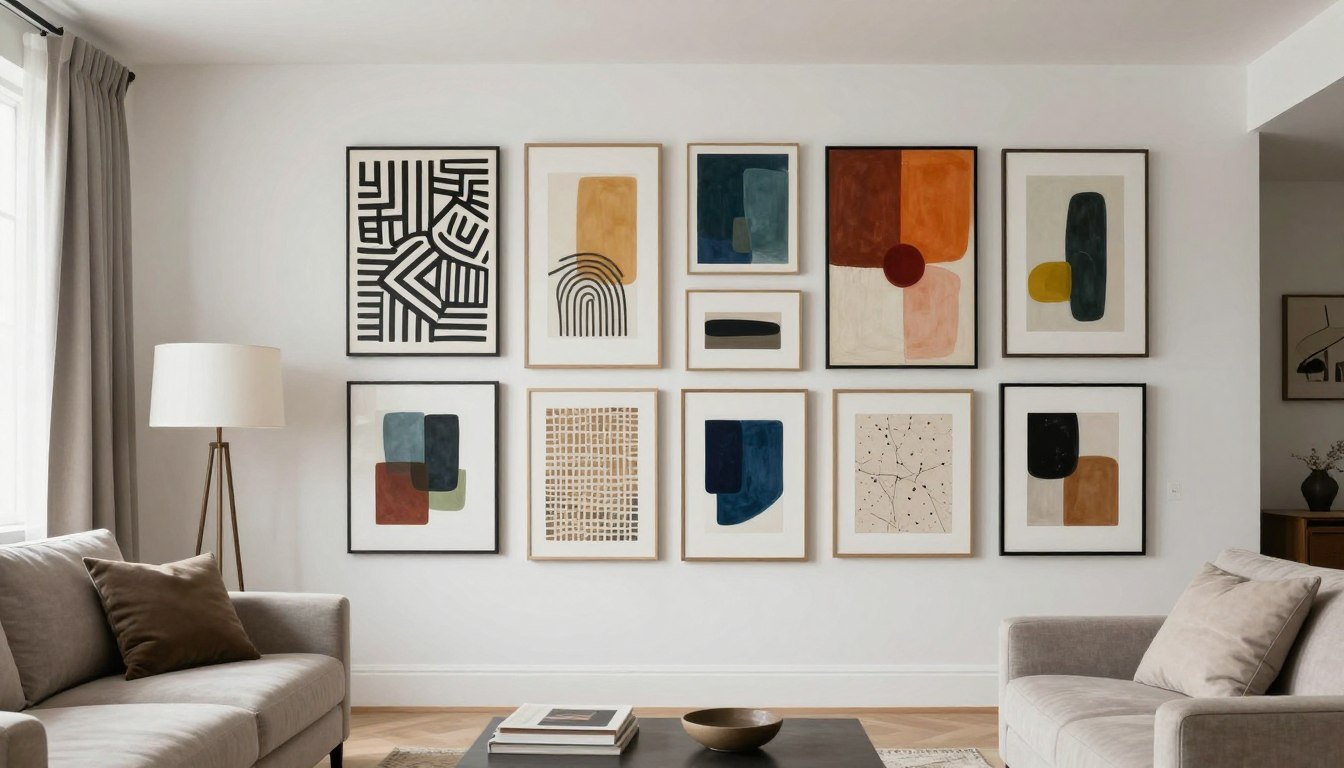
Leave a comment
This site is protected by hCaptcha and the hCaptcha Privacy Policy and Terms of Service apply.