
Abstract art captivates with its ability to evoke emotion through non-representational forms, colors, and compositions. Unlike traditional art that depicts recognizable subjects, abstract art samples use visual elements to create works that may exist independently from visual references in the physical world. Whether you're drawn to bold geometric patterns, subtle textural pieces, or expressive color fields, understanding abstract art samples can help you select pieces that transform your living spaces.
TL;DR: Finding Your Perfect Abstract Art
- Abstract art uses shapes, colors, and forms rather than realistic depictions to create visual impact
- Choose abstract art based on your room's purpose, desired mood, and existing color palette
- Consider scale carefully—larger pieces create drama, while smaller works add subtle interest
- Geometric abstracts work well in modern spaces; textured neutrals complement organic interiors
- Abstract art should be positioned at eye level, with proper lighting to highlight textures and colors
- Contrast is key—select pieces that complement but don't perfectly match your interior design

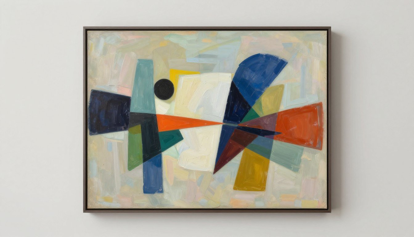
Abstract art samples can transform any space with their unique visual language and emotional impact
What Counts as an "Abstract Art Sample" (and What to Look For)
Abstract art samples encompass a wide range of styles and approaches, but they all share a fundamental characteristic: they don't attempt to represent accurate depictions of visual reality. Instead, they use the visual language of shape, form, color, and line to create compositions that may exist with varying degrees of independence from visual references.
When exploring abstract art samples, consider these key elements that define and differentiate various styles:
Color
The color palette sets the emotional tone of an abstract piece. Bold, vibrant colors create energy and drama, while muted or monochromatic schemes offer subtlety and calm. Look for how colors interact—complementary colors (opposite on the color wheel) create vibrant tension, while analogous colors (adjacent on the wheel) create harmony.
Shape & Form
Geometric abstractions use precise, mathematical forms like circles, squares, and triangles. Organic abstractions feature fluid, natural shapes. The relationship between shapes—their overlap, intersection, or isolation—creates the composition's visual rhythm.
Texture
Physical texture (actual surface variations) and visual texture (the illusion of texture) add depth and interest. Heavily textured pieces catch light differently throughout the day, while smooth surfaces offer clarity and precision.
Composition & Negative Space
How elements are arranged—and the empty space between them—creates balance or tension. Negative space (the "empty" areas) is as important as the painted elements themselves. Some abstract works use minimal elements with expansive negative space, while others fill the entire canvas with dense detail.

Texture plays a crucial role in abstract art, adding depth and dimension to the visual experience
Abstract Art Samples by Style (The Main Roundup)
Abstract art encompasses numerous distinct styles, each with its own visual language and emotional impact. Understanding these different approaches can help you identify which resonates most with your aesthetic preferences and interior design goals.
Geometric Abstraction Samples (Order, Symmetry, Modern Rhythm)
Geometric abstraction uses precise mathematical shapes and forms to create compositions that emphasize order and structure. These abstract art samples feature clean lines, defined shapes, and often incorporate mathematical principles like the golden ratio or sacred geometry.

Geometric abstraction creates visual rhythm through precise shapes and mathematical relationships
Sample ideas for geometric abstraction include:
- Grid-based compositions with primary colors (inspired by Mondrian)
- Concentric circles or squares that create optical effects
- Overlapping transparent geometric forms that create new colors where they intersect
- Linear compositions with precise angles and intersections
- Geometric patterns with subtle variations in repetition
Placement tip: Geometric abstractions work exceptionally well in modern, minimalist spaces with clean architectural lines. Their structured nature complements contemporary furniture and can add visual interest to otherwise simple rooms.
For a striking example of geometric abstraction that balances precision with visual energy, explore geometric canvas prints that can add architectural interest to contemporary spaces.
Minimalist Abstract Samples (Quiet, Negative Space, Soft Tension)
Minimalist abstraction embraces simplicity, restraint, and the power of negative space. These abstract art samples use limited elements to create compositions that evoke contemplation and tranquility.

Minimalist abstraction creates impact through restraint and thoughtful use of negative space
Sample ideas for minimalist abstraction include:
- Single horizon line dividing contrasting fields of color
- Subtle gradients that shift almost imperceptibly across the canvas
- Monochromatic compositions with variations in texture
- Simple geometric forms isolated in expansive negative space
- Delicate line work creating subtle movement across an otherwise empty canvas
Placement tip: Minimalist abstractions thrive in spaces where they can be contemplated without visual competition. Consider placing these pieces in bedrooms, meditation spaces, or reading nooks where their subtle presence can create a sense of calm.
Textured Neutral Samples (Plaster-like Surfaces, Earthy Calm)
Textured neutral abstractions focus on material qualities and subtle variations in tone rather than bold color or defined shapes. These abstract art samples often incorporate mixed media or built-up surfaces to create tactile interest.

Textured neutral abstractions create depth through material qualities rather than bold color
Sample ideas for textured neutral abstraction include:
- Plaster-like surfaces with subtle variations in white and cream
- Layered paper or fabric creating dimensional relief
- Sand or natural materials incorporated into paint for organic texture
- Impasto technique creating pronounced brushwork and shadow play
- Collaged elements creating subtle tonal and textural variations
Placement tip: Textured neutral pieces work beautifully in spaces with natural materials like wood, stone, and linen. Their subtle presence complements organic modern, wabi-sabi, and Scandinavian interior styles.
For sophisticated textured pieces that add depth without overwhelming a space, explore original abstract paintings that showcase unique textural qualities.
Bold Color & Expressive Samples (Movement, Saturation, Statement Pieces)
Bold color and expressive abstraction embraces emotional impact through vibrant hues and dynamic movement. These abstract art samples often feature gestural brushwork, splashes, or drips that convey energy and spontaneity.

Bold color and expressive abstraction creates emotional impact through vibrant hues and dynamic movement
Sample ideas for bold color and expressive abstraction include:
- Color field paintings with saturated, vibrant hues (inspired by Rothko)
- Action paintings with visible brushstrokes, drips, and splatters (inspired by Pollock)
- Gestural abstractions with sweeping, emotional brushwork
- High-contrast compositions with bold color juxtapositions
- Fluid, organic forms in vibrant, unexpected color combinations
Placement tip: Bold, expressive pieces work best as focal points in spaces with otherwise neutral palettes. Consider placing these statement pieces where they'll be immediately visible upon entering a room—above a sofa, at the end of a hallway, or in an entryway.
For a stunning example of bold color abstraction that can transform a space, consider Color Symphony, a vibrant original painting that creates an immediate visual impact.
Black & Gold Drama Samples (Luxury Contrast, Evening Mood)
Black and gold abstraction creates sophisticated drama through high contrast and metallic elements. These abstract art samples convey luxury and elegance while maintaining visual interest through textural variations.

Black and gold abstraction creates sophisticated drama through contrast and metallic elements
Sample ideas for black and gold abstraction include:
- Gold leaf applied to black backgrounds in organic patterns
- Metallic paint creating reflective elements against matte black
- Marbled effects combining black and gold in fluid patterns
- Geometric black compositions with precise gold accents
- Textured black surfaces with gold highlighting dimensional elements
Placement tip: Black and gold pieces create evening drama and work beautifully in dining rooms, entertainment spaces, or anywhere you want to create a sense of sophistication. These pieces often look stunning under directed lighting that highlights the metallic elements.
Abstract Cityscape / Architectural Samples (Depth, Reflections, Horizon Lines)
Abstract cityscape and architectural abstraction references urban environments and built structures without literal representation. These abstract art samples often incorporate linear elements, perspective, and spatial depth.

Abstract cityscape works suggest urban environments through geometric forms and implied perspective
Sample ideas for abstract cityscape/architectural abstraction include:
- Linear compositions suggesting building facades and windows
- Layered rectangular forms creating depth and perspective
- Horizon lines with geometric elements suggesting skylines
- Reflective qualities mimicking glass and steel structures
- Grid-based compositions with variations suggesting urban planning
Placement tip: Abstract cityscape pieces work well in urban apartments, office spaces, or anywhere you want to create a sophisticated metropolitan mood. Their structured nature often complements modern furniture with clean lines.
Abstract Art Samples Style Matrix
Use this comprehensive matrix to identify which abstract art style best suits your space, mood, and design preferences. Each row provides guidance on visual cues, room compatibility, color palettes, and emotional impact to help you make informed decisions.
| Style / Sample Type | Visual Cues | Best Rooms | Best Palettes | Mood Keywords | Size/Placement Tip | Rossetti Art Example |
| Geometric Abstraction | Precise shapes, clean lines, mathematical relationships | Living room, office, dining room | Primary colors, black/white, jewel tones | Ordered, intellectual, rhythmic | Large-scale pieces create architectural impact when centered on a wall. | Celestial Mosaic |
| Minimalist Abstraction | Negative space, limited elements, subtle forms | Bedroom, meditation space, reading nook | Neutrals, soft pastels, monochromatic | Calm, contemplative, serene | Medium pieces work well in intimate spaces where they can be viewed up close. | Minimalist Collection |
| Textured Neutrals | Material depth, tactile surfaces, tonal variations | Bedroom, living room, transitional spaces | Earth tones, whites, natural hues | Organic, grounded, tactile | Position where natural light will highlight textural qualities throughout the day. | Original Abstract Paintings |
| Bold Color & Expressive | Vibrant hues, gestural marks, dynamic movement | Living room, dining room, creative studio | Saturated primaries, complementary colors | Energetic, emotional, vibrant | Large statement pieces work best as focal points in otherwise neutral rooms. | Color Symphony |
| Black & Gold Drama | High contrast, metallic elements, reflective surfaces | Dining room, entryway, evening entertainment spaces | Black, gold, occasional deep jewel tones | Luxurious, sophisticated, dramatic | Install with directed lighting to highlight metallic elements and create evening drama. | Luxury Collection |
| Abstract Cityscape | Linear elements, implied perspective, horizon lines | Office, urban apartment, dining room | Urban grays, blues, warm accents | Metropolitan, structured, sophisticated | Horizontal pieces work well above sofas or in hallways to create depth. | Urban Collection |
| Fluid Abstraction | Flowing forms, blended colors, organic movement | Bathroom, bedroom, spa-like spaces | Blues, aquas, soft blended hues | Flowing, meditative, peaceful | Works well in spaces with water elements or where relaxation is the goal. | Fluid Collection |
| Op Art Abstraction | Optical illusions, visual vibration, precise patterns | Hallway, game room, creative spaces | High contrast black/white, limited color | Dynamic, playful, engaging | Position at eye level where viewers can engage with the optical effects. | Solar Pulse |
| Biomorphic Abstraction | Organic shapes, natural references, curved forms | Living room, sunroom, spaces with plants | Nature-inspired greens, blues, earthy tones | Natural, harmonious, evolving | Pairs beautifully with indoor plants and natural materials. | Nature Collection |
| Lyrical Abstraction | Fluid lines, musical rhythm, poetic quality | Music room, creative studio, living room | Harmonious color relationships, melodic combinations | Musical, flowing, expressive | Hang where the piece can be viewed as a visual "composition" from different angles. | Lyrical Collection |
How to Choose Abstract Art (A Simple Framework)
Selecting the perfect abstract art for your space doesn't have to be overwhelming. Follow this step-by-step framework to find pieces that enhance your environment and resonate with your personal aesthetic.

Taking time to consider how abstract art will function in your space leads to more satisfying selections
Step 1: Consider Your Room's Purpose
Begin by identifying the function of the space where the art will live. Energizing pieces work well in active areas like living rooms, while calming abstracts are ideal for bedrooms and relaxation spaces. Consider how much time you spend in the room and whether you want the art to stimulate conversation or create background harmony.
Step 2: Identify Your Desired Mood
Abstract art has a powerful ability to influence emotional atmosphere. Determine whether you want the space to feel energizing, calming, sophisticated, playful, or contemplative. The mood you wish to create will guide your style choices—from dynamic expressionist pieces to serene minimalist works.
Step 3: Assess Your Color Palette
Look at your existing interior colors, including walls, furniture, and textiles. Abstract art can either complement your palette with harmonious tones or create intentional contrast. For cohesive spaces, choose art with at least one color that appears elsewhere in the room. For visual interest, select pieces with complementary colors to your dominant hues.
Step 4: Determine Appropriate Scale
Scale is crucial for abstract art's impact. Large walls need substantial pieces (or thoughtfully arranged groupings) to avoid looking diminished. As a general rule, art above furniture should be approximately two-thirds the width of the furniture below it. Small abstract pieces can create intimate moments in transitional spaces or as part of gallery walls.
Step 5: Consider Lighting Conditions
Assess the natural and artificial light in your space. Rooms with abundant natural light can showcase subtle color variations and textural details. Darker spaces may benefit from brighter, more vibrant abstracts or pieces with reflective elements. Consider how lighting changes throughout the day and how this will affect your perception of the artwork.
Step 6: Select Appropriate Framing/Finish
The presentation of abstract art significantly impacts its integration with your space. Gallery-wrapped canvases offer a contemporary, minimal look. Traditional frames add formality and definition. For textured pieces, floating frames preserve the dimensional quality while adding refinement. Consider whether glossy, semi-gloss, or matte finishes best complement your interior style.
Abstract Art Selection Checklist
- Does the piece evoke the emotional response you want for the space?
- Does the scale work proportionally with your wall and furniture?
- Does the color palette enhance your existing interior design?
- Will the piece receive appropriate lighting to showcase its qualities?
- Does the style (geometric, expressive, minimal, etc.) align with your aesthetic preferences?
- Is the framing/finish appropriate for your interior style?
- Does the piece create the right balance of harmony and interest?
- Will you still appreciate the piece years from now, or is it a temporary trend?
- Does the artwork fit your budget while still delivering quality and impact?
Size & Placement Guide (Practical & Linkable)
Proper sizing and placement are crucial for abstract art to achieve maximum impact in your space. Use these guidelines to ensure your selections are displayed to their best advantage.

Proper art placement enhances both the artwork and the overall room design
Wall Width to Canvas Width Relationship
| Wall Width | Ideal Canvas Width Range | Notes |
| 24-36 inches (61-91 cm) | 16-24 inches (41-61 cm) | Leave at least 4-6 inches of wall space on each side |
| 36-60 inches (91-152 cm) | 24-40 inches (61-102 cm) | Works well for medium-sized abstract pieces |
| 60-96 inches (152-244 cm) | 40-65 inches (102-165 cm) | Large statement pieces or diptychs work well |
| Over 96 inches (244+ cm) | 65+ inches (165+ cm) or multiple pieces | Consider triptychs or gallery arrangements for very large walls |
5 Essential Placement Rules
1. Above Sofa Placement
Center the artwork above the sofa with the bottom edge 8-10 inches above the sofa back. The piece (or grouping) should be approximately 2/3 the width of the sofa. For sectionals, align the art with the main sofa section rather than the entire configuration.
2. Bedroom Art Placement
Position abstract art above the bed centered with the headboard, not necessarily the entire bed. The bottom edge should be 8-12 inches above the headboard. For maximum impact in bedrooms, choose pieces with colors that promote your desired atmosphere—cooler tones for tranquility or warmer hues for coziness.
3. Desk or Work Area Placement
In office or work areas, hang abstract art at eye level when seated (approximately 40-44 inches from the floor to the center of the artwork). Choose pieces that inspire creativity without being overly distracting—geometric abstractions often work well in productive spaces.
4. Hallway Art Placement
In hallways, position art at standard eye level (57-60 inches from floor to center) and consider the viewing angles as people move through the space. Hallways are excellent locations for series of smaller abstract pieces that create rhythm and movement as you walk past them.
5. Gallery Wall Arrangement
When creating a gallery wall with multiple abstract pieces, maintain 2-3 inches between frames for visual breathing room. Start with the largest or most impactful piece slightly off-center and build outward. Mix abstract styles while maintaining some unifying element—similar frames, color palette, or thematic connection.

Gallery walls allow you to combine multiple abstract styles while maintaining visual cohesion
Common Mistakes When Selecting Abstract Art
Even design enthusiasts can make missteps when choosing abstract art. Avoid these common pitfalls to ensure your selections enhance your space as intended.
1. Choosing Art That's Too Small
Undersized art looks diminished on large walls and fails to create visual impact. For substantial walls, select larger pieces or create thoughtful groupings that collectively fill the space appropriately. Remember the 2/3 rule for art above furniture.
2. Ignoring Color Undertones
Abstract art with undertones that clash with your existing color scheme can create visual discord. Pay attention to whether the piece has warm (yellow, orange, red) or cool (blue, green, purple) undertones and ensure they complement your interior palette.
3. Over-Matching Your Décor
Selecting abstract art that perfectly matches your furniture and accessories can create a flat, uninspired look. Instead, choose pieces that complement your décor while introducing new elements of interest, contrast, or unexpected color.
4. Hanging Too High
A common mistake is positioning abstract art too high on the wall. The center of the artwork should generally be at eye level (approximately 57-60 inches from the floor) when standing, adjusted appropriately when hanging above furniture.
5. Neglecting Lighting Considerations
Abstract art, especially textured or metallic pieces, requires proper lighting to reveal its full impact. Without adequate lighting, subtle details and dimensional elements can be lost. Consider adding picture lights or adjustable track lighting for optimal viewing.
6. Choosing Based on Trends Alone
Selecting abstract art solely because it's currently fashionable often leads to dissatisfaction over time. Instead, choose pieces that genuinely resonate with you emotionally and aesthetically, regardless of current trends.
7. Disregarding Scale Relationships
The relationship between furniture, wall size, and artwork dimensions creates visual harmony or discord. Massive furniture paired with tiny art (or vice versa) creates uncomfortable proportions. Maintain balanced scale relationships for a cohesive look.
8. Forgetting About Framing Impact
The framing choice significantly affects how abstract art integrates with your space. Heavy, ornate frames can overwhelm minimalist abstractions, while too-thin frames may not provide enough definition for bold, expressive pieces. Consider the frame as part of the overall presentation.

Proper sizing, placement, and lighting dramatically improves the impact of abstract art in your space
Frequently Asked Questions About Abstract Art Samples
What are the most popular abstract art styles?
The most popular abstract art styles include geometric abstraction, color field painting, abstract expressionism, minimalist abstraction, and lyrical abstraction. Geometric abstraction uses precise shapes and mathematical relationships, while abstract expressionism embraces emotional, gestural mark-making. Color field painting focuses on large areas of flat color, minimalist abstraction employs restraint and negative space, and lyrical abstraction creates flowing, musical compositions. Current trends show increased interest in textured neutral abstractions and pieces that incorporate metallic elements.
How do I know if abstract art will match my room?
To determine if abstract art will match your room, consider three key factors: color palette, style, and scale. For color, look for pieces that either complement your existing palette or provide intentional contrast. Style-wise, match the artwork's energy to your room's purpose—calming abstracts for bedrooms, energetic pieces for living spaces. Scale is crucial—the artwork should be proportional to your wall and furniture. Many designers recommend taking photos of your space and using digital visualization tools to "try before you buy." Remember that abstract art doesn't need to match everything perfectly; it should enhance your space while adding visual interest.
What size abstract art should I buy for above a sofa/bed?
For art above a sofa, the ideal width is approximately two-thirds the width of the sofa. For a standard 84-inch sofa, look for artwork (or a grouping) around 56 inches wide. The bottom edge should hang 8-10 inches above the sofa back. For beds, the artwork should align with the width of the headboard rather than the entire bed, with similar proportions (about two-thirds the headboard width). The bottom edge should be 8-12 inches above the headboard. In both cases, the height of the piece should be proportional to the width, typically following a ratio between 3:4 and 2:3 for balanced composition.
Is geometric art considered abstract?
Yes, geometric art is considered a major category within abstract art. Geometric abstraction uses precise mathematical shapes, lines, and forms rather than representational imagery. This style emerged in the early 20th century with artists like Piet Mondrian, Kazimir Malevich, and Wassily Kandinsky, who used geometric elements to express universal concepts and pure relationships. While all geometric art is abstract, not all abstract art is geometric—other abstract styles include expressionist, lyrical, and biomorphic approaches that use more organic, fluid forms rather than precise geometry.
How do I style multiple abstract pieces together?
When styling multiple abstract pieces together, create cohesion through at least one unifying element—similar color palette, complementary styles, consistent framing, or thematic connection. For gallery walls, maintain 2-3 inches between pieces and vary sizes while keeping the overall arrangement balanced. Start with the largest piece slightly off-center as an anchor, then build outward. For a series along a hallway or above a console, maintain consistent spacing and alignment. You can successfully mix abstract styles (geometric with expressionist, for example) if you maintain some connecting element. For the most sophisticated look, odd numbers of pieces (3, 5, 7) typically create more dynamic, interesting groupings than even numbers.
Are canvas prints good for modern interiors?
Canvas prints are excellent choices for modern interiors for several reasons. Their frameless, gallery-wrapped presentation offers a clean, contemporary aesthetic that complements minimalist and modern design approaches. Canvas prints are typically lighter than framed artwork, making installation easier and safer. They also eliminate glare issues that can affect glass-fronted frames. High-quality canvas prints offer excellent color reproduction and can be produced in custom sizes to perfectly fit specific spaces. For the most sophisticated look in modern interiors, choose canvas prints with deeper profiles (1.5-2 inches) and wrapped edges that continue the image or feature a complementary solid color.
What colors are trending for abstract wall art?
Current color trends in abstract wall art include earthy neutrals (terracotta, clay, sand), muted pastels (particularly sage green and dusty blue), and rich jewel tones (emerald, sapphire, amber). Black and white abstractions with high contrast remain perennially popular for their versatility. Metallic accents—particularly gold, copper, and bronze—continue to trend in abstract pieces, adding dimension and luxury. For the most current look, many designers are embracing "color drenching" with monochromatic abstracts in varying shades of a single hue. While trends provide inspiration, the most important factor is choosing colors that resonate with you personally and complement your existing interior palette.
How do I care for and maintain abstract art prints?
To maintain abstract art prints, position them away from direct sunlight, which can cause fading over time. For canvas prints, dust regularly with a soft, dry microfiber cloth or a clean feather duster. Avoid using chemical cleaners or sprays directly on the artwork. For framed prints under glass, use a lint-free cloth with a small amount of glass cleaner sprayed on the cloth (never directly on the glass). Maintain consistent humidity levels, as extreme fluctuations can damage canvas. If your abstract print requires more thorough cleaning or repair, consult a professional art conservator rather than attempting DIY solutions that might cause damage.
Can I create my own abstract art samples?
Creating your own abstract art can be a rewarding way to develop pieces perfectly tailored to your space. Begin by studying abstract styles that resonate with you and experimenting with different techniques—pour painting for fluid abstracts, masking tape for geometric designs, or expressive brushwork for gestural pieces. Quality materials make a significant difference; invest in artist-grade paints and proper canvas for the best results. If you're new to creating art, consider starting with a monochromatic palette to focus on composition and technique before introducing complex color relationships. Online tutorials and local workshops can provide guidance for specific techniques. Remember that abstract art is about expressing emotion and exploring visual relationships—there are no "wrong" approaches.
Conclusion
Abstract art offers endless possibilities for transforming your living spaces with color, form, and emotional resonance. By understanding different abstract styles and following thoughtful selection principles, you can choose pieces that not only complement your interior design but also create meaningful connections and visual interest.
Whether you're drawn to the precise geometry of Mondrian-inspired compositions, the emotional depth of expressionist works, or the subtle sophistication of textured neutrals, the perfect abstract piece exists to enhance your environment and express your unique aesthetic sensibility.
Explore Curated Abstract Art Collections
Discover a thoughtfully curated selection of abstract art pieces at Rossetti Art, where quality craftsmanship meets contemporary design. From geometric canvas prints to original textured paintings, find the perfect abstract piece to transform your space.
Browse the Collection
The right abstract art piece becomes the soul of a well-designed space, creating both visual impact and emotional resonance
Leave a comment
This site is protected by hCaptcha and the hCaptcha Privacy Policy and Terms of Service apply.