
Your living room walls tell a story about who you are. The right art transforms empty spaces into conversations, memories, and moments that make a house feel like home. Whether you're drawn to bold abstract pieces or serene botanical prints, the wall art you choose sets the mood for your entire space.
Finding the perfect pieces doesn't have to feel overwhelming. With a few thoughtful strategies, you can create a living room that reflects your personality while maintaining visual harmony.
Choosing the Right Artwork for Your Living Room

The best wall art for living room ideas starts with understanding your space and style. Think about the atmosphere you want to create. A room filled with natural light welcomes vibrant colors and bold patterns, while cozy spaces with warm lighting pair beautifully with subtle tones and organic textures.
Consider your existing color palette. Your furniture, rugs, and accent pieces already establish a foundation. Art can either complement these colors or provide a striking contrast that draws the eye. Many designers recommend choosing one or two dominant colors from your room and finding art that echoes those hues.
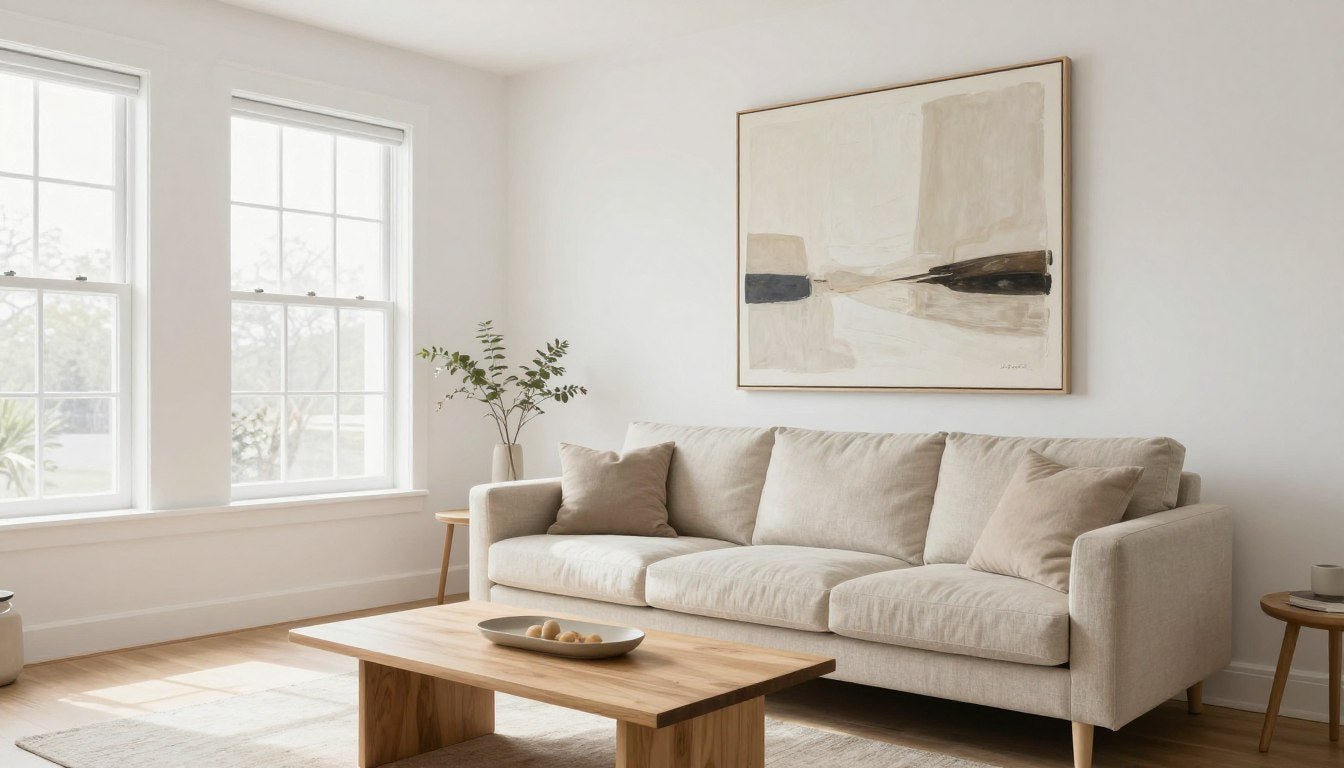
Room size matters more than most people realize. Large living rooms can handle oversized statement pieces or multiple artworks grouped together. Smaller spaces benefit from one well-chosen focal point that doesn't overwhelm the walls. Our abstract canvas prints work particularly well in modern homes where clean lines and contemporary aesthetics take center stage.

Understanding Art Styles for Different Living Spaces
Abstract art brings energy and sophistication to contemporary homes. These pieces spark imagination and work as conversation starters when guests visit. The beauty of abstract work lies in its flexibility—each person sees something different.
Botanical and nature-inspired pieces create calm, bringing the outdoors inside. These work especially well in homes with lots of natural materials like wood and stone. The organic forms soften angular furniture and architectural elements.
Portrait and figurative art adds a human element to your space. Black and white portraits carry timeless elegance, while colorful figurative pieces inject personality and warmth into modern minimalist rooms.

Matching Art to Your Living Room Function
Think about how your family uses the living room. A space designed for entertaining benefits from bold, statement pieces that become talking points. Family-focused rooms might feature more personal or nostalgic art that reflects shared memories and experiences.
Multi-functional living spaces require careful consideration. If your living room doubles as a home office or playroom, choose art that maintains professionalism while still feeling warm and inviting. Neutral tones with interesting textures often strike this balance perfectly.

Size and Placement Guidelines That Work

Getting the size right makes all the difference. A piece that's too small looks lost on a large wall, while oversized art can overwhelm a compact room. The key is finding that sweet spot where art feels intentional and balanced.
The sofa rule is a reliable starting point. Your wall art should span roughly two-thirds to three-quarters of your sofa's width. For a standard eight-foot sofa, this means looking for pieces between 48 and 72 inches wide. This proportion creates visual harmony without dominating the space.
[YOUTUBE VIDEO — https://youtu.be/EtnpEMViJdo?t=1]Height placement follows the gallery standard—hang art so the center sits at eye level, typically 57 to 60 inches from the floor. This positioning works in most homes and creates a natural viewing experience. When hanging art above furniture, leave 6 to 12 inches of space between the furniture top and the artwork's bottom edge.
[BANNER LINK HERE]


Working with Architectural Features
Fireplaces, windows, and built-in shelving create unique opportunities and challenges. Art above a fireplace should match the mantel's width or slightly exceed it. This creates a cohesive look that respects the room's natural focal point.
Corner spaces often get neglected, but they're perfect for creating intimate vignettes. A smaller piece paired with a floor lamp or plant can turn an awkward corner into a charming detail that adds character to your room.

Multi-Panel and Triptych Arrangements
Split canvas prints offer dynamic visual interest across living room walls. These multi-panel pieces create movement and can make walls appear larger. Space panels 2 to 4 inches apart for optimal effect. The combined width should still follow the two-thirds rule relative to your furniture.
Vertical arrangements work beautifully in rooms with high ceilings. They draw the eye upward, making spaces feel more expansive. Horizontal arrangements suit low-ceilinged rooms or wide wall spaces above sectional sofas.

Creating Gallery Walls with Impact

Gallery walls bring personality and depth to living room spaces. This approach lets you showcase multiple pieces while creating a unified visual statement. The key is maintaining cohesion through careful planning and thoughtful arrangement.
Start with your largest piece as the anchor. Position this central artwork first, then build around it with smaller complementary pieces. This technique creates a natural focal point while keeping the arrangement from feeling scattered or chaotic.
📐 Not sure what size to choose? Use our free Wall Art Size Calculator → https://rossettiart.com/blogs/news/wall-art-size-calculatorMaintaining consistent spacing between frames creates polish and professionalism. Most designers recommend 2 to 3 inches between pieces. This breathing room prevents the wall from looking cluttered while maintaining visual connection between artworks.
Theme-Based Gallery Wall Ideas
Monochromatic schemes use varying shades of one color family. This sophisticated approach works beautifully in minimalist spaces where restraint creates impact. Black and white canvas prints offer timeless elegance that never goes out of style.
Mixed-media galleries combine different art styles, frame finishes, and even dimensional pieces like mirrors or sculptural elements. This eclectic approach suits bohemian and transitional design styles where layered looks create warmth and interest.
Symmetrical arrangements appeal to traditional sensibilities. Perfect balance creates calm, orderly spaces that feel intentional and refined. This works particularly well in formal living rooms or spaces with classical architectural details.


Planning Your Gallery Wall Layout
Template mapping saves time and prevents nail holes from mistakes. Cut paper templates matching your frame sizes, then arrange them on the wall with painter's tape. Step back, adjust, and photograph the arrangement before committing to hanging.
Consider the room's sight lines when planning placement. The gallery should be visible from main seating areas but not compete with windows or architectural features that deserve attention. Balance is about respecting both art and space.


Color Coordination Tips for Cohesive Spaces

Color creates mood and unifies your living room's design story. The right palette makes spaces feel larger, brighter, or more intimate depending on your goals. Art serves as either a harmonious extension of existing colors or a bold accent that energizes the entire room.
The 60-30-10 rule guides balanced color distribution. Sixty percent of the room uses your dominant color (usually walls and large furniture). Thirty percent features your secondary color (accent furniture, rugs). Ten percent provides accent pops—this is where art can make dramatic impact.

Working with Existing Color Schemes
Complementary colors sit opposite each other on the color wheel. Blue art pops against orange-toned walls. Purple pieces shine in yellow-hued spaces. This high-contrast approach creates energy and visual excitement.
Analogous colors sit next to each other on the wheel—blues with greens, reds with oranges. These harmonious combinations feel natural and calming. They work beautifully in spaces designed for relaxation and conversation.
Monochromatic approaches use different shades and tints of one color. A navy blue room might feature art with sky blue, teal, and indigo tones. This sophisticated method creates depth without visual competition.

Seasonal Color Flexibility
Some homeowners enjoy refreshing their space with the seasons. Warm autumn tones—burnt orange, deep red, golden yellow—create cozy fall ambiance. Cool blues and crisp whites evoke summer freshness and light.
UV-resistant prints maintain their vibrancy season after season. Quality matters when you're investing in pieces meant to last. Archival inks ensure colors stay true even in rooms with significant natural light exposure.


Accent Colors Through Art
Small doses of bold color create impact without overwhelming. A predominantly neutral room gains personality from one vibrant art piece. This approach lets you experiment with trendy colors without committing to expensive furniture or wall paint.
Metallics add luxury and light reflection. Gold-toned art warms cool grey rooms. Silver and pewter accents complement modern minimalist spaces. These subtle touches elevate the perceived value of your entire design scheme.

Framing and Finishing Touches

Frames do more than protect art—they define how pieces interact with your space. The right frame enhances artwork while complementing your room's existing finishes and furniture. Frame choice impacts the overall design effect as much as the art itself.
Hand-stretched canvas offers a contemporary, frameless look. The wrapped edges create dimension and depth, making pieces feel substantial without traditional framing. This modern approach works beautifully in minimalist and contemporary living rooms where clean lines dominate.
Frame Material and Style Selection
Pine wood frames bring warmth and natural texture. The lighter wood tones complement Scandinavian and coastal design styles. These frames feel approachable and casual while maintaining quality and craftsmanship.
Oak floater frames create the illusion that art hovers within the frame. This sophisticated presentation suits modern and transitional spaces. The visible gap between canvas and frame adds architectural interest and dimension.
Black frames deliver classic versatility. They work with virtually any art style and room design. This neutral choice never competes with artwork, making pieces the undisputed focal point.


Matting and Glass Considerations
Canvas prints typically don't require glass, which reduces glare and weight. This makes hanging easier and creates more natural viewing angles. The textile texture of canvas adds tactile interest that glass-covered prints can't match.
For paper-based art, UV-protective glass prevents fading and damage. Museum-quality glass eliminates nearly all reflections while providing maximum protection. This investment makes sense for valuable or sentimental pieces you want to preserve long-term.

Lighting Your Wall Art
Proper lighting transforms good art into stunning focal points. Picture lights mounted above frames create gallery ambiance in home settings. These focused lights eliminate shadows while highlighting texture and color depth.
Track lighting offers flexibility for changing displays. Adjustable heads let you redirect light as you rotate art or rearrange furniture. This versatility works particularly well in multi-functional living spaces that evolve with your family's needs.


Final Styling Details
Layering creates visual richness. Place smaller art pieces on floating shelves below larger wall-mounted works. Add sculptural objects, plants, or decorative mirrors to build dimensional interest.
Balance doesn't mean symmetry. A large piece on one wall can be visually balanced by a grouping of smaller items on an adjacent wall. This approach creates flow and guides the eye through your living room naturally.

Frequently Asked Questions
Q: What size wall art should I choose for my living room?
A: For art above a sofa, choose pieces that span two-thirds to three-quarters of the sofa's width. An eight-foot sofa pairs well with art between 48 and 72 inches wide. In open wall spaces without furniture below, consider the wall's proportions—art should fill the space without overwhelming it. Our Wall Art Size Calculator helps determine ideal dimensions for your specific room measurements.
Q: How high should I hang wall art in my living room?
A: The center of your artwork should sit at eye level, typically 57 to 60 inches from the floor. When hanging art above furniture, leave 6 to 12 inches of space between the furniture top and the bottom edge of the frame. In rooms with high ceilings, you can hang pieces slightly higher to maintain proportion with the architectural space.
Q: Should living room wall art match my furniture colors exactly?
A: Art doesn't need to match furniture exactly—in fact, perfect matching can feel forced. Instead, choose pieces that complement your existing palette or provide intentional contrast. Pick one or two colors from your room and find art featuring those hues alongside new accent colors. This creates cohesion while adding visual interest and personality to your space.
Q: What's the best way to arrange multiple pieces of wall art?
A: Start with your largest piece as the anchor, positioning it first at eye level. Build around this focal point with smaller complementary works, maintaining 2 to 3 inches of consistent spacing between frames. Use paper templates to plan your layout before hammering nails—this prevents mistakes and helps visualize the final arrangement. Asymmetrical groupings often feel more dynamic than perfectly symmetrical layouts.
Q: How can I make a small living room feel larger with wall art?
A: Choose one substantial piece rather than multiple small artworks that can make walls feel cluttered. Light colors and simple compositions create openness, while mirrors alongside art reflect light and expand visual space. Vertical pieces draw the eye upward, making ceilings appear higher. Avoid heavy dark frames in tight spaces—frameless hand-stretched canvas or light wood frames maintain an airy feeling.
Q: What type of wall art works best above a fireplace?
A: Art above a fireplace should match or slightly exceed the mantel's width to maintain proportion. Leave 3 to 6 inches of space between the mantel and the bottom of your artwork. Ensure your piece can withstand heat exposure—quality canvas prints with UV-resistant, archival inks hold up better than delicate paper art. Horizontal pieces typically work better than vertical ones in this location, complementing the fireplace's natural width.
Transform Your Living Room with Gallery-Quality Art
Your walls are waiting for the right pieces to bring them to life. Whether you're drawn to bold abstracts, serene botanicals, or striking black and white compositions, the perfect canvas print can transform how your living room feels and functions.
Every piece in our collection features hand-stretched canvas, archival inks, and made-to-order craftsmanship. These aren't mass-produced posters—they're gallery-quality works designed to last and inspire for years to come.


Leave a comment
This site is protected by hCaptcha and the hCaptcha Privacy Policy and Terms of Service apply.