Your kitchen deserves more than bare walls and basic function. The right wall art transforms cooking spaces into rooms you actually want to spend time in. But kitchens present unique challenges that living rooms never face.
Heat rises from stovetops. Steam clouds the air when pasta water boils. Grease particles float invisibly until they settle on every surface.
Most homeowners discover these realities too late. They hang a beloved print near the range only to watch it warp within months. Or they choose art that clashes with the natural light that floods in at breakfast time.

The solution requires understanding three core elements. Where heat concentrates and how humidity affects different materials. How natural and artificial lighting changes throughout the day. Which layout strategies work for splash zones versus breakfast nooks.
This guide covers the practical realities of kitchen wall decor. You will learn which art types withstand cooking conditions. Where to place pieces for maximum visual impact without damage risk. How to create a cohesive look that elevates your entire cooking space.
Whether you favor contemporary wall art for kitchen spaces or lean toward classic styles, the principles remain constant. Function and beauty must work together in rooms where you cook, eat, and gather.
Kitchen-Ready Art: Prints That Handle the Heat
Not all wall art survives kitchen environments. Canvas prints offer superior durability compared to paper-based options. The material resists moisture better and maintains its shape despite temperature fluctuations.
These three pieces demonstrate kitchen-appropriate styling. Each features protective coatings that repel cooking residue. The colors remain vibrant even in high-traffic cooking spaces.

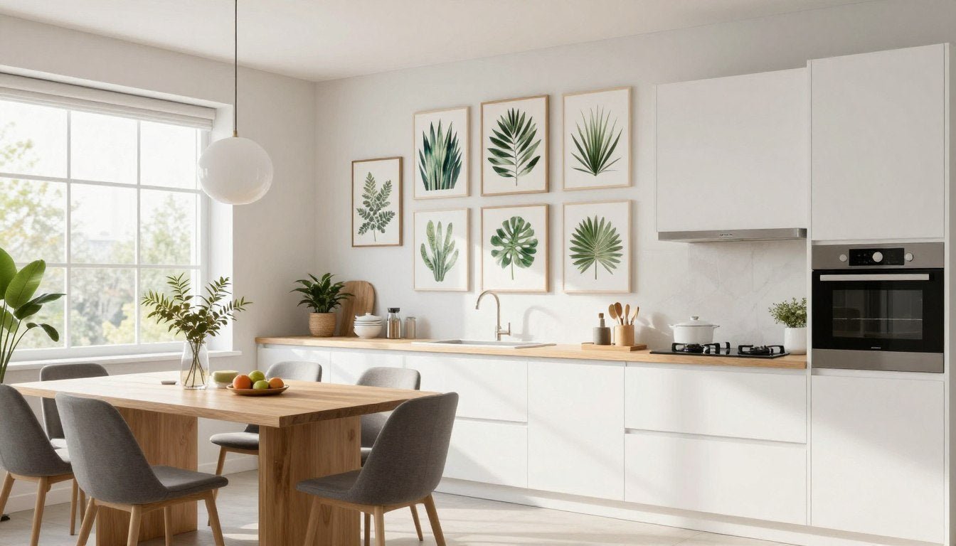
Fresh Botanical Canvas
Green leaf motifs bring natural energy to cooking spaces. The simple composition works with both modern and traditional kitchen styles. Canvas construction handles humidity from dishwashing and cooking steam.

Warm Abstract Geometry
Earth tones complement natural wood and stone kitchen elements. The abstract design adds visual interest without overwhelming the space. Protective sealant prevents grease absorption on the canvas surface.

Classic Line Art
Black and white prints offer timeless versatility. The simple palette coordinates with any color scheme you introduce through accessories or seasonal updates. Canvas material withstands kitchen conditions better than paper prints.
Each piece uses materials specifically suited to kitchen environments. The protective finishes wipe clean with a damp cloth. No special maintenance required beyond occasional dusting.
Understanding Heat and Humidity Impact on Kitchen Wall Art
Temperature and moisture create the harshest conditions for wall art in your home. Kitchens experience dramatic environmental shifts that other rooms never face. A pot of boiling water releases humidity into the air. The oven radiates heat when roasting at four hundred degrees.

How Heat Affects Different Art Materials
Paper-based prints suffer most from temperature extremes. The material expands when warm and contracts when cool. This constant movement causes warping over time. Framed pieces trap heat between the glass and paper, accelerating deterioration.
Canvas prints respond better to thermal changes. The woven fabric flexes with temperature shifts without permanent damage. The three-dimensional structure allows air circulation behind the piece. This prevents moisture accumulation that leads to mold growth.

Wood frames expand and contract with humidity changes. This movement can crack glass and stress mounting hardware. Metal frames remain more stable across temperature ranges. They also resist corrosion from cooking steam better than untreated wood options.
Moisture Zones in Your Kitchen
Every kitchen contains three distinct moisture zones. High-risk areas near the sink and dishwasher receive constant water exposure. Steam from washing dishes settles on nearby surfaces. Splash zones extend eighteen inches in all directions from water sources.
Medium-risk zones surround the cooking range. Boiling pots release steam that rises and spreads. Frying foods create airborne grease particles. These zones extend three feet from the stovetop in a cone-shaped pattern.
Low-risk areas include breakfast nooks and dining spaces within the kitchen. These locations experience ambient humidity but avoid direct exposure. Wall art thrives in these protected spots.

Temperature Fluctuations Throughout the Day
Morning coffee brewing creates the first temperature spike. The kitchen warms gradually as natural light increases. Breakfast cooking adds localized heat near the range. By noon, the space reaches its average daily temperature.
Evening meal preparation brings the most dramatic changes. Multiple burners operate simultaneously. The oven runs for extended periods. Room temperature can rise fifteen degrees during dinner preparation. This heat persists for hours after cooking ends.
Overnight, temperatures drop back to baseline. This daily cycle repeats constantly. Art materials must tolerate these recurring changes without degrading.
Protective Measures for Kitchen Art
Strategic placement provides the first line of defense. Mount pieces at least five feet from heat sources. This distance allows heat to dissipate before reaching the artwork. Avoid walls that share space with oven exhaust vents.
Material selection matters equally. Choose canvas prints with protective coatings. These sealants repel moisture and prevent grease absorption. The canvas surface wipes clean without damage to the image.

Ventilation systems reduce ambient humidity. Range hoods exhaust steam before it settles on surfaces. Opening windows during cooking allows moisture to escape. These simple habits extend the life of your kitchen wall decor significantly.
Regular cleaning prevents residue buildup. Dust weekly with a soft cloth. Wipe canvas surfaces monthly with slightly damp microfiber material. This maintenance takes minutes but preserves your investment for years.
Kitchen Lighting and How It Changes Your Art
Light transforms how wall art appears throughout the day. Morning sun through east-facing windows creates different effects than afternoon western light. Evening artificial lighting introduces yet another dimension. Understanding these shifts helps you select pieces that look good in all conditions.

Natural Light Patterns in Kitchen Spaces
North-facing kitchens receive consistent indirect light. This creates stable viewing conditions throughout the day. Colors appear true without dramatic shifts. Cool tones in artwork remain balanced. This orientation works well for most art styles.
South-facing rooms flood with bright direct sunlight. This intense light can wash out subtle details in pale artwork. Bold colors and strong contrasts perform better. Deep blues, rich reds, and dramatic blacks maintain their impact. Consider UV-protective glass for valuable pieces in these spaces.

East-facing kitchens shine during breakfast hours. Warm morning light enhances yellow and orange tones in artwork. By afternoon, the light becomes neutral and cooler. Choose pieces with warm color palettes to maximize the morning glow effect.
West-facing spaces darken in morning but brighten dramatically by late afternoon. The golden hour before sunset creates spectacular lighting effects. Artwork with metallic elements or glossy finishes catches this light beautifully. Matte surfaces appear more subdued.
Artificial Lighting Considerations
Overhead ceiling lights create flat illumination. This reduces shadows but can make art appear two-dimensional. The effect works for graphic designs and bold patterns. Subtle tonal variations may disappear under direct overhead lighting.
Under-cabinet lighting casts upward shadows. This creates dramatic effects but can distort how colors appear. Warm LED strips enhance earth tones and wooden frames. Cool white LEDs make blues and greens more vibrant.

Pendant lights over islands or dining areas create focused pools of light. Position art within these zones for maximum impact during evening hours. The targeted illumination draws attention and creates a focal point in the room.
Track lighting offers the most flexibility. Adjustable fixtures let you direct light exactly where needed. Angle spots at thirty degrees from the wall surface. This minimizes glare while highlighting texture and detail in the artwork.
Color Temperature Effects on Art Perception
Warm white bulbs (two thousand seven hundred Kelvin) create cozy atmospheres. They enhance reds, oranges, and yellows in artwork. Blues and greens appear more muted. This color temperature suits traditional and farmhouse kitchen styles.
Cool white bulbs (four thousand Kelvin) produce crisp modern lighting. Blues and greens pop with vibrancy. Reds may appear slightly dulled. This temperature complements contemporary wall art for kitchen spaces with sleek finishes.

Daylight bulbs (five thousand to six thousand five hundred Kelvin) mimic natural sunlight. They render colors most accurately. Use these in kitchens with limited windows. The bright white light prevents the space from feeling cave-like while maintaining color fidelity.
Glare and Reflection Management
Glass-covered frames reflect light sources directly. This creates bright spots that obscure the image. Position artwork perpendicular to main light sources when possible. Anti-reflective glass costs more but eliminates this problem entirely.
Canvas prints avoid reflection issues completely. The textured surface diffuses light rather than reflecting it. This makes canvas ideal for kitchens with many windows or bright overhead lighting.
Glossy finishes on prints intensify colors but increase reflections. Matte finishes reduce glare at the cost of some color saturation. Consider your specific lighting situation when choosing between these options.

Seasonal Light Changes
Summer sun angles higher in the sky. This creates less direct window light penetration. Rooms feel brighter overall but with softer shadows. Artwork appears more evenly lit during these months.
Winter sun travels lower across the horizon. Direct beams penetrate deeper into rooms through windows. This creates dramatic lighting but also potential fading risks. Rotate seasonal accessories but keep core art pieces in protected locations year-round.
Testing Light Conditions Before Hanging
Hold potential pieces against the wall at different times. Check morning, midday, and evening appearance. Notice how colors shift as light changes. This simple test prevents disappointment after permanent installation.
Take smartphone photos at various times. Review them later to compare. The camera captures subtleties your eye might miss in the moment. This documented approach helps you make confident decisions.
Consider temporary mounting solutions initially. Removable hanging strips let you test locations for a week. Experience the full daily light cycle before committing to permanent placement. This extra step ensures satisfaction with your final choice.
Match This Vibe to Your Kitchen Style
Your kitchen has a personality. Your wall art should enhance it. Whether you lean toward natural botanicals, bold abstracts, or timeless black and white compositions, the right collection transforms your cooking space into a curated environment.
Strategic Layout Approaches for Kitchen Wall Art
Where you place art matters as much as what you hang. Kitchens contain multiple functional zones with different visual opportunities. The right layout strategy maximizes impact while respecting the practical demands of the space.

Identifying Your Kitchen's Focal Point
Every successful kitchen layout centers around one primary focal point. This becomes the visual anchor for the entire room. Common focal points include the area above the range, the dining nook wall, or a blank wall visible from the main entry.
The range wall commands attention naturally. People face this direction while cooking and socializing. A single large piece works better here than multiple small items. Choose something bold enough to hold attention across the room.

Dining nooks offer another strong focal point opportunity. The wall behind a breakfast table or built-in bench creates a natural gallery space. People linger here longer than at other kitchen locations. This extended viewing time rewards more detailed or complex artwork.
Blank walls visible from adjacent rooms need special consideration. These spaces bridge your kitchen with living areas. The art you choose here should coordinate with both spaces. Transitional pieces that share color elements from both rooms work best.
Gallery Wall Configurations
Gallery walls bring multiple pieces together in cohesive arrangements. The salon-style approach mixes different sizes in organic layouts. Start with the largest piece at eye level. Build outward maintaining two to three inches between frames.
Grid arrangements create modern symmetrical displays. Use identical frame sizes and equal spacing. This works particularly well with canvas print sets designed as coordinated collections. The uniform structure suits contemporary kitchen styling.

Horizontal line arrangements stretch walls visually. This works well above long countertops or along narrow walls. Keep frames at the same height but vary widths for interest. This format suits landscape-oriented pieces.
Vertical stacks draw the eye upward. This makes rooms with lower ceilings feel taller. Use three to five pieces in descending size order. The largest piece goes at eye level with smaller items above and below.
Single Statement Piece Placement
Oversized art makes bold declarations. A single large canvas often impacts more than multiple small pieces. This approach suits minimalist and modern kitchen aesthetics. It also simplifies decision-making for those overwhelmed by gallery wall options.
Center the piece on the wall at eye level. Standard eye level measures fifty-seven to sixty inches from the floor to the center of the artwork. Adjust slightly higher in rooms with tall ceilings or lower in more intimate spaces.

Leave breathing room around statement pieces. A good rule maintains space equivalent to half the art's width on each side. This prevents the piece from appearing cramped or overwhelming the wall.
Above-Cabinet Decorating
The space above kitchen cabinets presents unique opportunities. This area often goes unused but offers valuable display real estate. Lean artwork against the wall rather than hanging. This creates a casual curated feel.
Lighter pieces work better in elevated positions. Heavy frames pose safety risks if they fall. Canvas prints offer ideal weight-to-impact ratios for high placement. The lightweight material installs securely with minimal hardware.

Rotate pieces seasonally in this location. The elevated position makes swapping easy without wall damage. This flexibility lets you refresh the space without permanent commitment. Try different styles until you identify what works best.
Corner and Nook Solutions
Awkward corners benefit from strategic art placement. Small pieces in breakfast nooks create intimate moments. The confined space allows you to use more personal or quirky selections that might overwhelm larger walls.
Built-in breakfast benches pair perfectly with art groupings. The seating defines a distinct zone within the larger kitchen. Treat this area like a separate room. The art here can differ stylistically from pieces in the main cooking area.

Diagonal corners where walls meet at angles challenge traditional hanging methods. Use the corner as the center point of a symmetric arrangement. Place matching pieces on each wall equidistant from the corner. This creates balance in an otherwise awkward space.
Open Shelving Integration
Open shelving dominates modern kitchen design. Integrate artwork among dishes and decorative items. Small pieces add color without competing with functional storage. This mixed approach feels collected and personal rather than staged.
Lean small canvas prints against the back wall of shelves. Layer them in front of dishes or cookbooks. The three-dimensional arrangement creates visual depth. Change the display as your mood shifts.

Color coordination matters more in shelf displays. Choose art that picks up tones from your dishware or favorite kitchen textiles. This creates visual harmony across the mixed media display. The eye travels smoothly rather than jarring at color clashes.
Splash Zone Alternatives
Areas directly behind sinks or near stoves require special solutions. Traditional framed art cannot survive direct water or grease exposure. Consider alternative approaches that deliver visual interest without risk.
Tile murals offer permanent artistic elements in wet zones. Custom designs cost more but withstand anything a kitchen produces. This investment makes sense for forever homes. Standard tile can create patterns that provide decorative interest without custom expense.
Leave true splash zones free of art entirely. Focus decorative attention on surrounding walls that stay dry. This concentrates visual impact in safer locations while keeping functional areas practical.

Scale and Proportion Guidelines
Artwork should fill sixty to seventy-five percent of the available wall space for balanced proportion. Measure your wall width. Multiply by point seven. This number represents the ideal width for your art or art grouping.
Furniture below artwork affects proportion calculations. A piece above a table or buffet should measure two-thirds to three-quarters the furniture width. This creates visual connection between horizontal planes.
Ceiling height influences vertical proportions. Standard eight-foot ceilings accommodate art up to thirty-six inches tall comfortably. Higher ceilings support proportionally larger pieces. The art should not extend into the upper quarter of the wall in most cases.

Creating Visual Flow Between Kitchen and Dining
Open-plan layouts require coordinated art strategies. The pieces in your kitchen should relate to adjacent dining room selections. This does not mean identical styles. Instead, look for connecting elements like color palette or subject matter themes.
A kitchen featuring botanical wall art prints flows naturally into a dining room with nature-inspired pieces. The specific plants or compositions can differ. The shared theme creates subliminal connection.
Alternatively, maintain consistent framing across both spaces. Black frames throughout create cohesion even when art styles vary. This approach offers more flexibility in subject matter while preserving overall design unity.

Transition zones need careful attention. The wall area where kitchen meets dining room should bridge both spaces. Choose art that incorporates colors from both rooms. This piece acts as a visual mediator preventing jarring style clashes.
Modern and Contemporary Kitchen Wall Art Ideas
Modern kitchen styling emphasizes clean lines and uncluttered spaces. The wall art you choose should enhance this aesthetic rather than fight against it. Contemporary approaches favor bold simplicity over ornate complexity.

Abstract and Geometric Patterns
Abstract art brings energy without literal representation. Geometric shapes in bold colors create focal points. These pieces work especially well in kitchens with neutral cabinets and countertops. The art provides the pop of personality the space needs.
Organic abstracts with flowing forms soften hard-edged modern kitchens. The curved lines contrast nicely with straight cabinet lines and rectangular appliances. Choose pieces with movement that guide the eye across the composition.

Color blocking in artwork mirrors modern design principles. Large sections of solid color create graphic impact. This style complements kitchens with strong architectural elements. The simplified forms prevent visual competition with structural features.
Explore abstract canvas prints that balance color and form. The best pieces for kitchens avoid excessive detail that gets lost across the room. Bold shapes read clearly even during the visual chaos of meal preparation.
Minimalist Line Art Approaches
Single-line drawings offer maximum impact with minimum fuss. These pieces suit the less-is-more philosophy of modern design. A continuous line forming a still life or botanical shape provides just enough interest without overwhelming.
Black line art on white backgrounds creates classic contrast. This palette coordinates with any kitchen color scheme. The graphic quality reads as intentional design rather than mere decoration. It feels curated and purposeful.

White line art on dark backgrounds inverts the traditional approach. This works beautifully in kitchens with dark cabinets or accent walls. The light lines pop dramatically against the dark surface. Consider this for contemporary spaces with moody color palettes.
Line art collections create impact through repetition. Three identical-sized pieces with different simple subjects form a cohesive display. The uniform frames and consistent line weights tie the grouping together. This approach suits long blank walls above counters.
Monochromatic Color Schemes
Black and white photography brings timeless elegance. Food photography in monochrome feels sophisticated rather than literal. Choose images with strong compositional elements. The lack of color forces focus on form and texture.
Grayscale paintings offer depth through tonal variation. Multiple shades of gray create dimension without color distraction. These pieces work in kitchens where homeowners want art that does not compete with colorful accessories or dishes.

Single-color studies explore a hue through its full tonal range. A piece featuring navy from pale blue to almost black creates visual interest through subtlety. This sophisticated approach suits homeowners who appreciate understated design.
The collection of black and white canvas prints spans multiple subjects and styles. The unifying monochrome palette ensures pieces mix well. You can combine abstract, figurative, and graphic elements without color clashes.
Typography and Text-Based Art
Kitchen-related quotes bring personality to the space. Choose sayings that resonate personally rather than generic Pinterest phrases. Custom typography art featuring family recipes or meaningful phrases adds deeply personal touches.
Modern typography design emphasizes font choice and layout. The words themselves matter less than how they appear on the canvas. Overlapping text creates depth. Varied font weights add visual hierarchy. The result feels designed rather than merely printed.

Single-word statements make bold declarations. Choose words that define your kitchen's purpose or your family's values. Large-scale letters create graphic impact. This works particularly well in minimalist kitchens where the simplicity aligns with overall design goals.
Foreign language text adds worldly sophistication. Italian food terms or French cooking phrases connect to culinary traditions. The foreign words feel less obvious than English equivalents. This subtle approach suits refined design sensibilities.
Botanical and Nature Motifs in Modern Contexts
Oversized plant portraits bring nature indoors dramatically. A single leaf photographed closely reveals intricate detail. The magnification transforms the ordinary into the extraordinary. These pieces bridge modern aesthetics with organic subject matter.
Stylized botanical illustrations offer cleaner interpretations. Scientific drawing styles with precise lines feel both natural and designed. The historical quality of botanical prints gains modern relevance through scale and framing choices.

Pressed plant shadowboxes add three-dimensional interest. Real preserved botanicals behind glass create textural depth. The organic materials contrast beautifully with sleek modern surfaces. This approach works for smaller kitchen walls or shelf displays.
Modern interpretations of traditional still life paintings update classic themes. Contemporary artists apply bold color choices and simplified forms to fruit and vegetable subjects. The familiar subject matter gains fresh relevance through modern artistic treatment.
Industrial and Urban Photography
Architectural photography suits modern industrial kitchens. Black and white cityscapes bring urban energy. Close-ups of building details reveal geometric patterns. These subjects complement exposed brick, concrete counters, or metal fixtures.
Vintage industrial imagery bridges old and new. Photographs of old factories or machinery add historical weight to modern spaces. The juxtaposition creates interesting tension. This works particularly well in loft conversions or urban apartments.

Abstract urban textures zoom in on city surfaces. Weathered paint, aged metal, or concrete patterns create minimalist compositions. The industrial subjects suit kitchen environments. The abstract treatment keeps them from reading as too literal.
Sculptural and Three-Dimensional Options
Metal wall sculptures add dimensional interest. Abstract forms in brushed steel or copper coordinate with modern fixtures. The three-dimensional aspect catches light throughout the day. This creates changing visual interest beyond what flat art achieves.
Wooden wall art brings warmth to stark modern kitchens. Geometric wood pieces in natural finishes soften cold surfaces. The organic material balances steel appliances and stone counters. Consider pieces that incorporate negative space for modern appeal.

For those drawn to dimensional pieces, explore modern sculptures designed for wall mounting. These pieces offer artistic expression beyond traditional flat art. The sculptural quality suits spaces where homeowners want statement-making design elements.
Mixed media pieces combine multiple materials. Wood, metal, and canvas elements create complex compositions. These sophisticated pieces suit mature modern aesthetics. They work best as focal points rather than part of larger groupings.
Color Coordination Between Art and Kitchen Elements
The colors in your wall art should connect to your kitchen's existing palette. This does not mean exact matching. Instead, look for complementary relationships that create visual harmony throughout the space.

Working with Cabinet Colors
White cabinets offer maximum flexibility. Nearly any art color works against pure white. This blank canvas lets you choose based purely on personal preference. Use art to introduce the main color accent in an otherwise neutral kitchen.
Dark cabinets require lighter art to avoid visual heaviness. Look for pieces with white or cream backgrounds. The light art creates contrast that prevents the space from feeling too dark. This balance maintains the dramatic impact of dark cabinets while keeping the room from feeling cave-like.

Wood cabinets pair beautifully with earth-tone art. Terra cotta, sage green, or warm gold tones complement natural wood finishes. These organic color relationships feel inherently harmonious. The wood grain and art colors create a cohesive natural aesthetic.
Colored cabinets need careful consideration. Blue cabinets work with complementary orange or analogous green art. Green cabinets pair with red accents or deeper green tones. Understanding basic color theory helps you make confident choices that enhance rather than clash.
Countertop Considerations
Granite and marble contain multiple colors within their patterns. Pull one accent color from the stone for your art. This creates subtle coordination that feels intentional. The connection might not be obvious initially but registers subconsciously.
Solid surface counters in neutral tones provide flexibility. Gray quartz works with cool or warm art tones. White counters support any color choice. Black counters benefit from art with lighter backgrounds to prevent excessive visual weight.

Bold countertop colors dominate the space. Art should either coordinate closely or contrast dramatically. Middle-ground color choices often fail. If you have bright blue counters, choose art with blue elements or go completely opposite with orange tones.
Backsplash Integration
Patterned backsplashes compete with busy art. If your backsplash features elaborate tile work or bold patterns, choose simpler art. The two elements should not fight for attention. One should dominate while the other supports.
Solid color backsplashes provide opportunities for repetition. Choose art that includes your backsplash color as an accent. This creates visual flow around the room. The eye travels smoothly rather than stopping abruptly at color changes.

Subway tile in classic white offers neutral backgrounds. The simplicity lets art take center stage. This traditional backsplash choice never competes with wall decor. It provides a clean backdrop that supports rather than conflicts.
Flooring Impact on Color Choices
Dark floors ground a space strongly. This allows lighter, brighter art without the room feeling unbalanced. The heavy visual weight of dark flooring anchors even the most colorful art choices. You can be bold without creating visual chaos.
Light floors create airy foundations. Art can range from light to dark without overwhelming. The pale floor reflects light, keeping the space bright even with darker art. This flexibility supports experimentation with various styles.

Wood floors in medium tones bring warmth automatically. Art in cool colors provides temperature balance. Blues and greens cool down the warm wood. This creates comfortable equilibrium rather than overwhelming warmth.
Appliance Finish Coordination
Stainless steel appliances read as neutral. The silver tone coordinates with both warm and cool art colors. The reflective surface picks up colors from surrounding elements including your art. This creates interesting subtle color echoes throughout the space.
Black appliances create strong visual anchors. They need counterbalancing with lighter art elements. Too much darkness concentrates visual weight uncomfortably. Distribute light and dark throughout the room for proper balance.

White appliances blend into white cabinet schemes. This creates a blank canvas similar to all-white cabinets. Use art to introduce your primary color accent. The art becomes even more important as a focal point when appliances disappear into the background.
Colored appliances make bold statements. Retro-style colored refrigerators or ranges dominate their areas. Art should acknowledge this but not attempt to compete. Choose pieces that include the appliance color as an accent rather than trying to match it exactly.
Seasonal Color Adjustments
Core art pieces should work year-round. Choose colors that feel appropriate across seasons. Neutrals with warm and cool elements adapt as you change seasonal accessories. This prevents the need to store and rotate art constantly.
Smaller accent pieces can rotate seasonally. Swap throw pillows on breakfast nook seating and small art pieces together. This refreshes the space without requiring major changes. The seasonal rotation keeps the kitchen feeling current and intentional.

Spring and summer suit lighter, brighter palettes. Swap in art with whites, soft blues, or fresh greens. The lighter colors feel refreshing during warmer months. This aligns your kitchen with the natural seasonal changes outside.
Fall and winter call for richer, deeper tones. Burgundy, forest green, or navy art creates cozy warmth. The darker colors feel appropriate as days shorten. This simple adjustment affects the emotional temperature of your space significantly.
Testing Color Combinations
Digital visualization tools help preview options. Photograph your kitchen and use apps to overlay art options. This prevents expensive mistakes. The digital preview shows how colors interact in your specific lighting conditions.
Paint sample boards provide physical testing. Gather paint chips matching your cabinets, counters, and potential art colors. Arrange them together under different lighting. This reveals how colors shift from morning to evening in your actual space.

Live with art on approval when possible. Many retailers offer return policies. Take advantage of these to test pieces in your actual space. What looks perfect online might not work with your specific combination of elements. Real-world testing eliminates guesswork.
Art Materials and Durability in Kitchen Environments
Material choices determine how well art survives kitchen conditions. Understanding the properties of different options helps you make smart investments. Some materials tolerate humidity and temperature changes. Others deteriorate quickly in challenging environments.

Canvas Print Advantages
Canvas withstands humidity better than paper. The woven fabric allows air circulation. Moisture does not get trapped against the surface. This natural breathability prevents mold growth in steamy kitchen conditions.
Gallery-wrapped canvas eliminates the need for framing. The image wraps around the wooden stretcher bars. This frameless presentation suits modern aesthetics. It also removes glass that could create glare from kitchen lighting.

Canvas accepts protective coatings easily. UV-resistant and water-repellent sprays add extra durability. The textured surface holds these treatments well. Regular paper cannot tolerate the same protective measures without damage.
The material weighs less than framed alternatives. This matters for kitchen installation where wall materials vary. Drywall anchors support canvas pieces easily. Heavier framed art may require more substantial mounting solutions.
Metal Print Characteristics
Metal prints offer exceptional durability. The image infuses directly into the metal surface through dye sublimation. This creates a permanent bond. The result resists moisture, heat, and physical damage better than almost any other option.
The glossy surface creates vibrant colors. Whites appear especially bright. The reflective quality intensifies the visual impact. This works well in modern kitchens where bold statements align with the overall design.

Cleaning metal prints requires only a damp cloth. The smooth surface wipes clean instantly. Grease and dust do not penetrate. This makes metal ideal for locations near cooking areas where splatter might occur.
The contemporary appearance suits modern spaces particularly well. The industrial quality aligns with stainless appliances and sleek surfaces. Traditional kitchens might find metal prints feel too modern for their aesthetic.
Acrylic Print Properties
Acrylic creates depth through its transparent layers. The image sits behind the clear acrylic face. This produces a three-dimensional quality. The depth effect adds visual interest beyond what flat prints achieve.
The material resists yellowing and degradation. UV stability keeps colors true for years. The plastic composition tolerates humidity without warping. These properties make acrylic suitable for kitchen conditions.

Glass-like appearance provides sleek modern aesthetics. The glossy surface reads as contemporary and refined. This suits kitchens with polished finishes and sophisticated styling. The high-end look justifies the premium price point.
Weight exceeds canvas significantly. Proper mounting becomes crucial. The rigid material requires secure wall anchors. Consider professional installation for larger acrylic pieces to ensure safety.
Framed Print Considerations
Traditional framed prints under glass create formal presentations. The frame protects edges and provides finished appearance. This classic approach suits traditional kitchen styles. The formality aligns with more conventional design aesthetics.
Glass protection has drawbacks in kitchens. It reflects light sources creating glare. The trapped air between glass and print allows condensation in humid conditions. This moisture can damage the print over time.

Non-reflective glass reduces but does not eliminate glare problems. The special coating diffuses reflections. This costs more than regular glass but significantly improves viewing in bright kitchens. The investment makes sense for valuable prints.
Frame materials matter for longevity. Sealed wood resists moisture better than untreated options. Metal frames avoid wood's expansion and contraction issues. The frame choice affects durability as much as the print itself.
Wood Prints and Mounted Options
Photos mounted directly to wood create rustic appeal. The grain shows through slightly in lighter image areas. This organic quality suits farmhouse and traditional kitchen styles. The wood warmth coordinates naturally with wood cabinets and floors.
Wood requires proper sealing for kitchen use. Unsealed wood absorbs moisture and warps. Quality wood prints include protective finishes. Verify this before purchasing pieces for kitchen installation.

The dimensional quality adds interest. The wood thickness creates shadow depth on the wall. This subtle three-dimensional effect suits spaces where you want texture without overwhelming detail. The simple approach feels curated.
Lightweight plywood constructions work well. Heavier solid wood increases mounting challenges. The thickness typically ranges from three-quarters inch to two inches. Thicker pieces make bolder statements but require stronger mounting hardware.
DIY Protection Strategies
After-market protective sprays extend art life significantly. UV-protective sprays prevent fading from window light. Water-repellent treatments add moisture resistance. Apply these to canvas or wood pieces for added durability.
Test protective treatments on inconspicuous areas first. Some sprays alter colors slightly. The change might be acceptable but should not surprise you. Small test areas reveal any issues before treating the entire piece.

Reapply protective treatments annually. Kitchen conditions gradually break down protective layers. Fresh application maintains effectiveness. This simple maintenance takes minutes but preserves your investment substantially.
Strategic placement reduces the need for extreme protection. Keep art away from direct splash zones. Maintain five-foot minimum distance from heat sources. These basic precautions often matter more than expensive protective treatments.
Professional Installation Techniques for Kitchen Art
Proper installation ensures your art hangs securely and looks its best. Kitchen walls present unique challenges. Tile backsplashes, uneven surfaces, and limited stud locations require adapted techniques. Understanding professional methods helps you achieve gallery-quality results.

Finding Studs and Using Anchors
Stud finders locate solid mounting points behind drywall. These electronic devices detect density changes in walls. Mark stud locations with light pencil marks. Screwing directly into studs provides maximum support for heavy pieces.
Drywall anchors enable mounting between studs. Toggle bolts support substantial weight when installed correctly. The wings expand behind the drywall distributing load across a larger area. These hold canvas prints reliably even without hitting studs.

Wall composition affects anchor selection. Plaster walls require different anchors than drywall. Tile backsplash areas need special drill bits and anchors. Identify your wall material before purchasing hardware. This prevents frustration and failed installations.
Weight ratings on anchors indicate maximum safe loads. Choose anchors rated for twice your artwork weight. This safety margin accounts for dynamic forces when doors slam or children play nearby. Over-engineering mounting prevents accidents.
Height and Level Precision
The fifty-seven-inch rule places art center at average eye level. Measure from the floor to this height. Mark lightly with pencil. This standard works for most people in most rooms. Adjust slightly for unusually tall or short household members.
Laser levels project perfectly straight lines. These tools eliminate guesswork for multi-piece installations. The projected line shows exactly where pieces should hang. This technology makes professional-quality alignment accessible to DIYers.

Measuring from consistent reference points prevents errors. Always measure from floor level rather than ceiling. Floors stay level while ceilings often slope slightly. This small detail makes significant differences in final appearance.
Check level after initial hanging. Even careful measurement sometimes results in slight tilts. A small adjustment prevents the tilted appearance that bothers viewers subconsciously. The one minute spent leveling improves the final result dramatically.
Gallery Wall Layout Methods
Paper templates eliminate wall damage from trial-and-error hanging. Trace each frame onto paper. Cut out the templates. Tape these to the wall in various arrangements. Step back to evaluate before committing to nail placement.
The "lay it out on the floor first" method provides spatial understanding. Arrange all pieces on the floor matching your wall dimensions. Take a photo from above. This becomes your installation guide. Transfer measurements to the wall systematically.

Start with the center piece in gallery arrangements. Hang the largest or most important piece first. Build outward maintaining consistent spacing. This prevents the common mistake of running out of room before hanging all pieces.
Maintain two to three inches between frames in gallery walls. Closer spacing feels cramped. Wider spacing loses cohesion. This sweet spot creates unified displays that read as intentional collections rather than random groupings.
Wire Versus Sawtooth Hangers
Picture hanging wire offers flexibility in positioning. The wire allows slight adjustments left or right after hanging. This helps achieve perfect alignment without re-drilling. The wire also distributes weight across both attachment points.
Sawtooth hangers provide cleaner backs but less flexibility. The piece hangs at a fixed point determined during manufacturing. This works well for pieces hung singly. Gallery walls benefit more from wire's adjustability.

D-rings with wire combine wire benefits with more secure attachment. The D-ring screws into the frame rather than relying on small nails. This creates stronger mounting suitable for heavier pieces. Consider upgrading to D-rings for valuable artwork.
Heavy pieces require two mounting points. Use two hooks on the wall rather than one. This prevents tilting and distributes weight. The dual-point mounting also prevents the piece from shifting over time.
Mounting on Tile and Backsplash Areas
Drilling through tile requires carbide or diamond-tipped drill bits. Regular bits shatter tile. Use low drill speed and light pressure. Add water to cool the bit and reduce dust. These precautions prevent cracked tiles.
Adhesive hooks offer no-drill alternatives for tile surfaces. Modern versions support substantial weight. Check weight ratings carefully. These work well for lighter canvas pieces but may not suffice for heavy framed art.

Grout lines provide natural drilling locations. Drill through grout rather than tile when possible. Grout repairs easier than tile if you ever remove the art. The slightly off-center placement rarely shows in final installations.
Silicone adhesive creates permanent bonds. This works for very light pieces you do not plan to move. The permanent nature makes this a last resort. Explore removable options first unless you commit to a forever placement.
Cable and Rail Systems
Professional gallery rail systems mount at ceiling level. Cables drop down from the rail. Hooks at adjustable heights hold artwork. This system allows easy height changes and piece rotation without wall damage.
The contemporary appearance suits modern kitchens. The visible cables and rails become design elements themselves. Industrial and minimalist spaces embrace this utilitarian aesthetic. Traditional kitchens might find the look too modern.

Installation requires more initial work than traditional hanging. The rail attaches securely to ceiling joists or blocking. This foundation supports multiple pieces without individual wall mounting. The effort pays off through long-term flexibility.
Picture ledges offer similar flexibility with different aesthetics. These narrow shelves mount to walls at any height. Pieces lean against the wall rather than hanging. This casual approach suits eclectic and transitional kitchen styles.
Avoiding Common Installation Mistakes
Hanging too high ranks as the most common error. Art floats near the ceiling losing connection with the room. The fifty-seven-inch center height keeps pieces at human scale. This creates proper visual relationship with furniture and architectural elements.
Ignoring furniture placement leads to awkward spacing. Art should relate to the furniture below it. The center of the piece should align roughly with the furniture center. This creates visual connection between horizontal and vertical elements.

Using inadequate hardware causes eventual failure. Small nails bend under weight over time. Pieces crash down damaging frames and walls. Invest in proper hardware rated for your specific pieces. The few extra dollars prevent disaster.
Skipping the level step results in tilted art. Your eye detects even slight angles. The subliminal wrongness bothers viewers. The thirty seconds spent checking level makes the difference between amateur and professional results.
Budget-Friendly Kitchen Wall Art Solutions
Beautiful kitchen walls do not require expensive art investments. Strategic shopping and creative approaches deliver high-impact results at modest prices. Understanding where to allocate limited budgets maximizes visual return on spending.

Printable Art Resources
Digital downloads eliminate printing costs when you have access to quality printers. Many artists sell high-resolution files. You purchase once and print at whatever size suits your space. This flexibility allows experimentation without financial risk.
Local print shops produce quality results at reasonable prices. Bring your digital file on a USB drive. They print on various papers and sizes. The cost runs significantly less than purchasing pre-made prints. You control the final size and material perfectly.

Free art sources exist throughout the internet. Museum collections offer public domain downloads. Vintage botanical illustrations and historical documents provide copyright-free options. These carry inherent quality despite zero acquisition cost. The age adds character and authenticity.
Frame printables in budget frames from discount stores. Simple black frames elevate even inexpensive prints. The uniform framing creates cohesive gallery walls. The frame quality matters more than the print price in creating polished appearances.
Thrift Store and Secondhand Finds
Thrift stores stock framed art constantly. You might dislike the existing art but love the frame. Replace the artwork with your own prints. Quality vintage frames cost significantly less secondhand than new.
Estate sales and garage sales offer unexpected treasures. Original art appears regularly at these events. Sellers often undervalue pieces. Your ten-dollar investment might be someone else's discarded masterpiece. The hunt adds entertainment value beyond the art itself.

Reframe and repurpose existing pieces from other rooms. That bedroom art might work perfectly in the kitchen. The change costs nothing but creates fresh impact. Rotation keeps all your spaces feeling updated without new purchases.
Paint existing frames to match your kitchen aesthetic. Spray paint transforms gold frames to modern black. Chalk paint creates farmhouse looks on traditional frames. The material cost runs under ten dollars with dramatic transformation results.
DIY and Personal Photography
Your own photography makes deeply personal art. That vacation sunset or garden bloom becomes wall-worthy when enlarged and properly displayed. Local photo printing services produce quality enlargements affordably. Your unique images ensure no one else has identical art.
Simple abstract paintings require minimal artistic skill. Large canvases with bold geometric color blocks look sophisticated. The contemporary aesthetic forgives imperfect execution. Your labor replaces the artist's fee, creating original art for material costs only.

Pressed botanicals create organic wall art. Frame leaves, flowers, or herbs between glass. The natural materials cost nothing if you grow them. The process preserves garden memories while creating seasonal decor. This approach suits farmhouse and cottage kitchen styles.
Children's artwork deserves better than refrigerator magnets. Frame their best pieces professionally. The gallery treatment validates their creativity. The personal connection makes these pieces more meaningful than anything purchased. This solution combines sentiment with decoration.
Strategic Splurging
Invest in one statement piece rather than multiple mediocre items. A single high-quality canvas commands attention. It elevates the entire space more than several cheap pieces. Quality over quantity creates sophisticated results on limited budgets.
Allocate funds to framing rather than the art itself. Professional framing transforms inexpensive prints into gallery-worthy displays. The frame quality signals value regardless of the print cost. This investment shows in the final presentation dramatically.

Wait for sales on quality pieces rather than settling for cheap alternatives. Many retailers offer significant discounts during specific seasons. Patience delivers better value than impulse purchases of mediocre art. The right piece at fifty percent off beats the wrong piece at full price.
The Rossetti Art blog shares budget-friendly styling ideas regularly. These posts demonstrate how to maximize impact regardless of budget constraints. Learn to style effectively rather than simply spending more.
Temporary and Changeable Solutions
Removable wallpaper creates art-like impact without permanence. Accent walls behind open shelving provide visual interest. The adhesive allows damage-free removal. You change the look whenever desired without long-term commitment or refinancing.
Picture ledges enable rotation without rehaning. Buy pieces gradually as budget allows. Display current favorites while storing others. The flexibility prevents buyer's remorse since no choice feels permanent.

Clipboards or curtain rods with clips display changing art. This ultra-casual approach suits eclectic personalities. Swap pieces weekly if desired. Children enjoy changing the display themselves. This interactive approach brings additional value beyond static decoration.
Fabric panels stretched over frames create custom art affordably. Choose kitchen-themed fabrics or bold geometric patterns. The materials cost less than purchased art. You customize colors exactly to your space. Sewing skills optional for simple stretched panels.
Ready to Transform Your Kitchen Walls?
Every piece in our collection features museum-quality printing on durable canvas that withstands kitchen conditions. Gallery-wrapped edges mean no framing required. Free worldwide shipping delivers your new art directly to your door. Each print comes ready to hang with included hardware.
Our canvas prints resist humidity and wipe clean easily. The protective coatings repel kitchen grease and cooking residue. Your art stays vibrant through years of daily cooking and family gatherings.
Styling Tips for Cohesive Kitchen Wall Decor
Individual pieces matter less than how everything works together. A cohesive kitchen aesthetic requires coordination across all design elements. Wall art represents one component in the larger visual story your kitchen tells.

Creating Visual Balance
Heavy visual elements on one wall need counterbalance elsewhere. A large bold painting on the dining nook wall requires visual weight on the opposite side. This might be substantial open shelving or a collection of smaller pieces. The room should feel balanced from the main entry viewpoint.
Dark and light distribution affects perceived balance. Concentrate dark tones in one area while keeping surrounding spaces lighter. This prevents the room from feeling bottom-heavy or top-heavy. The eye should travel smoothly rather than getting stuck on imbalanced areas.

Symmetrical arrangements create formal balance. Matching pieces flanking a window or hood create mirror-image stability. This traditional approach suits classic kitchen styles. The predictability feels calm and ordered.
Asymmetrical balance requires more skill but feels more dynamic. Different-sized pieces balance through color weight and placement rather than mirror matching. A large piece on one side balances three smaller pieces on the other. The visual math works subconsciously.
Repetition and Rhythm
Repeat specific colors throughout the space. If your art features navy blue, echo that color in dish towels, canisters, or small accessories. This repetition creates intentional cohesion. The color threads through the space tying elements together.
Consistent framing creates rhythm across multiple walls. All black frames or all natural wood frames unify diverse art subjects. The repeated frame element provides structure. This allows more freedom in art subject variety.

Spacing intervals create visual rhythm in gallery walls. Maintain identical gaps between all pieces. The regular spacing reads as intentional design. Inconsistent spacing appears accidental even when placement otherwise succeeds.
Subject matter repetition ties collections together. A gallery wall of all botanical subjects or all abstract geometric works benefits from the unified theme. The varied pieces still read as a curated collection rather than random accumulation.
Scale Variation for Interest
Mix sizes to create visual hierarchy. One large piece commands attention while smaller works support. This primary-secondary relationship prevents monotony. All same-size pieces can feel like wallpaper rather than curated art.
The largest piece should not exceed seventy-five percent of the available wall space. This leaves breathing room around the art. The wall surface frames the piece. Too-large art overwhelms and appears crammed.

Smallest pieces should still be substantial enough to view from normal room positions. Tiny four-by-six-inch prints disappear in kitchen spaces. Minimum eight-by-ten inches ensures visibility. Smaller pieces group together rather than standing alone.
Dramatic scale jumps create impact. Pair a very large canvas with several much smaller pieces. The contrast emphasizes the scale difference. Medium-sized pieces muddle this relationship. Think large plus small rather than medium plus medium-small.
Layering Techniques
Lean art against walls on counters or shelves. Layer smaller pieces in front of larger ones. This casual styling feels collected rather than rigid. The approach suits transitional and eclectic kitchen styles particularly well.
Overlap frames slightly in very casual displays. This technique works for picture ledge styling. The relaxed overlap prevents the formal feeling of perfectly spaced traditional hanging. Change the overlap arrangement seasonally for fresh looks.

Combine framed art with three-dimensional objects. Plants, sculptural pieces, or interesting pottery mix with flat art. The dimensional variety creates richer visual texture. This prevents the wall from feeling like a flat catalog page.
Vary depths in gallery wall installations. Mount some pieces flush while others extend further from the wall. Shadow boxes or deep frames create this variation. The dimensional differences add subtle interest that pure flat installations lack.
Negative Space Appreciation
Empty wall space matters as much as filled areas. Resist the urge to cover every surface. Negative space lets individual pieces breathe. It provides visual rest areas preventing overwhelming busy-ness.
The rule of thirds applies to wall arrangement. Divide your wall into thirds horizontally and vertically. Place key elements at the intersection points. This creates naturally pleasing composition. The mathematical basis ensures good results.

Leave space between art and architectural elements. Maintain distance from cabinet edges, windows, and doorways. Art should not crowd these features. The separation respects both the architecture and the art.
Fight the impulse to fill empty corners immediately. Some spaces benefit from simplicity. A corner with good natural light might need nothing but that beautiful light. Not every area requires decoration.
Transitioning Between Kitchen Zones
Different kitchen areas can feature different art styles. The cooking zone might display bold modern pieces. The breakfast nook could feature softer traditional works. The transition happens through shared color elements rather than matched styles.
Gradually shift styles across adjacent walls. Move from contemporary to transitional to traditional across three walls. The middle wall bridges the style gap. This prevents jarring switches between radically different aesthetics.

Unified color palette bridges style differences. Modern abstracts and traditional still lifes both work when sharing color schemes. The common colors create visual connection despite stylistic differences. This approach offers maximum flexibility.
Architectural breaks between zones allow more dramatic style shifts. A partial wall or column separating spaces permits different art approaches. The architecture signals the zone change preparing viewers for aesthetic shifts.
Maintaining and Caring for Kitchen Wall Art
Regular maintenance preserves your art investment. Kitchen conditions demand more attention than art in other rooms. Simple consistent care prevents deterioration. Neglect leads to permanent damage that ruins pieces beyond repair.

Routine Cleaning Schedules
Dust weekly with dry microfiber cloths. The soft material lifts particles without scratching. Start at the top working downward. Dust falls with gravity so this method prevents redistributing particles onto already-cleaned areas.
Monthly damp wiping removes accumulated cooking residue. Slightly dampen the cloth with plain water. Never saturate. The moisture should not drip or leave wet spots. This removes the invisible grease film that dulls colors over time.

Immediate spot cleaning prevents permanent stains. Splatter from cooking or spills require fast response. Blot rather than rub. Rubbing spreads the substance and drives it deeper into materials. Blotting lifts the foreign material away.
Seasonal deep cleaning addresses accumulated grime. Take pieces down carefully. Clean front and back surfaces. Check mounting hardware while down. This quarterly maintenance catches small issues before they become major problems.
Addressing Specific Stains
Grease spots require gentle dish soap solutions. Mix one drop of mild soap in warm water. Dab the solution onto the stain with a barely damp cloth. Work from outside edges toward the center. This prevents spreading. Rinse with clean damp cloth immediately.
Water spots on canvas usually disappear when dry. If marks remain, lightly mist the entire canvas with distilled water. Let air dry completely. This often redistributes minerals preventing visible rings. Tap water minerals cause most water spots, so distilled water prevents this issue.

Dust and dirt buildup in canvas texture requires soft brush work. Use clean makeup brushes or dedicated art brushes. Gently brush the surface loosening embedded particles. Follow with microfiber cloth to collect the loosened debris.
Never use harsh chemicals or abrasive cleaners. These damage protective coatings and fade colors. When in doubt, test any cleaning solution on an inconspicuous corner. The few minutes testing prevents permanent visible damage to prominent areas.
Environmental Monitoring
Check art quarterly for early damage signs. Look for warping, color fading, or material deterioration. Early detection allows intervention before damage becomes permanent. Small issues correct easily while advanced deterioration may prove irreversible.
Monitor humidity levels in your kitchen. Excessive moisture accelerates deterioration. If humidity consistently exceeds sixty percent, consider dehumidifier use. The investment protects not just art but cabinets and other wood elements too.

Temperature stability matters for long-term preservation. Avoid hanging art on exterior walls in cold climates. The temperature differential between inside and outside promotes condensation behind the art. This trapped moisture causes mold and warping.
Ventilation prevents moisture accumulation. Run exhaust fans during and after cooking. Open windows when weather permits. Moving air prevents the still humid conditions where mold thrives. Good habits protect your entire kitchen including the art.
Rotating and Refreshing Displays
Rotate art between rooms seasonally. This prevents fading in high-light locations. Pieces alternate between bright and dim areas. The rotation also keeps your entire home feeling fresh. You rediscover pieces you forgot you owned.
Store rotated art properly to prevent damage. Keep pieces vertical never horizontal. Horizontal storage allows warping over time. Cover with clean cloth to prevent dust accumulation. Climate-controlled areas work best for long-term storage.

Refresh hardware during rotation. Check that screws remain tight and wires show no fraying. Replace worn components before rehinging. This maintenance prevents accidents. A few cents of hardware replacement prevents hundreds in damage from falls.
Document your collection with photos. This helps insurance claims if damage occurs. The photos also help you remember what you own. After years of rotation, it becomes easy to forget pieces in storage. The photo inventory prevents this loss of awareness.
Professional Restoration When Needed
Serious damage requires professional intervention. Conservators specialize in art repair and preservation. Their expertise exceeds DIY capabilities for valuable or sentimental pieces. The cost seems high initially but prevents total loss of irreplaceable items.
Water damage assessment should happen within forty-eight hours. Mold begins growing quickly on damp materials. Professionals extract moisture using specialized equipment. Quick action often saves pieces that seem ruined initially.

UV fading cannot be reversed. Prevention matters more than treatment for sun damage. Once colors fade, they cannot be restored without repainting or reprinting. Strategic placement away from direct sunlight prevents this permanent damage.
Frame damage often fixes more easily than art damage. Professional frame shops repair breaks, replace glass, and refresh finishes. The art itself remains safe while the frame gets attention. This selective repair costs less than replacing the entire piece.
Wall Art Solutions for Small Kitchen Spaces
Limited square footage requires smart art choices. Small kitchens benefit from wall decor but face unique constraints. Strategic selection and placement make modest spaces feel larger rather than cramped. The right approach adds personality without overwhelming.

Scale Appropriate for Compact Rooms
Smaller art suits smaller spaces logically. One or two medium pieces work better than multiple tiny items. The pieces should be substantial enough to anchor the wall without dominating the entire room. Think twelve-by-sixteen inches rather than thirty-by-forty inches.
Avoid gallery walls in truly tiny kitchens. Multiple pieces create visual clutter in confined spaces. A single well-chosen statement piece delivers more impact. The simplified approach prevents the walls from closing in visually.

Vertical orientation draws eyes upward. This makes low ceilings feel taller. The upward movement creates the illusion of more space. Horizontal pieces emphasize width which small kitchens already lack.
Light-colored art keeps small spaces feeling open. Dark or heavily saturated colors absorb light making rooms feel smaller. Choose pieces with white or light backgrounds. The brightness reflects light maintaining the airy feeling small kitchens need.
Maximizing Limited Wall Space
Use the space above cabinets in small kitchens. This often-wasted area provides display opportunities. Lean lightweight canvas pieces against the wall. The elevated position draws attention upward expanding perceived space.
Inside glass-front cabinets offers unexpected art opportunities. Small pieces behind glass shelves create interest within functional storage. This dual-purpose approach makes every inch count. The glass protects art from kitchen conditions perfectly.

Narrow vertical spaces beside windows or doorways accommodate slim art. These awkward areas go unused typically. A tall narrow piece fills the gap without blocking traffic flow. This captures otherwise wasted space productively.
The area above the sink sometimes offers the only available wall. Choose art that can tolerate proximity to water. Canvas with protective coating works here. The moisture from sink use requires durability the location demands.
Color Strategies for Visual Expansion
Monochromatic art schemes make walls recede. When art colors match wall colors closely, the separation between elements blurs. This visual trick makes the room feel less boxed in. The unified color plane extends perceived dimensions.
Strategic accent colors draw eyes to focal points. A pop of bright color in the art redirects attention. This guides where viewers look. You control the visual journey through the space using color as the director.

Cool colors recede visually while warm colors advance. Blues and greens make walls appear further away. This creates depth illusion. Warm reds and oranges bring surfaces forward, making spaces feel smaller. Choose accordingly for your goals.
Reflective or metallic elements in art bounce light. The reflection adds dimension and brightness. Small spaces especially benefit from this light multiplication. The effect works subtly but measurably.
Furniture-Integrated Art Solutions
Small tables or carts benefit from coordinated art. Hang a piece directly above a narrow console or breakfast table. The vertical alignment creates a cohesive unit. This claims the corner as an intentional zone rather than leftover space.
Magnetic boards on refrigerator sides hold rotating art. Removable magnets let you change displays constantly. This flexibility suits small spaces where you tire of seeing the same things. The magnetic surface turns a necessary appliance into display opportunity.

Pegboard walls combine function and display. Hang utensils and small art pieces on the same board. The mixed approach creates visual interest while serving practical needs. The industrial aesthetic suits modern small space design.
Fold-down tables or Murphy-style furniture expose wall space when not in use. Choose art for these walls that looks good whether the furniture stands extended or folded. The piece should work in both configurations.
Avoiding Visual Clutter
Limit art to one or two walls maximum in very small kitchens. Decorated walls on all sides create overwhelming busyness. Choose the most visible wall for your focal point. Leave other walls minimal or bare.
Simple compositions work better than complex busy designs. Detailed intricate art overwhelms in close quarters. Choose pieces with clean lines and simple subjects. The visual simplicity prevents the room from feeling stuffed.

Frameless canvas or float mounting reduces visual weight. Traditional frames add borders that create additional visual elements. Gallery-wrapped canvas eliminates these extra lines. The cleaner presentation suits the streamlined aesthetic small spaces need.
Resist the temptation to use every available wall space. Strategic emptiness provides visual breathing room. The negative space makes the art you do display stand out more. Quality over quantity applies doubly in compact kitchens.
Farmhouse and Traditional Kitchen Art Approaches
Classic kitchen styles call for different art strategies than modern spaces. Farmhouse and traditional aesthetics favor certain subjects and presentation methods. Understanding these preferences helps you choose pieces that enhance rather than clash with your kitchen style.

Classic Still Life Compositions
Fruit and vegetable still life paintings suit traditional kitchens perfectly. The literal connection to cooking and food feels appropriate. These classical subjects have centuries of artistic precedent. The traditional medium aligns with traditional kitchen design naturally.
Vintage botanical prints bring historical charm. Original antique prints cost significantly but reproductions capture the aesthetic affordably. The aged appearance coordinates with distressed furniture and vintage accessories. These pieces feel collected over time rather than purchased as sets.

Kitchen implements as subject matter create meta appeal. Paintings of vintage kitchen tools or copper pots reference the room's function. This self-referential approach works in traditional spaces where modern irony might fall flat. The literal connection feels honest rather than contrived.
Wine and cheese still lifes elevate dining areas. These subjects suggest sophistication and European influence. The traditional presentation suits formal traditional kitchens particularly. Consider these for spaces where you entertain frequently.
Farmhouse Text and Typography
Vintage signage reproduction creates instant farmhouse character. Old store signs or product advertisements add nostalgic charm. The weathered appearance suggests history even in new construction homes. This effect building works faster than authentic aging could achieve.
Chalkboard art with hand-lettered quotes brings rustic warmth. The informal writing style contrasts with formal printed typography. Real chalkboards allow seasonal message changes. This interactive element suits family-focused farmhouse kitchens where personalization matters.

Recipe art featuring handwritten family recipes personalizes deeply. Frame grandmother's recipe cards behind glass. The handwriting preserves family history while decorating walls. This meaningful approach creates conversation pieces with genuine stories.
Farm animal vintage prints suit country-inspired kitchens. Roosters, cows, and pigs appeared frequently in historical kitchen decor. Modern reproductions of these vintage prints feel both nostalgic and playful. The familiar subjects comfort without taking themselves too seriously.
Wood and Rustic Frame Choices
Distressed wood frames enhance farmhouse aesthetics. The worn finish suggests age and use. New frames treated to appear old accelerate the collected look. This aging technique helps new homes achieve character faster.
Barn wood frames use authentic reclaimed materials. The weathered wood brings genuine history. Each piece differs due to its unique source. This one-of-a-kind quality suits farmhouse emphasis on authentic materials over manufactured perfection.

Painted wood frames in cream or sage green coordinate with farmhouse color palettes. The painted finish lightens visual weight compared to natural dark wood. Distress the paint slightly for additional character. The worn edges suggest loving use over time.
Shadow box depth creates dimensional interest. These deeper frames accommodate three-dimensional objects. Display dried herbs, vintage kitchen tools, or pressed flowers. The mixed media approach feels collected and personal rather than mass-produced.
Collection Displays
Plate walls create traditional focal points. Mix decorative plates with small framed art. The varied circular shapes create rhythm. This approach has deep roots in country and farmhouse design traditions. The collection suggests accumulation over generations.
Pitcher and utensil displays integrate function and decoration. Hang vintage enamelware or copper pieces artistically. The functional objects serve as decoration. This dual purpose suits practical farmhouse sensibilities where beauty comes from utility.

Multiple small frames grouped together create gallery walls with farmhouse flavor. Mix frame styles and sizes for collected appearance. Uniform spacing would read as too designed. Slight irregularity suggests organic accumulation rather than planned installation.
Open shelving displays integrate art among functional items. Lean small prints against the wall behind dishes. The casual placement appears unstudied. This relaxed approach suits farmhouse emphasis on livable comfort over formal presentation.
Vintage and Antique Finds
Authentic antique pieces bring immediate character. Even one genuine antique elevates surrounding reproductions. The real history shows in ways reproductions cannot fully capture. Investment in one quality piece often surpasses multiple new items.
Flea market finds provide affordable vintage options. Original artwork from unknown artists costs little but brings authentic age. The patina of time adds value beyond the artistic merit. These pieces feel discovered rather than purchased.

Antique frames deserve special mention. Original frames from estate sales often surpass modern reproductions in quality. The joinery and wood surpass mass-produced alternatives. Reuse these frames with new prints for best-of-both-worlds results.
Vintage kitchen advertising art captures specific historical moments. Old product posters for foods or appliances document changing tastes and technology. The snapshot of another era fascinates. This works particularly well in kitchens within historical homes.
Natural and Organic Subjects
Garden and harvest themes connect to farmhouse agricultural roots. Paintings or prints of garden vegetables celebrate growing food. This agricultural reference honors farmhouse history. The connection between garden and table feels fundamental to the style.
Landscape paintings of pastoral scenes reinforce country aesthetics. Rolling fields, farm buildings, and country lanes evoke rural life. These images support the farmhouse dream even in suburban settings. The aspirational quality matters as much as actual location.

Pressed flower art preserves garden beauty permanently. Frame dried flowers or herbs between glass. The natural materials require no artistic skill to arrange beautifully. Nature provides the composition. This approach suits gardening enthusiasts particularly.
Chicken and egg motifs appear frequently in farmhouse kitchens. The barnyard reference feels appropriate. Wire egg baskets displayed as art blur the decoration-function line. This practical beauty defines farmhouse design philosophy.
Visual Inspiration for Your Kitchen Gallery
Seeing art in actual kitchen settings helps you visualize possibilities. This video tour showcases various approaches to kitchen wall decoration. You will see how different styles work in real homes rather than just styled photographs.
The examples demonstrate scale relationships and placement strategies. Notice how lighting affects each piece throughout the day. Pay attention to the distance between art and functional elements like stoves and sinks. These practical details inform your own planning decisions.
Bringing Your Kitchen Art Vision to Life
Your kitchen deserves thoughtful wall art that enhances daily life. The practical considerations of heat, humidity, and lighting matter as much as aesthetic preferences. Understanding these factors prevents expensive mistakes while maximizing visual impact.
Start with assessment of your specific kitchen conditions. Measure walls and identify safe hanging zones away from direct heat and moisture sources. Consider your lighting patterns throughout the day. These practical foundations support successful art choices.

Choose materials appropriate for kitchen environments. Canvas prints offer the best balance of durability and visual appeal for most situations. Their resistance to moisture and easy cleaning suits cooking spaces perfectly. The protective coatings provide additional insurance against kitchen challenges.
Scale and placement determine success as much as the art itself. Proper positioning at eye level creates natural viewing. Appropriate size relationships between art and wall space prevent pieces from disappearing or overwhelming. These technical details elevate even modest art to professional presentation levels.
Style coordination between art and existing kitchen elements creates cohesion. Pull colors from countertops, cabinets, or backsplashes. Match the formality level between your kitchen aesthetic and art choices. This intentional connection makes everything feel purposeful rather than random.
Regular maintenance preserves your investment. Weekly dusting and monthly cleaning prevent buildup that becomes permanent. Quick attention to splatter or spills stops stains from setting. These simple habits extend art life significantly in challenging kitchen conditions.
Budget constraints should not prevent beautiful kitchen walls. Strategic choices maximize impact regardless of spending limits. One quality piece beats multiple mediocre items. Patient hunting at secondhand sources uncovers treasures. DIY options provide personalization that purchased art cannot match.
Your kitchen reflects your personality and lifestyle. Wall art should enhance this expression rather than follow generic rules. Trust your instincts while applying practical guidelines. The result should feel authentically yours.
The pieces you choose will witness countless family meals and gatherings. They become part of your home's story. Select with both immediate impact and long-term satisfaction in mind. Quality choices reward you daily for years.
Start your transformation today. Measure your spaces and evaluate your lighting. Browse collections that align with your style preferences. Take the first step toward the kitchen you have envisioned.
Explore more design inspiration and styling ideas through the Rossetti Art blog. Regular posts share practical tips for creating gallery-quality home displays. The guidance helps you achieve professional results in every room including your kitchen.
For those seeking statement pieces beyond traditional prints, original paintings offer unique one-of-a-kind options. These investment pieces bring authentic artistic heritage to your space. The singular nature ensures your kitchen features art no neighbor owns.
Your walls await transformation. The practical knowledge you have gained prevents common mistakes. Your informed choices will create a kitchen that functions beautifully while looking extraordinary. Begin your journey toward a more inspired cooking space.
Frequently Asked Questions About Kitchen Wall Art
Can I hang art above my stove or range?
Avoid hanging art directly above cooking surfaces. Heat rises and can warp frames or fade colors over time. Maintain at least five feet of horizontal distance from heat sources. If you must decorate above the range, consider heat-resistant metal prints or decorative range hoods instead of traditional art.
The wall behind and above stoves experiences temperature spikes during cooking. These conditions exceed what most art materials tolerate safely. Canvas prints handle heat better than paper but still suffer when exposed repeatedly. Adjacent walls offer safer alternatives for your favorite pieces.
What is the best material for kitchen wall art?
Canvas prints offer the best combination of durability and aesthetics for kitchen environments. The woven fabric withstands humidity better than paper. Gallery-wrapped canvas eliminates glass that can trap moisture. Protective coatings add water and grease resistance without affecting appearance.
Metal prints provide even greater durability if your aesthetic accepts the modern look. Acrylic prints resist moisture perfectly but cost more. Avoid paper-based prints under glass near cooking or washing areas. The wrong material choice leads to warping, fading, or mold growth within months.
Browse canvas print collections specifically designed for kitchen durability.
How do I prevent grease buildup on kitchen art?
Strategic placement prevents most grease problems. Position art away from the cooking triangle where airborne particles concentrate. Use your range hood during cooking to exhaust grease-laden air before it settles. This simple habit protects art and cabinets equally.
Apply protective spray coatings to canvas pieces. These create barriers that grease cannot penetrate. Wipe surfaces monthly with barely damp microfiber cloths. Catch buildup early before it becomes stubborn. Canvas with proper coating cleans easily compared to unprotected materials that absorb grease permanently.
What size art works best for kitchens?
Art should fill sixty to seventy-five percent of the available wall width. Measure your wall space and multiply by point seven. This calculation provides ideal artwork width. For vertical dimensions, leave space above and below maintaining visual breathing room.
Above furniture or counters, choose art measuring two-thirds to three-quarters the furniture width. This creates visual connection between horizontal and vertical elements. Single large pieces often impact more than multiple small items in kitchen spaces. Scale up rather than down when uncertain between two sizes.
Should kitchen art match my dining room?
Coordinate rather than match between adjacent spaces. Pull colors from kitchen art into dining room pieces or vice versa. The shared palette creates subtle connection. Styles can differ if color harmonizes. This approach offers flexibility while maintaining cohesion.
Open floor plans benefit from visible relationships between spaces. Maintain consistent framing across both areas even if subject matter varies. Black frames throughout unify diverse art styles. The structural consistency prevents visual chaos in sightlines spanning multiple rooms.
Consider dining room wall art that shares themes with kitchen pieces for natural flow.
How high should I hang art in my kitchen?
Standard eye level measures fifty-seven inches from floor to the center of the artwork. This guideline works for most kitchen applications. Adjust slightly higher in rooms with particularly tall ceilings or lower in more intimate breakfast nooks. The goal keeps art at natural viewing height.
Above furniture, maintain six to eight inches between the furniture top and bottom of the art. This creates visual connection without cramping either element. Measure carefully before drilling. Take time to hold pieces in position and step back to evaluate before permanent mounting.
Can I hang art in a small kitchen?
Small kitchens benefit from thoughtfully chosen art. Select one or two medium pieces rather than many small ones. Avoid gallery walls that create visual clutter in tight spaces. Light-colored art with simple compositions works best. The clean aesthetic prevents overwhelming limited square footage.
Vertical orientations draw eyes upward making ceilings feel taller. Utilize space above cabinets for leaning pieces. Consider art inside glass-front cabinets for dual-purpose display. Every inch counts in compact kitchens so creative placement maximizes available surfaces without crowding.
What colors work best for kitchen wall art?
Pull accent colors from existing kitchen elements. If your backsplash features blue, incorporate blue in your art. This creates intentional coordination. Alternatively, use art to introduce a new accent color into neutral kitchens. The art becomes the color statement in otherwise minimal spaces.
Light backgrounds keep spaces feeling open and bright. Dark or heavily saturated pieces can overwhelm in kitchens with limited natural light. Consider your lighting conditions throughout the day. Art that looks perfect in morning sun might appear dull by evening under artificial light. Test options at different times before committing.
Explore black and white canvas prints for timeless versatility across any color scheme.
How do I clean kitchen wall art safely?
Dust weekly with dry microfiber cloths working top to bottom. Monthly, wipe canvas with barely damp cloths using plain water. Never saturate or use harsh chemicals. Blot spills immediately rather than rubbing which spreads stains. These simple habits prevent ninety percent of kitchen art problems.
For stubborn spots, use one drop of mild dish soap in warm water. Test in an inconspicuous corner first. Dab gently from outside edges toward center. Rinse with clean damp cloth immediately. Allow complete air drying before rehanging. This gentle approach cleans effectively without damaging protective coatings.
What art styles suit modern kitchens?
Abstract and geometric designs complement modern aesthetics beautifully. Bold colors and clean lines align with contemporary design principles. Minimalist compositions with significant negative space prevent visual competition with sleek architectural elements. Single-line drawings offer sophisticated simplicity.
Monochromatic pieces suit modern sensibilities particularly well. Black and white photography or grayscale paintings provide impact without color complications. Typography and text-based art work when font choices reflect modern design sensibility. Avoid overly ornate or traditional subjects that clash with contemporary styling.
Discover abstract canvas prints perfect for modern kitchen spaces.
Should I use frames or frameless canvas prints?
Gallery-wrapped canvas suits most kitchen applications better than framed alternatives. The frameless presentation feels modern and clean. No glass means no glare from kitchen lighting. The three-dimensional wrapped edges add subtle depth. Canvas weighs less making installation easier on various wall surfaces.
Frames work when your kitchen aesthetic leans traditional or you want to coordinate multiple pieces through identical framing. Avoid glass in kitchens due to moisture-trapping and reflection issues. If you prefer frames, choose sealed wood or metal that tolerates humidity. Non-reflective glass reduces but does not eliminate glare problems.
How often should I update my kitchen art?
Core art pieces should work long-term. Choose quality items you genuinely love rather than trendy pieces you might tire of quickly. Supplement with smaller seasonal accents you rotate quarterly. This approach keeps the space feeling fresh without requiring complete overhauls or major expense.
Rotate art between rooms annually to prevent fading in high-light locations. This extends the life of all pieces while refreshing every space. Store rotated art properly in climate-controlled areas. The rotation helps you rediscover pieces you forgot you owned creating new combinations without purchasing anything new.
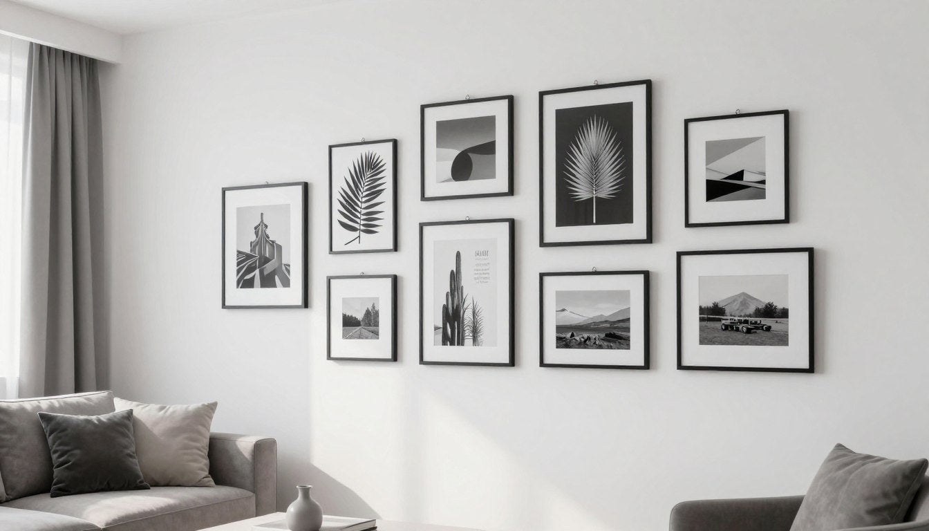
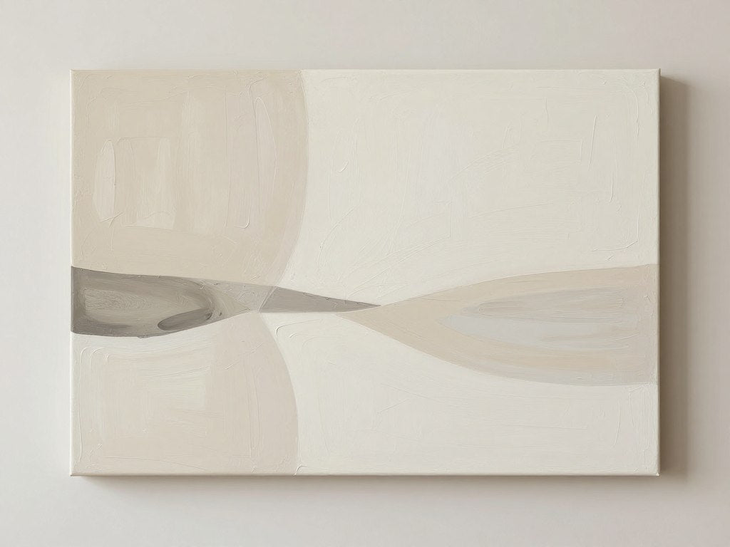
Leave a comment
This site is protected by hCaptcha and the hCaptcha Privacy Policy and Terms of Service apply.