Your bedroom wall above the bed often becomes an afterthought in home decor. Yet this space holds transformative power for the entire room. The right over bed wall art creates a focal point that anchors your bedroom design while expressing your personal style. It turns an empty wall into a statement of calm luxury.
Choosing art for this prominent space involves more than picking something pretty. The size must balance with your headboard. The placement height affects the room's visual flow. The style should promote restful energy rather than visual chaos.
This guide walks you through every decision in selecting and positioning art above your bed. You'll learn precise measurements that professional interior designers use. You'll discover which styles create serene bedroom atmospheres. Most importantly, you'll gain confidence in transforming that blank wall into your bedroom's crowning feature.
Serene Pieces That Transform Your Bedroom Space
If you love calming, centered aesthetics, these curated prints bring that exact mood into your bedroom. Each piece was selected for its ability to create visual balance above a bed while promoting restful energy.

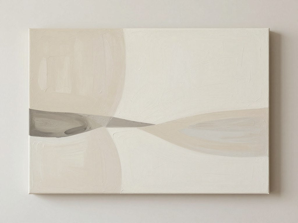
Minimalist Abstract Canvas
Soft neutral tones create instant calm. This piece works beautifully in modern and transitional bedrooms where simplicity meets sophistication.

Botanical Line Art
Nature-inspired designs bring organic serenity. The clean lines and botanical elements connect your space to the natural world without overwhelming it.

Black & White Geometric
Timeless monochrome designs offer versatility. These pieces adapt to evolving bedroom color schemes while maintaining a luxurious, gallery-quality look.
These bestselling bedroom canvas prints represent the most popular choices for creating serene sleeping spaces. Each arrives ready to hang with museum-quality materials.
Why the Space Above Your Bed Demands Attention
The wall above your bed serves as the natural focal point when entering most bedrooms. Your eye travels to this space first because it sits at the room's visual center. Without intentional design, this prominent wall becomes a missed opportunity that makes the entire bedroom feel incomplete.
Art above the bed anchors the room's design aesthetic. It ties together your bedding colors, furniture style, and overall bedroom decor into a cohesive visual story. This piece effectively sets the tone for the entire space.
The right wall art above your bed also influences the room's psychological atmosphere. Calming imagery and serene color palettes promote relaxation and better sleep quality. Visual chaos or aggressive colors can subtly increase stress levels even during rest.

Proper headboard alignment with your wall art creates visual balance that feels instinctively right. When proportions align correctly, the bed and art work together as a unified design element rather than competing focal points.
This space also represents valuable real estate for self-expression. Your bedroom remains your most personal space. The art you select for this prime location reflects your aesthetic preferences and creates an environment that truly feels like yours.
Determining the Perfect Size for Over Bed Wall Art
Size selection makes the difference between art that enhances your bedroom and art that disappears or overwhelms. Professional interior designers follow specific proportion rules that create visual harmony between your bed, headboard, and wall art.
The Two-Thirds Rule for Above Bed Sizing
Your art should span approximately two-thirds of your headboard width or bed width if no headboard exists. This proportion creates balance without dominating the wall. For a queen bed measuring 60 inches wide, aim for art between 40-50 inches in width.
This guideline prevents the most common sizing mistakes. Art that's too small looks like an afterthought floating awkwardly on a large wall. Oversized art crowds the space and creates visual tension rather than calm.
Height Considerations for Vertical Art
Vertical pieces should generally measure 30-36 inches tall for standard 8-foot ceilings. Taller ceilings allow for proportionally larger art. The piece should occupy the middle vertical third of the wall space between your headboard and ceiling.

Adjusting for Headboard Height
Tall upholstered headboards (over 50 inches) require larger art to maintain proper scale. Low-profile platform beds allow more wall space, so your art can expand vertically. Always measure your specific headboard height before selecting art dimensions.
For beds without headboards, treat the mattress top as your baseline. The art should start approximately 8-10 inches above the mattress and follow the same width proportions relative to bed size.
Gallery Wall Sizing Alternative
Gallery wall arrangements offer flexibility for smaller individual pieces. The collective arrangement should still follow the two-thirds width rule. Multiple pieces create visual interest while maintaining proper scale. Canvas print sets specifically designed for gallery wall layouts simplify this approach.
Common Bed Sizes and Art Recommendations
- Twin bed (38" wide): 24-30" art width
- Full bed (54" wide): 36-42" art width
- Queen bed (60" wide): 40-50" art width
- King bed (76" wide): 50-60" art width
- California King (72" wide): 48-58" art width

These measurements serve as starting points. Your room's specific proportions, ceiling height, and personal preferences may call for slight adjustments. Trust your eye while staying within general proportion guidelines.
Placement Height: Getting Your Art Positioning Right
Proper vertical placement proves just as critical as correct sizing. Art hung too high disconnects from the bed and floats awkwardly near the ceiling. Art placed too low crowds the headboard and disrupts visual flow.
The Standard 8-10 Inch Gap
Leave 8-10 inches of wall space between your headboard top and the bottom of your art. This breathing room creates visual separation while maintaining connection between elements. The negative space prevents crowding while keeping the composition unified.
For beds without headboards, measure from the mattress top. The same 8-10 inch gap applies, ensuring the art relates to the bed rather than floating randomly on the wall.
Eye Level Adjustment for Bedrooms
The traditional "eye level" hanging rule (57-60 inches from floor to art center) doesn't apply above beds. You view bedroom art primarily while lying down or standing at the room's entrance. The art should relate to the bed frame rather than standing eye level.
This context shift explains why bedroom art typically hangs higher than living room pieces. The bed itself occupies significant vertical space, pushing the art higher on the wall naturally.
Ceiling Height Impact
Standard 8-foot ceilings limit your vertical space. Maintain the 8-10 inch gap even if this places art closer to the ceiling. For 9-10 foot ceilings, you can increase the gap to 12-14 inches, allowing the art to breathe more.

Vaulted or cathedral ceilings create unique challenges. Center the art in the available wall space between headboard and ceiling peak. The piece should occupy the middle third of this vertical space.
Testing Placement Before Committing
Cut paper templates matching your art dimensions. Tape these to the wall to test placement before making holes. View from multiple positions: lying in bed, standing at the doorway, and from the side. The art should look balanced from all primary viewing angles.
This simple step prevents costly repositioning. It also helps you visualize scale and placement before your actual art arrives.
Match Your Style Vibe to the Perfect Art Collection
Art style dramatically affects bedroom atmosphere. Your selection should reflect the mood you want to create while complementing existing design elements. Different styles serve different aesthetic goals and emotional needs.
Match This Vibe to Your Space
Explore curated collections designed specifically for serene bedroom environments. Each collection offers pieces that promote calm, centered luxury above your headboard.
Minimalist and Abstract for Modern Serenity
Minimalist bedroom art emphasizes clean lines, limited color palettes, and ample negative space. These pieces create calm through visual simplicity. Abstract forms allow personal interpretation while avoiding literal imagery that can feel busy in a rest space.
Soft geometric shapes, watercolor washes, and organic abstract forms work particularly well. These styles provide visual interest without demanding attention. Your mind can rest rather than actively process complex imagery.

Botanical and Nature Themes for Organic Calm
Botanical wall art brings nature indoors without literal landscape photography. Line drawings of leaves, abstract plant forms, and subtle nature-inspired patterns create organic connections. These pieces promote relaxation through their association with natural environments.
Muted greens, soft browns, and creamy backgrounds work best. Avoid overly bright or tropical themes that can feel energizing rather than calming. The goal remains serene sophistication rather than vacation vibrancy.
Black and White for Timeless Versatility
Monochrome art adapts to evolving color schemes. As you change bedding or repaint walls, black and white pieces remain relevant. This versatility makes them practical investments for long-term bedroom styling.
The contrast in black and white artwork provides visual definition without color distraction. Line art, minimalist photography, and abstract compositions all work beautifully in monochrome for bedroom spaces.

Textured Paintings for Depth and Luxury
Original textured paintings or high-quality reproductions add dimensional interest. Impasto techniques, visible brushstrokes, and layered paint create tactile appeal. These pieces bring gallery-level sophistication to bedroom walls.
The texture catches light differently throughout the day, creating subtle visual changes. This dynamic quality adds life to the space without busy patterns. Original minimalist textured paintings offer this elevated aesthetic with authentic artistic value.
Portrait and Figurative Art for Personal Connection
Tasteful portrait canvas prints create human connection in the bedroom space. Abstract figurative work, line-drawn faces, or minimalist silhouettes add personality without feeling too literal or busy.
Choose pieces with calm expressions and simplified forms. Avoid intense eye contact or dramatic poses that can feel activating rather than restful. The presence should feel contemplative and serene.
Explore portrait canvas prints specifically curated for bedroom environments. These selections emphasize calm energy and sophisticated presentation.
Selecting Serene Color Palettes for Bedroom Wall Art
Color psychology plays a significant role in bedroom atmospheres. Your wall art's color palette should promote relaxation rather than stimulation. Certain colors naturally encourage calm while others subtly activate energy.
Cool Tones for Maximum Calm
Blues, soft greens, and lavenders create naturally calming effects. These cool colors lower perceived room temperature and encourage relaxation. They work particularly well in bedrooms that receive warm afternoon light.
Avoid overly saturated cool tones that can feel cold or clinical. Opt for muted, sophisticated versions: dusty blues, sage greens, and soft grays with cool undertones.
Warm Neutrals for Cozy Sophistication
Beiges, taupes, soft browns, and cream tones create warmth without overstimulation. These serene color palettes provide comfort while maintaining elegance. They complement a wide range of bedding colors and wood furniture tones.
Warm neutrals work especially well in rooms with cool natural light or minimal windows. They add perceived warmth that makes the space feel more inviting.

Monochromatic Schemes for Visual Rest
Single-color variations create cohesive, restful compositions. Tonal gradations in one color family provide subtle interest without competing elements. This approach works beautifully for minimalist bedroom design.
Gray scales, all-white compositions, and tonal beige works offer this simplified approach. The eye rests rather than processing multiple color relationships.
Accent Colors and Contrast Points
Small accent colors can add interest without overwhelming. A predominantly neutral piece might include touches of dusty rose, muted gold, or soft terracotta. These accent colors should appear as minor elements rather than dominant features.
High contrast should be used sparingly in bedroom art. Black and white works well because the contrast remains neutral. Bright color contrasts can feel too energetic for rest spaces.

Calming Color Recommendations
- Dusty blue and gray combinations
- Sage green with cream accents
- Warm taupe and beige layers
- Soft lavender gray tones
- Muted terracotta with neutral base
- Monochromatic gray scales
Your existing bedroom decor should guide final color selection. Pull accent colors from your bedding, curtains, or area rug. This creates visual continuity that makes the room feel intentionally designed rather than randomly decorated.
Layout Options: Single Statement Pieces vs. Gallery Walls
The decision between one large piece and multiple smaller pieces affects your bedroom's entire aesthetic. Both approaches work beautifully when executed correctly. Your choice depends on personal style, available art pieces, and desired visual impact.
Single Large Piece for Clean Focal Point
One substantial artwork creates immediate visual impact with minimal complexity. This approach works beautifully in minimalist or modern bedrooms where simplicity reigns. The single focal point draws the eye without competition.
Large-scale art makes a confident statement. It signals intentional design and sophisticated taste. For those who appreciate clean lines and uncluttered spaces, this remains the superior choice.

Diptych and Triptych Layouts for Balanced Drama
Two or three connected pieces create visual rhythm while maintaining cohesion. Diptychs work well for symmetrical layouts flanking a center point. Triptychs offer subtle movement across the wall space.
These multi-panel pieces should be hung with 2-4 inches between panels. The collective arrangement follows the same width and height guidelines as single pieces. Each panel relates to the others as part of one unified composition.
Gallery Wall for Personal Curation
Gallery wall arrangements above beds allow for personal curation and evolution over time. This approach works best in eclectic, bohemian, or collected aesthetics where layering tells a story.
The key to successful bedroom gallery walls lies in restraint. Too many pieces create visual chaos that works against rest. Limit your gallery to 3-5 carefully selected pieces that share a common element: color palette, frame style, or artistic theme.

Symmetrical vs. Asymmetrical Arrangements
Symmetrical layouts create formal balance and traditional elegance. Two identical pieces flanking the bed center or evenly spaced gallery arrangements project calm order. This approach suits classic and transitional bedroom styles.
Asymmetrical arrangements offer modern energy and visual interest. Varied sizes create dynamic compositions that feel collected and personal. This style requires more careful planning to achieve visual balance without formal symmetry.
Grid Layouts for Modern Precision
Uniform grid arrangements of 4, 6, or 9 pieces create contemporary sophistication. Each piece should be identically sized and framed. The mathematical precision projects confident modern design.
Maintain consistent spacing between all pieces (2-3 inches typically). The entire grid should follow the two-thirds width rule. Canvas print sets designed for grid layouts take the guesswork out of this approach.
Layout Decision Guide
- Choose single large pieces for minimalist or modern styles
- Select diptychs/triptychs for balanced visual rhythm
- Use gallery walls for eclectic or collected aesthetics
- Apply symmetrical layouts for traditional elegance
- Try asymmetrical arrangements for contemporary edge
- Consider grid layouts for precise modern sophistication

Your layout choice should feel authentic to your personal style. Don't force a gallery wall if you prefer simplicity, and don't limit yourself to one piece if you love curated collections. Trust your aesthetic instincts while following basic proportion guidelines.
Frame Styles and Mounting Options for Bedroom Art
Your chosen frame and mounting method affect the final presentation almost as much as the art itself. These practical decisions influence the overall aesthetic while determining installation ease and long-term enjoyment.
Canvas Prints: Ready-to-Hang Convenience
Gallery-wrapped canvas prints offer the most straightforward hanging solution. The printed canvas wraps around wooden stretcher bars with the image continuing around the edges. No additional framing is required.
These pieces hang with simple picture hooks or nails. The clean, modern presentation suits contemporary bedrooms beautifully. Canvas prints also weigh less than framed alternatives, making installation easier and safer.
Framed Prints for Traditional Elegance
Traditional frames add finished formality to art prints. Wood frames bring warmth and texture while metal frames offer sleek modern lines. The frame becomes part of the design element, either complementing or contrasting with the artwork.
Frame color should coordinate with existing bedroom furniture. Black frames create bold definition, white frames offer clean simplicity, and natural wood tones add organic warmth. Consider frame width relative to art size—larger pieces can handle wider frames.

Floating Frames for Modern Sophistication
Floating frames create the illusion that artwork hovers within the frame. A small gap between the art and frame edge produces this effect. This contemporary mounting style works beautifully with both prints and canvas.
The dimensional depth adds visual interest and gallery-level sophistication. Floating frames work particularly well for minimalist and modern wall artwork where clean lines matter.
Matting Considerations
Mats create breathing room between artwork and frame. This traditional approach suits smaller prints that need visual weight. White or cream mats offer classic elegance while colored mats can pick up accent colors from the art.
For bedroom spaces, avoid overly wide mats that make pieces feel too small for the wall space. If using mats, maintain proper overall sizing relative to your bed width.
Mounting Hardware and Safety
Proper mounting ensures your investment stays secure. Use appropriate hardware for your wall type—standard picture hangers for drywall, anchors for plaster, specialized hooks for concrete or brick.
For pieces over 20 pounds, use two mounting points rather than one. This distributes weight more evenly and prevents tilting. Consider professional installation for very large or heavy pieces, particularly above the bed where safety matters most.
Pro Tip: Use a level during installation to ensure perfectly straight hanging. Even slight tilts become obvious in bedroom spaces where you view the art daily from a reclined position.
The canvas prints collection offers ready-to-hang convenience with museum-quality presentation. Each piece arrives stretched, mounted, and prepared for immediate installation.
Common Over Bed Wall Art Mistakes to Avoid
Even with the best intentions, certain pitfalls can undermine your wall art for room decoration. Recognizing these common errors helps you achieve professional results that enhance rather than detract from your bedroom design.
Choosing Art That's Too Small
The most frequent mistake involves undersized art that disappears on the wall. Small pieces create awkward negative space and fail to create the intended focal point. Remember the two-thirds width rule and don't be afraid of appropriately scaled pieces.
When in doubt, size up rather than down. Slightly larger art makes a confident statement. Art that's too small just looks like an afterthought.
Hanging Art Too High
Floating art near the ceiling disconnects it from the bed and disrupts visual flow. The 8-10 inch gap between headboard and art maintains proper relationship. Resist the urge to center art on the entire wall height—it should relate to the bed frame instead.

Selecting Overly Busy or Stimulating Art
Bedrooms require visual calm. Highly detailed artwork, intense colors, or aggressive imagery works against restful environments. Save bold, energetic pieces for living areas and offices where stimulation serves a purpose.
Your bedroom wall art design should promote relaxation even if you love vibrant art elsewhere in your home. Context matters when selecting appropriate pieces for each room.
Ignoring Color Relationships
Art that clashes with existing bedroom colors creates visual discord. While contrast can work, jarring color combinations feel unsettling in rest spaces. Pull at least one color from your bedding or walls to create intentional coordination.
This doesn't mean everything must match perfectly. Subtle color echoes create cohesion without feeling matchy-matchy.
Forgetting About Negative Space
Crowding your wall with too much art or placing pieces too close together creates visual clutter. Negative space around and between art pieces allows each element to breathe. This breathing room contributes to the calm, centered atmosphere you're trying to create.
In bedroom spaces, less often proves more. Edit ruthlessly and give each piece room to make its impact.
Overlooking Lighting Considerations
Art placed where glare hits from windows or where shadows fall constantly never looks its best. Consider natural light sources and existing fixtures when positioning pieces. Artwork should be well-lit but not in direct harsh sunlight that can fade colors over time.
Bedroom Art Best Practices
- Follow two-thirds width proportion
- Maintain 8-10 inch gap above headboard
- Choose calming colors and subjects
- Select appropriately scaled pieces
- Coordinate with existing decor
- Allow breathing room and negative space
- Consider lighting and viewing angles
Common Mistakes to Avoid
- Undersized art that looks lost
- Hanging pieces too high near ceiling
- Busy, stimulating imagery
- Clashing color combinations
- Overcrowding wall with too many pieces
- Ignoring negative space importance
- Placing art in glare or shadow zones
Learning from these common mistakes saves time, money, and frustration. Most errors stem from uncertainty about proportion and placement. Following the guidelines throughout this article helps you avoid these pitfalls entirely.
Professional Styling Tips From Interior Designers
Interior design professionals use specific techniques to create cohesive bedroom styling that feels intentional rather than accidental. These insider approaches help your over bed wall art integrate seamlessly with the entire room design.
Create a Cohesive Color Story
Professional designers select art that shares at least one color with bedding, curtains, or accent furniture. This creates visual threads that tie the room together. The connections don't need to be obvious—subtle color echoes work beautifully.
Consider pulling a secondary color from your art into throw pillows or a bedroom bench. These intentional repetitions signal thoughtful design.
Layer Textures for Visual Richness
Combine your wall art with textured bedding, woven throws, and varied materials throughout the room. If your art is smooth canvas, balance it with linen bedding and velvet pillows. This layering creates sophisticated depth that engages multiple senses.
Textured wall art, like original textured paintings, adds another dimensional layer that captures light beautifully throughout the day.

Balance Symmetry and Asymmetry
Even if your art placement is centered and symmetrical, introduce asymmetrical elements elsewhere. One table lamp instead of two, or varied nightstand heights create visual interest. This prevents the room from feeling too formal or rigid.
Conversely, if your wall art uses asymmetrical arrangement, balance it with symmetrical elements like matching nightstands or identical table lamps.
Consider the View from the Bed
You'll spend significant time viewing your bedroom from a reclined position. Test your art placement by lying in bed and assessing the view. The piece should look balanced and pleasing from this primary viewing angle.
Also consider the view from the doorway, as this provides your first impression when entering the room. The art should look intentional from both perspectives.
Use Lighting to Enhance Art
Picture lights, directional can lights, or even well-placed lamps can dramatically enhance your wall art's impact. Proper lighting reveals colors accurately and creates ambiance. Dimmable options allow you to adjust lighting intensity for different moods.
Avoid harsh overhead lighting that creates glare. Soft, directed lighting that grazes the wall creates the most flattering presentation.
Think Beyond the Box
While traditional rectangular and square art dominates, think outside box with unique shapes. Round pieces, hexagonal canvases, or organic shaped art can create unexpected visual interest while maintaining the serene aesthetic.
Sculptural wall pieces also offer three-dimensional alternatives. Modern sculptures designed for wall mounting provide tactile interest beyond flat art.

Designer Pro Tips Summary
- Pull art colors into textiles and accessories
- Layer varied textures throughout the room
- Balance symmetrical and asymmetrical elements
- View art from bed position before finalizing
- Use lighting to enhance art presentation
- Consider non-traditional shapes for interest
- Edit accessories to let art shine
- Update art seasonally if desired for freshness
These professional techniques elevate your bedroom from simply decorated to intentionally designed. The difference lies in cohesive choices that create a unified aesthetic story.
Adapting Art Choices for Different Bedroom Types
Not all bedrooms serve the same purpose or suit the same aesthetic. Your art selection should adapt to the specific bedroom type and its inhabitants. What works beautifully in a primary bedroom may feel inappropriate in a guest room or child's space.
Primary Bedroom: Personal Sanctuary
Your primary bedroom represents your most personal retreat. This space allows for deeply personal art choices that reflect your authentic aesthetic preferences. Invest in quality pieces that bring you genuine joy and calm.
This remains the ideal location for statement artwork, original pieces, or meaningful art that holds personal significance. Don't compromise on primary bedroom art—it impacts your daily life significantly.
Guest Bedroom: Welcoming Neutrality
Guest bedroom wall art ideas should embrace broader appeal. Choose universally calming pieces that create welcoming atmospheres without imposing strong personal taste. Neutral color palettes and non-controversial subjects work best.
Consider artwork that reflects your home's location or natural surroundings. Landscape-inspired abstract pieces or botanical themes create pleasant, welcoming environments for visitors.

Children's and Teen Bedrooms: Age-Appropriate Evolution
Younger children benefit from playful but not overstimulating wall art. Simple shapes, gentle colors, and age-appropriate themes create fun environments that still promote rest. Kids room canvas prints offer curated options designed for younger age groups.
Teen bedrooms require more sophisticated choices that respect developing taste. Involve teens in selection to ensure the art resonates with their evolving identity. Abstract pieces, music or cinema-inspired art, and minimalist designs often appeal to this age group.
Small Bedrooms: Space-Conscious Choices
Compact bedrooms benefit from lighter color palettes and simpler compositions that don't overwhelm limited space. Vertical pieces can make ceilings feel higher. Avoid dark, heavy artwork that visually shrinks the room.
Single statement pieces work better than gallery walls in small bedrooms. Multiple pieces can make tight spaces feel cluttered and busy.
Large Primary Suites: Scaling Up Appropriately
Spacious bedrooms can accommodate larger scale art or more ambitious gallery wall arrangements. The extra wall space above king beds demands appropriately sized pieces. Undersized art looks particularly lost in large bedroom spaces.
Consider oversized single pieces (60+ inches wide) or expansive gallery arrangements that fill the space confidently. Large bedrooms also allow for additional wall art beyond the bed area.
Bedroom-Specific Guidelines
- Primary bedrooms: Invest in meaningful, high-quality pieces
- Guest rooms: Choose universal appeal and calming neutrals
- Kids' rooms: Select age-appropriate, non-stimulating designs
- Teen spaces: Involve them in sophisticated selections
- Small bedrooms: Opt for lighter colors and simpler compositions
- Large suites: Scale up appropriately with oversized pieces

Understanding your specific bedroom's purpose, size, and occupants helps narrow the overwhelming world of art options to appropriate choices that serve the space well.
Investing in Quality Wall Art That Lasts
Quality bedroom wall art represents an investment in your daily environment and long-term satisfaction. Understanding what constitutes quality helps you make purchases you'll love for years rather than regret within months.
Print Quality and Material Considerations
Canvas print quality varies dramatically between budget and premium options. Museum-quality canvas uses archival inks that resist fading for decades. Cheap prints use dye-based inks that fade noticeably within a few years, especially in rooms with natural light.
Look for giclée printing (the fine art standard) on cotton or poly-cotton blend canvas. The canvas should have substantial weight and tooth. Thin, flimsy canvas signals lower quality that won't hold up.
Stretcher Bar Construction
Quality canvas prints use solid wood stretcher bars rather than cheap composite materials. The corners should be properly joined, not simply stapled. Thicker stretcher bars (1.5 inches) create more impressive dimensional depth than thin 0.75-inch options.
Well-constructed stretcher bars prevent warping and sagging over time. This structural quality matters especially for large pieces above your bed.

Original Art vs. Reproductions
Original paintings carry unique value as one-of-a-kind pieces. They represent direct support of living artists and bring authentic artistic energy to your space. However, quality reproductions of original work offer accessible luxury when originals exceed budget.
The best reproductions are created by the original artist or under their direct supervision. This ensures color accuracy and proper representation of the artist's intent. Original paintings offer collectors authentic pieces while curated print collections provide accessible luxury.
Framing Quality for Longevity
If choosing framed art, frame construction quality matters as much as the art itself. Solid wood frames last indefinitely while composite frames can deteriorate or separate at corners. UV-protective glass or acrylic prevents fading in sunlight-exposed rooms.
Acid-free matting prevents yellowing and damage to paper prints. Proper backing and hanging hardware ensure secure, straight presentation for years.
Return Policies and Satisfaction Guarantees
Reputable art sellers offer return periods or satisfaction guarantees. This protection matters especially when purchasing online where you can't preview pieces in person. The ability to view art in your actual space before committing reduces purchase anxiety.
Free return shipping makes trying pieces risk-free. This customer-focused approach signals confidence in product quality.
Ready-to-Hang, Museum-Quality Canvas Art
Every piece in our collection features archival-quality printing on premium canvas with solid wood stretcher bars. Arrives ready to hang with free worldwide shipping and a satisfaction guarantee. Transform your bedroom with art that lasts.
Price vs. Value Considerations
Cheap art rarely proves economical. Pieces that fade, warp, or disappoint visually end up replaced, doubling your expense. Quality art you love provides years of daily enjoyment, making the higher initial investment worthwhile.
Calculate cost per year of enjoyment rather than just upfront price. A $200 quality piece you keep for 10+ years costs less annually than a $50 piece you replace every two years.
Quality Investment Tip: For primary bedrooms where you'll see the art daily, always choose quality over budget options. Guest bedrooms or temporary spaces allow more flexibility with budget-conscious choices.
Refreshing Your Bedroom Look: Seasonal Art Updates
While quality bedroom wall art provides long-term satisfaction, some homeowners enjoy seasonal refreshes that evolve with changing moods and seasons. This approach keeps your most personal space feeling current and responsive to your evolving taste.
Creating an Art Rotation System
Build a small collection of pieces that rotate through your bedroom over the year. Store off-season art properly (wrapped, in climate-controlled spaces) to maintain condition. This system allows variety without constant purchasing.
Rotating art gives each piece renewed impact. Absence makes the eye grow fonder—pieces you loved before gain fresh appeal after months in storage.
Seasonal Color Palette Shifts
Cool blues and greens feel refreshing in warm summer months. Warm neutrals and deeper tones create cozy cocoons during winter. These subtle seasonal shifts affect bedroom atmosphere without requiring complete redesigns.
Changing art seasonally offers an affordable refresh compared to repainting or buying new furniture. The transformation feels significant despite modest effort.

Trend-Conscious vs. Timeless Choices
Invest in timeless pieces as your permanent collection. Use more affordable prints for trend-conscious seasonal experiments. This balanced approach lets you enjoy current aesthetics without committing significant funds to trends that may not age well.
Abstract, minimalist, and nature-inspired pieces tend toward timelessness. Highly specific colors or very literal imagery may feel dated more quickly.
Working With What You Have
If rotating multiple pieces exceeds your budget, refresh the look with changeable elements around your permanent art. New throw pillows, different bedding colors, or seasonal flowers create fresh contexts that make existing art feel new.
Simply cleaning your art and adjusting lighting can revive its impact. Dust and neglect dull even beautiful pieces.
For those interested in building versatile collections, explore the full range at Rossetti Art's canvas prints gallery. Building a rotation of 3-4 pieces provides years of refreshing variety.
Creating Your Perfect Bedroom Sanctuary
The wall above your bed represents more than empty space waiting to be filled. It holds potential to anchor your bedroom design, reflect your personal aesthetic, and contribute meaningfully to the restful sanctuary you create for yourself.
Throughout this guide, you've gained specific knowledge about sizing proportions, placement height, style selection, and quality considerations. These aren't arbitrary rules but proven principles that create visual harmony and psychological comfort. Following these guidelines removes guesswork and builds confidence in your decisions.

Remember that your bedroom serves you personally. While design principles provide structure, your authentic preferences should guide final choices. The art you select should resonate emotionally, not just check technical boxes. When proportions are correct and the piece speaks to you, that combination creates magic.
Start with measurements. Know your bed width, headboard height, and available wall space. These numbers guide your size requirements. Then explore styles and colors that promote the calm, centered, luxurious atmosphere you crave. Test placement before committing. Trust both the guidelines and your instincts.
Quality matters in pieces you'll see daily for years. Invest appropriately in your primary bedroom where impact is greatest. The right over bed wall art doesn't just decorate your space—it completes it, creating the cohesive sanctuary you deserve. Your perfect piece awaits. The transformation begins with that first confident choice.
For additional inspiration and bedroom styling guidance, explore the Rossetti Art design blog featuring expert tips and creative ideas for every room in your home.
Frequently Asked Questions About Over Bed Wall Art
What size art should I hang above a queen bed?
For a queen bed measuring 60 inches wide, your art should be approximately 40-50 inches in width. This follows the two-thirds proportion rule that creates proper visual balance. If using multiple pieces in a gallery wall arrangement, the collective width of all pieces together should fall within this range. Height should typically be 30-36 inches for standard 8-foot ceilings, occupying the middle third of the wall space between your headboard and ceiling.
View properly sized options in the bedroom canvas prints collection.
How high should I hang wall art above my bed?
Leave 8-10 inches of space between the top of your headboard and the bottom of your art. This gap creates visual separation while maintaining connection between the bed and wall art. For beds without headboards, measure from the mattress top and maintain the same 8-10 inch distance. This placement ensures the art relates to the bed rather than floating disconnected near the ceiling. Always view from your bed position and the doorway to confirm the placement looks balanced from primary viewing angles.
Should bedroom wall art be centered on the wall or centered on the bed?
Center your wall art on the bed, not the wall itself. The art should align with the bed's center point, creating visual relationship between these two primary bedroom elements. If your bed isn't centered on the wall (common in rooms with offset windows or doors), the art follows the bed position. This creates intentional asymmetry that looks more balanced than forcing wall-centered art above an off-center bed. The bed and art work as a unified composition.
What colors work best for bedroom wall art?
Calming colors that promote relaxation work best in bedroom spaces. Cool tones like soft blues, sage greens, and muted lavenders create naturally soothing effects. Warm neutrals including beige, taupe, cream, and soft brown tones offer cozy sophistication. Monochromatic schemes in gray scales or tonal variations provide restful simplicity. Avoid highly saturated bright colors or jarring contrasts that can feel overstimulating. Pull at least one color from your existing bedding or decor to create cohesive visual flow throughout the room.
Explore serene color palettes in abstract prints and botanical collections.
Is it better to have one large piece or multiple smaller pieces above the bed?
Both approaches work beautifully when executed correctly. Single large pieces create clean, confident focal points ideal for minimalist and modern aesthetics. They offer immediate impact with visual simplicity. Multiple smaller pieces in gallery wall arrangements allow for personal curation and work well in eclectic or collected styles. The key is maintaining proper collective sizing—whether one piece or many, the total arrangement should follow the two-thirds width proportion. Choose based on your personal aesthetic preference and the level of visual complexity you want in your bedroom.
Can I hang canvas prints without frames in a bedroom?
Yes, gallery-wrapped canvas prints offer a clean, modern presentation perfect for contemporary bedrooms. The image wraps around the edges of stretcher bars, eliminating the need for traditional frames. This frameless approach creates streamlined sophistication while simplifying installation. Canvas prints are also lighter than framed alternatives, making hanging easier and safer. Quality canvas prints with proper stretcher bar construction look professionally finished without frames. This style suits minimalist, modern, and transitional bedroom aesthetics beautifully.
Browse ready-to-hang options at Rossetti Art canvas gallery.
What style of art promotes better sleep?
Abstract and minimalist styles with limited color palettes and simple compositions promote the most restful environments. Soft geometric forms, gentle organic shapes, and nature-inspired designs create calm without demanding active processing from your brain. Avoid highly detailed artwork, intense colors, or dramatic imagery that can feel stimulating rather than soothing. Horizontal compositions feel more restful than vertical pieces. The goal is visual interest that allows your mind to rest rather than artwork that demands attention or creates emotional intensity.
How do I choose art for a small bedroom?
Small bedrooms benefit from lighter color palettes and simpler compositions that don't overwhelm limited space. Choose pieces with significant negative space and avoid dark, heavy imagery that visually shrinks rooms. Vertical orientations can make ceilings feel higher in compact spaces. Stick with single statement pieces rather than gallery walls—multiple pieces can make small bedrooms feel cluttered. Despite the compact room, don't go too small with art size. Follow the same two-thirds proportion rule, which ensures the art feels appropriately scaled even in smaller spaces.
Should guest bedroom art be different from primary bedroom art?
Guest bedroom art should embrace broader, more universal appeal than primary bedroom selections. Choose calming, welcoming pieces with neutral subjects that don't impose strong personal taste. Avoid highly personal or controversial imagery. Landscape-inspired abstracts, botanical themes, and serene neutral compositions work well. The goal is creating comfortable, hotel-like environments that feel welcoming to various visitors. Primary bedrooms allow for deeply personal choices since they serve your specific preferences. Guest spaces require more diplomatic selections that prioritize comfort over personal expression.
How can I tell if canvas print quality is good before buying?
Look for specific quality indicators: giclée printing with archival inks (prevents fading), substantial canvas weight (16 oz. or heavier), solid wood stretcher bars (not composite materials), and proper gallery wrapping with image continuation around edges. Quality sellers provide detailed specifications about materials and construction. Check for satisfaction guarantees or return policies that allow you to evaluate quality in person. Read reviews specifically mentioning print quality, color accuracy, and construction durability. Museum-quality designations indicate higher standards than budget prints that use inferior materials and dye-based inks.

Leave a comment
This site is protected by hCaptcha and the hCaptcha Privacy Policy and Terms of Service apply.