
The organic movement of limewash and plaster walls creates a stunning backdrop in modern homes, but it also presents a unique styling challenge. When your walls already have character and depth, choosing the right print size for textured walls becomes crucial to maintain visual harmony. This comprehensive guide explores the designer principles for pairing art with textured surfaces, helping you create a space where both your walls and artwork shine without competing.
Quick Answer (TL;DR)

Why Textured Walls Change the "Rules" of Art
Shadow + Movement = Extra Visual Noise
Textural walls like limewash and plaster aren't just a color – they're a dynamic surface that changes throughout the day as light moves across their uneven finish. This natural movement creates subtle shadows and highlights that add visual complexity to your space before any art is introduced. Unlike flat painted walls that act as neutral backdrops, textured walls are active participants in your room's visual story.

Texture Eats Contrast (Why Subtle Art Disappears)
One of the biggest challenges when styling textured walls is what designers call the "contrast absorption" effect. The varied surface of limewash or plaster walls tends to visually absorb subtle details and low-contrast artwork. That delicate watercolor or pencil sketch that looks perfect on a smooth wall can completely disappear when placed against a heavily textured surface. The wall's own character competes with and often overwhelms nuanced artwork.
This is why understanding the relationship between your walls and art is essential for creating a cohesive space where both elements enhance rather than fight with each other. The good news is that with the right approach, you can create stunning combinations that leverage this textural interplay to your advantage.
The 3-Part Formula Designers Use
Professional interior designers rely on three key contrast principles when pairing art with textured walls. These principles help ensure your artwork stands out beautifully against even the most character-rich surfaces.
Value Contrast (Light/Dark)
Value contrast refers to the difference between light and dark elements in your artwork. Against textured walls, pieces with strong value contrast naturally command attention. Black-and-white pieces that sharpen contrast work exceptionally well, as do compositions with clear distinctions between light and shadow.

Designer tip: For limewash walls with warm undertones, choose art with at least 70% value contrast between its lightest and darkest elements to ensure it doesn't blend into the background.
Edge Contrast (Crisp Geometry vs Soft Washes)
While your walls offer organic, soft-edged texture, artwork with crisp, defined edges creates a pleasing visual counterpoint. Bold abstract shapes that 'stand up' to texture provide this edge contrast naturally. Geometric patterns, architectural photography, and minimal line art with plenty of negative space all offer the clean edges that help define art against textural backgrounds.

Scale Contrast (One Statement Piece Beats Many Small)
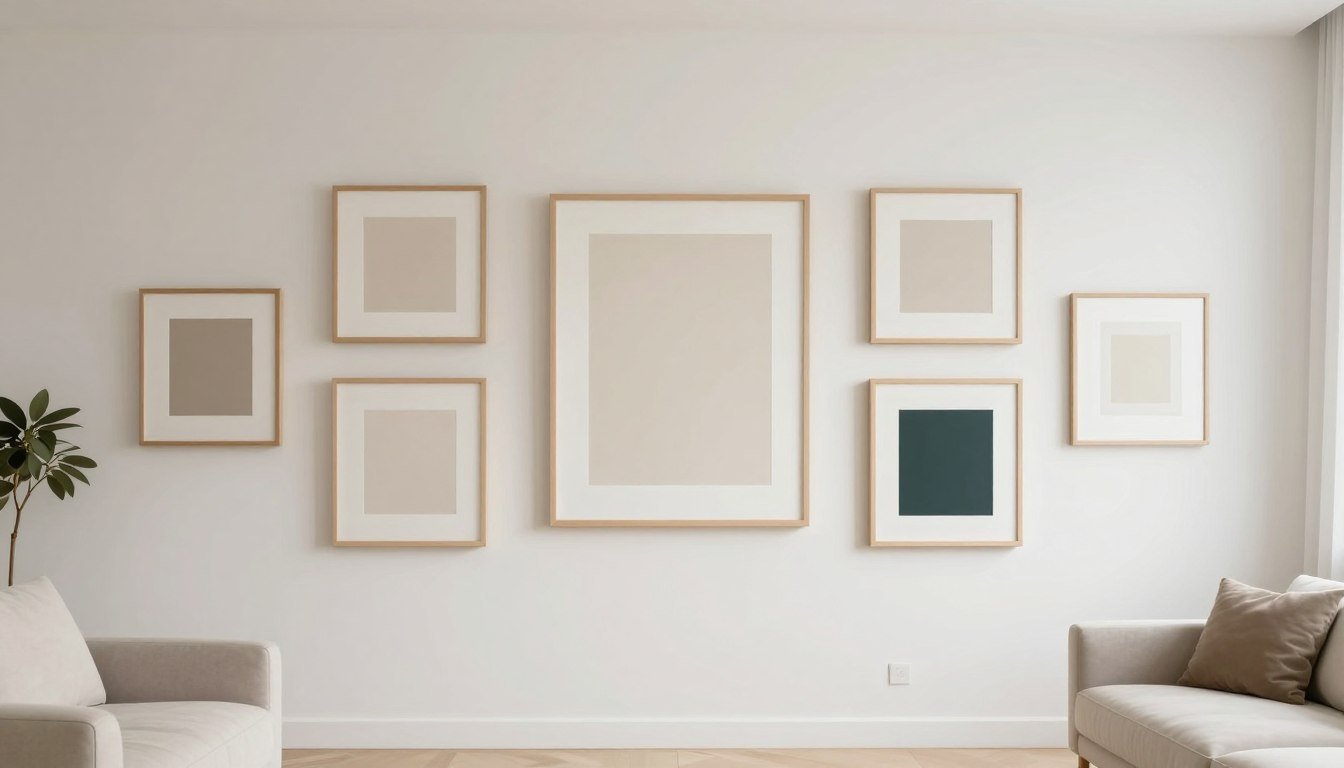
When it comes to textured walls, scale becomes particularly important. A single larger piece often works better than a collection of smaller works, as it creates a focal point that can stand up to the wall's texture. This doesn't mean you can't create a gallery wall on limewash, but it does suggest being more intentional about spacing and arrangement.
Consider how museum-quality canvas prints with clean edges in larger sizes (24×36 inches or larger) create impact against textured walls. The substantial scale helps the artwork hold its own against the visual weight of the texture.
Texture-to-Art Pairing Matrix (Linkable Asset)
Use this designer matrix to quickly determine the best art approach based on your specific wall texture and undertone. This reference guide helps you navigate the sometimes complex relationship between textured walls and artwork.
| Texture Level | Wall Undertone | Best Art Style | Best Color Strategy | Best Frame Choice | Size Rule | Avoid This |
| Soft (Light Limewash) | Warm | Abstract, Minimal | Monochrome or 2-color | Thin frame or floater | Single large piece | Busy patterns, pastel colors |
| Soft (Light Limewash) | Cool | Line art, Figurative | Accent pop (1 bold color) | Floater frame | Diptych or single large | Low contrast, tiny details |
| Medium (Standard Limewash) | Warm | Bold abstract, Minimal | High contrast monochrome | No frame or floater | Single XL or triptych | Small frames, watercolors |
| Medium (Standard Limewash) | Cool | Geometric, Metallic | 2-color with metallic | Thin metal frame | Single large or diptych | Busy gallery walls, pastels |
| Heavy (Plaster) | Warm | Bold minimal, Sculptural | Black & white or single bold | Substantial floater | Single XL statement | Multiple small pieces, subtle art |
| Heavy (Plaster) | Cool | Abstract, Metallic | High contrast with metal | Floater or unframed | Single large statement | Busy patterns, small frames |
Find Your Perfect Textured Wall Pairing
Browse our curated collection of canvas prints designed to complement textured walls with the perfect balance of contrast, scale, and visual impact.
Browse the Full Rossetti Art CollectionBest Art Styles Next to Limewash/Plaster (with examples)
Minimal Black & White
Black and white art creates maximum contrast against textured walls, allowing both elements to shine without competing. The simplicity of monochromatic pieces provides a visual rest from the complexity of the wall texture. Consider abstract compositions, photography with strong shadows, or graphic line work.

Bold Abstract + Clean Shapes
Abstract art with clean, defined shapes creates a pleasing counterpoint to the organic nature of textured walls. Look for pieces with bold forms, limited color palettes, and strong compositional structure. These qualities help the artwork stand up to the visual weight of texture.
When selecting abstract art, consider how bold abstract shapes that 'stand up' to texture create a dynamic relationship with your walls. Pieces with larger, simplified forms tend to work better than those with intricate details.
Line Art + Negative Space
Line art with generous negative space offers the perfect balance of presence and restraint for textured walls. The clean, precise lines contrast beautifully with the organic texture, while the negative space prevents visual overwhelm. Consider figure drawings, architectural sketches, or abstract line compositions.

Metallic Accents (When It Works)
Metallic elements in artwork can create stunning interactions with textured walls, especially when the lighting is considered. Gold, silver, or copper accents catch light differently than the wall texture, creating visual separation. This approach works particularly well with cooler-toned walls where the warmth of metallics provides pleasing contrast.
For best results, limit metallic elements to accents rather than entire pieces, and ensure proper lighting to maximize their reflective qualities.
Figurative Pieces (How to Avoid "Busy")
Figurative art can work beautifully with textured walls when approached thoughtfully. The key is simplification – look for pieces with clean lines, limited color palettes, and strong silhouettes. Avoid overly detailed or busy compositions that will compete with the wall texture.

Consider how modern styles that pair with plaster texture often emphasize form over detail, creating a harmonious relationship between art and architecture.
Frame & Finish Guide for Heavy Texture
Floater Frames vs Framed vs Unframed
Your framing choice significantly impacts how artwork interacts with textured walls. Floater frames create visual separation between the art and wall, allowing both to maintain their distinct character. These frames hold the canvas slightly away from the wall, creating a shadow line that defines the artwork's boundaries.
Traditional frames with mattes can also work well, especially for works on paper, as they create a clear visual boundary. Unframed canvas can be effective for very large pieces or when you want a more casual, integrated look.

Matte Finishes + Glare Control
The finish of your artwork is particularly important against textured walls. Matte or semi-matte finishes typically work best as they minimize glare and allow the artwork's details to remain visible from different angles. Highly glossy finishes can create distracting reflections that compete with the wall texture.
For how to mount canvas on textured walls while controlling glare, consider the lighting placement in your room. Avoid direct spotlights that create harsh reflections, and instead opt for ambient lighting or properly angled art lights.
Spacing Rules from Corners/Edges (Feature Wall Balance)
Proper spacing helps create visual balance between artwork and textured walls. For feature walls, center the artwork and allow generous breathing room around it – typically at least 8-12 inches from any edge or corner. This spacing allows the texture to frame the art rather than compete with it.
For larger walls, the classic design rule suggests hanging art at eye level (approximately 57-60 inches from the floor to the center of the piece). However, with textured feature walls, you might consider slightly higher placement to create more presence, especially for larger pieces.
Room-by-Room Placement
Living Room Focal Wall
In living rooms, textured walls often serve as dramatic focal points. Pair these walls with substantial artwork that anchors the space – typically one large piece (40+ inches) or a carefully arranged diptych or triptych. Position the art centered on the wall and at proper height relative to seating.

Consider how the artwork relates to your furniture arrangement. The piece should feel connected to the seating area, not floating independently. For textured walls behind sofas, choose art that spans approximately two-thirds of the sofa's width for proper proportion.
Bedroom Calm Zone
Bedrooms benefit from the serene quality of textured walls, especially in limewash finishes. Here, art should enhance the restful atmosphere. Consider pieces with soothing subjects, limited color palettes, and strong but not jarring contrast.
For placement, the wall above the bed is traditional, with the artwork centered and sized to approximately 2/3 the width of the headboard. Alternative placements include the wall opposite the bed (what you see upon waking) or a side wall that's visible from the bed.
Entryway "Statement Moment"
Entryways with textured walls offer the perfect opportunity for a dramatic first impression. This transition space benefits from bold, impactful art that sets the tone for your home. Consider oversized pieces, striking black and white photography, or pieces with metallic elements that catch light.

For narrow entryways with textured walls, vertical art helps emphasize ceiling height and create a sense of spaciousness. In larger foyers, consider how the art will be viewed from multiple angles as people move through the space.
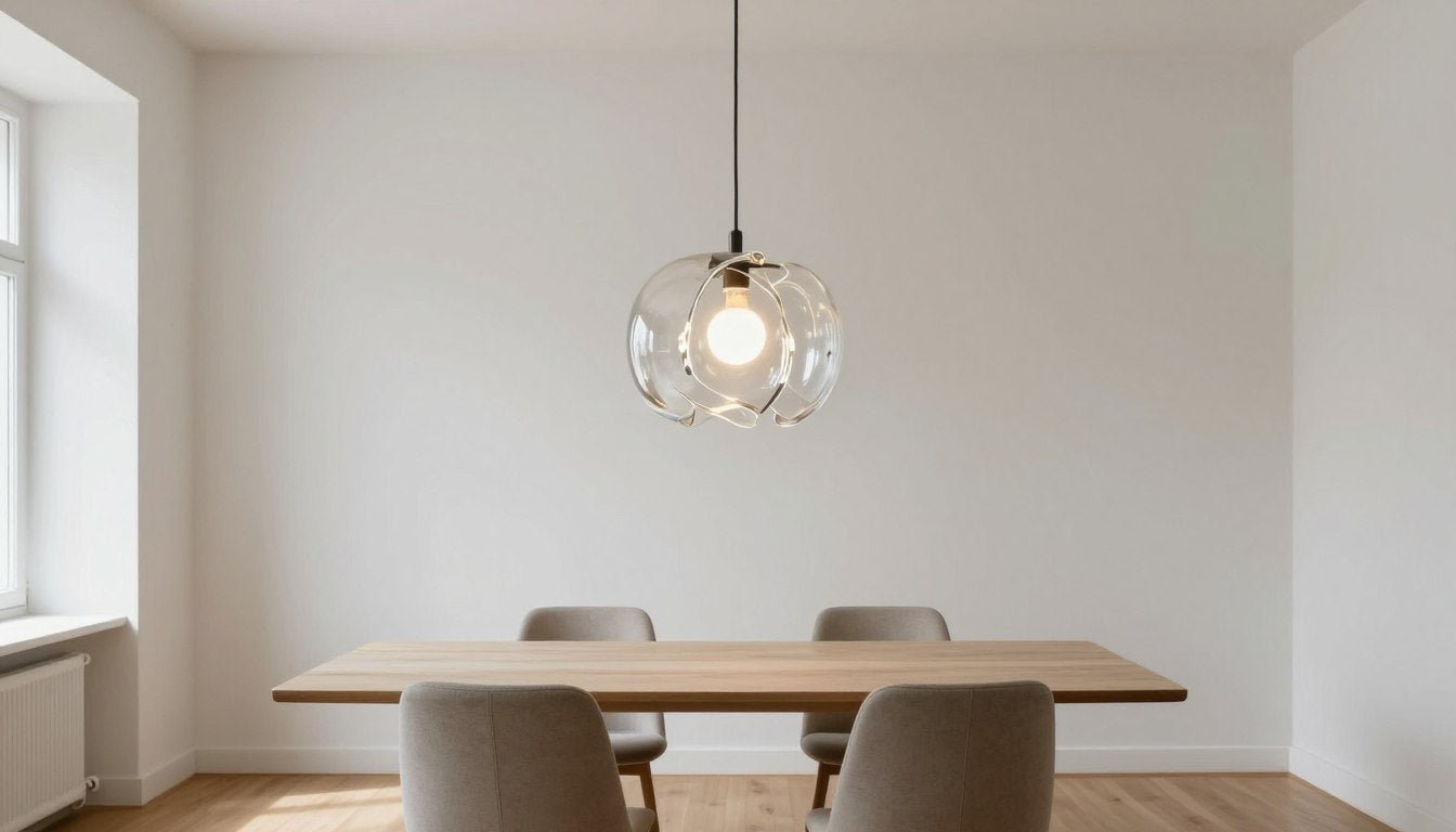
Dining Room and Warm Lighting
Dining rooms with textured walls benefit from the interplay of art and lighting. Since dining often happens in evening hours, consider how your artwork will look under warm artificial light. Pieces with depth, texture of their own, or metallic elements can create beautiful effects in this setting.
For placement, center art on the wall at seated eye level, or create a gallery arrangement that relates to the length of your dining table. Consider how a sculptural accent when the wall is already the artwork can add dimension without competing with the wall texture.
Common Mistakes (and Quick Fixes)
"Low-Contrast Disappears"
The most common mistake is choosing art with insufficient contrast for textured walls. Subtle watercolors, pencil sketches, or pieces with low value contrast often visually disappear against the varied surface of limewash or plaster.
Quick fix: If you love a low-contrast piece, frame it with a substantial matte and frame to create separation from the wall. Alternatively, place it on a smooth wall elsewhere in your home where its subtlety can shine.

"Too Many Small Pieces"
Another common error is creating busy gallery walls with many small pieces on textured surfaces. The combined visual complexity can feel overwhelming and chaotic rather than intentional.
Quick fix: Consolidate smaller pieces into more substantial groupings with generous spacing, or redistribute some pieces to smooth walls. Consider replacing multiple small works with one larger, impactful piece that can hold its own against the texture.
"Busy Art on Busy Wall"
Pairing highly detailed or visually complex artwork with heavily textured walls creates competition for attention. Neither element gets to shine properly in this scenario.
Quick fix: Follow the design principle of "busy with calm" – if your wall has significant texture, choose art with cleaner lines and more negative space. Save intricate, detailed pieces for smooth walls where they can be properly appreciated.
"Wrong Lighting Angle"
Improper lighting can exacerbate the challenges of pairing art with textured walls. Direct overhead lighting casts shadows that emphasize wall texture while potentially obscuring artwork details.

Quick fix: Install adjustable art lighting that can be angled to highlight the artwork while minimizing shadows on the wall texture. Picture lights mounted to the frame or wall-mounted adjustable fixtures work well for this purpose.
Recommended Next Reads
Ready to Transform Your Textured Walls?
Explore our curated collection of canvas prints specifically selected to complement the unique character of limewash and plaster walls.
Shop Canvas PrintsFAQ
Can you hang canvas prints on limewash or plaster walls?
Yes, canvas prints are excellent choices for textured walls like limewash or plaster. Their lightweight nature makes them easy to hang, and their texture creates an interesting dialogue with the wall surface. For hanging, consider using specialized picture hooks designed for plaster, or removable hanging strips for lighter pieces. Always check the wall's stability before hanging heavier artwork.
What colors look best against warm beige limewash?
Warm beige limewash walls pair beautifully with high-contrast colors that create visual separation. Black and white art provides maximum impact, while deep blues, forest greens, and rich terracottas complement the warmth of beige limewash. For a more subtle approach, consider art with similar warm tones but in deeper or lighter values to create tonal contrast.
Is black-and-white art too harsh for textured walls?
Black-and-white art is actually ideal for textured walls, as it provides the strong value contrast needed to stand out against the varied surface. Rather than appearing harsh, the clean contrast often creates a sophisticated, balanced look. The key is choosing pieces with the right proportion of black to white – aim for compositions with generous negative space to prevent overwhelming the texture.
How big should art be on a textured feature wall?
For textured feature walls, size matters significantly. As a general rule, aim for artwork that occupies about 2/3 to 3/4 of the available wall width (excluding margins). For standard living room walls, this often translates to pieces 36 inches or larger. Smaller pieces tend to get visually lost against textured surfaces, while properly scaled artwork creates presence and balance.
Should I use a frame on textured walls (floater vs framed)?
Floater frames are particularly effective for canvas art on textured walls as they create visual separation between the art and wall surface. The small gap between canvas and frame creates a shadow line that helps define the artwork. Traditional frames with mattes can also work well, especially for works on paper. Unframed canvas can be effective for very large pieces or when seeking a more casual, integrated look.
How do I light art on plaster walls without emphasizing bumps?
Lighting art on plaster walls requires careful angle consideration. Avoid harsh overhead lighting that casts shadows on the textured surface. Instead, use adjustable art lights positioned at approximately 30 degrees from the wall, focused primarily on the artwork rather than the surrounding wall. Picture lights mounted to the frame or adjustable track lighting can provide ideal illumination that highlights the art while minimizing texture shadows.
Can I do a gallery wall on limewash, or should it be one piece?
Gallery walls can work on limewash surfaces when approached thoughtfully. The key is providing ample spacing between pieces (at least 3-4 inches) and limiting the number of works to prevent visual chaos. Consider unifying the collection with consistent framing, a cohesive color palette, or thematic connection. For heavily textured limewash, fewer, larger pieces often create more impact than many small ones.
What art style fits "organic modern" interiors with limewash?
Organic modern interiors with limewash walls pair beautifully with art styles that balance clean lines with natural elements. Consider abstract landscapes, minimal line drawings of natural forms, or wabi-sabi texture and calm interiors that embrace imperfection. Look for pieces with a limited, earth-toned palette and strong compositional structure that complements rather than competes with the organic texture of the walls.
Leave a comment
This site is protected by hCaptcha and the hCaptcha Privacy Policy and Terms of Service apply.