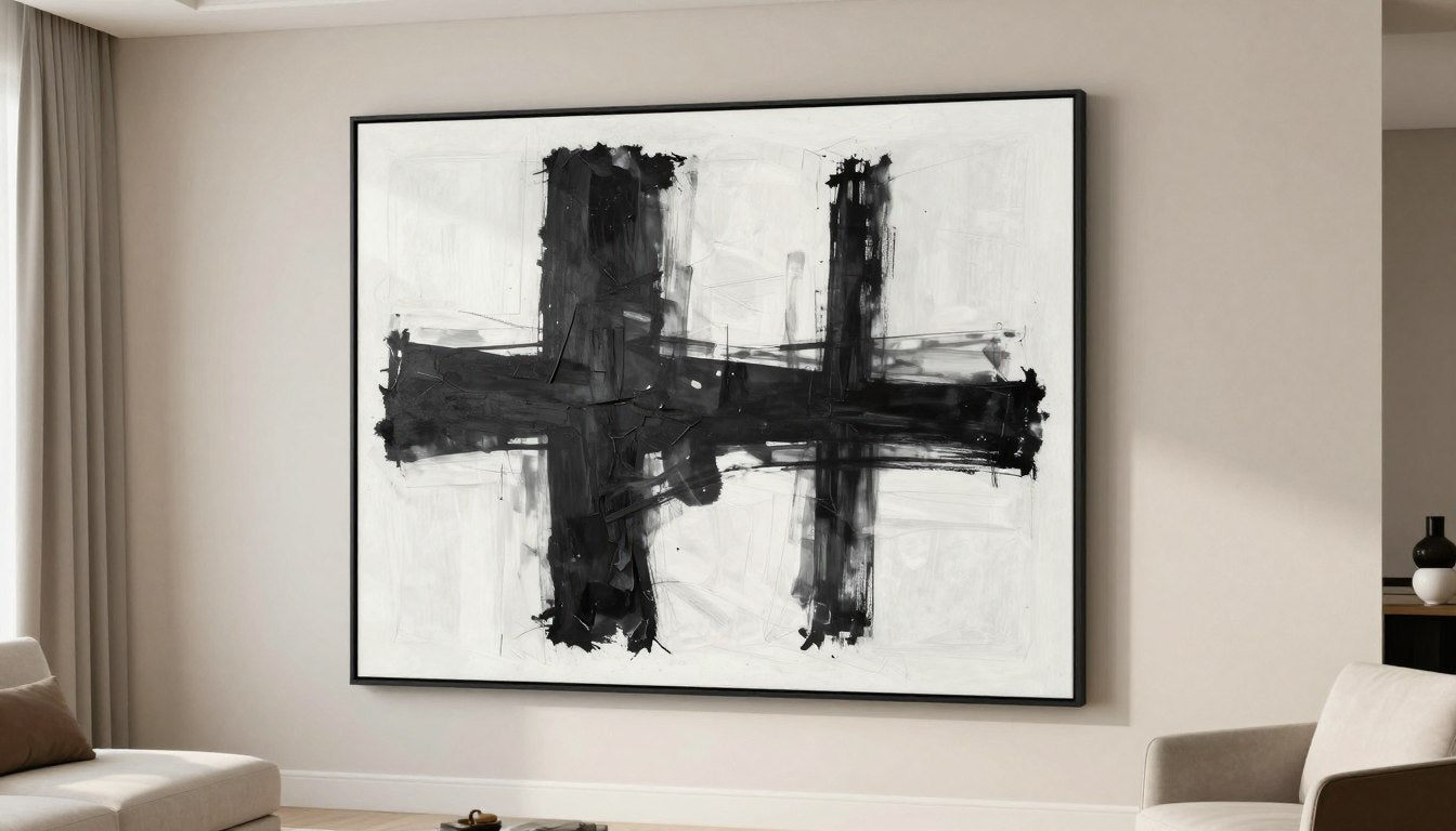
The gallery wall has evolved. In 2026, the trend has shifted decisively toward intentional curation rather than maximalist collection. Today's most striking gallery walls tell one cohesive story through fewer, more thoughtfully selected pieces. The result? Spaces that feel purposeful, personal, and perfectly balanced. Whether you're designing for a living room, hallway, or staircase, these three layout recipes will help you create a gallery wall that feels curated, not cluttered.
Quick Answer (TL;DR)

- The 2026 gallery wall features 5-7 pieces total (down from 10-15 in previous years)
- Maintain consistent 2-3 inch spacing between frames for a curated look
- Choose one anchor piece (30-40% larger than other pieces) as your focal point
- Limit your color palette to 2-3 complementary tones for cohesion
- Use one consistent frame style or finish throughout the arrangement
- Position the centerline of your arrangement at 57-60 inches from the floor
- Include one sculptural or textural element to break the rectangular rhythm
What Changed in 2026 (and why walls look calmer now)

"One story, fewer frames"
The defining shift in 2026 gallery walls is the move toward cohesive storytelling. Rather than displaying every piece you love, today's approach focuses on selecting fewer pieces that work together to convey a single aesthetic message. This "less is more" philosophy creates walls that feel intentional rather than accumulated over time. The most successful gallery walls now feature 5-7 pieces total, down significantly from the 10-15 pieces common in previous years.
Negative space as the luxury signal
In 2026, the space between your art has become as important as the art itself. Consistent, generous negative space between frames (ideally 2-3 inches) creates a sense of breathing room that signals intention and sophistication. This balanced approach allows each piece to stand on its own while still contributing to the collective impact. The result is a gallery wall that feels curated by design rather than constrained by space limitations.
This shift aligns with broader interior trends toward mindful minimalism—not stark emptiness, but thoughtful selection of fewer, more meaningful items. Gallery walls now serve as a visual representation of this philosophy, showcasing quality and intention over quantity.
The Curated-Not-Cluttered Rules
Choose one anchor piece first
Every successful gallery wall in 2026 starts with a single focal point. Select one piece that's approximately 30-40% larger than your other pieces to serve as your anchor. This creates a natural hierarchy and gives the eye a place to land first. Your anchor piece should represent the mood, color palette, or theme you want the entire wall to convey. For living rooms, position this piece slightly off-center for a more dynamic arrangement that still feels balanced.

Limit the palette to 2-3 tones
Color cohesion is crucial for the curated look. Select artwork that shares 2-3 main colors or tones to create visual harmony. This doesn't mean everything must match perfectly—variations in shade and intensity add depth—but the overall palette should feel intentionally coordinated. For a timeless approach, build around neutral tones with one accent color, or browse by mood and palette to find pieces that naturally work together.
Keep spacing consistent
The hallmark of a professionally designed gallery wall is consistent spacing between frames. In 2026, the ideal gap is 2-3 inches—enough to create visual breathing room without disconnecting the pieces from each other. This consistent negative space creates rhythm and intention, making even eclectic art collections feel purposefully curated rather than randomly assembled.
Repeat one frame profile (or one finish)
While mixing frame styles was popular in previous years, 2026 gallery walls favor consistency in framing. Choose either one frame profile in different finishes or different profiles in one consistent finish. The most on-trend approach uses thin, minimal frames in either matte black or natural wood tones. This framing consistency creates a visual through-line that unifies diverse artwork into a cohesive collection.
The Linkable Asset — Gallery Wall Layout Recipe Cards (3 templates)
These three gallery wall recipes provide exact specifications for creating perfectly balanced arrangements for different spaces. Each recipe includes piece counts, sizing recommendations, and spacing guidelines to take the guesswork out of your design.
Recipe #1 — The Statement + Satellites (best for living rooms)

- Best for: Living rooms, above sofas, dining rooms
- Ideal wall width: 60-80 inches
- Piece count: 5-7 total (1 anchor + 4-6 satellites)
- Anchor size: 24×36" or 30×40"
- Satellite sizes: Mix of 11×14" and 8×10"
- Spacing: 2.5 inches between all frames
- Unifying rule: Same frame style, 2-3 color palette
- Avoid: Symmetrical arrangements, which can feel static
This arrangement creates visual interest through size contrast while maintaining balance. The large anchor piece establishes the wall's theme, while smaller satellites create rhythm. For added dimension, consider incorporating one sculptural accent to break the rectangle rhythm.
Recipe #2 — The Quiet Grid (best for hallways/offices)

- Best for: Hallways, home offices, bedrooms
- Ideal wall width: 40-60 inches
- Piece count: 4 or 6 (arranged in grid)
- Frame sizes: All identical (16×20" recommended)
- Spacing: 3 inches between frames
- Unifying rule: Identical frames, related subject matter
- Avoid: Mixing frame sizes, which disrupts the calm rhythm
The Quiet Grid creates a sense of order and intentionality through perfect alignment and repetition. This layout works beautifully with a series of related images or clean-edged canvas prints that unify a set. The consistent sizing and spacing creates a meditative quality perfect for spaces where you want to promote focus and calm.
Recipe #3 — The Staircase Rhythm (best for stairs/landings)

- Best for: Staircases, landings, sloped ceilings
- Ideal wall length: Follows staircase (typically 80-120")
- Piece count: 5-7 pieces in ascending arrangement
- Frame sizes: Mix of sizes (8×10" to 16×20")
- Spacing: 2 inches between frames
- Unifying rule: Consistent frame color, aligned bottom edges
- Avoid: Irregular spacing, which disrupts the flow
This dynamic arrangement follows the natural movement of ascending or descending stairs. Align the bottom edges of frames to create a clean line that parallels the staircase angle. This layout creates visual interest through varied frame sizes while maintaining cohesion through consistent frame style and tight spacing.
| Wall Width | Recommended Anchor Size | Supporting Pieces | Ideal Spacing |
| 36-48 inches | 18×24 inches | 3-4 pieces (8×10" or 11×14") | 2 inches |
| 48-72 inches | 24×36 inches | 4-5 pieces (mix of 11×14" and 16×20") | 2.5 inches |
| 72+ inches | 30×40 inches | 5-6 pieces (mix of sizes) | 3 inches |
How to Choose Art for Each Recipe
Abstract vs line art vs photography-style minimalism

Each art style creates a distinct mood for your gallery wall. Abstract pieces with organic shapes and fluid lines create a soft, contemplative atmosphere ideal for living and bedroom spaces. Line art offers graphic impact with a light, airy quality that works beautifully in hallways and offices. Minimalist photography brings depth and realism while maintaining a clean aesthetic, perfect for dining areas and entryways. For a cohesive look, pick a style family to unify the wall rather than mixing multiple approaches.
When to add one bold color accent
While the 2026 gallery wall trend favors restrained palettes, a single bold color accent can create a powerful focal point. In predominantly neutral arrangements, consider including one piece with a vibrant hue that draws the eye. This technique works best when the accent color appears in small amounts throughout other pieces, creating subtle connections. For the Statement + Satellites recipe, place this accent piece adjacent to (not opposite) your anchor to create balanced visual tension.
Frame + Finish Guide (2026 look)
Thin frames / floater frames

The 2026 frame aesthetic emphasizes thin profiles that don't compete with the artwork. Frames under 1-inch in width create a refined, contemporary look that allows the art to take center stage. Floater frames, which create a small gap between the frame and the canvas, add subtle dimension without visual weight. For a timeless approach, choose either matte black metal frames for a crisp, architectural look or natural wood tones for organic warmth.
Matte vs glossy
Matte finishes dominate the 2026 gallery wall, both in frames and in the artwork itself. Matte surfaces reduce glare and create a soft, sophisticated appearance that feels intentional rather than flashy. If your space receives significant natural light, matte finishes are especially important to prevent distracting reflections. For frames, choose matte black, matte white, or natural wood with a low-sheen finish. For artwork, consider choose sizes that feel intentional with matte or semi-matte paper that enhances color depth without shine.
"Same frame, different sizes" trick
One of the simplest ways to create a cohesive gallery wall is to use identical frames in different sizes. This approach creates visual consistency while allowing for varied artwork dimensions. Choose one frame style in 3-4 different sizes that complement your wall space. This technique works particularly well with the Statement + Satellites recipe, where the consistent framing unifies the arrangement despite the size variation between the anchor and satellite pieces.
Hanging & Placement (practical USA-friendly)
Centerline height guide

The most common mistake in gallery wall installation is hanging artwork too high. For a professional look, position the centerline of your entire arrangement at 57-60 inches from the floor—approximately eye level for the average person. This height creates a natural viewing experience and anchors the arrangement to the furniture below it. For gallery walls above furniture like sofas or consoles, maintain 8-10 inches of space between the furniture top and the bottom of your lowest frame.
Paper templates / painter's tape method
Before making any holes in your wall, create paper templates of each frame using kraft paper or newspaper. Tape these templates to the wall using painter's tape, which won't damage your paint. This allows you to experiment with spacing and arrangement until you find the perfect composition. Step back frequently to assess the overall balance from the distance at which the wall will typically be viewed. Once you're satisfied with the arrangement, mark nail positions directly on the templates before removing them to install hardware.
Renter-friendly hanging options
For those who can't make permanent changes to their walls, several renter-friendly options exist. Command picture hanging strips can support frames up to 16 pounds when properly installed. Picture hanging rails that mount at the ceiling allow you to hang frames from nearly invisible wires without damaging walls. For lightweight pieces, removable mounting putty offers a nail-free solution. These methods allow you to create a professional-looking gallery wall that can be removed without a trace when it's time to move. For more detailed guidance, check out how to hang a canvas print without nails.
Common Mistakes (and fast fixes)
Too many small pieces
The most common gallery wall mistake is including too many small pieces, which creates visual clutter rather than impact. If your current arrangement feels busy, remove the smallest 2-3 pieces and increase spacing between remaining items. This simple edit often transforms a chaotic collection into a curated display. Remember that in 2026, fewer, larger pieces create more impact than numerous small ones.
No anchor piece
Without a dominant anchor piece, gallery walls can lack focus and hierarchy. If your arrangement feels flat or unbalanced, identify one piece to serve as your focal point. Either replace a current piece with something 30-40% larger, or rearrange to position your largest existing piece slightly off-center. This creates a natural starting point for the eye and gives the entire arrangement more purpose.
Inconsistent spacing
Irregular gaps between frames create visual tension and an unfinished appearance. To fix uneven spacing, remove all pieces and reinstall using paper templates with precisely measured gaps (2-3 inches is ideal). If you can't reinstall everything, focus on creating consistent spacing in the most visible central area of your arrangement. The human eye quickly detects irregularity in spacing, so this adjustment makes a significant difference in the professional appearance of your gallery wall.
Competing colors
Too many bold colors fighting for attention can make a gallery wall feel chaotic rather than cohesive. If your current arrangement includes multiple bright hues, consider swapping some pieces for neutral alternatives that incorporate just one or two of your favorite colors as accents. Alternatively, try reframing colorful pieces in identical frames to create unity despite color variation. Remember that in 2026, restraint in color palette signals intentional curation.

Recommended Next Reads

Ultimate Guide to Art Print Sizes
Learn how to select the perfect print sizes for any space and create balanced arrangements that feel intentional.

How to Hang Canvas Prints Without Nails
Discover renter-friendly methods to display your gallery wall without damaging walls or losing your security deposit.

6 Modern Art Styles You Need to Know
Explore different art styles to find the perfect aesthetic for your gallery wall and create a cohesive visual story.
FAQ
What is the best gallery wall layout in 2026?
The best gallery wall layout in 2026 follows the "curated, not cluttered" principle with fewer, more intentional pieces (5-7 total) and consistent spacing (2-3 inches between frames). The Statement + Satellites layout is particularly popular for living spaces, featuring one larger anchor piece surrounded by smaller complementary works. For more structured spaces like offices, the Quiet Grid offers elegant simplicity with identical frames arranged in perfect alignment.
How much space should be between frames on a gallery wall?
In 2026, the ideal spacing between frames on a gallery wall is 2-3 inches. This provides enough visual breathing room for each piece while maintaining a cohesive grouping. Smaller walls may benefit from tighter 2-inch spacing, while larger walls can accommodate the full 3 inches between pieces. The key is consistency—whatever spacing you choose should remain uniform throughout the arrangement to create a sense of intentional design.
Should all frames match for a curated look?
For a 2026 curated gallery wall, frames should have at least one unifying element, but they don't need to be identical. The most sophisticated approach is to either use the same frame style in different sizes or the same finish (like matte black or natural wood) across different profiles. Thin frames (under 1-inch width) are particularly on-trend, creating a refined look that lets the artwork take center stage while still providing visual cohesion across the arrangement.
How do I choose the anchor piece for a gallery wall?
Select an anchor piece that's approximately 30-40% larger than your other pieces and represents the mood, color palette, or theme you want the entire wall to convey. This piece should draw the eye first and set the tone for the arrangement. Ideally, your anchor contains colors or elements that appear in smaller amounts throughout your other pieces, creating subtle connections. Position this piece slightly off-center (rather than dead center) for a more dynamic, professional-looking arrangement.
Can I mix canvas prints with original paintings?
Yes, mixing canvas prints with original paintings creates depth and textural interest in a 2026 gallery wall. To make this combination work, maintain consistency in other elements—use similar frame styles for framed pieces and choose canvas prints with edges that complement your color scheme. The key is ensuring all pieces share a cohesive color palette and subject matter approach. This mix of mediums adds sophisticated layering to your gallery wall while maintaining the curated, intentional aesthetic that defines the 2026 trend.
How do I plan a gallery wall without making holes?
Plan your gallery wall without commitment by creating paper templates of each frame and arranging them on the wall with painter's tape. This allows you to experiment with different layouts before making any holes. For installation without wall damage, consider command picture hanging strips (for pieces up to 16 pounds), adhesive hooks, picture hanging rails that mount at the ceiling, or removable mounting putty for lightweight pieces. These methods create a professional-looking gallery wall that can be removed without damage when needed.
What's the best gallery wall for a hallway or stairs?
For hallways, the Quiet Grid layout creates elegant simplicity with identical frames arranged in perfect alignment—ideal for narrow spaces where balance is essential. For staircases, the Staircase Rhythm layout follows the natural ascending or descending angle with frames of varying sizes arranged along a diagonal line. The key for both spaces is maintaining consistent spacing (2-3 inches) and using frames with the same finish to create cohesion despite the architectural challenges these areas present.
How high should a gallery wall be hung?
The centerline of your gallery wall arrangement should be positioned at 57-60 inches from the floor—approximately eye level for the average person. This creates a natural viewing experience and prevents the common mistake of hanging artwork too high. For gallery walls above furniture, maintain 8-10 inches of space between the furniture top and the bottom of your lowest frame. This spacing creates a visual connection between the furniture and artwork while maintaining proper proportions.
Create Your Perfect Curated Gallery Wall
The 2026 gallery wall trend embraces thoughtful curation over maximalist collection. By following these layout recipes and design principles, you can create a wall that feels intentional, balanced, and uniquely yours. Remember that the most successful gallery walls tell one cohesive story through carefully selected pieces rather than displaying everything at once.
Ready to refresh your walls with curated art?
Explore our collection of canvas prints, original paintings, and sculptural accents designed to create the perfect 2026 gallery wall.
See the full Rossetti Art collection


Leave a comment
This site is protected by hCaptcha and the hCaptcha Privacy Policy and Terms of Service apply.