
When a light fixture transcends its utilitarian purpose to become a focal point of artistic expression, it enters the realm of statement lighting as sculpture. These bold pieces don't just illuminate a space—they transform it, creating visual drama that demands attention. But the true art lies in balancing these sculptural fixtures with wall art that complements rather than competes. This guide reveals how to create that perfect harmony between bold lighting and minimal art, turning your home into a curated gallery space that feels both dramatic and balanced.
TL;DR: Statement Lighting + Minimal Art Essentials
- Choose one hero element (typically your statement light) and let supporting art complement it
- Position art lighting at a 45° angle to prevent glare on canvas surfaces
- Select minimal art with calm compositions that won't fight with bold lighting
- Match undertones between your lighting fixture and art frames for cohesion
- Maintain adequate negative space between elements for a gallery-like effect
What "Statement Lighting as Sculpture" Really Means

Statement lighting transforms from functional object to sculptural centerpiece
When a Fixture Becomes the Focal Point
Statement lighting transcends ordinary illumination when its form becomes as important as its function. These pieces—whether a cascading chandelier, an architectural floor lamp, or a bold pendant—command attention through scale, unusual materials, or dramatic silhouettes. Like the artisan-made pieces featured in recent design fairs, these fixtures "droop, blossom, and unfurl like something alive," creating an immediate focal point that anchors the entire room.
The rise of statement lighting reflects a larger shift in interior design: spaces are embracing artistic expression and organic forms as counterpoints to the minimalist aesthetic that dominated previous years. Designers like Frederick Tang and Patrick Mele understand that the right lighting fixture can function as a three-dimensional sculpture, adding depth and personality to a space that flat decorative elements simply cannot achieve.
Why Minimal Art Is the Perfect Counterbalance
When your lighting makes a bold statement, minimal art provides the ideal counterbalance. Clean-lined, understated wall pieces create breathing room that allows your sculptural lighting to shine. This pairing works because it follows a fundamental design principle: visual hierarchy needs both focal points and resting places for the eye.
Minimal art—with its restrained color palettes, simple compositions, and thoughtful negative space—creates the perfect backdrop for dramatic lighting. The art doesn't compete for attention but instead complements and enhances the sculptural quality of your statement fixture. This balanced approach prevents visual chaos while still delivering a rich, layered design experience.
The Pairing Framework (So It Looks Designed, Not Busy)

The 60/30/10 Focus Rule (Light / Art / Accents)
To create a space that feels intentional rather than chaotic, apply the 60/30/10 focus rule. Your statement lighting should command approximately 60% of the visual attention in the arrangement, while your minimal art takes about 30%, leaving 10% for smaller accents. This distribution creates a clear hierarchy that guides the eye naturally through the space.
This ratio isn't about physical size but visual impact. A dramatic pendant might be physically smaller than a wall canvas, but its three-dimensional form, material contrast, and the way it interacts with light gives it greater visual weight. The minimal art should be substantial enough to hold its own without overwhelming the lighting fixture that serves as your primary focal point.
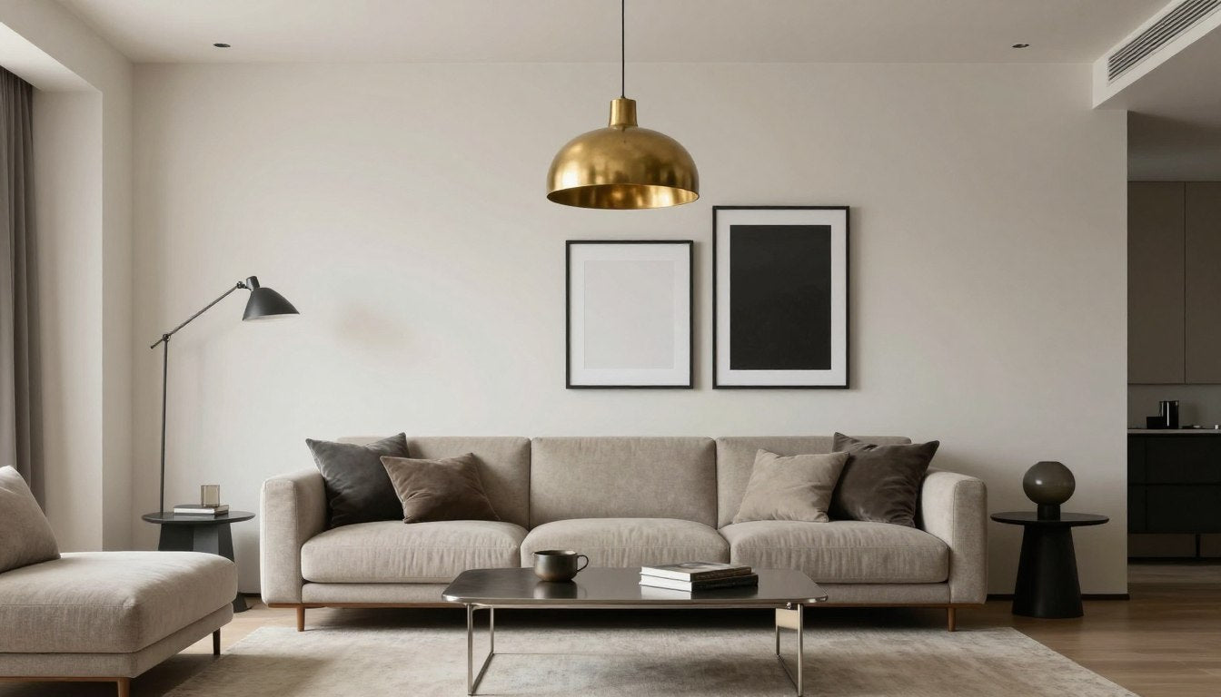
Match Undertones (Warm Brass vs. Cool Chrome)
For a cohesive look, match the undertones between your statement lighting and minimal art. If your fixture features warm brass or gold elements, choose art with warm undertones or frames in complementary finishes. Similarly, fixtures with cool chrome or blackened metal pair beautifully with art featuring cool grays or crisp white frames.
This subtle coordination creates visual harmony without being too obvious. The connection might be as simple as a brass pendant light paired with a minimal soft-grid abstract in a warm-toned frame, or a matte black sculptural sconce complemented by a charcoal line drawing in a simple black frame.
Use Negative Space Like a Gallery
Professional galleries understand the power of negative space—the empty area around and between objects. Apply this principle when pairing statement lighting with minimal art by ensuring adequate breathing room between elements. This spacing prevents visual competition and allows each piece to be appreciated individually.
As a general rule, maintain at least 12-18 inches between your statement lighting and wall art. In dining rooms, position pendant lights at least 30-36 inches above the table surface, with art placed at eye level on adjacent walls rather than directly behind the fixture. This thoughtful spacing creates the gallery-like atmosphere that makes both elements shine.
Lighting Art Without Glare (The Practical Rules)

The 45-degree rule ensures proper illumination without reflective glare
The 45-Degree Rule for Art Lighting
To properly illuminate art without creating distracting glare, follow the 45-degree rule. Position your art lighting (whether picture lights, track lighting, or adjustable sconces) at a 45-degree angle to the center of the artwork. This angle ensures that any reflection bounces away from the viewer's typical sightline rather than directly into their eyes.
As noted in Rossetti Art's guide on textured wall art, this positioning is especially important for pieces with any glossy elements or protective glass. The 45-degree rule works equally well for illuminating both textured and flat minimal art while preserving the visual integrity of the piece.
Picture Lights vs. Track Lighting vs. Wall Washers
Different art lighting solutions offer distinct advantages when paired with statement lighting:
- Picture lights provide focused illumination directly on the artwork and can become a subtle design element themselves. They work well when your statement lighting is in the center of the room, away from walls.
- Track lighting offers flexibility to adjust both direction and intensity, making it ideal for spaces where you might rearrange art periodically. The tracks themselves should be minimal to avoid competing with your statement fixture.
- Wall washers create even, diffused light across an entire wall, highlighting minimal art with a subtle glow. This option works best when your statement lighting is dramatic but not overly bright.
"3x Brighter Than the Wall" Guideline
For a subtle, premium look, aim to make your artwork approximately three times brighter than the surrounding wall. This level of contrast creates enough definition to highlight the art without creating harsh transitions that distract from your statement lighting.
This 3:1 ratio is particularly effective with minimal art, as it gently emphasizes the subtle details and textures that make these pieces interesting without overwhelming the space. Dimmable lighting options allow you to fine-tune this balance throughout the day as natural light conditions change.
Best Minimal Art Types to Pair With Bold Lights

Four minimal art styles that perfectly complement statement lighting
Soft-Grid Abstracts (Structured Calm)
Soft-grid abstracts feature geometric elements with blurred edges or subtle color transitions. These pieces provide just enough structure to feel intentional while maintaining a sense of calm that won't compete with bold lighting fixtures. The Minimal Soft Grid Abstract Canvas exemplifies this style with its balanced composition and restrained palette.
These abstracts work particularly well with angular or geometric statement lighting, creating a subtle dialogue between the three-dimensional fixture and the two-dimensional art. The soft edges of the artwork provide a gentle counterpoint to the defined lines of many sculptural lights.
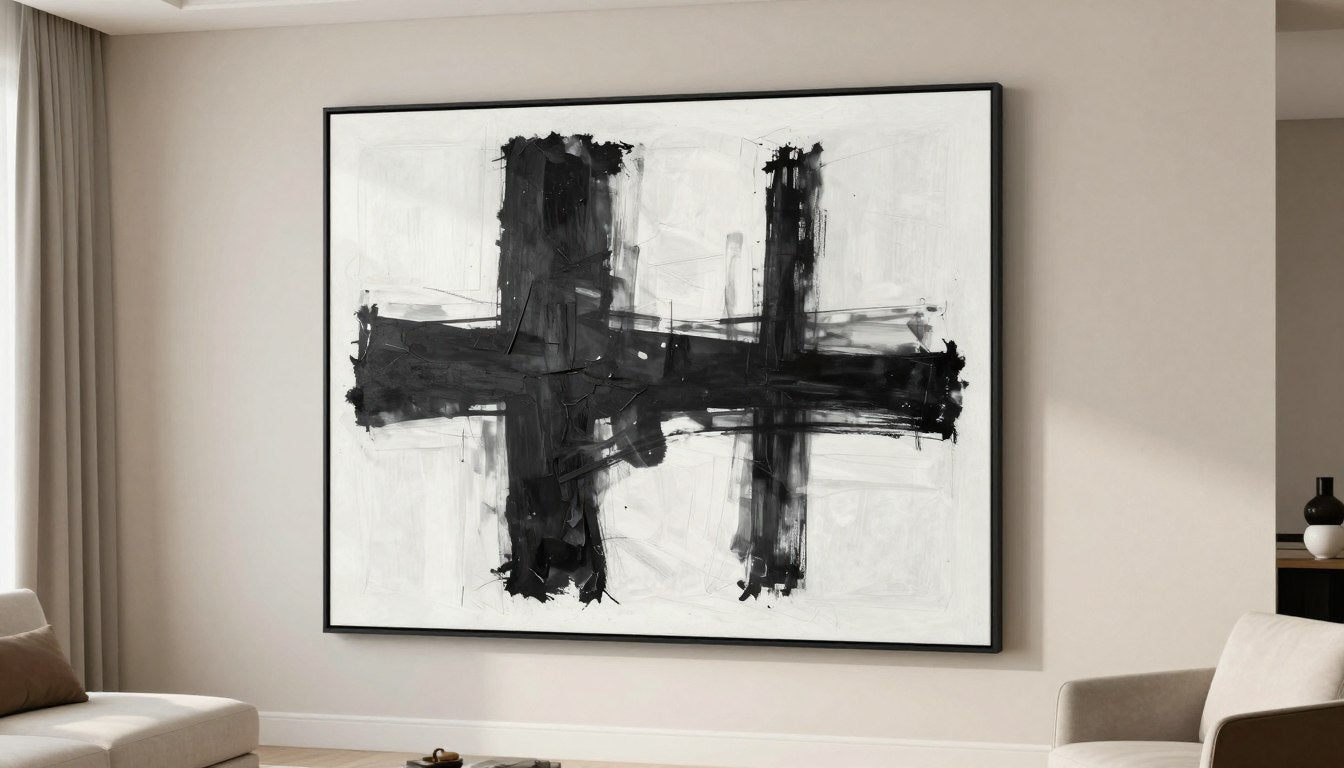
Charcoal/Ink Abstracts (Dramatic, Still Minimal)
For spaces with lighter, more ethereal statement lighting (like blown glass pendants), charcoal or ink abstracts provide a grounding contrast. These pieces feature bold, gestural marks that add drama while maintaining minimalist principles through limited color palettes and thoughtful composition.
The high contrast between dark marks and light backgrounds creates visual interest without busy details. When paired with statement lighting, these abstracts create a compelling balance between light and shadow, structure and fluidity. The Structured Silence Minimal Canvas offers this perfect balance of drama and restraint.
Line Art (Quiet Rhythm)
Line art—featuring continuous, flowing lines on a minimal background—creates a sense of movement and rhythm without overwhelming visual complexity. These pieces work beautifully with statement lighting that has strong silhouettes, as they echo the fixture's form without directly competing with it.
The simplicity of line art makes it versatile enough to complement nearly any statement lighting style, from organic, nature-inspired fixtures to more geometric, architectural pieces. The continuous lines create a visual flow that guides the eye around the room, connecting the art to the three-dimensional statement of your lighting.
Textured Minimal Pieces (Light Makes Them Come Alive)
Textured minimal art—featuring subtle relief, impasto techniques, or mixed media elements—takes on new dimensions when illuminated by statement lighting. As explored in how light changes textured art throughout the day, these pieces transform as light conditions shift.
The Minimal Harmony Modern Abstract exemplifies how subtle texture can add depth to minimal compositions. When paired with statement lighting, these textured pieces create a dynamic interplay between light, shadow, and form that changes throughout the day, adding an element of discovery to your space.
| Statement Light Type | Best Minimal Art Type | Best Palette Pairing | Placement Rule | Lighting Angle Note |
| Sculptural Pendant | Soft-Grid Abstract | Warm Neutral | Pendant centered over dining table, art on adjacent wall at eye level | Use wall washer lighting to avoid competing with pendant glow |
| Brass Chandelier | Textured Minimal | Cream + Black | Chandelier centered in room, art positioned on focal wall | Position picture light at 45° to highlight texture |
| Organic Glass Pendant | Charcoal Abstract | Monochrome | Pendant 30-36" above surface, art at least 24" away horizontally | Avoid direct downlights that create glare on glass |
| Architectural Floor Lamp | Line Art | Ink + Sand | Lamp in reading corner, art at seated eye level | Lamp should not cast shadows on art |
| Sculptural Sconce | Geometric Abstract | Warm Neutral | Sconce and small art piece grouped on entryway wall | Sconce should illuminate path, not shine directly on art |
| Clustered Pendants | Triptych Line Art | Monochrome | Pendants over island, art on perpendicular wall | Track lighting with 45° angle toward art |
| Oversized Dome Pendant | Soft-Grid Abstract | Cream + Black | Pendant centered over coffee table, art above sofa | Art should be 3x brighter than surrounding wall |
| Sculptural Table Lamp | Small Textured Canvas | Ink + Sand | Lamp on console, art hung slightly above lamp height | Secondary picture light recommended |
| Starburst Chandelier | Modern Sculpture (wall-mounted) | Metallic + Neutral | Chandelier centered in foyer, sculpture on focal wall | Adjust chandelier height to prevent casting shadows on sculpture |
| Minimalist Linear Pendant | Horizontal Line Art | Monochrome | Pendant over dining table, art centered on wall | Wall washer from ceiling for even illumination |
7-Point Gallery Lighting Checklist
- Glare Prevention: Position lights at 45° angle to art surface
- Angle Consistency: Maintain the same lighting angle for all pieces in a collection
- Brightness Ratio: Art should be 3x brighter than surrounding wall
- Spacing: Allow 12-18" minimum between statement lighting and art
- Frame Finish: Match or intentionally contrast with lighting fixture metals
- Scale Balance: Larger statement lights pair with simpler, more minimal art
- Focal Hierarchy: Apply the 60/30/10 rule to maintain visual balance
Room-by-Room Pairing Guide

Dining Room: Sculptural Pendant + One Calm Statement Print
The dining room offers a perfect opportunity to showcase statement lighting as sculpture, with a bold pendant or chandelier centered above the table. Balance this focal point with a single, substantial piece of minimal art on an adjacent wall—not directly behind the table where it would compete with the lighting.
For optimal balance, choose a minimal canvas approximately two-thirds the width of your dining table, positioned at eye level when standing. If your statement pendant features warm metals like brass, consider a structured minimalist canvas print with subtle warm undertones to create cohesion.
Living Room: Chandelier + Wide Minimal Canvas
In living rooms, a statement chandelier or oversized pendant creates a central focal point that anchors the seating arrangement. Complement this with a wide, horizontal minimal canvas above the sofa or fireplace. The horizontal orientation provides a counterbalance to the vertical drop of most statement lighting.
Scale is crucial here—your minimal art should be approximately two-thirds the width of your sofa or fireplace to feel proportional. For cohesive design, select art with subtle references to your lighting's form; for instance, pair a starburst chandelier with a minimal soft-grid abstract featuring radiating lines or subtle geometric patterns.


Entryway: Bold Sconce + Small Minimal Piece
Entryways benefit from the combination of a sculptural wall sconce paired with a smaller minimal art piece. This pairing creates an impactful first impression without overwhelming a typically compact space. Position the sconce and art piece as a deliberate grouping, with the art hung at eye level and the sconce positioned to provide both ambient light and visual interest.
In this smaller-scale application, consider a calm monochrome abstract with subtle texture that catches the light from your statement sconce. The interplay between light and texture creates depth and dimension that welcomes visitors into your home.
Bedroom: Soft Pendant + Low-Contrast Abstract
Bedrooms call for a more subdued approach to the statement lighting and minimal art pairing. Choose a statement pendant with softer lines or diffused light, paired with a low-contrast abstract that promotes relaxation. Position the pendant off-center—perhaps over a bedside table or reading nook—rather than directly above the bed where it might disrupt sleep.
The minimal art should feature a soothing palette with limited color contrast. A modern abstract with harmonious elements creates the perfect serene backdrop for a statement pendant with organic, flowing lines. This combination adds visual interest while maintaining the restful atmosphere essential for a bedroom.

Common Mistakes (and Quick Fixes)

Common mistakes to avoid when pairing statement lighting with wall art
Two "Heroes" Fighting
The most common mistake is placing two visually dominant elements in competition with each other—like pairing an elaborate chandelier with a bold, colorful art piece. This creates visual tension rather than harmony.
Quick Fix: Apply the 60/30/10 rule. If your statement lighting is the 60% focal point, choose art that takes a supporting role with simpler composition and more restrained colors. Alternatively, if you're committed to a bold art piece, select more minimal lighting that won't compete for attention.
Glossy Art + Direct Downlight Glare
Positioning glossy or glass-covered art directly beneath statement lighting creates distracting glare that obscures the artwork and creates an unpleasant viewing experience.
Quick Fix: Follow the 45-degree rule for art lighting, positioning light sources at an angle to the art surface. For statement pendants or chandeliers, place art on adjacent walls rather than directly beneath fixtures. Choose matte-finished art or non-reflective glass when possible.
Too Many Small Frames
Surrounding a statement lighting fixture with numerous small framed pieces creates visual clutter that diminishes the impact of your sculptural lighting and creates a busy, unfocused aesthetic.
Quick Fix: Consolidate smaller pieces into a single, intentional gallery wall on one surface, leaving other walls more minimal. Alternatively, replace multiple small pieces with one larger statement piece that can hold its own alongside your lighting without creating visual noise.
Wrong Scale Above Console/Sofa
Undersized art above large furniture pieces creates an unbalanced look, particularly when paired with substantial statement lighting. This scale mismatch makes the space feel unintentional and incomplete.
Quick Fix: Follow the two-thirds rule—your art should be approximately two-thirds the width of the furniture piece below it. For consoles paired with statement floor or table lamps, a single substantial piece or a deliberately arranged triptych creates the right proportional relationship.
Next Reads + Suggested Pieces

Minimal Soft Grid Abstract
Perfect for pairing with bold geometric lighting fixtures, this structured yet calm canvas creates visual harmony without competition.

Minimal Harmony Abstract
With subtle texture that comes alive under statement lighting, this piece creates depth and visual interest in any room.

Structured Silence Canvas
Dramatic yet minimal, this canvas provides the perfect counterpoint to organic, flowing statement lighting fixtures.
Explore the Complete Collection
Discover our full range of minimal art pieces perfectly suited to pair with statement lighting in your home.
Browse All CollectionsFrequently Asked Questions
How do I balance statement lighting with minimalist decor?
Balance statement lighting with minimalist decor by applying the 60/30/10 focus rule. Let your lighting be the primary focal point (60%), supported by minimal art (30%) and small accents (10%). Maintain plenty of negative space around your statement piece, and choose furniture with clean lines and neutral upholstery to create a calm backdrop that allows your lighting to shine.
What kind of wall art works best with a bold chandelier?
Minimal art with clean compositions and restrained color palettes works best with bold chandeliers. Look for pieces with subtle texture, soft-grid patterns, or simple line work that won't compete with your chandelier's form. The art should complement rather than mirror your chandelier's style—for instance, pair an angular, geometric chandelier with softer, more organic art forms for pleasing contrast.
How do I prevent glare on canvas prints?
Prevent glare on canvas prints by following the 45-degree rule for lighting placement. Position light sources at a 45-degree angle to the canvas surface so reflections bounce away from viewers. As noted in Rossetti's guide on textured wall art, avoid placing art directly beneath downlights or opposite windows with direct sunlight. Choose matte-finish canvases without glossy varnishes, and consider picture lights specifically designed to illuminate art without creating hot spots.
Are picture lights worth it for minimal art?
Yes, picture lights are worth the investment for minimal art, as they highlight subtle details and textures that might otherwise go unnoticed. Quality picture lights create depth by casting gentle shadows that enhance the three-dimensional quality of even the most minimal pieces. They also allow you to create a focal point on your art during evening hours when your statement lighting might be dimmed for ambiance. Choose slim-profile picture lights in finishes that complement your statement lighting for a cohesive look.
What frames look best with brass or black fixtures?
For brass fixtures, choose frames in warm tones like natural oak, walnut, antique gold, or brass-toned metal for cohesion. Black fixtures pair beautifully with black frames for a coordinated look, or with white frames for dramatic contrast. For either fixture type, consider thin, minimal frames that won't compete with your statement lighting. Floating frames or canvas wraps with minimal framing work particularly well when you want your lighting to remain the primary focal point.
How big should art be in a dining room with a statement pendant?
In a dining room with a statement pendant, art should be substantial enough to hold its own without overwhelming the lighting. For art on the same wall as the dining table, choose a piece approximately two-thirds the width of the table. For adjacent walls, a single large piece (about 30-40 inches wide) or a deliberately arranged set of two to three smaller pieces works well. The bottom edge of the art should hang approximately 60-65 inches from the floor to maintain proper eye level when seated.
Can I mix sculptural lighting with textured wall art?
Yes, sculptural lighting and textured wall art can create a dynamic pairing when balanced thoughtfully. As explained in Rossetti's textured wall art guide, the key is ensuring your lighting enhances rather than competes with the texture. Choose textured art with a relatively minimal composition and limited color palette to prevent visual overload. Position your sculptural lighting to cast interesting shadows that highlight the art's dimensional qualities, creating an engaging interplay between the two elements.
How many focal points should one room have?
A well-designed room should have one primary focal point and one or two secondary focal points. Your statement lighting can serve as either the primary focal point (in rooms like dining rooms or entryways) or a secondary focal point (in living rooms where a fireplace or large window might take precedence). Too many competing focal points create visual chaos and dilute the impact of your statement pieces. Apply the 60/30/10 rule to maintain clear visual hierarchy and create a space that feels intentional rather than overwhelming.
Creating Your Own Sculptural Lighting Story
Statement lighting as sculpture transforms ordinary rooms into extraordinary spaces when paired thoughtfully with the right minimal art. By following the principles outlined in this guide—from the 60/30/10 focus rule to proper lighting techniques—you can create a home that feels both dramatically designed and perfectly balanced.
Remember that the most successful pairings honor the unique characteristics of both elements: let your statement lighting command attention while your minimal art provides sophisticated support. This thoughtful approach creates spaces that feel curated rather than chaotic, with each element enhancing rather than competing with the others.
Ready to find the perfect minimal art to complement your statement lighting? Explore our collection of abstract and geometric canvas prints designed to pair beautifully with bold lighting fixtures.
Leave a comment
This site is protected by hCaptcha and the hCaptcha Privacy Policy and Terms of Service apply.