
People love to say canvas prints look cheap.
They're not wrong… when the canvas is too small, badly placed, and lit like an office hallway.
But a canvas print can look properly high-end. Like a gallery piece. Like it belongs in the room.
Here's how to do it.
The 3 Things That Scream "Cheap"
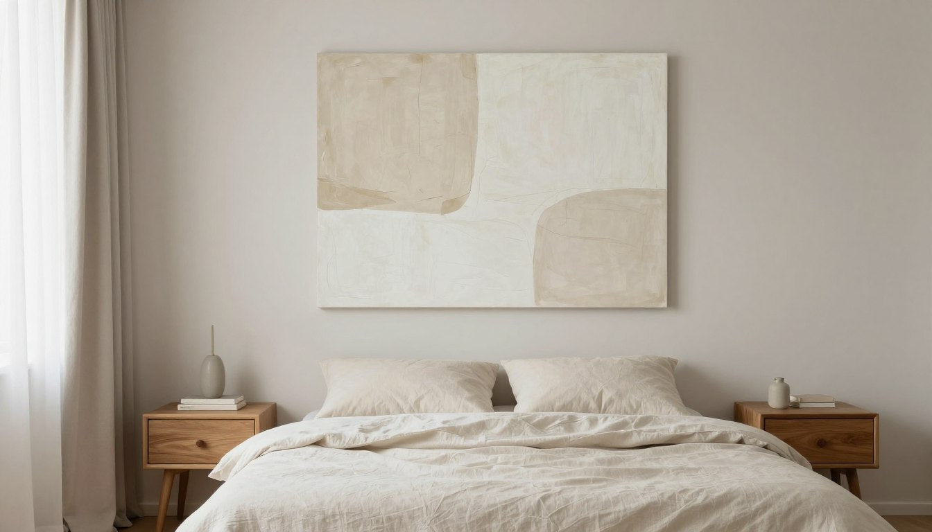
1) The Canvas is Too Small for the Wall
A tiny canvas floating in the middle of a big wall feels like a placeholder. Not a statement.
Expensive-looking rooms do the opposite: they commit.
If you're hanging art above a sofa, bed, or console, you want the piece (or group of pieces) to visually own that zone.

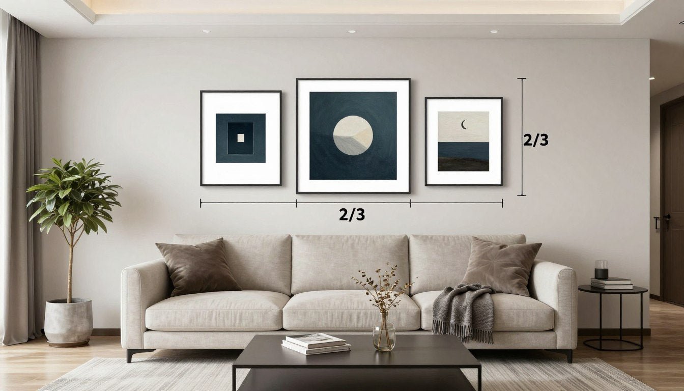
2) The Placement is Random
When the center of the art is too high, the whole room feels off.
A quick fix that designers use: hang for eye level, then align to furniture.

3) The Canvas is "Bare"
Unframed canvas can look unfinished. That's the part people describe as "mass-produced."
Not because canvas is bad—because the presentation is incomplete.
This is where the upgrades matter most: edge finish, structure, and frame choice.

The Fix: Scale, Spacing, Lighting
Scale: Go Bigger Than You Think
If you want "expensive," you want presence.
Fast rule: bigger wins
One large canvas usually looks more premium than several small ones.
If you're unsure: pick the size that feels almost too bold. That's usually the right one.
If you're shopping, prioritize collections that offer genuinely large sizes (it changes everything in real homes).
Large Wall Art Sizing, Placement, Room Balance

Spacing: Make It Intentional
"Cheap" looks happen with awkward or random gaps.
Use these spacing rules:
- For a single piece above furniture: leave breathing room above the furniture line.
- For a set/group: keep gaps consistent so it reads curated, not accidental.

Lighting: Stop Relying on Ceiling Light
Overhead lighting flattens art. It makes canvas texture look dull.
Better options:
- A floor lamp angled toward the wall
- A picture light mounted above the canvas
- A warm wall sconce nearby
Aim for soft, directional light. The difference is immediate.

Why Floater Frames Change Everything
If you do one thing, do this.
A floater frame gives a canvas that clean "finished" edge you see in galleries—without turning it into a traditional framed print. It also adds depth, structure, and a more deliberate look.
Rolled vs Stretched vs Floater Framed Canvas
What to Do With a Canvas Print: Designer Tips
When Floater Frames Are a No-Brainer
- The canvas is a focal point in the room
- You want a "gallery" look fast
- You don't want the art to feel like decor-store filler
If you're buying new canvas prints, choose a brand that builds the whole thing properly: museum-quality canvas, clean stretching, and a real hardwood floater frame option.

Recommended Picks
The Dreamer in Red
Bold color field + minimalist figure reads "gallery"

Monochrome Balance
High contrast always looks intentional

Fluid Elegance
Soft movement + premium presentation cues

The "Gallery Wall" Trick for Modern Homes
Gallery walls look expensive when they look planned.
Here's the trick: design it on the floor first.
That's how you get "designer" without the chaos.
How to Mix and Match Art Prints for a Stunning Gallery Wall

Want It to Feel Modern (Not Busy)?
- Limit the palette (black/white, warm neutrals, or one accent color)
- Mix sizes, but keep spacing consistent
- Treat the whole wall like one artwork, not a bunch of separate pieces

Quick Picks That Look Expensive Fast
Use this table as a shortcut when you're choosing what to buy and how to present it.
| Pick | Best for | Why it looks expensive | What to choose |
| The Dreamer in Red | One-piece statement | Bold color field + minimalist figure reads "gallery" | Go large + floater frame |
| Monochrome Balance | Modern, clean interiors | High contrast always looks intentional | Floater frame in black or oak |
| Fluid Elegance | Calm, upscale vibe | Soft movement + premium presentation cues | Floater frame, medium-to-large |
| Fragmented Whimsy | Adding character without clutter | Portrait-style composition stands up, keeps wall clean | Medium size, black floater frame |
| Floral Elegance Triptych | Filling wide walls fast | Triptych reads "curated collection" | Keep spacing even, frame all 3 |
| Black & White Set of 3 | Instant gallery wall | Matching set removes the "random" factor | Align as a grid, consistent gaps |
(If you're deciding formats, start here: Rolled vs Stretched vs Floater Framed Canvas.)
Quick Checklist (Use This Before You Hang Anything)
- The art fills the wall zone (not floating in empty space)
- The center hits eye level
- Spacing is consistent (especially in sets)
- The wall around it is calm (less clutter nearby)
- Lighting is directional, not just overhead
- If it's canvas: it's either perfectly stretched… or floater framed
- The piece has a "real" finish: ready to hang, clean edges, built to last
If you hit those, your canvas prints won't look cheap.
They'll look like you know what you're doing.

Ready to Transform Your Walls?
Get the gallery look without the gallery price. Our floater-framed canvas prints are designed to make a statement.
Get a Floater-Framed CanvasReady to hang. Made to last.
Leave a comment
This site is protected by hCaptcha and the hCaptcha Privacy Policy and Terms of Service apply.