Abstract wall art brings energy and personality to any living space. However, many homeowners worry about one common challenge. Will adding bold pieces make the room feel too busy or overwhelming?
The answer lies in thoughtful selection and strategic placement. When done correctly, abstract art enhances your home without creating visual chaos. At Rossetti Art, we specialize in creating abstract pieces designed to enhance spaces without overwhelming them.

This comprehensive guide reveals proven strategies for incorporating abstract canvas art into your home. You will discover how to choose the right pieces, coordinate colors effectively, and arrange artwork for maximum impact. These practical tips help create balanced, beautiful rooms that reflect your personal style.
Understanding Visual Balance in Interior Design
Visual balance determines whether a room feels comfortable or chaotic. Every element in a space contributes to this balance. Abstract art, furniture, colors, and decor all compete for attention.
The key principle involves controlling visual weight. Large, bold pieces carry more weight than small, subtle ones. Bright colors demand more attention than neutral tones. Busy patterns overwhelm faster than simple designs.

Creating harmony requires distributing visual weight evenly throughout the space. When abstract art becomes the focal point, other elements should recede into the background. This approach prevents competing interests and maintains a cohesive look.
Consider the rule of three for balanced composition. Designers often group elements in odd numbers because our eyes naturally find this arrangement pleasing. This principle applies to wall arrangements, furniture groupings, and decorative elements.
Choosing the Right Color Palette for Your Abstract Pieces
Color selection makes or breaks the harmony of your space. Abstract art offers unlimited color possibilities. The wrong choice creates discord, while the right palette ties everything together beautifully.
Start by identifying your room's existing color palette. Look at your walls, furniture, and textiles. Choose abstract pieces that pull colors from these existing elements. This creates instant cohesion.
Neutral Abstract Art Approach
Neutral artwork in beige, gray, white, and cream tones provides sophistication without overwhelming. These pieces work in any room and complement various decor styles.
- Creates calming atmosphere in busy spaces
- Allows flexibility in changing room decor
- Emphasizes texture and composition over color
- Works perfectly in minimalist home office settings
Bold Color Statement Approach
Vibrant abstract pieces in blue, red, gold, or emerald command attention as the room's focal point. This strategy works when the rest of the space remains relatively neutral.
- Injects energy and personality instantly
- Pulls colors from accent pillows or rugs
- Creates conversation-starting visual interest
- Best suited for confident design choices

The 60-30-10 color rule provides a foolproof formula. Use 60% of a dominant color, 30% of a secondary color, and 10% of an accent color throughout the room. Your abstract art should reflect this same ratio for seamless integration.

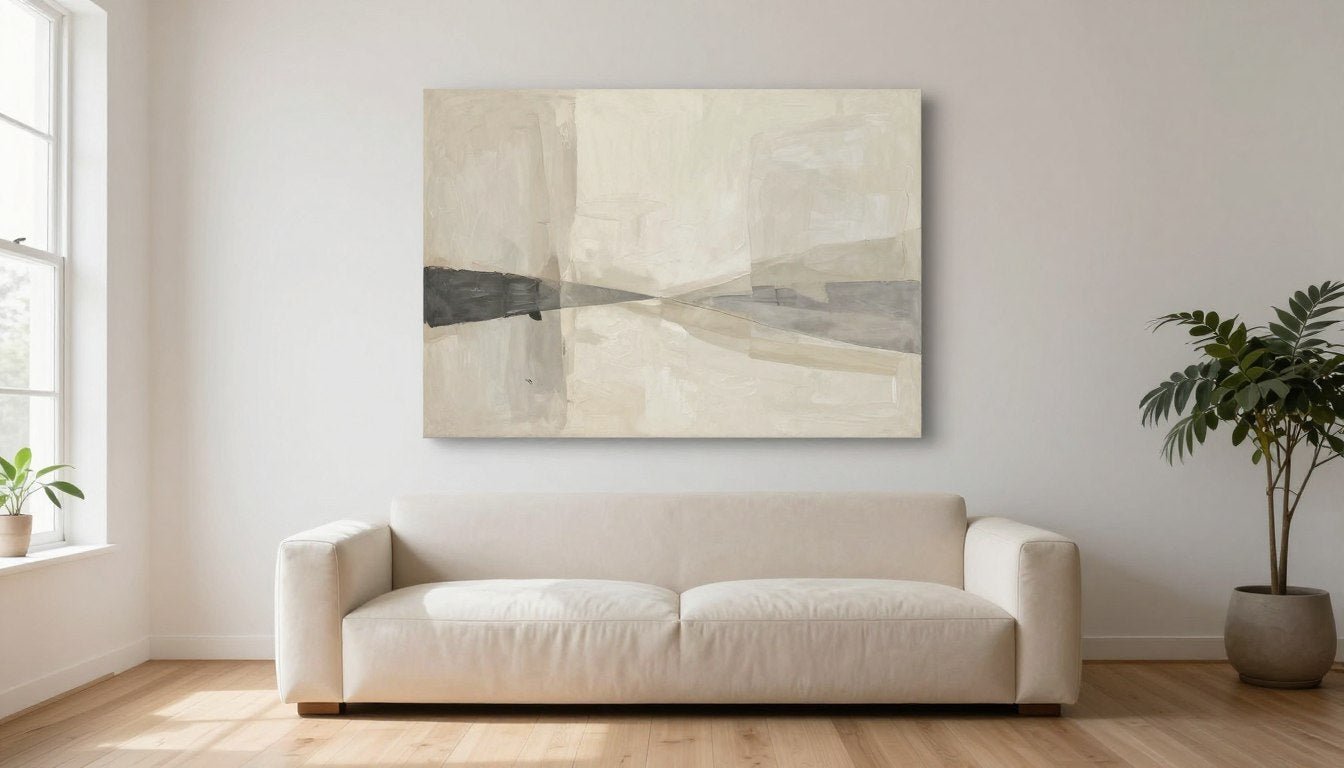
Serene Neutral Canvas
This carefully curated piece demonstrates how neutral abstract art enhances spaces without overwhelming. The subtle tonal variations add depth while maintaining tranquility.

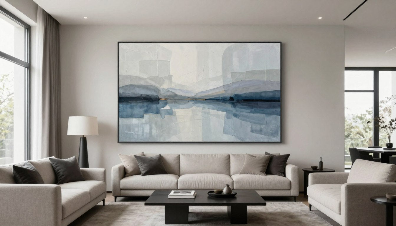
Bold Azure Statement
Perfect for creating a focal point, this piece shows how controlled color creates impact without chaos. The balanced composition guides the eye naturally.

Earthy Harmony Canvas
Demonstrating the 60-30-10 rule in action, this artwork balances warm and cool tones. It proves color can energize without overwhelming your dining room or living area.
Limit your color palette to three or four main colors maximum. More colors create confusion and visual noise. Repetition of colors across different room elements creates rhythm and unity.
Selecting the Appropriate Size and Scale
Size selection directly impacts whether art feels balanced or overwhelming. A piece too large dominates and crowds the space. A piece too small gets lost and feels insignificant.
The golden rule suggests artwork should cover approximately two-thirds to three-quarters of the furniture width below it. For a sofa measuring 84 inches wide, choose art between 56 and 63 inches wide. This proportion creates visual harmony.

Wall space matters equally. Leave adequate breathing room around your artwork. A general guideline allows 6 to 12 inches of space on each side of the piece. This negative space prevents the cramped feeling.
Single Statement Piece Strategy
One large abstract piece creates a powerful focal point without overwhelming. This approach works exceptionally well in minimalist spaces or rooms with bold furniture.

The single-piece approach simplifies decision-making. Choose a piece that speaks to you and let it shine. Everything else in the room should support this centerpiece.
Gallery Wall Considerations
Multiple smaller abstract pieces can work when arranged thoughtfully. However, this approach requires more planning to avoid a busy appearance.

Limit gallery walls to three to five pieces maximum. Maintain consistent spacing between frames. Use similar frame styles and colors to create cohesion. The overall gallery arrangement should form a simple geometric shape.
Ceiling height influences size selection too. Rooms with 8-foot ceilings accommodate smaller to medium pieces better. Spaces with 10-foot or higher ceilings welcome larger, more dramatic artwork. Vertical pieces draw the eye upward, making rooms feel taller.
Strategic Placement and Positioning Techniques
Where you hang abstract art matters as much as what you hang. Proper placement enhances room flow and prevents visual clutter. Poor positioning creates awkward focal points and disrupts balance.
The eye level rule provides the foundation for hanging height. Center your artwork at 57 to 60 inches from the floor. This positions pieces at average human eye level for comfortable viewing.

Consider furniture placement carefully. Art hung above a sofa should sit 6 to 12 inches above the back cushions. This creates a visual connection between furniture and wall decor. Too much space disconnects the elements.
- Position abstract pieces on walls with natural light but avoid direct sunlight that causes fading
- Create a focal point on the wall opposite the room entrance for immediate impact
- Balance heavy visual elements by placing art on opposite walls or adjacent walls
- Avoid hanging art above radiators or heating vents that damage canvas over time
- Consider sight lines from multiple seating positions in the living room
- Leave enough clearance above door frames and below crown molding for clean lines
The frame selection influences the overall busy-ness of your space too. Simple, clean-lined frames in neutral colors reduce visual noise. Ornate, heavily detailed frames add complexity and can contribute to a cluttered feeling.
Living Room Placement
The living room offers the most prominent display opportunity. Position your statement piece on the main focal wall, typically opposite the entry or above the sofa.
- Avoid competing with television screens
- Consider furniture arrangement first
- Ensure adequate viewing distance
- Balance with room lighting
Dining Room Considerations
Dining areas benefit from art that encourages conversation without distraction. Choose pieces with moderate energy and balanced composition.
- Center above buffet or sideboard
- Maintain clear wall space around piece
- Coordinate with dining table colors
- Consider chandelier positioning
Home Office Strategy
Abstract art in work spaces should inspire without overwhelming. Select pieces that energize but maintain focus and productivity.
- Position within sight line from desk
- Choose calming color palettes
- Avoid overly busy compositions
- Complement professional atmosphere
Bedroom Approach
Bedrooms require soothing abstract pieces that promote relaxation. Avoid high-energy colors and chaotic compositions in sleeping spaces.
- Hang above headboard as anchor
- Select peaceful color schemes
- Maintain symmetrical balance
- Consider viewing from bed position

Lighting dramatically affects how abstract art appears in your space. Natural light changes throughout the day, altering colors and mood. Add picture lights or track lighting to maintain consistent presentation and prevent shadows.
Balancing Abstract Art with Other Room Elements
Abstract wall art never exists in isolation. It interacts with furniture, textiles, lighting, and architectural features. Managing these relationships prevents visual overload.
The principle of repetition creates harmony. If your abstract piece features geometric shapes, echo those shapes in throw pillows or area rugs. If the artwork includes organic flowing lines, repeat similar curves in furniture silhouettes.

Texture balance matters significantly. A highly textured canvas painting pairs beautifully with smooth, simple furniture. Conversely, ornate furniture benefits from simpler, less complex artwork. This contrast prevents sensory overload.
Quick Balance Check: Stand in your room's main entrance. Count the elements competing for visual attention. If you count more than three to five distinct focal points, consider simplifying. Remove decorative items or choose less complex abstract pieces.
Pattern mixing requires careful attention. If your abstract art features bold patterns or busy compositions, keep surrounding fabrics and textiles simple. Solid colors in furniture and curtains let the artwork shine without competition.
Consider the style consistency across all decor elements. Modern abstract art feels out of place in heavily traditional spaces. Contemporary pieces work best in contemporary, transitional, or eclectic rooms. Mixing styles intentionally requires advanced design skills.

The concept of negative space applies to entire rooms, not just wall placement. Leave empty wall areas and clear surfaces. Open space gives the eye a place to rest and prevents overwhelming sensations.
The Curated Collections Approach
Choosing abstract art becomes easier when working with thoughtfully curated collections. Professional curation eliminates guesswork and ensures pieces work harmoniously together.
Curated collections consider color relationships, compositional balance, and style consistency. Each piece complements others within the collection while standing strong individually. This approach simplifies the selection process significantly.
Discover Curated Collections Designed for Balanced Spaces
Rossetti Art offers carefully curated abstract collections that enhance your home without creating visual chaos. Each American-made piece is designed with both artistic integrity and interior design principles in mind. Explore collections organized by color palette, style, and room type to find your perfect match.
Quality over quantity remains the most important principle. One exceptional abstract piece outperforms multiple mediocre options. Invest in fewer, higher-quality works that truly resonate with your aesthetic and space requirements.

American-made abstract art offers distinct advantages in quality and craftsmanship. Premium materials, archival inks, and superior canvas ensure longevity and color preservation. These pieces maintain their beauty for decades rather than fading within years.
Practical Styling Tips for Different Room Types
Each room in your home presents unique opportunities and challenges for abstract art. Understanding these differences helps you make appropriate selections and avoid common mistakes.
Living Room Abstract Art Strategy
The living room typically offers the largest wall space and highest visibility. This room accommodates your boldest abstract pieces. However, balance remains crucial.

Choose one primary artwork as the room's focal point. Additional pieces should be significantly smaller or positioned on different walls to avoid competition. The primary piece should be the first thing guests notice upon entering.
Dining Room Art Selection
Dining areas benefit from abstract pieces that encourage conversation without causing distraction. Medium-energy compositions work best here. Avoid overly chaotic or intense pieces that might overwhelm during meals.

Consider the dining room lighting when selecting art. Chandeliers create shadows that can obscure artwork details. Position pieces where they receive adequate illumination without glare from overhead fixtures.
Home Office Artwork Choices
Work spaces require abstract art that inspires productivity without causing distraction. Choose pieces with organized compositions rather than chaotic energy. Blues, greens, and neutral tones promote focus better than high-energy reds and oranges.

Position office artwork at eye level when seated at your desk. This placement makes the piece visible during work without requiring head movement. The art becomes a natural focal point during thinking breaks.

Contemporary Living Room Canvas
This piece demonstrates perfect living room proportions and energy. The balanced composition creates interest without overwhelming, making it ideal for main gathering spaces.

Sophisticated Dining Piece
Designed specifically for dining spaces, this artwork balances warmth and elegance. The moderate energy level encourages conversation while maintaining refined atmosphere.

Productive Office Abstract
This thoughtfully composed piece promotes focus and creativity in work environments. The calming palette and organized structure support productivity without distraction.
Common Mistakes to Avoid
Even design-conscious homeowners make predictable errors when incorporating abstract wall art. Recognizing these mistakes helps you avoid them entirely.
Do These Things
- Choose one primary focal point per room
- Coordinate art colors with existing room palette
- Leave adequate negative space around artwork
- Hang pieces at proper eye level height
- Select appropriate sizes for wall dimensions
- Invest in quality framing and materials
- Consider room function and mood requirements
- Test placement before making permanent holes
Avoid These Mistakes
- Hanging multiple competing pieces on same wall
- Choosing art that clashes with room colors
- Overcrowding walls with too many elements
- Hanging artwork too high or too low
- Selecting oversized pieces for small walls
- Using cheap frames that detract from art
- Ignoring room's existing style and energy
- Making permanent installation without testing
The biggest mistake involves purchasing art on impulse without considering your space. Always measure your wall, photograph your room, and visualize placement before buying. Many retailers offer return policies, but proper planning prevents unnecessary hassle.

Another common error involves prioritizing trends over personal taste. Abstract art remains visible daily in your home. Choose pieces you genuinely love rather than what appears popular on social media. Authentic choices create more satisfying long-term results.
Creating Your Perfectly Balanced Space
Using abstract wall art without making a room feel busy requires thoughtful consideration of multiple design elements. Color coordination, appropriate sizing, strategic placement, and balance with existing decor all contribute to success.
The principles outlined in this guide provide a framework for confident decision-making. Remember that your personal style and comfort matter most. Design rules serve as guidelines, not rigid requirements.

Start with one quality piece that speaks to you. Observe how it interacts with your space over several days. This experience teaches you about your preferences and room dynamics. You can always add more pieces gradually as your confidence grows.
Transform Your Space with Premium Abstract Art
Rossetti Art's curated collections make it easy to find pieces that enhance your home without overwhelming it. Each American-made canvas is crafted with premium materials and designed to complement modern living spaces. Browse collections organized by color, style, and room type to discover your perfect match.
Remember that creating a beautiful space is a journey, not a destination. Your tastes evolve, and your home should evolve with them. Abstract art offers the flexibility to refresh your look without major renovations or expense.
Frequently Asked Questions
How do I choose abstract art that won't make my small room feel crowded?
For small spaces, select one medium-sized piece rather than multiple smaller ones. Choose artwork with lighter colors and less complex compositions. Neutral tones and simple designs create openness rather than visual weight. Avoid dark, busy pieces that can make compact rooms feel even smaller. Our neutral abstract canvas collection features pieces specifically designed for smaller spaces.
Can I use bold, colorful abstract art without overwhelming my living room?
Absolutely. The key is making bold art the singular focal point. Keep surrounding walls relatively bare and choose solid-colored furniture in neutral tones. The bold piece becomes a statement element rather than part of competing visual noise. Limit accent colors in pillows and decor to colors pulled directly from the artwork for cohesion.
What size abstract art works best above a sofa?
Measure your sofa width and choose artwork that spans two-thirds to three-quarters of that measurement. For an 84-inch sofa, select a piece between 56 and 63 inches wide. Hang the artwork 6 to 12 inches above the sofa back for proper visual connection. This proportion creates balance without overwhelming the furniture below.
Should I match abstract art colors exactly to my room palette?
Exact matching is not necessary and can feel too coordinated. Instead, choose pieces that pull one or two colors from your existing palette while introducing complementary tones. This approach creates cohesion while adding visual interest. The art should coordinate with your space without looking like it came from a matching furniture set.
How many abstract pieces can I display in one room?
Limit yourself to one large statement piece or one carefully curated gallery wall of three to five smaller pieces maximum per room. More than this creates competition for attention and contributes to a busy feeling. Different walls in the same room can feature different pieces, but maintain visual consistency through coordinating colors or frame styles.
What frame style prevents abstract art from looking too busy?
Simple, clean-lined frames in neutral colors like black, white, natural wood, or metallic finishes reduce visual noise. Avoid ornate, heavily detailed frames that add complexity. For a modern look, consider floating frames or even frameless canvas wraps. The frame should enhance the artwork without demanding its own attention.
Can abstract art work in traditional or classic home decor styles?
Yes, but choose abstract pieces with more subdued compositions and classic color palettes. Look for artwork that leans toward impressionistic abstraction rather than bold geometric styles. Warm neutrals, soft blues, and earthy tones bridge traditional decor with abstract art successfully. The key is selecting pieces that complement rather than clash with your existing style.
Where should I position abstract art in a dining room?
Center artwork on the wall above a sideboard, buffet, or console table if available. If hanging on an open wall, position it at eye level and centered relative to the dining table. Ensure the piece does not compete with your chandelier or pendant lighting. Choose moderate-energy compositions that encourage conversation without causing distraction during meals. Explore our dining room appropriate collection for suitable options.

Leave a comment
This site is protected by hCaptcha and the hCaptcha Privacy Policy and Terms of Service apply.