
Modern abstract wall art is the interior designer's secret weapon for transforming ordinary spaces into sophisticated, personalized environments. Unlike conventional decor elements that require extensive renovation, the right abstract piece instantly elevates a room's aesthetic while expressing your unique perspective. It's the fastest route to that elusive "designer touch" – the perfect balance of visual interest, emotional resonance, and spatial harmony.
What makes abstract art so powerful is its versatility. Whether your space is minimalist or maximalist, traditional or contemporary, there's an abstract piece that can either complement your existing palette or introduce a captivating new dimension. The key lies in understanding how to select, place, and pair these artistic statements – which is exactly what we'll explore in our curated collection of 25 designer-style looks.
TL;DR: Quick Abstract Art Placement Guide
- Living Room: Choose oversized pieces (60-80% of sofa width) at eye level; pair with complementary textiles
- Bedroom: Select calming abstracts with horizontal orientation above the bed (2/3 bed width)
- Dining Room: Hang dynamic pieces at seated eye level; echo 1-2 colors from your tableware
- Home Office: Position energizing abstracts in your line of sight; avoid glare on screens
- Hallways: Create movement with a series of related pieces at standing eye level
- Small Spaces: Use lighter palettes with negative space; consider vertical orientation
- Gallery Walls: Maintain 2-3 inches between frames; unify with consistent framing or color theme
- General Rule: Center artwork at 57-60 inches from the floor to create a gallery-like effect
Designer Placement Rules (Fast)
- Center Height Guideline: Position the center of your artwork 57-60 inches (145-152 cm) from the floor – the standard gallery height
- Sofa Rule: Choose art that's 60-80% of your sofa's width; hang 6-8 inches (15-20 cm) above the back
- Bed Rule: Allow 6-10 inches (15-25 cm) clearance above the headboard; width should be 2/3 of the bed width
- Gallery Wall Spacing: Maintain 2-3 inches (5-7.5 cm) between frames for visual breathing room
- Lighting/Glare Tip: Test artwork placement at different times of day; use non-reflective glass for high-light areas
- Color-Repeat Rule: Echo 1-2 colors from your artwork in smaller accessories (pillows, vases, books)
- Oversized vs. Multi-Piece: Go oversized for dramatic impact in large rooms; use multi-piece arrangements for visual interest in long spaces
- Frame Consistency: Keep frames identical in gallery arrangements; mix frames only when pieces share a strong color or thematic connection
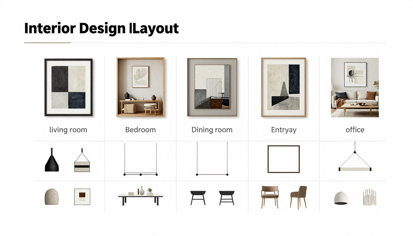
The 25-Look Finder (Room → Theme → Palette → Size)
| Look # | Room | Theme Name | Palette | Best Orientation | Suggested Sizes | Frame Suggestion | Styling Rule | Rossetti Art Pick |
| 1 | Living Room | Soft-Grid Minimalism | Black, white, gray | Horizontal | 40×30″ (102×76cm) | Thin black metal | Pair with textural neutrals and one metal accent | Ink Reverie |
| 2 | Living Room | Warm Modern Terracotta | Terracotta, cream, charcoal | Horizontal | 48×36″ (122×91cm) | Floating canvas | Echo terracotta in small ceramics and textiles | Cubist Muse |
| 3 | Living Room | Graphic Blackline Gallery | Black, white, beige | Mixed (gallery) | Set of 3: 20×20″ (51×51cm) | Identical thin white | Maintain 2-3″ spacing between all frames | Abstract Charcoal Flow |
| 4 | Living Room | Statement Color Block | Blue, orange, white | Horizontal | 60×40″ (152×102cm) | Floating canvas | Keep surrounding decor neutral to let art dominate | Radiant Echo |
| 5 | Living Room | Organic Texture Layering | Cream, taupe, charcoal | Square | 36×36″ (91×91cm) | Natural wood float | Pair with natural materials (wood, linen, stone) | Muted Form Funk |
| 6 | Living Room | Oversized Statement | Gray, white, blue | Horizontal | 72×48″ (183×122cm) | Floating canvas | Allow 8-10″ clearance on each side of furniture | Tranquil Form |
| 7 | Living Room | Mid-Century Organic | Mustard, teal, cream | Horizontal | 48×36″ (122×91cm) | Walnut wood | Pair with curved furniture and warm wood tones | Organic Shapes |
| 8 | Bedroom | Serene Horizon Flow | Blue, gray, white | Horizontal | 48×24″ (122×61cm) | White float frame | Position 8″ above headboard; 2/3 bed width | Flowing Contrast Harmony |
| 9 | Bedroom | Monochrome Tranquility | Black, white, gray | Square | 30×30″ (76×76cm) | Thin black metal | Balance with soft textiles in similar tones | Monochrome Reverie |
| 10 | Bedroom | Soft Geometric Balance | Blush, gray, cream | Horizontal | 40×30″ (102×76cm) | Brass metal | Echo one accent color in bedding or lamp | Bold Shapes Harmony |
| 11 | Bedroom | Minimal Line Composition | Black, cream | Vertical (pair) | Two 24×36″ (61×91cm) | Identical white | Hang as a pair with 4″ spacing between | Abstract Charcoal Flow |
| 12 | Bedroom | Textural Neutrals | Beige, white, taupe | Horizontal | 36×24″ (91×61cm) | Natural wood | Layer with textural bedding in complementary tones | Muted Form Funk |
| 13 | Dining Room | Bold Conversation Starter | Red, black, white | Horizontal | 48×36″ (122×91cm) | Floating canvas | Hang at seated eye level; echo one color in tableware | Fire Form Flow |
| 14 | Dining Room | Elegant Geometric Grid | Navy, gold, cream | Square | 36×36″ (91×91cm) | Gold metal | Pair with metallic accents in table setting | Celestial Mosaic |
| 15 | Dining Room | Minimal Triptych | Black, white, gray | Horizontal (series) | Three 16×20″ (41×51cm) | Identical thin black | Align bottom edges at same height across wall | Ink Reverie |
| 16 | Dining Room | Earthy Abstract Landscape | Terracotta, olive, cream | Horizontal | 48×30″ (122×76cm) | Walnut wood | Complement with natural table materials (wood, ceramic) | Cubist Muse |
| 17 | Home Office | Energizing Color Block | Blue, yellow, white | Vertical | 24×36″ (61×91cm) | White gallery | Position in line of sight; avoid screen glare | Radiant Echo |
| 18 | Home Office | Structured Grid Calm | Gray, white, black | Square | 30×30″ (76×76cm) | Black metal | Balance with organic elements (plant, wood desk) | Monochrome Reverie |
| 19 | Home Office | Creative Inspiration | Multi-color, white | Horizontal | 36×24″ (91×61cm) | White gallery | Keep desk accessories minimal and coordinated | Bold Shapes Harmony |
| 20 | Hallway/Entry | Linear Movement Series | Black, white, gray | Vertical series | Three 16×24″ (41×61cm) | Identical thin black | Space evenly with 6-8″ between frames | Abstract Charcoal Flow |
| 21 | Hallway/Entry | Statement Welcome | Blue, orange, white | Vertical | 30×40″ (76×102cm) | Floating canvas | Center above console with minimal styling | Radiant Echo |
| 22 | Hallway/Entry | Elegant Minimal | Beige, white, black | Horizontal | 36×24″ (91×61cm) | Brass metal | Pair with single statement mirror or sconce | Muted Form Funk |
| 23 | Small Space | Airy Vertical | White, gray, pale blue | Vertical | 20×30″ (51×76cm) | Thin white | Choose art with ample negative space | Flowing Contrast Harmony |
| 24 | Small Space | Mini Gallery Moment | Black, white, gray | Mixed (small gallery) | Four 11×14″ (28×36cm) | Identical white | Arrange in grid with 2″ spacing between frames | Ink Reverie |
| 25 | Open Plan | Zone Defining Statement | Terracotta, navy, cream | Horizontal | 60×40″ (152×102cm) | Floating canvas | Use to visually anchor and define a specific zone | Cubist Muse |
25 Designer-Style Looks (Room-by-Room)

Living Room
Look 1: Soft-Grid Minimalism
Best for: Contemporary living rooms with clean lines and neutral palette
Palette: Black, white, gray
The move:
- Pair with textural elements like bouclé pillows and natural wood accents
- Add one metallic element (brass lamp, chrome side table) for dimension
Placement + size: Horizontal orientation, 40×30 inches (102×76 cm), centered above sofa with 8-inch clearance
Rossetti Art pick: Ink Reverie's monochromatic grid pattern creates a sophisticated focal point without overwhelming the space.
If your room is small: Scale down to 30×24 inches while maintaining the same proportions.
Look 2: Warm Modern Terracotta
Best for: Living rooms with earthy palettes and organic materials
Palette: Terracotta, cream, charcoal
The move:
- Echo terracotta tones in small ceramics, textiles, or a single accent chair
- Balance with natural materials like jute, leather, and unfinished woods
Placement + size: Horizontal orientation, 48×36 inches (122×91 cm), centered on main wall
Rossetti Art pick: Cubist Muse's earthy palette brings warmth and sophistication to living spaces with its balanced composition.
If your room is small: Consider a 36×24 inch version that maintains the warm impact.
Look 3: Graphic Blackline Gallery
Best for: Contemporary living rooms seeking visual interest without color
Palette: Black, white, beige
The move:
- Create a gallery of three coordinated pieces with strong linear elements
- Pair with minimalist furniture featuring clean lines and subtle textures
Placement + size: Mixed orientations, set of three 20×20 inch (51×51 cm) pieces arranged horizontally with 2-3 inch spacing
Rossetti Art pick: Abstract Charcoal Flow's bold strokes create dramatic impact in a gallery arrangement, especially when paired with similar monochromatic pieces.
If your room is small: Reduce to two pieces while maintaining the spacing.

Look 4: Statement Color Block
Best for: Neutral living rooms needing a vibrant focal point
Palette: Blue, orange, white
The move:
- Let the art dominate by keeping surrounding decor neutral
- Echo one accent color (blue or orange) in a single small accessory
Placement + size: Horizontal orientation, 60×40 inches (152×102 cm), centered above sofa
Rossetti Art pick: Radiant Echo's vibrant interplay of blue and orange creates an energetic focal point in otherwise neutral spaces.
If your room is small: Scale down to 48×32 inches but maintain the visual impact.
Look 5: Organic Texture Layering
Best for: Transitional living rooms with natural materials
Palette: Cream, taupe, charcoal
The move:
- Pair with natural materials like wood, linen, and stone
- Layer different textures (rough, smooth, woven) throughout the space
Placement + size: Square orientation, 36×36 inches (91×91 cm), centered on feature wall
Rossetti Art pick: Muted Form Funk's textural depth creates visual interest while maintaining a sophisticated neutral palette.
If your room is small: A 30×30 inch version will maintain the textural impact.
Look 6: Oversized Statement
Best for: Large living rooms with high ceilings
Palette: Gray, white, blue
The move:
- Make the art the dominant feature with 8-10 inches of clearance on all sides
- Balance with substantial furniture that won't be overwhelmed
Placement + size: Horizontal orientation, 72×48 inches (183×122 cm), centered on main wall
Rossetti Art pick: Tranquil Form's expansive composition creates a serene yet powerful presence in spacious living areas.
If your room is small: This look is specifically for larger spaces; consider Look 1 or 5 instead.
Look 7: Mid-Century Organic
Best for: Living rooms with mid-century modern furniture
Palette: Mustard, teal, cream
The move:
- Pair with curved furniture and warm wood tones (walnut, teak)
- Add brass accents for authentic mid-century appeal
Placement + size: Horizontal orientation, 48×36 inches (122×91 cm), centered above sofa or credenza
Rossetti Art pick: Organic Shapes' flowing forms perfectly complement mid-century aesthetics with its balanced composition and warm palette.
If your room is small: Scale down to 36×24 inches while maintaining the mid-century vibe.

Bedroom
Look 8: Serene Horizon Flow
Best for: Primary bedrooms seeking calm and tranquility
Palette: Blue, gray, white
The move:
- Position above headboard with 8-inch clearance
- Echo the horizontal flow in layered bedding and simple accessories
Placement + size: Horizontal orientation, 48×24 inches (122×61 cm), centered above bed at 2/3 bed width
Rossetti Art pick: Flowing Contrast Harmony's gentle movement creates a peaceful focal point that promotes relaxation.
If your room is small: Scale to 36×18 inches while maintaining the horizontal flow.
Look 9: Monochrome Tranquility
Best for: Contemporary bedrooms with minimalist aesthetic
Palette: Black, white, gray
The move:
- Balance stark monochrome with soft textiles in similar tones
- Add one natural element (wood nightstand, plant) for warmth
Placement + size: Square orientation, 30×30 inches (76×76 cm), centered above bed or on adjacent wall
Rossetti Art pick: Monochrome Reverie's balanced composition creates visual interest without disrupting the bedroom's restful atmosphere.
If your room is small: A 24×24 inch version maintains the impact while fitting smaller spaces.
Look 10: Soft Geometric Balance
Best for: Bedrooms with feminine or transitional style
Palette: Blush, gray, cream
The move:
- Echo the blush tone in bedding, lamp, or single decorative pillow
- Pair with brass or gold accents for warmth and sophistication
Placement + size: Horizontal orientation, 40×30 inches (102×76 cm), centered above bed
Rossetti Art pick: Bold Shapes Harmony's structured elegance brings sophisticated geometry to bedroom spaces.
If your room is small: A 30×24 inch version maintains the geometric impact.

Look 11: Minimal Line Composition
Best for: Modern bedrooms with architectural elements
Palette: Black, cream
The move:
- Hang as a vertical pair with 4-inch spacing between frames
- Keep bedding and accessories minimal with clean lines
Placement + size: Vertical pair, each 24×36 inches (61×91 cm), aligned at top edge
Rossetti Art pick: Abstract Charcoal Flow's strong lines create architectural interest when arranged as a vertical pair.
If your room is small: Scale down to 18×24 inches per piece while maintaining the pairing.
Look 12: Textural Neutrals
Best for: Organic modern or coastal bedrooms
Palette: Beige, white, taupe
The move:
- Layer with textural bedding in complementary neutral tones
- Add natural elements like woven baskets, ceramics, or linen curtains
Placement + size: Horizontal orientation, 36×24 inches (91×61 cm), centered above bed
Rossetti Art pick: Muted Form Funk's subtle texture adds depth to neutral bedroom spaces without disrupting the calm atmosphere.
If your room is small: A 30×20 inch version maintains the textural interest.

Dining Room
Look 13: Bold Conversation Starter
Best for: Dining rooms that host frequent gatherings
Palette: Red, black, white
The move:
- Hang at seated eye level for maximum impact during meals
- Echo one color (red) in small tableware elements or single floral arrangement
Placement + size: Horizontal orientation, 48×36 inches (122×91 cm), centered on main dining wall
Rossetti Art pick: Fire Form Flow's dynamic energy creates a perfect conversation starter for social dining spaces.
If your room is small: Scale down to 36×24 inches while maintaining the bold impact.
Look 14: Elegant Geometric Grid
Best for: Formal dining rooms with traditional elements
Palette: Navy, gold, cream
The move:
- Pair with metallic accents in table setting (gold flatware, candlesticks)
- Balance with classic furniture in rich wood tones
Placement + size: Square orientation, 36×36 inches (91×91 cm), centered on wall opposite entry
Rossetti Art pick: Celestial Mosaic's structured elegance adds sophistication to formal dining spaces.
If your room is small: A 30×30 inch version maintains the geometric impact.

Look 15: Minimal Triptych
Best for: Contemporary dining rooms with clean lines
Palette: Black, white, gray
The move:
- Arrange three coordinated pieces with bottom edges aligned at same height
- Keep table styling minimal with monochromatic elements
Placement + size: Horizontal series, three 16×20 inches (41×51 cm), evenly spaced
Rossetti Art pick: Ink Reverie's clean aesthetic creates visual rhythm when arranged as a triptych in dining spaces.
If your room is small: Reduce to two pieces while maintaining the spacing and alignment.
Look 16: Earthy Abstract Landscape
Best for: Rustic or transitional dining rooms
Palette: Terracotta, olive, cream
The move:
- Complement with natural table materials (wood, ceramic, linen)
- Add organic elements like a simple branch arrangement or stone accessories
Placement + size: Horizontal orientation, 48×30 inches (122×76 cm), centered on main wall
Rossetti Art pick: Cubist Muse's earthy palette brings warmth and depth to dining spaces with natural elements.
If your room is small: A 36×24 inch version maintains the earthy impact.

Home Office
Look 17: Energizing Color Block
Best for: Home offices needing creative stimulation
Palette: Blue, yellow, white
The move:
- Position in your line of sight but avoid creating screen glare
- Keep desk accessories minimal and coordinated with one accent color
Placement + size: Vertical orientation, 24×36 inches (61×91 cm), on wall visible from desk
Rossetti Art pick: Radiant Echo's vibrant energy stimulates creativity and focus in work environments.
If your room is small: A 20×30 inch version maintains the energizing effect.
Look 18: Structured Grid Calm
Best for: Home offices requiring concentration and focus
Palette: Gray, white, black
The move:
- Balance geometric structure with organic elements (plant, wood desk)
- Keep surrounding decor minimal and monochromatic
Placement + size: Square orientation, 30×30 inches (76×76 cm), centered on main wall
Rossetti Art pick: Monochrome Reverie's balanced composition promotes focus without visual distraction.
If your room is small: A 24×24 inch version maintains the structured calm.
Look 19: Creative Inspiration
Best for: Creative workspaces and studios
Palette: Multi-color, white
The move:
- Position where it can inspire but not distract from work
- Keep desk accessories minimal and coordinated in neutral tones
Placement + size: Horizontal orientation, 36×24 inches (91×61 cm), at eye level when seated
Rossetti Art pick: Bold Shapes Harmony's dynamic composition stimulates creative thinking in work environments.
If your room is small: A 30×20 inch version maintains the creative energy.

Hallway + Entry
Look 20: Linear Movement Series
Best for: Long hallways needing visual rhythm
Palette: Black, white, gray
The move:
- Space three vertical pieces evenly with 6-8 inches between frames
- Keep other hallway elements minimal and coordinated
Placement + size: Vertical series, three 16×24 inches (41×61 cm), aligned at center height
Rossetti Art pick: Abstract Charcoal Flow's dynamic lines create movement and visual interest in transitional spaces.
If your room is small: Reduce to two pieces while maintaining the spacing.
Look 21: Statement Welcome
Best for: Entryways seeking to make a bold first impression
Palette: Blue, orange, white
The move:
- Center above a console table with minimal styling
- Keep surrounding elements neutral to let the art dominate
Placement + size: Vertical orientation, 30×40 inches (76×102 cm), centered on main entry wall
Rossetti Art pick: Radiant Echo's vibrant presence creates an energetic welcome in entry spaces.
If your room is small: A 24×36 inch version maintains the statement impact.
Look 22: Elegant Minimal
Best for: Sophisticated entryways with curated elements
Palette: Beige, white, black
The move:
- Pair with a single statement mirror or sconce for balanced composition
- Add one organic element (small vase, sculptural branch) for warmth
Placement + size: Horizontal orientation, 36×24 inches (91×61 cm), centered at eye level
Rossetti Art pick: Muted Form Funk's refined texture creates sophisticated entry moments without overwhelming the space.
If your room is small: A 30×20 inch version maintains the elegant impact.

Small Spaces + Open Plan
Look 23: Airy Vertical
Best for: Small spaces needing visual height
Palette: White, gray, pale blue
The move:
- Choose art with ample negative space to maintain visual lightness
- Keep surrounding decor minimal and in light tones
Placement + size: Vertical orientation, 20×30 inches (51×76 cm), centered on main wall
Rossetti Art pick: Flowing Contrast Harmony's airy composition creates a sense of space in compact areas.
If your room is small: This look is specifically designed for small spaces.
Look 24: Mini Gallery Moment
Best for: Small spaces seeking visual interest without overwhelming
Palette: Black, white, gray
The move:
- Arrange four small pieces in a grid with 2-inch spacing between frames
- Keep frames identical for a cohesive, intentional look
Placement + size: Mixed orientations, four 11×14 inches (28×36 cm), arranged in grid
Rossetti Art pick: Ink Reverie's clean aesthetic creates a sophisticated gallery moment when arranged in multiples.
If your room is small: This look is specifically designed for small spaces.
Look 25: Zone Defining Statement
Best for: Open plan spaces needing visual anchors
Palette: Terracotta, navy, cream
The move:
- Use to visually anchor and define a specific zone within open plan
- Echo one color from the artwork in nearby furniture or accessories
Placement + size: Horizontal orientation, 60×40 inches (152×102 cm), centered above furniture grouping
Rossetti Art pick: Cubist Muse's substantial presence helps define zones in open-concept spaces.
If your room is small: This look is specifically for larger open plan spaces.
Quick "Choose Your Look" Guide
Do you want calm or energy?
For calm: Look to monochromatic or neutral palettes in Looks 1, 5, 8, 9, 12, 18, and 22.
For energy: Choose vibrant color combinations in Looks 4, 7, 13, 17, 19, and 21.
What's your room size?
For large rooms: Consider oversized statements in Looks 6, 13, and 25.
For medium rooms: Most looks work well, particularly 2, 5, 7, 10, 14, and 16.
For small rooms: Choose pieces with visual lightness in Looks 23 and 24, or scaled-down versions of other looks.
What's your design style?
For minimalist: Consider the clean lines in Looks 1, 9, 15, 18, and 22.
For mid-century modern: The organic forms in Looks 7 and 19 complement this style perfectly.
For transitional: The balanced compositions in Looks 2, 5, 10, 12, and 16 bridge traditional and contemporary.
For contemporary: The bold statements in Looks 3, 4, 6, 14, and 21 create modern impact.
What's your color palette?
For neutrals: Enhance with textural interest in Looks 1, 5, 9, 12, 18, and 22.
For earth tones: Complement with the warm palettes in Looks 2, 7, 16, and 25.
For cool tones: Balance with the serene compositions in Looks 6, 8, and 23.
For bold accents: Make a statement with Looks 4, 13, 17, 19, and 21.
What's your wall configuration?
For long walls: Consider horizontal pieces or series in Looks 2, 4, 6, 8, 15, and 25.
For tall walls: Vertical orientations work best in Looks 11, 17, 20, and 21.
For square walls: Square formats create balance in Looks 5, 9, 14, and 18.
For awkward walls: Gallery arrangements adapt well in Looks 3, 15, 20, and 24.
Common Mistakes (And Fixes)
Art Too Small
The problem: Undersized artwork looks like an afterthought and fails to make an impact.
The fix: Follow the 2/3 rule—artwork should be approximately two-thirds the width of the furniture it hangs above. For sofas, aim for 60-80% of the sofa width.
Hung Too High
The problem: Art placed too high creates visual disconnection and an unbalanced room.
The fix: Position the center of your artwork at 57-60 inches from the floor—standard gallery height. When hanging above furniture, allow only 6-8 inches of wall space between the furniture and the bottom of the frame.
Too Many Competing Colors
The problem: When artwork clashes with room colors, it creates visual tension rather than harmony.
The fix: Choose art that either complements your existing palette or introduces a controlled new element. Echo 1-2 colors from your artwork in small accessories for cohesion.
No Breathing Space
The problem: Crowding artwork with too many surrounding elements diminishes its impact.
The fix: Allow visual breathing room around statement pieces. In gallery arrangements, maintain 2-3 inches between frames. Keep nearby shelving and wall decor minimal when featuring abstract art.
Improper Lighting
The problem: Poor lighting or glare can obscure the details and impact of your artwork.
The fix: Test artwork placement at different times of day to avoid direct glare. Consider picture lights or adjustable track lighting to properly illuminate pieces. Use non-reflective glass for areas with challenging light conditions.
Inconsistent Framing
The problem: Mismatched frames without purpose create a disjointed, amateur look.
The fix: For gallery walls, either keep all frames identical or ensure they share a strong connecting element (all wood tones, all same color, all same width). For standalone pieces, choose frames that complement both the art and your interior.
FAQ
What size wall art should I choose for above a sofa?
For above a sofa, choose artwork that spans 60-80% of your sofa's width. For a standard 84-inch sofa, this means artwork (or a grouping) around 50-67 inches wide. Hang the piece so its bottom edge is 6-8 inches above the sofa back. If using a grouping, treat the entire arrangement as one unit when measuring width and placement. For particularly large sofas or sectionals, consider an oversized canvas or diptych to maintain proper scale.
How high should I hang wall art?
The standard gallery approach is to position the center of your artwork at 57-60 inches (145-152 cm) from the floor, which aligns with average eye level. When hanging art above furniture, allow 6-8 inches of clearance between the furniture and the bottom of the frame. For dining rooms, consider a slightly lower placement (centered at 54-56 inches) to account for seated viewing. In hallways or stairwells, adjust for typical viewing angles and distances. The key is consistency—maintain the same center height for all pieces in a room for a cohesive, professional look.
Are abstract prints timeless?
Yes, abstract art has proven its longevity throughout modern design history. Since the early 20th century, abstract works have remained relevant across changing interior trends. The key to timelessness lies in selecting pieces with balanced composition, thoughtful color relationships, and emotional resonance rather than following fleeting trends. Abstract art that connects with you personally will likely maintain its appeal over time. For maximum longevity, consider pieces with sophisticated color palettes, strong compositional structure, and quality materials. The psychological impact of well-chosen abstract art creates an enduring connection that transcends passing trends.
How do I match abstract art to my color palette?
There are two effective approaches to color coordination with abstract art. First, you can choose artwork that incorporates colors already present in your space for a harmonious, cohesive look. Look for pieces that feature your existing accent colors, even if just in small touches. Alternatively, use abstract art to introduce a controlled new color element that complements your existing palette. Once installed, echo 1-2 colors from your artwork in small accessories (pillows, vases, books) to create visual connections throughout the room. For neutral rooms, abstract art with bold color can serve as the perfect focal point, while colorful rooms might benefit from more restrained, tonal abstract pieces that provide visual relief.
Should I frame canvas prints?
Canvas prints can work beautifully both framed and unframed, depending on your aesthetic goals. Unframed canvas with gallery-wrapped edges (where the image continues around the sides) offers a contemporary, casual look that works well in modern spaces. Floating frames—where a small gap exists between the canvas and frame—provide a refined, finished appearance while maintaining a modern sensibility. Traditional frames with no visible gap create a more formal, classic presentation. Consider your interior style, the artwork's composition, and the level of formality you desire. In contemporary spaces, unframed or floating frames typically work best, while transitional or traditional interiors often benefit from the finished look of proper framing.
How do I style a modern gallery wall?
For a sophisticated modern gallery wall, start with a unifying element—either consistent frames, a cohesive color palette, or a shared theme. Mix and match art prints with intention by varying sizes while maintaining 2-3 inches of spacing between pieces. For the most polished look, align at least one edge (top, bottom, or center) across multiple pieces. Consider starting with a larger anchor piece and building around it. Limit your selection to 5-9 pieces for focus, and plan your arrangement by laying everything on the floor first or creating paper templates. For frame selection, either keep all frames identical (most contemporary approach) or ensure they share a strong connecting element like color or material.
What works best in a small room?
In small rooms, abstract art can actually create a sense of expanded space when chosen thoughtfully. Select pieces with ample negative space, lighter palettes, and compositions that suggest depth or movement. Vertical orientations can enhance ceiling height, while horizontal pieces can visually widen narrow rooms. Consider a single statement piece rather than multiple small works, which can create visual clutter. Abstract pieces featuring receding colors (blues, cool grays) tend to expand space visually. For maximum impact in small rooms, position your abstract art as a focal point on the wall you see upon entering, and keep surrounding decor minimal. Oversized canvas prints can sometimes work surprisingly well in small spaces by creating an immersive, expansive feeling.
Elevate Your Space with Curated Abstract Art
The right piece of abstract wall art does more than fill an empty wall—it transforms your entire space, creating a designer-worthy environment that expresses your unique perspective. Whether you're drawn to bold color statements or subtle textural compositions, the perfect abstract piece can become the cornerstone of your room's identity.
At Rossetti Art, we believe in the transformative power of thoughtfully selected abstract art. Our collection of abstract and geometric canvas prints features pieces designed to complement a range of interior styles, from minimalist to maximalist, traditional to contemporary. Each piece is created with attention to composition, color harmony, and emotional resonance—the elements that distinguish truly impactful abstract art.
For those seeking unique statement pieces, our original abstract paintings offer one-of-a-kind artistic expressions that can become the focal point of any room. If you're drawn to serene, balanced compositions, explore our Wabi-Sabi collection, featuring pieces that celebrate the beauty of imperfection and natural harmony.
As you consider how to incorporate sustainable, handcrafted art into your home, we invite you to explore our curated collections and discover pieces that resonate with your personal aesthetic. The perfect abstract artwork isn't just a decorative element—it's an investment in your daily experience of home.
Ready to transform your space?
Explore our curated collection of modern abstract wall art and find the perfect piece for your home.
Shop Abstract Art Collection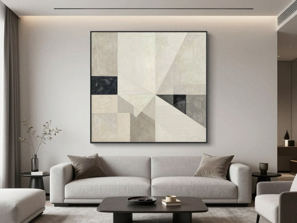
Leave a comment
This site is protected by hCaptcha and the hCaptcha Privacy Policy and Terms of Service apply.